Let’s be honest about doing the wash. It is usually a chore. Yet, selecting the right laundry room colors actually changes how you feel in the space. Traditionally, these utility zones were stuck with sterile whites and clinical finishes. However, modern homes treat the laundry room differently. It is an extension of your living space. You can transform a chore-heavy room into a calmer spot just by changing the paint. Perhaps you prefer heritage darks. Maybe muted plaster tones are more your style. Either way, the right laundry room colors provide a much-needed emotional anchor for daily tasks.
Many people still think a laundry space must be stark white. Historically, this clinical look proved a room was clean. Indeed, the style stems from a century-old hygiene obsession. Early designers treated the utility room like a sterile hospital ward. White paint quickly became the default choice for dark basements. Still, this outdated approach feels entirely wrong today. In fact, stark surfaces completely disconnect from the warmth of classic design.
Today, our utility rooms often sit right next to main living areas. A cold white box simply feels out of place here. Worse, sterile environments can actually increase chore-induced stress. High-glare lighting actively raises cortisol levels during repetitive tasks. Next, we need to reframe how we view this space. We are finally rejecting the old hospital aesthetic. Warm hues and rich textures actually offer real psychological benefits. Simply put, a colorful utility room lowers daily task anxiety.
Next, we must rethink how these hardworking spaces function. Specifically, color is a highly functional tool. We will explore the calming power of earth tones and the restorative effects of muted greens. You will also see how to incorporate sensory-rich elements. Soon, your utility room will feel much more comfortable.
Theme I: The Heritage Darks (Foundational Scullery Hues)
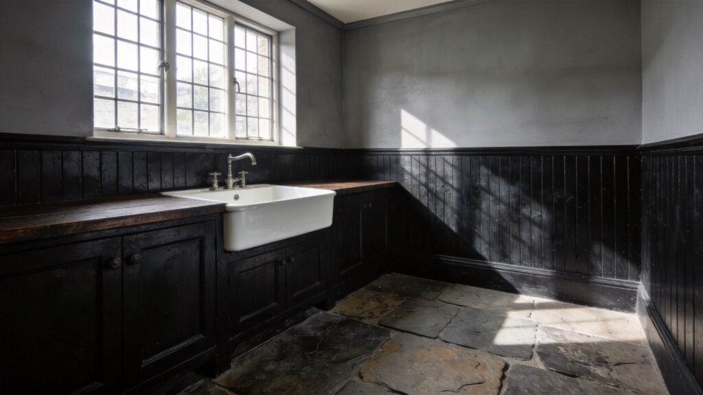
Historically, Victorian sculleries used deep colors for pure survival. These wet rooms endured heavy soot, harsh smoke, and daily grime from coal-fired boilers. Homeowners applied dark charcoals over lower beadboards to hide the inevitable stains. Today, reclaiming these heritage darks adds instant sophistication. Indeed, transforming a chore area into a grounded space is surprisingly easy. You just need to experiment with dark laundry room colors to create a bold, intentional atmosphere.
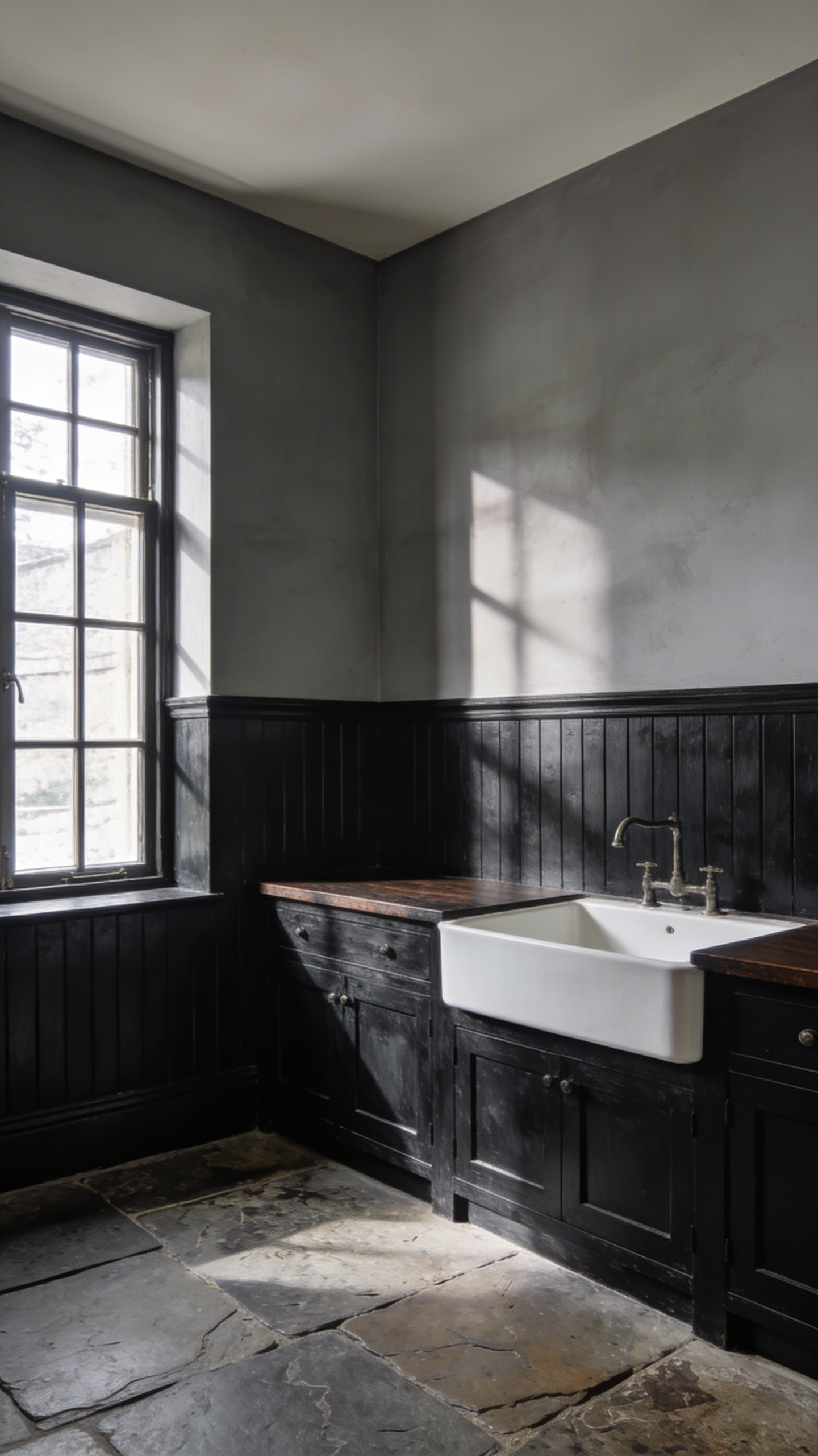
Authentic scullery hues have incredible depth because they use rich earth pigments. For instance, deep navies like Oxford Blue feel highly elegant. Similarly, dark greens create a wonderful cocooning effect. A small, windowless laundry room suddenly feels like a moody jewel box instead of a cramped closet. In fact, rich earthy browns provide vital warmth. They soften the harsh look of cold metal appliances beautifully.
In the past, these high-friction spaces required heavy gloss paints to survive constant humidity. However, modern designers often prefer satin or semi-gloss finishes. This softer sheen allows light to bounce beautifully across dark walls. As a result, the room never feels too heavy. Next, try pairing these walls with unlacquered brass and soapstone. It adds a wonderful sense of permanence to the room.
Deep scullery hues genuinely offer a bit of domestic escapism. Typically, people think pale colors are required to enlarge small rooms. However, design experts know that dark shades blur room corners effectively. The physical boundaries of a tight utility space simply melt away. In fact, these grounded tones make the room feel wonderfully expansive. They also help lower the stress of repetitive chores.
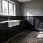
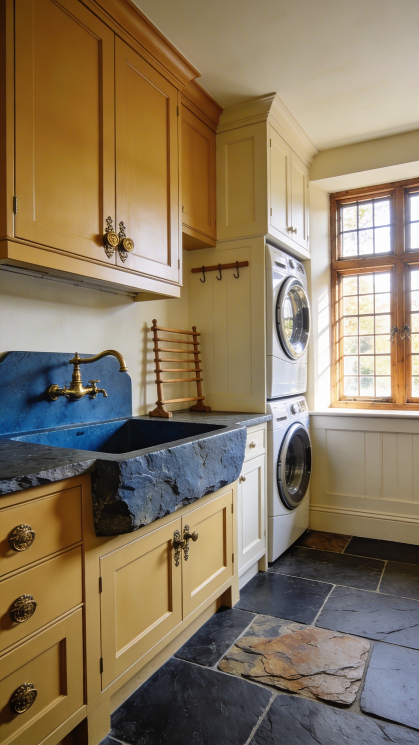
1. Manor house navy: Anchoring modern white appliances in timeless elegance.
Manor house navy is more than just a paint color. Actually, it is a brilliant design strategy. This deep ink hue provides visual gravity for utility spaces. Specifically, dark lower cabinetry anchors the entire room. This approach prevents spaces filled with reflective tiles from feeling sterile. You create a classic tuxedo effect by wrapping modern white washers in navy shades. Suddenly, your standard appliances pop with crisp sophistication.
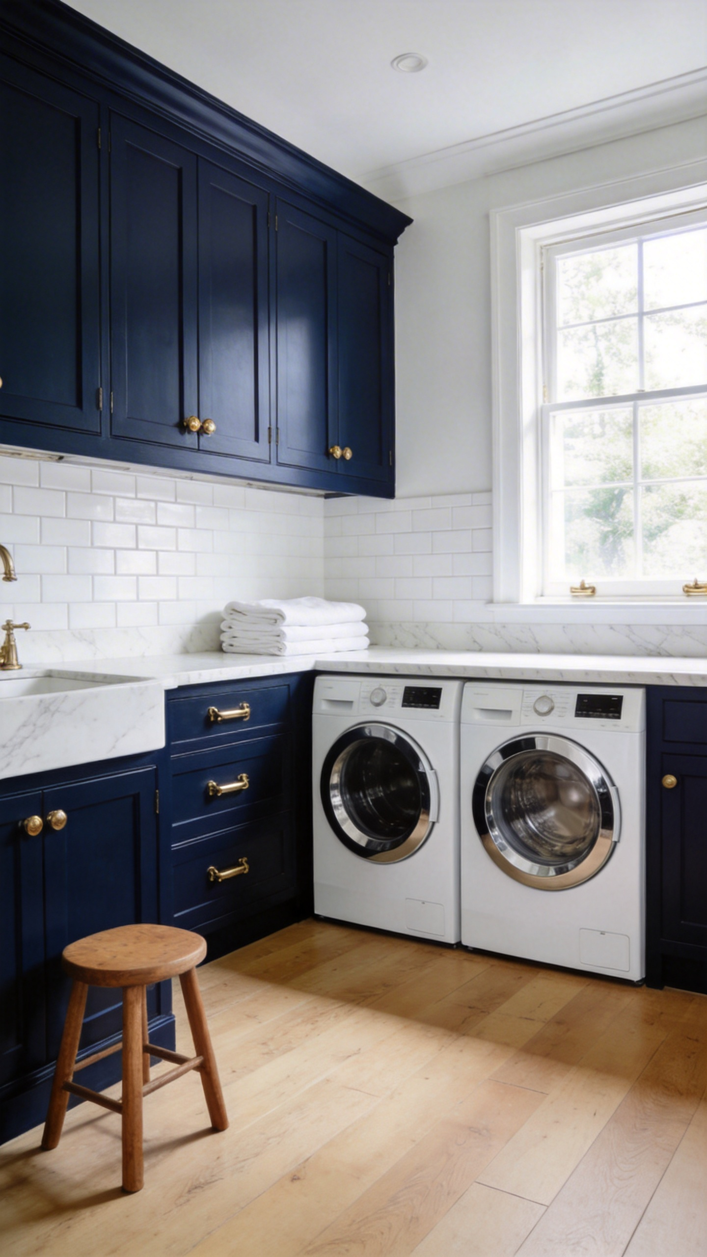
Historically, this rich color taps into authentic British utility design. For instance, Victorian sculleries frequently used laundry blue pigment in their wall paint. People believed this faint blue tint repelled flies. It also cleverly counteracted the yellowing effects of indoor coal fires. Today, a saturated navy invokes a subconscious link to hygiene and clean fabrics.
However, you definitely need to pair this backdrop with proper textures. Unlacquered brass hardware introduces a stunning living finish. Over time, this organic patina warms up the high-gloss modernity of white appliances. Similarly, a classic white Belfast sink creates a cohesive look. The continuous dark cabinetry neatly unites the sink, washer, and dryer.
Interestingly, dark, cool-toned blues also expand small utility closets. Because navy is a receding color, the room’s physical boundaries begin to blur. Therefore, the space feels much deeper and significantly calmer. You can perfect the look by adding traditional elements like a wooden drying rack. This simple touch grounds modern industrial appliances in heritage craft.
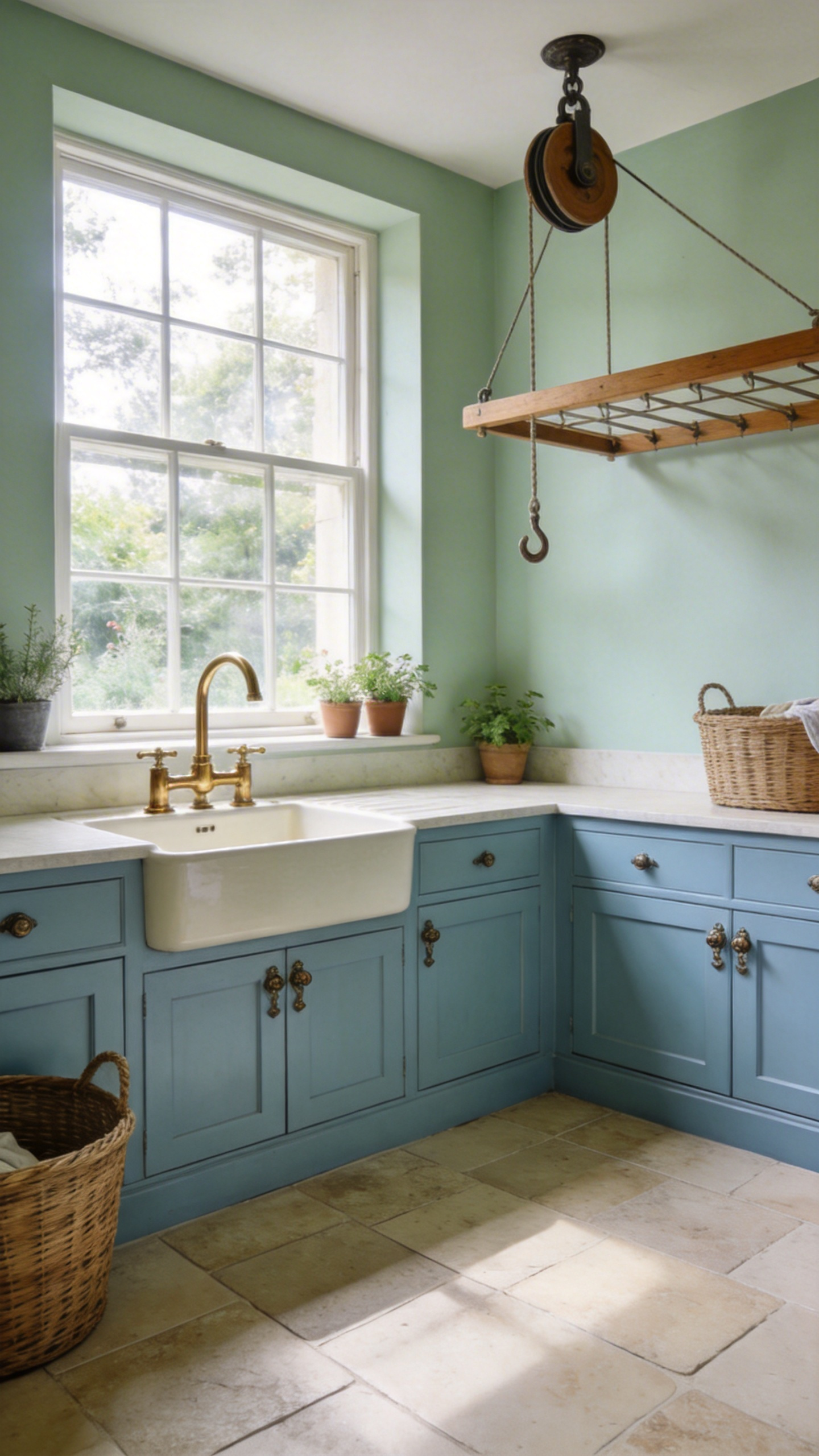
2. Boot room green: Blurring the boundary between the outdoor garden and indoor utility.
Boot room green is not just a single shade. Rather, it is a thoughtful design approach. It transforms utilitarian laundry spaces into natural indoor-outdoor bridges. This connects the untamed garden directly with domestic order. Utility rooms are high-friction zones in any home. Muddy boots and damp pets inevitably create natural chaos here. Therefore, introducing mid-tone foliage hues eases this sensory shift. For instance, exploring modern farmhouse laundry room colors is a great way to bridge the gap between indoor utility and the natural world.
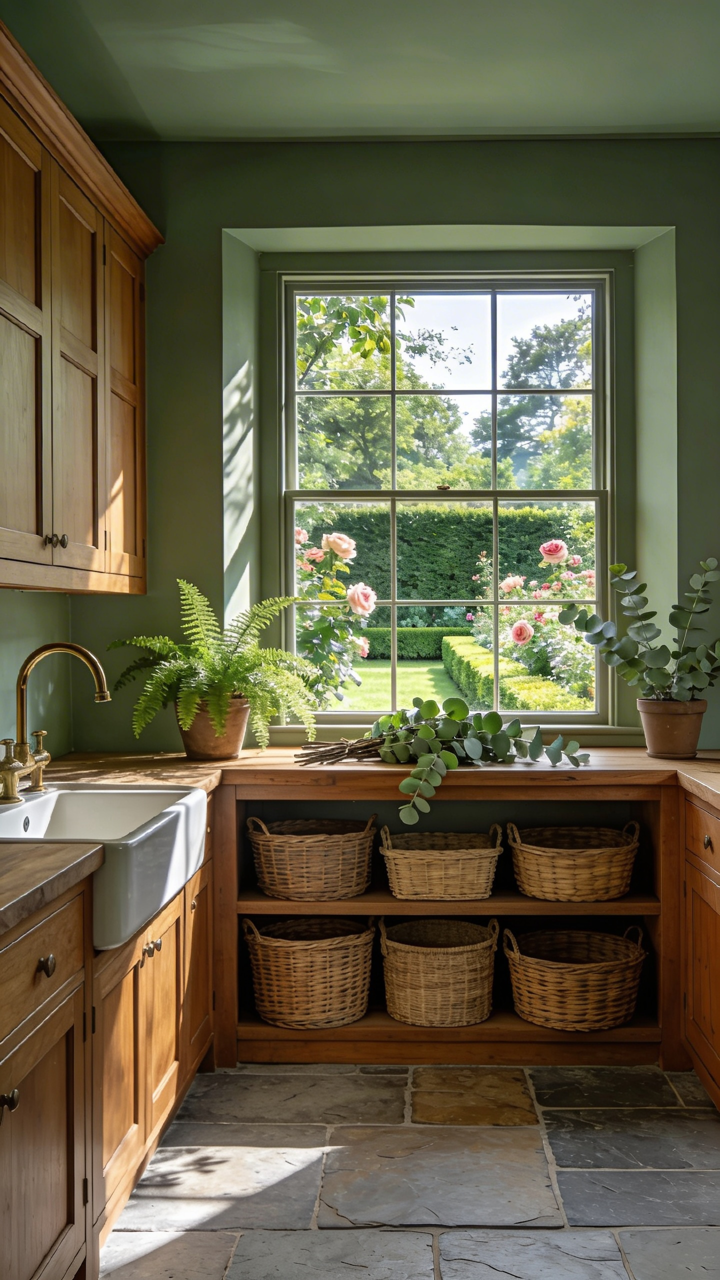
Practically, the rise of the hybrid laundry-mudroom demands hardworking palettes. Traditional white laundry rooms show dirt far too easily. Conversely, darker greens expertly camouflage dried mud and grass. This is a brilliant 19th-century heritage trick. Designers also frequently use color drenching in these windowless rooms. Painting the cabinetry and ceilings the same color makes cramped spaces feel intentional. Of course, lighting plays a vital role here. Deep greens often act as brilliant light traps. They can appear almost black under harsh overhead LEDs. However, the true green beautifully blooms when natural garden light hits it.
Classic design usually grounds these greens with tactile materials. Herringbone brick or limestone floors naturally echo the outdoor earth. Meanwhile, unlacquered brass hardware warmly oxidizes next to woven wicker baskets. This material synergy builds a wonderful little micro-ecosystem right inside your home.
3. Aubergine and brinjal: Injecting unexpected depth into bespoke laundry cabinetry.
Using aubergine and brinjal in bespoke cabinetry represents a distinct shift in modern design. It moves utility spaces away from sterile white toward unexpected, moody depth. Historically, these deep purples were popular in the libraries of 19th-century country houses. Injecting this regal hue into the modern laundry room reclaims that formal status. The color simply feels expensive. Indeed, it evokes the deep purple glazes of rare antique porcelain.
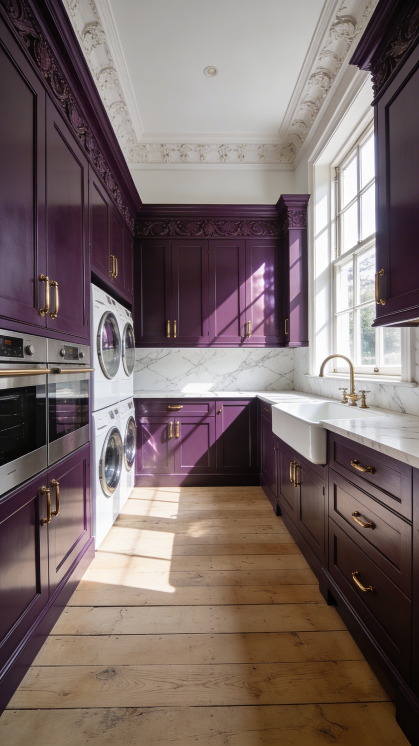
Technically, colors like brinjal reflect very little light. Therefore, these dark shades require careful application so they do not feel oppressive. Luxury designers often recommend applying these hues in a full gloss finish. This creates a mirror-like depth that beautifully reflects your task lighting. Next, watch how the color magically transforms. It looks like warm maroon in daylight, but shifts to winey violet under LEDs.
This dramatic depth relies heavily on high-contrast material pairings to succeed. For instance, brass hardware pops brilliantly against the dark cabinetry. Additionally, cool marble countertops provide a necessary visual break from the saturated purple. Raw walnut shelving adds an earthy anchor so the space does not feel too pompous. Color drenching a laundry room in such a sultry tone genuinely shifts your emotional state. Instead of feeling like drudgery, laundry becomes a surprisingly elegant ritual.
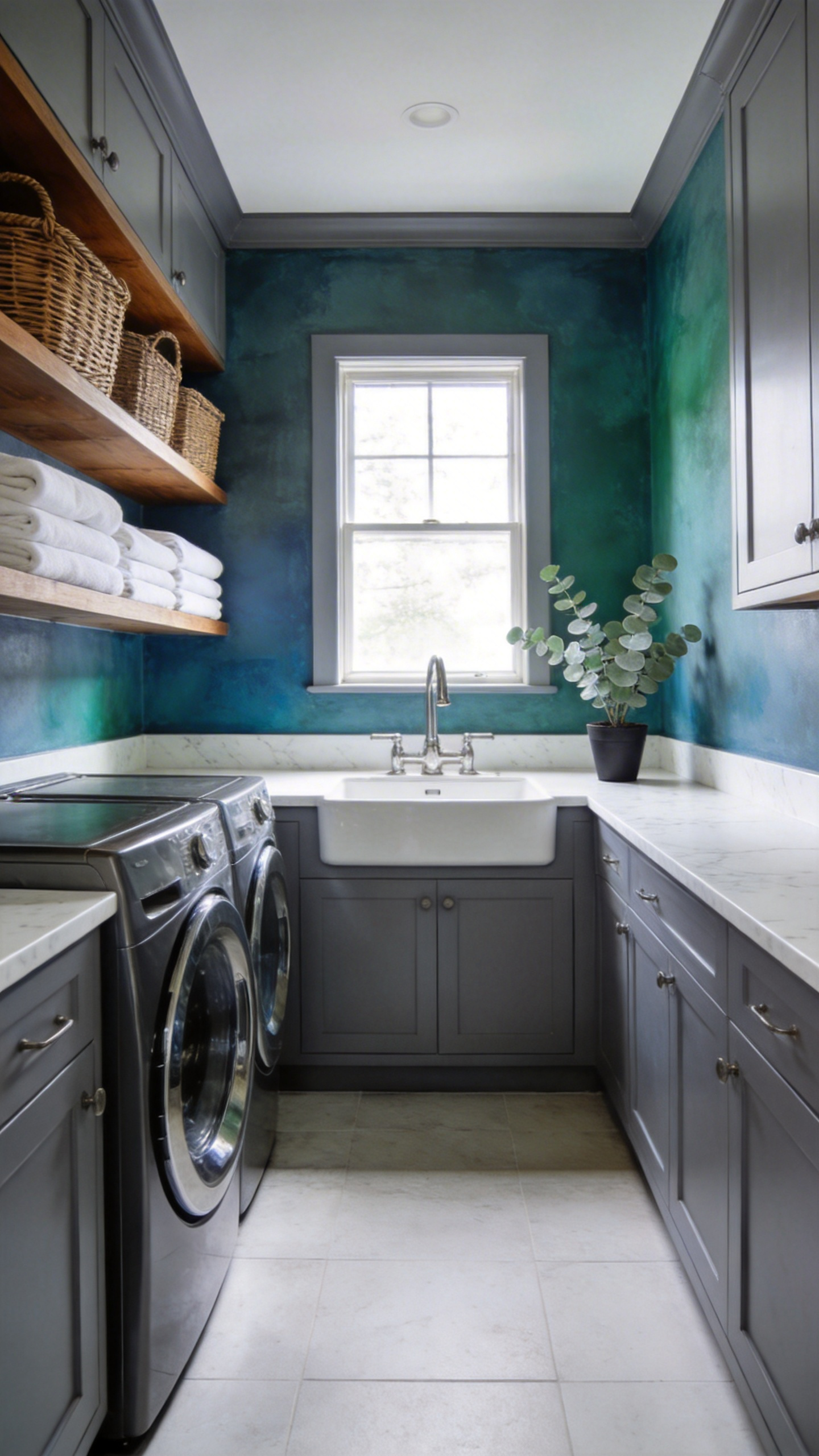
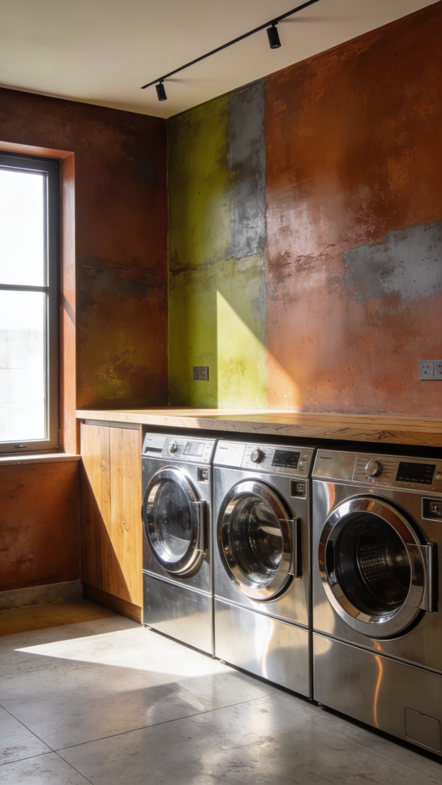
4. Deansgate teal: The perfect moody backdrop to elevate brass hardware.
Deansgate teal is a fantastic architectural color. It channels the rich heritage of old industrial buildings. The hue beautifully mimics the deep shadows of historic stone corridors. Consequently, modern utility spaces gain a profound sense of permanence. I love how this tone fully embraces the modern luxe utility movement. It truly helps transform laundry from a dreary chore into a soothing ritual.
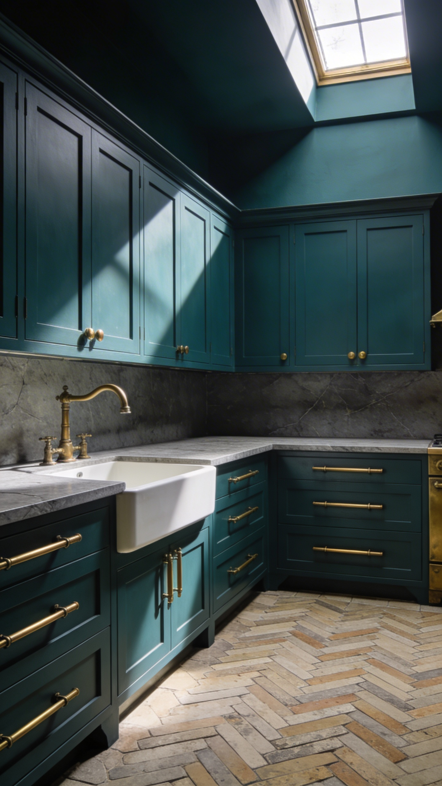
Technically, Deansgate teal absorbs light rather than reflecting it. Its muddy grey undertones are quite heavy. To maintain this moody spell, a dead flat emulsion is absolutely essential. Any surface sheen will reflect overhead glare and break the atmosphere. Crucially, this visually heavy backdrop creates a beautiful recessive effect. As a result, your foreground elements push forward with striking luminosity.
This is exactly why raw brass hardware is the perfect pairing. Polished chrome often looks far too clinical against dark walls. Raw brass, however, provides a stunning living finish. The unsealed metal naturally oxidizes when exposed to everyday room humidity. Eventually, it develops a dark, organic patina that adds immense warmth. Visually, the cool blue-green walls directly complement the warm orange-gold metal. Tactile brass cup pulls actually accelerate this aging process through daily touch. Together, these elements elegantly elevate the space.
Theme II: The Mineral & Plaster Tones (Textural Warmth)
Traditional design usually favors highly functional utility spaces. Modern homes, however, are finally embracing a textural shift. We are rapidly abandoning clinical white rooms in favor of warm, tactile minimalism. Authentic limewash and Roman clay drive this specific trend. Interestingly, these mineral materials actually offer superior technical breathability. Standard latex paints just trap moisture behind a plastic seal. Limewash, conversely, provides a highly permeable interior surface. Appliance vapor easily passes right through the breathable wall. The slaked lime reacts with ambient carbon dioxide as it dries. This mineral bond is naturally antimicrobial and mold-resistant.
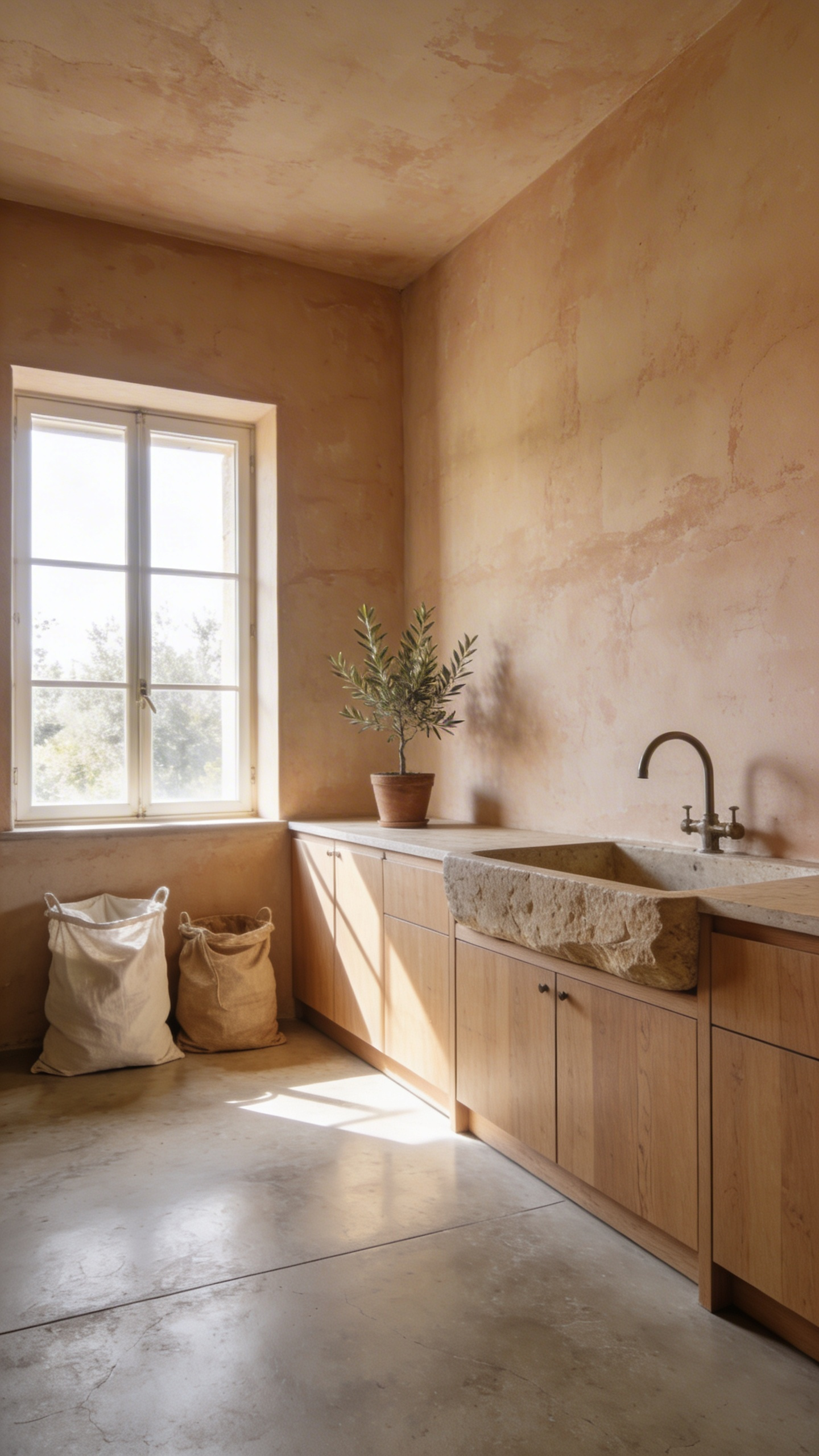
Flat color is no longer the only option for utility rooms. Movement and texture tell a much richer design story. Harsh LED lighting often plagues these small laundry spaces. Thankfully, micro-textured plaster beautifully diffuses this harsh artificial glare. Hand-troweled applications intentionally leave visible artisan marks on the walls. It makes mundane chores feel a bit more grounded. Earth-sourced pigments create a brilliant new neutral palette here. Dusty pinks add serious warmth to cold, north-facing rooms. Deep terracotta hues also work wonderfully for immersive color drenching. Meanwhile, unrefined bone whites provide a highly stable, calming feeling.
Designers love to pair these chalky walls with living finishes. Unlacquered brass hardware develops a stunning dark patina over time. Moroccan Zellige tiles similarly echo the imperfect nature of plaster. Natural oak shelving ultimately completes this soothing environment. These thoughtful material pairings genuinely make the room feel better. A room built for labor finally becomes a comfortable space.
5. Setting plaster: Casting a flattering warm glow over mundane tasks.
Top designers frequently choose dusty pinks to elevate utilitarian spaces. Historically, these shades mimic the unpainted, blushing walls of classic Georgian homes. They ground the modern laundry room in an artisanal, sun-baked texture.
This earthy pink paint also functions as a highly flattering light filter. Its warm yellow pigment base easily counters harsh fluorescent lighting. Consequently, the painted walls reflect a surprisingly healthy glow. Even your crisp white linens will appear noticeably brighter against this backdrop.
Psychologically, a soothing environment completely changes the vibe of washing clothes. Muted earthy tones actively reduce distracting visual chaos. Frantic folding quickly transforms into a calm, rhythmic household ritual.
Naturally, this chameleon color adapts well to challenging lighting. In dreary north-facing rooms, the warm undertones fight back against cold blue shadows. Conversely, bright south-facing daylight softens the pink into a sophisticated dusty neutral. High-moisture laundry rooms always require durable paint finishes. Fortunately, a wipeable emulsion prevents mildew without sacrificing that historic glow. Color-drenching the entire space creates a truly seamless retreat.
6. Cotswold stone: The tactile alternative to sterile white paint.
For decades, utility spaces suffered under the glare of sterile white paint. Today, designers are embracing the tactile warmth of Cotswold stone. This aesthetic draws heavily from yellow Jurassic limestone. It offers a luminous depth that flat paint simply lacks. Indeed, writer J.B. Priestley once noted this stone holds the “lost sunlight of centuries.” Applying these honey-gold tones instantly transforms a windowless laundry room from clinical to cocooning.
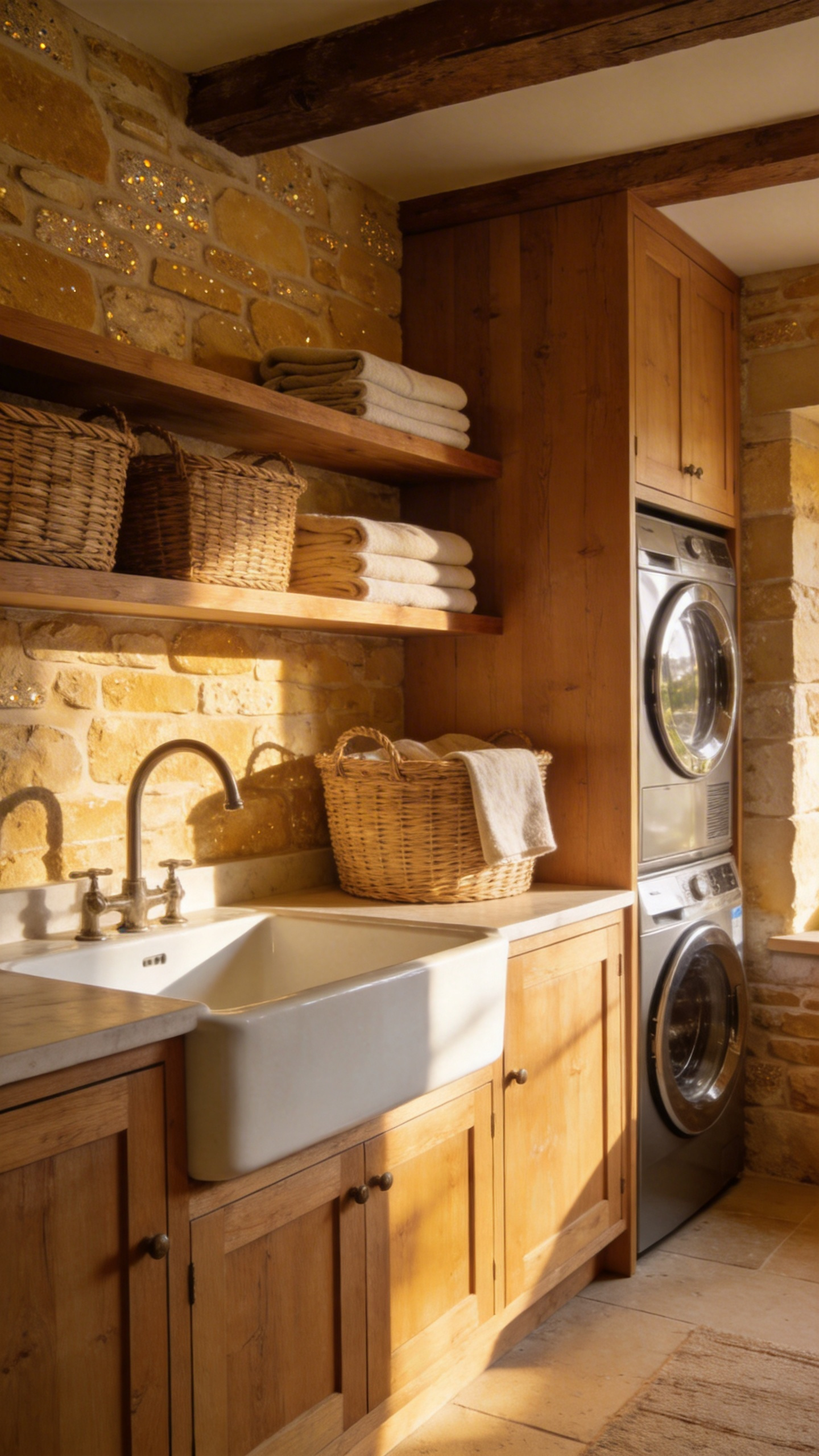
Designers increasingly favor these “dirty neutrals” over flat perfectionism. An earthy palette truly thrives on charming imperfections. Homeowners are also swapping standard latex for breathable limewash or Roman clay. Crucially, these mineral finishes absorb light rather than bouncing it around. Their breathable nature also prevents trapped moisture in damp utility rooms.
Psychologically, warm stone tones provide great emotional stability. They subtly signal durability against muddy boots and daily messes. If actual stone is unavailable, high-pigment paints replicate this depth beautifully. For instance, rich tan paints provide a fantastic earthy foundation. Other grey-beige tones easily mimic weathered limestone. Replacing reflective surfaces with velvety stone hues makes the room feel incredibly grounded.
7. Muted French gray: A highly adaptable lighting chameleon.
Muted French gray is a masterclass in atmospheric design. This historical hue shines especially well in neglected, north-facing laundry spaces. These utility rooms usually suffer from flat, cool natural light. Stark whites often feel clinical and cold in these conditions. On the other hand, pale grays can easily resemble dirty dishwater.
Fortunately, muted French gray has a perfect mid-tone light reflectance value. An LRV between 45 and 53 provides crucial depth to the walls. Consequently, the paint absorbs blue-heavy northern light beautifully. Instead of fighting shadows, the color becomes a true lighting chameleon. Morning light turns it into a soft winter sage. Later, waning afternoon light transforms it into wet cement.
Historically, this complex shade traces back to 19th-century European decoration. Painters mixed pigments like French ultramarine with earthy raw umber. This muddy complexity offers a very relaxed, refined heritage feel. It creates a soothing psychological reset for chore-heavy spaces. Practically, the muted depth significantly reduces visual clutter in the laundry room.
The earthy tones also effortlessly hide daily scuffs and marks. Modern designers love to completely wrap these utility rooms in color. By painting the walls, cabinets, and trim, you create distinct unity. This deliberate shadow play forms a cozy, high-end design cocoon. Clearly, a room does not need blinding brightness to have incredible personality.
8. Smoked terracotta: Grounding cool washing machines with centuries-old warmth.
Smoked terracotta is far more than a simple Mediterranean orange. It channels the ancient technique of reduction firing. This process forces raw carbon directly into porous clay. It leaves unpredictable blushes of umber and ash-grey. This complex neutral easily replaces the flat, boring tones of the 1990s. In modern homes, this shade acts as a vital visual anchor. Cool-toned chrome washing machines inherently possess a certain industrial coldness. However, smoked terracotta easily tames this sterile utility. Its earthy vibration perfectly counteracts the cold efficiency of your appliances.
Interior designers increasingly favor chalky finishes for these specific walls. Unlike reflective metal, matte surfaces absorb ambient light beautifully. They introduce tactile depth to an otherwise sensory-deprived space. Historically, baked earth was the default material for Tuscan utility rooms. Today, the added smokiness embraces a modern, perfectly imperfect aesthetic. It celebrates the profound beauty of natural earth tones.
This warm base perfectly suits windowless laundry environments. Rather than turning muddy in the dark, the color maintains a subtle inner glow. Shiny chrome appliances actively reflect their immediate surroundings. Consequently, your machine picks up warm, amber reflections from the walls. This beautifully integrates a sterile metal appliance into the warmth of your home.
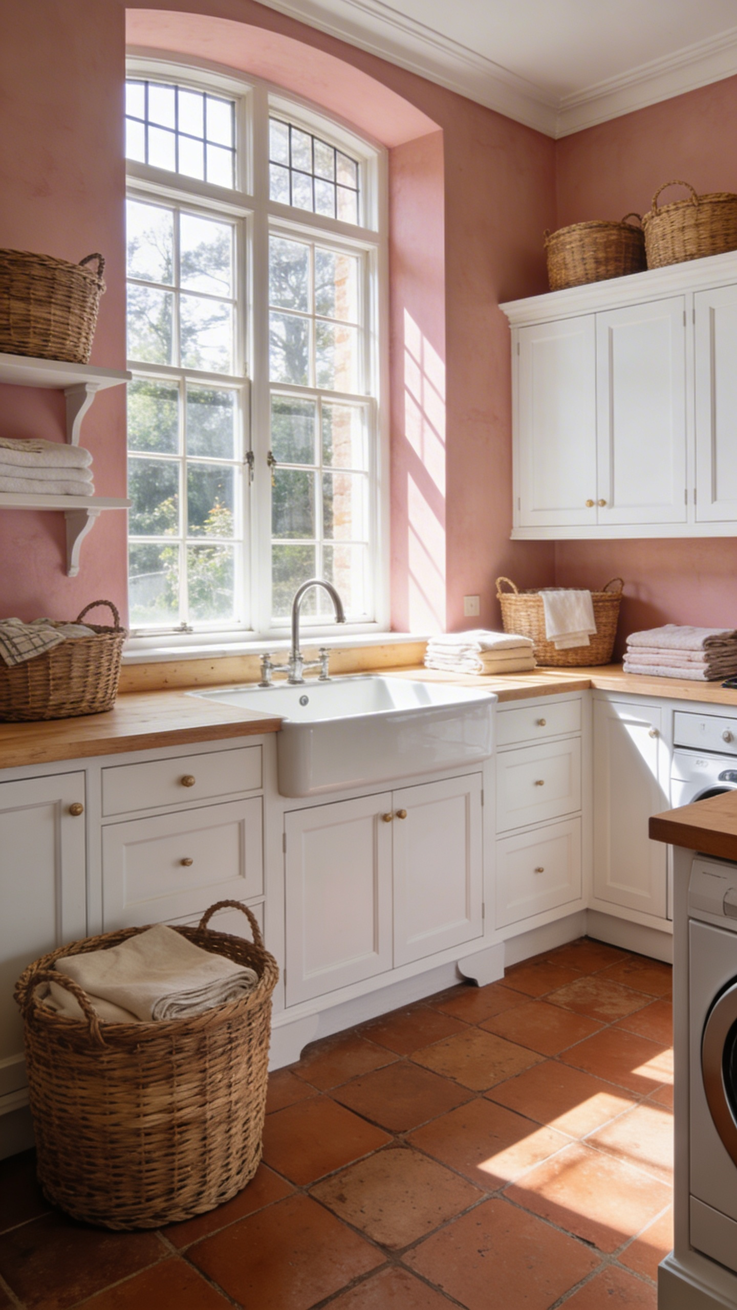
Theme III: The Country House Pastels (Spatial Expansion)
Historically, laundry rooms were the hidden engines of grand country estates. However, early 20th-century designers introduced garden-inspired pigments to elevate these spaces. Today, treating utility rooms with a bit of aesthetic dignity transforms daily drudgery. Achieving real spatial expansion relies on understanding light reflectance. While we focus on paint here, some homeowners prefer the intricate patterns found in laundry room wallpaper ideas to add a classic country feel.
9. Duck egg blue: Creating crisp, airy illusions of space in cramped quarters.
Duck egg blue is a brilliant architectural fix for cramped utility quarters. It relies entirely on the physics of short-wavelength hues. Unlike advancing reds or yellows, this complex blue-green is highly recessive. It tricks the eye into perceiving a visual retreat. Suddenly, your low-ceilinged laundry room feels several inches wider. Historically, this hue has deep roots in classic utility spaces. Victorian sculleries frequently used laundry blue to project ultimate cleanliness.
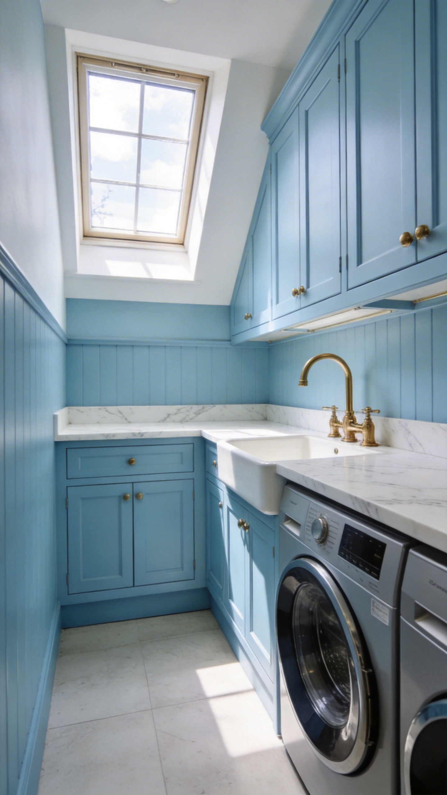
The muddied grey-green undertone also acts as a practical shield. Unlike clinical whites, this slightly dirty pigment beautifully masks daily wall scuffs. Its specific light reflectance value perfectly optimizes dim overhead lighting. Laundry environments are often overwhelmed by heat and steam from the dryer. However, cool-toned spaces can actively lower the perceived room temperature. Duck egg blue acts as a soothing thermal stabilizer while you work.
Visually, a chalky finish diffuses harsh shadows in tight corners. For the best result, apply this shade in a completely monochromatic envelope. Paint the low ceiling, walls, and cabinetry the exact same color. This bold move erases the visual horizon line entirely. The brain naturally associates a seamless blue ceiling with an open sky. It is a simple trick that creates an airy illusion of infinite space.
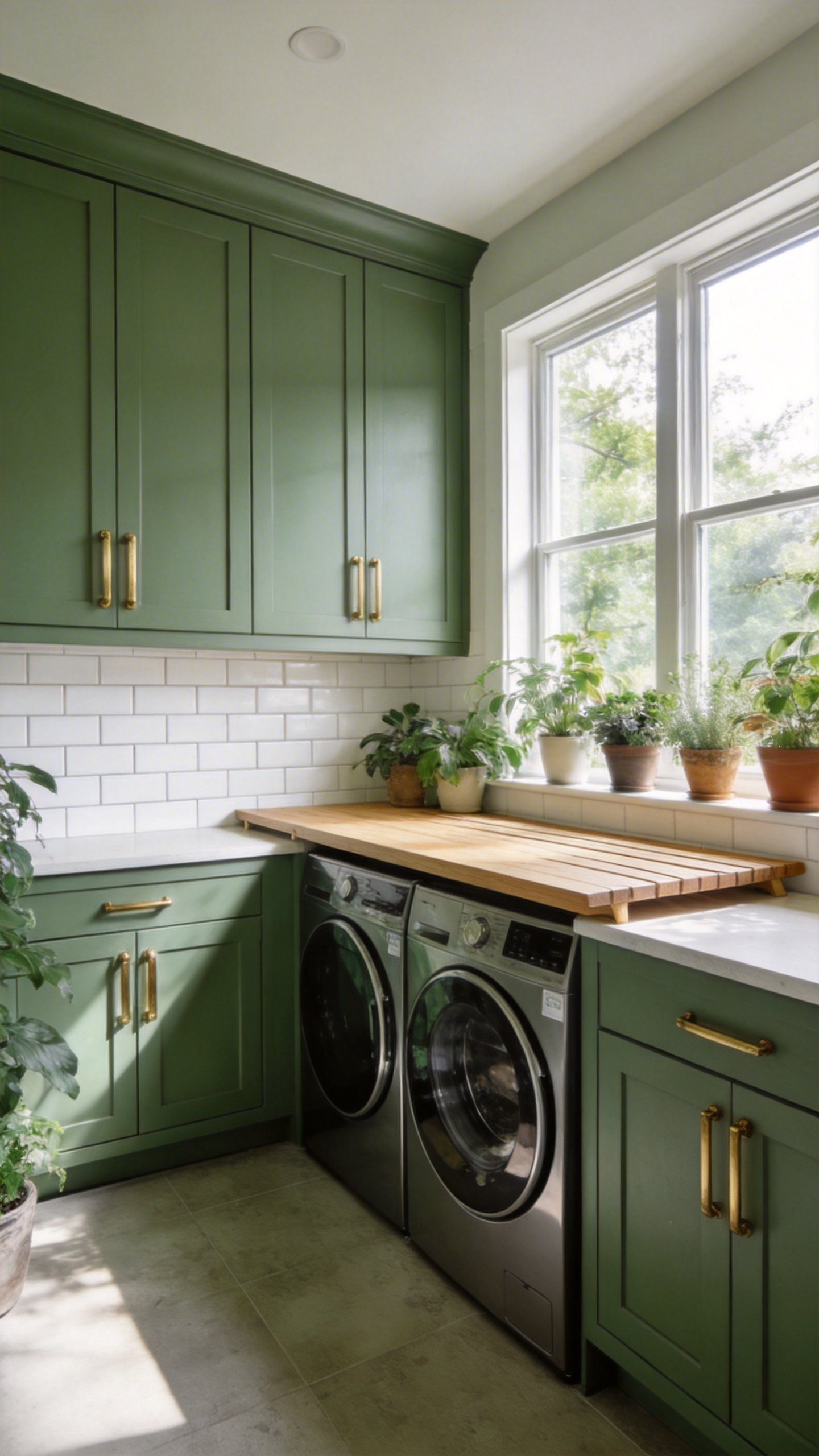
10. Heritage sage: The restorative hue proven to cure utilitarian fatigue.
Utilitarian fatigue absolutely plagues modern laundry rooms. Stark whites and cold grays can create a subconscious chore-prison. We spend quite a bit of time standing in these sterile environments. Therefore, we desperately need a restorative design solution. Heritage sage offers a beautifully grounded, mid-tone alternative. Its low chroma and green base naturally help lower cortisol spikes. This soothing color effectively cuts through the mental exhaustion of repetitive chores.
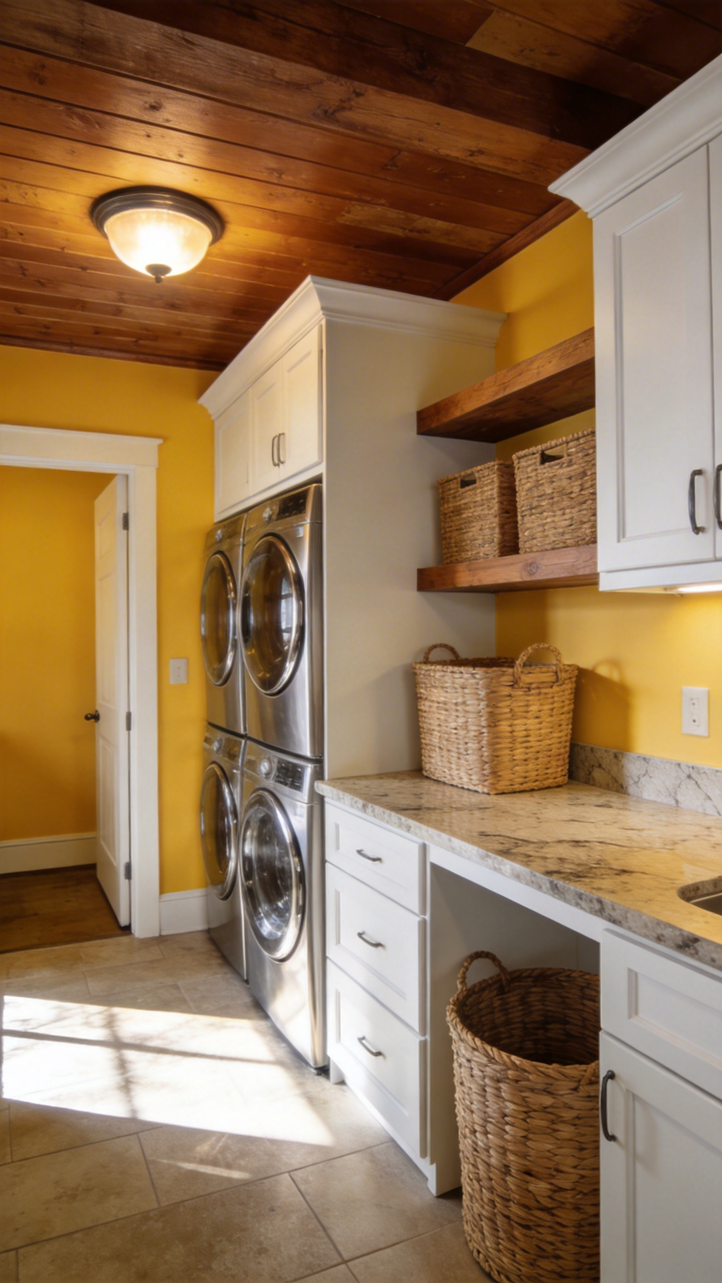
11. Scullery yellow: Injecting cheerful faux sunlight into windowless basements.
Historically, sculleries were the bustling engine rooms of classic homes. These damp back-kitchens heavily relied on yellow ochre limewash. This earthy pigment naturally warmed the dark, windowless working spaces. Today, modern designers are rediscovering this unique brownish-yellow. Unlike stark white, scullery yellow actually harvests artificial light. It almost acts as a secondary light source indoors. The warm hue successfully tricks the brain into perceiving real sunlight.
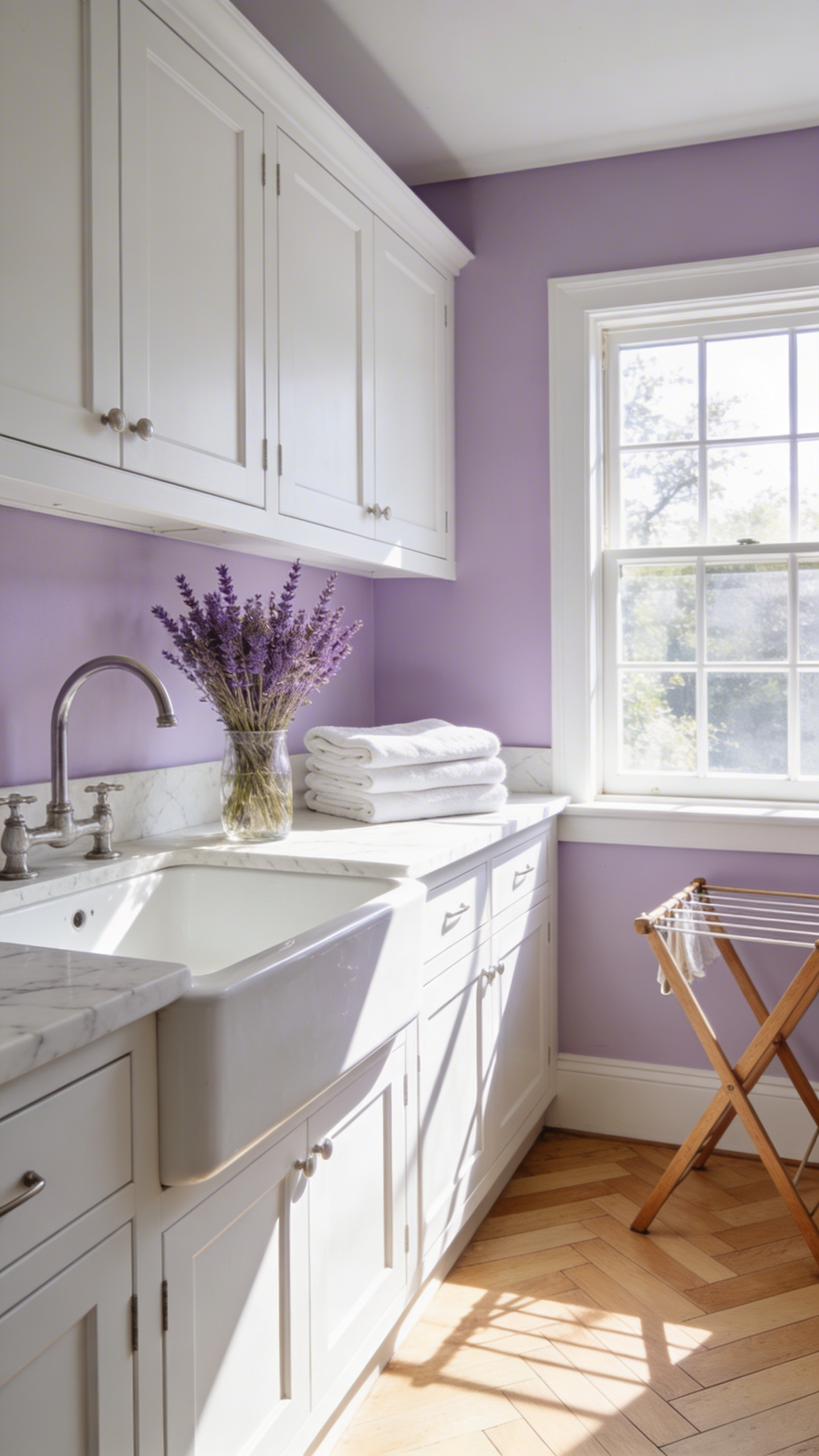
12. Pale lavender: A nod to dried botanicals and freshly pressed linens.
The connection between lavender and the laundry room is quite literal. The word itself stems from the Latin verb *lavare*, meaning to wash. In fact, historic wash houses were often built right next to blooming lavender gardens. People simply draped wet linens over the bushes to dry outdoors. Today, a pale lavender palette honors this heritage of botanical fabric care. However, achieving a sophisticated look requires shades with heavy gray and putty undertones. Muddy pinks and lavenders prevent the room from feeling overly saccharine.
Theme IV: Contemporary Classic Pairings (Lifestyle Integration)
The modern laundry room is no longer a damp basement secret. Instead, it serves as a high-visibility lifestyle hub. This shift requires bridging beautiful aesthetics with heavy-duty performance. Before finalizing your design, reviewing a guide on painting a laundry room is highly recommended. It ensures your walls are properly prepared for high-performance finishes.
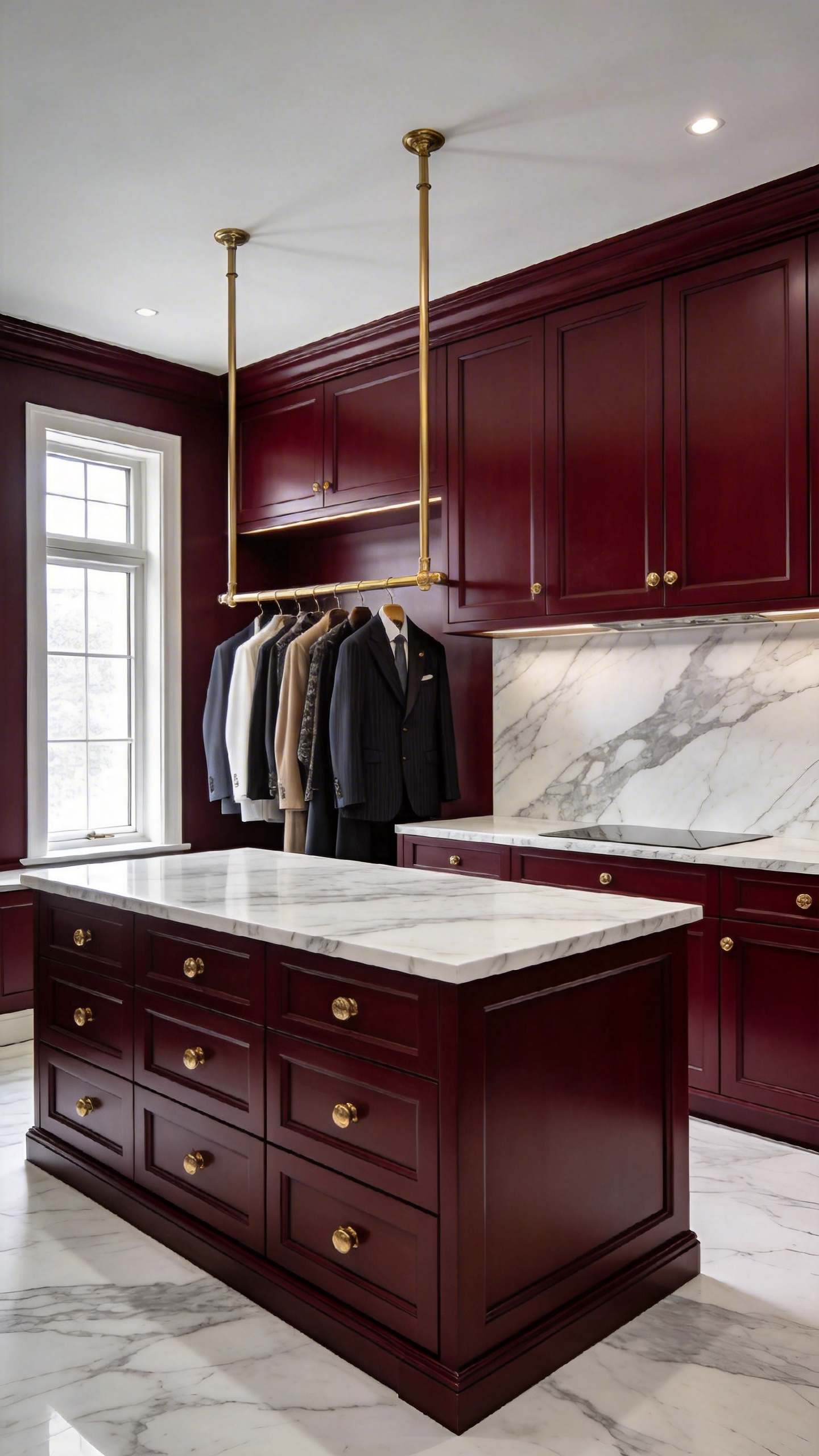
13. Oxblood and Carrara marble: The ultimate pairing for garment care.
Utility spaces have relied on clinical white palettes for far too long. Modern design finally elevates these rooms into bespoke garment care spaces. Pairing deep oxblood with Carrara marble creates a highly sophisticated boutique atmosphere. This rich color evokes the tailored heritage of a luxury suit. Caring for your clothing suddenly feels like a curated ritual rather than a chore.
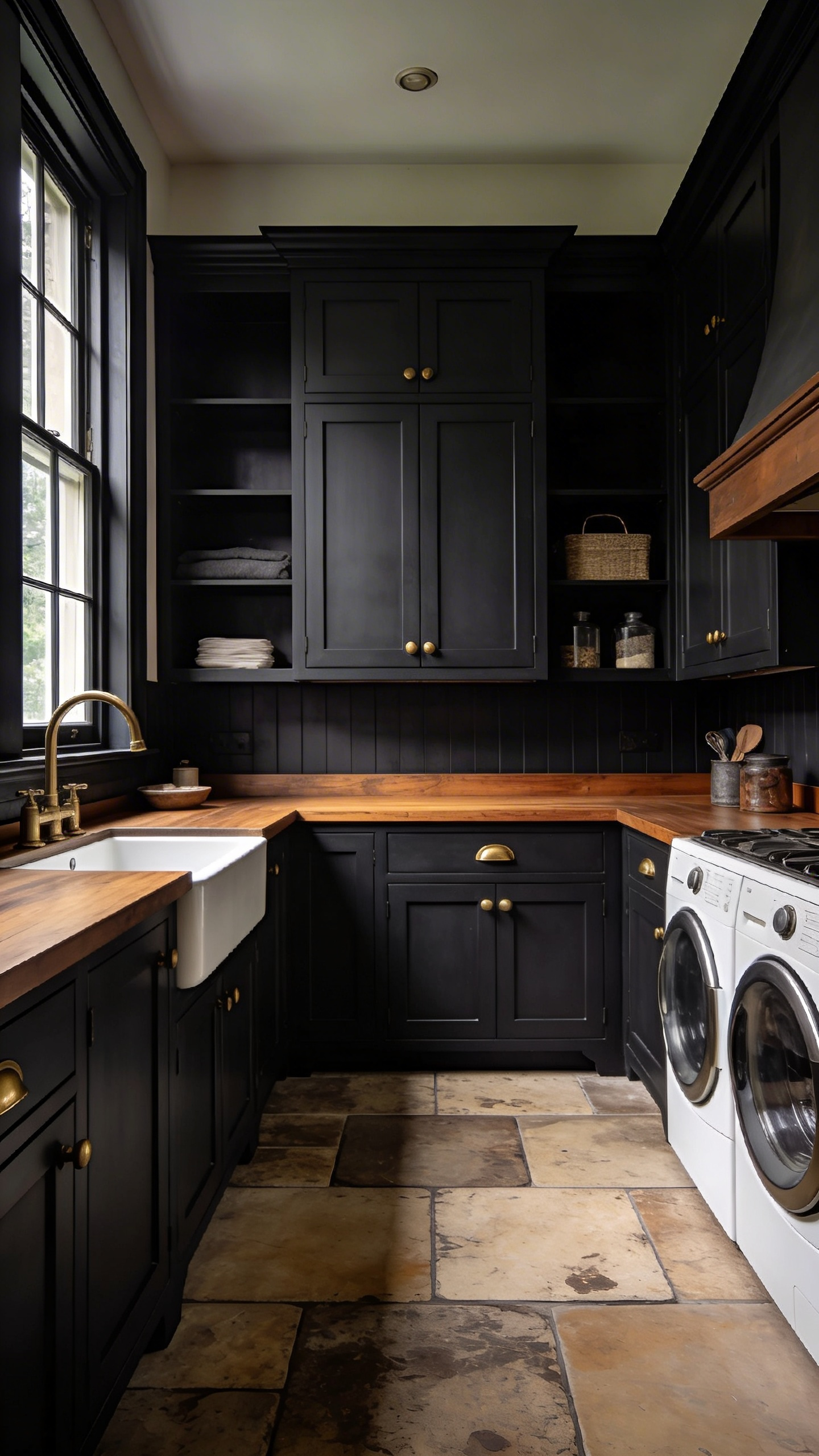
14. Deep charcoal and warm oak: Balancing industrial function with comfort.
The modern laundry room descends directly from the utilitarian Victorian scullery. This dark aesthetic bridges raw industrial efficiency with historic elegance. Deep charcoal cabinetry evokes the iron and soot of industrial history. Conversely, warm oak countertops introduce natural, grounded stability. Traditional Shaker cabinet profiles painted in dark charcoal hide modern machinery beautifully.
15. Clotted cream and slate blue: A softer approach to monochromatic design.
This elegant pairing perfectly echoes the traditional English scullery. It reimagines the highly functional wet rooms of the 18th century. Historically, non-porous slate was the absolute foundation for utility sinks. This durable stone easily resisted the daily slop of household laundry. The addition of clotted cream paint creates a vital sense of warmth. Visually, the buttery cream color perfectly balances the cold mineral slate. This timeless palette grounds modern laundry spaces with ease.
Frequently Asked Questions
What are the best laundry room colors for a windowless space?
For windowless laundry rooms, designers often recommend “light-harvesting” colors like yellow ochre or a reflective duck egg blue. These hues help maximize limited artificial light. Alternatively, you can fully embrace the darkness. Using deep charcoals or teals creates a sophisticated “jewel box” effect that feels intentional rather than cramped.
How do I choose a paint finish for a high-humidity utility room?
Laundry rooms face incredibly high levels of steam and moisture. Therefore, it is critical to use durable architectural paint finishes. A satin or semi-gloss finish is ideal for cabinetry and trim. Meanwhile, you should use a specialized modern emulsion or anti-mildew paint for the walls to prevent moisture damage.
Should the laundry room color match the rest of the house?
It certainly does not need to be an exact match. However, the laundry room should still feel like a cohesive extension of your home. Many homeowners use the utility space to experiment with bolder versions of their existing palette. Trying a deeper sage green or a highly saturated navy creates a fantastic boutique-inspired style.
Conclusion: The Art of the Chore
The utility room has finally stepped out of the basement shadows. This functional space is no longer a zone for hidden toil. Instead, you can use thoughtful color drenching to build a calming productivity cocoon. A unified color palette drastically reduces visual noise and calms a busy mind. Warm hues even alter our perception of time during repetitive tasks. As a result, your daily chores will actually begin to feel faster. This design shift elevates basic domestic labor into something resembling a daily luxury. In the future, every service room should absolutely be treated as an aspirational retreat.
Ultimately, your choice of laundry room colors is the foundation for transforming an unavoidable necessity. By balancing sensory beauty with technical performance, you create a space that actually celebrates garment care. It is a simple upgrade that dramatically enhances the overall feel of your home.