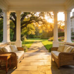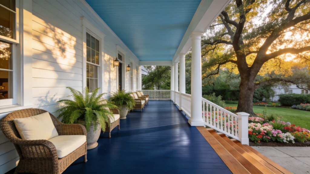
Architecturally, the porch is far more than a mere exterior add-on. Rather, it functions as a vital transition area. This space acts as a bridge between the wild landscape and your curated interior. As a result, it holds unique authority. When exploring various porch paint ideas, you realize this zone is neither fully public nor private. Instead, it becomes the primary site where a home’s narrative begins.
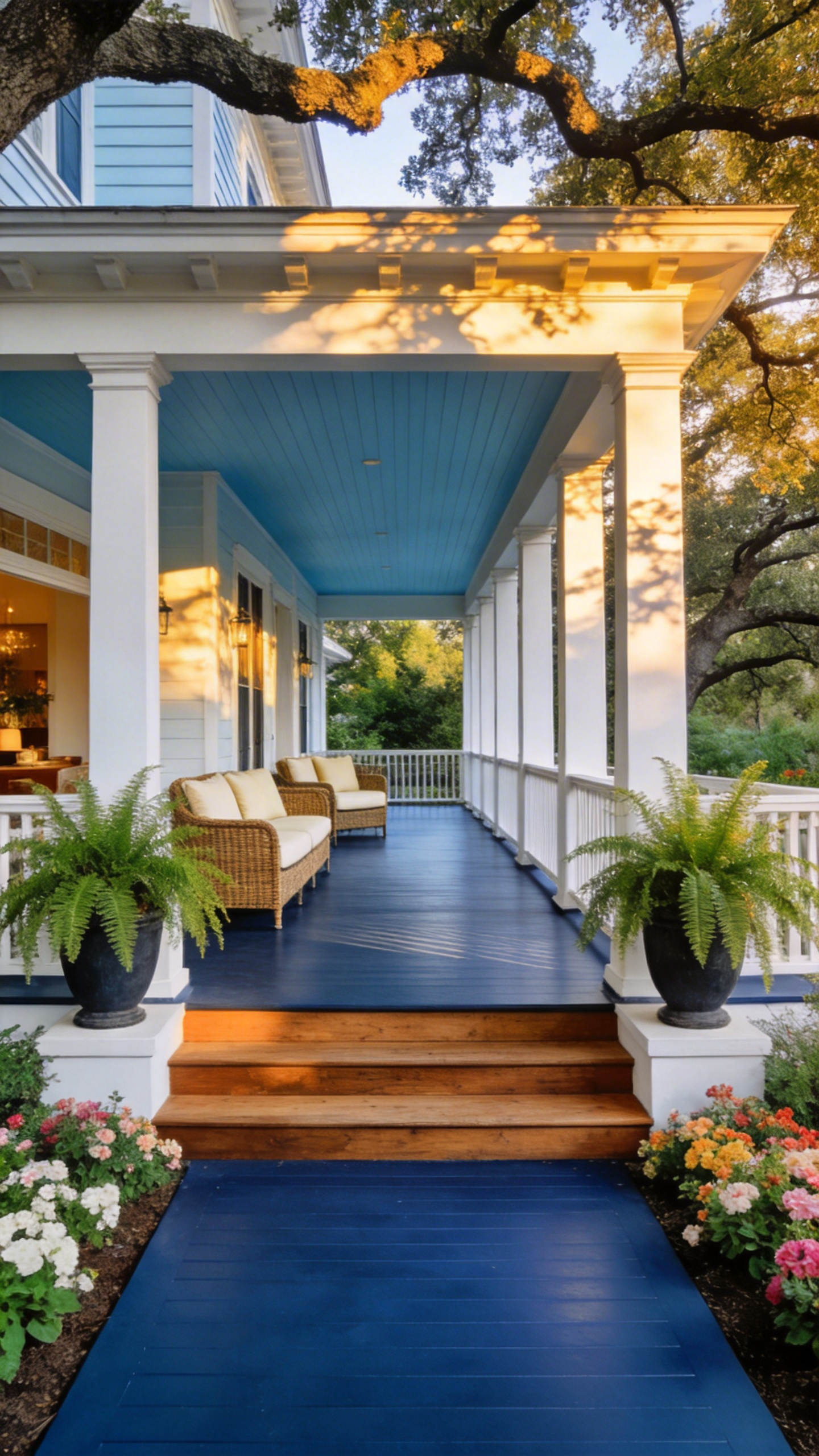
Through specific paint choices, homeowners actively write the prologue to their domestic life. A “Haint Blue” ceiling, for instance, does not simply add color. Instead, it invokes a protective spiritual barrier while extending the sensory experience of twilight. Similarly, the floor color dictates the psychology of entry. A “Battleship Gray” deck signals nautical resilience. It suggests the family can weather any storm. Conversely, a high-gloss finish on the door acts as a kinetic spotlight. These choices calibrate your relationship with the street. By the time a guest reaches the door, the story is already told.
Analyzing Your Home’s Era Before Opening the Paint Can
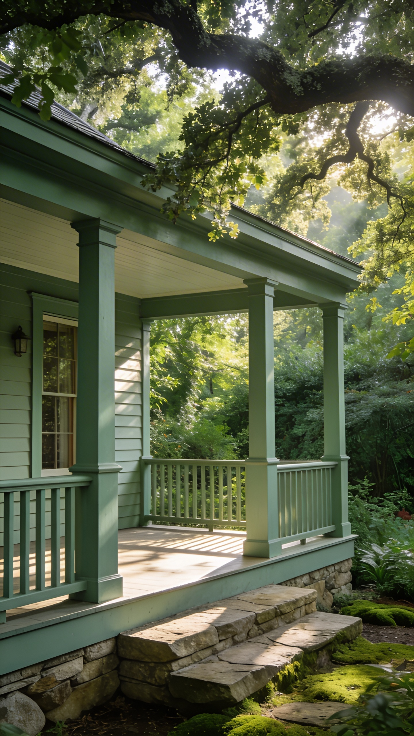
Before selecting a specific shade, consider your home’s architectural lineage. The porch often serves as a historical document rather than just an entryway. The Victorian porch, for example, was designed as a public stage. Homeowners utilized “polychromy,” applying a coordinated palette of five to seven colors to highlight intricate millwork. Practical needs drove these choices, too. Notably, deck floors were painted dark “Chocolate” or “Vandyke Brown” to camouflage industrial coal soot. Ceilings remained pale to reflect light into dim interiors. Painting a Victorian porch entirely white actually flattens its intended depth. This is a common pitfall when attempting to implement front porch decor ideas that captivate from the kerb.
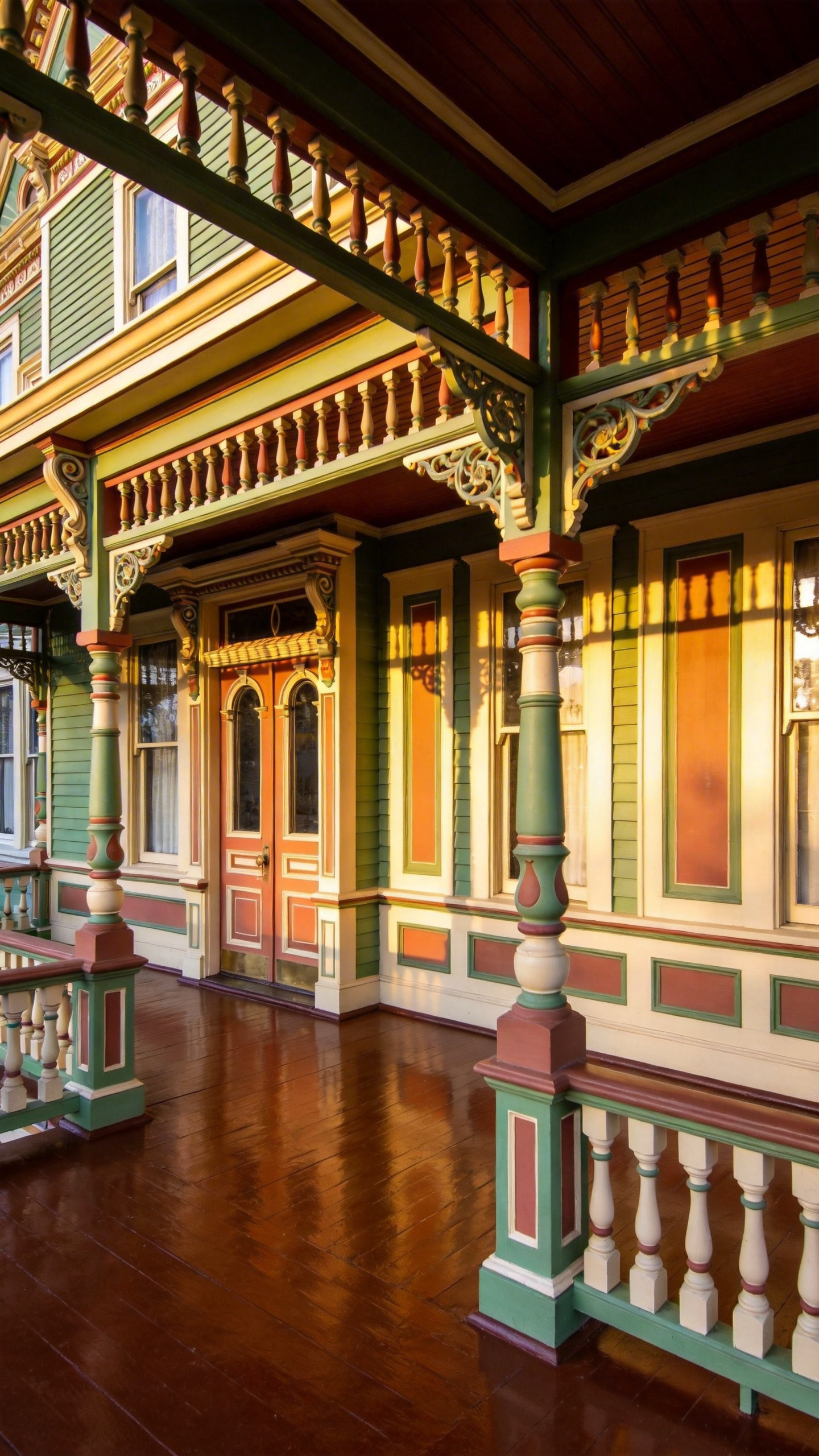
Regional history plays a significant role as well. The Southern tradition of “Haint Blue” ceilings offers deep spiritual significance. Historically, this watery blue tricked spirits into believing the porch was water, which they could not cross. Original lime-based mixtures naturally repelled insects, although modern acrylics lack this technical property. Later, the Arts and Crafts movement rebelled against such complexity. Instead of paint, architects favored heavy oils to highlight the wood grain. Craftsman porches utilized “muted nature” palettes, effectively bridging the home and the landscape.
Finally, the 20th century introduced utilitarian durability. The “Battleship Grey” common on older porches originated from surplus maritime enamels. Similarly, “Oxblood” red became a standard choice because iron oxide pigments resisted distinct fading. The Mid-Century era shifted focus entirely. As air conditioning arrived, the porch receded in importance. The front door became the focal point, often featuring bright pops of turquoise or chartreuse. Understanding these origins ensures your renovation honors the structure’s true narrative.
London Black & Brilliant White: The Enduring Sophistication of High-Contrast Monochromatics
Rooted in Georgian history, the high-contrast pairing of London Black and Brilliant White offers timeless sophistication. Historically, high-gloss black paint was practical. It effectively masked the industrial grime of 19th-century London. Maintaining pristine white masonry, however, signaled immense domestic pride and labor. Today, choosing this palette is an act of architectural grooming. It bridges the street and the sanctuary.
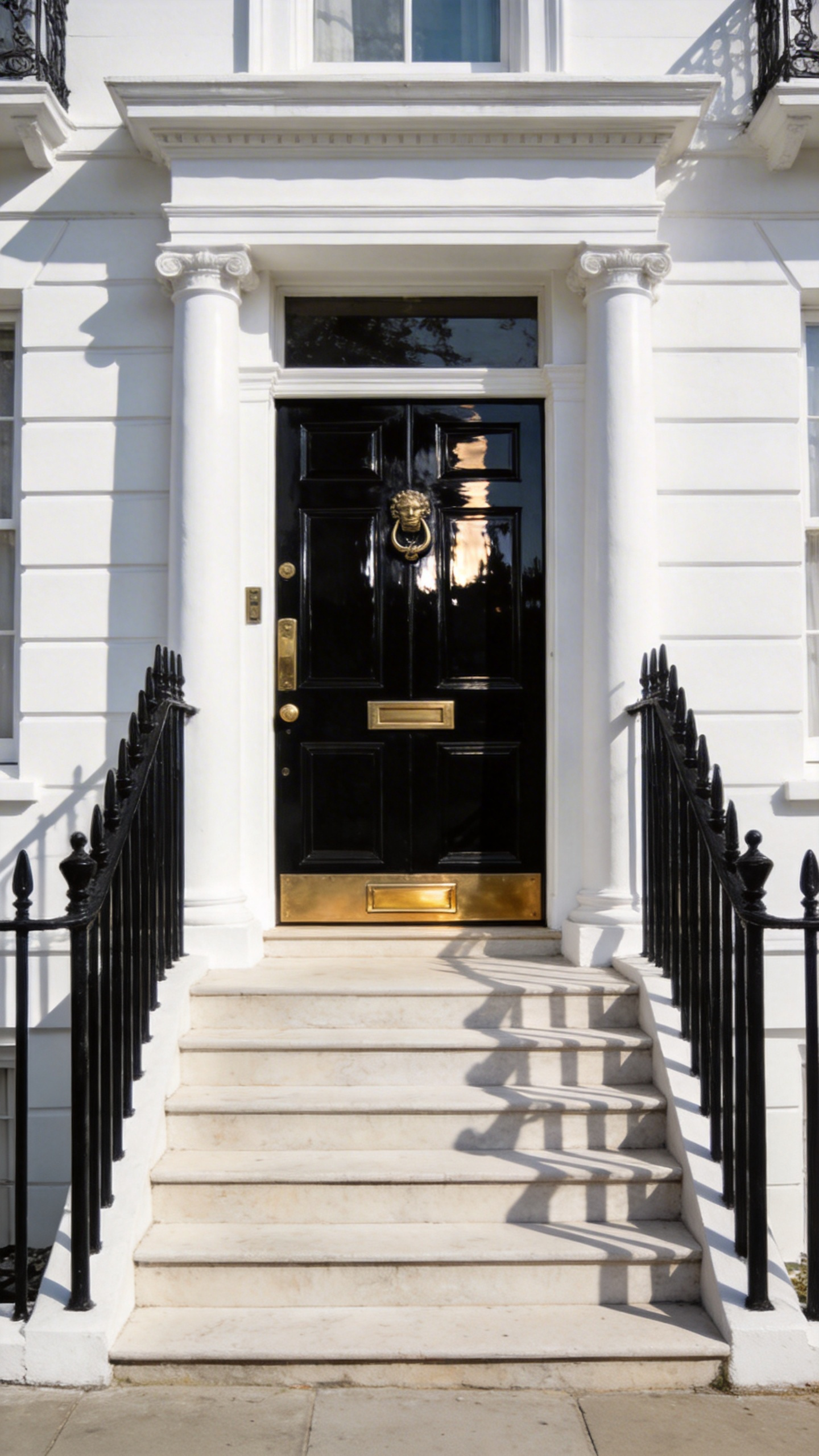
Technically, the success of this look relies on extreme differences in Light Reflectance Value (LRV). Black elements absorb light, providing a psychological sense of stability. Meanwhile, the white reflects natural light downward. This effectively illuminates visitors’ faces. This contrast acts as a visual anchor. It fixes any “architectural muddle” by prioritizing form over material.
The true secret, however, lies in the finish. Authentic London style demands a high-gloss finish for black doors or floors. This creates a “wet look” mimicking polished obsidian. It adds depth and reflects evening streetlights. White trim should remain in satin or eggshell to avoid appearing clinical.
Designers often refer to this approach as the “Tuxedo Effect.” Like a formal suit, it provides a versatile, high-impact foundation. Seasonal accessories pop with electric intensity against this achromatic backdrop. Pink spring geraniums look far more saturated against white columns than grey ones. Finally, consider painting a black border around a white floor. This creates a “rug effect,” transforming the porch into an intimate outdoor room.
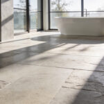
Estate Grey: Elevating the Standard ‘Greige’ into a Statement of Stone-Like Permanence
Standard “greige” often acts as a safe, neutral background. Estate Grey, however, changes this dynamic through the concept of “Visual Ballast.” Lighter shades tend to recede or float visually. In contrast, this deeper tone anchors the home with significant weight. A simple wooden deck transforms into a substantial structural plinth. The home appears to rise from a permanent foundation rather than a wooden frame.
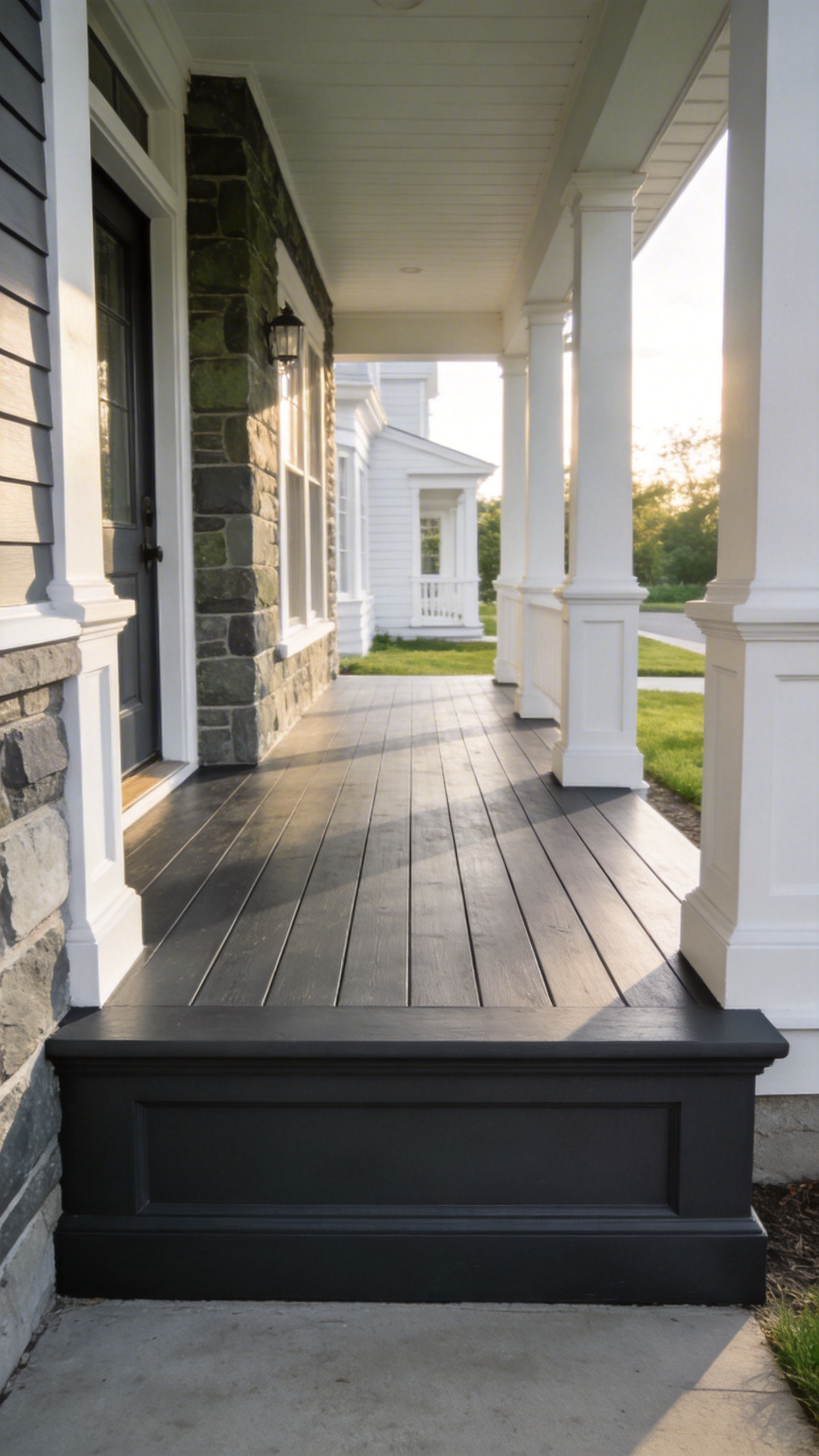
This aesthetic draws from the weathered limestone of English country estates. Applying Estate Grey creates an illusion of quarried stone or slate. It replaces the temporary feel of timber with a sense of historic permanence. This shift elevates curb appeal from standard to stately. Ideally, a satin finish is used to mimic the honed surface of granite.
The color’s chemistry offers a unique sensory experience. A true Estate Grey contains complex blue or violet undertones. Thus, it undergoes a “metameric shift” depending on the light. In the morning, it mimics the cool crispness of mountain fog. At dusk, warm pigments emerge to create an inviting, velvety softness.
This shade acts as a superior canvas for landscaping. Because it mirrors deep earth tones, it boosts the vibrancy of greenery. Boxwoods and ferns appear richer against the dark floor through simultaneous contrast. Estate Grey turns a porch into an enduring architectural landmark.
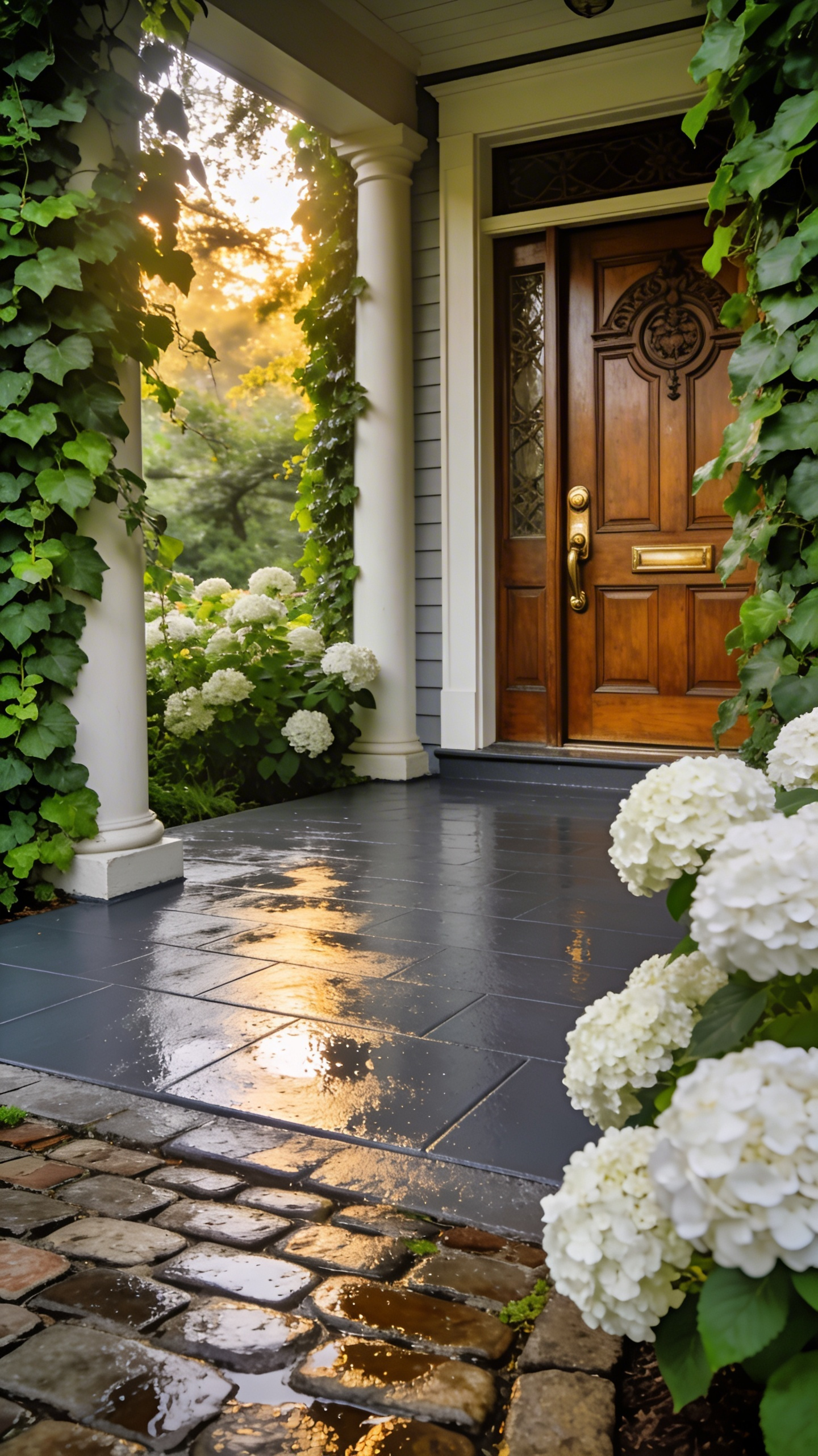
Eau de Nil: The Art of Bridging the Gap Between English Garden and Architecture
Eau de Nil, or “Water of the Nile,” offers much more than vintage charm. Historically, this shade emerged from the Victorian fascination with North Africa. Today, applying this grey-tinged green to a porch creates a necessary psychological reprieve from the heat. It serves as a powerful bridge between structure and nature. Unlike forest greens that try to compete with your lawn, Eau de Nil mimics the pale underside of foliage. It reflects the silver tones found in olive leaves or lichen on stone. The building visually recedes. This effect expands the garden’s presence, making small porch decorating ideas feel significantly more expansive.
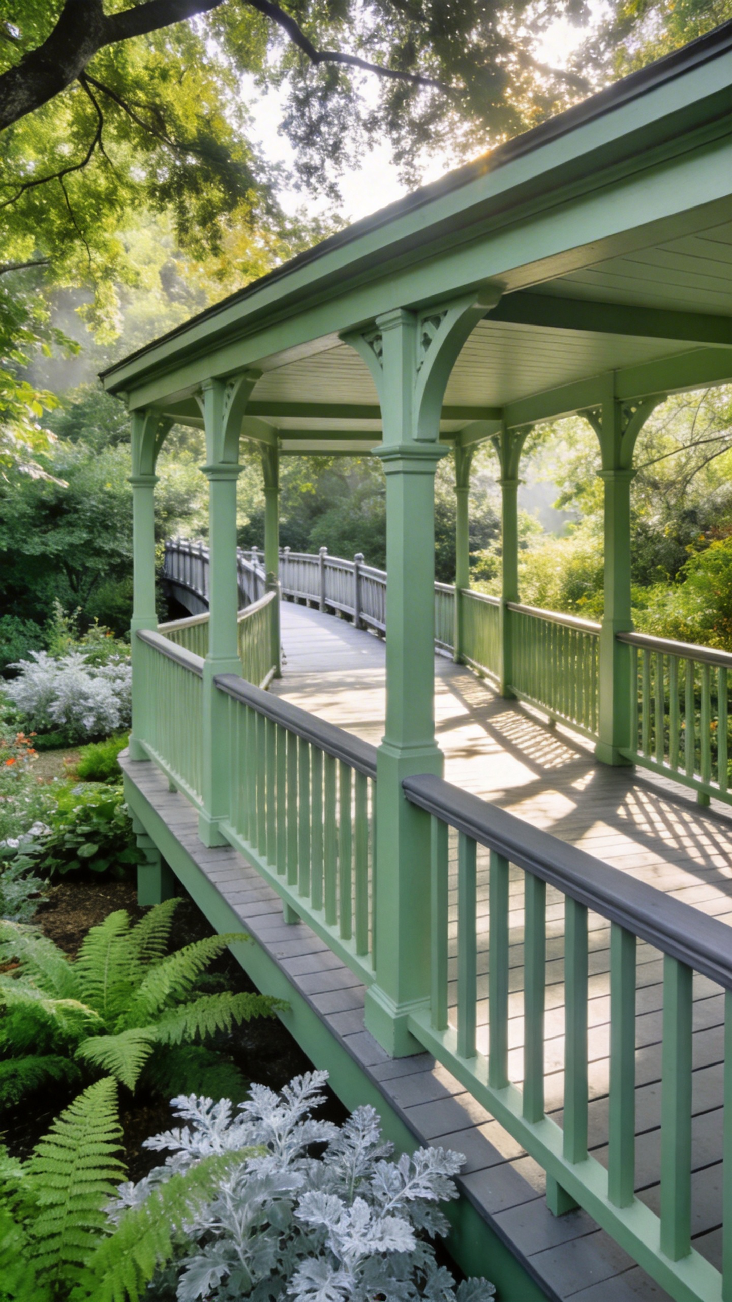
From a technical standpoint, Eau de Nil excels in Light Reflectance Value (LRV). Typically, it reflects light without the harsh glare associated with bright white paint. During the “Golden Hour,” its unique grey-yellow undertones transform the surface into a warm, glowing sage. On overcast days, it blends softly into the mist rather than standing out starkly. Moreover, this “soft contrast” offers a distinct practical advantage. Because it shares chromatic DNA with nature, it hides pollen and dust far better than dark paints.
This shade creates harmony with varied materials. Whether applied near weathered cedar or heavy black iron, it softens hard architectural lines. Using Eau de Nil frames the porch as a living fixture of the garden itself.
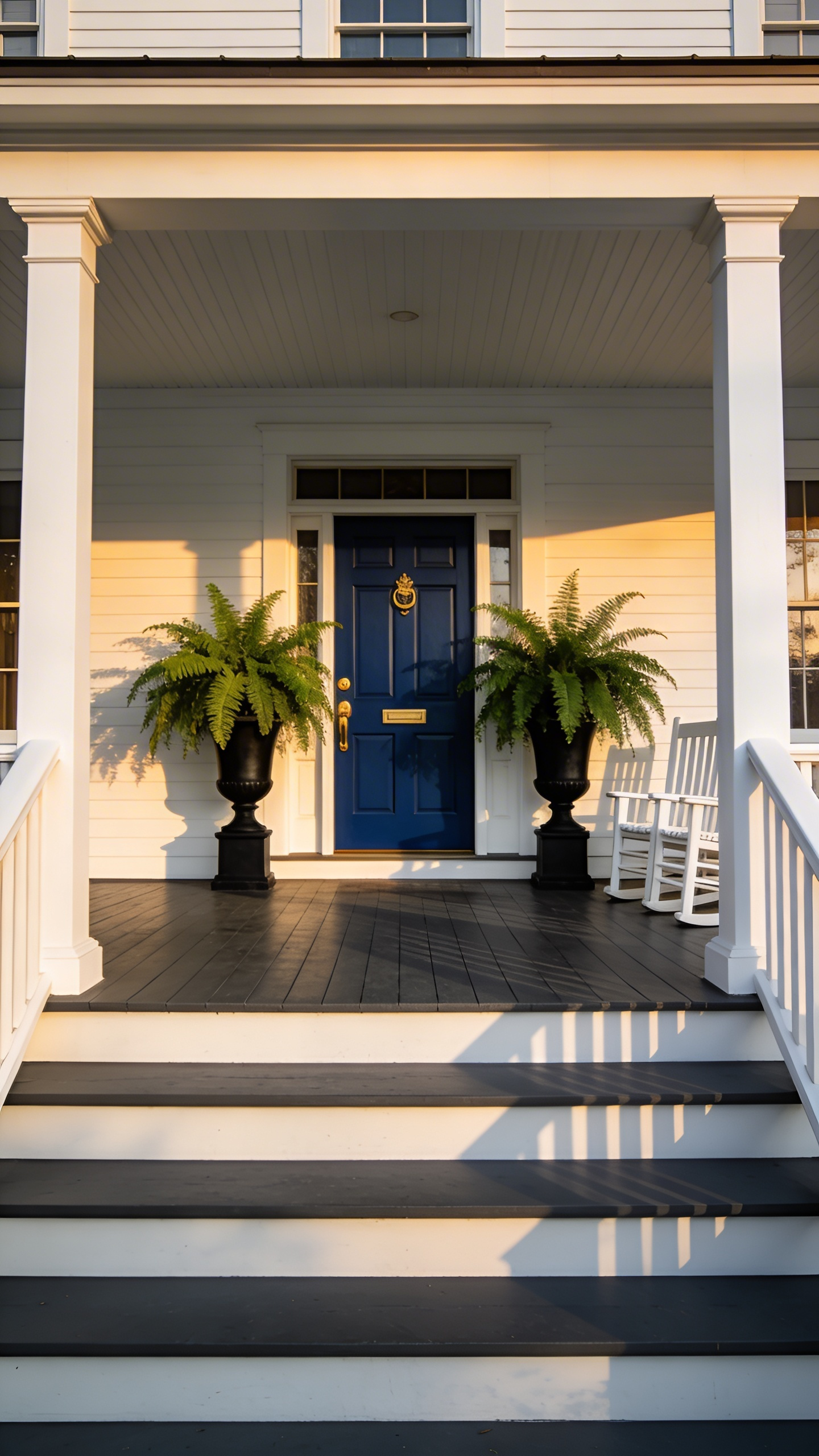
The ‘Haint Blue’ Ceiling: Adapting a Transatlantic Tradition with British Reserve
The “Haint Blue” ceiling famously originated with the Gullah Geechee people of the American South. This watery blue acted as a spiritual barrier against restless spirits. However, adapting this transatlantic tradition for British homes requires a distinct shift in saturation. While the Golden Isles support vivid turquoise, our Northern light is notoriously cooler. A bright “Charleston Blue” often reads as garish or plastic under grey skies.
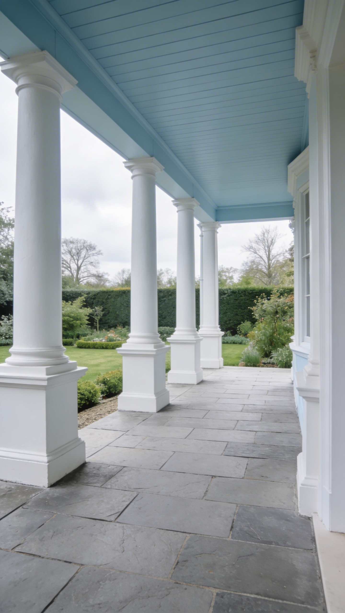
The “British Reserve” approach favors complex, dusty shades. Look to “Duck Egg” or “Pale Powder” tones heavily infused with grey or green. These muted hues utilize “atmospheric perspective” to create an essential illusion of height. The ceiling effectively recedes. This prevents low-slung porch structures from feeling heavy or oppressive. The physical finish dictates the success of this optical trick, especially when paired with porch lighting ideas designed to illuminate your evenings.
Strictly avoid high-gloss paints. Gloss reflects the floor, instantly destroying the illusion of an open sky. Ideally, select a Flat or Dead Flat finish to limit reflection. This technique visually extends the “blue hour,” keeping the porch bright as evening sets in. This design choice is a functional classic rather than a fleeting trend. It transforms a simple entryway into a calming, hospitable space.
Victorian Tile Illusions: High-End Stenciling Strategies for Tired Concrete Slabs
In the Victorian era, a tiled porch signaled status and cleanliness. Today, we can reclaim that grandeur. Stenciling transforms cold concrete into architectural warmth. True authenticity, however, requires a strategic approach. First, avoid a flat, sticker-like appearance. Successful illusions rely heavily on the “grout gap.” Instead of painting lines, your base coat serves as the grout. Leaving a fraction of this grey base exposed creates necessary depth. Expert designers strictly avoid high-gloss finishes. To mimic fired clay, choose a “slip-matte” finish that absorbs light.
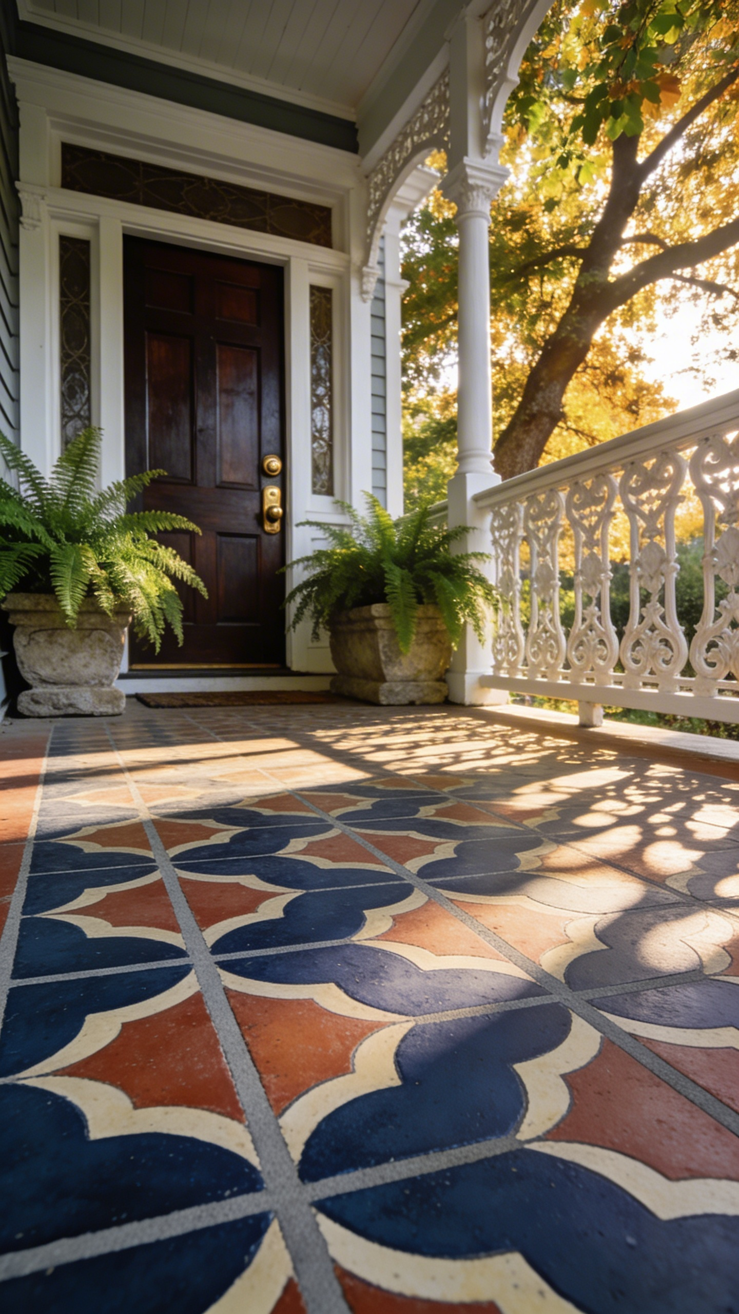
Next, consider your color hierarchy carefully. Authentic Victorian aesthetics used iron oxides, not bright primary colors. Select a historical palette of deep terracotta, buff, and carbon. Always incorporate a contrasting border. This “rug effect” grounds the space, preventing an unfinished look. Longevity depends on the substrate bond. Concrete needs “tooth” to effectively hold paint. Etch the surface to the texture of fine sandpaper. Avoid standard latex paints that trap moisture. Instead, use silicate-based mineral paints. These petrify within the slab, ensuring your design endures. Slight imperfections in application mimic kiln-firing, convincing the eye.
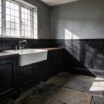
Oxford Blue Masonry: Using Deep, Saturated Tones to Ground Elevated Entryways
Elevated porches frequently suffer from a visual “hovering” effect. The light-colored upper structure often seems disconnected from the landscape. To correct this architectural imbalance, utilize the physics of color. Oxford Blue possesses an incredibly low Light Reflectance Value. Applying this saturated tone to masonry adds necessary visual weight. Effectively, it anchors the home by mimicking the heavy shadows of classical stone foundations.
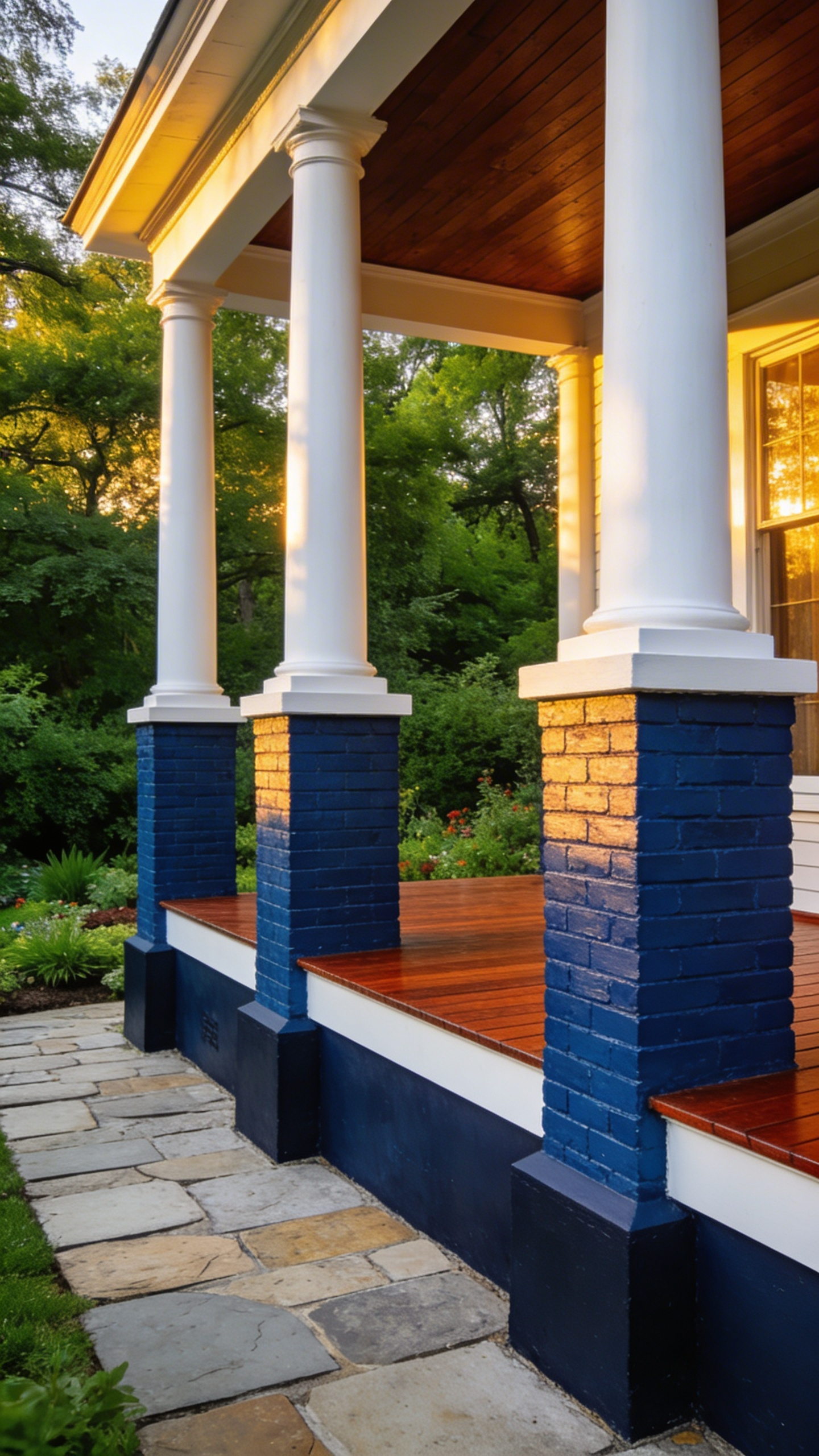
This approach elevates the entryway’s perceived pedigree. Historically, deep blues signaled permanence, authority, and prestige. Treating “lowly” foundation masonry with this shade feels intentionally curated. The texture plays a vital role here, too. Unlike flat white paint, which highlights surface cracks, Oxford Blue absorbs light. As a result, rough-hewn brick gains a soft, velvet-like depth.
This dark canvas creates high contrast for seasonal flora. The green foliage of boxwoods appears nearly neon against the navy backdrop. Technical execution remains paramount for preservation. Ideally, select mineral-based silicate paints or breathable masonry stains. This ensures the rich pigment bonds chemically without trapping destructive moisture inside the brick.
The Manor House Green: Harmonizing Dark Railings with Red Brick and Ivy
Drawing from the legacy of 18th-century designer Humphry Repton, this aesthetic relies on the concept of “Invisible Green.” The goal is blending man-made structures into the landscape. A deep, blackened forest green creates a visual bridge. This helps the porch disappear into the surrounding garden. Unlike standard primaries, this hue utilizes tertiary muting. Heavy gray and brown undertones prevent the color from clashing with red brick. Instead of a jarring “Christmas effect,” the green pulls the soot tones from the masonry. It makes it look elegantly aged.
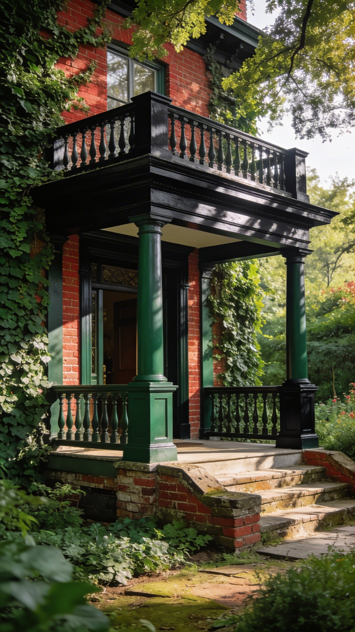
Structurally, dark railings act as vital “graphite outlines.” If the green is the body, the “off-black” metal is the ink holding the view together. These dark lines frame the organic chaos of climbing ivy without obstructing the eye. Regarding finish, a satin floor enamel is preferable to high gloss. A lower sheen hides pollen and debris, allowing a natural patina to develop over time. This approach creates a sophisticated, low-stress transition between the home’s architecture and the natural world.
Terracotta & Baked Clay: Bringing Mediterranean Warmth to Grey Northern Skies
In northern latitudes, natural light frequently carries a distinct, cool blue cast. Modern greys often feel sterile under cloudy skies. Terracotta and baked clay tones offer a sophisticated solution. These earthy pigments sit directly opposite the blue spectrum on the color wheel. Therefore, they physically neutralize cool shadows rather than just covering them. Instead of reflecting harsh light, they absorb blue wavelengths. This creates a cozy optical illusion. It simulates the warmth of a sunset.
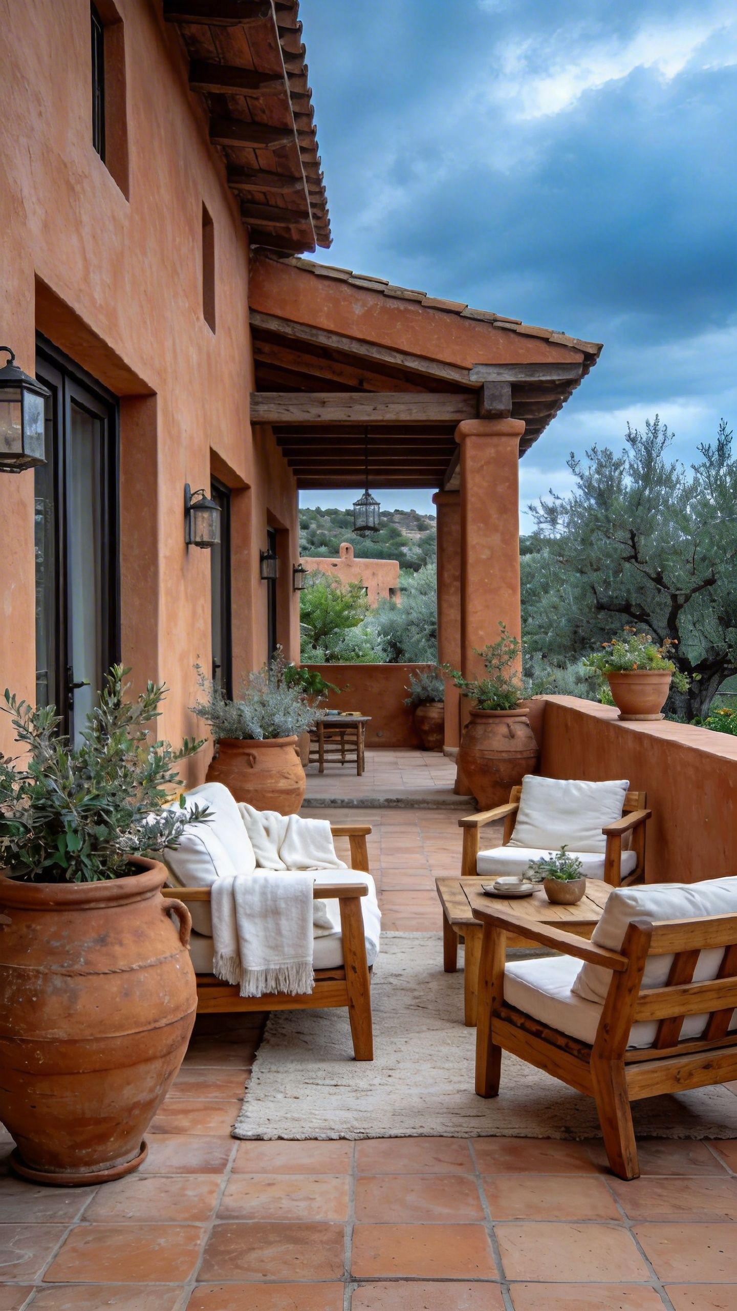
Look for paints utilizing iron oxide pigments. Unlike synthetic oranges, these create an honest, “dug-from-the-earth” appearance. Designers strongly recommend a matte or low-sheen finish. High-gloss options often resemble plastic traffic cones. A matte surface, however, mimics the porous texture of authentic kiln-fired ceramic. This allows light to diffuse softly across the porch floor.
Historically, this style references the warmth of Mediterranean architecture. Yet, it functions beautifully as a practical four-season strategy. Baked clay provides a striking contrast to deep green conifers in winter. It visually grounds the home. When applying this look, avoid stark white trim. Instead, choose creamy off-whites to maintain a cohesive, hand-built aesthetic. Consider painting the porch ceiling in these hues. This technique creates an artificial “golden hour,” reflecting warm, flattering light downward onto guests.
The Notting Hill Pastel: Executing Blush and Mint with Architectural Restraint
The secret to the Notting Hill aesthetic lies in distinct architectural framing. Vibrant hues like blush and mint rarely cover an entire façade. Instead, heavy white stucco acts as a visual cleanser. Think of your porch as a gallery wall. The pastel paint is the art, while crisp white pillars serve as the frame. This “white space” prevents the home from looking like a confection.
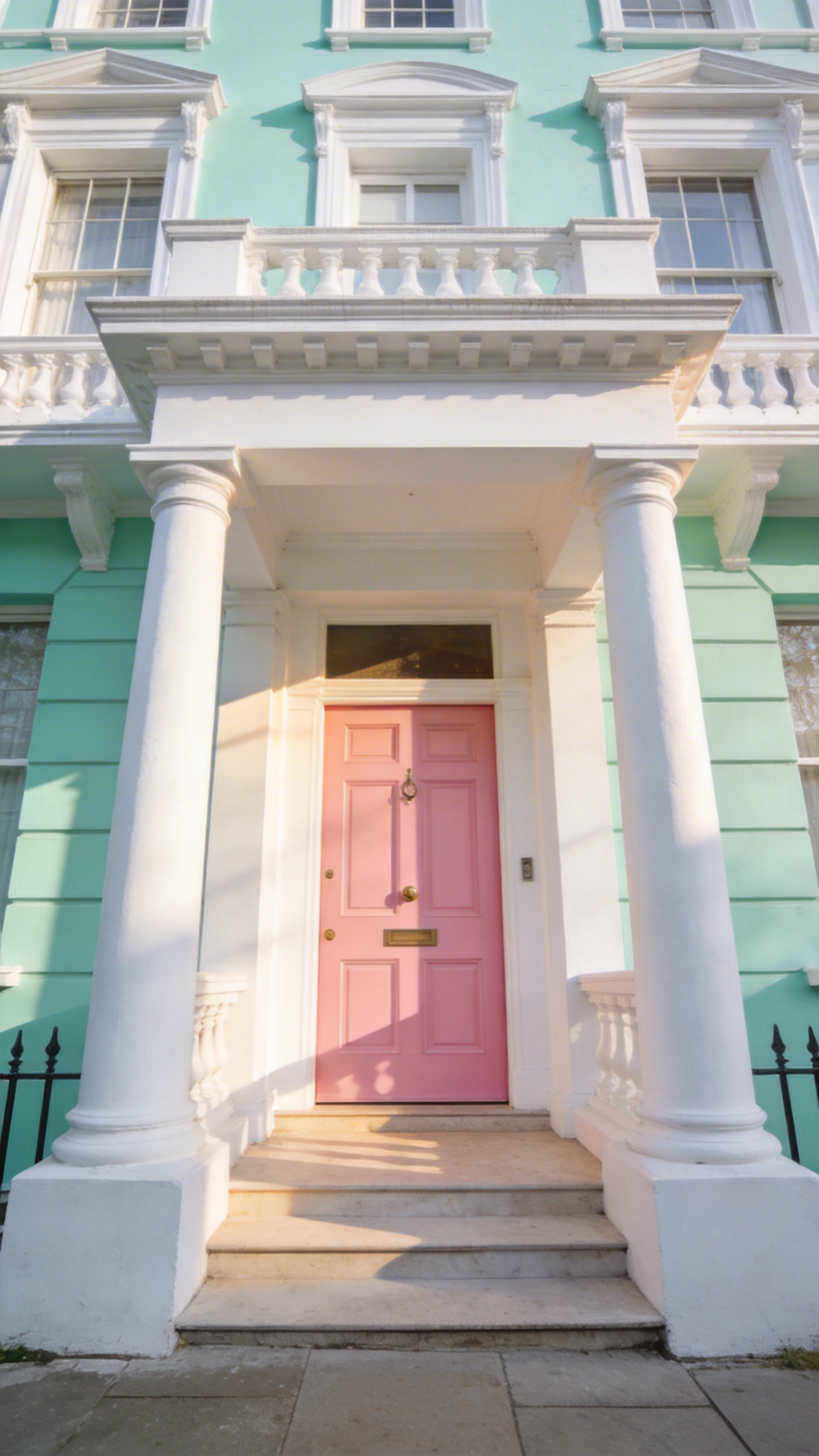
Selecting the right pigment is equally critical. To avoid a “nursery” atmosphere, use “muddied” versions of these colors. A true baby pink appears garish in natural sunlight. Expert designers select shades with substantial gray or brown undertones. This ensures the porch feels grounded in the landscape rather than floating away from it.
The paint finish itself dictates the level of sophistication. Ideally, opt for flat matte finishes over high gloss. Glossy pastels reflect too much light, often appearing plastic. In contrast, a chalky matte finish absorbs light, suggesting the color is part of the stone.
Structural elements must provide a counterweight to these soft tones. Pair a “dirty” blush door with unlacquered brass hardware. Similarly, install black-and-white Victorian tiles on the floor. This geometric rigor creates a necessary masculine contrast to the feminine palette. The result is a space that feels curated rather than whimsical.
High-Gloss Balustrades: Capturing Light and Movement on Spindles and Railings
High-gloss finishes transform a standard porch railing into a dynamic architectural feature. This effect relies on the physics of specular reflection. Unlike flat paints that scatter light, high gloss creates a sharp, vertical highlight on turned spindles. This visual “pinstripe” follows the viewer. It adds a sense of movement to the architecture.
Historically, this mirror-like sheen signaled prestige and craftsmanship. It mimics the “carriage finishing” techniques used on fine furniture. Applying a high-gloss finish serves as a formal “handshake” for your home. It effectively bridges the gap between the matte texture of the street and a polished interior.
The aesthetic impact extends to color saturation. A high-gloss navy or black possesses a distinct, liquid depth. Rather than appearing flat, the paint actually reflects the environment. A black rail often catches the green of the lawn or the blue sky.
Beyond visuals, the tactile experience changes significantly. High-gloss surfaces feel cooler and harder to the hand than satin finishes. This smoothness conveys a sense of cleanliness and structural integrity. Achieving this “wet look” requires rigorous preparation. Gloss is the most honest of all finishes. Because it magnifies every grain raise or dent, the underlying woodwork must be flawless. The result is a durable, kinetic display of light that elevates the entire entryway.
Charcoal & Brushed Brass: The Contemporary Industrial Update for Urban Townhouses
In the high-energy environment of an urban townhouse, design must provide an anchor. Charcoal paint acts as a sophisticated architectural response to city living. Unlike beige, which appears dull under smog, charcoal absorbs harsh glare. The surface transforms into a “velvety” texture at dusk, offering a sense of grounded mystery. This palette honors the soot-stained ironworks of the 19th-century industrial revolution.
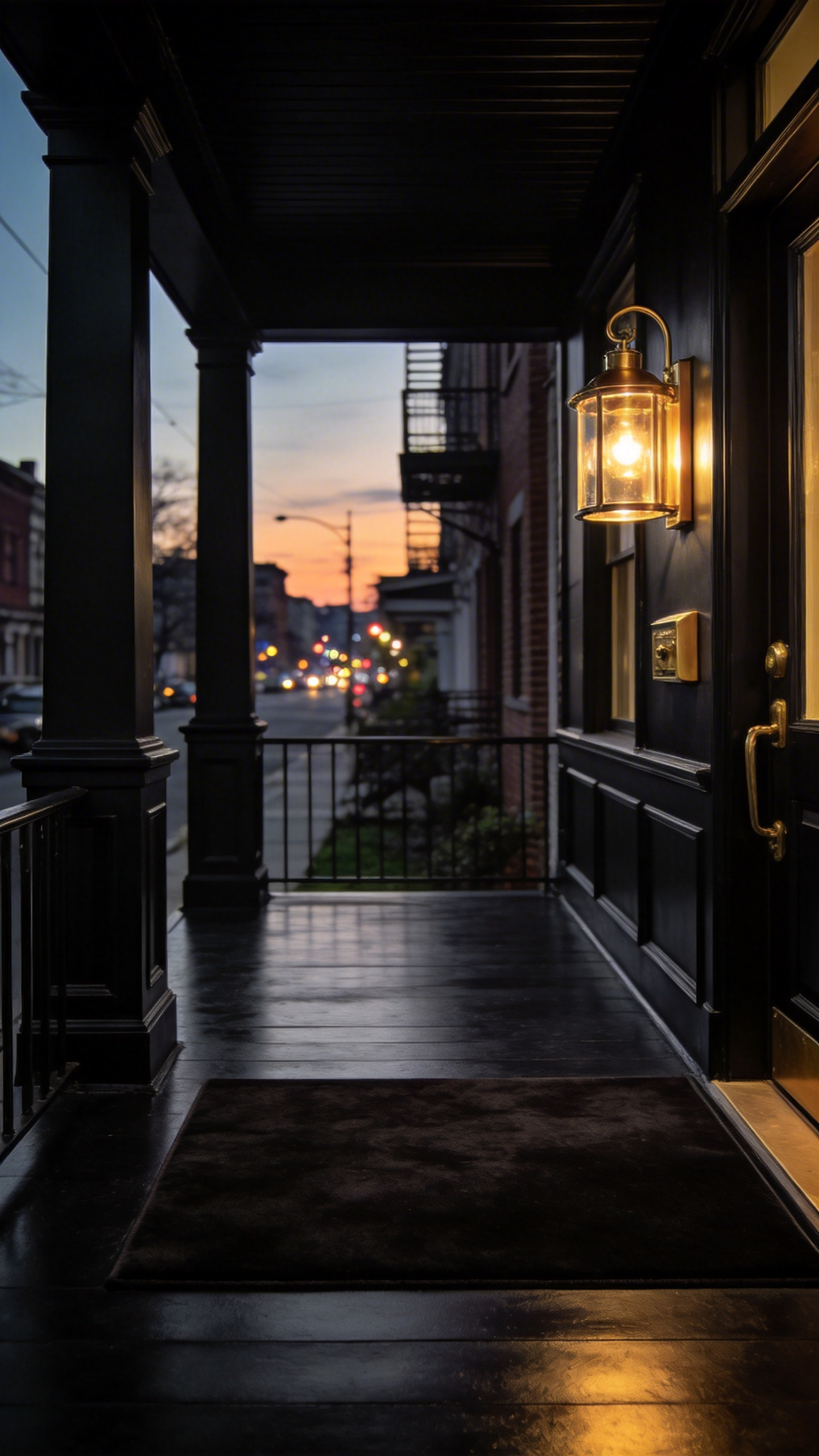
To balance this visual weight, brushed brass serves as essential “intentional contrast.” Unlacquered “living” finishes create a tactile tension against the cold, matte paint. The hardware develops a unique patina. This allows the home to age gracefully alongside the streetscape. Applying dark pigments to a porch requires careful technical planning.
Charcoal surfaces absorb significant solar radiation, often reaching temperatures 20°F higher than lighter walls. Using standard paint can lead to thermal stress or warped wood. Ideally, you should utilize IR-reflective pigments. This technology reflects invisible heat, keeping the substrate cool without sacrificing the deep aesthetic.
This combination strategically manipulates narrow urban entries. Dark walls can inadvertently create a “tunnel effect.” Placing oversized brass hardware at the door creates a strong “focal lure.” This reflects light and draws the visitor’s eye through the shadows. It makes a shallow porch feel significantly deeper.
Sage & Limestone: A Study in Organic Camouflage for Cottage Exteriors
Sage and Limestone offer more than a simple color pairing. They represent a design philosophy known as “Organic Camouflage.” This approach uses tonal mimicry to blur the boundaries between a man-made structure and its natural site. The goal is distinct biophilic integration rather than military-style disruption.
Sage green acts as the primary vehicle for visual receding. Because it mimics the shadowed underside of leaves, the house’s mass seems to retreat into the landscape. The structure feels less like a stark object and more like a natural feature. Limestone provides the necessary structural “bone” to the palette. Rooted in the Arts and Crafts movement, this warm mineral white acts as a psychological anchor. It suggests that the porch floor mimics a bedrock outcrop, effectively grounding the cottage.
Texture plays a crucial role in this sensory narrative. Experts recommend a low-lustre or matte finish for limestone floors. High gloss finishes break the organic illusion. Matte surfaces replicate the breathable texture of historic limewash. Therefore, the light reflects softly rather than with a harsh glare. Designers often cite the 70/30 rule. Apply Sage to 70% of the body and Limestone to 30% of the accents to avoid a washed-out look. The mineral undertones of Limestone conceal garden dust, making it a practical choice for lived-in spaces.
The Red Door Theory: Balancing Bold Focal Points with Neutral Surrounds
The “Red Door Theory” is more than just a fleeting trend. This bold choice has historically signaled a safe harbor or a “paid-off” mortgage. A red door acts as an undeniable visual protagonist. However, red possesses the longest wavelength of all visible light colors. It reaches the human eye faster than soft neutrals. To manage this vibrancy, your porch paint choices must provide balance. The floor should serve as a quiet, supporting cast.
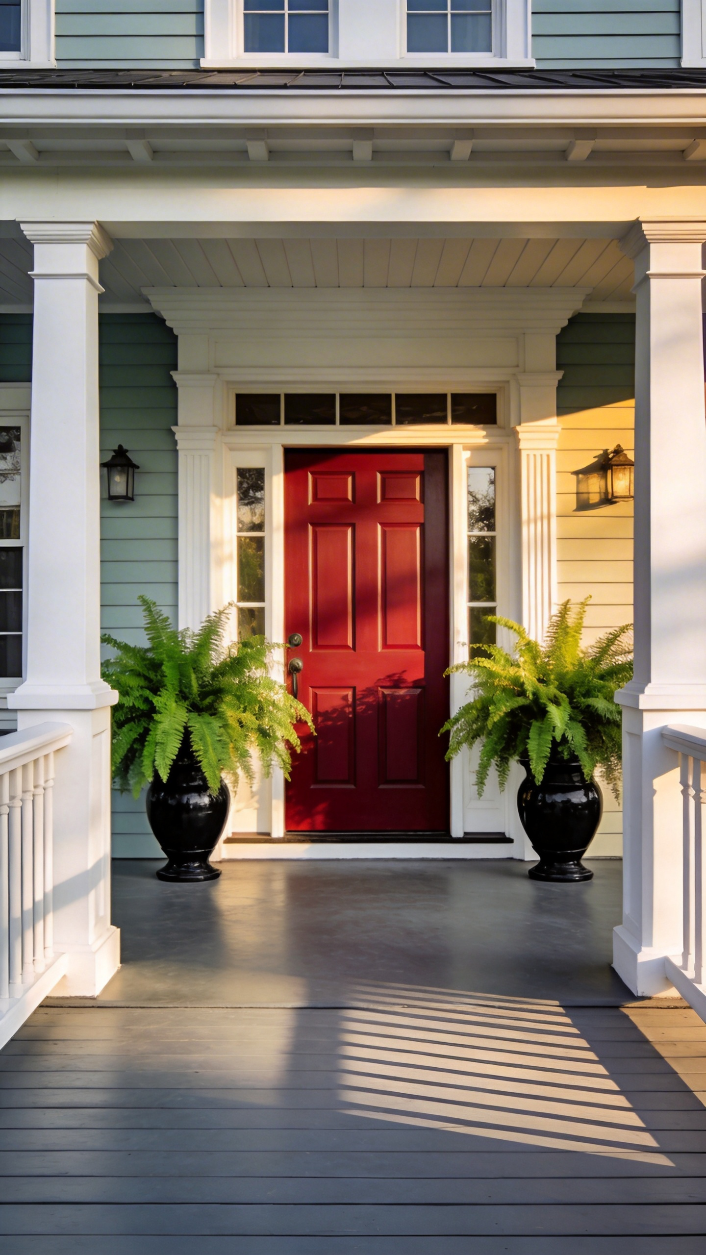
Pair a high-gloss “Heritage Red” with a matte neutral. ideally, select desaturated porch paint colors like slate gray or driftwood. These grounded tones prevent “visual shouting” against the door’s intensity. This approach effectively utilizes the popular “Unexpected Red Theory.” By anchoring the space with high-quality porch furniture, the bold focal point feels intentional rather than chaotic.
Successful designs often follow the classic “60-30-10” rule. Here, the neutral porch floor occupies the secondary 30%. Meanwhile, the red door claims the bold 10%. This allows the red door to guide the eye. It creates a clear sense of arrival without overwhelming the senses.
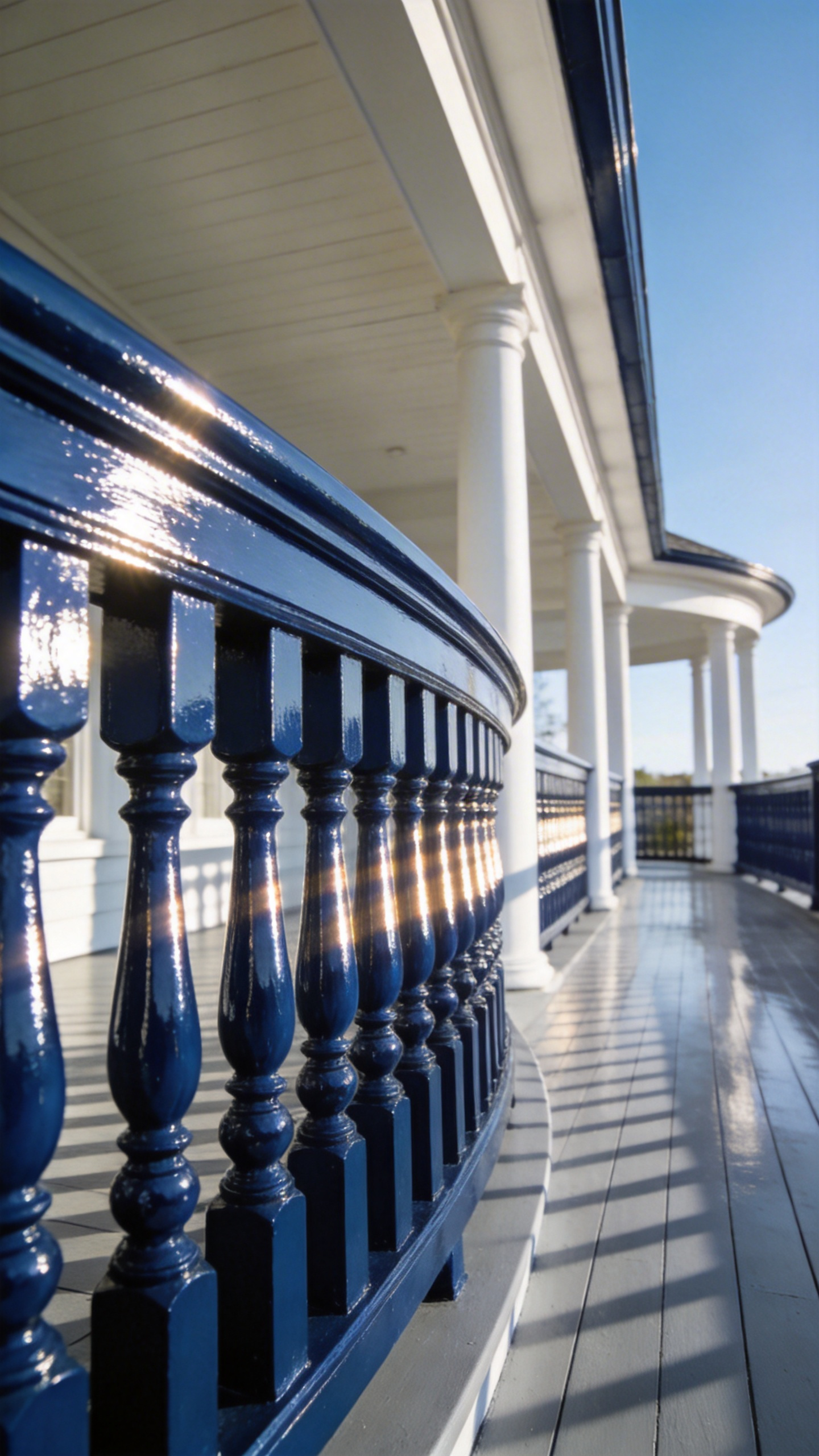
Navy Pinstripes: Using Dark Trim to Frame and Formalize Architectural Features
Think of a traditional porch like a bespoke suit. Without definition, an all-white structure can feel visually blurry. Adding navy trim acts as a precise pinstripe. Designers call this stabilizing effect “chromatic gravity.” The space feels grounded rather than ethereal. Deep blue occupies a unique psychological niche. It is softer than black yet more disciplined than gray. It formalizes the entry without sacrificing hospitality.
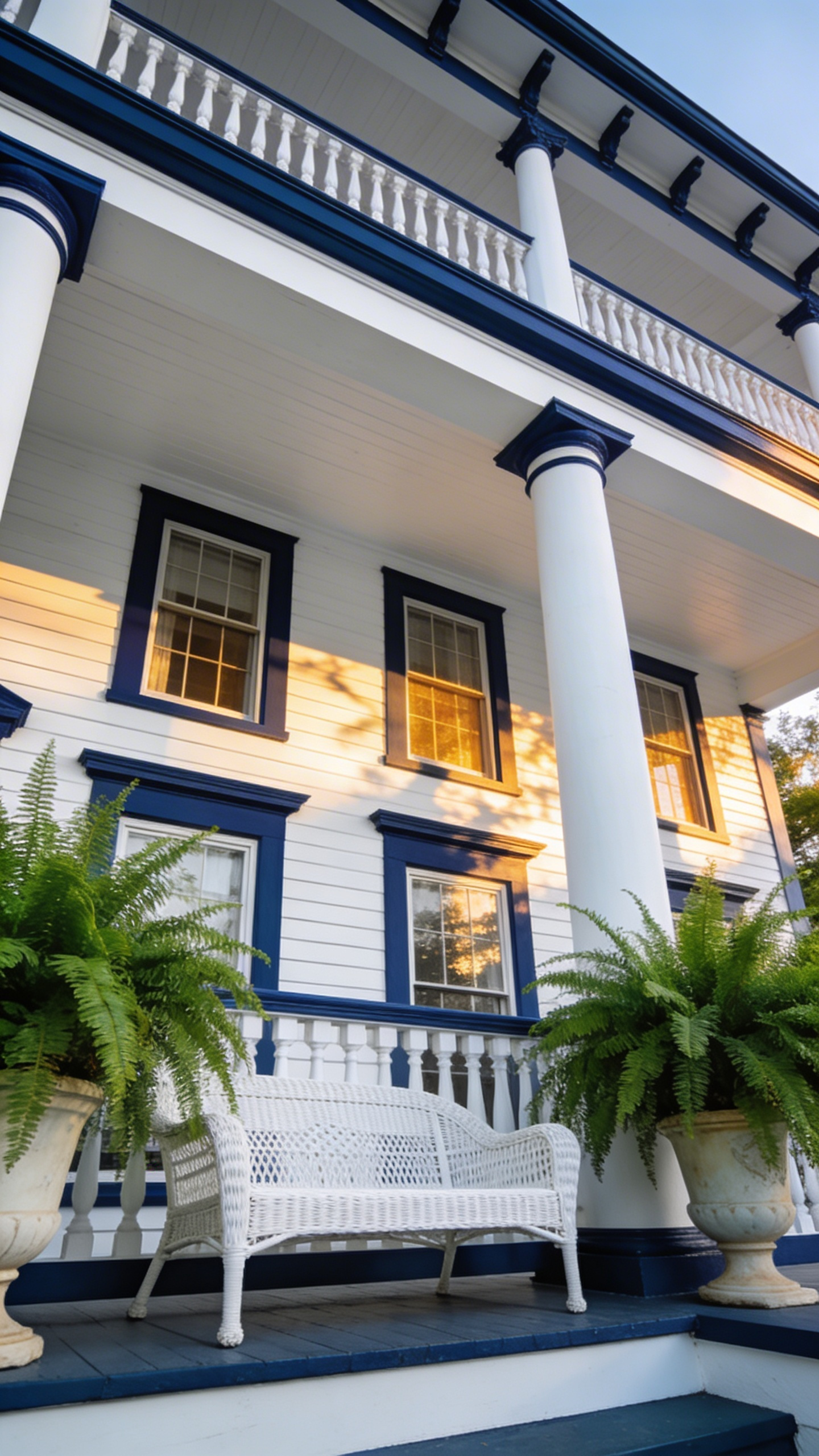
This high contrast creates a distinct “chiaroscuro” effect. Intricate millwork often gets lost in monochrome palettes. Outlining these elements makes details like chamfered posts become focal points. Successful application requires technical restraint. Experts often recommend the “Three-Surface Rule” to avoid overwhelming the space. Simply apply the navy to the floor, handrail, and window sash. This technique gently loops the eye around the perimeter.
Paint finish matters immensely in this context. Because navy has a low Light Reflectance Value, matte paints can appear chalky outdoors. Instead, choose a high-gloss finish to reflect light and reveal blue undertones. This approach changes the sensory experience. Dark sashes act as a cinematic “view-finder.” The navy trim recedes visually, causing the bright landscape beyond to pop. The porch transforms from a simple deck into a curated sanctuary.
The Practical Layer: Anti-Slip Additives and Weatherproofing for the British Climate
Ideally, a porch should be as functional as it is welcoming. In the UK, the primary challenge is our notoriously unpredictable weather. We must look beyond standard masonry paints to truly engineer the space. Pliolite resin-based paints have become the professional’s choice for British exteriors. Unlike traditional water-based options, these synthetic rubber paints become shower-resistant within twenty minutes. They provide a durable mechanical bond that prevents flaking, even on damp Victorian brickwork.
Safety is a non-negotiable element of porch design. Historically, builders simply added coarse sand to paint for grip. Unfortunately, this created an abrasive surface that felt like sandpaper underfoot. Modern solutions utilize micronized polypropylene beads. Because these additives are spherical rather than jagged, they offer “interlocking friction” for rubber soles without trapping dirt. Your porch remains safe during a downpour yet easy to clean.
Additionally, consider the structural health of the home. Old damp-proof courses often allow moisture to rise through the substrate. Applying a non-breathable sealant inevitably causes damaging osmotic blisters. Instead, select Class V1 or V2 microporous coatings. These advanced formulations allow vapor to escape naturally while preventing rain ingress. Finally, reconsider the finish itself. High-gloss surfaces can become dangerous skating rinks in winter. A satin or eggshell finish naturally holds anti-slip additives more effectively. This creates a sophisticated entrance that handles the climate with ease.
Curating Your Welcome – From Simple Paint Swatch to Grand Entrance
Finishing your porch project is more than a functional renovation task. It represents a deliberate act of architectural storytelling. In design theory, this area serves as a vital “liminal space.” It acts as a psychological handshake between the bustling street and your private sanctuary. Your choice of porch paint ideas dictates the pace of entry and the home’s overall curb appeal. Darker grounded shades, for instance, often signal stability, encouraging guests to slow down.
Historical choices like “Haint Blue” offer more than just folklore. Technically, this hue reflects the sky’s frequency. It extends the “Golden Hour” of twilight through thoughtful biophilic integration. To truly curate a grand entrance, designers often employ a “three-value system.” Typically, this involves anchoring the space with a deep-toned floor and framing the view with crisp, high-contrast railings. The goal is shifting from simple curb appeal to a genuine “curb experience.” Thus, your chosen porch paint ideas become the foundation for curated hospitality.
Frequently Asked Questions
What is the best color to paint a porch floor for longevity?
For high-traffic areas, mid-to-dark tones with low Light Reflectance Values (LRV), such as Estate Grey or Slate, are ideal. These colors mask scuffs and environmental debris better than lighter shades. Technically, using a satin or semi-gloss finish in a resin-based paint provides the best balance between durability and ease of cleaning.
Does painting a porch ceiling “Haint Blue” actually repel insects?
Historically, Haint Blue was made with lime, which acted as a natural insect repellent. While modern acrylic and latex paints lack these chemical properties, the color still offers significant aesthetic and psychological benefits. It creates an illusion of daylight, which some believe confuses nesting birds and wasps, though its primary modern value is architectural.
Should I use a high-gloss or matte finish for my porch railings?
High-gloss finishes are preferred for balustrades and railings because they reflect light, emphasizing the architectural detail of the spindles. Glossy surfaces are also harder and easier to wipe down. However, for the porch floor, a satin or matte finish is safer and more practical, as it provides better traction and hides surface imperfections.