You know what people always ask me? They have a lovely bedroom—perhaps the Farrow & Ball paint is on, the bed linen is crisp—but the walls are distressingly bare. They’re paralyzed by the thought of choosing art. “What if I get it wrong?” they whisper, as if the Art Police might break down the door. The real crime, my dear, isn’t getting it wrong; it’s being so timid you do nothing at all. Or worse, you buy some mass-produced canvas simply because it “matches the cushions.” A notion that sends a little shiver down my spine.
Art is the soul of a room. It’s the final, most personal layer. It’s what transforms a generic space into your space. Forget the noise about trends and what’s hot on Instagram. What truly matters is creating a personal gallery that you love to wake up to. I’ve spent years in some of London’s most beautiful homes, and the secret isn’t about spending a fortune; it’s about curation, confidence, and a little bit of wit. So let’s pour a drink and sort out your walls, shall we?
Foundational Principles for Your Bedroom Art
Before we even think about hanging a single hook, we need to lay the groundwork. Think of this as the grammar of your room’s visual language. Get this right, and everything else simply falls into place.
1. Define Your Bedroom’s Desired Mood with Art
First things first: how do you want your bedroom to feel? Don’t just say “nice.” Be specific. Is it a tranquil, bookish retreat reminiscent of a Cambridge don’s study? Is it a light-drenched, airy sanctuary that feels like a permanent holiday in the Cotswolds? Or is it a sophisticated, slightly moody boudoir perfect for a late-night tipple? Answering this is your North Star.
Art is an unbelievably powerful tool for setting this tone. I once worked with a client in Chelsea whose bedroom was a cacophony of anxious energy. We banished the jarring, frantic abstracts and brought in a series of soft, hazy photographs of the Scottish Highlands. The entire atmosphere shifted. The room began to breathe. That’s what we’re aiming for—an intentional mood, not a collection of random objects.
With the intended atmosphere settled in your mind, it’s time to ensure the style is authentically yours.
2. Uncover Your Personal Art Style for Cohesive Decor
Please, don’t tell me you don’t have a “style.” You do. You just might not have the words for it yet. Your style isn’t something you pluck from a magazine; it’s the visual thread that connects the things you naturally love. Start paying attention. Do your eyes linger on the sharp, clean lines of modern architecture or the gentle, faded florals of a Victorian chintz? Are you a minimalist at heart or a glorious maximalist, a true descendant of the Bloomsbury Group?
Look at the clothes you wear, the books on your shelf, the films you watch. There are clues everywhere. Create a secret board on Pinterest, but don’t just pin “bedroom art.” Pin everything that gives you a little jolt of joy—a landscape, a ceramic glaze, a costume from a period drama. After a week, look at it. You’ll see patterns emerge. That’s your style, my friend. Articulated.
Once you have a grasp of your personal aesthetic, you must consider the stage on which it will be performed: the room itself.
3. Assess room dimensions to Optimize Art Scale
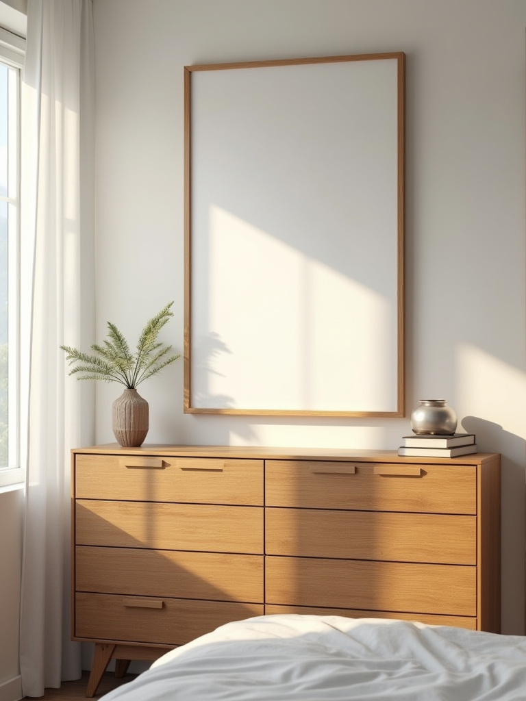
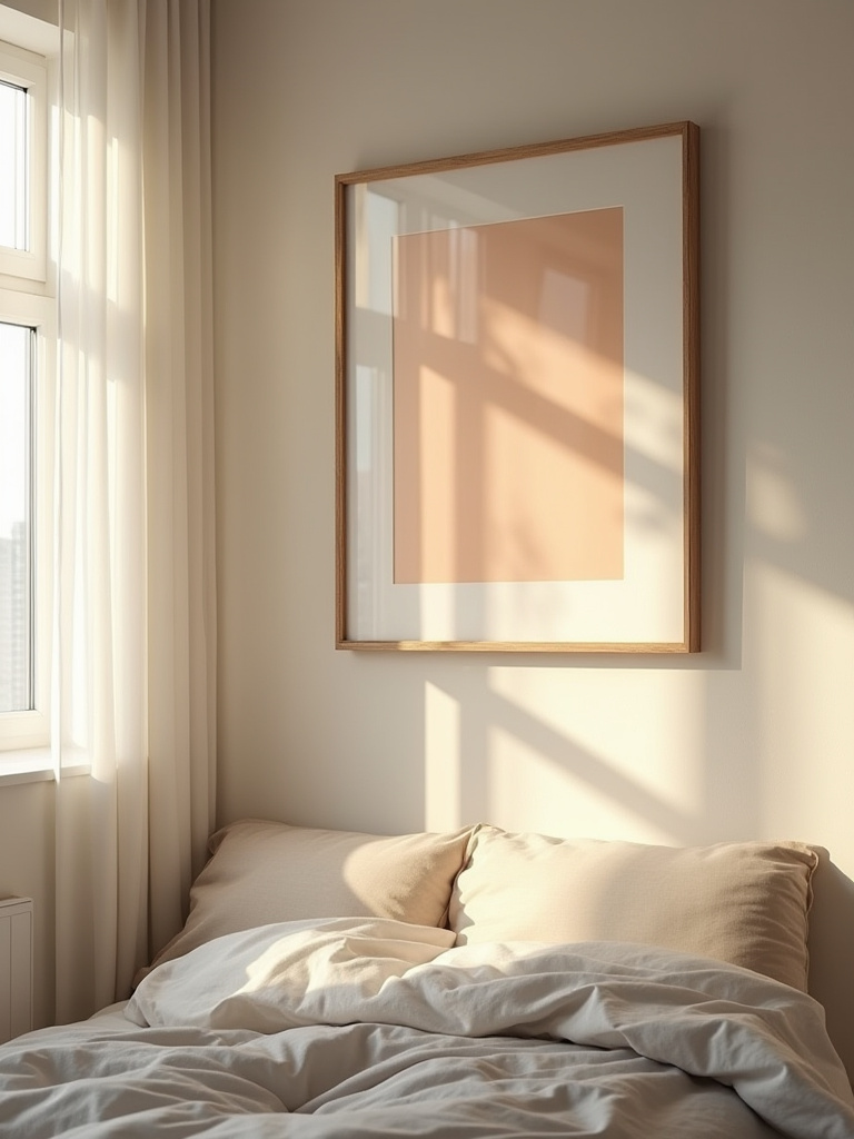
This is where so many good intentions go awry. You fall in love with a delicate little sketch, bring it home, and hang it above your king-sized bed. It ends up looking like a postage stamp on an envelope, completely lost and faintly ridiculous. Scale is everything. It’s the difference between a confident design statement and a hesitant whisper.
A good rule of thumb is that art above a piece of furniture—like your headboard or a chest of drawers—should be about two-thirds the width of the furniture itself. It creates a pleasing, anchored relationship. On a large, empty wall, you need a piece with presence, or you need to group smaller pieces to act as one large statement. Before you buy, I insist you do this: cut out a piece of paper or cardboard to the size of the prospective artwork and tape it to the wall. Live with it for a day. You’ll know instantly if it works.
Now that we understand scale, we can address that most delicate of subjects: colour.
4. Harmonize Art with Existing Bedroom Decor Colors
Let us be clear: “harmonizing” does not mean “matching.” Your art is not a supporting actor, it is a lead. It should not slavishly match the accent colour in your rug. Instead, it should have a conversation with the colours in the room. It can pull a minor, background colour from your wallpaper and elevate it to a starring role. Or, it can provide a delightful, witty contrast that brings the whole scheme to life.
A client of mine once agonized over a vibrant, slightly acidic green abstract painting for her very traditional, blush-pink bedroom. On paper, it sounded mad. In reality, it was genius. It cut through the sweetness of the pink and gave the room an edge, a personality. The lesson here is to think like a curator, not a paint-matcher. Look for colours that speak to each other, even if they’re not in perfect agreement.
This leads us to the broader idea of creating a palette, a tonal story that unifies your entire collection.
5. Establish a Core Color Palette for Unified Artwork
While we’re not matching, we are aiming for cohesion. Your art collection should feel like it belongs together, even if the pieces are wildly different in style or period. The easiest way to achieve this is by establishing a loose palette. Perhaps your unifying theme is the muted, earthy tones of the English landscape—soft greens, stony greys, and muddy browns. Or maybe it’s a crisper, more graphic palette of black, white, and a single primary accent.
This doesn’t mean every piece must contain every colour. It’s more of a guideline. Think of it as creating a family of colours. They’re all related, but they each have their own personality. This simple trick allows you to collect over time—a photograph here, a painting there—and have it all work together beautifully, as if it were always meant to be.
With these foundational rules firmly in mind, we can move on to the rather more thrilling part: actually choosing the art.
Curating Your Ideal Bedroom Art Collection
This is where the fun truly begins. We’re on the hunt for pieces that speak to you, that fit the mood and the space, and that will build a collection you’ll love for years to come.
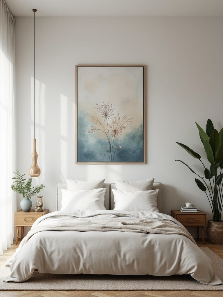
6. Select Art Themes That Evoke Serenity and Calm
The bedroom is, for most of us, a place of rest. It’s the room where we shake off the day. So, while I adore a dramatic, challenging piece of art, the wall directly opposite your bed might not be the place for it. We are generally aiming for serenity here. But “serene” doesn’t have to mean boring. It doesn’t mean a generic, stock photo of a beach.
Think about what serenity means to you. It could be the deep, enveloping quiet of a forest floor, captured in a dark, moody oil painting. It could be the elegant simplicity of Japanese woodblock prints, or the soft, hazy light of a Turner-esque watercolour. Find images that allow your mind to rest. The goal is a visual sigh of relief.
A key element of serenity is, of course, the colour itself, which deserves its own moment of consideration.
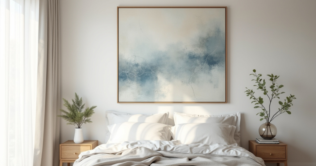
7. Prioritize Calming Color Tones for Bedroom Artwork
Living in Britain, we are connoisseurs of soft light and muted tones. We understand instinctively that the most restful colours are often the most complex. Avoid shrill, primary colours in the bedroom. Instead, embrace the vast and beautiful world of blues, greens, greys, and earthy neutrals. These colours recede, creating a sense of space and quiet.
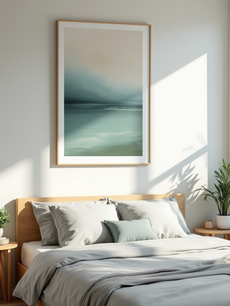
Look for colours with a touch of grey or black in them—what we might call ‘duck egg’ blue instead of sky blue, or ‘sage’ green instead of grass green. These tones have a softness and sophistication that is inherently calming. They absorb the light beautifully and create an atmosphere that feels both comforting and chic. I learned this the hard way after a youthful dalliance with a canary-yellow feature wall. One learns.
Beyond a calming palette, the real secret to a sophisticated room is layering in different forms of expression.
8. Mix Media Types Smartly for Dynamic Visual Interest
A room with only framed prints can feel a bit… flat. The most interesting spaces layer different textures and media. It adds depth and a sense of history, as if the collection has been built over time (which, ideally, it has). Don’t be afraid to mix things up.
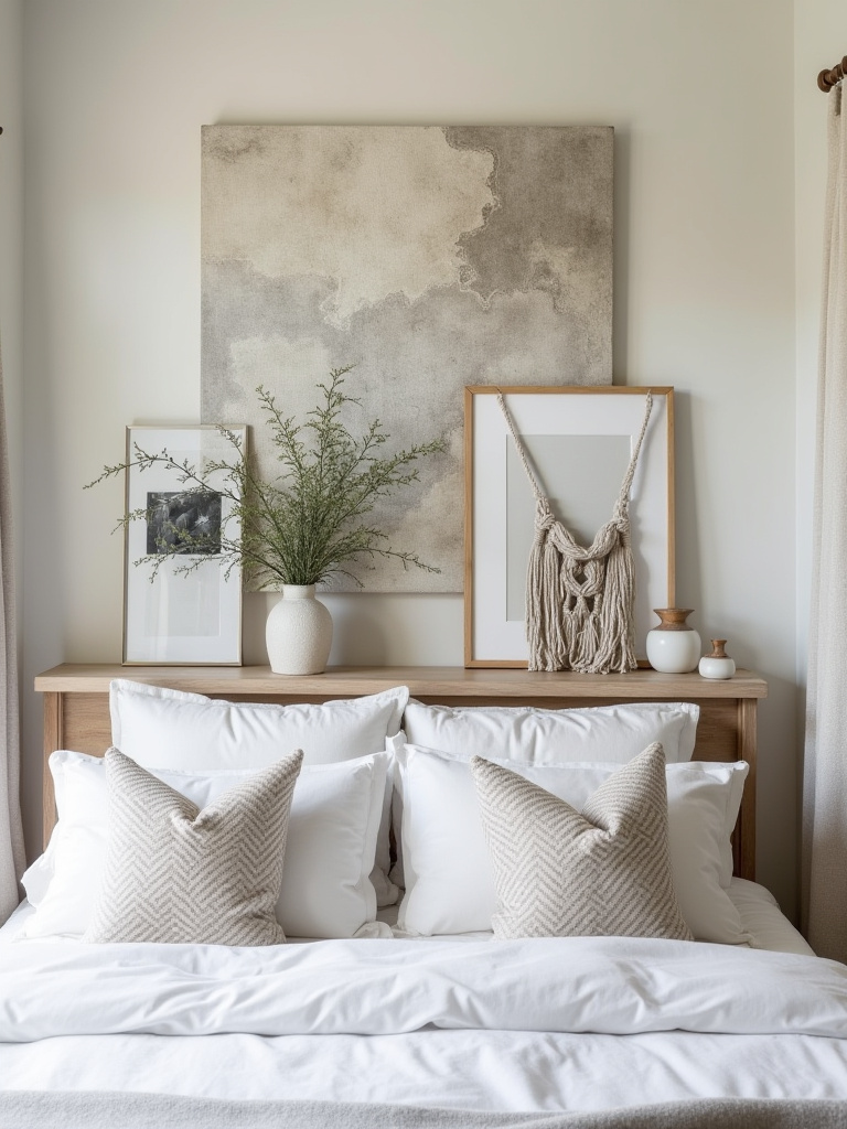
On a gallery wall, hang a smooth photograph next to a richly textured oil painting. Prop a small, unframed sketch on a shelf next to a piece of ceramic. A woven wall hanging or a piece of architectural salvage can add a wonderful, unexpected sculptural element. The key is to find a common thread—perhaps a shared colour palette or frame style—to keep it from looking like a jumble sale.
From this mix, one piece will inevitably step forward to take the lead.
9. Choose Statement Pieces to Anchor Your Wall Design
Every room needs a ‘main character,’ and in the bedroom, this is often a large piece of art above the bed. This is your anchor. Your statement. It sets the tone for everything else. But a statement piece is not just about size; it’s about impact. A huge, boring painting is just a huge, boring painting. A smaller, more powerful piece can have far more presence.
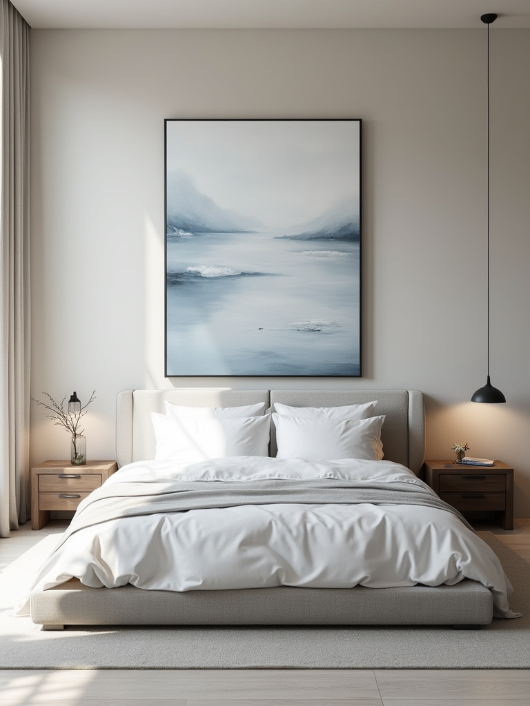
When you’re choosing this piece, invest in the best you can afford. This is where you want the quality to show. It’s the piece you’ll see every morning and every night, so it ought to be something you truly love. A statement piece gives a room focus and confidence. It says, “This is the story of this room. Pay attention.”
But the grandest stories are often balanced by the most personal of tales.
10. Integrate Personal Photography for Unique Sentimental Value
Some designers turn their noses up at personal photos, which I find utterly absurd. Your home is your story! The trick is to treat your own photographs like art. First, be a ruthless editor. Not every holiday snap makes the cut. Look for the photos with a strong composition, beautiful light, or a captured moment that feels truly special.
Then, elevate them. Don’t use a mishmash of cheap frames. For a truly cohesive, chic look, print a series in black and white and have them all framed identically with generous white mats. Suddenly, your personal memories look like a curated exhibition from a professional photographer. I once did this for a client with his father’s old slides of London in the 60s; the result was breathtakingly personal and incredibly stylish.
Once your collection is assembled, it’s all about the art of the hang.
Strategic Placement & Layout for Visual Harmony
You can have the most fabulous art collection in the world, but if it’s hung badly, the entire effect is ruined. Placement is not an afterthought; it is an art in and of itself.
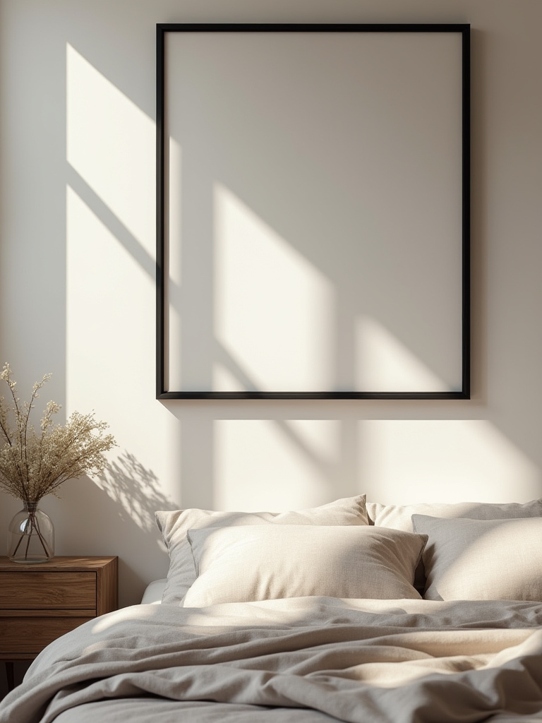
11. Master Eye-Level Hanging for Optimal Viewing Comfort
This is the one rule I am utterly militant about. Art hung too high is one of my greatest pet peeves. It creates a weird, floating disconnect from the rest of the room. Here is the secret, passed down from every museum and gallery curator: the centre of the artwork (or the centre of a gallery group) should be 57 inches from the floor. That’s approximately 145 cm.
This is the average human eye level, and it makes the art feel grounded and accessible. It connects it to the human scale of the room. If you are hanging a piece over a piece of furniture, you might adjust slightly, but the general principle holds. The bottom of the frame should be 6 to 12 inches above the furniture. Get out your measuring tape. I’m serious about this.
For smaller pieces, the solution isn’t to hang them higher, but to group them with purpose.
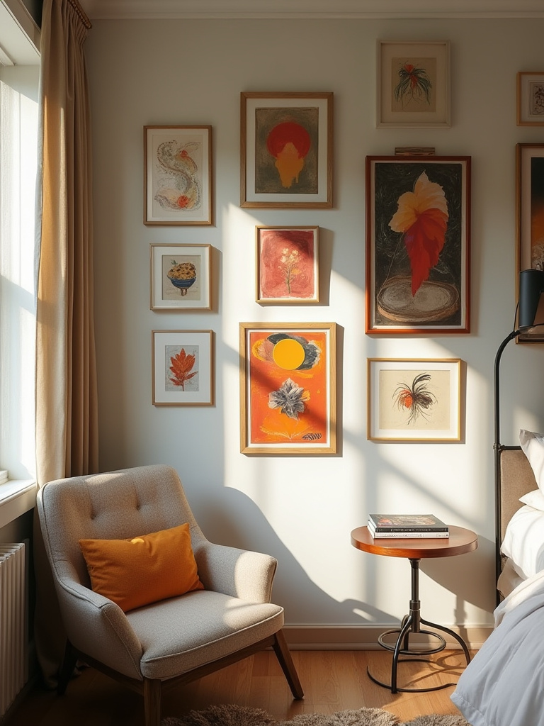
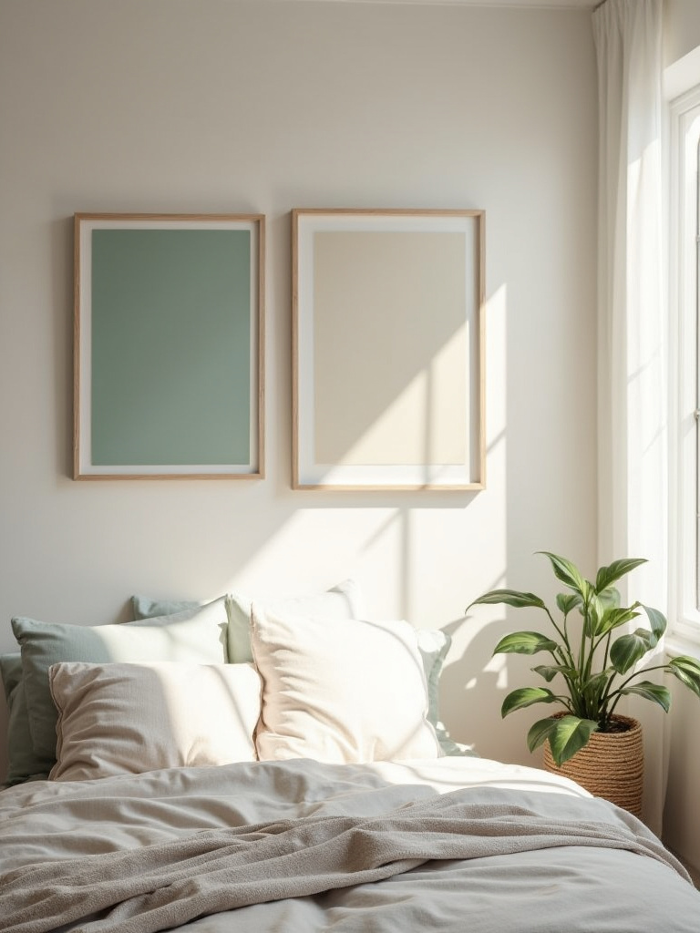
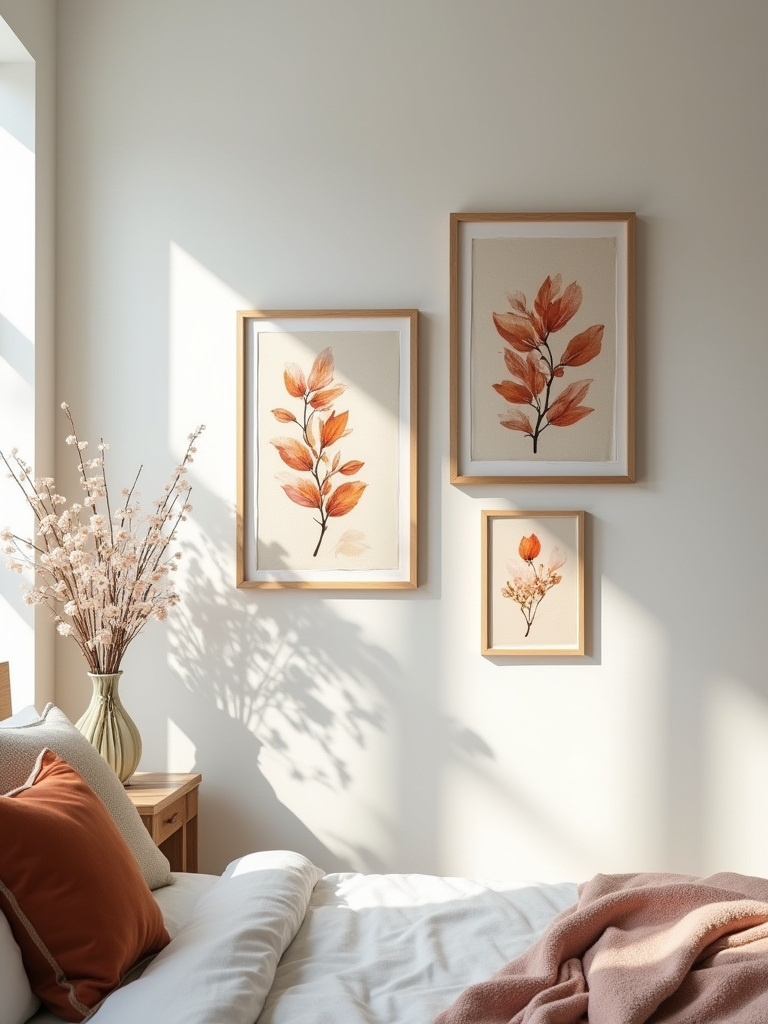
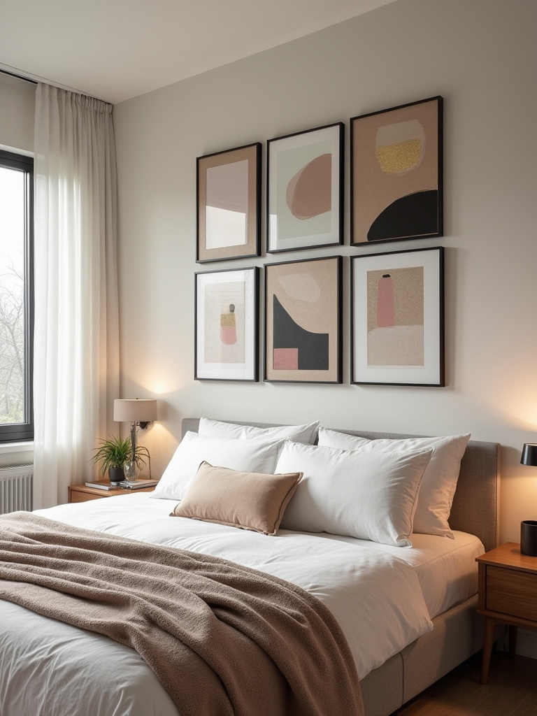
12. Group Smaller Artworks for an Impactful Gallery Wall
A collection of smaller artworks can have more impact than one large piece if grouped correctly. We call this a “salon hang,” a nod to the grand academic salons of Paris. The secret to a successful salon hang is to treat the entire grouping as one single, large shape. Start with your largest, most important piece (your anchor) and build out from there.
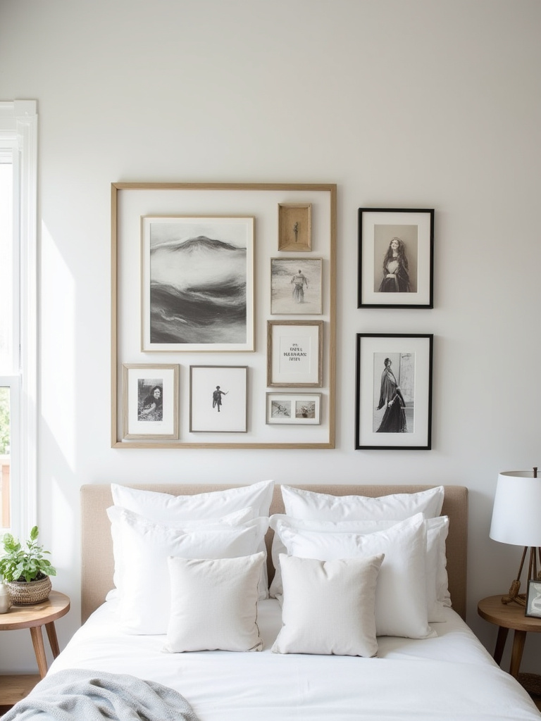
Lay everything out on the floor first. Play with the arrangement until it feels balanced but not too symmetrical—a little bit of tension is a good thing. Keep the spacing between the frames relatively consistent. And please, resist the urge to create a perfectly sterile grid. A good salon hang has rhythm and personality, telling a story through the connections and conversations between the pieces.
Now, let’s address the most important wall in the room: the one behind your bed.
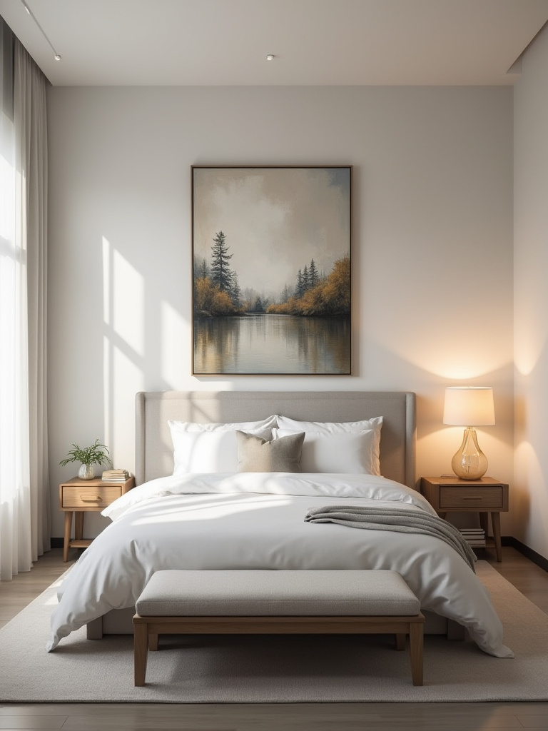
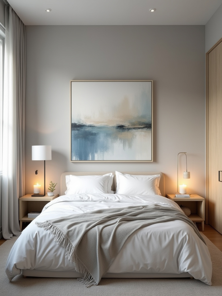
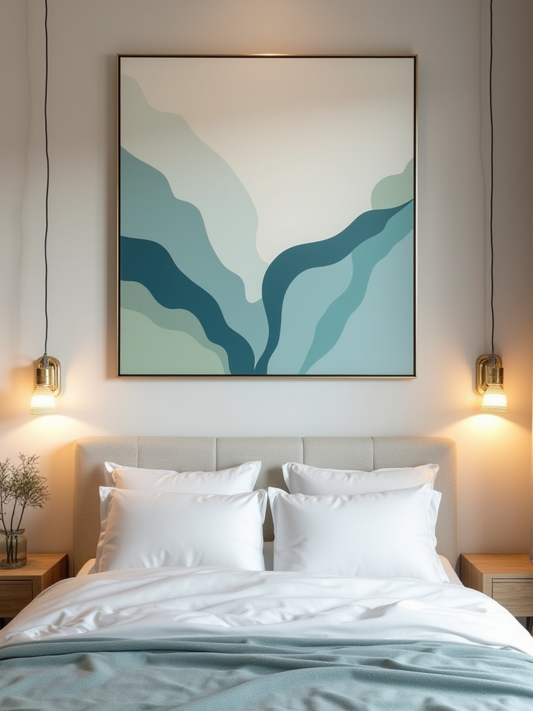
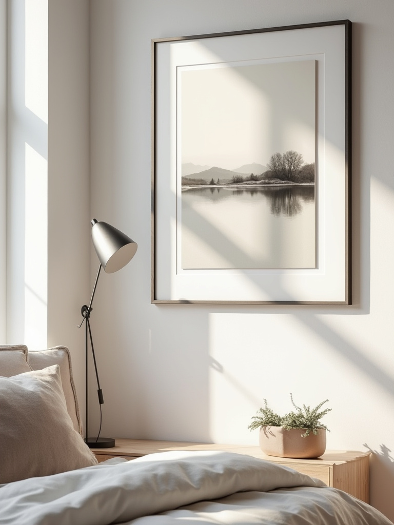
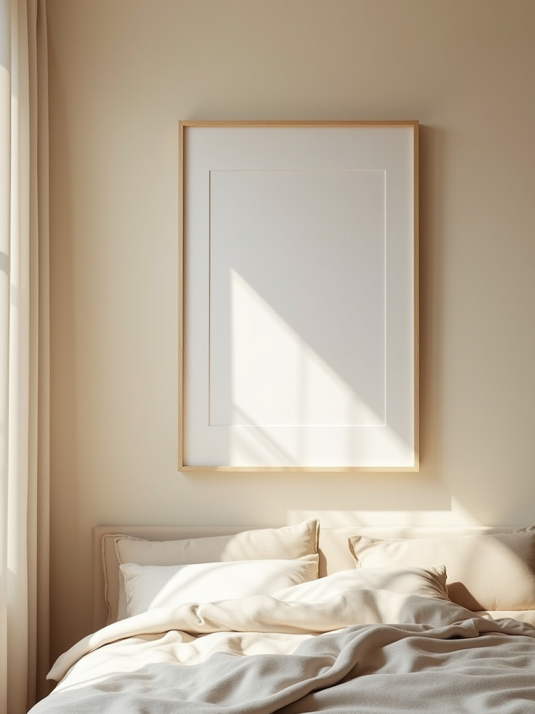
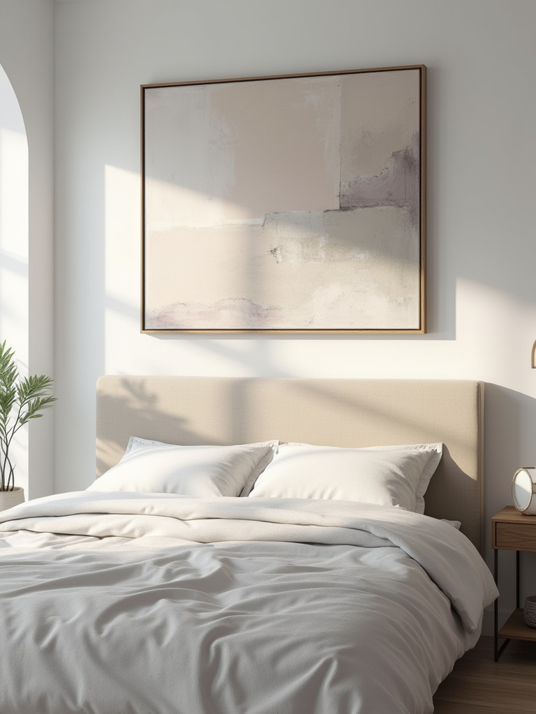
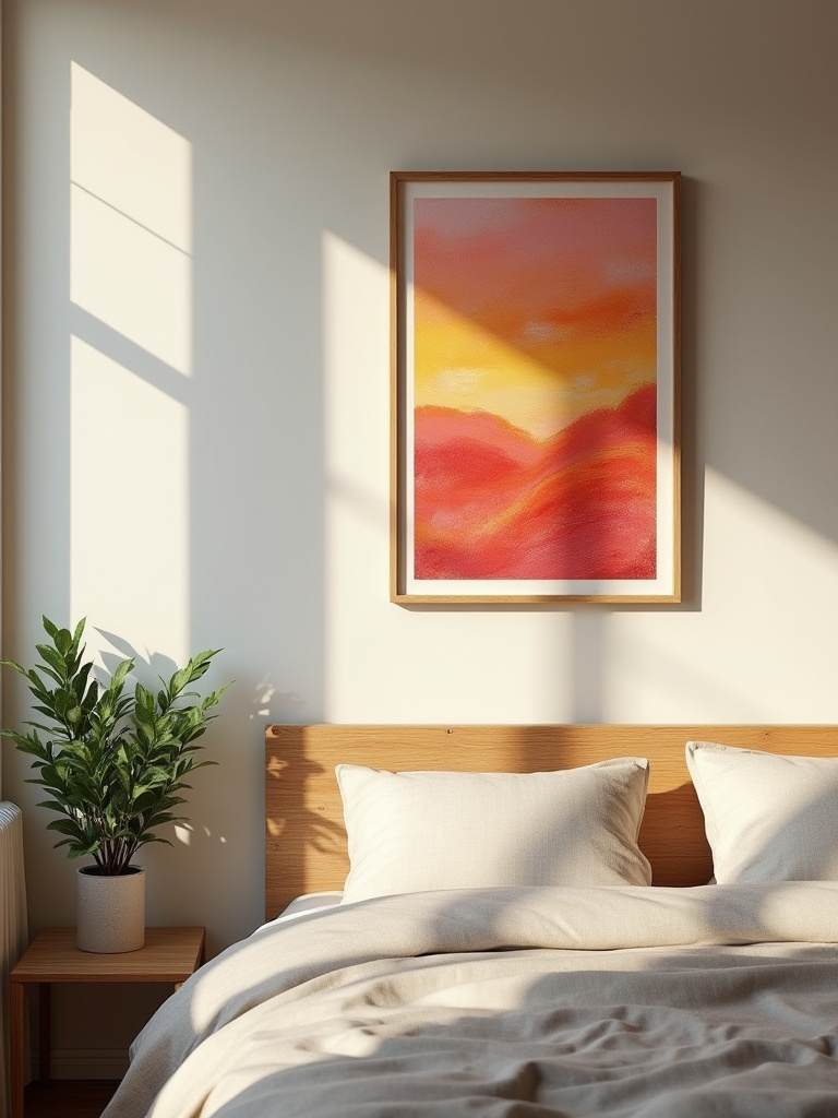
13. Utilize Bed’s Headboard Height for Perfect Art Alignment
The art above your bed should feel connected to it. It shouldn’t be floating in a sea of paint halfway up the wall. As a general rule, the bottom of the frame should be 4 to 8 inches above the top of your headboard. This creates a cohesive unit, grounding both the bed and the art.
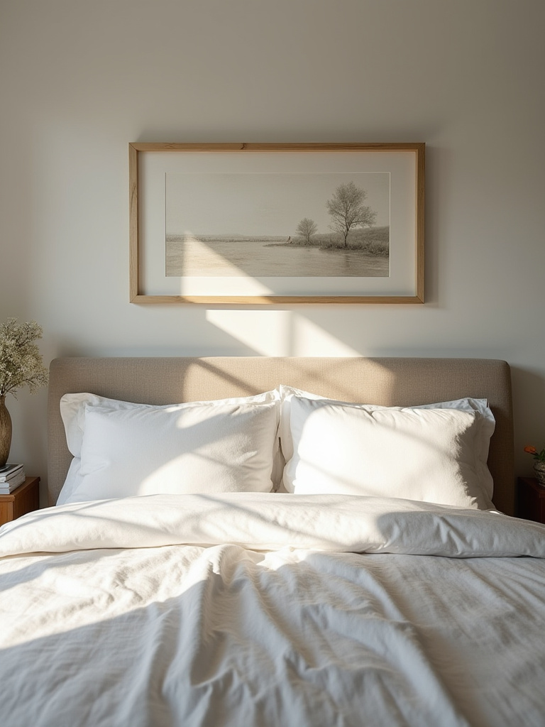
The width is also crucial. Remember our two-thirds rule? That applies here more than anywhere. Your art should be a substantial presence that crowns the bed, extending its visual importance up the wall. A dinky little picture above a grand, tufted headboard just looks sad and apologetic. Be bold.
With the art in place, the final flourish is to give it a spotlight.
14. Incorporate Strategic Lighting to Accentuate Bedroom Art
Proper lighting is what separates a nicely decorated room from a truly sophisticated space. You don’t need to turn your bedroom into a commercial gallery, but a little dedicated light on your art works wonders. A simple, elegant picture light mounted above your main piece can create a soft, ambient glow that makes the art come alive in the evenings.
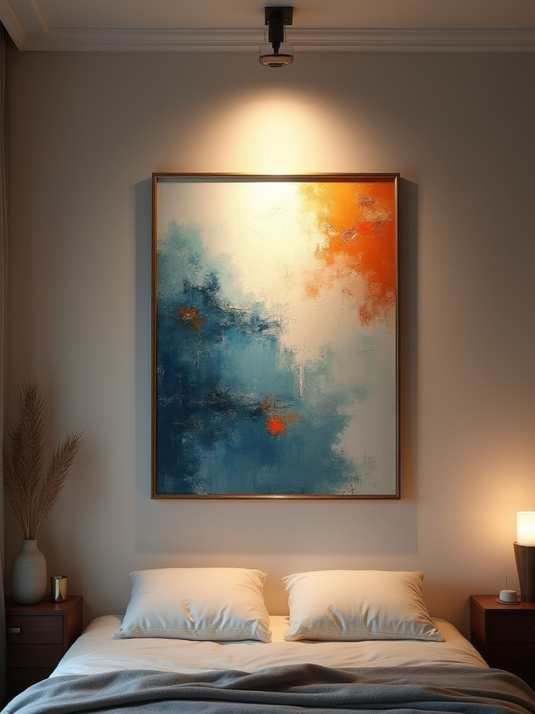
It adds a layer of warmth and luxury, turning a painting or photograph into a real focal point. For a more modern look, you can use adjustable recessed spotlights angled towards the art. The key is to use a warm light and, if possible, a dimmer. You want to highlight the art, not interrogate it.
Now we move from the broad strokes of placement to the finer points of presentation.
Elevating Your Aesthetic Through Refined Details
God, as they say, is in the details. And when it comes to art, the framing and finishing touches can make all the difference. This is where you telegraph quality and care.
15. Select Framing Styles to Complement Art and Decor
A frame is not just a border; it is part of the artwork. Choosing the right one is paramount. I confess, I once bought a wonderful antique map and lived with it in a cheap, temporary frame for far too long. When I finally had it properly framed in a simple, dark wood with a gilded fillet, it was utterly transformed. It finally looked as important as it was.
The frame should serve the art, first and foremost. A delicate watercolour needs a different treatment than a bold, modern canvas. But it should also nod to the style of your room. You can unify a disparate collection of art by using the same frame style for all of them. Or, for a more eclectic, “collected-over-time” feel, mix frame styles but keep the colour—say, black or natural wood—consistent. And please, invest in quality. A good frame will protect your art and make it sing.
A critical component of that frame is, of course, the mat.
16. Consider Matting to Elevate Art and Create Space
A mat (or mount, as we often call it here) provides breathing room for your art. It separates the image from the frame and the wall, drawing your eye inward. Don’t skimp on the mat. For most pieces, a generous mat makes the artwork feel more significant and professionally presented. A skinny little mat just looks cheap.
Here’s a secret from the pros: ask for a “bottom-weighted” mat, where the bottom border is slightly wider than the top and sides. It’s a subtle optical trick that creates a more stable, pleasing balance. For the mat colour, you can rarely go wrong with a soft, archival white or cream. It provides a clean, classic stage for almost any piece of art.
But don’t limit your thinking to what’s inside a frame.
17. Introduce Sculptural Elements for Three-Dimensional Depth
Art isn’t just two-dimensional. Adding a few sculptural elements can give your bedroom a wonderful sense of depth and texture. This doesn’t mean you need a life-sized marble statue (unless you have a very large bedroom in Belgravia, of course). It can be as simple as a beautiful ceramic vessel on your chest of drawers, a small bronze figure on a bookshelf, or a tactile piece of driftwood on the windowsill.
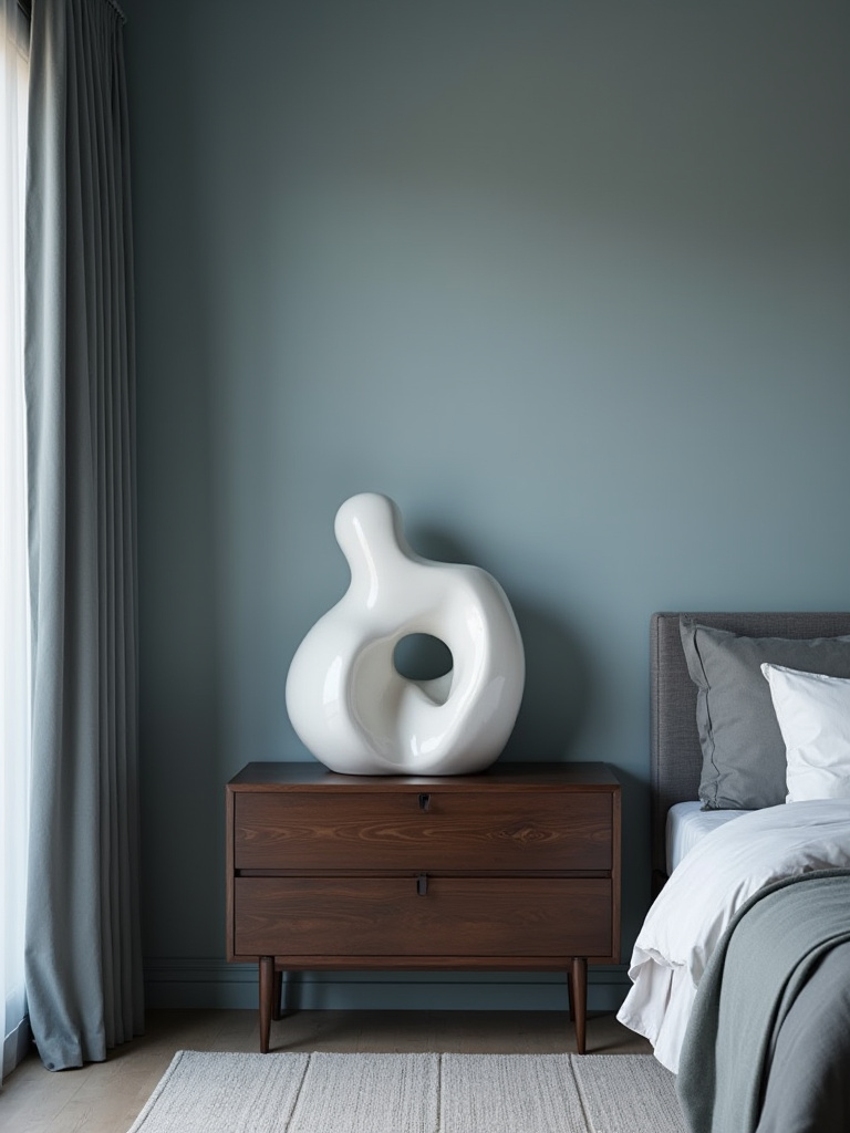
These objects break the plane of the wall and interact with the light in a different way. They add a tactile quality that invites you to touch. Think about pieces that have an interesting form or finish. It’s about creating small, intriguing vignettes throughout the room, giving the eye different points of interest to land on.
And remember, every element must exist in harmony with the room’s most substantial inhabitants.
18. Balance Art Placement with Bedroom Furniture Scale
We’ve touched on this, but it bears repeating. Your art and furniture are in a constant dialogue. For the conversation to be a pleasant one, they need to be well-proportioned to one another. A large, heavy, dark wood Victorian wardrobe requires a different artistic partner than a light, leggy, Scandinavian-style bedside table.
Before you hang anything, step back and consider the “visual weight” of both the art and the furniture. A dark, busy painting has more visual weight than a light, minimalist line drawing of the same size. Your goal is balance. If you have a very heavy piece of furniture, you might need a substantial piece of art—or a group of pieces—to hold its own. It’s an intuitive process, but one that becomes second nature once you start paying attention.
With your room perfectly balanced and detailed, our final task is to ensure it stays that way—and continues to evolve.
Maintaining & Evolving Your Bedroom Art Aesthetic
A beautiful room is not a static museum piece. It should live and breathe with you. This final set of secrets is about preserving your collection and allowing it to grow and change over time.
19. Protect Artwork from Sun Damage with UV Glazing
That lovely sun-drenched spot in your bedroom? It’s the enemy of your art. Sunlight, specifically the UV rays, will fade colours and degrade paper over time. The damage is irreversible. I learned this to my great sorrow with a beautiful antique botanical print that is now a pale ghost of its former self.
If you have a piece you truly value—whether for sentimental or financial reasons—I implore you to spend the extra money on UV-protective glazing when you have it framed. Museum-grade glass or acrylic can block up to 99% of harmful UV rays. It’s an invisible shield that will preserve your investment and keep your art looking vibrant for decades to come.
Preservation ensures your collection lasts, but rotation ensures it stays fresh.
20. Plan for Seasonal Art Rotations to Refresh Ambiance
This might sound frightfully organised, but it’s a wonderful way to keep from getting “decor fatigue.” You don’t have to change everything, but swapping out one or two pieces with the seasons can completely refresh the feel of your room. Bring out a bright, fresh floral print in the spring, and replace it with a warm, moody landscape in the autumn.
Think of it as “shopping your own home.” Rotate a piece from the living room into the bedroom. You’ll be amazed at how it takes on a new life in a different context. It keeps your eye sharp and your appreciation for your own collection alive. You see things anew.
Even without new pieces, a simple shuffle can work wonders.
21. Strategically Reconfigure Art Layout for Fresh Perspectives
This is the cheapest redecoration imaginable, and one of the most effective. If your bedroom is feeling a bit stale, take everything off the walls. Live with the blank space for a day. Then, approach your collection with fresh eyes.
That gallery wall you’ve had for five years? Break it up. Hang the main piece on its own somewhere else. Group three smaller sketches together in a vertical line to draw the eye up. A simple reconfiguration can trick your brain into feeling like you’ve completely redone the room. It forces you to see your beloved pieces in a new light.
Finally, the most rewarding part of any collection is adding a piece with a real story.
22. Discover Local Artists for Unique, Meaningful Additions
While I have great respect for the classics, there is a special joy in discovering and supporting a local, living artist. It infuses your home with a unique soul that a print from a big-box store never can. Visit degree shows at local art colleges, browse artisan markets, and follow local galleries on social media.
When you buy a piece from a local artist, you’re not just buying an object; you’re buying a piece of their story and a piece of your community. It becomes a conversation starter, a point of personal connection. You might just discover the next big thing, but even if you don’t, you’ll have a unique piece that means something special to you. And that, my dear, is what truly matters.
And there you have it. Creating a bedroom art aesthetic isn’t about following rigid rules; it’s about learning the principles of good design so you can break them with confidence and flair. It’s about telling your story, creating a sanctuary, and surrounding yourself with beauty that you love. So go on, be brave. Start your collection, hang that piece you’ve been hiding, and make your bedroom a masterpiece. You absolutely deserve it.