Picture the deep, indigo-dyed cloth of traditional Japanese artisans, a color that holds the stillness of the night sky. Now, imagine bringing that sense of profound calm into the heart of your home. A friend asked me about this recently. They saw a picture online and thought, “That looks nice.” But choosing a color, especially one as full of life as blue, is not about picking a chip from a wall. It is about understanding the spirit of a space.
Most people approach design with a checklist of trends. They see a color and want to copy it. But a kitchen is not a picture; it is a space where you live, breathe, and nourish yourself. The real story behind creating a beautiful blue kitchen is not about what is fashionable, but what is harmonious. It is about how light touches a surface, how a material feels under your hand, and how the entire room settles into a quiet, functional grace. Let us explore the path to this, beyond the noise of fleeting styles.
Crafting Your Blue Kitchen Cabinet Vision (Part 1)
Before a single brush is lifted or a cabinet ordered, the most important work happens in stillness. This first step is about observation and intention. We are not just decorating a room; we are composing a space that will hold a significant part of your life. We must consider the essential elements—light, form, and purpose—to ensure the final kitchen feels not just designed, but destined.
1. Assess Your Kitchen’s Natural Lighting for Optimal Blue Tones
Light is not an accessory; it is a living material in your home. The color you choose on a paint chip is a mere suggestion until it meets the light in your kitchen. North-facing light is cool and constant, it will deepen a navy into near-black and quiet a sky blue into a contemplative gray. South-facing light is warm and bright, it will energize a teal and make a pale blue sing. You must observe this dance.
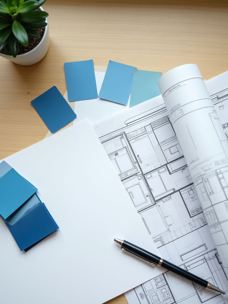
Forget the tiny paper samples. Secure a large sample door or board painted in your chosen blue. Place it in your kitchen. Watch it in the morning, at noon, and as dusk falls. See how it speaks with the cool light of your LEDs and the warm glow of an evening lamp. People think a color is static. That is the first mistake. The color is in a constant conversation with the light, and your first job is to simply listen.
This patient observation is the shortcut. So many rush this and end up with a color that feels alien in their own home, a shade that looked perfect in a brightly lit showroom but feels somber and heavy in their reality. Taking a few days to live with the color will save you from the deep regret of a costly mistake.
2. Define Your Kitchen Style: Modern, Farmhouse, or Coastal Blue?
People get caught up in labels like “modern” or “farmhouse.” I ask you to think differently. Instead, ask: what is the feeling I want to create? Do you seek a space of clean lines and quiet efficiency, where everything has its place? Or one of rustic warmth, where the history of materials is celebrated? This is about defining the spirit of the space, and the cabinet style is its physical expression.
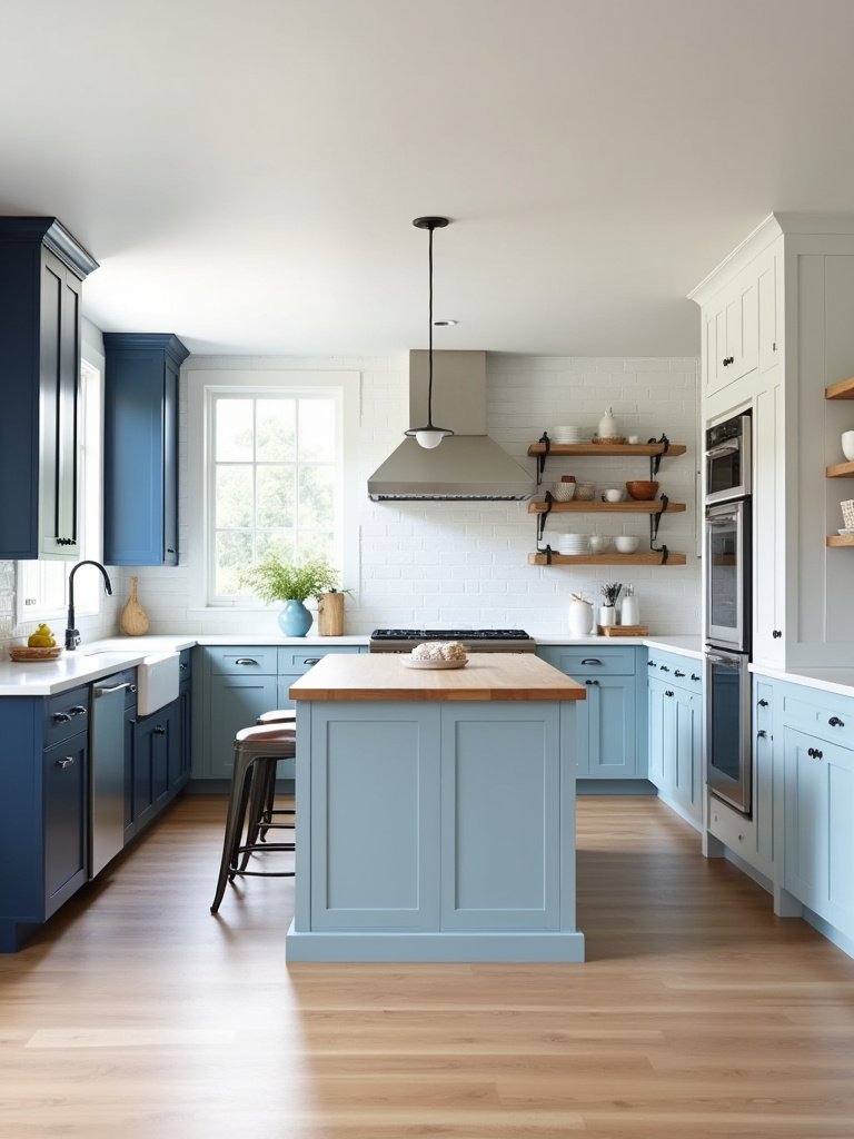
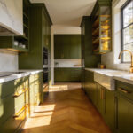
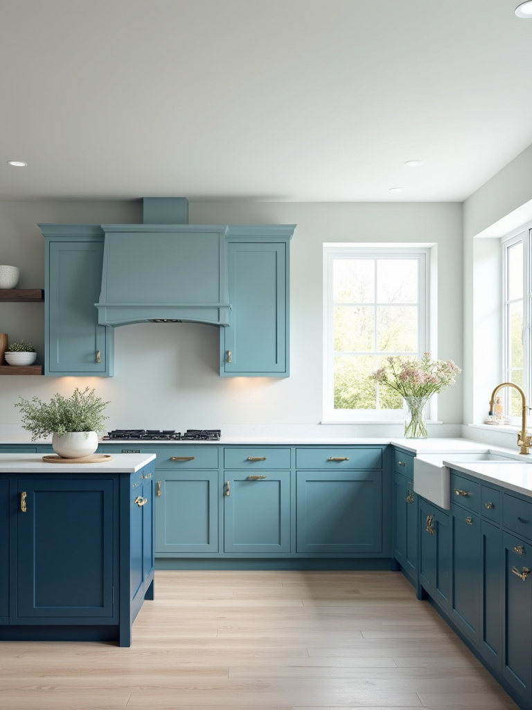
A flat-panel cabinet in a deep, matte navy can create a sense of profound stillness, like a calm lake at midnight. This is for the modern, contemplative spirit. A shaker-style door in a dusty, weathered blue, paired with the texture of wood, speaks of wabi-sabi—the beauty of imperfection and the passage of time. This is the heart of the farmhouse aesthetic. The style you choose is the story you are telling.
Can we talk about the biggest mistake here? It is forcing a style that does not belong. A sleek, high-gloss European cabinet will feel jarring in a rustic country home. The goal is harmony, a seamless flow between your kitchen and the bones of your house. Your home’s architecture provides the context; your design should be a respectful continuation of that story.
3. Research Different Blue Cabinet Finishes: Matte, Gloss, or Wood Grain?
The finish of a cabinet determines how it speaks with light and how it feels to the touch. This is a sensory decision. A high-gloss finish is energetic; it reflects light and motion, bouncing energy around the room. It can make a small space feel larger, but it also shows every fingerprint, demanding constant attention. It is a choice for a crisp, dynamic space.
A matte finish, by contrast, is about quiet and calm. It absorbs light, giving the blue a deep, velvety softness. There is a stillness to it. It hides imperfections and softens the edges of a room, creating a serene, almost meditative atmosphere. A visible wood grain, stained in a shade of blue, connects the kitchen back to nature. It celebrates the life of the material, a core principle of Japanese design. You feel its history.
So many articles will debate which finish is easier to clean. While that is a practical consideration, the more important question is what feeling you want to live with every day. Do you want the lively dance of reflected light, or the profound peace of a surface that absorbs it? Your answer will tell you which finish belongs in your home.
4. Determine Your Budget for Blue Cabinet Renovation Effectively
A budget is not a restriction; it is a parameter that invites creativity. In Japanese architecture, elegant solutions are often born from limitations. Rather than viewing the budget as a barrier to what you want, see it as a guide toward what truly matters. It forces you to distinguish between the essential and the extraneous.
The mistake everyone makes is focusing only on the cost of the cabinets themselves. This is just noise. What truly matters are the “hidden” costs: the installation, the removal of the old, the small but necessary changes to plumbing or electrical work. Always, always set aside a contingency—at least 15%—for the unexpected. The house will reveal its needs as you work, and you must be prepared to listen.
I once worked with a client who had a modest budget. Instead of expensive custom cabinets, we chose simple, well-made stock cabinets in a standard navy. Then, we invested the savings into truly exceptional hardware and a single, beautifully crafted open shelf from a local artisan. The result felt more thoughtful and personal than a kitchen that cost three times as much. Your budget does not define the beauty of the outcome; your intention does.
Crafting Your Blue Kitchen Cabinet Vision (Part 2)
With a clear vision of the kitchen’s spirit, we can now turn to its physical form. The way a thing is made is just as important as how it looks. This is about choosing the bones of your kitchen with care, ensuring they provide a foundation of quality and integrity that will support your daily life for years to come.
5. Consider Cabinet Construction: Custom, Semi-Custom, or Stock Blue Cabinets?
The choice between stock, semi-custom, and custom is a question of control. Stock cabinets are like a ready-made garment. They are efficient and affordable, but you must accept their standard sizes and limited colors. They are a practical solution, but they often require filler strips and compromises to fit a space perfectly.
Custom cabinetry is the opposite; it is bespoke tailoring. Every dimension, every detail, every nuance of the blue is made precisely for your space. It allows for a perfect, seamless fit and unparalleled quality. Semi-custom is the middle path, offering some flexibility in size and finish without the full expense of bespoke work. The choice depends on your space and your priorities.
The BS I hear most often is that custom is always “better.” Better for what? If your kitchen has a standard layout and your budget is tight, a well-chosen stock cabinet can be an excellent choice. The true measure of quality is not the price tag, but the integrity of the construction—solid boxes, durable joinery, and a lasting finish. Focus on the substance, not the label.
Choosing Your Ideal Blue Cabinet Palette (Part 1)
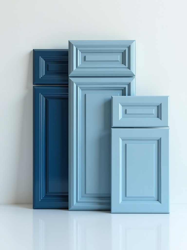
Now we arrive at the color itself. But blue is not a single idea. It is a vast ocean of possibilities, from the quiet gray of a morning mist to the intense cobalt of a summer sky. Selecting your palette is about composing a harmonious chord of color, material, and light that will resonate throughout your kitchen.
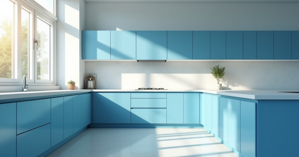
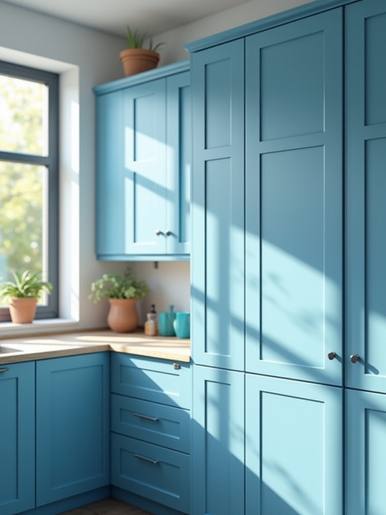
6. Select the Right Blue Shade: Deep Navy, Serene Sky, or Bold Teal?
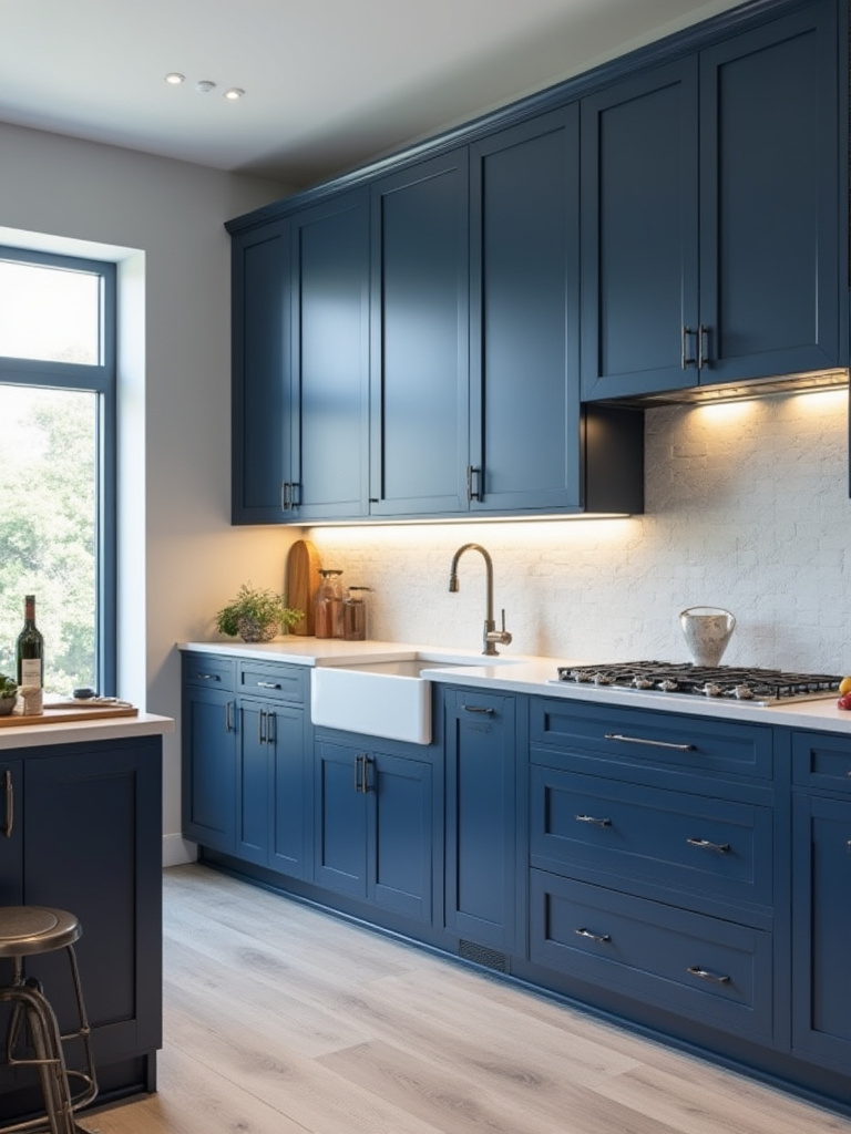
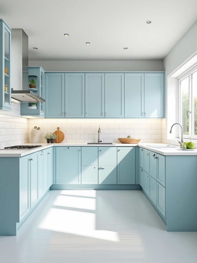
A color’s name means nothing. “Navy” from one company is entirely different from another’s. One holds hints of green, another violet. You must look beyond the name to the color’s soul. Deep navy grounds a space with sophistication and depth. Sky blue lifts it, creating a sense of air and openness. Teal is a mineral color, full of energy and life.
Ask yourself, what element of nature am I trying to evoke?
- Deep Navy: The stillness of the deep sea, the vastness of the night sky. It is grounding, stable, and timeless.
- Sky Blue: The openness of a clear day, the feeling of breath and space. It is calming, airy, and expansive.
- Teal: The color of a tropical lagoon or a rare stone. It is vibrant, confident, and enlivening.
The shortcut is to connect the color to a feeling you want to cultivate in your home. Don’t just pick a pretty shade; choose an atmosphere. This single shift in perspective will guide you to a blue that feels not just beautiful, but deeply right.
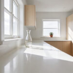
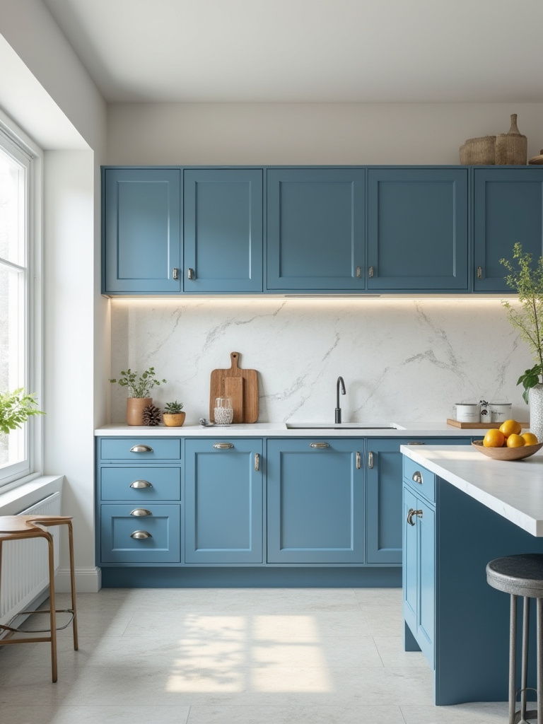
7. Pair Blue Cabinets with Complementary Countertop Materials
The countertop is the work surface, the horizontal plane that meets the vertical blue. This relationship must be one of balance. A busy, heavily veined stone will fight with your blue cabinets for attention, creating visual noise. A simple, quiet surface will allow the blue to be the focus, creating a sense of calm.
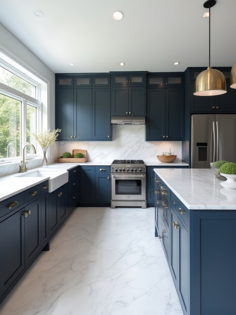
Think in terms of texture and temperature. The cool, smooth perfection of white quartz creates a crisp, clean contrast with a deep navy. It is a modern, precise pairing. The living warmth of a butcher block counter, however, offers a beautiful counterpoint to a cool slate blue. It introduces an organic, natural element that softens the entire room. There is no single “best” material, only the one that creates the harmony you seek.
A client once fell in love with a very dramatic granite and a deep teal cabinet. Separately, they were beautiful. Together, they shouted at each other. We learned the hard way that sometimes, for one element to shine, another must be content to quietly support it. Choose a star of your kitchen—the cabinets or the countertop—and let the other be the serene backdrop.
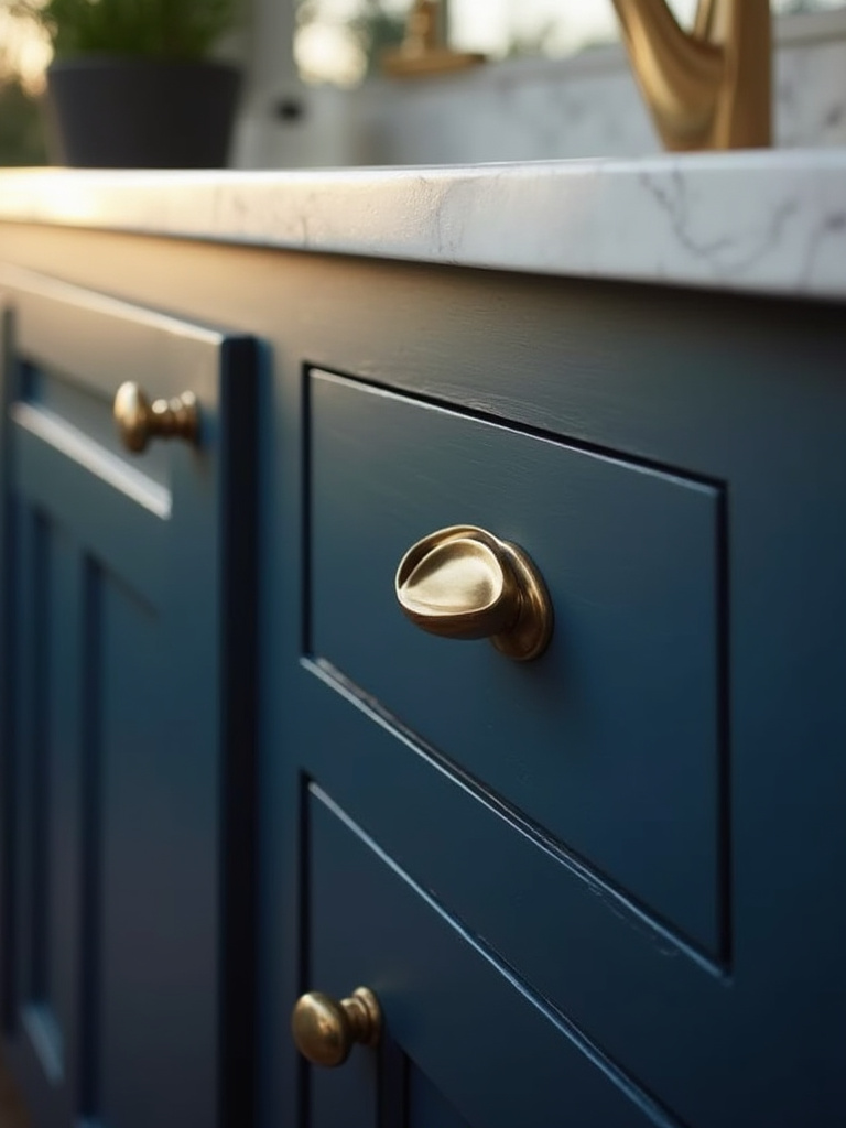
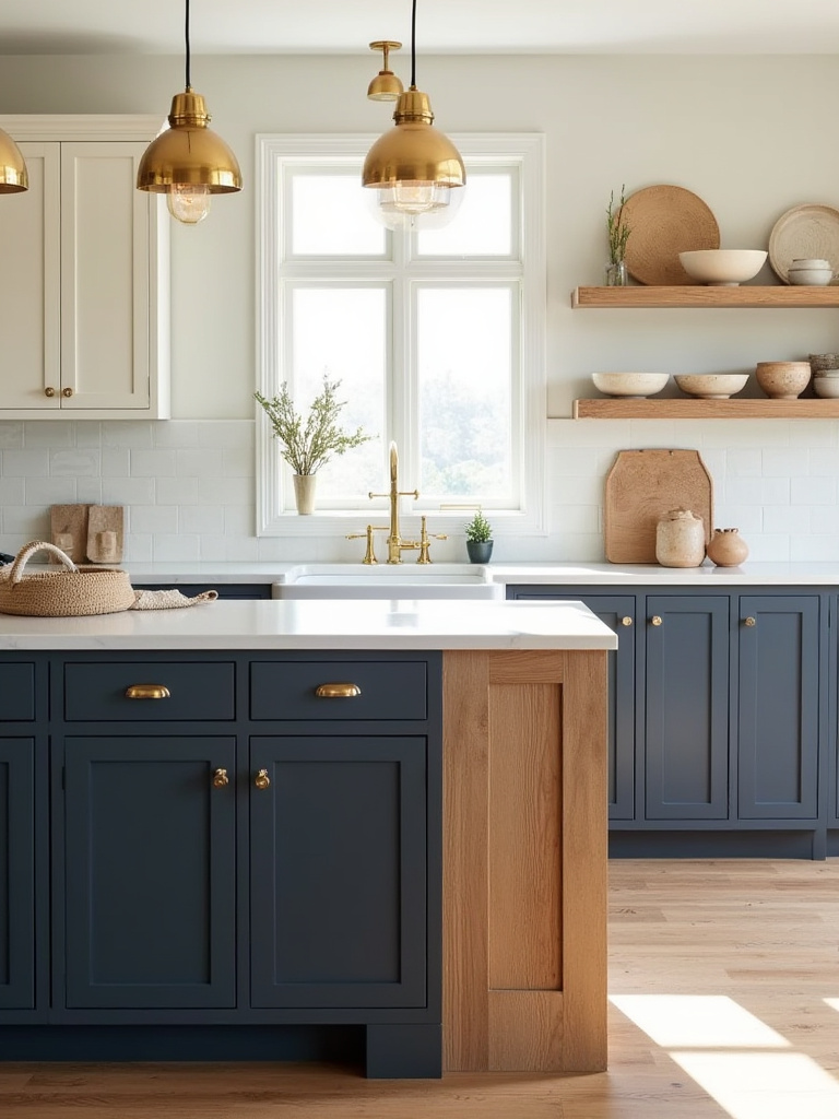
8. Integrate Warm Metallics to Prevent an Overly Cool Blue Space
Blue, by its nature, is a cool color. In a room with cool northern light, it can sometimes feel too austere or distant. Warm metallics—brass, copper, aged gold—are the perfect counterpoint. They are like a candle flame in a still room, introducing a spark of warm, living energy.
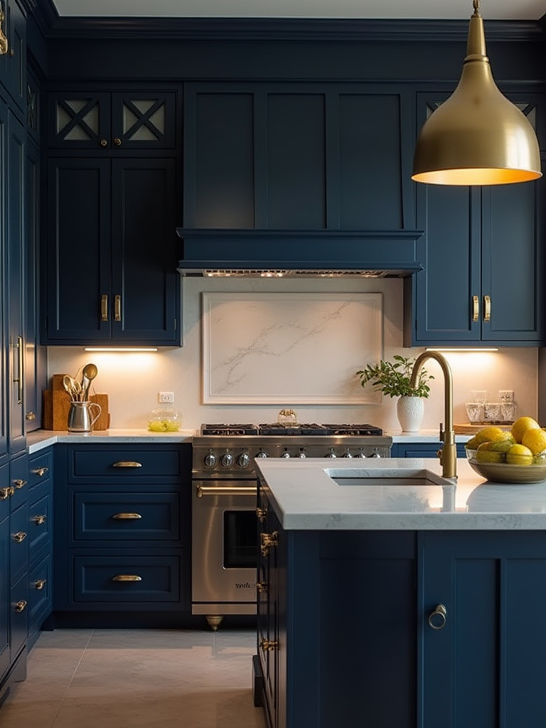
Think of these metals not as hardware, but as jewelry for the room. A simple brass knob or a slender copper pull is a point of warmth that the hand connects with every day. A pendant light with a warm brass interior casts a gentle, flattering glow, balancing the coolness of the blue below. These small touches make a space feel not just designed, but inhabited.
Everyone defaults to chrome or nickel because it feels “safe.” But safe can be sterile. The subtle warmth of brass or copper is the simple secret to making a blue kitchen feel both sophisticated and deeply inviting. It’s the contrast, the balance of cool and warm, that creates a space that feels complete.
9. Explore Two-Tone Cabinet Strategies with Blue Uppers or Lowers
Using two colors is a direct expression of the Japanese concept of ma, or negative space. The second color—often a soft white or light wood—is not just another color; it is the breathing room that allows the blue to have presence. It is the silence that gives meaning to the note.
Placing a dark blue on the lower cabinets grounds the kitchen, anchoring it to the earth. The lighter upper cabinets then seem to recede, making the ceiling feel higher and the room more expansive. This creates a beautiful balance of weight and air. Reversing this, with blue on top, is a bolder choice that draws the eye upward, but it must be handled with care in a small space.
People often worry a two-tone kitchen will look busy. The key is simplicity in all other areas. The cabinet style should be consistent, the hardware the same finish. The two colors should be the primary statement. By creating this clear visual hierarchy, you achieve a look that is dynamic and interesting, yet still feels serene and uncluttered.
Choosing Your Ideal Blue Cabinet Palette (Part 2)
As we refine our palette, we must look down at the very foundation of the room. The floor is the ground upon which everything else is built. Its color and material are not afterthoughts; they are integral to the composition, providing the anchor for the entire space and ensuring a seamless transition from one area to the next.
10. Coordinate Blue Cabinets with Flooring Choices for Seamless Transitions
The floor is the earth beneath the sky of your blue cabinets. The connection between them must feel natural and effortless, like the edge of a forest meeting a meadow. A floor with a clashing undertone—for instance, a yellow-toned wood against a cool, gray-blue cabinet—will create a constant, low-level visual tension.
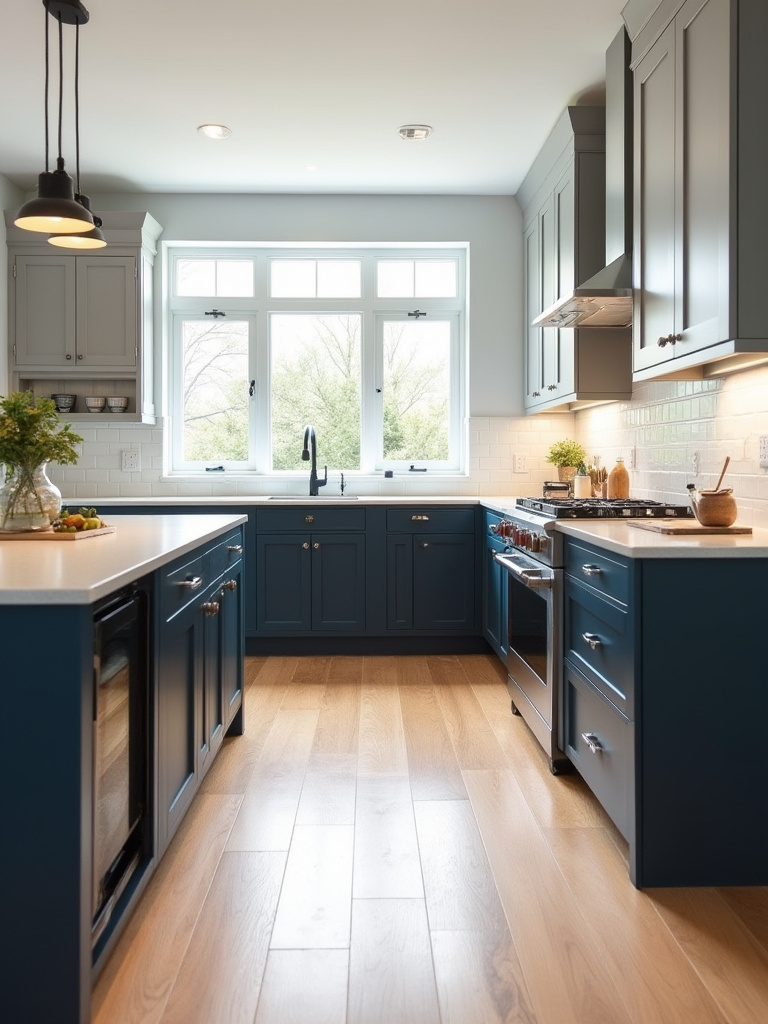
To find harmony, bring a sample of your blue cabinet to the flooring store. Do not rely on memory. Place it directly against your flooring options and observe them in different lights. A light oak floor can provide a warm, organic foundation for a navy blue, while a soft gray slate or porcelain tile can create a calm, monolithic base for a brighter sky blue. The goal is a relationship of quiet complements.
The simplest advice I can offer is this: when in doubt, go for a quiet, neutral floor. A floor that doesn’t scream for attention provides the perfect, tranquil stage upon which your beautiful blue cabinets can take their rightful place as the focus of the room.
Strategic Design and Styling with Blue Cabinets
With the foundational elements in place, we now turn to the details that bring a space to life. This is where the personality of the kitchen is truly defined. From the hardware that your hand will touch a dozen times a day to the backsplash that forms the backdrop to your daily rituals, each choice is an opportunity to add a layer of texture, light, and intention.
11. Choose Cabinet Hardware that Enhances Your Blue Shade
Hardware is the point of contact between you and the kitchen. It should feel good in the hand—substantial, smooth, and ergonomic. But it is also a key decorative element. A polished brass knob against a deep indigo cabinet is like a gold button on a fine coat; a simple, elegant statement that elevates the entire piece.
The finish is important, but so is the form. A long, linear bar pull in matte black will emphasize the modern geometry of a flat-panel cabinet. A classic cup pull in aged bronze will lend a sense of history and craft to a shaker door. Let the form of the hardware echo the form of the cabinet for a result that feels cohesive and intentional.
Don’t be afraid to mix styles, but maintain a consistent finish. Using knobs on doors and pulls on drawers is a timeless and practical approach. This subtle variation adds a layer of quiet interest without creating clutter. It is a sophisticated detail that speaks of thoughtful design.
12. Strategically Place Lighting to Highlight Blue Cabinetry and Textures
Light creates mood. You must move beyond the single, harsh overhead light. Think in layers. First, there is ambient light—the general, soft glow that fills the room. Second, task light—the focused light above your countertops and sink, provided by under-cabinet LEDs. This is essential for function, but it also casts a beautiful wash of light down your cabinet faces.
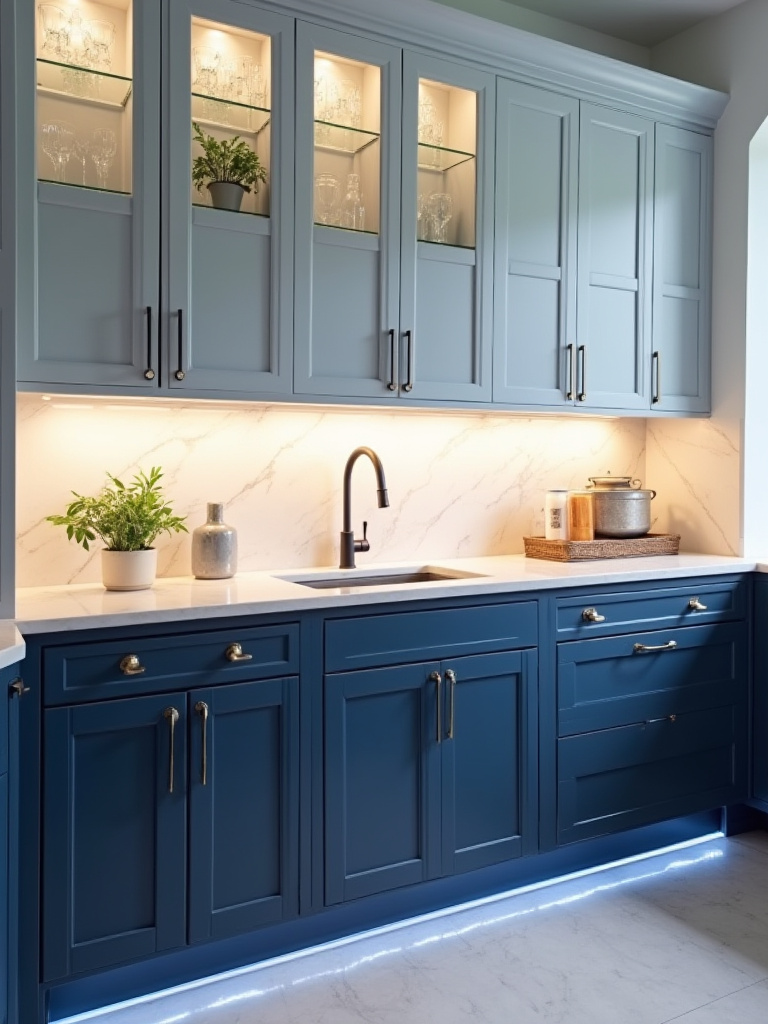
Finally, there is accent lighting. This is the subtle light inside a glass-fronted cabinet or a small spotlight directed at a piece of art. This is the layer that creates depth and shadow. In the Japanese aesthetic, we celebrate shadow—in’ei raisan. The interplay of light and dark is what gives a space its soul. A well-lit kitchen is not one that is uniformly bright, but one where light and shadow are in beautiful balance.
A warm temperature light (around 2700K-3000K) is almost always the answer in a kitchen. It balances the coolness of blue and creates an inviting, welcoming atmosphere. Cool, blue-toned light will make your kitchen feel like a laboratory. Warmth is what makes a house a home.
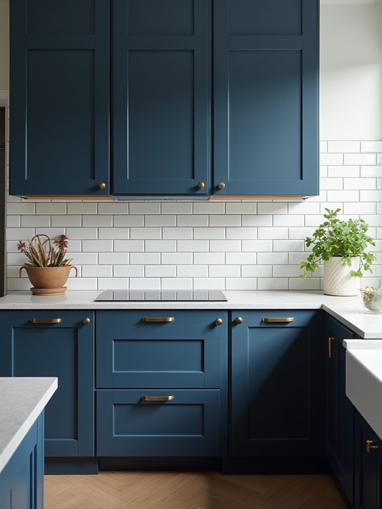
13. Select Backsplash Designs that Harmonize with Blue Cabinet Colors
The backsplash is the backdrop. It should support your blue cabinets, not compete with them. For a bold navy or teal cabinet, a simple, quiet backsplash is often the most elegant choice. A handmade white tile, with its subtle imperfections and gentle sheen, provides a perfect, textural counterpoint without creating visual noise.
If you desire pattern, choose one that is subtle and rhythmic, like a classic herringbone in a single, neutral color. The pattern provides interest, but the monochrome palette keeps it calm. Alternatively, extend your countertop material up the wall for a seamless, monolithic look that is both dramatic and profoundly simple. This creates a powerful sense of unity.
The mistake I see most often is people falling in love with a bold, colorful backsplash tile and a bold blue cabinet. It is too much. You are creating a space for peace and contemplation, not a carnival. Allow for moments of quiet in your design. A simple backsplash provides that essential visual pause.
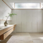
14. Incorporate open shelving to Break Up Solid Blue Cabinet Runs
A solid wall of blue cabinets, especially in a dark shade, can feel heavy and monolithic. Open shelving is the breath. It introduces air and light into the composition, breaking up the mass of color and providing a place for beauty and personal expression. This is another form of ma, the purposeful void.
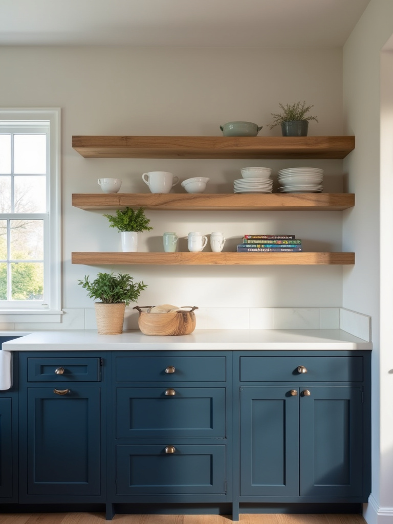
The shelf itself should be a beautiful object—a thick piece of reclaimed wood, a slim plane of blackened steel. Then, curate what you place upon it with intention. A few favorite ceramic bowls, a small plant, a stack of handmade plates. This is not for storing your mismatched mugs. This is for objects that have meaning.
Think of your open shelves as a living composition, one that changes with the seasons or your mood. It prevents the kitchen from feeling static and institutional. It brings a touch of life and imperfection to the structured order of the cabinetry, creating a beautiful balance.
Elevating and Maintaining Your Blue Cabinet Kitchen
Creating a beautiful space is only the beginning. The final layers of paint and decor, and the daily rituals of care, are what sustain its spirit over time. This last phase is about finishing the composition with subtle, supporting elements and embracing the practice of maintenance as a form of respect for your home.
15. Utilize Wall Paint Colors that Flatter Your Chosen Blue Cabinets
The walls are the container for your kitchen. Their color should create a soft, harmonious envelope that allows the blue cabinets to be the focal point. A crisp, gallery-white will make a deep navy pop, creating a bold, graphic contrast. A soft, warm gray or a muted off-white will create a gentler, more integrated look.
Hold your paint chips for the wall directly next to your cabinet door sample. Do their undertones speak to each other? A creamy white with yellow undertones will feel dissonant next to a cool, gray-blue cabinet. You are searching for a quiet harmony, a color that feels like a natural extension of the palette, not a new idea.
The simplest shortcut? Take the lightest possible shade from your chosen stone countertop—a faint gray, a soft cream—and use that for your walls. This guarantees a cohesive, sophisticated result because the palette is already inherent in your core materials. It is a simple path to a professional, unified look.
16. Introduce Natural Wood Elements to Add Warmth and Contrast
Wood brings nature, shizen, into the home. It is the perfect element to balance the refined color of your painted cabinets. Its organic texture, unique grain, and inherent warmth provide a necessary contrast to the smooth, uniform finish of the blue. A kitchen without any natural elements can feel cold and lifeless.
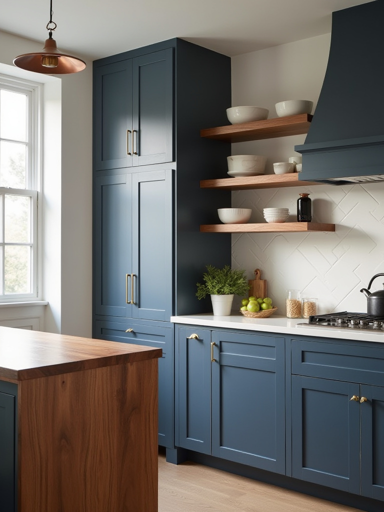
Introduce wood in thoughtful ways. The warm glow of a white oak floor. A few thick cutting boards leaning against the backsplash. The simple, elegant form of wooden stools at the island. These elements ground the space and connect it back to the natural world.
The tone of the wood should complement the blue. A light, neutral wood like maple or white oak is a versatile choice that works with most blues. A darker, richer wood like walnut creates a more dramatic, luxurious pairing with a deep navy. Avoid woods with strong red or orange undertones, as they can often clash.
17. Accessorize with Decor that Complements Blue Kitchen Cabinetry
Accessorizing is not about filling empty space. It is about placing objects of meaning and purpose. Each item on your counter or shelf should be either useful or beautiful, and preferably both. This is the essence of minimalist philosophy—not having less, but ensuring that everything you have is worthy of its place.
Choose a few key elements to complete your story. A ceramic vase holding a single branch. A beautiful cast-iron pot sitting on the stove. A worn linen towel hanging from a handle. These are not clutter; they are quiet statements that add a layer of personality and soul to the room.
Think in terms of texture. A rough, unglazed ceramic bowl, a smooth wooden board, a soft linen textile. The interplay of these textures creates a rich, sensory experience. It transforms the kitchen from a purely visual space to one that engages all the senses.
18. Implement a Routine Cleaning Schedule to Preserve Blue Cabinet Finish
Caring for your kitchen is a practice, a moving meditation. A routine cleaning schedule is not a chore, but a way of showing respect for the materials and craftsmanship that surround you. A gentle wipe-down with a soft, damp cloth is all that is needed for daily care.
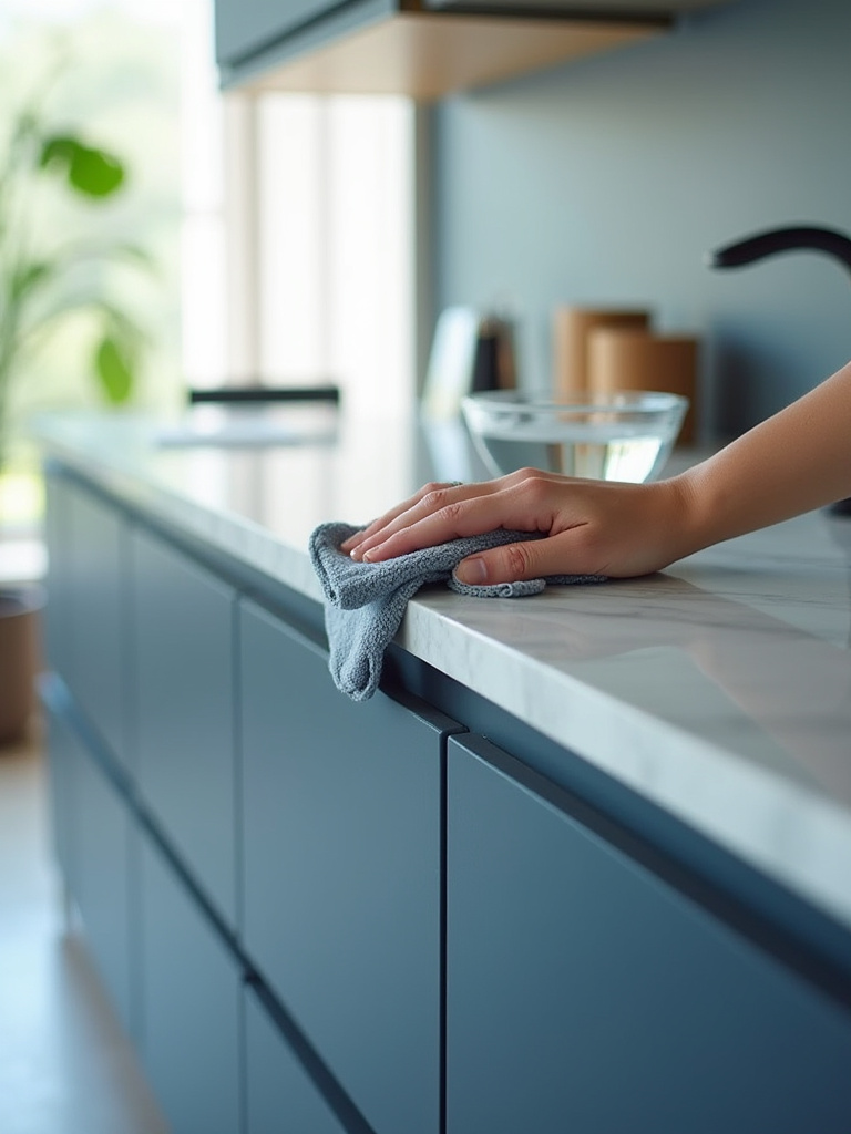
For a deeper clean, a simple solution of warm water and a drop of mild dish soap is best. Harsh chemicals and abrasive sponges are the enemies of a fine finish; they will dull the color and wear away its integrity over time. After cleaning, always dry the surface completely with a soft, clean cloth. This prevents water spots and protects the wood beneath.
This simple, consistent act of care will preserve the beauty of your blue cabinets for years. It is a small ritual that maintains the harmony of your space and reinforces your connection to the heart of your home.
Conclusion
In the end, bringing blue cabinets into your home is not about following a trend. It is an invitation. It is an invitation to create a space of calm, of focus, of serene beauty. The path we have walked through these principles—from the grand vision of light and form to the quiet detail of a wooden bowl—is about composing that space with intention. The goal is a kitchen that not only functions perfectly but also nourishes the spirit.
Let this be your guide not to copy a look, but to discover the harmony that belongs in your own home. Blue is a color of depth and contemplation. Choose your shade, balance it with warmth and texture, and create a kitchen that is more than just a room. Create a sanctuary. The quiet beauty you are seeking is already there, waiting to be composed.