Introduction: Shattering the ‘Resale Beige’ Myth
The “resale beige” phenomenon wasn’t a natural design evolution. Actually, it originated from the 1970s industrialization of home staging. As a result, the kitchen became a provisional waiting room designed for a hypothetical future buyer. However, modern market data suggests this “safe” choice creates a financial paradox. Today’s discerning homeowners are rediscovering that thoughtful kitchen color design offers more than aesthetics. It provides a significant emotional return on investment, transforming the home into a bespoke, investment-grade sanctuary.
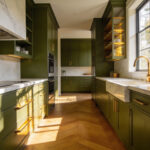
Surprisingly, Zillow’s 2025 analysis indicates that distinctive colors like olive green significantly boost buyer interest. Specifically, these nature-inspired hues can increase sale prices by roughly $2,000. In contrast, “cookie-cutter” white layouts now signal builder-grade shortcuts rather than bespoke luxury. If you are seeking inspiration for these high-end palettes, explore these 24 kitchen color ideas that celebrate craftsmanship.
This shift prioritizes “Emotional ROI” over simply blending in. We call this the “Dopamine Decor” effect. For instance, blue environments make cooks 31% more likely to experiment with new recipes. Conversely, sterile white spaces often increase anxiety by highlighting every speck of dust. Therefore, bold, intentional design represents a smart move rather than a market risk. Instead, it transforms a functional box into a bespoke sanctuary that offers financial returns and daily joy.
Phase 1: The Psychology of Appetite and Gathering
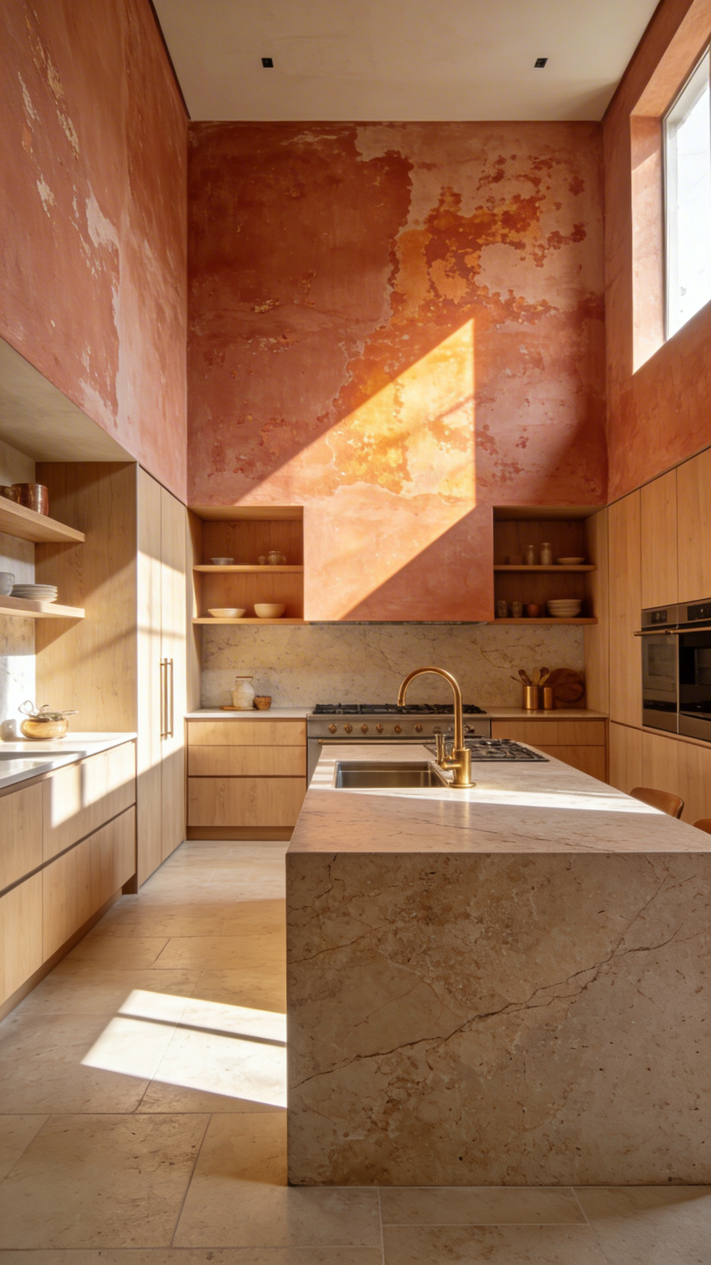
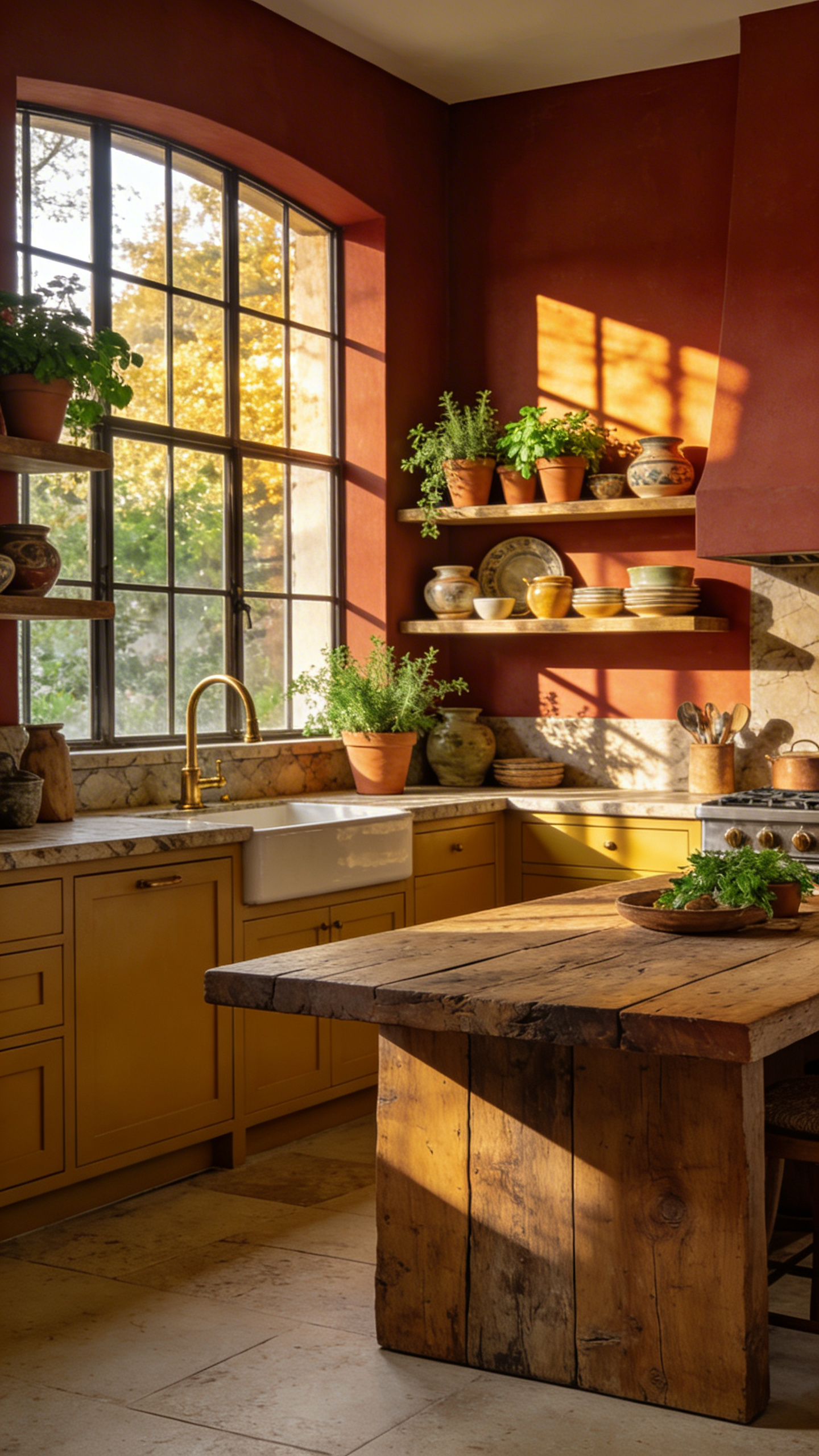
Kitchen color design acts as a complex biological and sensory “primer.” Fundamentally, this influence is rooted in evolutionary survival. For millennia, fire signaled warmth, protection, and cooked food. Therefore, humans instinctively gather in spaces featuring warm hues. Specifically, tones like terracotta, ochre, and deep sienna mimic a hearth’s spectral output. As a result, these colors lower cortisol levels and signal a communal “safe zone.”
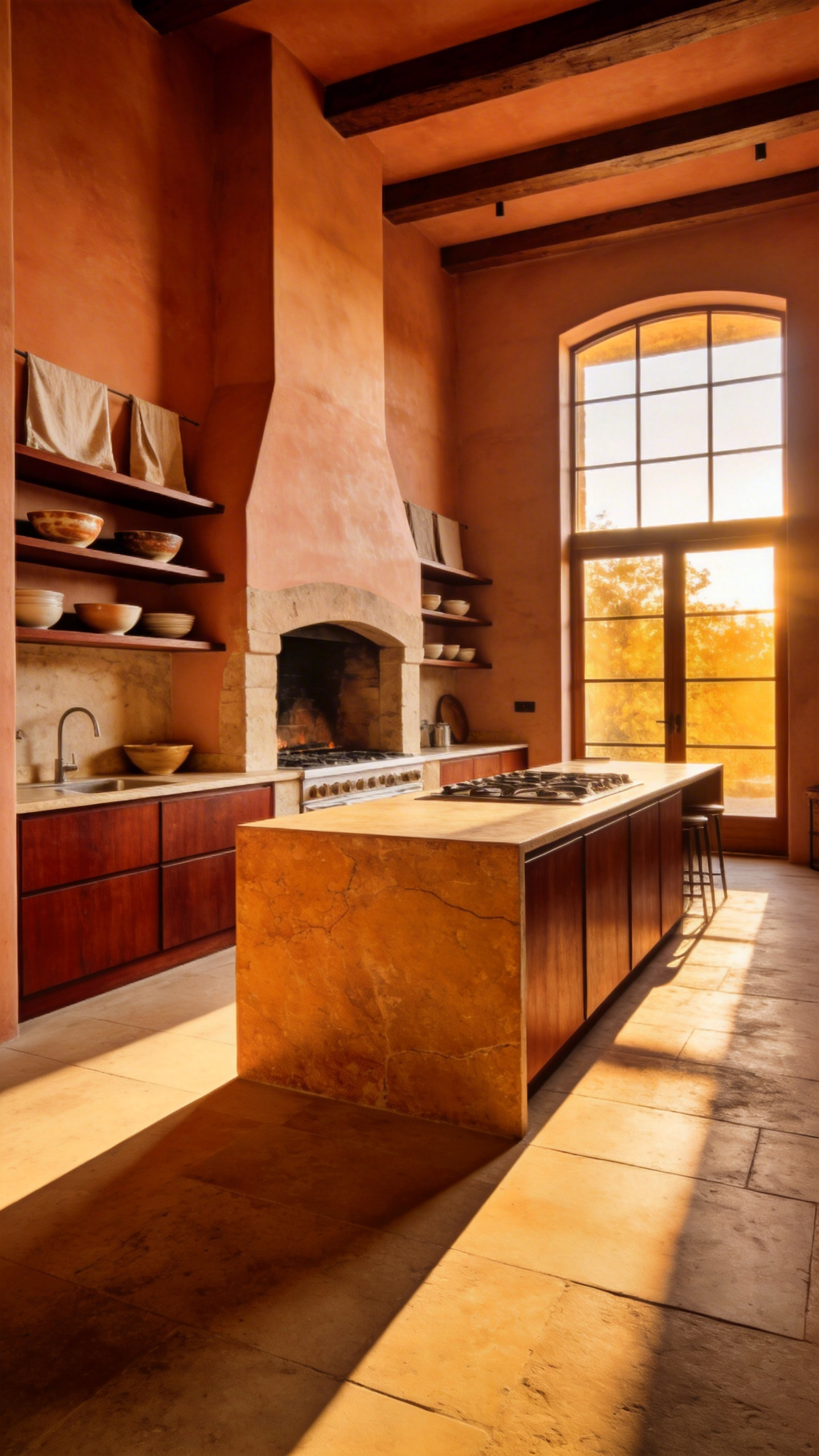
Additionally, our brains associate warmth with biological ripeness. In nature, red and orange indicated sweet, high-energy fruits. Consequently, these shades trigger immediate digestive readiness. In the field of neurogastronomy, color serves as the meal’s first ingredient. Indeed, seeing soft red accents can make food appear sweeter and richer.
Color also heavily influences social chemistry. Research links yellow hues to the production of serotonin. Thus, sunny tones act as a “social lubricant” to encourage talkativeness. In contrast, dark, desaturated tones foster longer, more formal stays.
Finally, vision biases our sense of smell through crossmodal synergy. A warm-toned room enhances the perceived “hominess” of scents like baking bread. Conversely, blue acts as a distinct outlier. Because blue is rare in natural food sources, it functions as an appetite suppressant. Therefore, designers reserve cool palettes for tranquil reflection rather than high-energy feasting. Ultimately, the palette dictates the hunger.
1. The Biological Response to Warmth: analyzing why ochres, terracottas, and deep reds stimulate appetite and conversation compared to sterile clinical whites.
The impact of color in a kitchen extends far beyond mere aesthetics. In fact, our physical reaction to warmth is a deep-seated neurological reflex. Hues like ochre, terracotta, and deep red act as powerful metabolic signals. Neuro-architecture research reveals that long-wavelength light directly triggers the hypothalamus. Consequently, this stimulation releases orexin, a neuropeptide that actively sparks appetite.
Simultaneously, these colors lower leptin, the hormone responsible for signaling fullness. Therefore, a rich terracotta wall effectively signals the body to prepare for digestion. Historically, this preference is rooted in our survival instincts. For example, our eyes evolved to spot “ripe fruit” colors against green foliage. Additionally, mineral pigments like hematite offer a natural texture that the brain processes easily.
However, sterile white spaces often fail to engage us psychologically. High-gloss white lacks natural “sparse coding,” leading to visual fatigue and elevated cortisol. Instead of relaxation, the brain perceives a stressful “visual vacuum.” Ultimately, warm tones foster social connection alongside hunger. They stimulate the brain’s reward center, releasing dopamine to naturally lower social inhibition.
2. Mood Mapping: How to align color choices with the kitchen’s role as either a high-energy morning hub or a moody evening sanctuary.
Designing a kitchen requires more than picking a favorite paint chip. Fundamentally, you must view the kitchen as a metamorphic space. It shifts personalities between the 7:00 AM rush and the 8:00 PM wind-down. Therefore, successful “Mood Mapping” aligns color choices with your body’s internal clock.
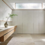
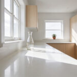
For a high-energy morning hub, prioritize light reflectance. Specifically, high-reflectance whites or cool greys amplify natural morning light. Consequently, this signals the brain to wake up. Furthermore, polished surfaces like marble act as mirrors. They create bright “specular highlights” that increase perceived vitality.
Conversely, an evening sanctuary requires a different approach. As daylight fades, the kitchen should become a place of restoration. Thus, deep, pigmented neutrals like charcoal or ink navy work best here. These colors absorb light rather than bouncing it. In fact, this reduces visual noise, allowing the eye to rest. Additionally, choosing honed or leathered stone finishes diffuses light. This creates a velvet-like glow instead of a harsh glare.
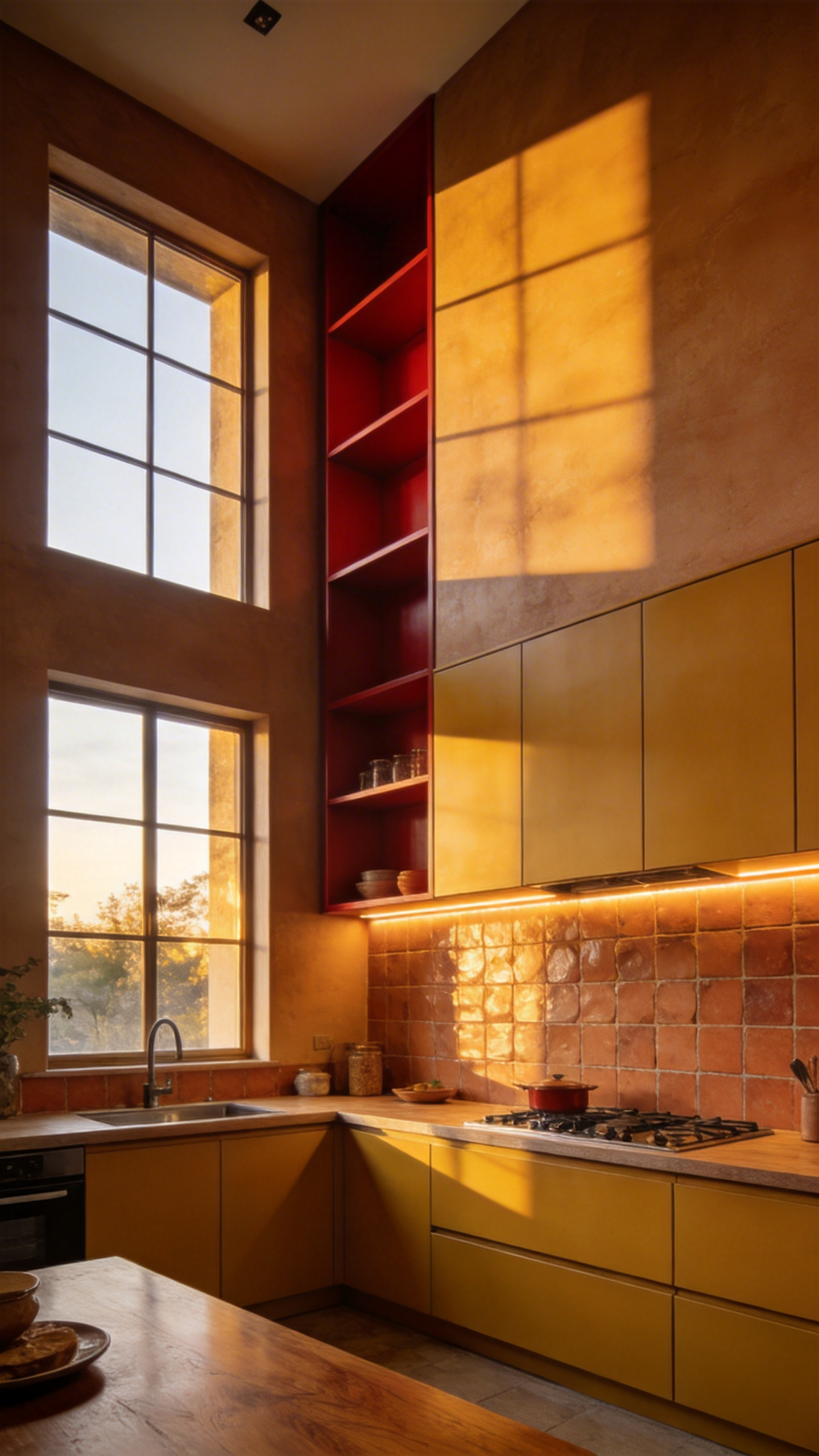
3. The ‘Spice Box’ Philosophy: A proprietary method for selecting colors based on culinary ingredients (Turmeric, Cardamom, Chili) rather than paint chips.
The “Spice Box” philosophy offers a sophisticated alternative to synthetic color systems. It draws inspiration specifically from the *Masala Dabba*, a traditional Indian spice container. Consequently, this method treats the kitchen not as a sterile lab, but as a “vessel of flavor.” Rather than relying on flat paint chips, designers anchor the aesthetic in “culinary-led” hues. These offer biological resonance and incorporate high-end materials.
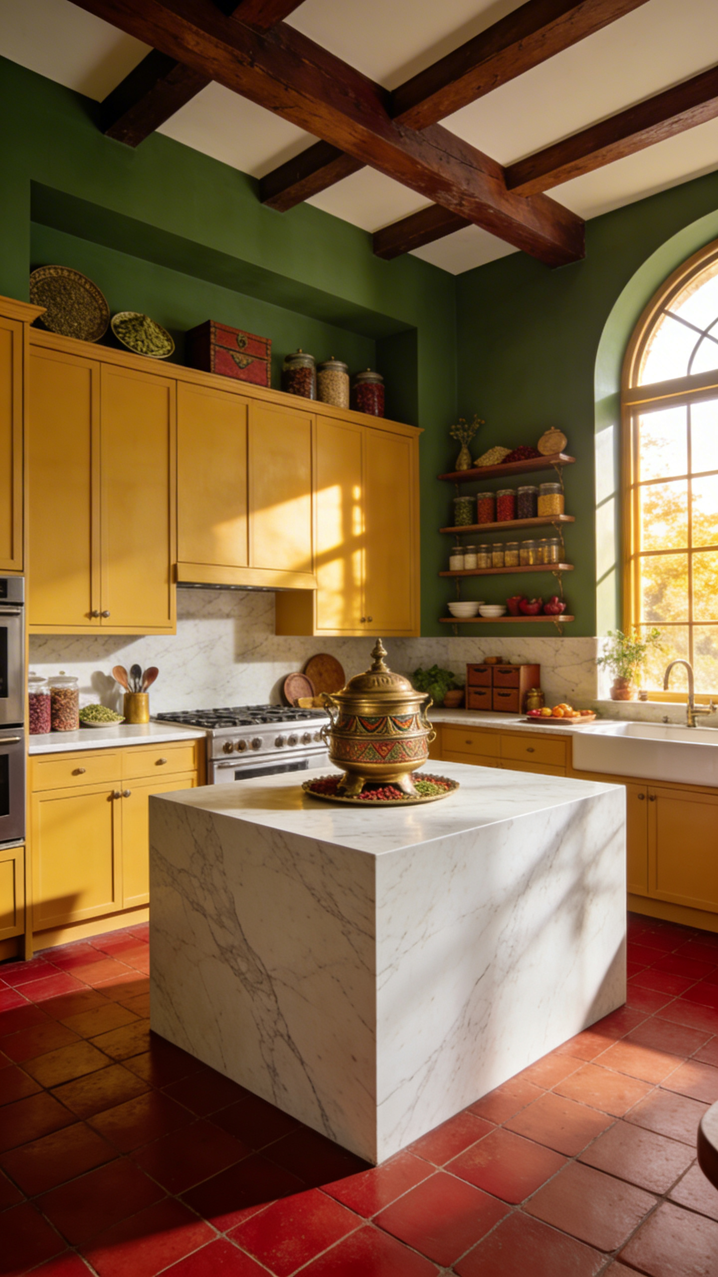
At its core, the palette relies on three “hero” shades. First, Turmeric serves as a grounding foundation. Unlike bright yellow, this deep ochre evokes the “golden hour” of cooking. Next, Cardamom introduces a cooling aromatic element. Sitting between sage and teal, it balances the heat with a fresh, herbal presence. Finally, Chili acts as an energy catalyst. Specifically, this burnt terracotta hue stimulates appetite and social interaction.
Interestingly, color selection involves a literal “Pantry Test.” Designers observe how light interacts with raw ingredients to find paints with organic depth. Therefore, matte finishes are preferred over gloss. They mimic the powdery texture of ground spices, adding a tactile, velvety layer to walls. Ultimately, this approach moves beyond the “Grey Era” of design. Because these tones are rooted in nature, they provide a timeless, metabolic connection to our food.
Phase 2: The Foundation – Materiality and Palette Construction
Transitioning into Phase 2 requires a fundamental shift in perspective. Specifically, you must move from *chromatic thinking* to *material thinking*. In professional practice, a sophisticated palette is rarely built from a simple paint swatch. Instead, it relies on the principle of “Anchor Materiality.” Consequently, the design process begins with a permanent element, such as a dramatic stone slab or a specific wood species.
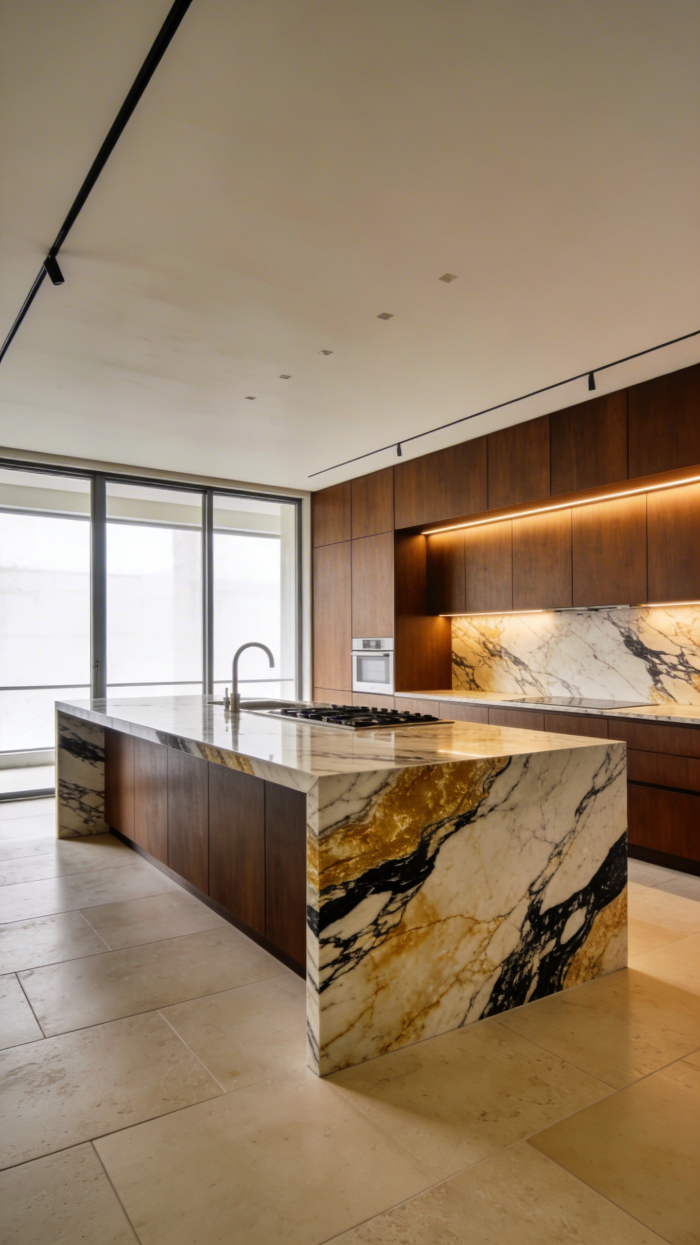
For instance, a slab of *Calacatta Paonazzo* provides an inherent micro-palette of gold, charcoal, and cream veining. Therefore, by extracting these tones, the resulting scheme feels discovered rather than invented. However, color is not a static property; it is an interaction between light and texture.
Technically, this involves navigating optical physics. Polished finishes create specular reflection, making colors appear sharper but often cooler. Conversely, honed or “leathered” finishes diffuse light, significantly softening the visual impact. Thus, mixing these finishes is crucial to avoid a sterile, clinical atmosphere.
Phase 3: Spatial Architecture and Application
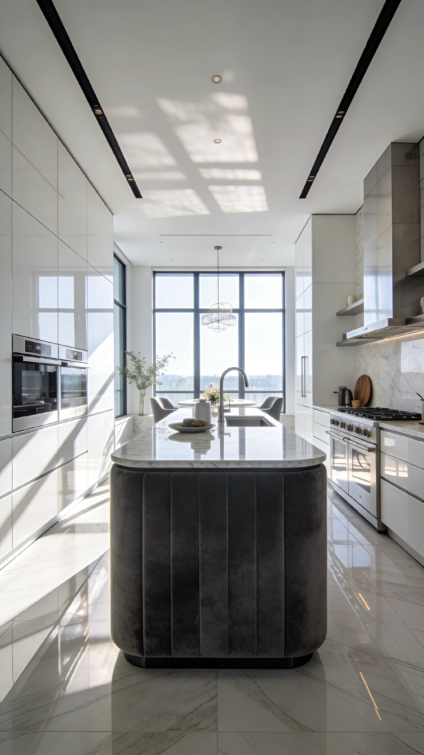
Phase 3 represents a critical pivot in the design process. Here, color transforms from a decorative afterthought into a distinct structural tool. Specifically, this stage moves beyond abstract mood-boarding to precise technical execution. In modern open-plan architecture, light and color often replace physical walls. Designers are increasingly integrating ideas for modern kitchen design to define these zones. For instance, applying a monolithic charcoal hue to an island creates a visual anchor. Thus, color acts as a psychological boundary, signaling the transition from social space to utility.
Furthermore, technical application involves using Light Reflectance Value (LRV) to manipulate spatial perception. To visually “lift” a ceiling, designers often target an LRV of 70–80% for upper cabinetry. Conversely, applying darker tones to a high ceiling creates a “lid” effect. This nuances the volume, making cavernous spaces feel intimate and human-scaled.
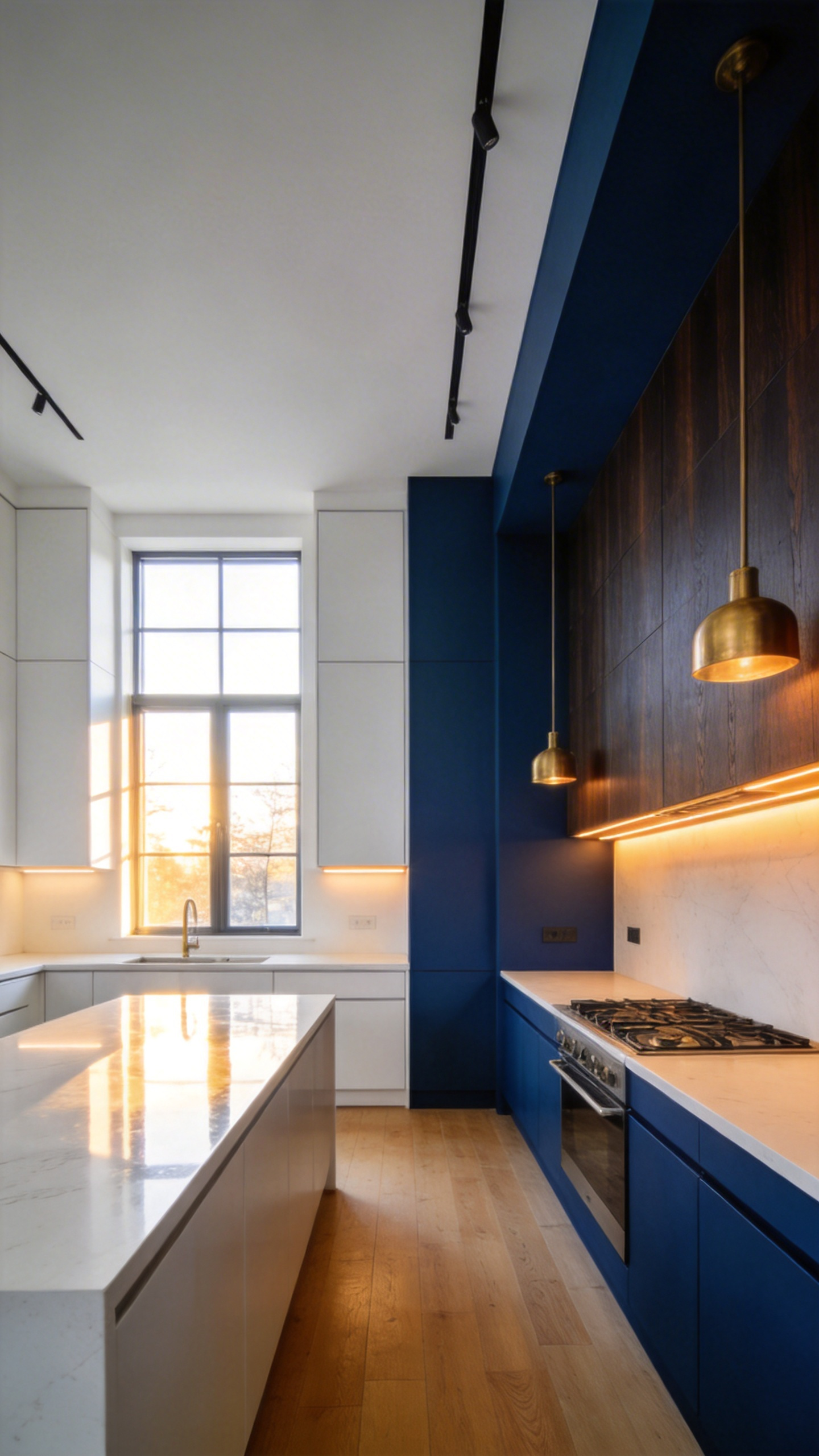
4. Redefining Neutrals: Why deep indigos, forest greens, and aubergines act as more sophisticated ‘new neutrals’ than gray or beige.
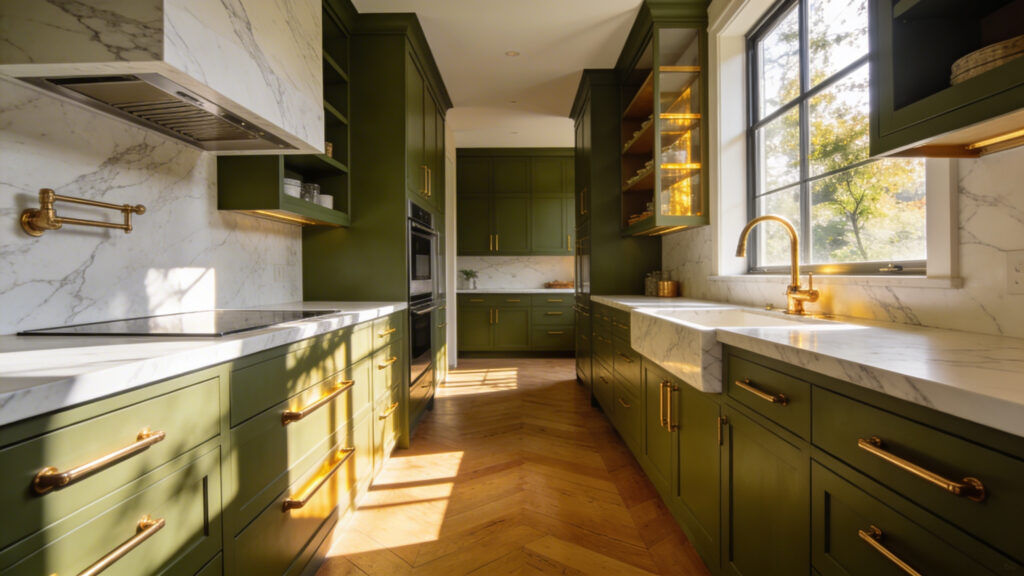
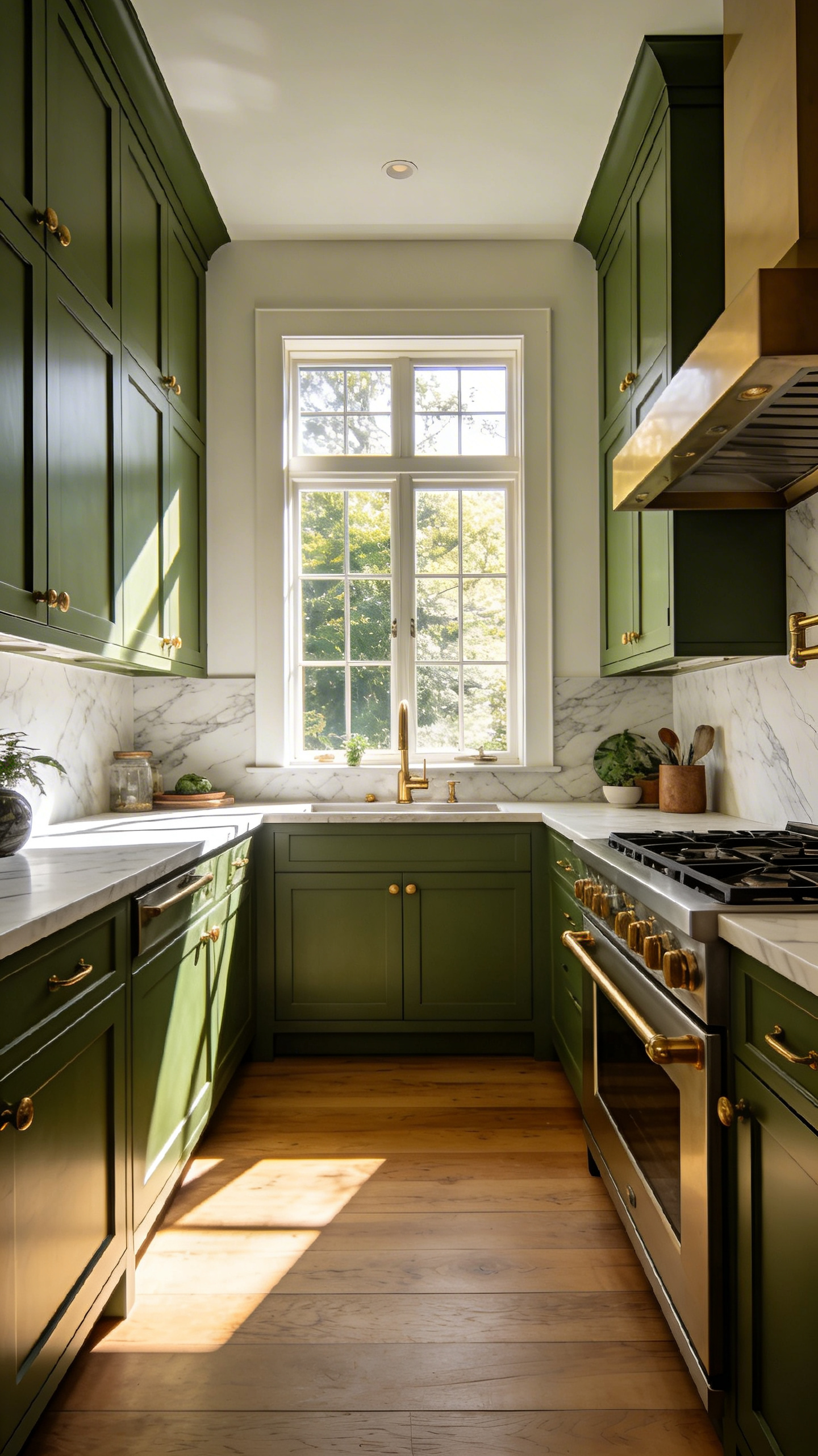
Designers are moving away from the safe invisibility of gray and beige. Instead, they are embracing deep indigos, forest greens, and aubergines as “new neutrals.” These saturated tones act as sophisticated anchors rather than passive backgrounds. Similarly, green kitchen cabinets have evolved from a bold accent into a grounded staple, offering a biophilic bridge between indoor cabinetry and outdoor views.
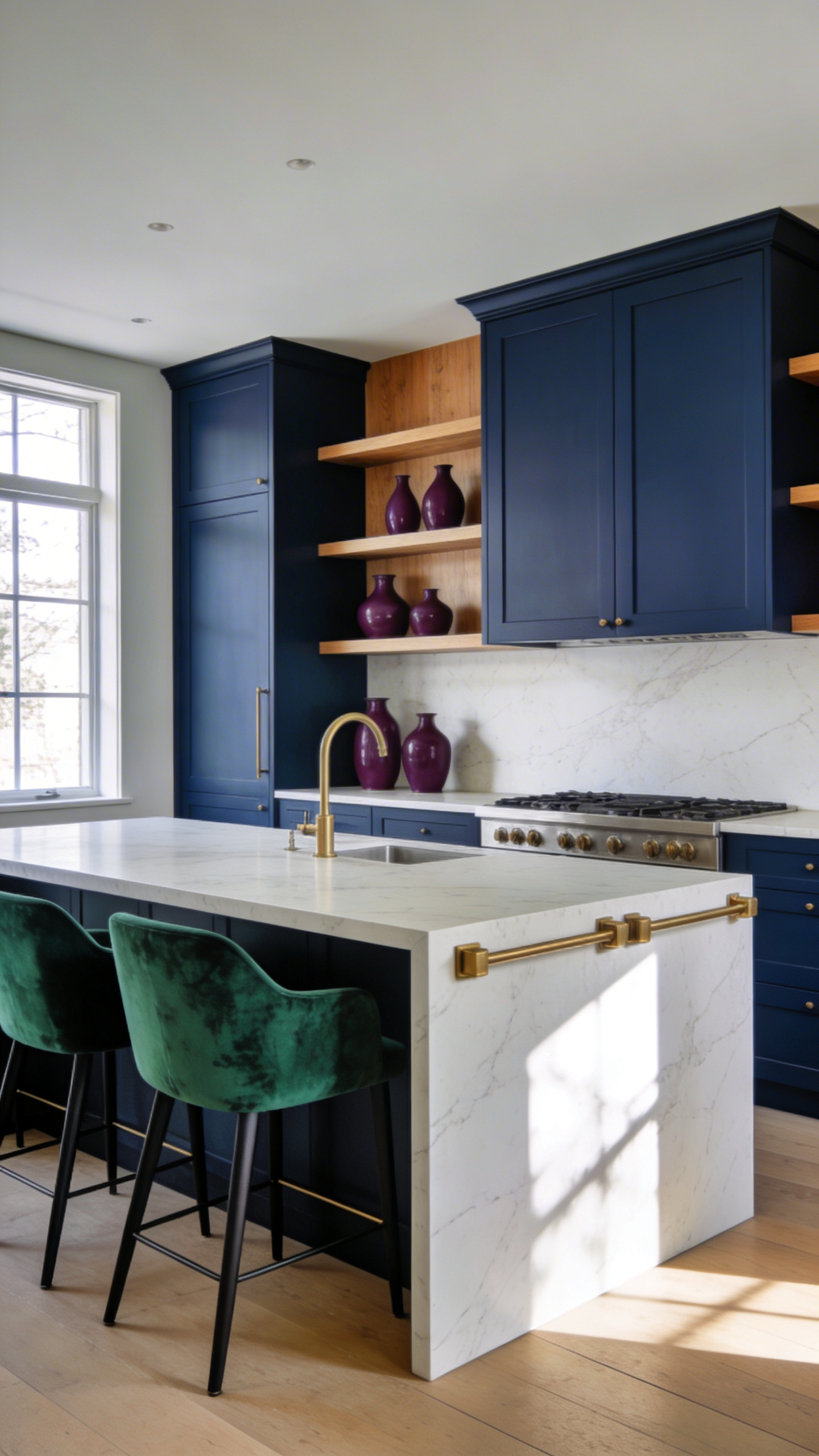
Consider deep indigo as the “denim” of the interior world. Just as dark jeans pair with anything, indigo provides universal balance. Specifically, it possesses purple-violet undertones that prevent it from feeling flat. Furthermore, its low Light Reflectance Value (LRV) creates a visual “infinity” effect. Consequently, cabinet boundaries seem to recede, making the kitchen feel expansive yet grounded.
Ultimately, these shades redefine sophistication through their interaction with light. Unlike white, which reflects glare, dark tones are light-absorbers. Thus, they create a “cocooning” effect that feels intimate. Additionally, matte finishes in these colors diffuse light, effectively hiding fingerprints. Therefore, these deep hues offer depth without the visual noise of traditional kitchens.
5. Texture Over Pigment: Using limewash and tadelakt to add depth and vibration to color, rather than flat latex paint.
The shift away from sterile modern kitchens requires rethinking our wall surfaces. Specifically, standard latex paint creates a static, plastic film. However, lime-based finishes like limewash offer a superior, vibrant alternative featuring artisanal finishes. Unlike petroleum-based paints, limewash contains calcium hydroxide crystals. Consequently, these microscopic structures refract light in multiple directions. This phenomenon, known as mottling, creates a “glow from within.” Therefore, color appears to vibrate rather than sitting flatly on the drywall.
For splash zones, Tadelakt provides a functional marvel. Originating from Moroccan artisans, this technique creates a waterproof seal without synthetic chemicals. Uniquely, olive soap reacts with the lime plaster to form calcium oleate. Thus, the surface becomes water-repellent and “stone-silk” to the touch.
Beyond aesthetics, these “living” surfaces improve indoor health. Because of their high alkalinity, lime finishes are naturally antibacterial and mold-resistant. Additionally, they are highly vapor-permeable. As a result, the walls “breathe” moisture in and out. This regulates humidity better than trapped latex films. Finally, we must appreciate the aging process. While chipped paint looks broken, lime finishes develop a rich patina. Ideally, you can embrace this honest aging as part of the home’s evolving story.
Phase 4: Lifestyle Integration and Details
Phase 4 transforms a color palette from a visual mood into a functional reality. Specifically, this stage demands that surfaces respond to the friction of daily life. Consequently, experts categorize integration through “Gloss Units,” a measurement dictating performance. For active families, matte finishes around 10 to 30 Gloss Units are often ideal. They diffuse light effectively, hiding fingerprints and micro-scratches.
Furthermore, color is a temporal experience. Designers must consider the room’s circadian rhythm. For morning-focused homes, cool whites maximize blue-spectrum light to stimulate alertness. However, evening hubs require careful testing for metamerism. A sage green might look fresh at breakfast but muddy under warm LEDs. Many homeowners find that maintaining the timeless appeal of a classic white kitchen provides a predictable baseline while they experiment with these lighting temperatures.
Finally, hardware acts as the design’s anchor. Brushed brass offers a “workhorse” solution, concealing water spots effortlessly. Alternatively, unlacquered metals embrace a “living finish” akin to heritage styles. This develops a rich patina over time, adding authentic character. Ultimately, successful integration balances aesthetic beauty with practical endurance.
Frequently Asked Questions
how does kitchen color design affect home resale value?
Modern luxury buyers increasingly value personality over “resale beige.” Saturated, nature-inspired tones like olive green and deep indigo can actually increase buyer interest. In fact, they command a premium by signaling bespoke quality rather than builder-grade shortcuts.
What are the “new neutrals” in luxury kitchen design?
The new neutrals include deep, complex tones like forest green, charcoal, and ink navy. These colors provide the same grounding versatility as gray or beige. However, they offer more architectural depth and better conceal wear in high-traffic kitchens.
How do I choose between matte and high-gloss finishes for my kitchen?
Matte finishes are ideal for hiding fingerprints and creating a soft, velvety glow that works well with natural lighting. High-gloss finishes, such as lacquer, are best for small, dark spaces like pantries. They reflect light, effectively adding a “jewel box” sense of luxury.
Conclusion: From Laboratory to Hearth
Transforming a kitchen begins by recognizing its sterile past. Historically, the 1920s “Frankfurt Kitchen” operated like a strict laboratory, prioritizing efficiency over human connection. However, we are currently witnessing a profound shift toward the “hearth.” This approach views the kitchen as a soulful, social anchor. Specifically, this transformation relies on replacing cold surfaces with “living colors.” Deep terracottas and ochres replace clinical whites to foster warmth.
Furthermore, texture plays a critical role in this narrative. Materials like teak wood or natural stone offer a “tactile hue” that develops a patina over time. Instead of following trends, homeowners now curate “migration colors” to tell stories. Ultimately, a masterful kitchen color design becomes a vibrant canvas for life. It ensures the space reflects the homeowner’s unique journey and daily joy.