If you are searching for high-end living rooms decorating ideas, remember that true luxury is not about visual perfection; it is about comfort and narrative. During my tenure at a storied design house in Mayfair, we once showcased a chaise longue of breathtaking architectural beauty. It was sleek, Italian, and undeniably photogenic. It was also, regrettably, a spinal disaster. I recall watching a distinguished client attempt to settle in with the financial section, only to slide off the silk upholstery like a garnish off a gelatin mold. That moment crystallized a vital lesson: a room that looks splendid but rejects the human form is not a sanctuary; it is merely a museum exhibit.
This brings us to the “Sunday Paper Test.” True luxury demands more than visual symmetry; it requires Intimate Authority. If your living room cannot support a chaotic spread of broadsheets, a pot of tea, and two hours of uninhibited slumping, it has failed its primary directive. We must move past the harsh interrogation of overhead lighting and the brittle perfection of the showroom. Instead, we must embrace the tactile reality of life, where durable fabrics meet soft, layered light, and furniture is designed for bodies, not just eyes.
In this guide, we shall dismantle the notion that sophistication requires suffering. We will explore how to prioritize genuine comfort without sacrificing wit, select authentic materials that age with dignity, and mix historical eras to create a narrative that feels inherited rather than purchased. Prepare to reclaim your space from the glossy magazines. Let us design for the glorious, messy reality of a Sunday morning.
Phase 1: The Envelope – Setting the Atmospheric Tone
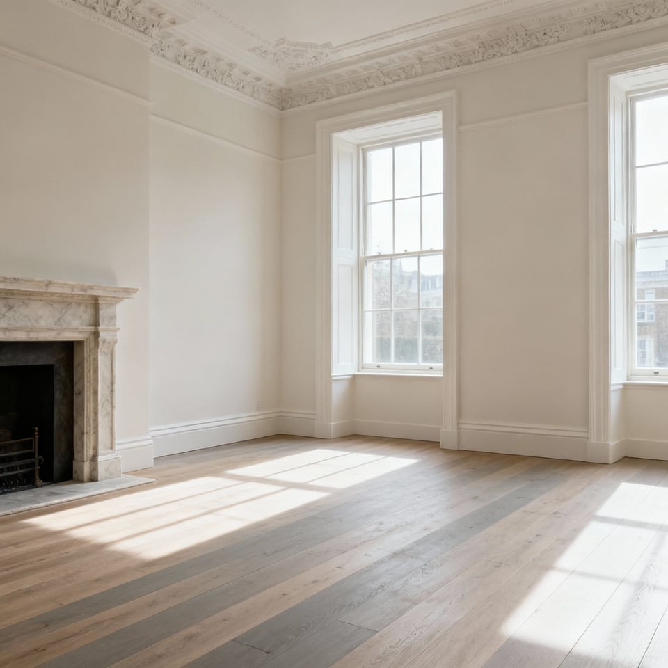
Before dragging in the velvet chaise, one must respect the “Envelope.” This architectural shell—your walls, ceiling, and floors—dictates the room’s entire temperament, much like the bone structure of a portrait subject. During my years restoring Georgian townhouses in London, I learned that the most successful rooms begin with a foundational neutral palette. Treat your walls as a quiet refuge by utilizing whites, greys, or beiges. This restraint creates a forgiving canvas, allowing subsequent furniture choices to experiment with texture without creating visual chaos.
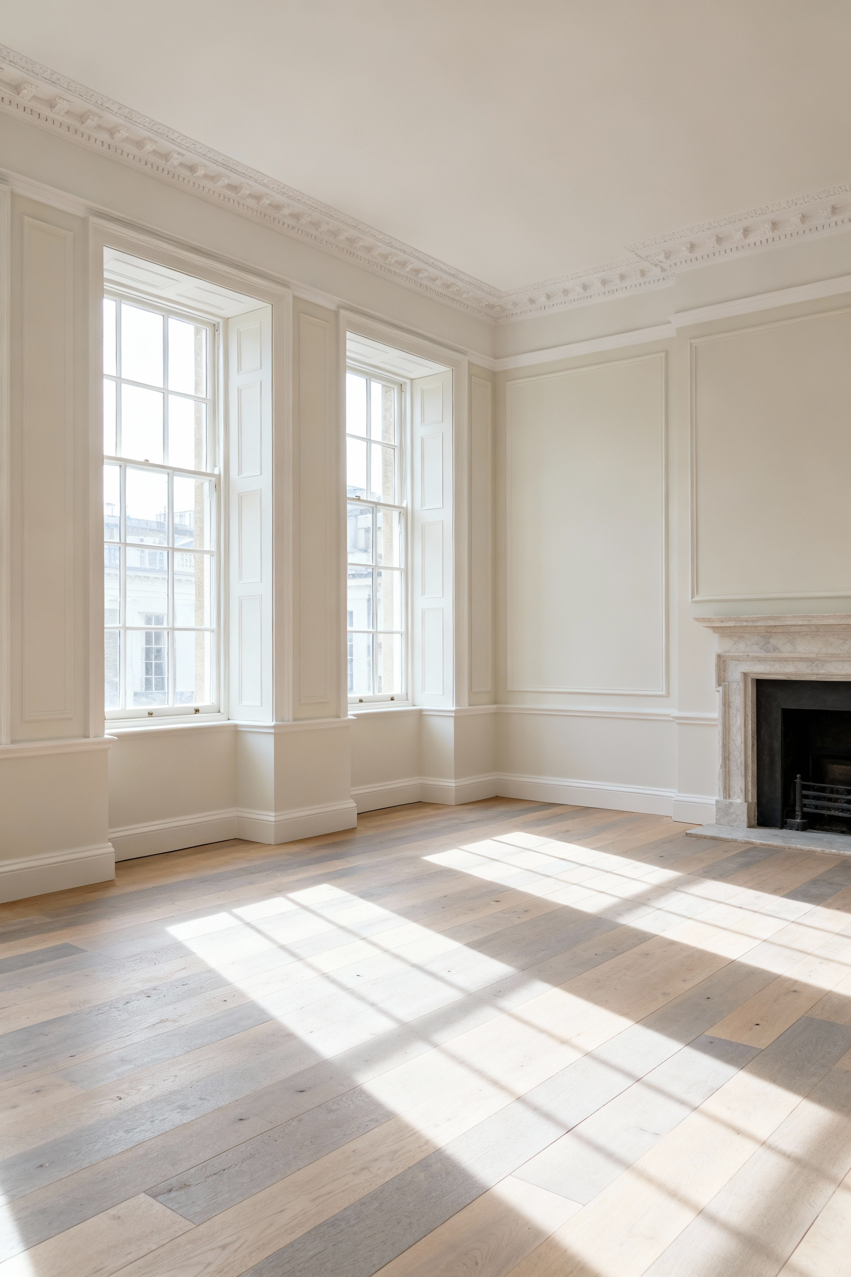
Consequently, do not neglect the heavy lifting performed by structural elements. Consider these fixed features as the directors of your atmospheric play:
- The Fifth Wall: Treat flooring as a decisive mood setter; light woods invite an airy, bohemian spirit, while dark finishes demand dramatic, industrial respect.
- Light Control: Maximize glare-free daylight to suffuse the space with warmth, using sheer drapery to frame the view rather than block it.
- Architectural DNA: Celebrate existing oddities, such as exposed beams for rustic charm or plaster moldings for vintage-chic elegance.
By accentuating these details, you establish an immediate, sophisticated style before a single cushion is purchased.
1. The ‘Muddy’ Palette: Embracing Heritage Hues with Modern Depth
Banish the clinical chill of ‘gallery white’ and the ubiquitous, soulless grey that has plagued interiors for a decade. True sophistication now resides in the “muddy” spectrum—complex, heritage hues like chalky plum, muted olive, and deep terracotta that possess historical gravitas. During my years with London’s heritage firms, we learned that these storied colors require a specific architectural tension to feel contemporary rather than curatorial; you must treat the paint as an anchor, not a time capsule.
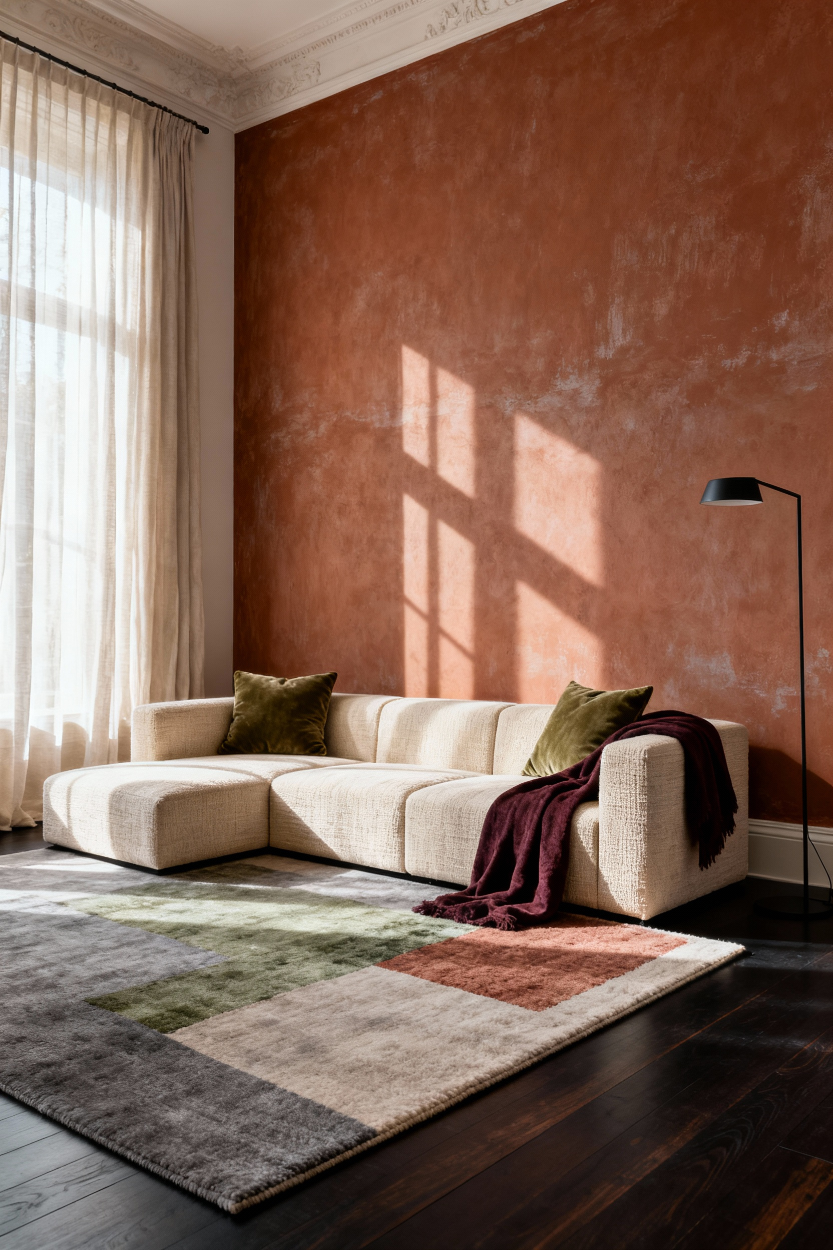
To successfully navigate this aesthetic without turning your sitting room into a dusty museum, rely on deliberate contrast.
- Juxtapose eras: Place a sleek, glass coffee table or a razor-sharp modern sofa against a Georgian-inspired brown wall to prevent the look from feeling dated.
- Layer aggressively: Prevent flatness by combining tactile riches like velvet, rustic wood, and natural rattan, which catch the light differently than flat paint.
- Sharpen the edges: Slice through the murk with crisp off-white trim or a “no-regrets” shock of ochre yellow.
This approach ensures the space feels lived-in yet razor-sharp, proving that a bit of mud is, quite frankly, magnificent.
2. The Fifth Wall: Why Your Ceiling Deserves More Than Flat White
To treat the ceiling as an afterthought is a pedestrian mistake. In my years restoring London’s heritage properties, I rarely encountered a ceiling left unadorned; the Georgians understood that looking up should inspire awe, not boredom. Therefore, banish “Builder’s White” and embrace color drenching. Paint your ceiling the exact shade as your walls to eliminate jarring visual breaks. This simple technique creates a cohesive, cocooning atmosphere that feels delightfully intentional.
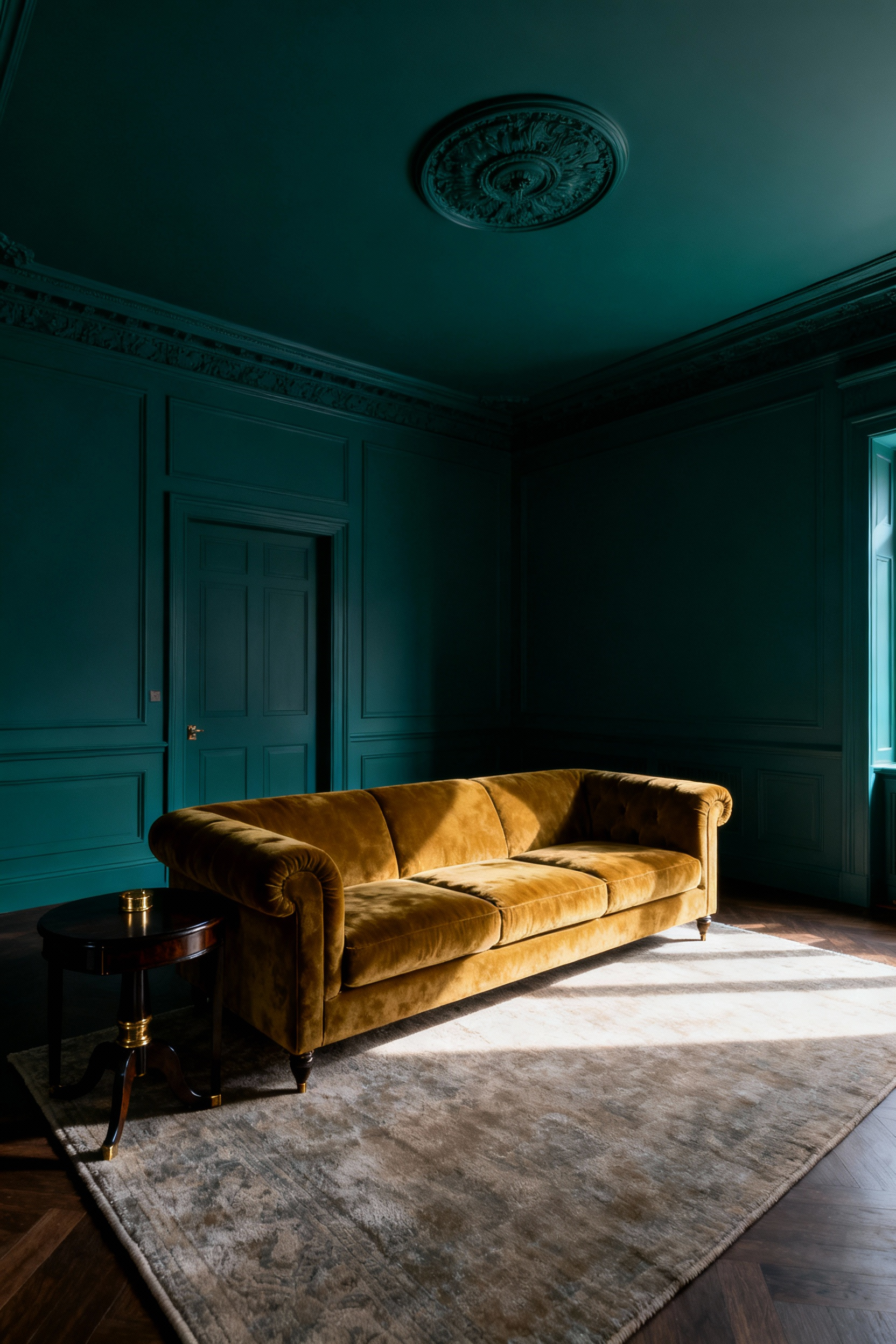
If paint feels too simple, elevate the space through texture and strategic illumination. A flat ceiling offers a blank canvas for drama, so consider these architectural upgrades:
- Integrate hidden lighting: Install LED strips in coves or recesses to cast a soft, ambient glow that highlights dimensions without the glare of a central fixture.
- Introduce timber: Apply oak slats or faux beams to inject the natural warmth and acoustic benefits of a country manor.
- Wallpaper the expanse: Deploy a bold geometric pattern overhead to create an unexpected artistic focal point.
3. Architectural Trompe l’œil: Adding Character with Applied Moldings
Trompe l’œil serves as the ultimate sophisticated deception. While the 18th-century elite commissioned *grisaille* to mimic carved stone, I frequently deploy this “trick of the eye” in featureless London conversions to manufacture instant history without the exorbitant joinery bills. You need not bankrupt yourself on authentic wainscoting to achieve structure; simply paint the *idea* of it. By manipulating *chiaroscuro*—the interplay of light and shadow—a flat wall suddenly claims the depth and dignity of a Georgian library.
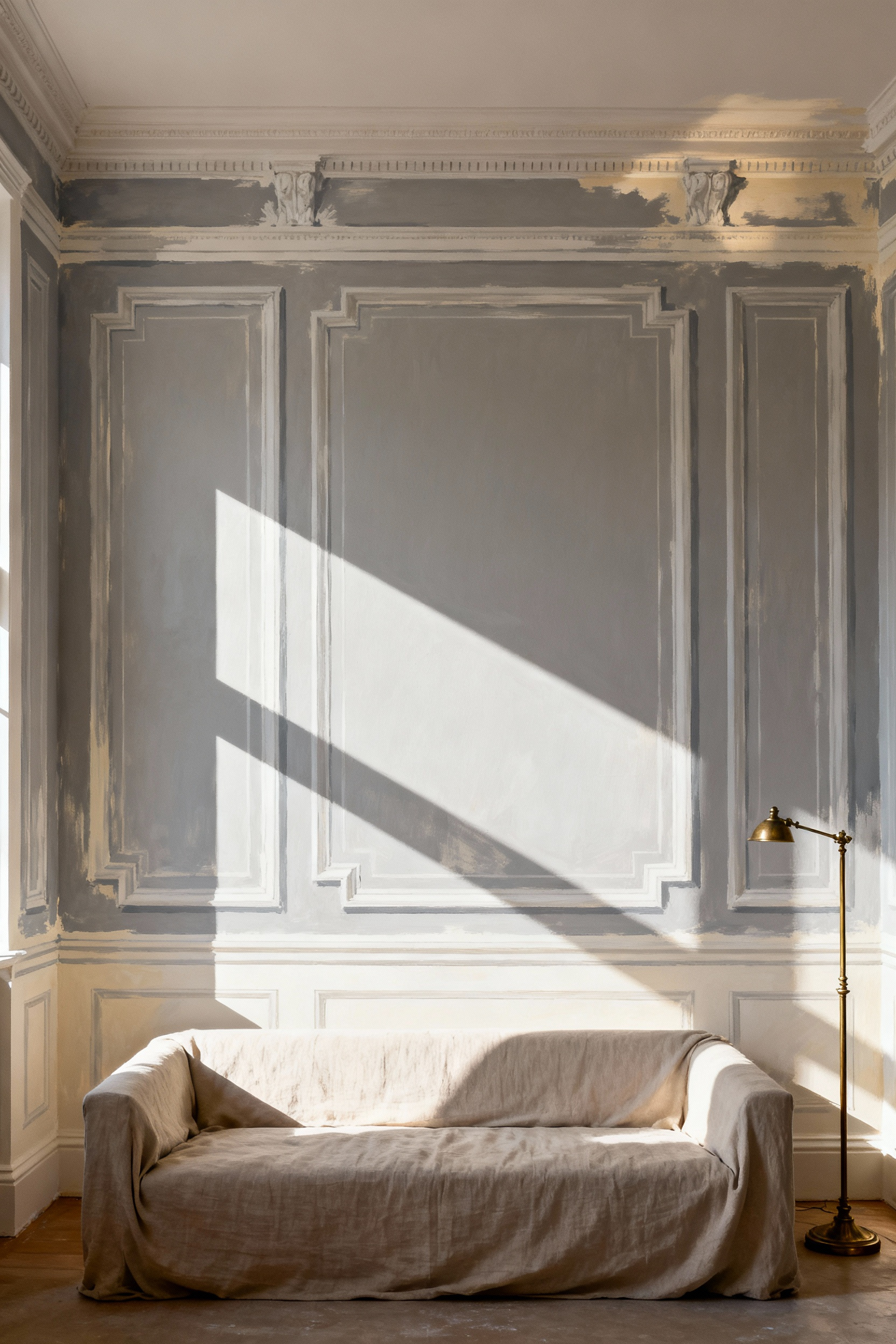
To successfully pull off this visual heist, precise execution is non-negotiable.
- Master the light: Paint highlights and shadows consistent with your room’s actual window position to sell the 3D effect.
- Ensure crisp edges: Seal your painter’s tape with the wall’s base color before applying the “molding” shade to prevent messy bleeding.
- Modernize the palette: Abandon safety and use deep jewel tones to make your faux architectural features a contemporary statement.
4. Wallpaper as Narrative: Using Print in Alcoves and Feature Walls
Treat your walls not merely as partitions, but as theatrical backdrops for your life. To establish an instant narrative, treat a chimney breast or sofa wall as a massive canvas; deploy jumbo botanicals or geometric murals to serve as the room’s visual protagonist. Alternatively, embrace the “jewel box” effect in architectural recesses. By applying a lavish print strictly to the back of an alcove, you introduce maximalist whimsy without overwhelming the senses—a technique I frequently employed to breathe life into the drafty corners of Victorian drawing rooms in Kensington.
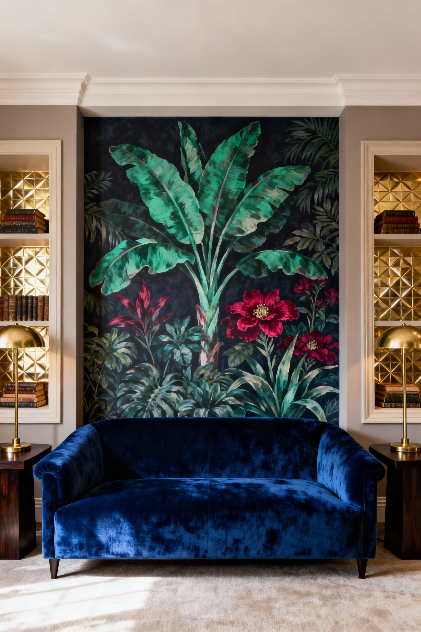
However, a captivating story requires structure to avoid becoming a rambling farce. Anchor your bold paper by pulling a dominant accent color from the print and painting the surrounding trim to match; this intentionality grounds the drama. Furthermore, dictate the “volume” of the print by its specific function:
- For open expanses: Choose commanding, large-scale motifs to seize attention.
- For shelved displays: Opt for subtle textures, such as grasscloth, to prevent visual arguments with your books and curios.
Smart design, much like a successful dinner party, knows exactly when to shout and when to whisper.
Phase 2: Soft Architecture – Textiles and Layering
Textiles provide the masonry of comfort, transforming a stark box into a sanctuary. During my tenure with a heritage firm in Chelsea, we treated fabric selection with the same gravity as structural engineering; a room without layers feels decidedly unfinished. To construct this “soft architecture,” begin with your seating and apply the Three-Layer Formula to banish flatness:
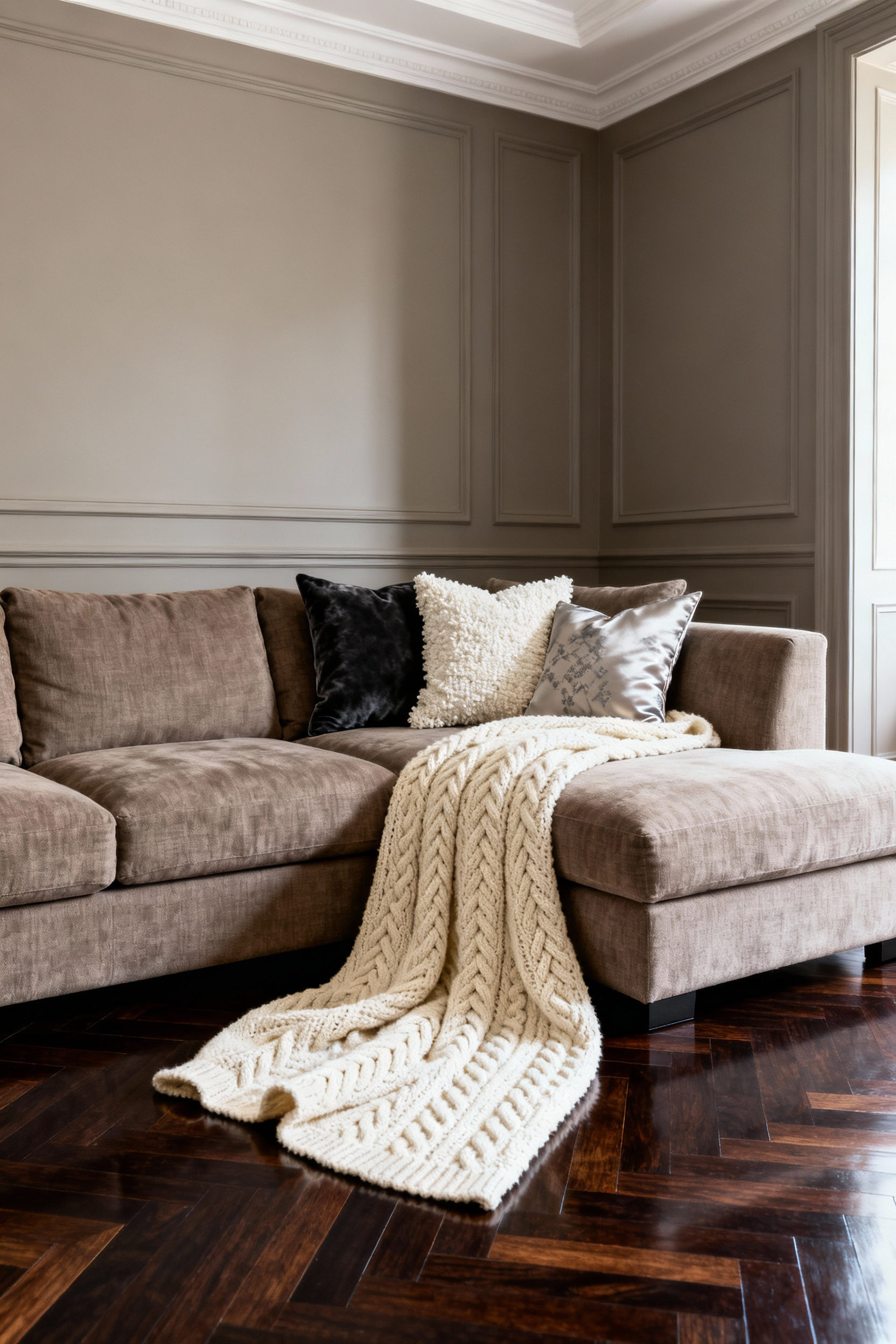
- Base: Start with your foundational sofa upholstery as the canvas.
- Mid-layer: Drape a textural throw, perhaps a chunky knit or woven wool, over an arm to break the visual line.
- Top layer: Finish with pillows of varying shapes, placing large squares behind smaller lumbar cushions.
Extend this dimensional approach to the floor. Anchor the room by placing a smaller, vibrant antique rug atop a large, neutral sisal base. This instantly defines the area’s architecture without requiring a carpenter. Finally, embrace tension by clashing smooth velvet against rough linen, but ensure mixed patterns share a cohesive color palette. This discipline prevents visual chaos, ensuring your drawing room feels curated rather than accidental.
5. The Anti-Match Principle: Breaking Up the Three-Piece Suite
The matching three-piece suite once signaled suburban prosperity; alas, today it merely screams “showroom monotony.” Resist the temptation to purchase the full set. A truly sophisticated British interior feels inherited or collected, never delivered on a single pallet. Break the uniformity by anchoring your space with a primary sofa, but ruthlessly discard its matching siblings in favor of a sculptural accent chair. Contrast is king here. Pair a plush, upholstered Chesterfield with a sleek, modern leather armchair to inject necessary tension. This creates a narrative, suggesting you acquired your treasures over a lifetime rather than a frantic afternoon online.
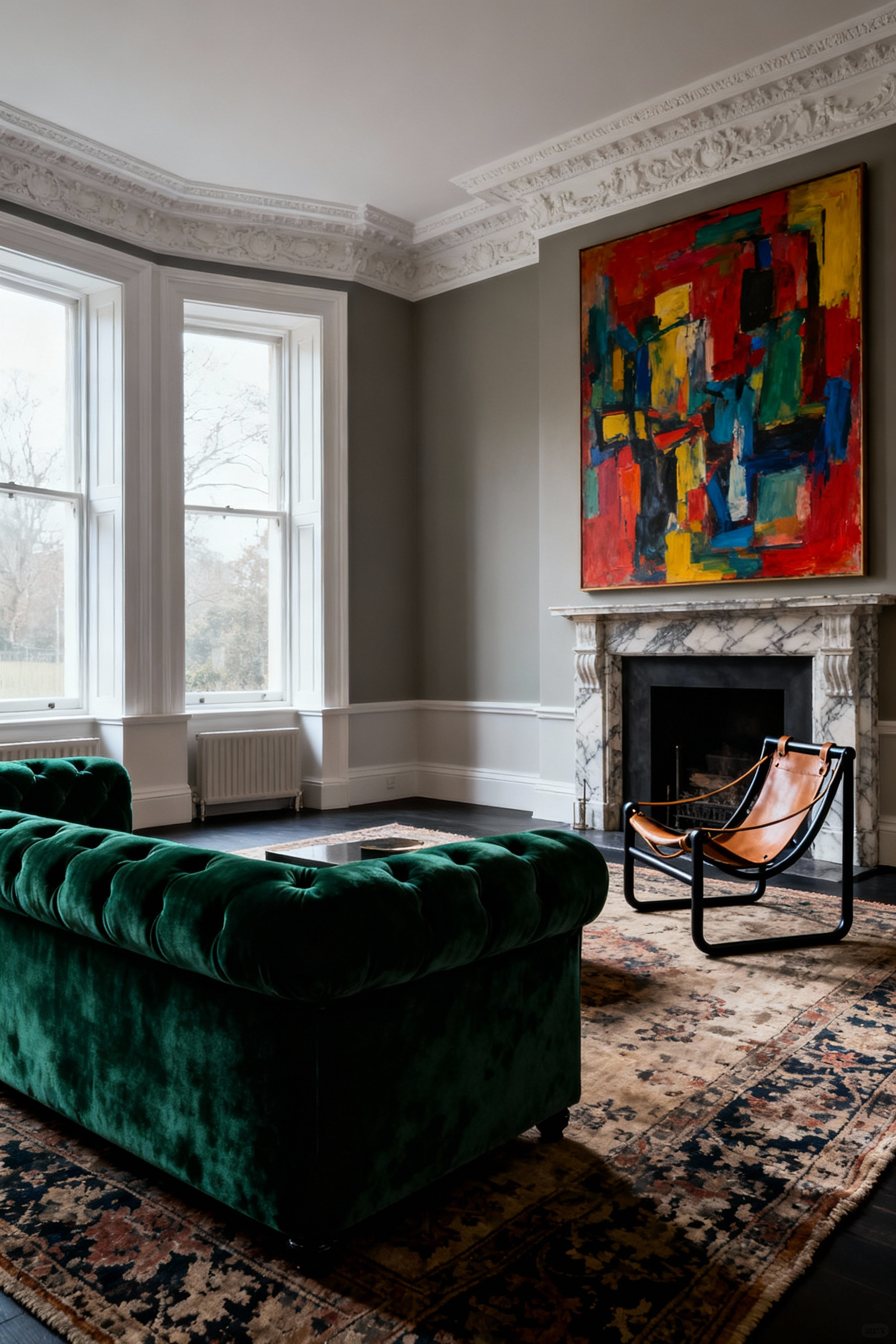
However, eclecticism requires a steady hand to avoid looking like a flea market explosion. During my tenure at a Chelsea design house, we relied on a “Red Thread” to bind disparate styles together. Use these tactics to maintain cohesion while ignoring the catalogue:
- Vary the silhouettes: Pair a “leggy” mid-century sofa with a “slouchy,” skirted chair to balance the room’s visual weight.
- Bridge the eras: Place a vintage coffee table alongside modern seating to create a sense of history.
- Repeat the accent: Ensure a specific wood tone or metal finish appears three times throughout the room.
Ultimately, this approach creates a layered space, proving that your taste is far too complex for a “buy all” button.
6. Textural Foundations: The British Art of Rug Layering (Sisal Meets Vintage)
In the drafty drawing rooms of the British aristocracy, layering rugs began as a sensible defense against the chill; today, it endures as a hallmark of curated style. During my tenure with London’s heritage design houses, we frequently utilized this “sisal strategy” to anchor cavernous spaces without bankrupting the client. Simply lay a coarse, expansive sisal or jute rug as a neutral foundation. Then, float a delicate, patterned vintage piece atop it. This coarse-meets-fine contrast adds immediate historical depth, yet the mechanics require precision.
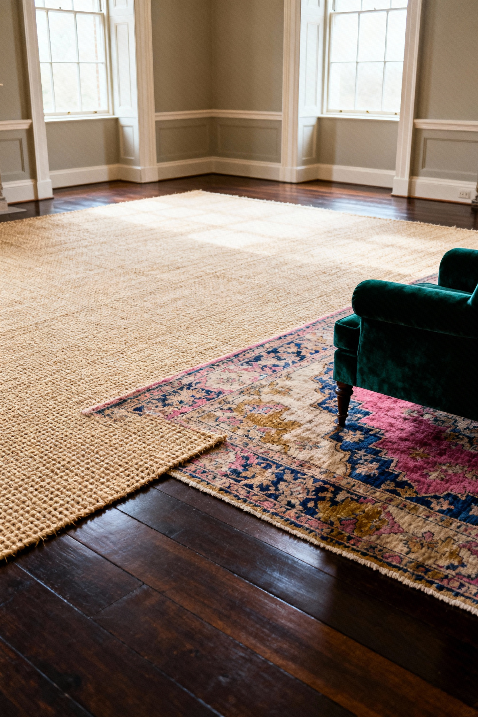
- Mind the Gap: Ensure the vintage rug covers approximately two-thirds of the sisal base to create a deliberate, framing border.
- Preserve the Past: Let the rugged sisal absorb the foot traffic, protecting the fragile antique weave from daily wear.
Consequently, a smaller, less expensive antique rug commands the room like a grand masterpiece. You achieve the look of a centuries-old collection while saving your budget for more important things, like a truly excellent claret.
7. Window Dressing Mathematics: Hanging Drapery High and Wide
One often ignores the simple geometry of deception in interior design. During my tenure restoring cramped Victorian terraces in Kensington, I learned that drapery acts not merely as a covering, but as an architectural corrective. To fabricate grandeur, mount your rod significantly higher than the window frame—at least 4 to 6 inches, or ideally, halfway to the ceiling cornice. Furthermore, extend the hardware 4 to 10 inches beyond the casing on each side. This strategic placement allows the fabric to stack against the wall rather than the glass, maximizing natural light and tricking the eye into perceiving a much wider aperture.
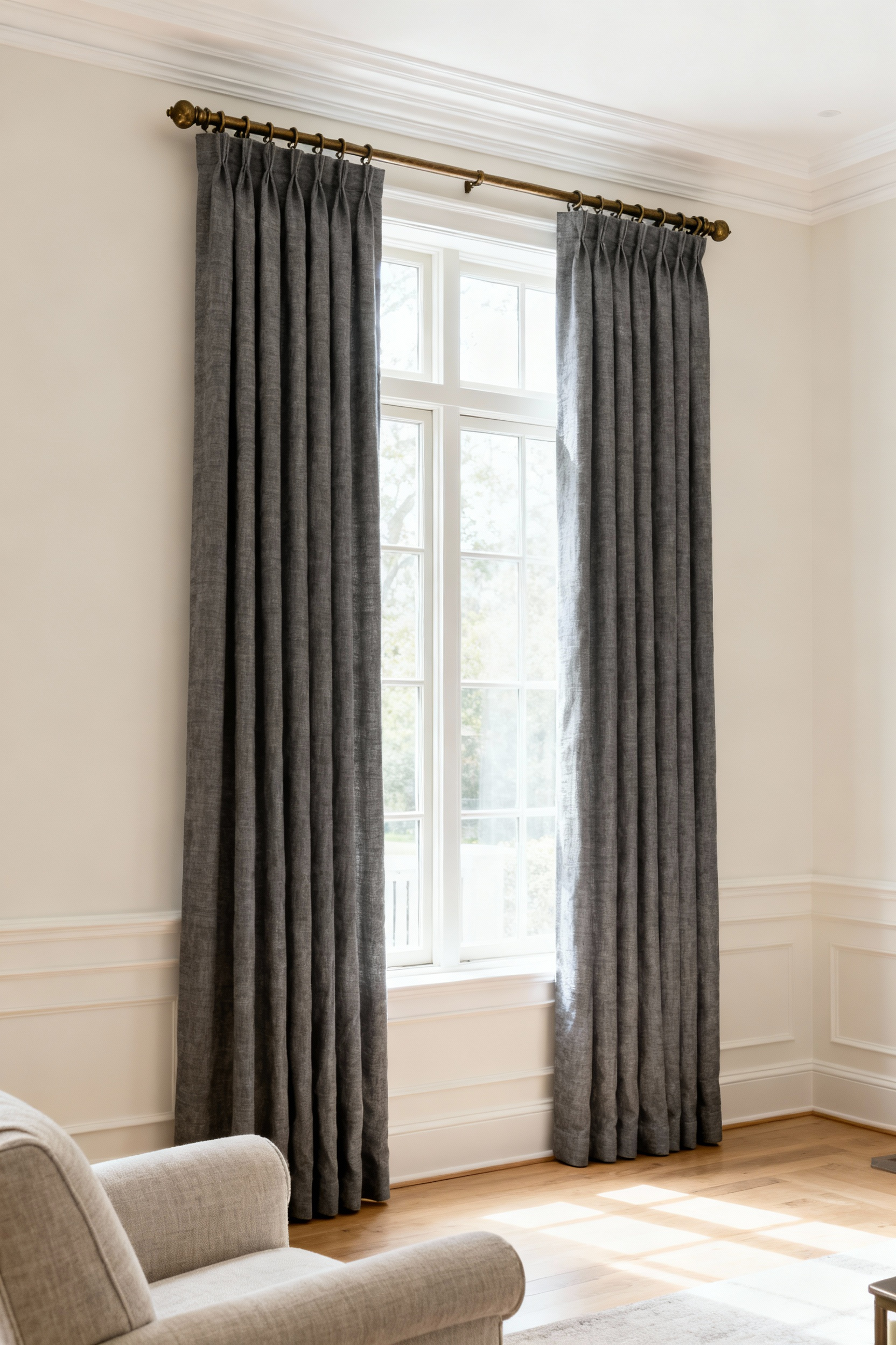
Next, one must avoid the tragic austerity of skimpy panels. Nothing betrays a lack of sophistication quite like fabric stretched taut. Adhere strictly to the “fullness ratio” by ensuring your total fabric width equals 2 to 2.5 times the rod’s length for that sumptuous, gathered look found in England’s finest estates. Finally, select your hemline with precision:
- The Floor Kiss: Allow the fabric to barely graze the floor for a tailored, modern silhouette.
- The Break: Let the drapes rest 1 to 2 inches on the floor for a romantic, slightly traditional air.
Never allow the hem to hover aimlessly above the skirting; your windows simply deserve better trousers.
8. Pattern Play: The Sophisticated Clash of Tartan, Floral, and Velvet
Mixing tartan, floral, and velvet creates a delightful tension, much like a Highland regiment crashing a genteel garden party. This specific “clash” marries the structured, masculine grid of the clans with the organic, feminine whimsy of English gardens. During my tenure at a Chelsea design firm, we often employed this triad to inject ancestral gravity into modern flats. To avoid a visual riot, however, let the tartan dictate the rules. Simply pull a core shade—perhaps a deep navy or hunter green—from the plaid to serve as the unifying thread for your floral choices and velvet accessories.
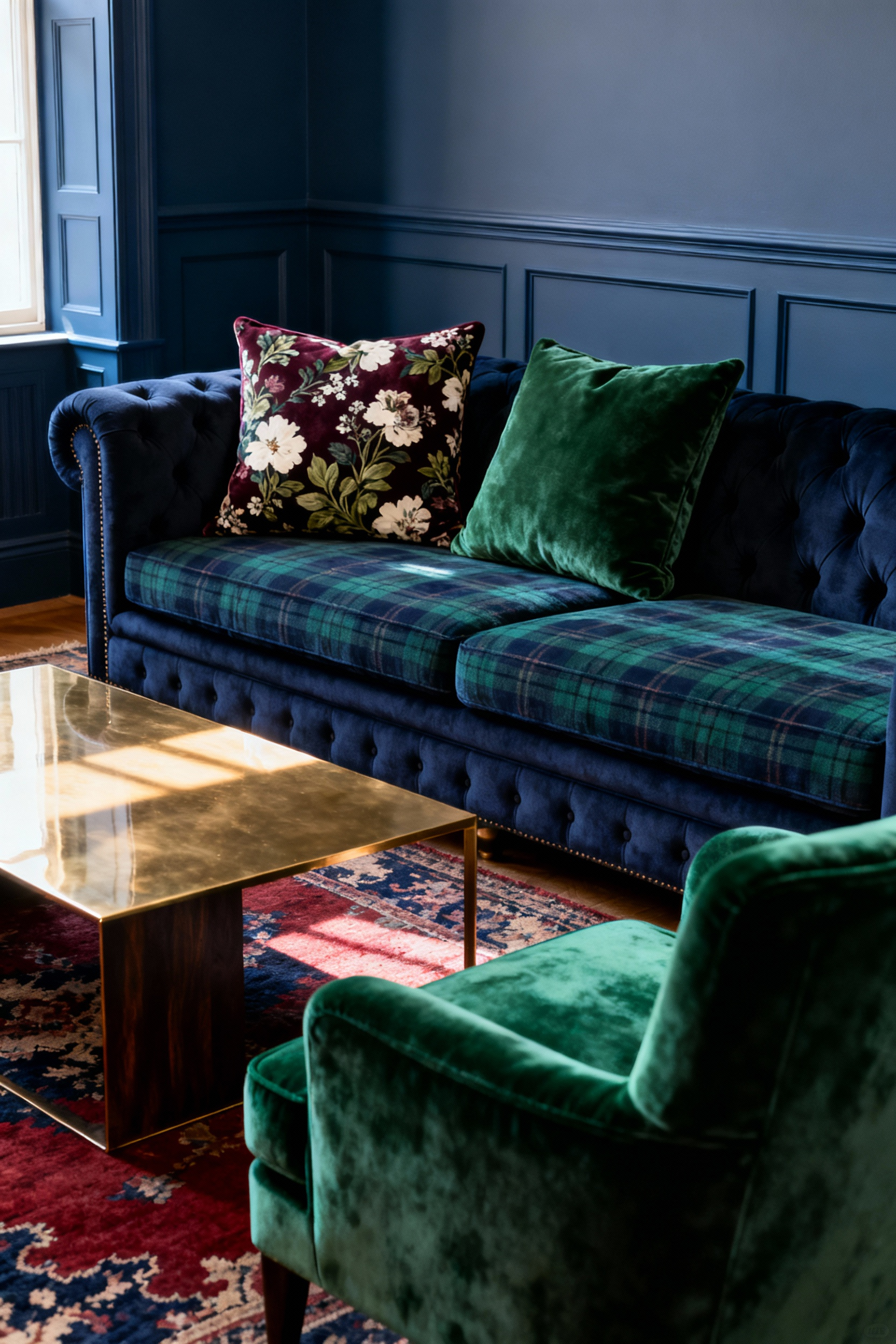
Precision prevents chaos. You must vary the visual weight to ensure the room feels curated rather than cluttered.
- Vary the Scale: Contrast a bold, large-scale floral rug against a tighter, medium-scale tartan armchair to create necessary movement.
- Anchor with Velvet: Utilize a solid, jewel-toned velvet sofa—think emerald or oxblood—as a luxurious buffer for the eye.
- Create Breathing Room: Surround these statement pieces with neutral walls or linen drapery to prevent pattern fatigue.
The deep pile of the velvet bridges the gap between the rugged wool and delicate prints, proving that opposing forces often make the most sophisticated bedfellows.
9. The ‘Un-Chopped’ Pillow: Curating Cushions That Look Lived-In, Not Staged
The aggressive “karate chop” has finally succumbed to a gentler, more confident aesthetic. I once visited a grand Kensington townhouse where every velvet cushion appeared brutally assaulted; thankfully, modern taste favors the organic over the rigid. Rather than mirroring soldiers in formation, embrace asymmetry to suggest a life well-lived. Group cushions in odd numbers—threes or fives—and mix sizes to create a “collected” narrative.
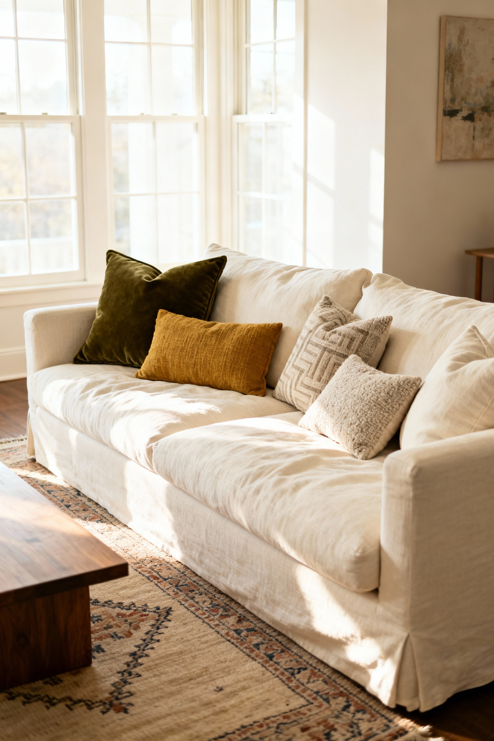
Achieving this studied nonchalance requires precise engineering, however. A limp pillow merely looks neglected. Therefore, size up your inserts to maintain structure without the crease. Always force a 22-inch feather fill into a 20-inch cover. This tension creates a plush, inviting silhouette that supports itself. Furthermore, rely on tactile depth to do the heavy lifting:
- Select rich, varied materials like heavy linen, bouclé, or wool.
- Avoid matching sets in favor of tonal, complementary palettes.
- Simply fluff the cushion and let it settle naturally.
Your sofa should invite a nap, not a formal inspection.
Phase 3: Spatial Dynamics – Essential Living Rooms Decorating Ideas for Layout and Flow
The Victorian drawing room was designed as a theater for conversation, not a storage unit for settees. Yet, during my tenure with London’s heritage design houses, I frequently witnessed clients banishing furniture to the perimeter like awkward teenagers at a school dance. Resist this impulse. Instead, pull your sofas and chairs away from the walls to create intimate, conversational islands. Anchor these zones with a large area rug—ensuring the front legs of all main pieces sit firmly upon it—or use the high back of a sofa to softly demarcate the space. This approach invites effortless movement and prevents the room from feeling like a cavernous hall.
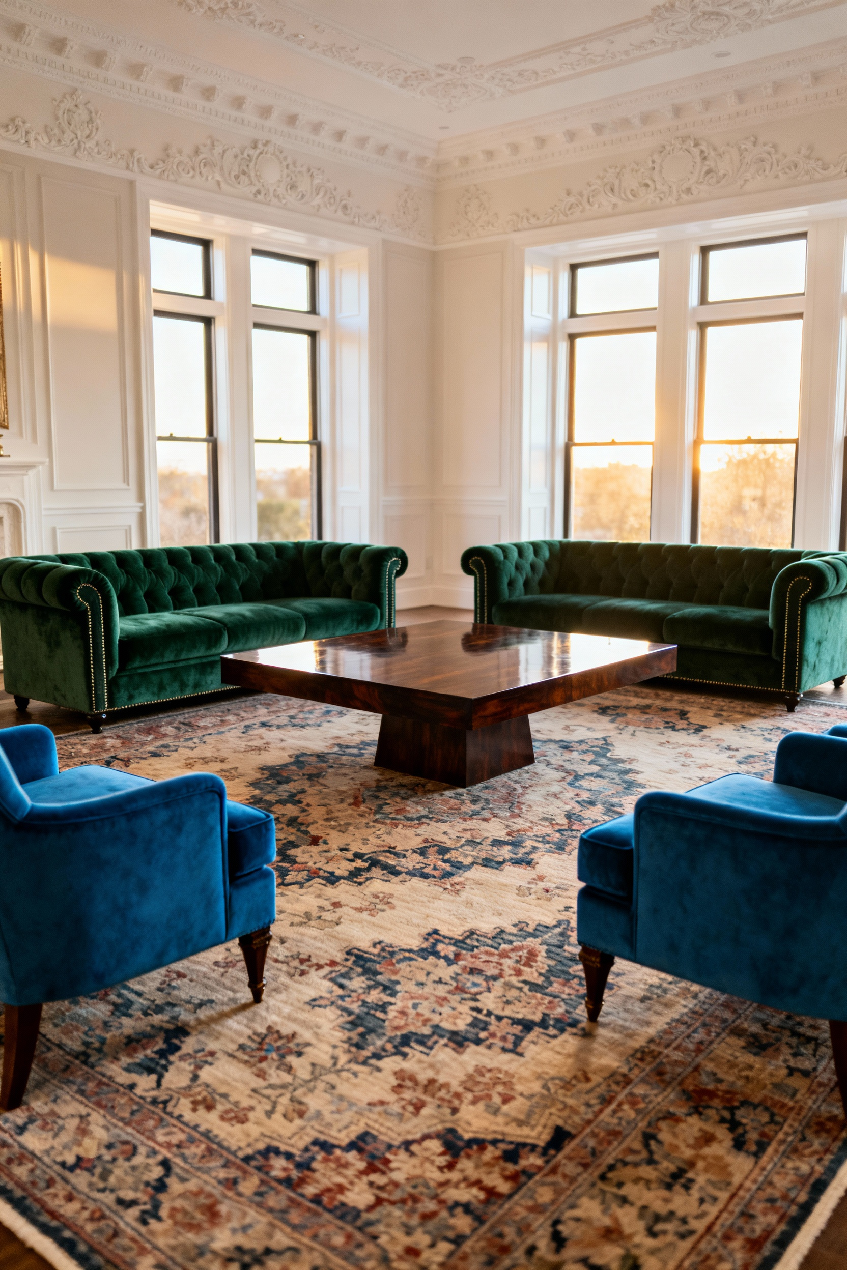
Once you liberate your furniture from the plasterwork, orient the arrangement toward a singular focal point, be it a roaring fireplace or a sweeping garden view. Structure implies intent. However, elegance requires precision. To ensure your guests need not shout across the void like town criers, adhere to the “Golden Ratios” of comfort:
- Maintain a maximum distance of 10 feet between seats to facilitate civilized discourse.
- Position the coffee table exactly 16–18 inches from the sofa edge for effortless reach.
- Clear a 30 to 36-inch path between zones to prevent collisions.
Precision, after all, is the backbone of true leisure.
10. Floating the Furniture: Why Your Sofa Shouldn’t Touch the Wall
Pushing your sofa flush against the plaster is a distinctly modern tragedy, often leaving guests shouting across a vast, empty carpet like sailors in a gale. In my time working with classic Georgian townhouses, I learned that the grandest drawing rooms prioritized intimacy over perceived square footage. Therefore, you must “float” your furniture. Pull the sofa and armchairs inward to create a conversational circle, keeping all seating within a civilized eight feet. Counterintuitively, this centralized arrangement expands the room’s visual weight and banishes the aesthetic of a gymnasium awaiting a school dance.
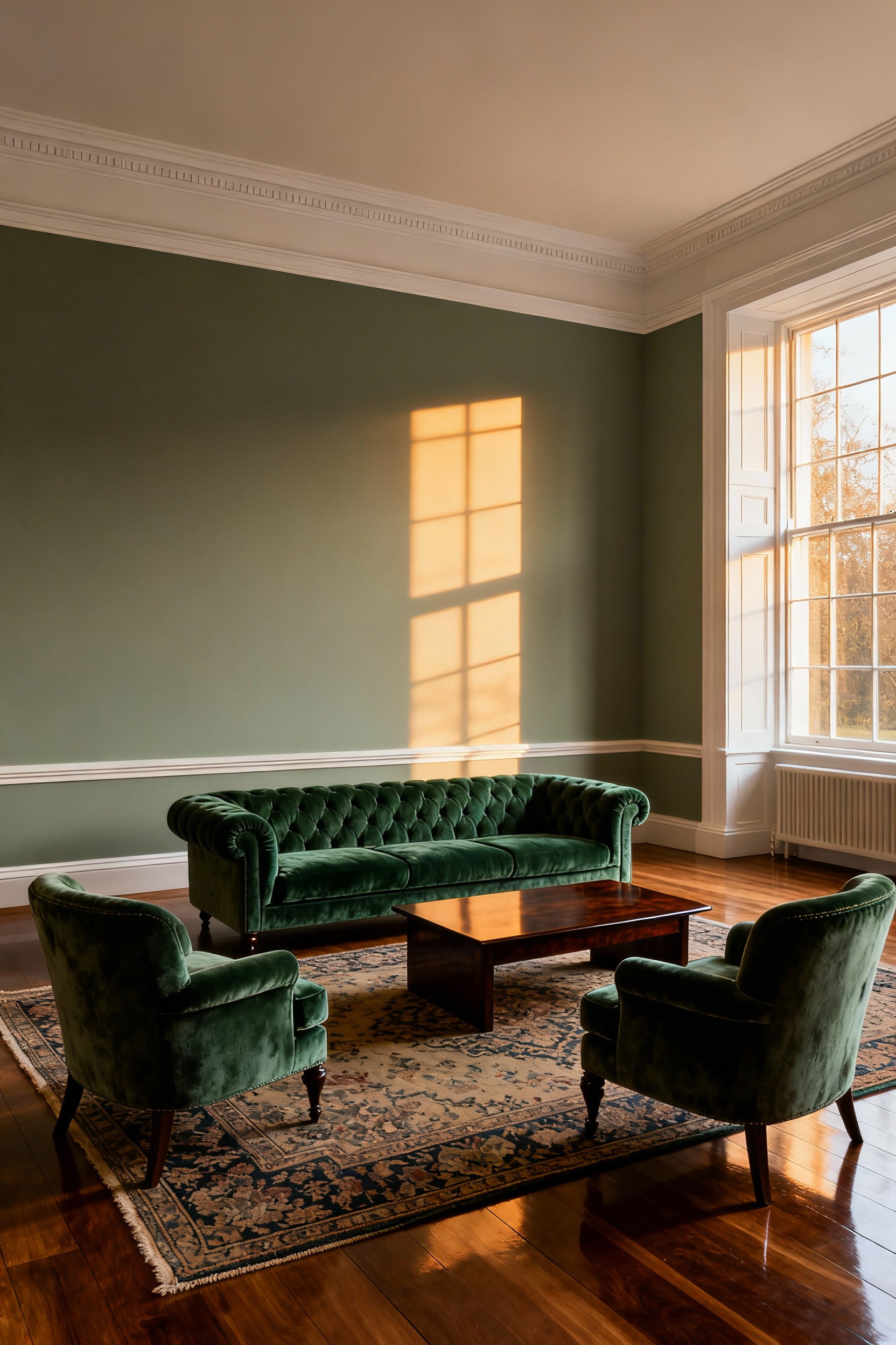
Furthermore, a floating sofa acts as a superb architectural tool in open-plan living. Use the back of the piece as a soft boundary to delineate the lounge from the dining area, establishing clear traffic corridors. To execute this with proper flow:
- Create clearance: Aim for at least one foot of space behind the frame to allow for movement or a slender console table.
- Mind the shadow: If quarters are tight, spare a mere three inches to prevent the piece from looking shoved.
Even a slight gap adds necessary dimension, ensuring your home feels curated rather than simply filled.
11. The Conversation Circle: Prioritizing Social Interaction Over TV Views
The Georgian drawing room facilitated the exchange of sharp wit, not the passive consumption of screens. To reclaim your living space from the tyranny of the television, simply shift your focal point. Position two sofas or a suite of armchairs facing one another to create a distinct “conversation circle” that demands eye contact. Consequently, the television becomes secondary. During my time restoring Kensington townhouses, I learned that true intimacy requires precision. Therefore, adhere to these rules for a civilized arrangement:
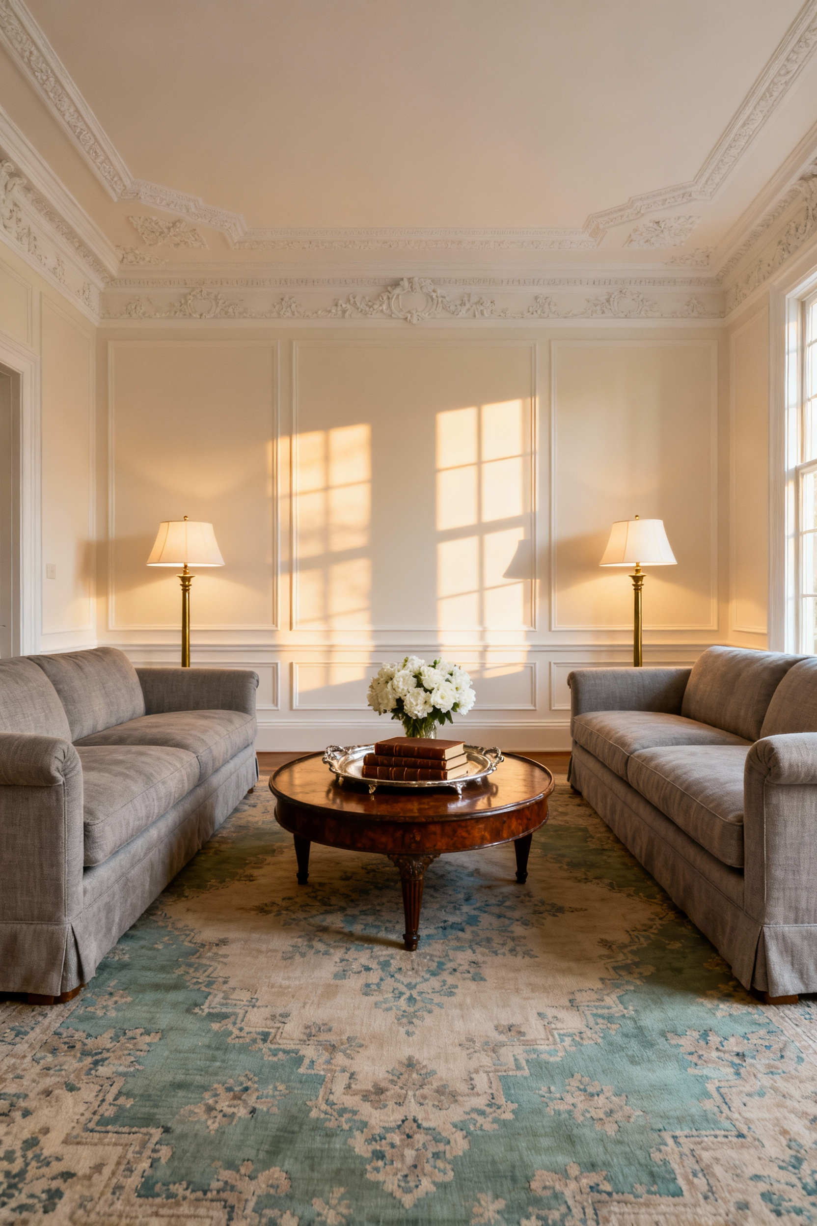
- Mind the gap: Keep seated guests within four to eight feet of one another to ensure comfortable, low-volume chatter.
- Anchor the zone: Deploy a round rug and warm, layered lighting to visually corral the group.
- Redirect the gaze: Orient furniture toward a fireplace or artwork, rather than the digital void.
By prioritizing people over pixels, you effectively restore the room’s original, noble purpose.
12. Zoning with Consoles: Anchoring Open Plans with Surface Space
The modern open plan demolished our walls, yet it often leaves our furniture adrift. A sofa floating mid-room creates an unsettling lack of structure, resembling a life raft lost at sea. Restore architectural order by placing a console table directly behind your seating arrangement. This acts as a subtle boundary, effectively partitioning the lounge from the dining area without sacrificing the room’s flow. I once salvaged a sprawling Notting Hill loft using this exact method; the addition of a slender, leggy table instantly transformed a cavernous hall into distinct, civilized zones.
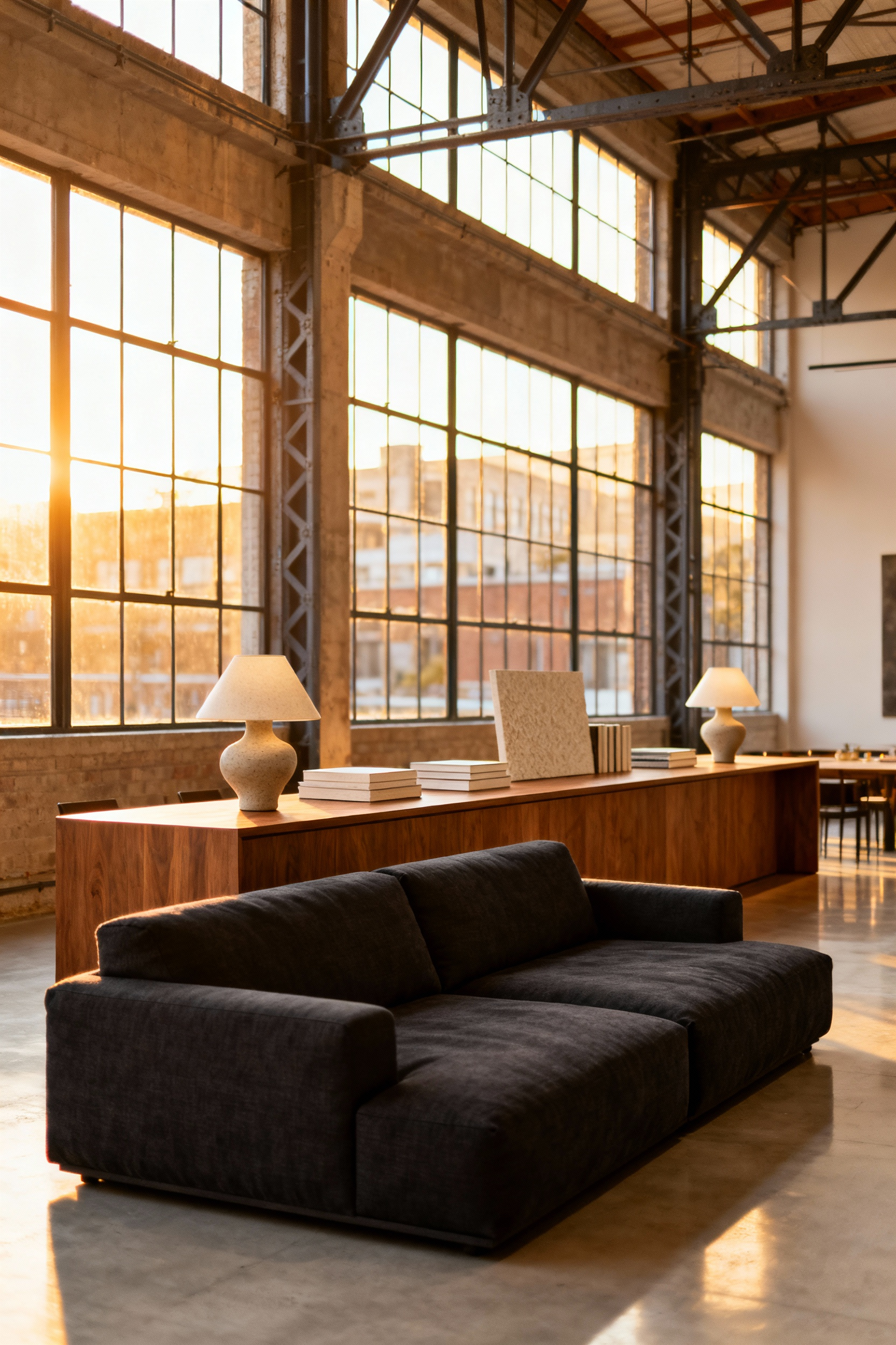
However, strict rules of proportion apply. Ensure the console sits level with or slightly below the sofa frame to maintain a polished profile. Furthermore, treat this new surface as a functional stage:
- Deploy symmetry: Position a pair of table lamps to add height and crucial task lighting.
- Conceal the chaos: Use the table’s body to hide unsightly cables running to your lamps or chargers.
- Maintain airiness: Choose open, slimline silhouettes over heavy sideboards to keep the visual weight light.
Phase 4: The Curated Finish – Lighting and Objects
Banish the “big light” immediately; it renders a room as clinical as a Victorian operating theatre. Instead, master the Rule of Three to craft a proper atmosphere. Layer ambient, task, and accent lighting to banish shadows and create depth. During my time with a heritage design house in London, I learned that a room without a dimmable sconce is simply unfinished. Treat your fixtures as functional art by selecting sculptural forms with warm, aged brass or alabaster finishes. These materials diffuse the glow, preventing the harsh glare that ruins a dinner party faster than bad wine.
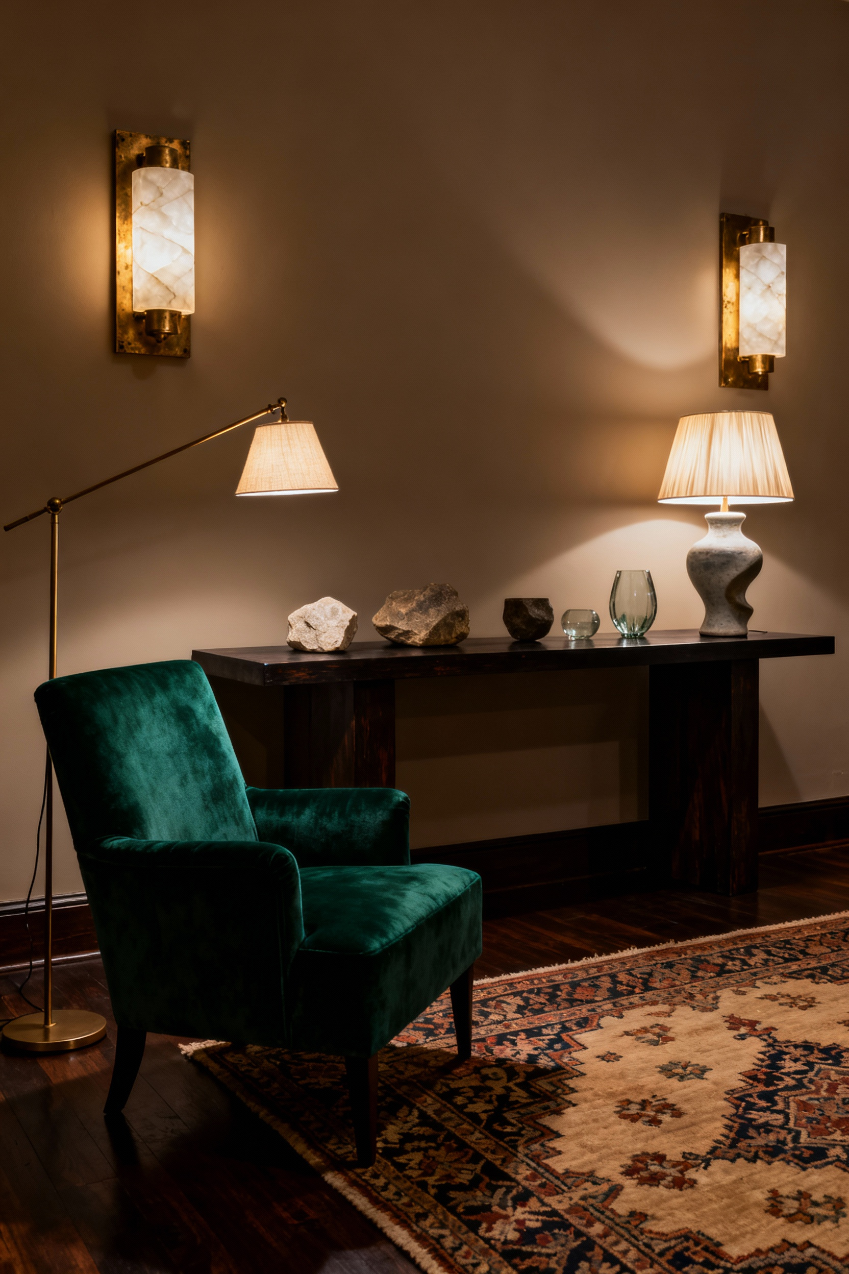
Once the lighting sets the mood, curate your surfaces with intention. While my ancestors might have preferred a cluttered “cabinet of curiosities,” the modern aesthetic demands editorial restraint. Compose vignettes on mantels and tables to tell a story rather than merely fill space.
- Anchor with scale: Use substantial lamps that balance the furniture beneath them.
- Mix eras: Pair oversized art books with vintage finds for instant pedigree.
- Tell a story: Select objects that reference your core color palette.
Avoid apologetic, flimsy trinkets. Choose bold, proportional pieces that hold their own, ensuring the room feels collected, not just decorated.
13. Triangulated Lighting: Banishing the ‘Big Light’ for Table and Floor Lamps
Turning on the “Big Light”—that solitary, glaring overhead bulb—is an act best reserved for locating lost contact lenses or conducting police interrogations. Historically, the most inviting British drawing rooms relied on the flickering warmth of hearth and candle; modern electricity should mimic this intimacy, not obliterate it with clinical brightness. Consequently, you must embrace “triangulated lighting.” This technique creates a sophisticated, layered scheme by positioning distinct light sources to illuminate the room’s four corners, effectively banishing the gloom without assaulting the senses.
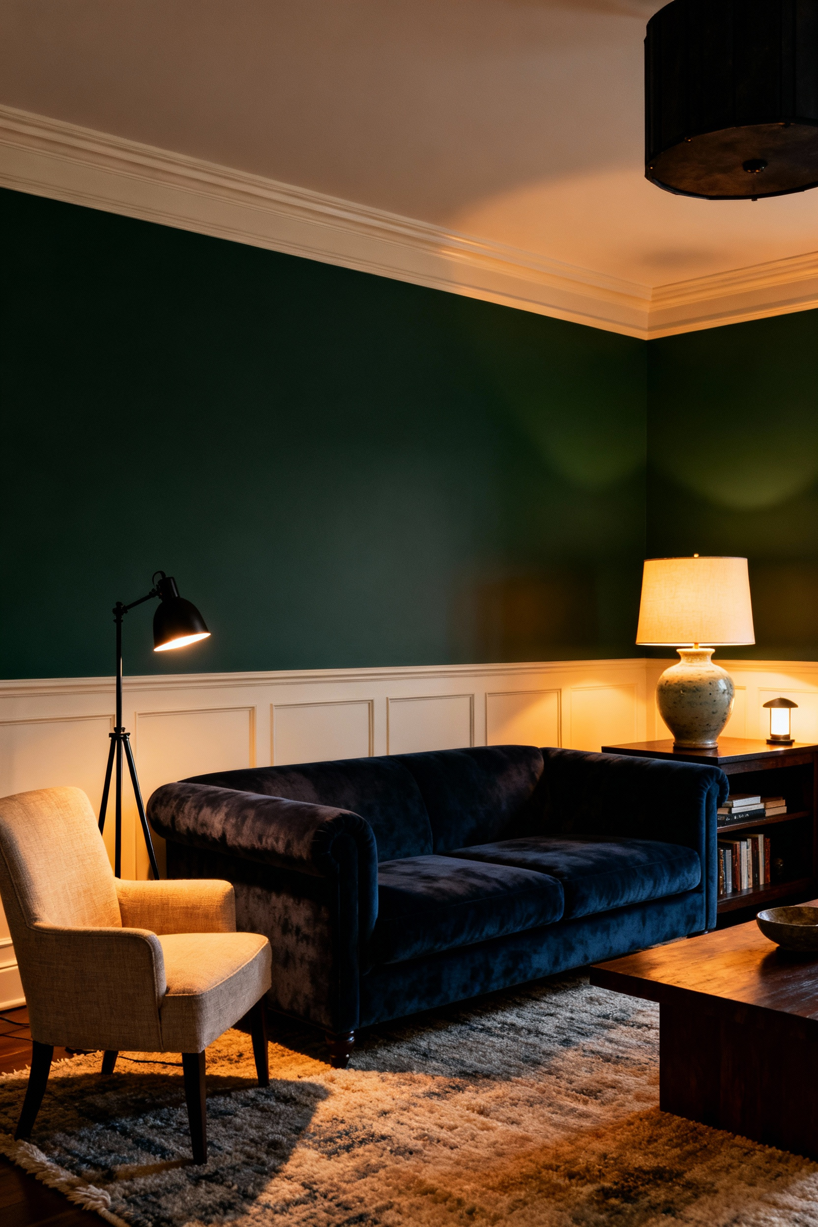
To master this atmospheric alchemy, focus on the quality and placement of your luminescence. My time in London design studios taught me that lighting is less about seeing everything and more about seeing the *right* things. Implement these adjustments for immediate effect:
- Curate Warmth: Exclusively use bulbs around 2700K; this warm temperature replicates the golden hue of dusk.
- Vary the Levels: Place floor lamps in dark corners and scatter 2-3 table lamps across side tables and bookshelves to create depth.
- Automate Control: Utilize smart plugs or dimmers to adjust the entire “triangle” instantly, sparing you the indignity of running around the room like a frantic butler.
14. The ‘Library’ Effect: Styling Bookshelves with Breathable Space
The Victorian fear of empty space—*horror vacui*—has no place in a modern study; true sophistication requires restraint. During my years with London’s heritage design firms, we treated bookshelves as galleries rather than storage lockers. To achieve this curated ‘Library’ effect, you must prioritize negative space. Leave at least one-third of your shelving naked. This “breathable space” allows individual treasures to command attention. Furthermore, adhere to a strict 60/40 rule: dedicate sixty percent of real estate to books and forty percent to sculptural objects.
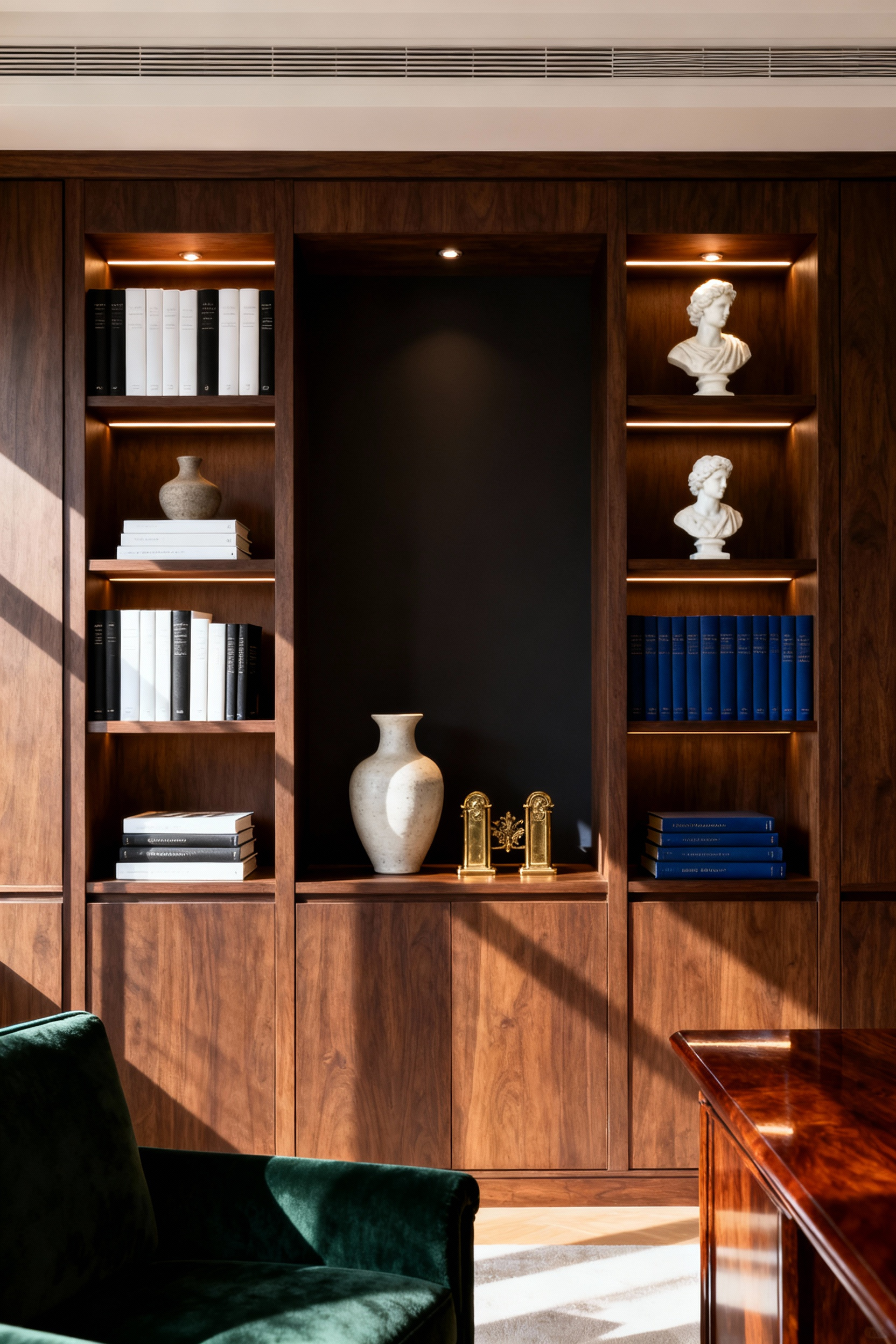
Consequently, the arrangement becomes a dynamic composition rather than a dusty archive. Vary your geometry to keep the eye engaged.
- Disrupt the vertical: Stack books horizontally to form pedestals for ceramics.
- Create depth: Push rows back slightly to create a uniform shadow line.
- Soften the edges: Introduce a trailing pothos to break up rigid woodwork.
Ultimately, a well-styled shelf suggests a mind that curates, rather than one that merely collects.
15. The Collected Gallery Wall: Mixing Oil Paintings with Modern Photography
Nothing betrays a lack of confidence quite like a gallery wall that whispers “flea market explosion” rather than “curated collection.” To master this visual remix, you must respect the weight of history while embracing the crispness of the now. During my tenure at a Chelsea design house, we frequently juxtaposed 19th-century landscapes with stark architectural photography; the tension creates a delightful dialogue between the eras. Start by anchoring the arrangement with a textured oil painting. Its three-dimensional visual weight demands a central position. Surround this brooding “old soul” with the flatter, glossy precision of modern prints to keep the composition from feeling top-heavy or antiquated.
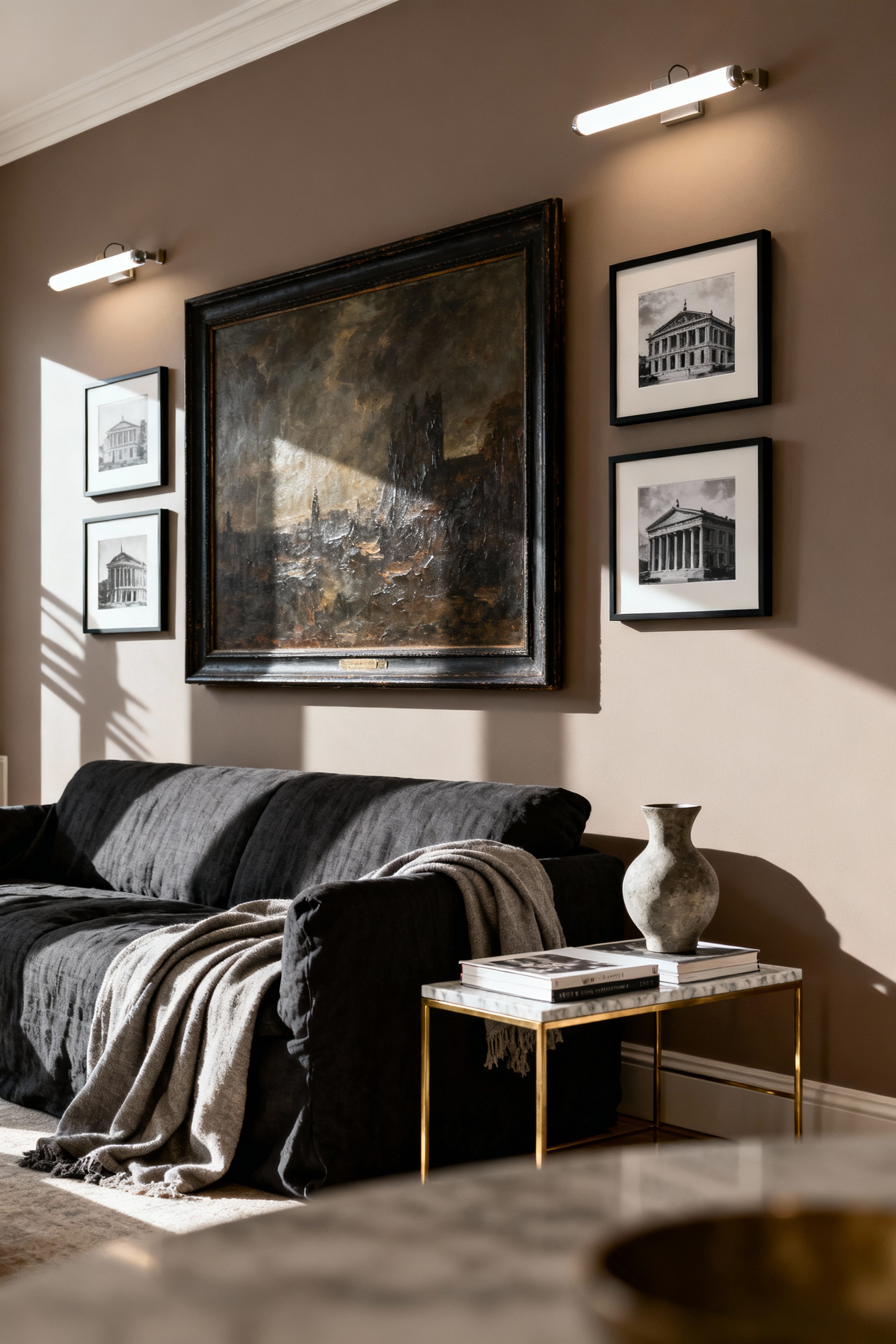
To ensure these distant cousins play nicely together, you must enforce a strict unifying code. Without a common thread, the wall becomes a chaotic argument rather than a cohesive narrative. Consider these strategies for harmonization:
- Standardize the joinery: Encase both mediums in identical frames—perhaps a sleek ebony or a warm walnut—to strip away historical hierarchy.
- Utilize the monochrome: Intersperse black-and-white photographs between colorful canvases to act as sophisticated visual pauses.
- Echo the pigment: Isolate a singular accent color that appears in the oil brushstrokes and ensure it repeats in the modern photographs.
Consequently, the eye travels smoothly across centuries, appreciating the curation rather than stumbling over the confusion.
16. Antique Anchors: Grounding Contemporary Rooms with One Brown Wood Piece
Modern minimalism often risks feeling like a sterile clinic rather than a home. To remedy this, deploy a solitary “brown furniture” antique as your room’s anchor. Think of a heavy Georgian chest or a brooding Victorian armoire; these pieces possess gravitas that sleek lacquer simply cannot mimic. I once placed a heavy mahogany partner’s desk, rescued from a dusty Sussex auction, into a client’s glass-walled office. Instantly, the room gained a soul.
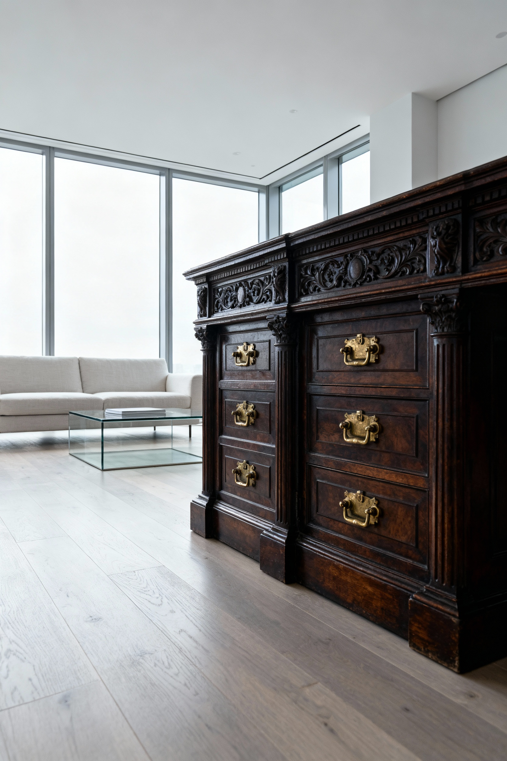
Success relies on deliberate isolation rather than accumulation. Do not recreate a museum period room; instead, master the contrast through strict curation:
- Create breathing room: Allow substantial negative space around the item so it stands as a sculpture, not storage.
- Control the backdrop: Position dark woods against crisp white or moody navy walls to prevent the piece from looking drab.
- Modernize the surroundings: Pair ornate carpentry with low-profile, neutral upholstery to keep the aesthetic current.
By treating the antique as a singular work of art, you bridge the gap between history and the present.
17. Bringing the Garden In: Structural Botanicals as Living Sculpture
The Victorians built entire Orangeries to showcase their botanical treasures, yet modern living rarely affords us such sprawling glasshouses. Consequently, one must treat large, structural botanicals not as mere garnish, but as architectural imperatives. Position a towering Fiddle-Leaf Fig or a dramatic Monstera exactly as you would a marble bust—to anchor the room and soften harsh, minimalist lines. By placing these verdant giants in bare corners or adjacent to low seating, you draw the eye upward. This verticality instantly expands the room’s perceived volume, adding drama without requiring a renovation.
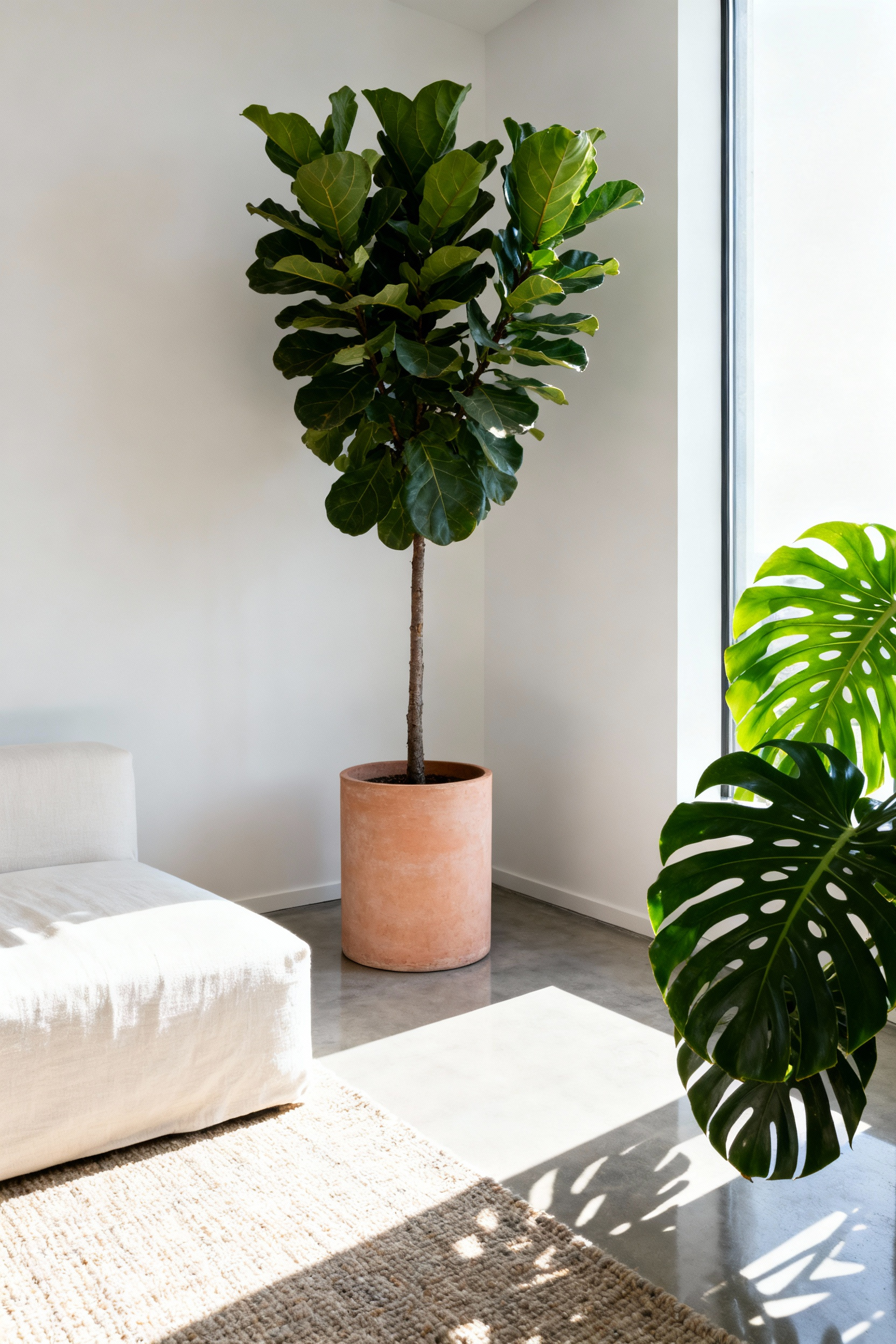
Furthermore, a masterpiece requires a proper pedestal. Just as I learned during my time with London’s heritage design houses, the vessel is as critical as the contents. Select a planter that elevates the room’s specific narrative:
- Sleek, minimalist pots maintain a modern, disciplined aesthetic.
- Woven basketry introduces tactile warmth and a relaxed, bohemian wit.
- Aged terracotta evokes the rustic grandeur of a classic garden room.
Ultimately, this biophilic approach does more than fill space; it establishes a functional, calming connection to nature. Your living sculpture purifies the air and soothes the psyche, proving that good design is indeed good for the soul.
Frequently Asked Questions About Living Rooms Decorating Ideas
How do I make my living room look luxurious on a tight budget?
Focus on architectural details and texture rather than quantity. Use paint to create sophistication, such as color drenching or heritage “muddy” palettes. Prioritize one large, high-impact piece—like a sculptural light fixture or an antique mirror—and use high-quality, tactile textiles for throws and pillows. The illusion of luxury often comes down to lighting: ditch the harsh overhead light in favor of warm, layered lamps.
What is the most popular color palette for high-end living rooms right now?
While neutrals are always timeless, the current trend favors deep, saturated heritage hues paired with sharp contrast. Look for complex greens (such as sage or forest teal), muddy purples (plummy aubergine), or rich, chalky terracotta. These sophisticated anchor colors prevent a room from feeling flat and provide a refined backdrop for classic wood and natural linen.
How do designers make a small living room feel larger and more spacious?
Employ vertical and horizontal deception. Hang drapery rods high and wide to visually enlarge the windows (see Section 7). Use reflective surfaces like mirrors or sleek brass to bounce light. Crucially, paint the walls and ceiling the same color (color drenching) to eliminate the visual break at the cornice, making the room feel like a continuous, cohesive envelope.
Where should I place the sofa if I am floating the furniture in an open-plan space?
If you are “floating” the sofa (pulling it away from the walls), its primary function becomes room definition. Place the sofa facing the main focal point, such as a fireplace or a bank of windows, and use its back as a soft boundary. Immediately anchor the arrangement with a large rug, ensuring the front legs of the sofa sit firmly on it. Place a narrow console table directly behind the back of the sofa to provide necessary surface space and complete the transition into the next zone.
Conclusion: From Showroom to Sanctuary – The Slow Evolution of a Living Room
We must bid a fond, yet firm, farewell to the Victorian parlor concept—that pristine, airless tableau reserved solely for high tea or the vicar’s approval. The modern evolution demands we trade rigid perfection for genuine conviviality. Prioritize deep, forgiving seating that invites a Sunday nap, and banish the single overhead bulb in favor of layered pools of light that flatter both the room and its inhabitants. By pulling furniture into intimate circles, you invite spirited debate rather than passive observation.
Furthermore, true luxury lies in the narrative, not the showroom catalog. Layer your space with tactile wools and velvets, but ensure the soul of the room remains yours. Display the chipped travel trinkets and dog-eared books that tell your specific history, transforming a sterile display into a rich, sensory tapestry. Ultimately, whether you are implementing high-end living rooms decorating ideas or simply seeking sanctuary, a home should never feel like a museum exhibit where one fears to touch the velvet rope.
A sanctuary is not merely bought; it is curated through the messy, beautiful act of living. So, break the symmetry. Fluff the cushions, dim the lights, and allow your living room to finally exhale. Stop curating for an audience of strangers and start designing for the comfort of your own soul.
