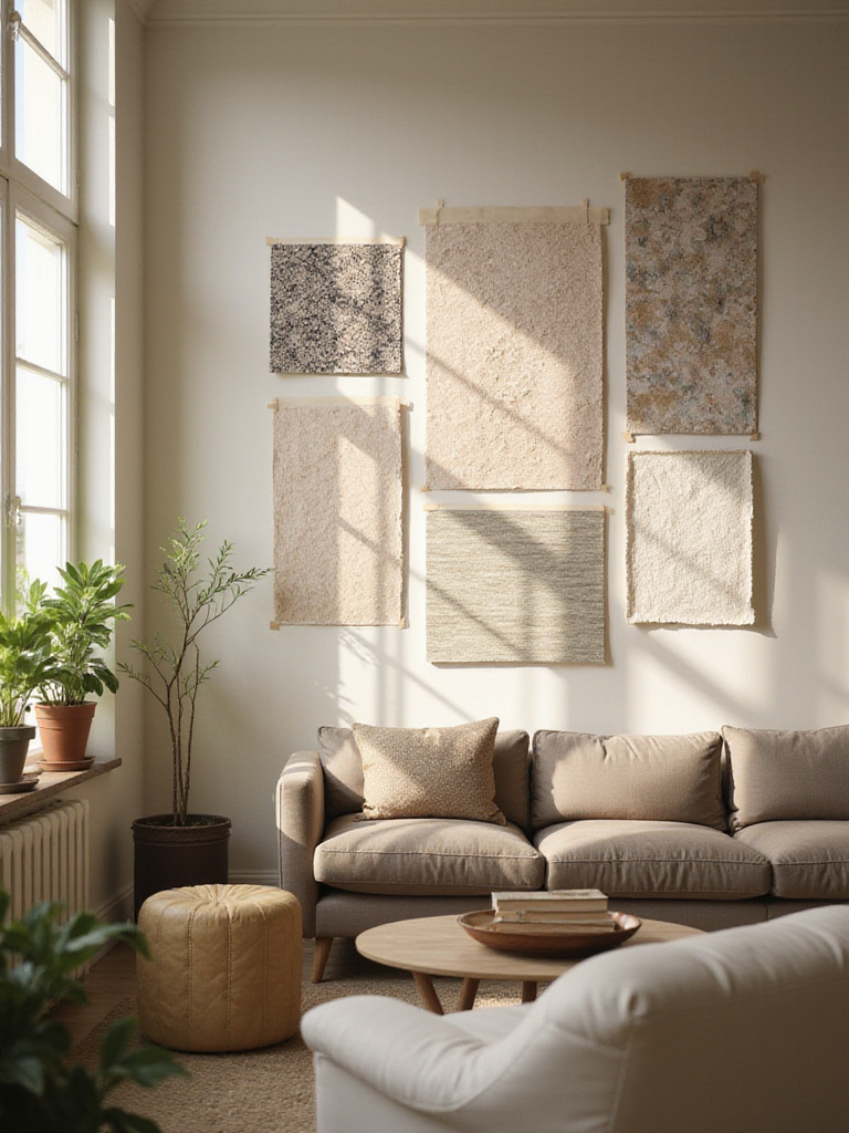
Of all the design choices you can make, I find the ones that tell a story are the most powerful. Your home’s walls aren’t just structural; they are canvases. They can whisper family histories or announce bold new chapters. Growing up with a Polish father who revered the texture of aged, memory-soaked plaster and a Chinese mother who understood the narrative power of a single, perfect brushstroke on silk, I learned early that a wall can be so much more than a painted surface. A thoughtfully chosen wallpaper on a single wall does something paint simply can’t—it introduces a layer of pattern, texture, and story that can completely reshape a room’s spirit.
This isn’t about overwhelming a space. It’s the opposite, actually. By creating a single accent wall, you’re giving the rest of your room permission to breathe. You’re crafting a heart for your living space, an anchor that draws the eye and sets the tone. Whether you’re pulled toward the lush, organic lines of a botanical print that reminds you of your grandmother’s garden, or the crisp logic of a geometric pattern that speaks to your modern sensibilities, the right paper can elevate a room from simply “nice” to truly yours.
So, let’s walk through this together. We’ll go beyond just picking a pretty pattern and explore how one decision can become the keystone for your entire living space.
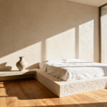
1. Define Your Focal Point Wall for Maximum Impact
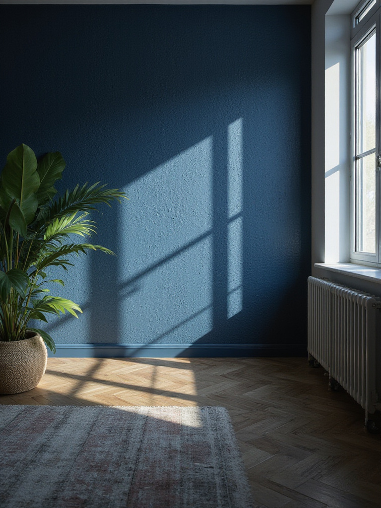
Before you even think about patterns, you have to choose your canvas. The success of an accent wall begins and ends with picking the wall that naturally wants to be the star. This isn’t just a matter of taste; it’s about listening to the architecture of your room and understanding how the eye instinctively travels when you walk in. A great focal wall isn’t forced; it feels inevitable.
Stand at the main entrance to your living room. Relax your eyes and see where they land first. That’s almost always your best candidate. Is it the wall with the fireplace your family gathers around on cold nights? Or the expansive wall behind your sofa, where conversations happen and memories are made? These places already have an energy, an architectural “gravity.” You’re just giving them the spotlight they deserve. I’ve worked on projects where the most obvious wall wasn’t the best one. In one Brussels apartment, the first wall you saw was chopped up by a doorway. Instead, we chose the adjacent wall, which caught the afternoon light beautifully, turning a simple textured grasscloth into a dynamic surface that changed throughout the day.
So, don’t just look for the biggest, blankest wall. Look for the one with the best story to tell. Your goal is to find the wall that establishes a clear anchor, making every other design choice in the room feel easier and more intentional.
2. Choose the Right Wall Based on Room Layout and Furniture
Now, let’s get practical. Your room’s layout is the grammar of how you live, and the accent wall should be a perfectly placed punctuation mark, not a confusing sentence fragment. The most stunning wallpaper will fall flat if it’s fighting with your furniture.
The wall behind the main sofa is a classic for a reason. It anchors your largest piece of furniture and creates a backdrop for your home’s social hub. It just works. A media wall can also be a fantastic choice. Frankly, TVs can be an eyesore, but wallpapering the wall behind them turns a utilitarian zone into a deliberate design moment. It frames the technology, making it feel integrated rather than just stuck there. The key is to pick a wall that won’t be mostly hidden by a towering armoire or interrupted by too many doors and windows, which would shatter your beautiful pattern into pieces.
- Behind the Sofa: A no-brainer for anchoring your main seating area.
- Media Walls: An opportunity to make your tech feel intentional.
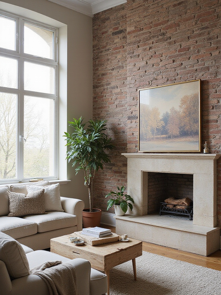
- Architectural Features: A wall with a fireplace, built-ins, or a lovely alcove is already a focal point. Lean into it.
- The Entry View: That first wall your guests see can make a powerful first impression.
This is also where design gets tricky—and fun. An accent wall can solve problems. In a long, skinny room that feels like a bowling alley, papering the shortest wall at the far end can visually pull it forward, making the room feel more balanced. It’s a bit of a magic trick that works every time.
3. Select a Pattern Scale Appropriate for Your Room Size
The scale of a pattern is everything. It can make a small room feel grand or a large room feel claustrophobic. This isn’t just about rules; it’s about proportion and feeling. Think of it like a conversation: a small-scale print is an intimate whisper, while a large-scale mural is a bold declaration. You have to match the volume to the room.
In a smaller space, like a cozy den or a city apartment living room, a delicate, small-scale pattern—say, with a repeat of 2-8 inches—adds texture and interest without shouting. It invites you to come closer to see the detail. But in a large, open-concept living room with high ceilings, that same small pattern would get lost, blurring into a vague texture from a distance. Here, you need confidence. Go for a large-scale floral, a dramatic abstract, or a geometric with a repeat of 18 inches or more. These patterns have the presence to hold their own on an expansive wall.
I always tell clients to consider the viewing distance. Where will you actually see this wall from? That beautiful, intricate Chinoiserie paper might be breathtaking up close, but from your favorite armchair 15 feet away, does it just become a blur? Conversely, a giant abstract that looks amazing from afar might feel chaotic when you’re sitting right next to it. Get a sample and tape it up. Walk around. Live with it for a day or two. A pattern’s scale affects the room’s energy as much as its perceived size.
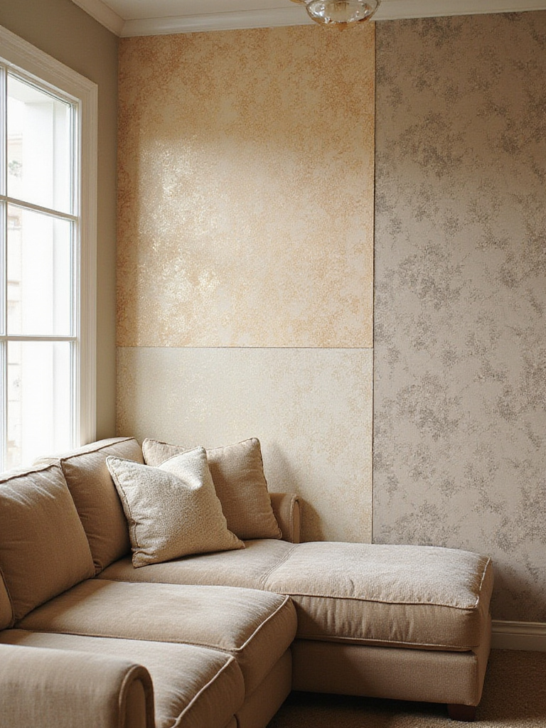
4. Coordinate Wallpaper Colors with Existing Decor and Palette
This is where the real art of integration comes in. Your wallpaper shouldn’t feel like a foreign object that just landed in your living room. It should feel like it has always been there, weaving itself into your existing color story. A lack of color harmony is the number one reason an accent wall fails.
Start by being a detective in your own home. Look beyond the obvious paint color on the other three walls. What are the undertones in your wood floors? The color of the metal on your light fixtures? The secondary thread color in your sofa’s upholstery? Most color clashes happen because of warring undertones—that warm, creamy beige sofa will never look right next to a cool, grey-toned wallpaper, even if they both seem “neutral.” In my work, I find this is where a multicultural perspective is so useful. The specific shade of red that signifies joy and celebration in Chinese culture carries a different weight and pairs differently than, say, the deep crimson you might find in a traditional Polish folk textile. Both are red, but their soul is different.
You can use the classic 60-30-10 rule here if you like frameworks: 60% dominant color (your other walls), 30% secondary (your sofa and larger pieces), and 10% accent. Your wallpaper can fit into any of these roles. A bold, vibrant paper might be your “30” or “10,” while a neutral, textured paper could actually become part of your “60” foundation. But honestly, the best approach is to pull a color from your wallpaper and repeat it somewhere else in the room—in a cushion, a vase, or a piece of art. This creates a thread of connection that ties everything together.
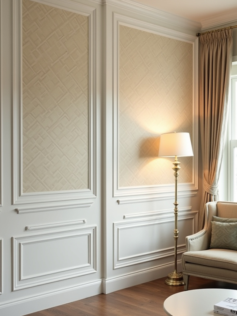
5. Achieve a High-End Look with Textured or Embossed Wallpaper
If you want to instantly elevate a room and make it feel more layered and luxurious, texture is your answer. It takes your wall from a simple visual element to a tactile one. Running your hand over a textured wall engages more than just your eyes; it creates an intimacy with the space that flat paint can never replicate. The way light plays across a textured surface—creating subtle highlights and shadows—adds a quiet, architectural depth.
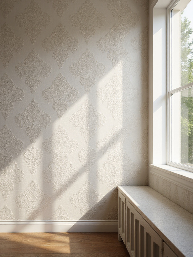
Natural materials are a personal favorite. A grasscloth or jute wallpaper brings such a warm, organic feel that can soften even the most modern space. For a project blending Eastern and Western aesthetics, I once used a Japanese raw silk paper behind a sleek Italian sofa. The subtle, imperfect texture of the silk was the perfect counterpoint to the sofa’s clean lines, creating a beautiful dialogue between the two. Embossed papers are another fantastic option, creating a kind of geometric relief that catches the light and adds structure.
Be warned: these special papers require a bit more care. They are often heavier and require a specific type of adhesive. And when you’re smoothing them onto the wall, you have to be gentle. You can’t just slap a plastic smoother on an embossed paper, or you’ll flatten the very texture you paid for. The extra effort is always worth it. It’s the difference between a room that just looks good and a room that feels good.
6. Inject Personality with Bold Geometric or Abstract Designs
Choosing a bold pattern is a declaration of confidence. It says you’re not afraid of making a statement. Geometric and abstract wallpapers can energize a room, providing a jolt of visual excitement that’s perfect for spaces where you entertain and gather. They work especially well in contemporary or transitional homes, where they can play off of clean lines and create a sophisticated, artistic tension.
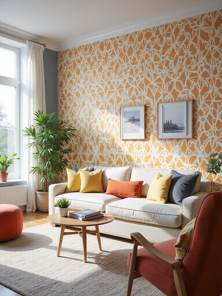
A large-scale geometric—like a crisp honeycomb, a dramatic chevron, or something inspired by Art Deco—creates structure and rhythm. It feels intentional and controlled. An abstract pattern is more fluid and emotional. Think of it as a giant piece of art for your wall—painterly brushstrokes, organic forms, or color fields that evoke a mood rather than a specific image. What’s crucial here is that the pattern feels authentic to you. Don’t choose a trendy pattern if it doesn’t speak to your soul. Your home should be a reflection of your personality, not a design showroom.
Here’s a great secret about bold patterns: they actually make decorating simpler. When you have one major “wow” moment on a wall, you often need less of everything else. The wallpaper becomes the art. You can keep the rest of your decor more minimal and edited, because the accent wall is doing all the heavy lifting. This can lead to a space that feels more serene and focused, despite having a very bold element. It’s about concentrating your energy in one impactful gesture.
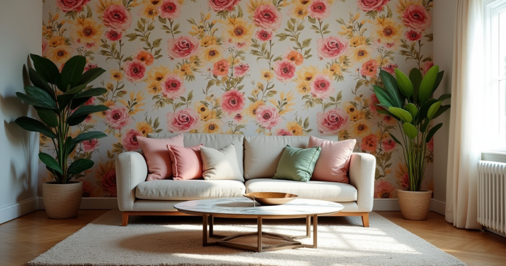
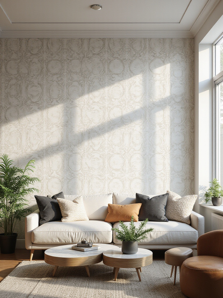
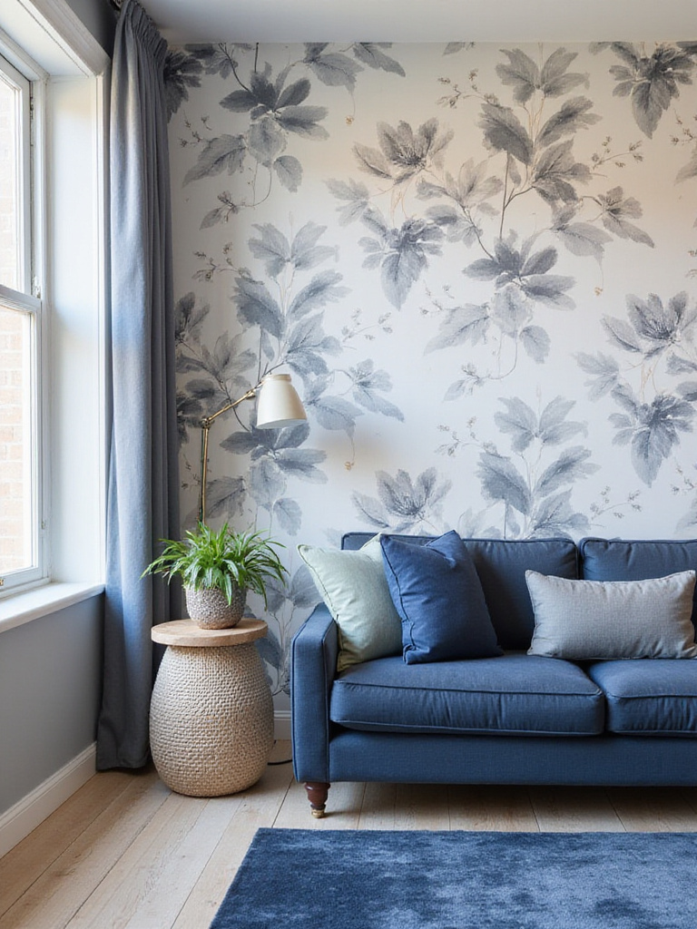
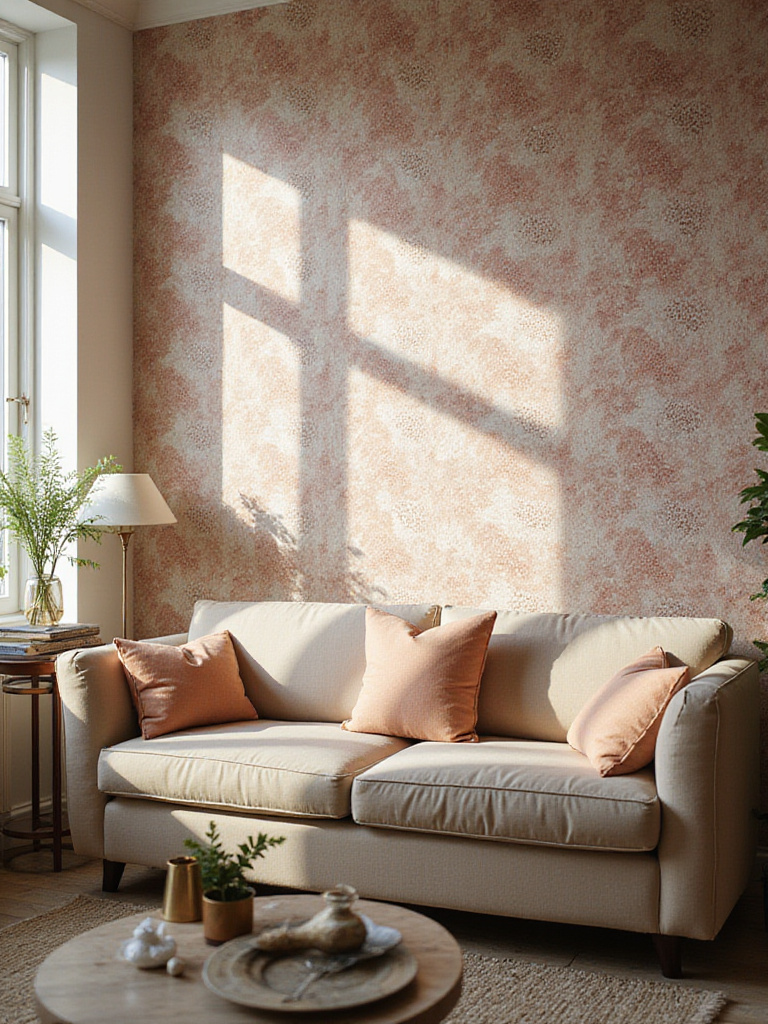
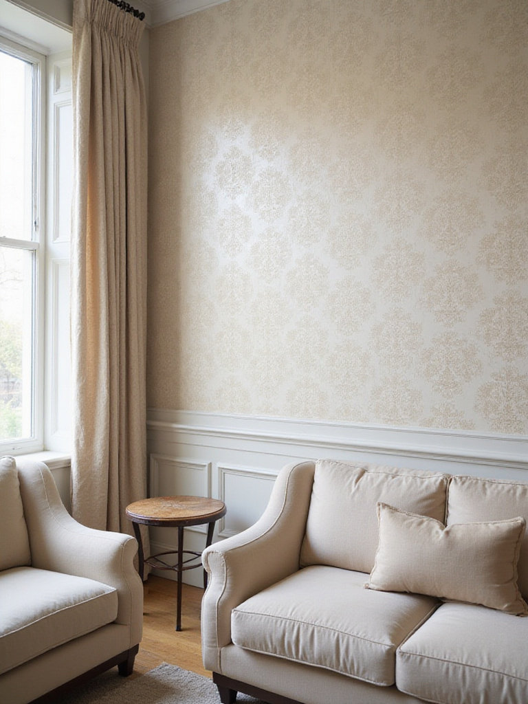
7. Create a Serene Atmosphere Using Subtle Floral or Botanical Prints
Sometimes, what we need from our living room is a sanctuary. A place to exhale. Nature-inspired patterns are brilliant for this. There’s a principle called biophilia—our innate human need to connect with nature—and bringing botanical elements into our home taps right into it. A subtle floral or leaf print can make a space feel calm, restorative, and grounded, without being saccharine or old-fashioned.
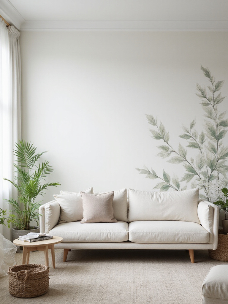
This is where cultural nuances are so beautiful. An English floral print, with its dense collection of cabbage roses, feels lush and romantic. A Japanese-inspired design, with a few delicate cherry blossom branches against an open field, feels more serene and minimalist. A Scandinavian print might feature stylized, simple leaf forms in a monochromatic palette. They are all “botanical,” but they create entirely different moods. The key is subtlety—you want the pattern to create an atmosphere, not scream for attention.
When clients tell me they want a room that feels peaceful but not boring, this is often where we land. The organic shapes and gentle colors provide visual interest, but they don’t have the hard edges of a geometric pattern, which can sometimes feel too energetic for a space meant for relaxation. It’s like bringing the calming presence of a garden indoors, and that’s a powerful way to make a home feel like a true retreat.
8. Consider Peel-and-Stick for Easy Installation and Removal
Let’s be honest, the idea of traditional wallpapering—with the paste, the mess, the permanence—can be intimidating. Peel-and-stick wallpaper has completely changed the game, especially for those of us who rent, love to change our minds, or are just a bit terrified of commitment. It makes the idea of a living room accent wall accessible to everyone.
The technology has come a long way from the cheap, vinyl-y stuff of the past. High-quality brands like Tempaper or Chasing Paper offer sophisticated textures, gorgeous patterns from renowned designers, and finishes that look almost identical to traditional paper. The ability to install it in an afternoon and (crucially) remove it without damaging the wall is a game-changer. It encourages experimentation. You’re more likely to try that bold print you love if you know you can take it down in a year.
But—and this is a big but—it’s not a magic solution for a bad wall. For peel-and-stick to work well, your wall surface must be properly prepared. It needs to be smooth (every bump will show), clean, and painted with the right finish. It sticks best to eggshell or satin paint that has had weeks to fully cure. Flat or matte paint is too porous, and the adhesive might not hold or could damage the paint upon removal. So while it’s easier than traditional paper, it’s not without its own set of rules.
9. Prepare Your Wall Surface Properly for Smooth Application
I’m going to be firm here because this is the step everyone wants to skip, and it’s the one that will make or break your project. Meticulous wall prep is the invisible foundation of a professional-looking wallpaper job. A beautiful, expensive paper will look cheap and sloppy on a poorly prepared wall. There are no shortcuts.
You need to look at your wall with critical eyes. Every tiny nail hole, hairline crack, or bump from an old paint job will be magnified under wallpaper. You have to fill every imperfection with spackle, let it dry, and then sand it perfectly smooth. After that, wipe the entire wall down with a degreasing cleaner to remove any dust or grime. The final, non-negotiable step is priming. Don’t use regular paint primer; use a primer specifically designed for wallpaper. This special primer, often called a “size,” does two things: it seals the wall so the paste doesn’t just get sucked into the drywall, and it creates a perfect surface for the adhesive to grip onto.
It’s this priming step that also makes future removal so much easier. It creates a barrier between the wallpaper and your wall. I once had to help a client who had applied a stunning (and very pricey) silk wallpaper directly onto drywall. When they decided to move a few years later, removing it took chunks of the wall with it, resulting in a costly repair job. A $30 can of primer would have saved them a thousand-dollar headache. Trust me on this. Do the prep.
10. Order Wallpaper Samples to See Patterns in Your Lighting
Never, ever order wallpaper without getting a sample first. I cannot stress this enough. A pattern you fall in love with on a glowing computer screen can look entirely different in the unique light of your own home. The color, the texture, even the scale can shift dramatically. Ordering samples is a small investment that can prevent a very large, very expensive mistake.
Your living room’s light is a living thing. It changes from the cool, blue tones of a north-facing window in the morning to the warm, golden light of the afternoon sun. Then, at night, your artificial lighting—be it a warm-toned lamp or a cool LED overhead—adds another layer. That sophisticated greige sample might suddenly look lavender in your specific light. That subtle metallic detail might create an unexpected glare at night.
Get the largest samples you can find—at least 8×10 inches, bigger if possible. Tape them to the wall you plan to cover. And then live with them. Observe them in the morning, at noon, in the evening, and with the lights on. See how the color shifts and how the pattern reads from different parts of the room. This patient observation is what separates a good design choice from a great one. It ensures the mood you’re trying to create will hold up, no matter the time of day.
11. Accurately Measure Your Wall to Avoid Running Out of Paper
There are few home project frustrations as acute as getting to your last strip of wallpaper and realizing you’re a few feet short. Accurate measurement is critical, and it’s a little more complex than just multiplying width by height. You have to account for pattern repeats and the inevitable waste from trimming.
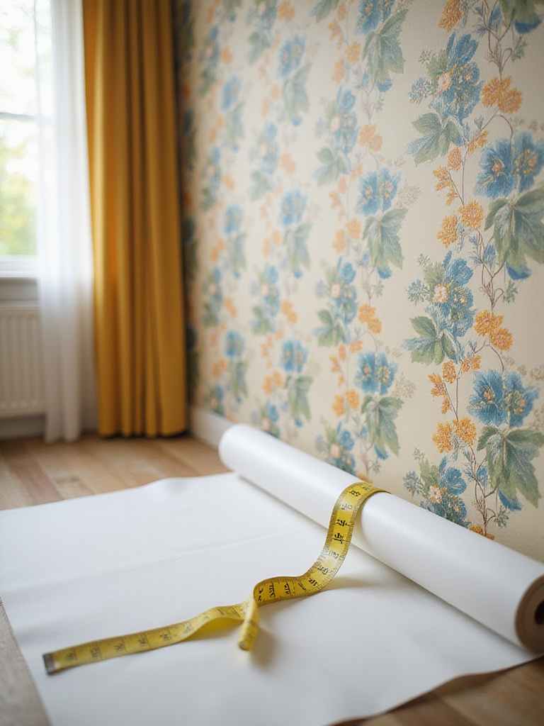
First, forget the idea of a “perfectly square” room. They don’t exist, especially in older homes. Measure the height of your wall in at least three different places (left, middle, right) and use the tallest measurement. Do the same for the width (top, middle, bottom) and use the widest one. This ensures you have enough paper to cover the wall’s largest dimensions.
Next, you need to understand pattern repeat. This information is on the wallpaper label. A large pattern with, say, a 24-inch repeat, means you might have to waste a significant amount of paper on each strip to get the pattern to line up perfectly with the previous one. Most online wallpaper calculators will factor this in for you, but it’s good to understand the principle. As a general rule of thumb, always add an extra 10-15% to your final square footage for waste and mistakes. And critically: buy all your rolls at the same time to ensure they come from the same dye lot. Rolls from different lots can have subtle color variations that will be painfully obvious once they’re on your wall.
12. Understand Pattern Match Types for Seamless Panel Alignment
This might sound technical, but understanding pattern match is the secret to getting that seamless, professional look where the wallpaper flows across the wall as one continuous image. There are three main types, and the one you have will dictate how you plan and hang your paper.
- Random Match: This is the easiest. The pattern is abstract or textured (like grasscloth) so you don’t need to match it up side-to-side. You can just hang the strips next to each other, which means very little waste.
- Straight Match: This is the most common. The pattern matches up directly across the seams. You just need to make sure the motif on the left edge of your new strip lines up perfectly with the right edge of the strip you just hung.
- Drop Match: This is the trickiest. The pattern on the next strip will be staggered, usually dropping by half the height of the pattern repeat. This creates a diagonal flow that can be beautiful, but it requires careful planning and creates the most waste, because you have to cut each strip strategically to get the alignment right.
The match type will be indicated by a symbol on the wallpaper label. Knowing this before you buy helps you calculate how much extra paper you’ll need. For a drop match, you might need up to 25% extra. When I’m teaching apprentices, this is where I spend the most time. A perfect plumb line for your first strip is everything. If that first piece is even slightly crooked, the error will multiply with every subsequent strip, and by the end, your pattern will be visibly slanted.
13. Learn Proper Cutting Techniques for Clean Edges and Corners
The difference between a DIY-looking job and a professional one is often found in the details—specifically, the cuts along the ceiling, baseboards, and around window frames. Clean, crisp edges make the wallpaper feel like an integrated part of the wall, not something just stuck on top.
The single most important tool for this is a razor-sharp blade. Not a kind-of-sharp blade. A brand-new one. Change your utility knife blade far more often than you think you need to—I often change mine after every long cut. A dull blade doesn’t slice; it tears the paper, leaving a fuzzy, ragged edge that looks terrible. This is especially true for thicker, textured papers.
Here’s the technique: Hang the strip so it overlaps the ceiling or baseboard by a couple of inches. Use a wide putty knife or a metal straightedge to press the wallpaper firmly into the corner or crease. This creates a sharp guide. Then, run your ultra-sharp knife along the edge of your guide in one smooth, continuous motion. Don’t saw at it. For inside corners, you’ll hang one piece, wrap it slightly around the corner, then hang the next piece overlapping it. Then, with your straightedge, you cut through both layers at once right in the corner, peel away the excess, and you’re left with a perfect seam. It takes practice, but it’s a skill that makes all the difference.
14. Master Hanging Techniques for Different Wallpaper Types
Not all wallpapers are hung the same way. Matching your technique to your material is crucial for success and will save you a world of frustration. Knowing whether to put the paste on the wall or the paper is half the battle.
- Non-Woven Wallpaper: This is the modern standard for a reason. These papers are a DIYer’s best friend. You apply the paste directly to the wall, not the paper. This is so much cleaner and easier to manage. You then hang the dry strip of wallpaper onto the pasted wall and smooth it out. Because they’re made of synthetic fibers, they don’t expand when wet, so you don’t have to worry about shrinkage or seams separating as it dries.
- Traditional Paper-Backed Wallpaper: This is the old-school method. You apply the paste to the back of the paper. Then you have to “book” it, which means gently folding the pasted sides together and letting it rest for a few minutes. This allows the paper to expand from the moisture before it goes on the wall. If you skip this, the paper will expand on the wall and you’ll get bubbles and wrinkles.
- Peel-and-Stick: We’ve talked about this, but the key technique is “start at the top and work your way down.” Peel back only a foot or so of the backing at a time, smooth it onto the wall, and then gradually pull more backing away as you smooth your way down the wall. This gives you more control and prevents the whole sticky sheet from folding onto itself—a truly maddening experience.
Understanding your material beforehand sets you up for a calm, methodical installation instead of a panicked, paste-covered mess.
15. Navigate Around Outlets and Switches Like a Pro
Dealing with electrical outlets and light switches can feel nerve-wracking, but with a simple, safe process, you can get clean, professional results every time. It’s one of those finishing details that really shows craftsmanship.
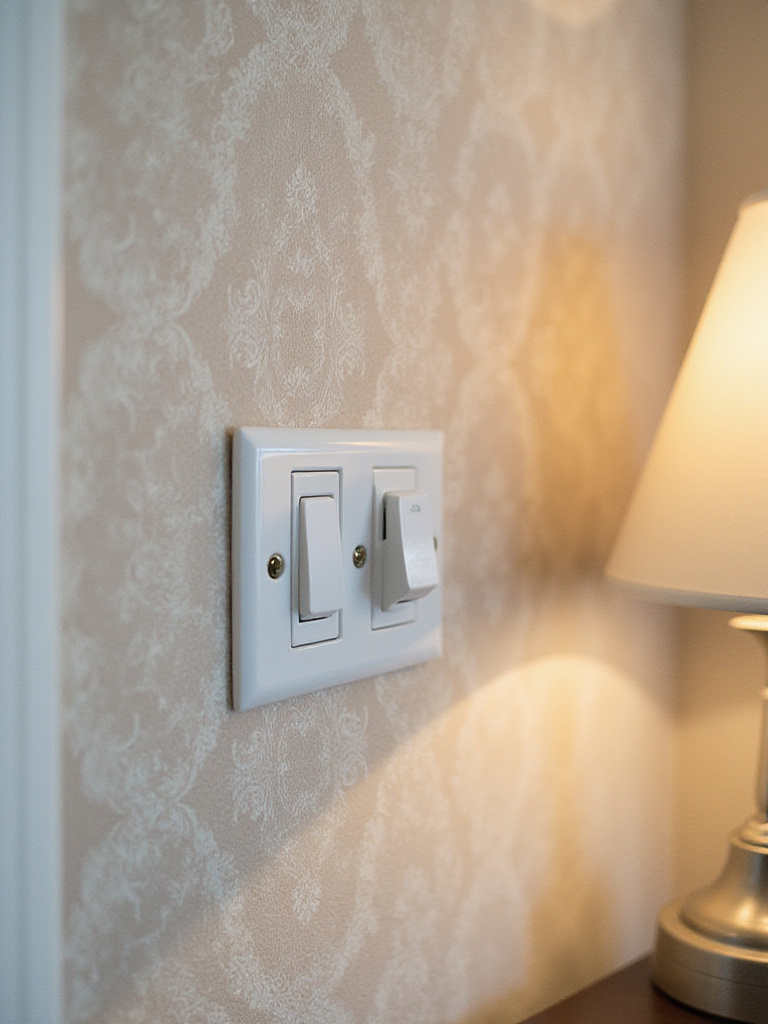
First and foremost: safety. Go to your circuit breaker and turn off the power to the room you’re working in. Don’t just trust the switch. Use a simple voltage tester (they’re inexpensive) to be absolutely sure the power is off before you unscrew and remove the cover plates. Keep the screws somewhere safe, like taped to the back of the plate.
When you hang your strip of wallpaper, just hang it right over the opening for the electrical box. Don’t try to pre-cut the hole. Once the paper is smoothed onto the wall, you can feel the edges of the box through the paper. Take your sharp utility knife and carefully cut a small ‘X’ from corner to corner over the opening. This creates four triangular flaps. You can then trim these flaps away, cutting flush against the inside edge of the electrical box. When you put the cover plate back on, it will neatly conceal your cuts, leaving a perfect finish. It’s a simple trick that takes all the guesswork out of it.
16. Decide Between DIY Installation or Hiring a Professional
This is a really personal decision that comes down to a clear-eyed assessment of your time, your budget, your patience, and the complexity of the job. There’s no shame in calling a pro; sometimes, it’s the smartest decision you can make.
Going the DIY route can save you a lot of money—hiring a pro can often double the cost of the project. There’s also a huge sense of satisfaction in doing it yourself. If you’re working with a straightforward wall and a non-woven or peel-and-stick paper with a simple pattern, it can be a very rewarding weekend project. But you have to be honest with yourself. Are you a patient, detail-oriented person? Or do you tend to rush through things? A botched wallpaper job is not easy to fix.
Hiring a professional installer is an investment in peace of mind. They have the experience to handle tricky corners, crooked old walls, and complex patterns like murals or delicate grasscloth without breaking a sweat. They’ll do the job in a fraction of the time it would take you, and the result will be flawless. If you’ve invested in a very expensive paper, I almost always recommend hiring a pro. The cost of their labor is an insurance policy against ruining costly materials. It’s not about ability, it’s about valuing your time and sanity.
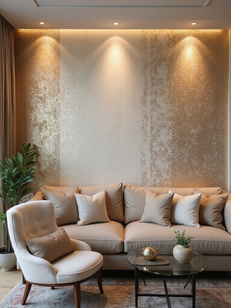
17. Illuminate Your Accent Wall with Strategic Lighting
Lighting can completely change your accent wall, turning it from a static feature into a dynamic one. The right light can make colors richer, bring textures to life, and add a layer of drama that makes the entire room feel more sophisticated. Don’t let your beautiful new wall sit in the dark.
There are a few key techniques:
- Wall Grazing: This is when you place a light source (like a track light or a floor lamp) very close to the wall, aiming the light down or up at a sharp angle. This technique is magic for textured wallpapers like grasscloth or embossed patterns. It creates long, dramatic shadows that emphasize every little ridge and fiber.
- Wall Washing: This provides broad, even illumination. It’s best for flat, patterned wallpapers where you want the colors to pop and the pattern to be seen clearly, without distracting shadows. This is achieved with recessed ceiling lights or track lights positioned a few feet away from the wall.
- Picture Lights: For murals or papers that are essentially large-scale artworks, a gallery-style picture light mounted above it can provide focused, intentional illumination.
Think about the mood. Warm-toned light (around 2700K) will make your room feel cozier and enhance reds, oranges, and yellows in your wallpaper. Cooler light (3500K+) creates a more energetic, contemporary feel and makes blues and greens more vibrant. The interplay of your wallpaper and your lighting is where a room really comes alive.
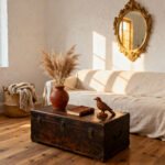
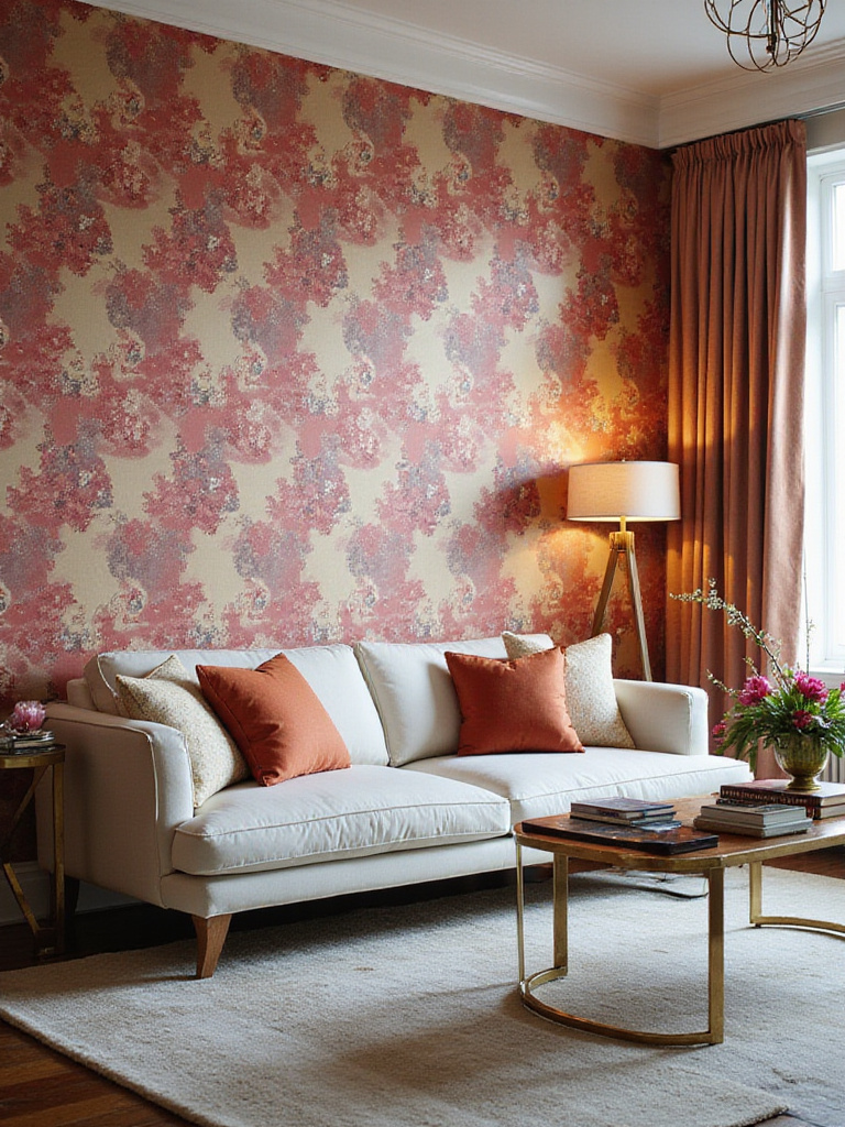
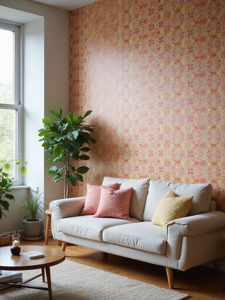
18. Use Wallpaper Behind Your Sofa to Anchor the Seating Area
Placing your accent wall behind the sofa is the design equivalent of a firm, confident handshake. It defines the main social zone of your home and provides a beautiful, intentional backdrop for your life. Especially in open-plan homes where you need to create “zones” to prevent the space from feeling like one big, undifferentiated cavern, this is a brilliant and effective strategy.
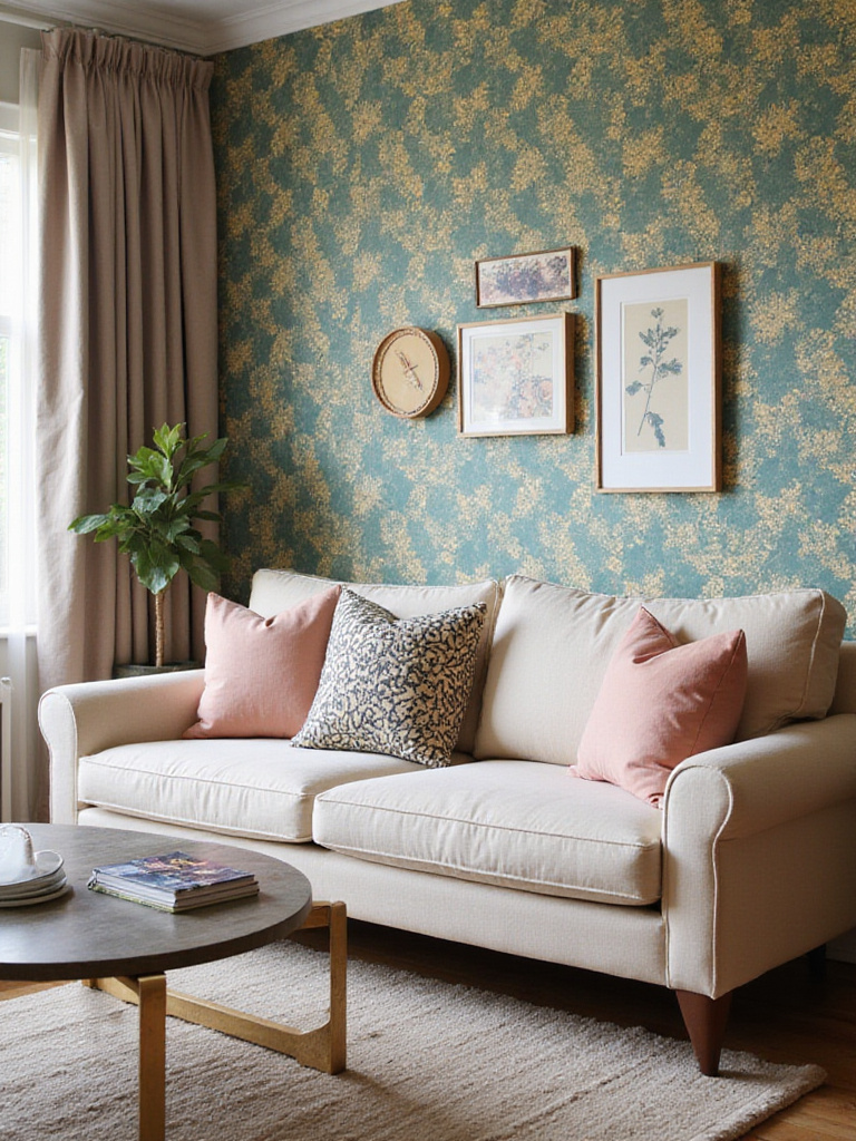
The wall behind a sofa is usually a generous, uninterrupted canvas, which allows you to showcase a pattern without it being broken up. It gives the pattern room to breathe and make its full impact. The wallpaper will always be a part of the view, framing your conversations and quiet moments. It makes the whole seating area feel more cohesive and pulled-together.
The only caveat here is to think about the relationship between the sofa and the paper. If you have a very bold, patterned sofa, you might want a more subtle, textured wallpaper so they aren’t screaming at each other. Conversely, a simple, solid-colored sofa is the perfect foundation for a really dramatic and exciting wallpaper. It’s all about balance—creating a dialogue where one element supports the other.
19. Enhance a TV Wall with a Complementary or Subtle Pattern
The television wall is often the most challenging in a living room. It’s functional, but not always beautiful. Wallpapering this wall is a fantastic way to solve that problem, but it requires a delicate touch. The goal is to create a backdrop that is interesting when the TV is off, but doesn’t distract you when it’s on.
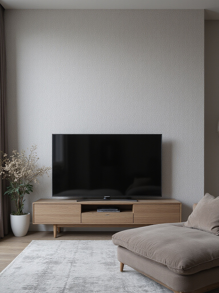
My advice is almost always to go for subtlety. Dark, moody, low-contrast patterns are your friend here. Think charcoal grasscloth, a deep navy geometric tone-on-tone print, or a subtle woodgrain. Darker backgrounds actually make the picture on the screen appear more vibrant and reduce eye strain. High-contrast patterns—like a bold black-and-white stripe—will visually fight with the screen and give you a headache. The same goes for anything too shiny or metallic, as it can create a distracting glare.
The wallpaper should integrate the TV, not just surround it. It should make the black rectangle of the screen feel like a deliberate part of a larger, more sophisticated composition. When done right, it can completely transform the feeling of a media-focused room from purely functional to beautifully designed.
20. Integrate a Mural Wallpaper for a Dramatic, Artistic Statement
If you want to make a truly breathtaking statement, a mural wallpaper is the answer. This moves beyond a repeating pattern into the realm of large-scale art. It can transport you to a misty forest, an abstract landscape, or a historic city. A mural becomes the undeniable heart and soul of the room, a focal point so powerful that it often requires very little other decoration.
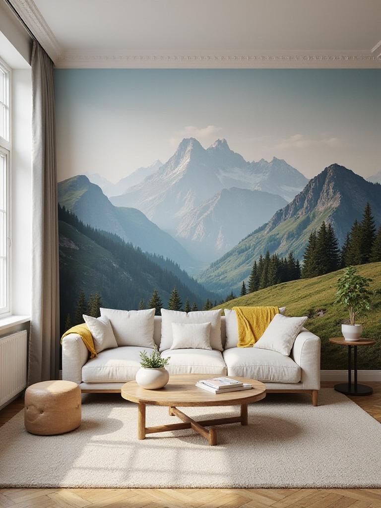
The possibilities are endless, from sweeping romantic landscapes to sophisticated abstract designs, or even vintage-inspired botanical illustrations. In my own work, I love using murals to tell a client’s personal story. For a well-traveled family, we might choose an antique map of a meaningful region. For an art collector, an abstract mural that echoes the colors of their favorite painting. Many companies now offer custom-sized murals to fit your wall perfectly, or even fully bespoke designs based on your own photograph or concept.
A word of caution: installing a mural is not for the faint of heart. The panels must align with absolute precision to create the seamless image. This is one area where I strongly, strongly recommend hiring a professional installer. You’re investing in a piece of art for your wall; it’s worth the extra cost to have it installed perfectly. The impact, however, is second to none. It creates a completely immersive experience.
21. Boost Architectural Interest in a Featureless Room
So many of us live in homes that are, frankly, a bit bland. Simple, boxy rooms with no interesting moldings, no built-ins, no architectural charm. This is where wallpaper can be a superhero. It can create the architectural interest that your room is missing.
There are incredible wallpapers available today that convincingly mimic other materials. You can find papers that look just like exposed brick, reclaimed wood planks, concrete, or elegant board-and-batten millwork. These can add instant character and history to a featureless room without the cost and hassle of actual construction. It’s an especially brilliant solution for renters who can’t make permanent changes. Vertical stripes can create the illusion of taller ceilings, while a geometric pattern can suggest the look of custom paneling.
The trick is to choose a faux-texture or architectural paper that has a realistic scale and a high-quality print. A cheap, badly printed brick wallpaper will look exactly like that. But a good one can be surprisingly convincing, adding a layer of depth and character that can completely transform a boring white box into a room with a soul.
22. Address Common Installation Issues Like Bubbles or Seams
Even with the best preparation, you might end up with a few small issues like a stubborn air bubble or a seam that isn’t lying perfectly flat. Don’t panic. Most of these can be easily fixed if you address them quickly.
Air bubbles are usually caused by trapped air or a spot with not enough paste. If the paste is still wet, you can often gently lift the paper from the nearest edge, smooth the bubble out with a smoothing tool, and re-adhere it. If the bubble appears after the paste has dried, don’t try to peel it back. Take a fine needle or the tip of a sharp craft knife and prick a tiny, tiny hole in the center of the bubble. Then you can gently press the air out and smooth it flat. If it still won’t stick, you can use a special seam adhesive syringe to inject a tiny bit of glue into the hole before smoothing.
Lifting seams usually mean the edges didn’t get enough paste or they dried too quickly. Again, a seam adhesive is your best friend. Squeeze a very thin line of it under the lifting edge, press the seam back into place with a seam roller, and immediately wipe away any excess glue that squeezes out with a damp sponge. The key is to address these small flaws right away. Attending to these details is what gives you that flawless, professional finish.
23. Factor In Long-Term Durability and Washability Needs
When you’re choosing your wallpaper, it’s easy to get swept up in the beauty of the pattern and forget about the practicalities of daily life. But thinking about durability is crucial for ensuring your investment lasts, especially in a high-traffic area like the living room. Your beautiful accent wall might be behind a sofa where kids and pets brush against it, or near a walkway where it gets touched frequently.
Look at the wallpaper’s specifications. Vinyl and vinyl-coated papers are the workhorses of the wallpaper world. They are highly durable, scrubbable, and resistant to stains, making them perfect for homes with a lot of activity. Non-woven papers also offer good durability and have the added benefit of being easier to remove down the line. Traditional papers and delicate materials like silk or grasscloth are the most beautiful, but also the most fragile. They are best for lower-traffic areas where they won’t be subjected to as much wear and tear.
Also, look for the washability rating, which is usually shown as a series of standardized symbols on the label. “Spongeable” means you can gently wipe it with a damp sponge. “Washable” means you can use a bit of mild soap. “Scrubbable” means it can handle more vigorous cleaning. Matching the paper’s durability to your lifestyle will ensure it looks just as good in five years as it does the day you install it.
24. Plan for Future Removal or Replacement if Desired
Our tastes evolve, and our lives change. The wallpaper you love today might not be the wallpaper you want in a decade. Planning for future change is one of the smartest things you can do, and it doesn’t have to compromise your design now. It’s about making thoughtful choices from the start.
This brings us back full circle to peel-and-stick papers, which are obviously the easiest to change out. But even with traditional wallpaper, you can plan for easy removal. The most important step, as I mentioned before, is using a good quality wallpaper primer. It creates a protective layer that allows the paper to be stripped off later without taking your wall with it. Using a “strippable” adhesive also makes a huge difference.
And a simple pro tip: always buy one extra roll of your wallpaper. Keep it stored away safely. If you ever have a section that gets damaged and needs to be repaired, you’ll have paper from the exact same dye lot to patch it with. It’s also a good idea to keep a record of the brand, pattern name, and lot number, just in case. Thinking about the end of your wallpaper’s life at the very beginning is the mark of a truly thoughtful designer.
Conclusion
In the end, creating a living room accent wall is so much more than a decorating project. It is an act of curation. You are choosing the story you want your home to tell. Through these steps—from choosing the right canvas, to understanding pattern and color, to mastering the techniques—you are empowered to create a space that is not just beautiful, but deeply and authentically personal.
The real reward is a room that feels complete, a space where the backdrop is as intentional as the life lived within it. Your home becomes a celebration of your journey, a reflection of the cultures you carry within you, and a testament to your unique style. Your accent wall is waiting. It’s time to give it a voice.