Is your kitchen feeling lackluster? The heart of your home deserves colors that inspire both creativity and comfort. As a space where we gather, create, and nourish, kitchens benefit tremendously from thoughtful color choices that reflect your personal style while enhancing functionality.
A fresh coat of paint offers remarkable transformation power at a fraction of the cost of a full renovation. Whether you’re drawn to serene neutrals or bold statement hues, these kitchen paint ideas will help you create a space that feels both refreshing and uniquely yours.
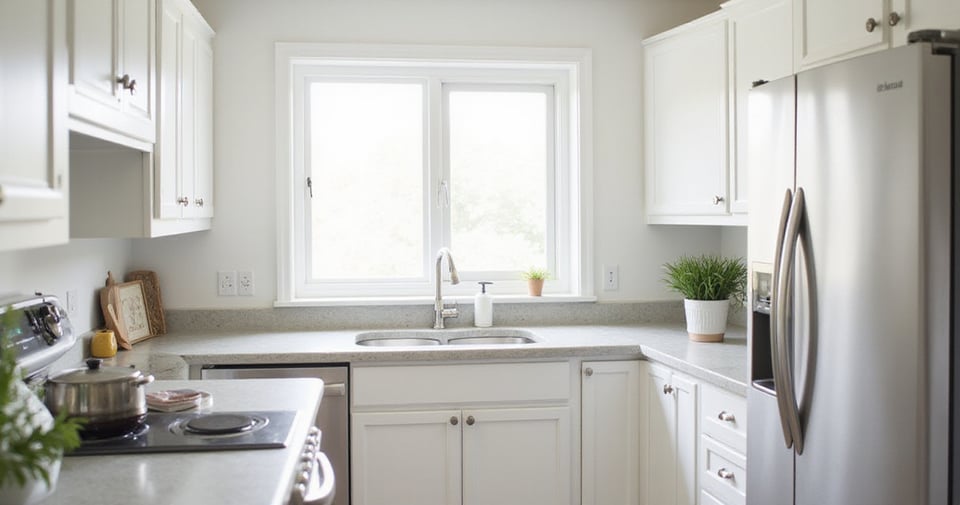
1. Classic White: The Timeless Kitchen Canvas
White kitchens endure for good reason—they create an atmosphere of brightness and adaptability that few other colors can match. The magic of white lies in its reflective qualities, bouncing light throughout the space and making even compact kitchens feel more expansive. This becomes particularly valuable in kitchens with limited natural light or smaller footprints.
Not all whites are created equal, however. Cool whites with blue or gray undertones create a crisp, contemporary feel perfect for modern spaces. Warm whites with yellow or beige undertones bring a cozy, inviting ambiance ideal for traditional or farmhouse kitchens. The key is examining your existing elements—cabinets, countertops, flooring—and selecting a white that harmonizes with these features.
“White is not merely a safe choice—it’s a canvas that allows other elements to shine while creating a sense of timeless elegance.”
The inspiration for this collection struck when I visited a client’s home where white walls transformed a previously dark galley kitchen into a bright culinary haven. Now, let’s explore how gray can bring sophisticated depth to your kitchen palette.
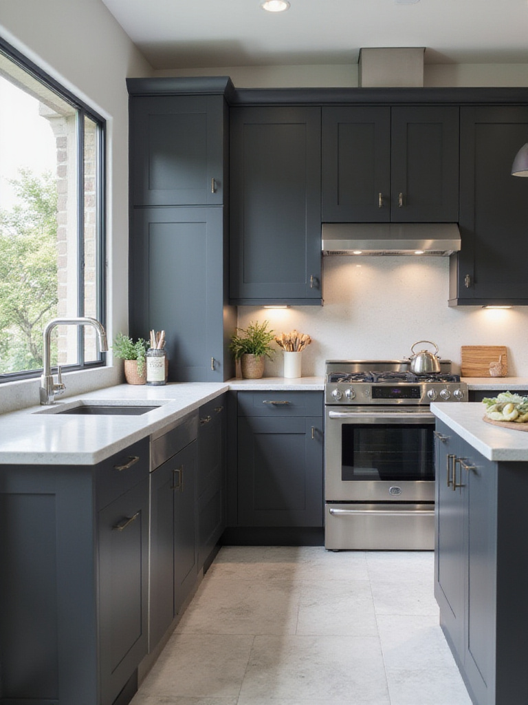
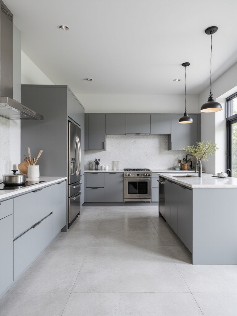
2. Serene Gray: Embrace Modern Kitchen Elegance
Gray has emerged as the modern neutral of choice, offering depth and sophistication that white sometimes lacks. This versatile hue effortlessly complements various design aesthetics, from sleek minimalist spaces to industrial-chic lofts, allowing other kitchen elements—vibrant countertops, statement hardware, eye-catching appliances—to truly shine.
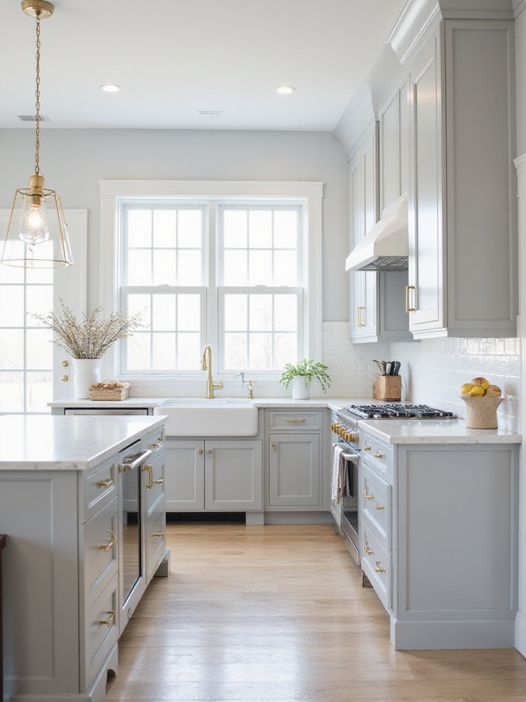
The gray spectrum offers remarkable variety to suit every mood and kitchen size. Light grays create brightness and airiness in smaller kitchens, while medium grays like stone or the popular “greige” (gray-beige blend) strike perfect balance. Dark grays bring drama and depth, ideal for larger kitchens with ample natural light. For walls, lighter to medium grays maintain spaciousness, while darker grays work beautifully as accents.
- Pair gray cabinets with brass hardware for warmth
- Consider high-gloss gray for light reflection
- Test samples under different lighting conditions
- Combine light gray walls with darker gray island for dimension
The magic of this piece lies in its versatility—gray kitchens can feel contemporary yet timeless, sophisticated yet approachable. If you’re seeking pure joy and optimism in your kitchen, our next color choice will surely brighten both your Culinary Space and your mood.
3. Cheerful Yellow: Infuse Your Kitchen with Sunshine
Yellow is the color of sunshine and happiness, guaranteed to create an uplifting and energetic kitchen. The yellow spectrum offers remarkable variety—from bright, sunny yellows that invigorate to muted buttermilk tones that create a calming yet cheerful atmosphere. Mustard yellow brings sophistication and richness, while pale yellows bordering on off-white provide subtle warmth without overwhelming the space.
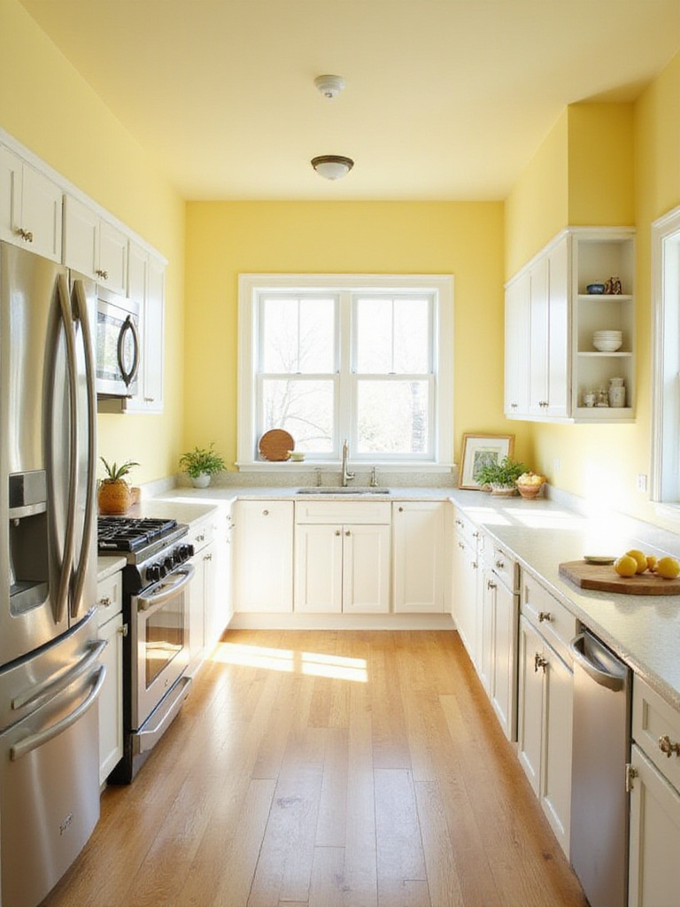
When selecting your perfect yellow, consider the natural light in your kitchen—darker spaces benefit from brighter yellows, while sun-drenched kitchens can handle more muted tones. Yellow’s versatility extends to its harmonious pairings with other colors. Classic combinations include white and gray for a clean, modern aesthetic. For bolder statements, consider contrasting yellow with navy blue or teal. Green accents bring freshness, while wood tones enhance yellow’s warmth.
- Paint a kitchen island yellow to create a focal point
- Try yellow upper cabinets with white lowers for balance
- Use yellow as an accent on open shelving
- Consider yellow for breakfast nooks to enhance morning light
The unexpected pairing that always works is yellow with natural materials—wood, stone, and plants create a kitchen that feels both vibrant and grounded. From the energetic burst of yellow, we transition to a color that evokes tranquility and relaxation, transforming your kitchen into a true culinary haven.
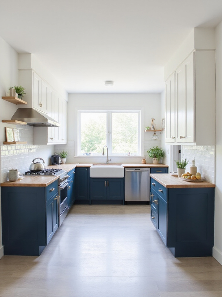
4. Calming Blue: Create a Relaxing Culinary Haven
If you envision your kitchen as a serene escape, blue is your ideal color ally. The key to a calming blue kitchen lies in choosing the right shades—lighter, muted blues like powder blue, sky blue, or soft gray-blues evoke tranquility and peace. These gentle tones create a relaxed ambiance without the stimulating effect of brighter hues. Blues with gray or green undertones further enhance the calming effect, bringing a touch of nature indoors.
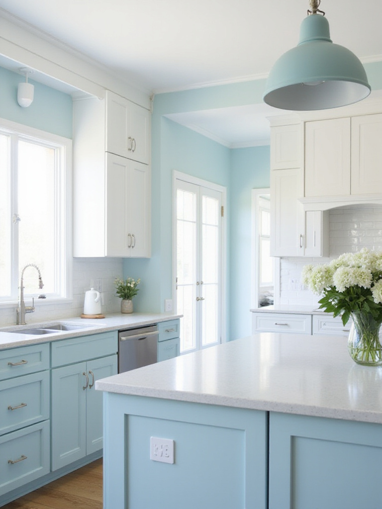
Blue’s versatility extends beyond wall paint. For a truly immersive calming kitchen, incorporate blue through various elements. Soft blue lower cabinets create a grounded, serene feel while maintaining brightness with lighter upper cabinets. A kitchen island in gentle blue becomes a calming focal point. Blue tiles or a painted backsplash offer color and texture, while accessories in varying blue shades layer the color throughout the space.
Designer Tip: In Vietnamese design philosophy, blue represents water—an element that brings fluidity and calm to spaces. Consider how blue might create this sense of peaceful flow in your own kitchen.Beyond aesthetics, the emotional response this blue evokes begins with a sense of exhaling tension—exactly what many of us need in our busy culinary spaces. Moving from the serenity of blue, our next color palette invites the outdoors in, grounding your kitchen in natural beauty and organic vibes.
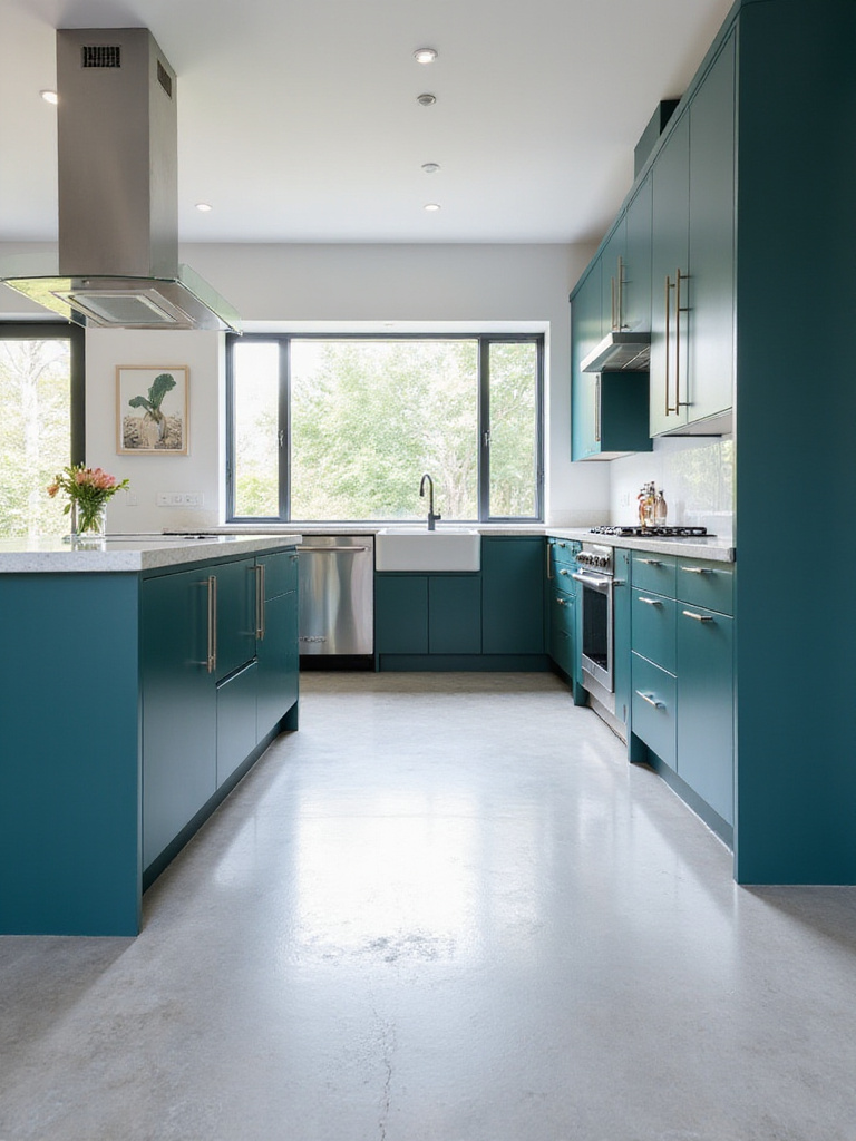
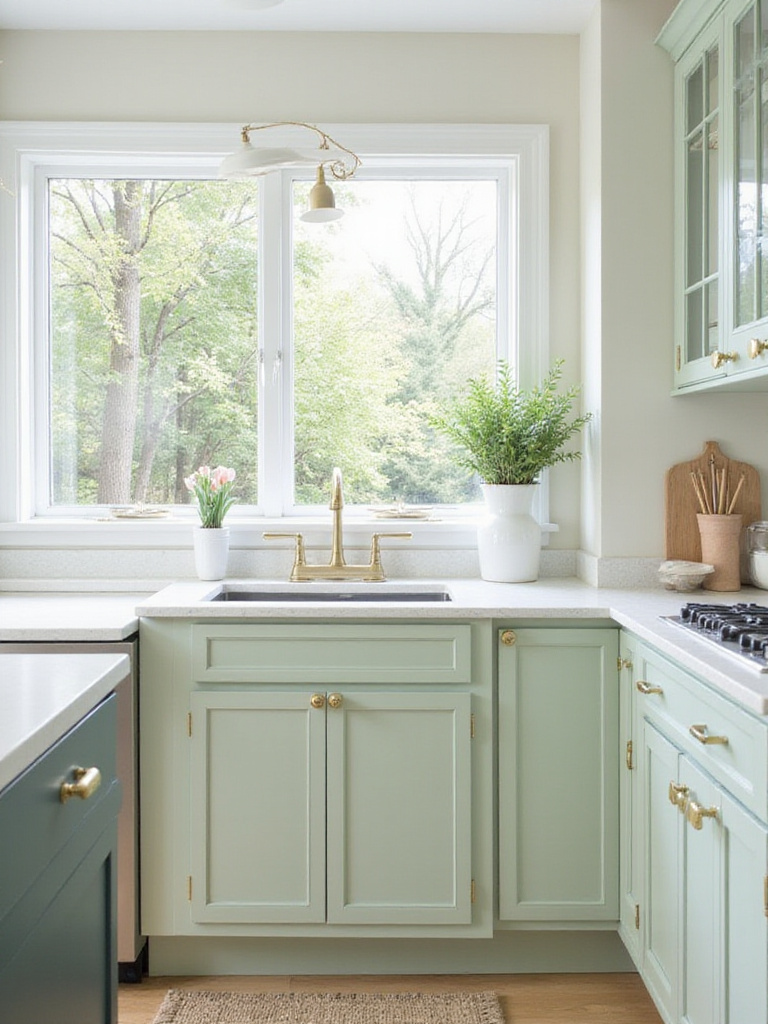
5. Earthy Green: Bring the Outdoors In for a Natural Vibe
Earthy green paint colors have gained tremendous popularity in kitchens for their ability to create calm, tranquility, and a profound connection to nature. These versatile hues integrate seamlessly into diverse kitchen styles, from modern farmhouse warmth to bohemian chic freedom. The inherent natural tones cultivate a soothing atmosphere, transforming your kitchen into a welcoming retreat for cooking, gathering, and simply being.
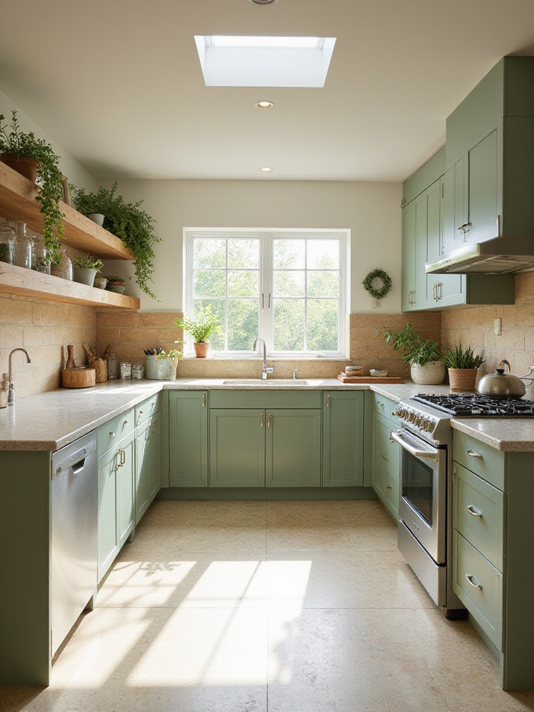
The spectrum of earthy greens offers a rich palette to explore. Sage green provides a soft, subtle touch, perfect for creating a light and airy kitchen. Olive green brings sophisticated depth and elegance, while forest green offers drama best suited for larger spaces or accent walls. Muted avocado tones deliver a retro-inspired vibe with modern sensibility. Your ideal shade depends on your kitchen’s size, lighting, and your desired aesthetic impact.
- Pair sage green cabinets with white countertops
- Combine olive green with natural wood elements
- Use forest green for a dramatic island statement
- Add copper accents to enhance green’s warmth
The environmental story behind these green kitchen paint ideas began with my Vietnamese heritage, where connection to nature is fundamental to design. For those seeking dramatic impact and sophisticated edge, our next color choice makes an unforgettable statement.
6. Bold Black: Make a Dramatic Statement in Your Kitchen
Black paint in kitchens might seem daunting, especially in smaller spaces, but strategic application creates remarkably impactful and stylish results. Rather than painting all walls black in a compact kitchen, consider it as a powerful accent. Black lower cabinets paired with light countertops and backsplash ground the space while adding drama without overwhelming. A single black accent wall creates a focal point and adds depth. Crucially, ensure ample lighting to counteract black’s light-absorbing nature.
The world of black paint offers more diversity than you might expect. Popular kitchen black shades range from soft charcoal to the deepest true blacks. For maximum drama, consider “Black Beauty” or “Black Magic.” If you prefer subtlety, “Iron Ore” or “Wrought Iron” offer depth without overwhelming darkness. Always note undertones—some blacks lean toward blue, while others have warmer brown undertones. Testing samples under your specific lighting is essential for selecting the perfect black.
“Black is not merely absence of color—it’s a statement of confidence and sophistication. In Vietnamese-European fusion design, we use black as punctuation, creating moments of dramatic contrast that define spaces.”
While black brings drama, many homeowners wonder how to balance style with comfort. If black feels too intense but you still crave warmth and timelessness, our next color profile offers cozy comfort and enduring appeal.
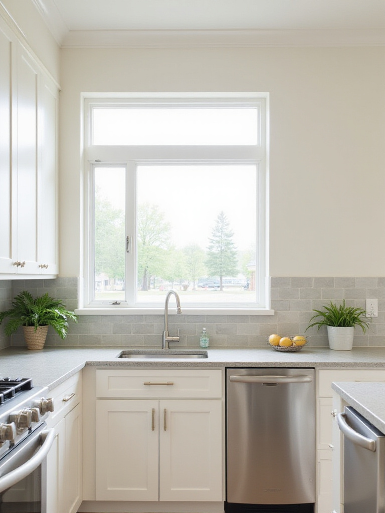
7. Warm Beige: Achieve Cozy Comfort and Timeless Style
Warm beige whispers understated elegance and cozy comfort, making it an excellent choice for kitchen paint ideas. Its strength lies in neutrality, providing a versatile backdrop that harmonizes with various cabinet styles, countertop materials, and appliance finishes. Beige fosters a welcoming atmosphere ideal for the heart of the home where family and friends gather, while concealing minor imperfections and everyday wear—practical for high-traffic kitchens.
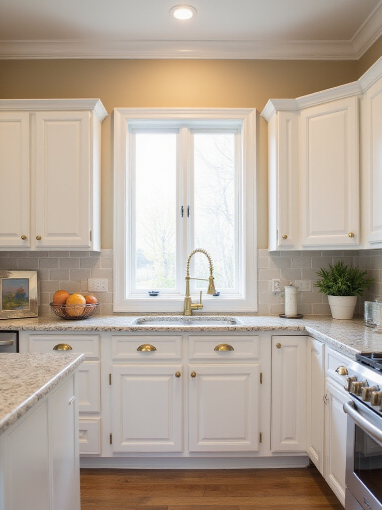
This timeless color can be beautifully complemented in numerous ways. For classic elegance, pair beige walls with white trim and cabinets. Natural wood tones amplify beige’s warmth and richness. Metallic accents like brass or copper hardware add sophistication, while accessories in blues, greens, or corals create vibrant yet harmonious contrast. Your countertop selection also influences the overall effect—granite or quartz with warm undertones blend seamlessly, while darker countertops create striking elegance.
- Use warm beige with yellow undertones to maximize sunlight
- Try textured beige paint for subtle dimensional interest
- Combine beige walls with cream cabinets for layered neutrals
- Add colorful accessories that can be easily changed seasonally
The designer’s secret here is to view beige not as a “safe” choice but as a sophisticated foundation that allows texture and material quality to become the stars. For those seeking to move beyond single-color schemes and add dynamic visual interest, our next idea explores a technique that brings depth and dimension to your cabinetry.
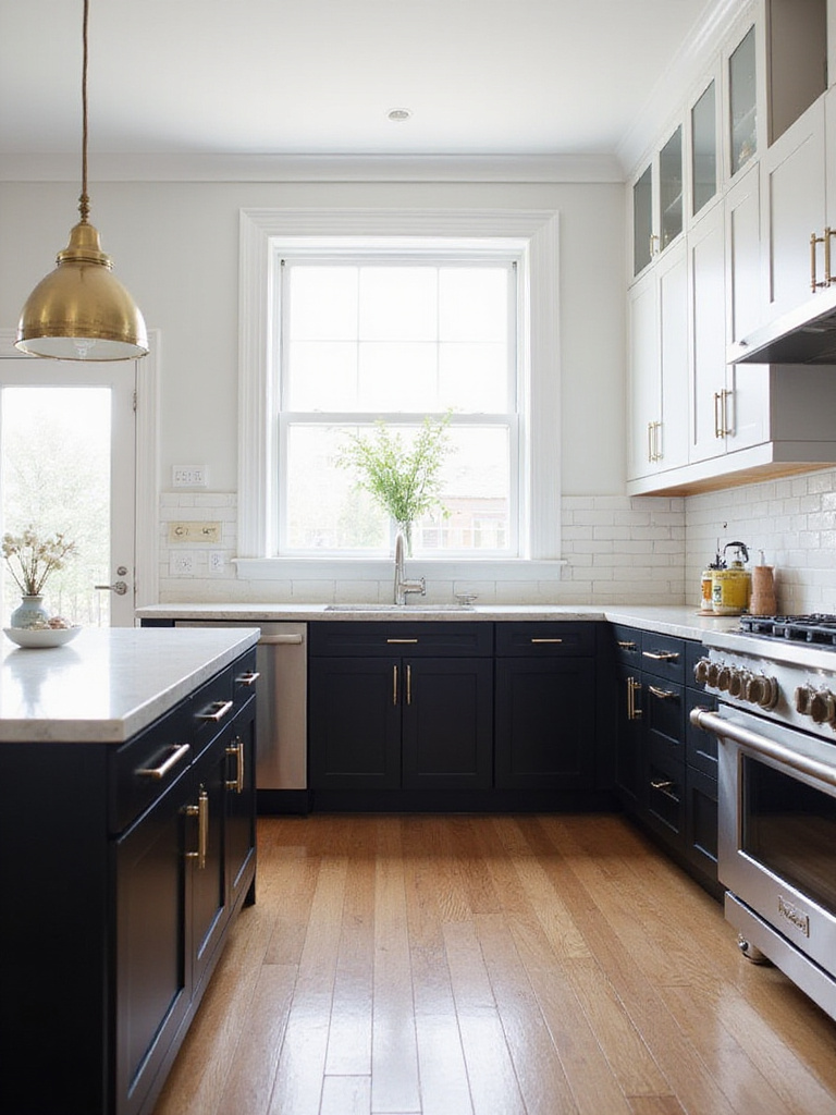
8. Two-Tone Cabinets: Add Depth and Visual Interest
Two-tone cabinets inject personality and visual intrigue into kitchen paint ideas. The most popular approach uses darker colors on lower cabinets with lighter shades above. This classic combination grounds the space while creating a sense of height and spaciousness. Another effective technique transforms the kitchen island with a contrasting color, instantly creating a focal point. For subtle sophistication, consider two different shades within the same color family for a monochromatic two-tone scheme. The truly adventurous might use a bold, unexpected color for either upper or lower cabinets to make a unique statement.
The advantages of two-tone cabinets extend beyond aesthetics. They add depth and dimension, preventing the kitchen from feeling flat or monotonous. Two-tone cabinets can strategically define different zones, subtly separating cooking areas from preparation or serving spaces. They express personal style while highlighting architectural features or specific cabinet styles. This approach allows you to showcase design elements while creating visual interest throughout the space.
Popular Two-Tone Combinations:

- Navy lower cabinets with white uppers
- Black lowers with light gray uppers
- White cabinets with a green island
- Warm wood lowers with cream uppers
The craftsmanship reveals itself in details like the careful color selection that makes two-tone cabinets feel intentional rather than random. If you’re looking for a way to draw attention to specific areas in your kitchen, our next idea explores the power of a single, impactful surface.
9. Accent Wall Magic: Highlight Key Kitchen Features
An accent wall in the kitchen is a design superpower, transforming ordinary spaces with a single brushstroke. It creates instant visual interest, breaks up large wall expanses, and defines distinct zones like breakfast nooks or coffee bars. An accent wall draws attention to architectural features such as beautiful range hoods or open shelving. It injects warmth, depth, or vibrant color while allowing experimentation with bolder kitchen paint ideas without overwhelming the entire space.
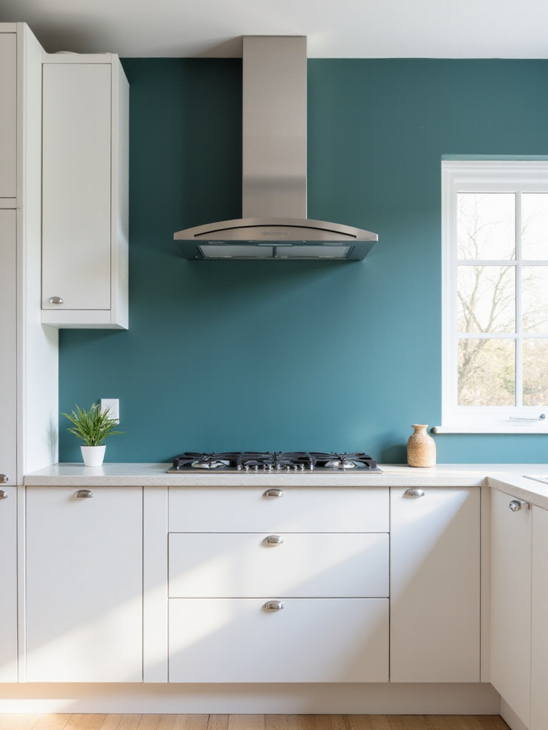
Certain kitchen features naturally benefit from accent wall treatment. The wall behind the range hood becomes a showcase, especially with statement hoods deserving attention. Breakfast nooks or dining areas gain definition and intimacy. Walls with open shelving allow dishes and décor to pop against accent colors. Architectural details like exposed brick or beams gain emphasis. Even the back wall of a kitchen island can become an accent surface, adding interest and grounding the island as a focal point. However, avoid accenting walls already visually busy with numerous doors or windows.
- Use bold color behind open shelving to highlight displayed items
- Try textured paint techniques for subtle accent walls
- Consider a painted arch as a partial accent wall
- Experiment with geometric patterns for modern kitchens
Many homeowners wonder about balancing style with practicality. The ambiance evolves throughout the day as natural light plays across your accent wall, creating different moods from morning to evening. Moving from highlighting features, let’s explore paint finishes, starting with a sophisticated option that offers a modern, non-reflective look.
10. Matte Finish Sophistication: For a Modern, Non-Reflective Look
Matte finishes have risen to prominence in kitchen paint ideas, celebrated for their sophisticated and modern aesthetic. Their non-reflective nature contributes to understated elegance while forgiving imperfections on walls and cabinets—they don’t highlight bumps, dents, or uneven surfaces like glossier options. The soft, diffused light created by matte paint fosters calm and tranquility. Modern matte formulations offer impressive durability with good scrubbability and stain resistance, especially when choosing kitchen-specific products.
While matte finishes offer numerous advantages, consider potential drawbacks. Less expensive matte paints might be more susceptible to staining compared to glossier alternatives. Grease splatters, food stains, and everyday kitchen messes could require more cleaning effort with lower-quality matte finishes. However, high-quality modern matte paints formulated specifically for kitchens contain additives enhancing stain resistance and washability. Investing in quality and choosing kitchen-appropriate formulations allows you to enjoy matte’s aesthetic benefits without compromising practicality.
“In my European-Asian fusion designs, I often use matte finishes to create a sense of quiet sophistication—they absorb light rather than reflect it, allowing texture and form to become the focus rather than surface shine.”
The sustainable journey of matte kitchen paint ideas involves innovations in washable, low-VOC formulations that maintain the aesthetic while improving performance. In contrast to matte’s understated elegance, our next finish option maximizes light and adds glamour.
11. Glossy Finish Glamour: Reflect Light and Enhance Shine
Glossy finishes are the champions of reflectivity in kitchen paint ideas, making spaces appear instantly brighter and more spacious. Their high sheen bounces light throughout the room, creating an airy openness particularly beneficial in smaller kitchens or those with limited natural light. Beyond aesthetics, glossy finishes offer incredible durability and cleanability. They form hard, non-porous surfaces resistant to stains, grease, and moisture—practical qualities for demanding kitchen environments.
However, the very quality that makes glossy finishes reflective can be disadvantageous. They mercilessly highlight imperfections, requiring meticulous surface preparation for flawless results. Their bold reflectiveness might not suit every aesthetic, and in kitchens flooded with natural light, they can sometimes become overwhelmingly bright. Glossy finishes are most at home in modern, minimalist, and contemporary kitchens, complementing clean lines and stainless steel appliances. They’re particularly effective in smaller spaces where their light-enhancing properties maximize openness.
- Use glossy finish on lower cabinets in dark colors for drama
- Consider high-gloss white for maximum light reflection
- Pair glossy cabinets with matte walls for balanced contrast
- Thoroughly prepare surfaces before applying glossy paint
The composition comes together when you balance glossy elements with textural contrasts—think matte walls, natural wood, or textured tile. For a fun and functional addition to your kitchen, our next idea moves beyond traditional paint finishes to a playful and practical option.
12. Chalkboard Paint Fun: Create a Family-Friendly Message Board
Chalkboard paint adds both whimsy and practicality to kitchen paint ideas. Ideal application areas include a section of wall near the kitchen table or busy family area, creating a designated message center. The side of a kitchen island offers a fun, accessible space for notes or drawings. Inside a pantry door works perfectly for grocery lists or meal planning. Even a repurposed cabinet door can become a decorative and functional element. When selecting a location, choose areas that are visible and accessible but protected from constant bumping or water exposure.
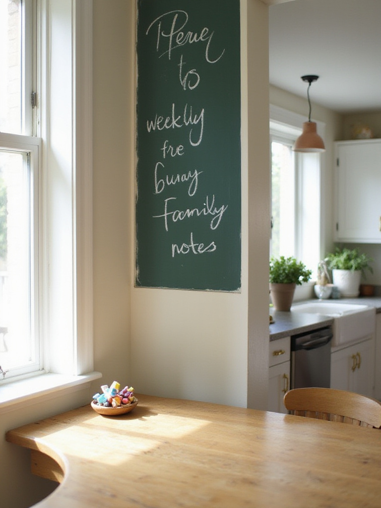
For optimal results with chalkboard paint, traditional chalk provides a classic writing experience, while dustless chalk offers a cleaner alternative with less dust. Proper surface preparation is crucial—thoroughly clean the chosen surface, lightly sand to create texture for adhesion, then apply primer designed specifically for chalkboard paint. Once dry, “season” the surface by rubbing chalk sideways over the entire painted area, then wiping clean. This process fills microscopic imperfections and creates a superior writing surface. Repeat seasoning several times for best results.
Chalkboard Paint Ideas:

- Weekly meal planning board
- Family message center
- Recipe conversion charts
- Children's drawing area
- Grocery list station
If you’ve struggled with similar rooms before, consider how chalkboard surfaces might solve communication challenges in your household while adding personality to your kitchen. If you’re seeking to add luxury and reflective shimmer without committing to a glossy finish, our next kitchen paint ideas explore subtle metallic accents.
13. Metallic Accents: Add a Touch of Glamour and Shine
Metallic paints offer sophisticated glamour and shine to kitchen paint ideas, with color selection crucial for achieving desired effects. The best metallic colors depend on your kitchen style and ambiance goals. Gold and copper bring warm luxury, ideal for traditional, farmhouse, or modern-glam kitchens. Silver and pewter deliver sleek, contemporary feel, perfect for minimalist, industrial, or modern spaces. Bronze bridges warm and cool tones, working beautifully in rustic, transitional, or eclectic kitchens. Consider existing hardware, appliances, and cabinetry when selecting metallic hues to ensure cohesive harmony.
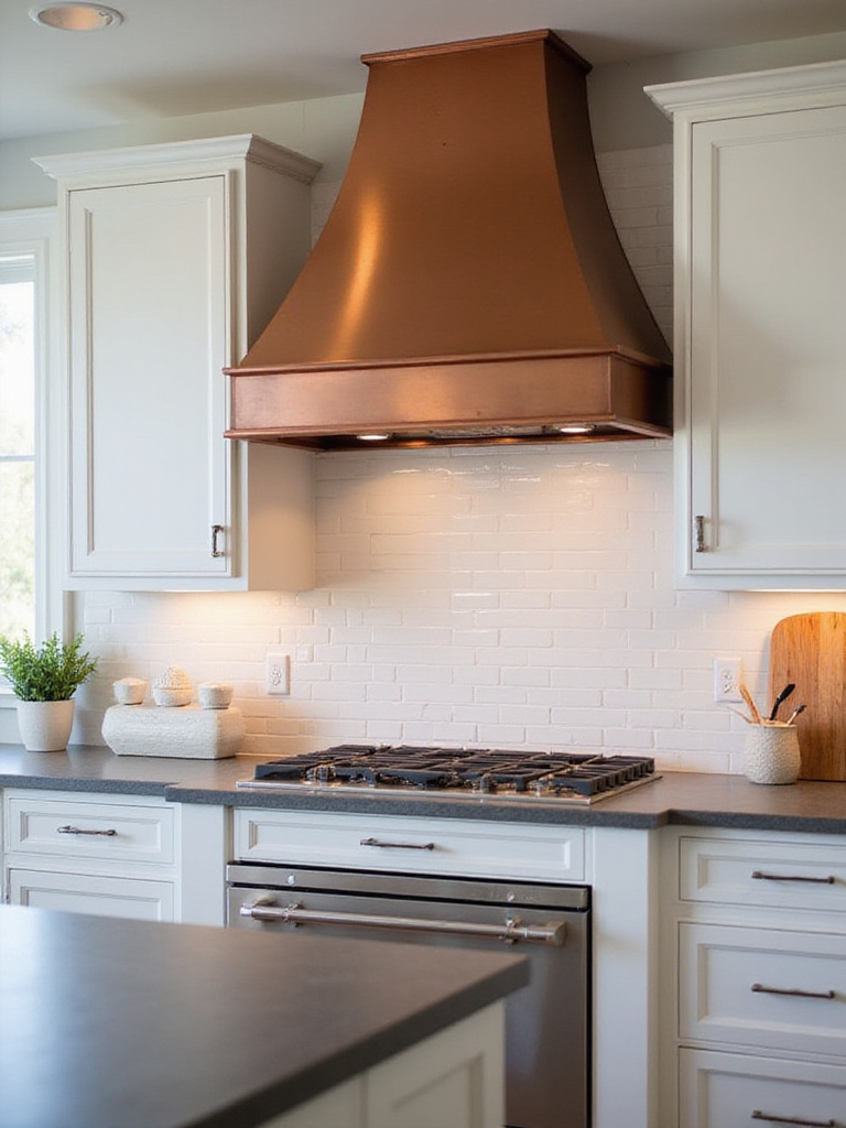
Metallic paint creates maximum impact when used as an accent, preventing overwhelming or dated appearances. Consider painting an accent wall behind open shelving or a statement range hood for a shimmering focal point. Metallic paint can highlight cabinet hardware or create beautiful backdrops inside glass-front cabinets. Even a small portion of backsplash or subtle trim application adds delicate shine. Avoid painting all kitchen cabinets in metallic finish, which can quickly become excessive and appear dated.
- Try metallic gold stripes on a kitchen island
- Use copper metallic paint inside niches or display areas
- Apply silver metallic to highlight architectural details
- Consider metallic ceiling paint for unexpected glamour
The unexpected environmental benefit comes from how metallic surfaces reflect light, potentially reducing artificial lighting needs during daytime hours. For a truly unique and visually captivating wall treatment, our next kitchen paint ideas explore the stunning effect of gradient color.
14. Ombre Walls: Create a Stunning Gradient Effect
Ombre, from the French word for “shaded,” creates a mesmerizing gradient effect that gradually blends one color hue to another. In kitchen paint ideas, ombre walls add depth and visual interest without overwhelming the space. The seamless color transition creates a subtle yet captivating focal point while potentially making small kitchens feel larger by visually elongating walls and drawing the eye upward. This inherently calming, flowing technique complements various kitchen styles, from modern minimalist to rustic bohemian.
The versatility of ombre allows for diverse color palettes, though certain combinations prove particularly successful. Monochromatic schemes using different shades of one color (light gray to dark gray or pale blue to navy) create subtle sophistication. Neutral-to-color ombre, starting with white, cream, or light gray and fading into teal, sage green, or terracotta, adds color without overwhelming. Warm-to-cool transitions from yellow, orange, or red to blue, green, or purple create dynamic interest but require careful planning. Pastel ombre using soft pinks, lavenders, or mint greens delivers gentle dreaminess perfect for light, airy kitchens.
“Ombre walls represent the beautiful transitions in nature—dawn to day, shallow waters to deep. In my fusion designs, I often use this technique to honor the gradual blending of cultural influences.”
The revival of this classic form comes with a twist—modern ombre kitchen paint ideas often incorporate metallic transitions or textural elements. For a kitchen exuding warmth, comfort, and nostalgic charm, our next exploration takes us to the countryside.
15. Farmhouse Fresh: Embrace Creamy Whites and Soft Greens
Creamy whites and soft greens epitomize farmhouse kitchen paint ideas, evoking warmth, simplicity, and nostalgic charm that captures rural living essence. Creamy whites provide neutral, inviting backdrops reminiscent of traditional farmhouses, allowing natural wood, rustic textures, and vintage elements to shine. Soft greens bring outdoors in, mirroring fields, gardens, and nature—core farmhouse elements. Together, these colors create calming, inviting atmospheres that embody the heart of farmhouse kitchens.
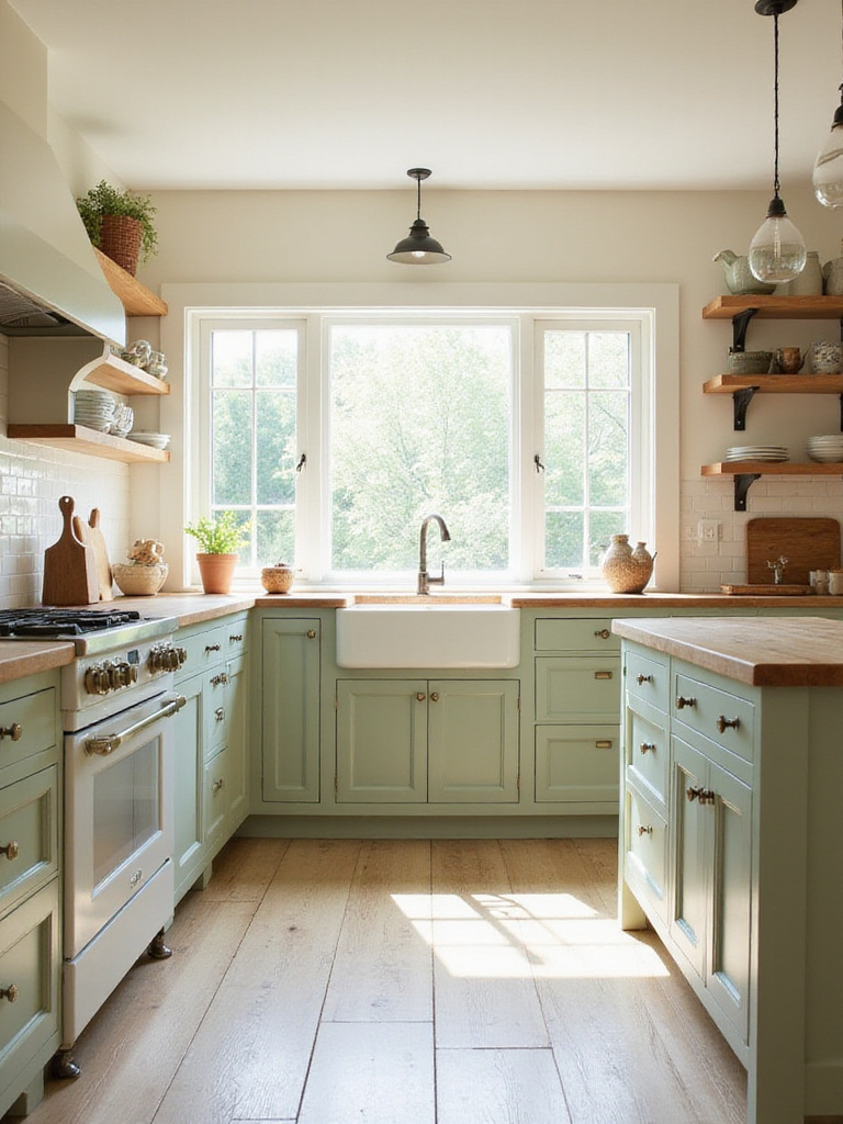
Popular creamy whites for farmhouse kitchens include off-whites with warm undertones like antique white, ivory, or light beige. These shades offer gentle warmth without the starkness of cool whites, which can feel too modern for farmhouse aesthetics. For soft greens, consider sage, mint, seafoam, or muted olive. These greens should remain subtle rather than saturated, creating relaxed, natural feels that complement creamy whites. Always test paint samples under different lighting conditions to ensure harmonious integration within your specific kitchen space.
- Use creamy white on upper cabinets with soft green lowers
- Try beadboard painted in soft green for textural interest
- Add farmhouse accents like wooden open shelving
- Incorporate vintage elements against these gentle colors
When clients ask about balancing style with comfort, I often recommend this color combination for its timeless appeal and ability to create spaces that feel both fresh and familiar. For those who appreciate clean lines, uncluttered spaces, and serene simplicity, our next style journey explores modern minimalism.
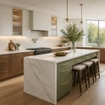
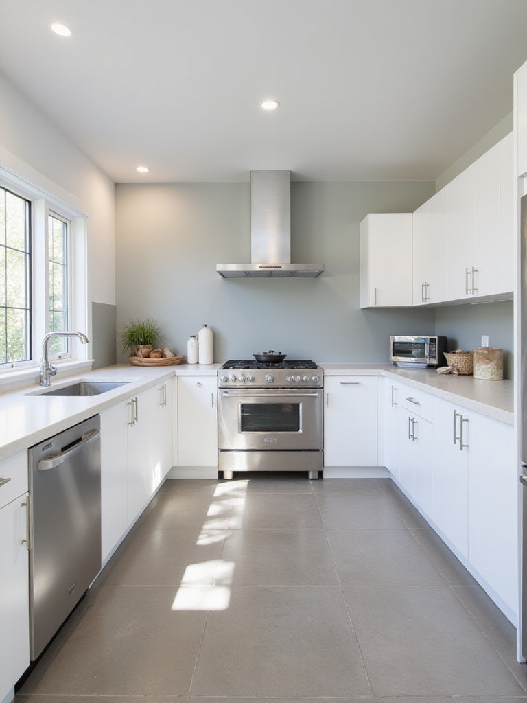
16. Modern Minimalist: Opt for Sleek Gray and White Palettes
Gray and white palettes form the foundation of modern minimalist kitchen paint ideas, embodying core principles of simplicity, clean lines, functionality, and spaciousness. White maximizes light reflection, making kitchens feel larger and brighter—essential in minimalist design. Gray adds sophisticated depth without disrupting minimalist aesthetics, providing subtle contrast while maintaining calm and order. This versatile combination creates a neutral backdrop allowing architectural details, quality materials, and subtle textures to shine without bold color distractions.
The beauty of gray and white minimalist kitchens lies in their subtle variations. Beyond stark white, consider off-whites or warm whites with hints of creaminess to add depth and prevent sterility. The gray spectrum offers options from light dove gray to dramatic charcoals. Experiment with undertones—cool grays with blue/green undertones create calming serenity, while warm grays with beige/brown undertones introduce inviting warmth without compromising clean aesthetics. Greige (gray-beige blend) bridges the gap between cool and warm minimalist palettes with sophisticated warmth.
Minimalist Paint Selection Tips:

- Choose whites with consistent undertones
- Sample grays at different times of day
- Consider how colors interact with natural light
- Select low-VOC formulations for better air quality
- Test finishes for durability in high-use areas
The quality becomes evident after years of use when these classic colors continue to provide a timeless backdrop for evolving design trends. Dreaming of a kitchen that evokes seaside tranquility? Our next palette transports you to sun-drenched shores with colors inspired by ocean and sand.
17. Coastal Kitchen Dreams: Capture Light Blues and Sandy Beige Hues
Coastal kitchen paint ideas capture the essence of beach and ocean tranquility. The color palette mimics soft sea and sand hues, including light blues ranging from sky blue and powder blue to pale aqua and seafoam green, evoking gentle ocean waters. Sandy beige tones encompass warm off-whites, light tans, and creamy beiges, representing sun-kissed shores. Crisp whites provide clean, airy backdrops enhancing the coastal feel. Deeper blues like navy or indigo and greens like sea green can accent the palette, representing deeper ocean or coastal vegetation. The goal is creating bright, airy, relaxing atmospheres that transport you to serene beachside days.
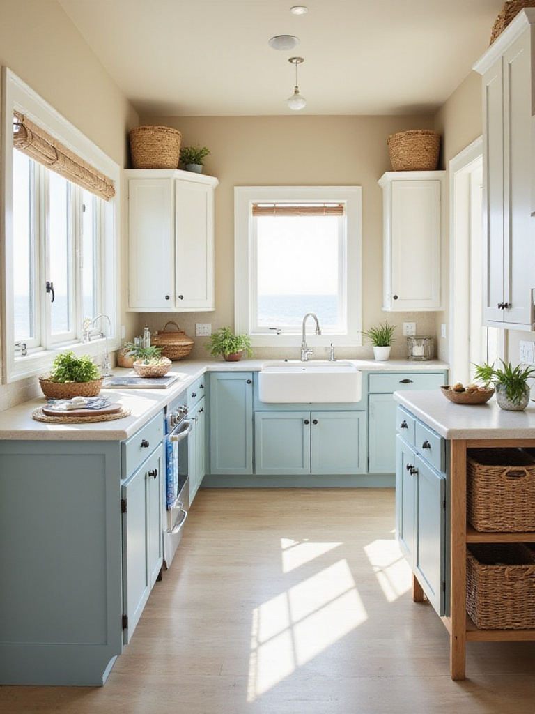
For coastal kitchens, choosing appropriate paint finishes enhances both aesthetics and practicality. Walls benefit from matte or eggshell finishes, providing soft, non-reflective surfaces that enhance the calming, natural coastal palette. These finishes mimic sand and sea glass textures, contributing to relaxed ambiance. For cabinets, satin or semi-gloss finishes offer durability and cleanability—crucial in kitchens prone to spills. For authentic coastal, weathered looks, consider chalk paint on cabinets with distressing techniques, creating gently aged, beach-worn appearances. Regardless of finish, choose moisture-resistant formulations, especially near sinks and stoves.
- Paint islands in weathered blue contrasting with creamy cabinets
- Use sandy beige on walls with white trim for classic coastal look
- Add navy blue accents for nautical coastal themes
- Incorporate natural wood elements to enhance beach vibes
The emotional response this evokes begins with the calming sensation of being near water—something deeply ingrained in our psyches. If you yearn for a kitchen exuding warmth, groundedness, and comforting history, our next journey explores rustic charm.
18. Rustic Charm: Warm Browns and Terracotta for a Cozy Feel
Warm browns and terracotta tones embody rustic charm in kitchen paint ideas, creating spaces that feel cozy, inviting, and connected to natural beauty. These earthy hues evoke strong connections to outdoors, natural materials, and simpler lifestyles—key rustic design elements. Inherently inviting, they create comfort and warmth, making kitchens welcoming hubs for gathering. They evoke aged wood, sun-baked earth, and natural clay, bringing history and authenticity. These colors harmonize beautifully with exposed wood beams, natural stone countertops, and copper accents, enhancing organic, cozy aesthetics.
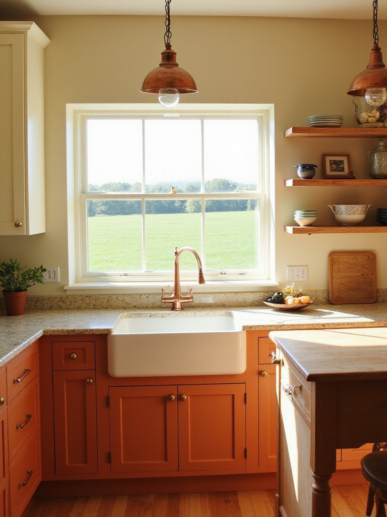
The spectrum of warm browns and terracotta offers rich palette possibilities. For browns, consider deep chocolate, rich walnut, warm coffee bean, or lighter taupe and beige with warm undertones to maintain coziness. For terracotta, explore burnt sienna, brick red, ochre, or softer salmon pink, each bringing unique rustic nuances. Your specific shade choice depends on desired rustic intensity and natural light availability. Always test samples under your kitchen’s specific lighting conditions before committing to particular shades.
“In my design practice, I’ve found that terracotta tones create a bridge between Vietnamese earthiness and European warmth—they speak a universal language of comfort that transcends cultural boundaries.”
The traditional methods used in creating these earthy pigments result in colors that feel grounded in history yet timeless in appeal. For a simple yet impactful way to inject personality into your kitchen, our next idea focuses on a single, strategic element.
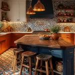
19. Island Pop of Color: Make Your Kitchen Island Stand Out
Painting your kitchen island a different color than surrounding cabinets delivers impressive design impact. This technique instantly adds visual interest, breaking up monotonous uniform color schemes. A contrasting island color creates an immediate focal point, drawing the eye and adding personality. It defines the island as a distinct kitchen zone, highlighting its functionality as prep area, serving station, or gathering spot. This approach offers a low-risk way to experiment with bold colors without committing to painting all cabinets, injecting personality while avoiding major overhauls.
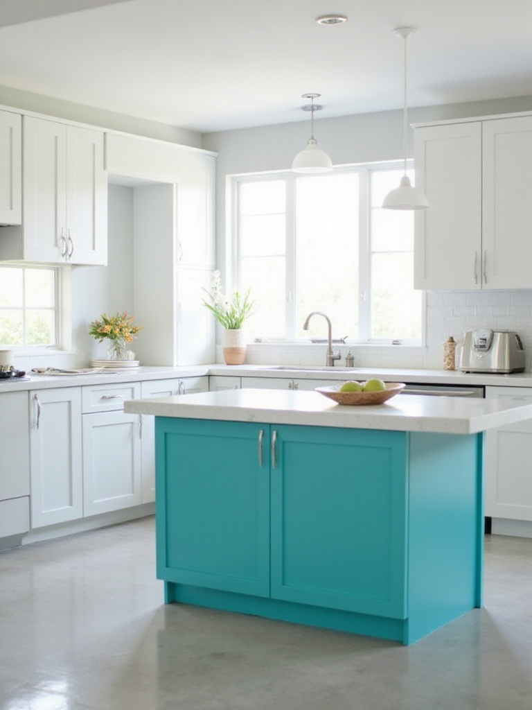
Choosing the right island pop color depends on existing kitchen colors, overall style, and your desired statement. Consider complementary colors (opposite on the color wheel) for bold, dynamic contrast—white cabinets with teal or coral island create striking impact. Analogous colors (adjacent on the color wheel) offer more harmonious, subtle contrast—light blue cabinets with soft green island create cohesive yet interesting looks. Popular island colors include blues (navy, teal, light blue), greens (sage, emerald), reds (burgundy, tomato), yellows (mustard, sunshine), and sophisticated black or dark gray for drama. Always consider undertones of existing cabinets and countertops to ensure complementary, intentional design.
- Use unexpected colors like plum or emerald for contemporary kitchens
- Try black islands with white cabinets for timeless contrast
- Consider navy blue islands in neutral kitchens for subtle sophistication
- Experiment with two-tone islands for truly unique statements
The maker’s journey from apprentice to master influenced how I approach these color decisions—understanding that the island often serves as the heart of kitchen activity deserves special color consideration. For truly transformative kitchen updates without breaking budgets, our next idea focuses on revitalizing existing cabinetry.
20. Cabinet Refresh: Instantly Update with New Kitchen Paint Ideas
Painting kitchen cabinets offers design transformation at a fraction of replacement costs. This high-impact, budget-friendly approach completely revitalizes kitchen aesthetics. Fresh paint drastically changes style, modernizes outdated cabinets, brightens dark spaces, and coordinates with new appliances, countertops, or décor. It’s a versatile tool for injecting personality and creating spaces that feel new and uniquely yours without major renovation expenses or disruption.
Choosing cabinet paint colors requires careful consideration of several factors. First, evaluate existing kitchen elements—countertops, backsplash, flooring, appliances—selecting cabinet colors that harmonize with these features for cohesive, balanced looks. Consider your desired kitchen style—modern, farmhouse, traditional, eclectic—ensuring paint colors align with this aesthetic for unified, intentional design. Assess lighting conditions—smaller kitchens and those with limited natural light benefit from lighter, brighter cabinet colors that maximize spaciousness. Examine paint undertones to ensure they complement other elements and contribute to your desired ambiance. Select durable, washable finishes like satin or semi-gloss, ideal for withstanding daily kitchen use and cleaning.
Cabinet Painting Preparation Steps:
1. Remove all hardware and label for easy reinstallation
2. Clean thoroughly with degreaser
3. Sand surfaces to create tooth for primer
4. Apply high-quality primer designed for cabinets
5. Sand lightly between coats
6. Apply at least two coats of quality cabinet paint
7. Allow proper curing time before reinstalling hardware
The cultural heritage preserved in quality cabinet paint jobs includes the tradition of craftsmanship—taking time to prepare surfaces properly honors the cabinets themselves while ensuring lasting results. Finally, to truly complete your kitchen transformation and achieve polished professionalism, our last idea focuses on an often-overlooked but essential detail.
21. Don’t Forget the Trim: Finishing Touches for a Polished Look
Painting kitchen trim isn’t an afterthought but a crucial step in achieving truly polished, cohesive kitchen paint ideas. Even freshly painted walls highlight imperfections in worn or poorly maintained trim. Painted trim provides clean, crisp contrast that defines spaces, enhances wall colors, and prevents unfinished or amateur appearances. Beyond aesthetics, painted trim protects against moisture, wear, and kitchen grime—particularly important in high-traffic, humid kitchen environments. Freshly painted trim elevates entire kitchens, adding refinement and attention to detail that completes transformations.
Selecting appropriate trim colors complements kitchen walls and achieves desired aesthetics. With white walls, crisp white trim (often slightly brighter than walls) creates classic, clean looks emphasizing architectural lines. For softer feels with white walls, off-white or cream trim adds subtle depth and richness. Dark walls with bright white trim create striking contrast and dramatic effects. For sophisticated, understated looks with dark walls, consider slightly lighter shades of wall colors for subtle monochromatic schemes. Neutral walls (grays, beiges) offer versatility—white trim provides clean contrast, while warmer off-whites or subtle greige creates harmonious, inviting feels. For colorful walls, neutral trim (white, off-white, light gray) prevents overwhelming spaces and allows wall colors to shine. Bold wall colors with dark trim like charcoal add sophistication and grounding, creating balanced, intentional designs.
- Consider higher-sheen trim paint for durability and contrast
- Paint trim in stages for easier application and cleaner lines
- Use painter’s tape for crisp edges between trim and walls
- Don’t forget door frames and window casings in your trim plan
The finishing touch that elevates the entire look comes from this attention to detail—trim is like the perfect frame for your kitchen’s color story.
Transforming Your Kitchen with Paint
These 21 kitchen paint ideas demonstrate the remarkable power of color to transform your culinary space without major renovation. From timeless whites and sophisticated grays to bold statement colors and innovative techniques, paint offers endless possibilities for personalizing your kitchen to reflect your unique style and needs.
Remember that successful kitchen painting projects begin with proper preparation, quality materials, and thoughtful color selection that considers your existing elements, lighting conditions, and desired atmosphere. Take time to test samples in your actual space before committing, as colors can appear dramatically different under various lighting conditions.
Whether you choose a complete cabinet transformation, an accent wall statement, or simply refreshed trim, the impact of well-chosen kitchen paint ideas extends far beyond aesthetics—it creates an environment that inspires creativity, encourages gathering, and makes daily cooking and dining a more joyful experience. Your refreshed kitchen awaits!