Gray kitchen cabinets didn’t become ubiquitous by accident. The color has a quality that designers noticed long before homeowners did: it absorbs what surrounds it. A pale dove gray in a sunny south-facing kitchen reads as almost cream. The same shade in a north-facing terraced house becomes cool and composed, like a pebbled shore in February. That mutability is exactly why gray has stayed — not because it’s safe, but because it’s intelligent. It responds to its environment in ways that pure white or navy simply can’t.
Emma Blake has spent a decade watching gray kitchen cabinets prove their staying power across British and international interiors, from Georgian townhouses in Bath to flat conversions in Shoreditch. The sixteen ideas below span every register — from pale dove gray Shakers with brass knobs to deep stormy charcoal set against terracotta — to help you find the specific direction that suits your kitchen, your light, and your way of living in a house.
1. Two-Tone Gray Kitchen Cabinets: White Uppers, Dark Lowers
The two-tone kitchen risks becoming shorthand for “couldn’t decide.” Done well, though, it’s one of the most structurally elegant moves you can make — and gray kitchen cabinets are perfectly suited to making it work.
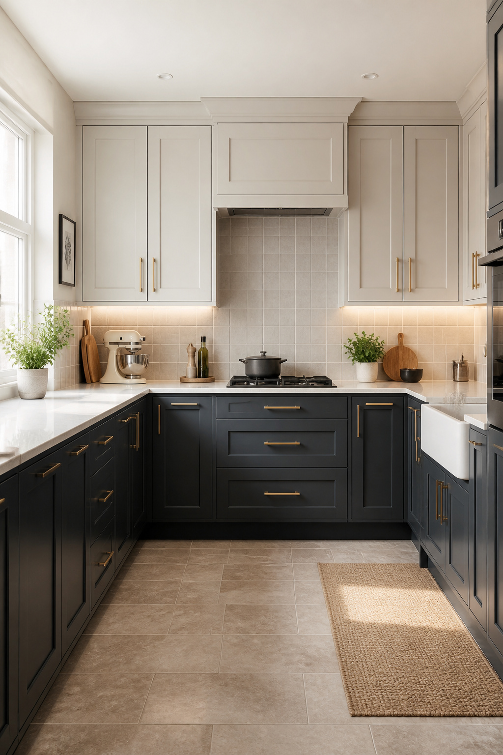
The principle is simple: lighter tones belong above eye level, darker tones below. Pale gray or white upper cabinets reflect light downward and make a ceiling feel higher — a genuine benefit in the standard eight-to-nine-foot kitchen. Charcoal lower cabinets ground the room, create visual weight where furniture traditionally sits, and are considerably more forgiving with daily kitchen wear than white base cabinets that show every splash.
Getting the Tonal Gap Right
The rule to enforce is tonal distance. The two shades need to be at least three paint stops apart on any brand’s colour card. Two adjacent mid-grays read as one muddy neutral under artificial light. Farrow & Ball Pavilion Gray uppers alongside Railings lowers is a proven pairing — the gap between them is wide enough to read as intentional. Use the same hardware finish on both levels: brushed brass or brushed nickel pulled consistently across upper and lower cabinets signals a unified decision rather than two separate kitchens stacked on top of each other. A continuous worktop material across the lower run anchors the split and prevents the design from fragmenting.
2. Pale Dove Gray Shaker Cabinets With Brass Hardware
Dove gray occupies a specific and useful position in the gray spectrum. It’s lighter than mid-gray, warmer than slate, and neither definitively cool nor definitively warm — which is exactly why it works in more kitchens than almost any other shade.
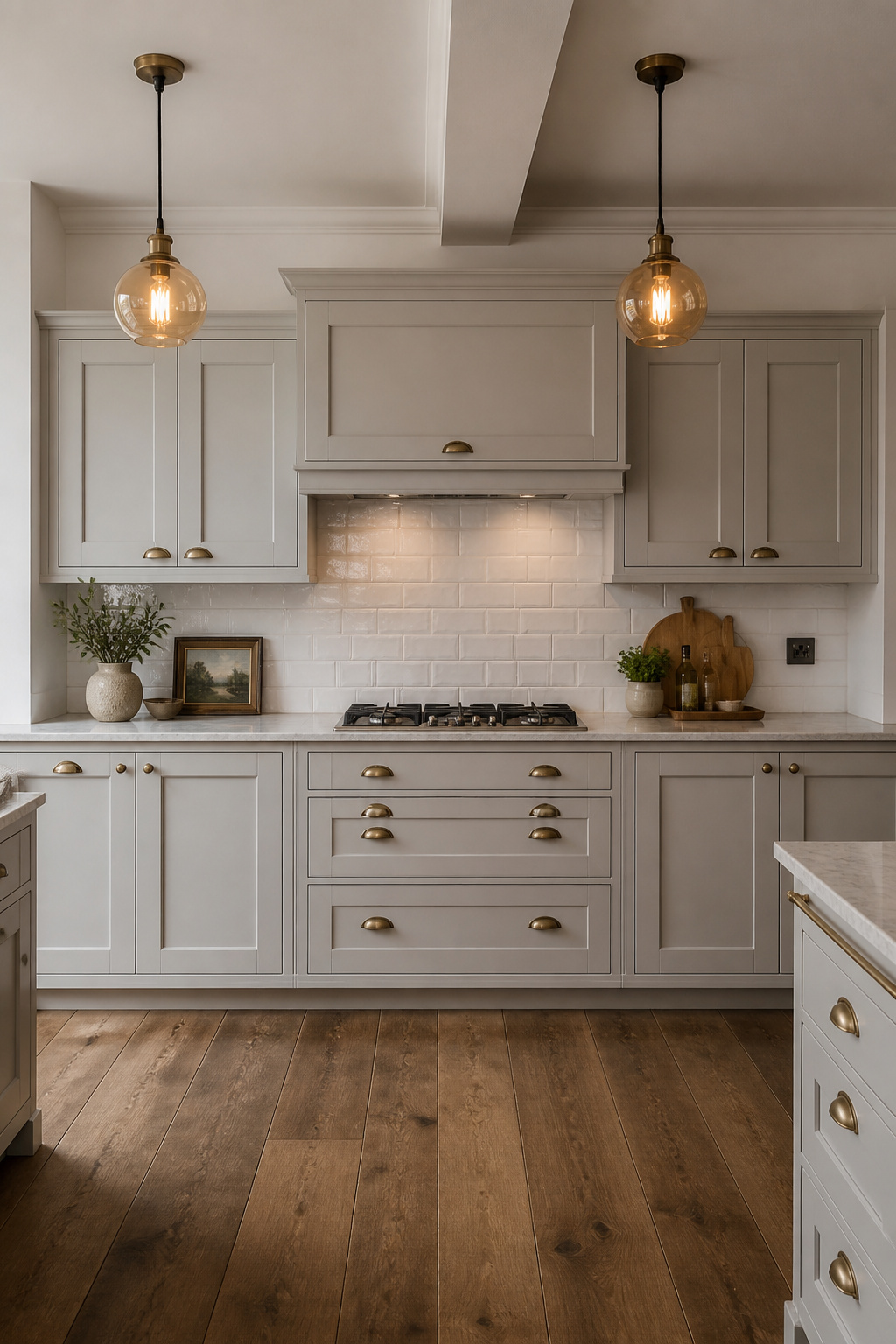
In good natural light, dove gray reads almost as white, with just enough presence to prevent the kitchen from feeling bleached. In shadow and artificial light, the same color deepens slightly, taking on the quality of old limestone or worn plaster. Farrow & Ball Dove Tale, Dulux Polished Pebble, and Benjamin Moore Gray Owl are the most frequently specified dove grays for gray kitchen cabinets in current British and American design practice — all available in hard-wearing cabinet finishes with enough sheen to resist the kitchen environment without looking lacquered.
The Shaker Profile and Hardware Choice
The Shaker profile does something important for dove gray: it provides structure without competing. The recessed panel gives the pale color somewhere to settle into shadow and light. Pair with brushed brass rather than polished — polished brass sits on a surface; brushed brass belongs to it. For the kitchen backsplash design choices that complete the scheme, handmade subway tile in off-white or ivory — rather than stark white — is the most sympathetic partner. Enough variation in the glaze to bring texture, enough neutrality to step back and let the pale gray cabinet color lead.
3. Charcoal Gray Lowers With Open Shelving Above
Remove the upper cabinets. It’s a suggestion that still makes some homeowners nervous, but charcoal lower cabinets with open shelving above is one of the most resolved arrangements in contemporary kitchen design — and it solves several visual problems simultaneously.
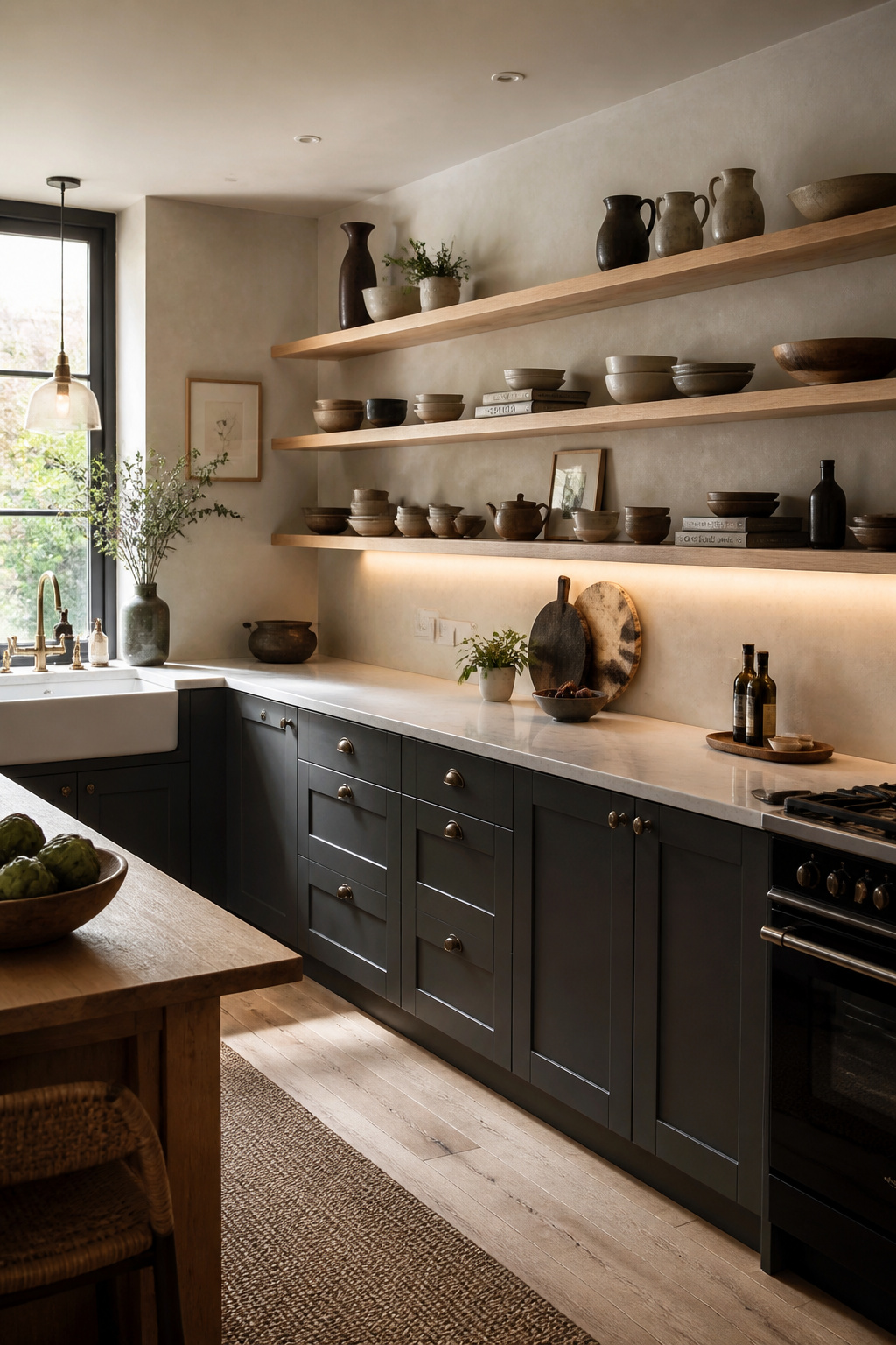
Charcoal grays — Farrow & Ball Railings, Down Pipe, or Little Greene Lava — on lower cabinets create a substantial, furniture-like base. Above the worktop, open shelving in white oak or ash allows the walls to breathe. The warm grain breaks any coolness the charcoal introduces, and the backsplash visible behind the shelves becomes part of the decorative scheme rather than a utilitarian afterthought.
Light Is Non-Negotiable
Under-cabinet LED strip lighting is essential here — without it, the dark lower cabinets pull the worktop surface into shadow by early afternoon. Toe-kick lighting at plinth level adds the floating effect that makes charcoal base cabinets look elevated rather than grounded. A light-colored worktop — white quartz, pale marble, or Corian — provides the horizontal reflective surface that stops the base from reading as one continuous dark mass.
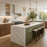
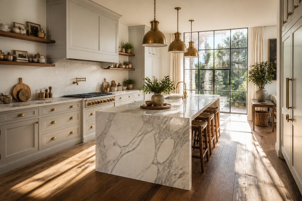
4. Gray Kitchen Cabinets Paired With a Marble Waterfall Island
The reason gray kitchen cabinets and marble are so frequently paired is not fashion. Most white marble contains gray veining — and that veining is visually the same color as the cabinets surrounding it. The pairing works because the island echoes the cabinetry without matching it.
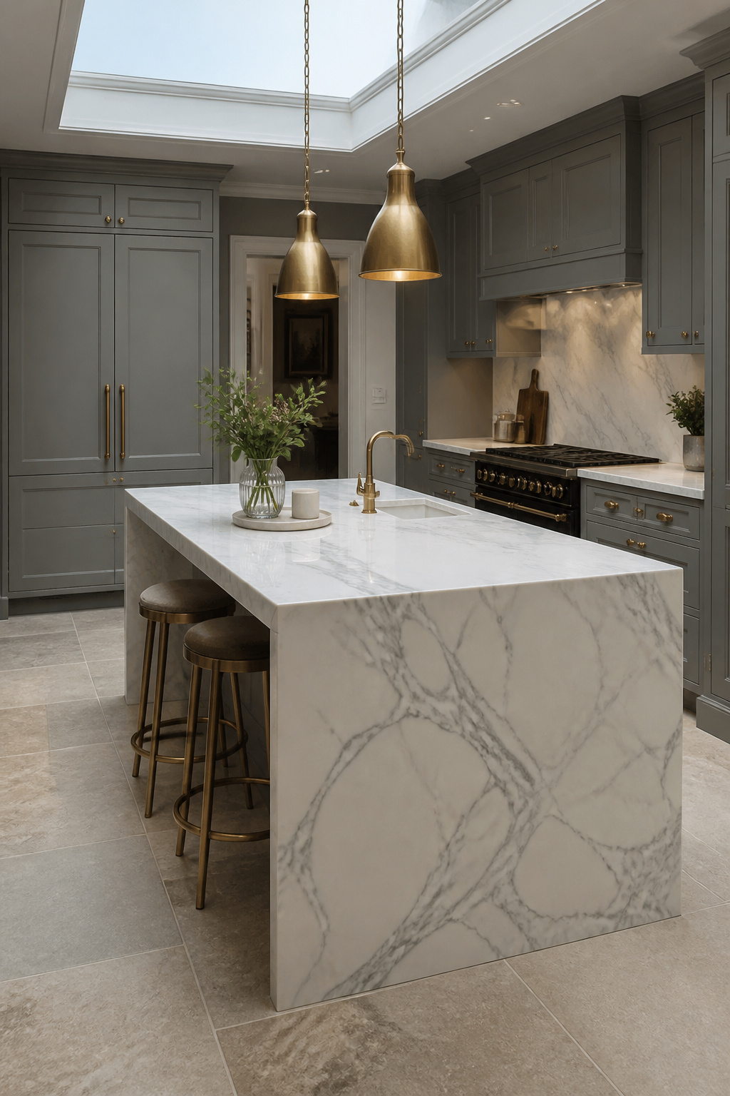
Calacatta has a bright white background with bold, dramatic gray-to-gold veining; Statuario offers a crisper white with more linear, architectural gray. Both work with mid-to-pale gray kitchen cabinets. For those who want to take the gray-on-gray logic further, Pietra Serena — the dark, consistently gray Tuscan stone historically used in Florentine architecture — turns the island into a monolithic object that reads as architectural.
Finish, Maintenance, and Proportions
For a kitchen island in daily use, a honed marble finish is the only sensible choice. Polished marble shows every water ring and acidic drip within weeks; honed stone hides small marks and improves with age. Engineered quartz in a Calacatta pattern offers the look without the maintenance commitment. Whatever material is chosen, the kitchen island countertop materials and proportions are worth thinking through carefully: a waterfall island requires at least 25-30cm of overhang for comfortable seating, and the mitred joint where the horizontal top meets the vertical panel needs to be specified precisely to avoid a visible seam that undermines the whole effect.
5. Sage-Tinted Gray Cabinets in a Cottage-Style Kitchen
Sage-gray is the most organic of all the gray kitchen cabinet options — a color that seems to have grown from the landscape rather than been chosen from a card. In direct sunlight it reads as a complex, slightly weathered gray; in shadow, the green undertone asserts itself, and the kitchen feels connected to the garden just outside.
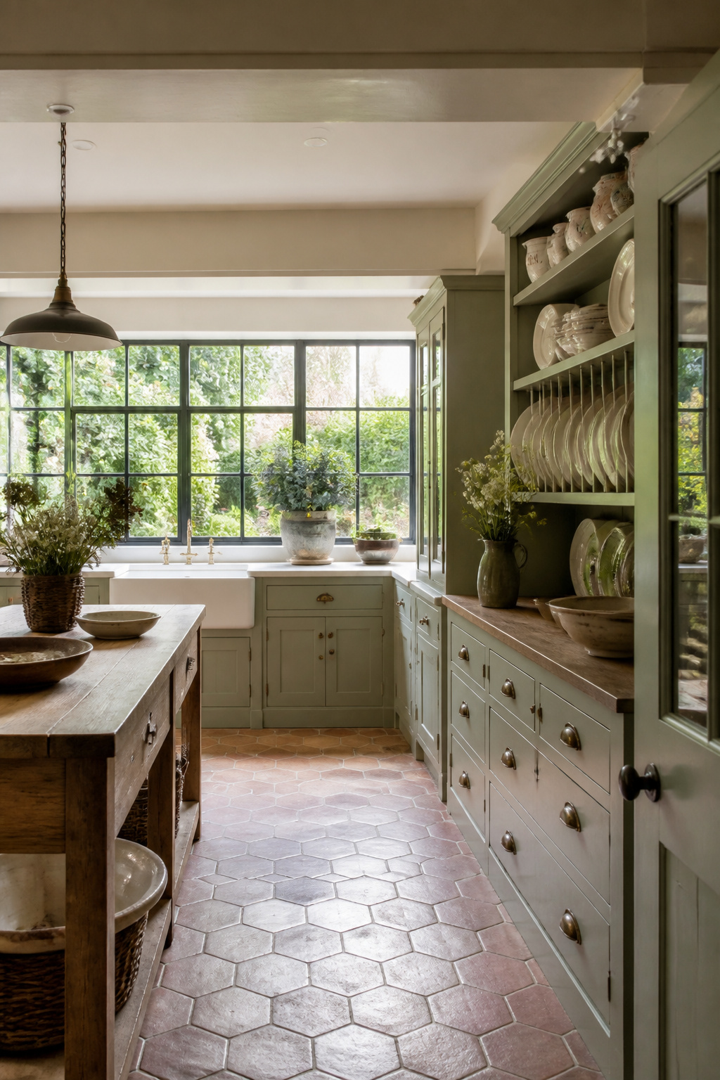
Farrow & Ball Cromarty, Little Greene Joanna, and Sherwin-Williams Evergreen Fog all sit in this sage-gray corridor. The green component in each prevents the cold-gray problem that afflicts more blue-leaning shades in north-facing kitchens. Keep the LRV above 45 and pair with white or off-white trim; the moderate reflectance of these paints means a truly white trim provides the necessary contrast without reading as jarring.
Cottage Elements and Colour Relationships
In a cottage kitchen, tongue-and-groove panelling on an island end — painted in the same sage-gray as the gray kitchen cabinets — adds textural depth that reads as genuine craft. A Butler’s sink in white fireclay shifts the entire register of the kitchen toward the country house. Cream or linen walls, rather than stark white, keep everything in the warm, softly weathered palette of a proper English farmhouse kitchen. Aged oak on an island worktop or as a floating shelf grounds the sage-gray with exactly the warmth that the colour’s organic character calls for.
6. Slate Gray Handleless Cabinets for a Minimalist Look
Handleless kitchens in slate gray represent the minimalist kitchen taken to its logical endpoint: a surface so resolved that it functions as architecture rather than furniture. The appeal is not for everyone — but for those who find visual calm in the absence of applied ornament, this is one of the most considered arrangements a kitchen can achieve.
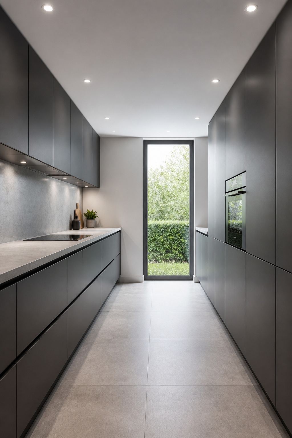
The mechanism matters more in a handleless kitchen than most designers admit. Push-to-open systems work elegantly on lightweight upper cabinet doors, where the spring-loaded mechanism manages the load reliably. Applied to heavy drawer units carrying pots and cutlery, the same mechanisms fatigue quickly. The most considered slate gray handleless kitchens use push-to-open on upper cabinets and J-pull profiles on base drawers — different mechanisms for different demands, unified by the visual language of the door fronts.
Slate gray in this context tends toward the cool, blue-gray end: Benjamin Moore Wrought Iron, Dulux Anthracite, or RAL 7015 are frequently specified for flat-front handleless doors. A pale quartz worktop in a concrete or light stone tone completes the monolithic palette; a full-height porcelain slab backsplash running floor to ceiling as a single uninterrupted surface is the premium move.
7. Gray Kitchen Cabinet Ideas for Warming Up With Wood Shelves
The single most effective antidote to the cold gray kitchen is not more lighting or a warmer paint shade. It’s wood — specifically a floating shelf in white oak, walnut, or ash replacing one run of upper cabinets.
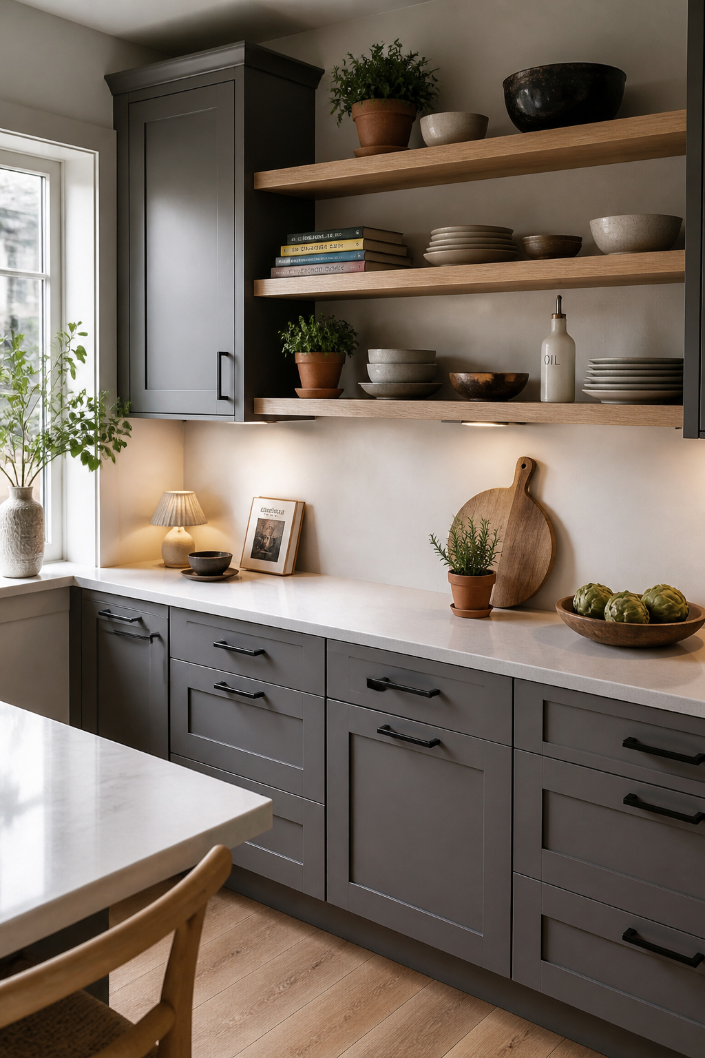
A kitchen without organic material reads as functional space. The moment a natural wood shelf appears — with its grain, its tonal variation, its warmth — the room shifts register from professional kitchen to inhabited home. White oak is the most versatile choice: its honey-to-golden tone is warm enough to offset even a cool mid-gray, but its grain is restrained enough not to push the kitchen toward the farmhouse end of the spectrum. Walnut works better against deep charcoal or dark mid-grays, where the rich brown creates a layered depth; against pale gray, it can feel heavy.
The practical limit is one wall, or one dedicated run above a specific worktop zone. Replacing all upper cabinets with open shelves looks beautiful in a styled photograph and becomes exhausting to maintain after a few months of actual kitchen use. Keep shelf depth to 25-30cm and use a hidden bracket system for shelves under 90cm wide.
8. Greige Cabinets With a Classic White Subway Tile Backsplash
Greige has an unfair reputation as the color of indecision. In fact, it’s one of the most technically flexible neutral choices available — a gray-beige hybrid that reads as warm in some lights and cool in others, serving two masters simultaneously.
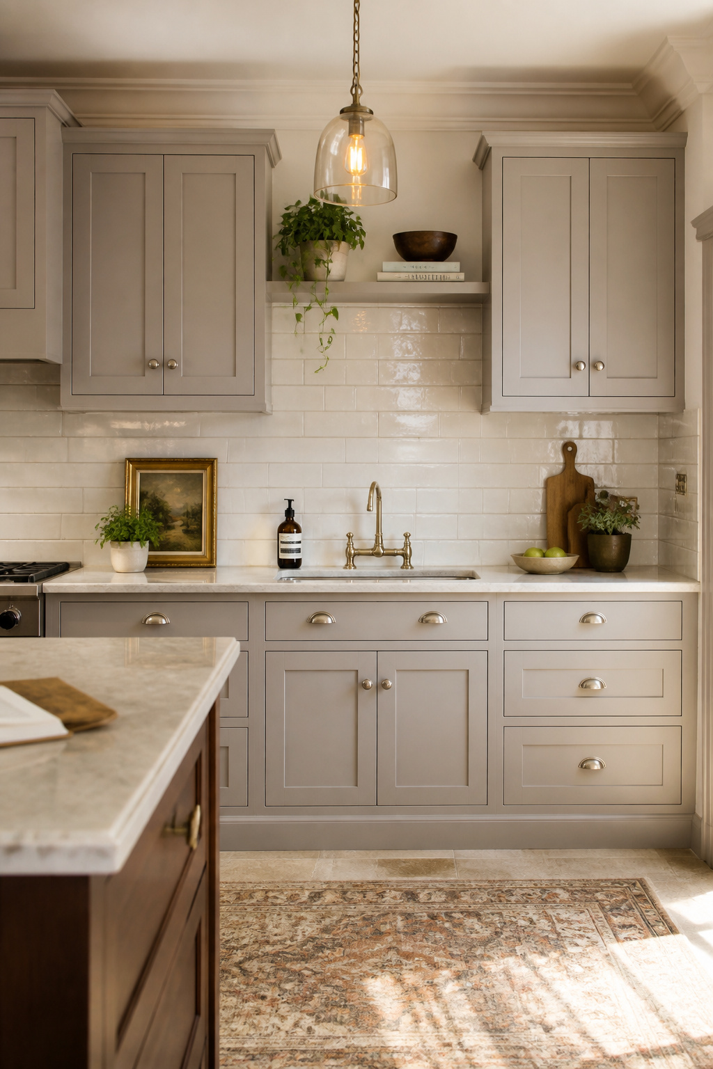
In strong natural light, greige reads as a warm gray — composed and contemporary. Under artificial evening light that makes cooler grays turn icy, greige shifts toward beige or taupe, gaining warmth rather than losing it. Farrow & Ball Elephant’s Breath (LRV approximately 37, with genuine beige undertones), Dulux Soft Stone, and Benjamin Moore Edgecomb Gray are the most often-cited options for gray kitchen cabinets in the greige register. Elephant’s Breath is the most complex — a color that genuinely changes identity depending on the hour, and that behavior is part of its appeal.
Subway Tile: Orientation and Grout
Standard horizontal subway tile with tight white grout creates the crispest, most classic look. Vertical stacked tile reads as more contemporary and can make low ceilings feel taller. Grout color is often overlooked: warm-white or ivory grout rather than cold bright white maintains the palette’s warmth. For anyone drawn to other backsplash configurations in this color family, contemporary kitchen backsplash tile options cover the full range of what works alongside warm cabinet tones.
9. Navy and Gray Cabinet Combination in a Modern Kitchen
Navy and gray share something useful: they are both colors that mean business. Neither is warm, neither is relaxed, and together they create a kitchen that has the deliberate quality of a room that was designed rather than assembled.
The proportional rule here is inflexible: navy should appear in one zone, not two. A navy island within a gray perimeter kitchen turns the island into an object — like furniture that was chosen and placed rather than fitted cabinetry. Navy lower perimeter cabinets with pale gray uppers works from the same visual-weight logic as the two-tone approach, but with more drama at the base. What doesn’t work is navy on both the island and the lower perimeter simultaneously — the kitchen becomes too heavy and the pale gray above fails to compensate.
The gray chosen must have a cool, blue-adjacent undertone. A warm greige next to navy creates an undertone conflict that shows most under artificial light. For hardware and overall kitchen color ideas and combinations in this palette, unlacquered brass or polished nickel work across both tones — the same finish on navy and gray zones signals a unified decision. Lighting temperature is worth specifying: a 2700K bulb keeps the kitchen residential; a 4000K reading pushes both colors toward the commercial register.
10. Gray Kitchen Cabinetry With Matte Black Fixtures
Matte black hardware is the most contemporary choice for gray kitchen cabinets — and the only finish that adds definition without adding warmth. Where brass brings gold light and nickel brings silver shimmer, matte black sharpens. The cabinet color becomes more itself.
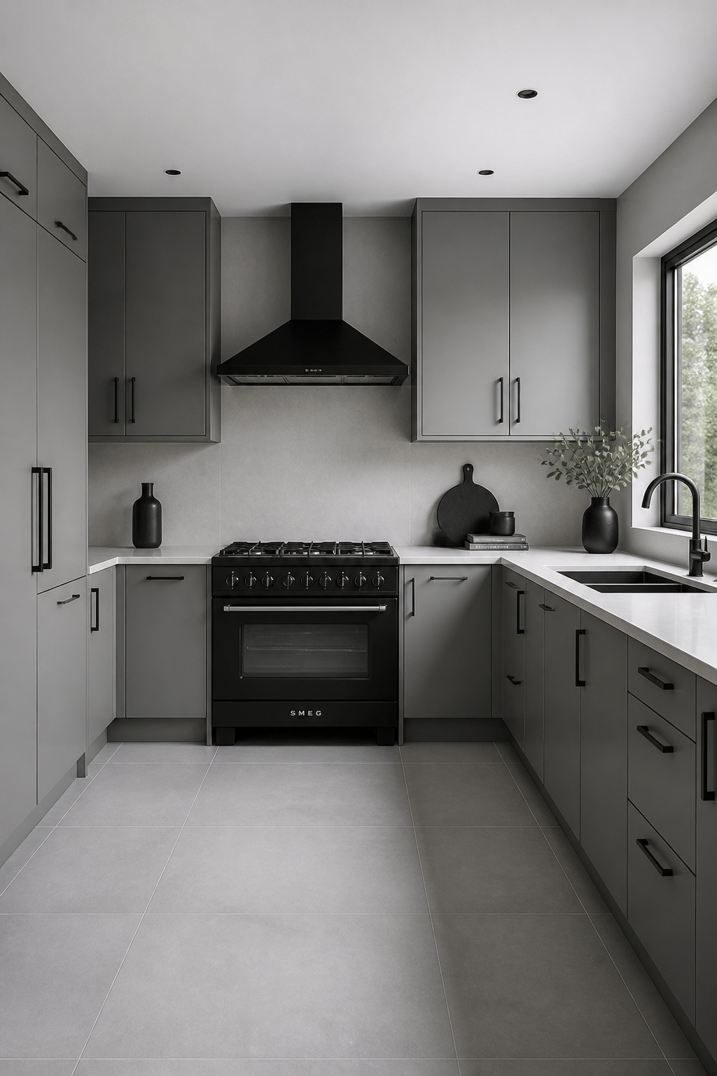
The pairing works best with mid-grays in the LRV 35-55 range — dark enough to make the hardware feel considered, but light enough to maintain the contrast that gives the combination its graphic quality. Cool grays with blue undertones are the most natural partners: they share the composed, contemporary character of matte black, and neither competes for the room’s warmth. Very pale grays can work if there are other dark materials in the room — a dark worktop, a black floor tile — to anchor the hardware choice.
Extending the Matte Black Palette
A matte black extractor hood above a gray island or range cooker is the highest-impact single move: it anchors the upper portion of the kitchen with the same graphic weight as the hardware below, creating a vertical black axis in a field of gray. Kitchen tap brands including Quooker, Perrin & Rowe, and Grohe all offer matte black in their premium ranges. The kitchen cabinet hardware choices that make this palette work are precise: avoid mixing matte black with brushed stainless steel in the same kitchen — both are near-black neutrals, but they create a visual friction that resolves in favour of neither.
11. Warm Pebble Gray in an English Country Style Kitchen
There is a particular shade of gray that looks as though it was lifted from the Dorset coast — the color of smooth river pebbles, pale limestone, and old stone walls. Farrow & Ball named it modestly, and Purbeck Stone No. 275 has become one of the most-specified cabinet colors in British country kitchens for good reason.
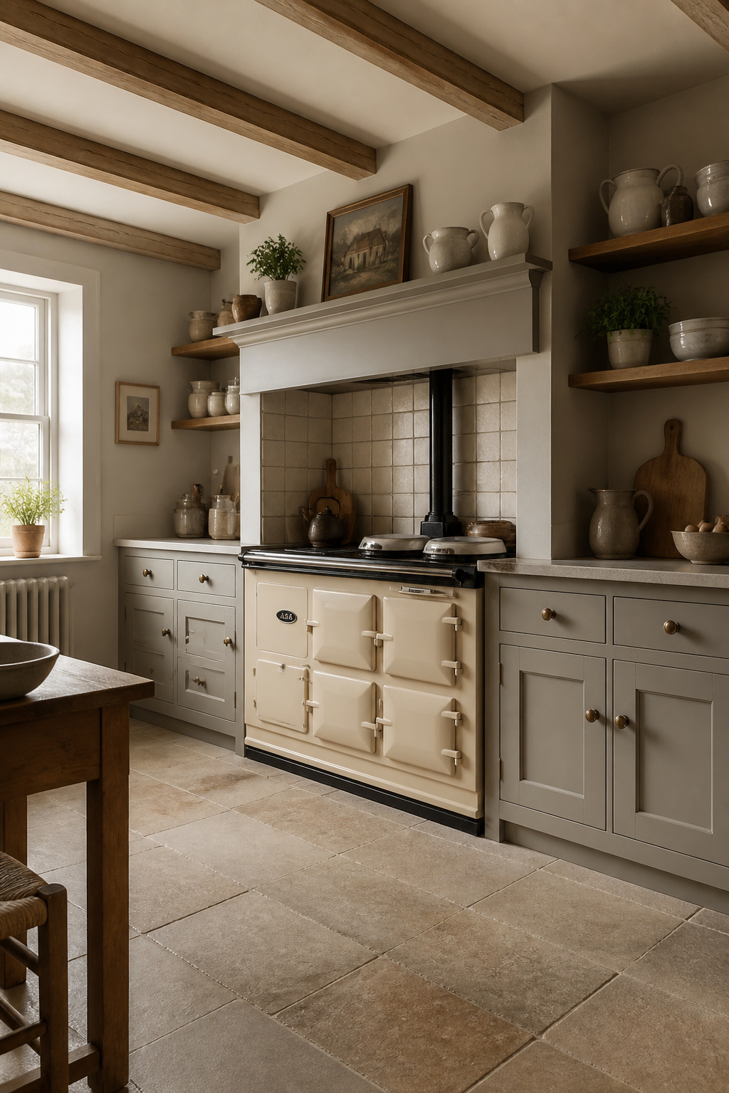
Purbeck Stone reads differently at different hours. In morning sun it’s almost lavender-gray — refined, slightly formal. By afternoon it settles toward a warm stony greige, more familiar and comfortable. This tonal mobility makes it sympathetic in a British country kitchen, where the light changes dramatically across the day and the room needs to feel appropriate at every hour. An LRV of approximately 55 gives it enough substance on a full kitchen’s worth of cabinetry to read as a genuine color decision.
A range cooker in cream or racing green as centrepiece gives the pebble gray cabinetry something to recede behind gracefully. A stone or terracotta tiled floor grounds the palette with a geological character that synthetic flooring can’t replicate. And an unpainted oak island unit introduces the sense that not everything arrived at the same moment — in British design, a quality rather than a flaw.
12. Pale Gray Glass-Front Cabinets for Display Storage
Glass-front kitchen cabinets are having a significant moment — partly as a reaction to the seamless, closed kitchen of the 2010s, and partly because they require their owners to edit and curate what they own rather than hide it.
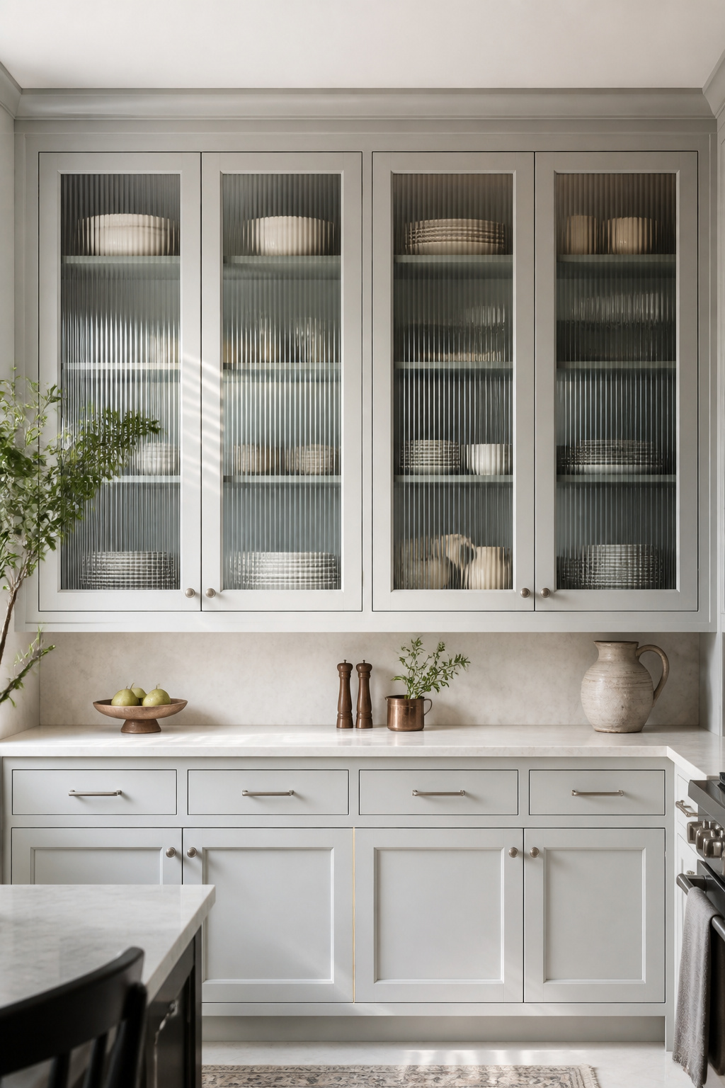
The interior of a glass-front cabinet needs as much thought as the exterior. Painted the same pale gray as the outside, the interior becomes a unified surface and the displayed objects sit within a gentle graduated shadow. Paint it one or two shades deeper and the objects gain a shadow-box quality that makes them feel presented rather than stored. Use an eggshell finish rather than matte on the interior: the subtle sheen catches the light and gives the cabinet’s interior a quiet luminosity that flat paint can’t match.
Reeded or fluted glass is the most practical option for most homeowners: its vertical ridges blur the contents without obscuring them, allowing shape and color to read through while hiding minor disorder. Clear glass demands the highest standard of internal curation — it shows everything. Seeded glass, with its embedded air bubbles, suits heritage or traditional kitchen contexts where the deliberate imperfection reads as artisanal. The content audit before installation is not optional: decide what will live in these cabinets before the doors are ordered, not after they’re hung.
13. Gray Cabinet Ideas for Small Kitchens: Light Tones and Smart Tricks
The small kitchen is where pale gray earns its most compelling practical argument. It does what pure white cannot: it reads as nearly white in strong light while maintaining just enough color presence to prevent the cold, institutional quality that makes some all-white kitchens difficult to live in.
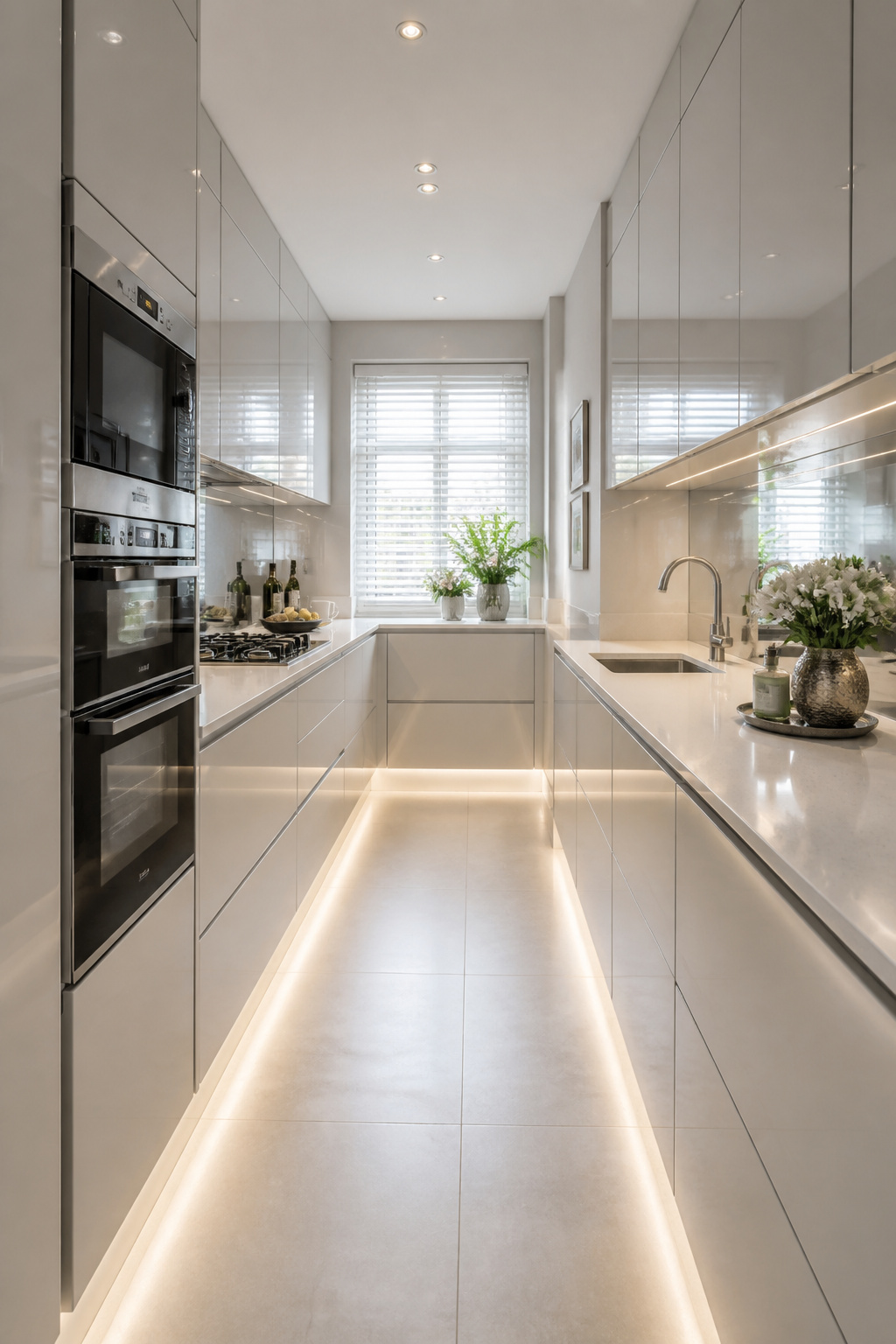
The most effective move for a small kitchen with pale gray cabinets is also the most counterintuitive: paint the walls the same pale gray as the cabinet fronts. When cabinetry and wall read as one continuous surface, the visual boundary between furniture and architecture dissolves. The room stops being a small box with cabinets installed in it. Choose a shade with an LRV of 65 or above — these reflect enough light to maintain brightness while creating tonal continuity that makes the room feel larger than its floor plan suggests.
Reflective Surfaces and Layout Decisions
Mirrored splashbacks behind the hob zone bounce the opposite end of the kitchen back at itself — in a galley layout, this effectively doubles the perceived depth. Polished or lightly honed quartz worktops in a light tone add a horizontal reflective plane across the length of the counter. High-gloss cabinet finishes redistribute both natural and artificial light in ways that matte finishes cannot. For the layout decisions that make the most of limited space, modern kitchen interiors for compact spaces address these trade-offs methodically. Tall larder or fridge-freezer housing units running floor to ceiling are, counterintuitively, better than standard-height cabinets with a soffit above — they remove dead space and give the room a decisive vertical line.
14. Aged Pewter Gray With Brushed Gold Hardware
Pewter gray is dove gray’s more complex, more demanding elder sibling. Where dove gray is light and accommodating, pewter gray has depth and opacity — it absorbs light rather than reflecting it, creating a quality in painted woodwork that looks as though the color has been there for decades.
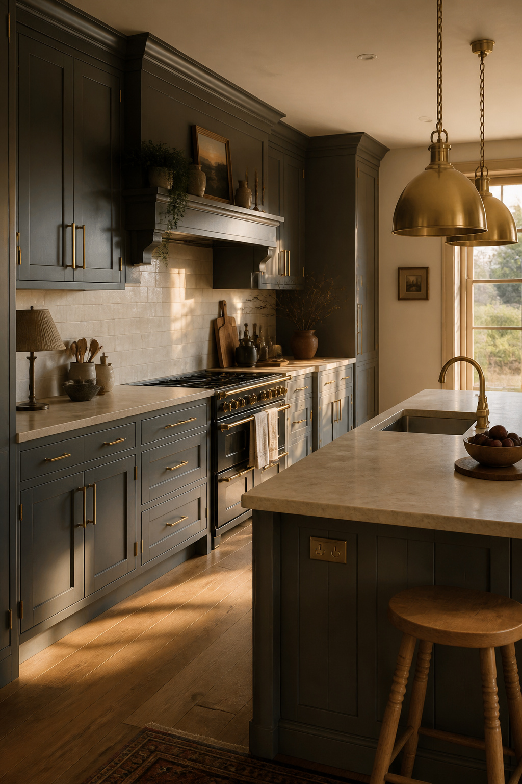
The aesthetic connection to actual pewter — the alloy used for centuries in British kitchens, churches, and taverns — is not incidental. Pewter gray carries a sense of material history that lighter grays lack. Dulux Warm Pewter and Little Greene Normandy Gray sit consistently in this zone, with LRVs of around 35-45 that give them enough darkness to create shadow in recessed profiles and enough lightness to hold natural light on flat door faces.
Brushed gold is the only hardware that reads as right here. Polished gold is too declarative — it announces itself against any background and competes with the quiet depth of pewter gray. Brushed gold’s matte surface sits alongside the paint’s metallic quality without competing for the room’s attention. Both surfaces share a depth and craft that polished finishes lack. Brushed gold also ages better: the PVD coating used on quality products maintains its finish significantly longer than polished lacquer, which shows wear at handle contact points within three to five years. A warm stone worktop — honed limestone, fossil-effect porcelain, or a pale warm quartz — completes a palette that feels collected rather than specified.
15. Concrete-Look Gray Laminates for an Urban Industrial Kitchen
Real poured concrete kitchens are the preserve of architects’ own houses and magazine features — they require specialist trades, precise temperature control, extensive sealing, and a tolerance for the occasional crack that most homeowners don’t share. Concrete-effect laminate removes every one of those obstacles while reproducing what actually makes concrete interesting.
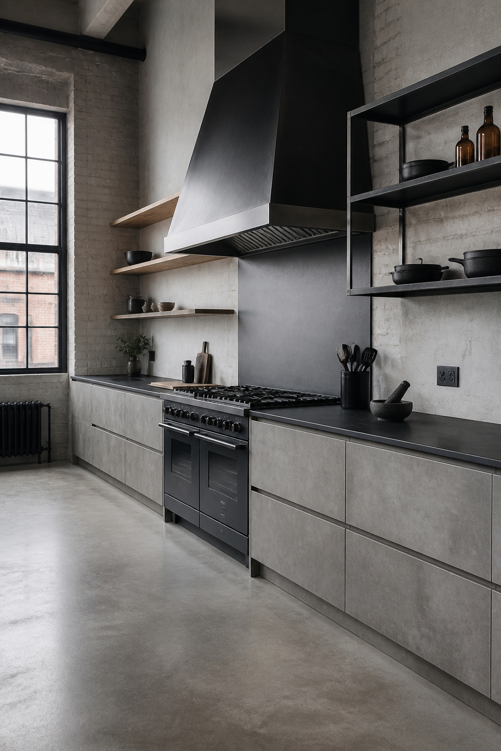
HPL in a concrete effect reproduces tonal variation, surface texture, and aggregate quality through a photographic layer beneath a hard-wearing resin surface. The best products from Formica, Egger, and Kronospan in their premium ranges resist stains, moisture, and scratches better than the concrete they emulate, require no sealing, and cost 20-40% less than equivalent lacquered wood fronts. For a complete kitchen renovation, concrete-effect laminate cabinet fronts typically run £50-200 per linear foot for fitted units.
The industrial kitchen around these gray kitchen cabinets needs materials that share its commitment to the raw and unfinished. Exposed brick or a high-quality brick-effect tile is the most effective companion — two raw materials creating the layered texture that genuinely industrial interiors have. A stainless commercial-style extractor, exposed black steel pipe detailing, or a factory pendant light reinforces the register. And every industrial kitchen benefits from one deliberate softening element — a run of warm-wood open shelves, a large-leafed plant — that signals home rather than workshop without undermining the raw aesthetic.
16. Stormy Gray Cabinets With Warm Terracotta Accents
Stormy gray — the deep, brooding, almost-but-not-quite-black shade that sits just short of charcoal — is the kitchen cabinet choice that polarizes opinions most productively. Those drawn to it are not looking for a neutral. They want a color with genuine presence.
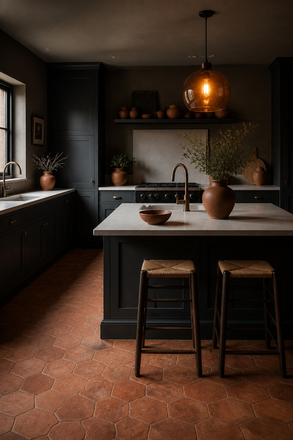
Farrow & Ball Down Pipe, Little Greene Lava, and Valspar Midnight in the City all sit in this stormy territory — deep grays with a cool blue undertone that gives them an atmospheric, slightly oceanic quality. That blue undertone is what makes the terracotta pairing work. Terracotta’s orange-red pigment is a near-complement to the cool blue in stormy gray — in color theory terms, they create a tension that is visually alive without being jarring. The depth of the stormy gray is what prevents the terracotta from reading as merely cheerful; against a color of this weight, terracotta becomes architectural rather than decorative.
Placing the Terracotta Accent
Placement matters enormously. A terracotta floor tile is the most effective location — it grounds the stormy gray kitchen cabinets from below and creates a color relationship across the entire room. Terracotta ceramic vessels on open shelves or the worktop introduce the color as an object rather than a surface, keeping it moveable. The proportion rule is strict: terracotta should occupy no more than 10-15% of the visual field. The moment it competes with the stormy gray for dominance, the palette tips from composed to noisy.
Finding Your Perfect Gray Kitchen Cabinet Shade
The most common and most costly mistake in choosing a gray kitchen cabinet color is confusing the paint chip with the finished room. A chip the size of a playing card in a paint shop is one thing. The same color applied across twenty-four door fronts under your specific kitchen’s combination of north light, tungsten bulbs, and oak flooring is something else entirely.
Before any decision is final, paint a large sample — at minimum A3 size, ideally A2 — on a piece of white card and move it through the kitchen at different times of the day. Morning sun, overcast midday, and artificial evening light will each reveal something different about the paint’s undertone. A warm gray shifts toward cream or stone in certain lights; a cool gray can turn icy-blue under the wrong bulb. Neither behavior is wrong, but both need to be known before cabinet doors are ordered.
The 48-hour rule is worth observing: paint takes a full 24 hours to cure to its true color, and living with a large sample across two full days prevents the particular discomfort of a kitchen full of new doors in a shade that wasn’t quite what the chip promised. The fastest way to read an undertone is to hold the sample against something definitively warm — an orange-toned wood floor — and then something definitively cool — a stainless appliance. The undertone in the paint declares itself immediately. Choose the gray kitchen cabinet shade that holds its character across the widest range of your kitchen’s light conditions, and you’ll have a color that rewards you every time you walk in.