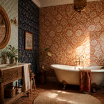
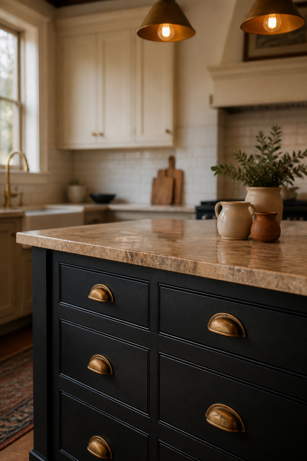
There’s a particular kind of confidence required to install a black kitchen island. Not the showboating sort — the quiet, considered sort that says: I know exactly what I’m doing, and I’ve thought about it rather carefully. Black as a kitchen colour has a distinguished history in British interiors, from Victorian country house kitchens painted in dark, practical tones to the lacquered furniture of Georgian townhouses. The fact that it’s become a contemporary staple speaks less to trend-chasing and more to a genuine truth that designers have always known: dark pigment anchors a room, and a well-chosen black kitchen island does something no other single element can — it gives the whole kitchen its centre of gravity.
What separates a successful black kitchen island from an expensive mistake is understanding the variables. Finish, countertop material, hardware, lighting, and scale all interact in ways that a paint chip at the showroom simply cannot convey. This guide covers fifteen specific interpretations — from the historically-rooted Shaker style to the rigorously contemporary handleless design, from marble waterfall tops to butcher block — so you can find the version that belongs in your particular kitchen, not just any kitchen.
1. Matte Black Island with Unlacquered Brass Hardware
The first thing to understand about unlacquered brass is that it changes. Within a year or two of daily handling, a polished brass pull begins its migration toward a warmer, darker amber-brown — and rather than fighting this, a well-designed kitchen leans into it. Against a matte black island, this living patina becomes the whole point.
Matte black cabinetry absorbs light rather than reflecting it. This flat, non-competitive ground is why warm metals — brass, bronze, copper — appear so clearly against it: they’re not fighting with a reflective surface for attention. The pairing is visually logical, and it’s one reason that brushed brass and matte black led kitchen hardware trends through 2025 and into 2026, showing no signs of retreating. If you’re choosing kitchen cabinet hardware choices for a dark island, understanding the difference between unlacquered and lacquered brass is where you should start.
Unlacquered brass has no protective coating, so it responds to its environment: kitchen humidity, the oils from your hands, daily contact. It will never look the same as it did on the day of installation, and that is entirely the point. Lacquered brass, by contrast, holds its polished gold tone indefinitely — until it chips, at which point the underlying metal shows through in patches that look considerably worse than honest ageing. For a kitchen island, where handles are touched dozens of times daily, unlacquered brass is almost always the better long-term choice.
To complete the palette: warm-toned stone countertops — a honey quartzite or cream-veined Calacatta rather than stark white Carrara — bridge the relationship between matte black cabinetry and brass hardware. The cool undertones of very white marble work against the warmth of both; the stone should lean warm, not cool.
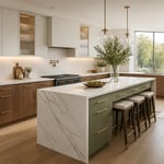
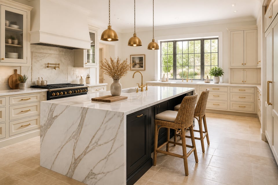
2. Black Kitchen Island Anchoring an All-White Cabinetry Scheme
The black-island-in-white-kitchen formula is the most searched black island configuration, and for very straightforward reasons. The white perimeter does two things simultaneously: it keeps the room feeling open and light-reflective, and it sets up the black island as a deliberate punctuation mark rather than an intrusive dark element.
The design principle is contrast, and contrast only works when the ratio is right. A black island in an otherwise white kitchen reads as a considered gesture precisely because the rest of the kitchen doesn’t share its colour. If the perimeter cabinets were grey, the same island would lose half its impact — the contrast is what makes it read as intentional. This is also why sizing matters so acutely: an island that’s too small in a large white kitchen looks like an accident. It needs enough mass to anchor the space.
Getting the Scale Right
Standard circulation guidance calls for 42 inches of clearance on the working side of an island (36 inches as an absolute minimum in compact kitchens), and this should determine island width before aesthetics enter the conversation at all. For visual balance, a black island in a white kitchen generally looks most confident when it occupies roughly 25-40% of the kitchen floor area — enough to anchor, not so much that the black dominates. Length-wise, an island shorter than four feet rarely provides enough mass to ground a room; at that scale a dark element reads as incidental rather than structural.
For the countertop, the predictable choice is white quartz on a black base, which reinforces the contrast rather than softening it. A warm-toned quartzite or a butcher block surface introduces a third material that stops the kitchen reading like a brief rather than a home. Check the kitchen island decorating ideas that carry this principle through to the seating and object choices above the counter.
3. Waterfall Marble Top on a Painted Black Island Base
A waterfall edge extends the countertop material vertically down the sides of the island all the way to the floor, wrapping it in continuous stone. On a painted black base, this detail transforms the island from a piece of cabinetry into a sculptural object — the stone appears to cascade down over the painted surface like a geological reveal.
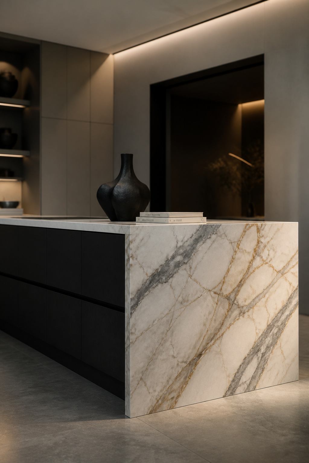
The effect is most dramatic when the marble has bold, readable veining: a fine-veined, pale stone loses much of the impact on the vertical face. Calacatta Venato is the most popular choice — white background with gold and grey veining that moves dramatically on the waterfall panel. Calacatta Borghini’s thicker, more graphic veining creates an even louder statement. At the premium end of the consideration, book-matched waterfall edges — where two mirror-image slabs are joined so the veining creates a symmetrical butterfly pattern on the side panel — are genuinely extraordinary, and genuinely expensive.
Choosing the Marble
Nero Marquina is the alternative for those prepared to fully commit: a black marble with crisp white veining on a black island base creates a tone-on-tone composition where only the veining provides contrast. It requires confidence and an understanding that the effect will be read differently in morning light than afternoon light. That instability is part of its appeal to those who want it. Details on kitchen island countertop ideas are worth reviewing before committing to any stone, given the range of material decisions involved.
A practical note: marble is calcite-based and acid-sensitive. Wine, lemon juice, and vinegar etch the polished surface if left for more than a few minutes. On the waterfall face — which is vertical and rarely encounters food or liquid — this is almost never a problem. On the horizontal worksurface, it is a genuine limitation. Honed (matte) marble hides etching better than polished, because the surface is already matte and new scratches read as patina rather than damage.
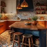
4. Industrial Black Island with Reclaimed Wood Open Shelving
The industrial kitchen aesthetic only functions when it’s genuinely material-led — and reclaimed wood open shelving is the single element that prevents a black painted island from tipping into the cold, contract-kitchen territory. The tension between the precision of painted joinery and the unpredictability of aged timber is exactly what makes this combination work.
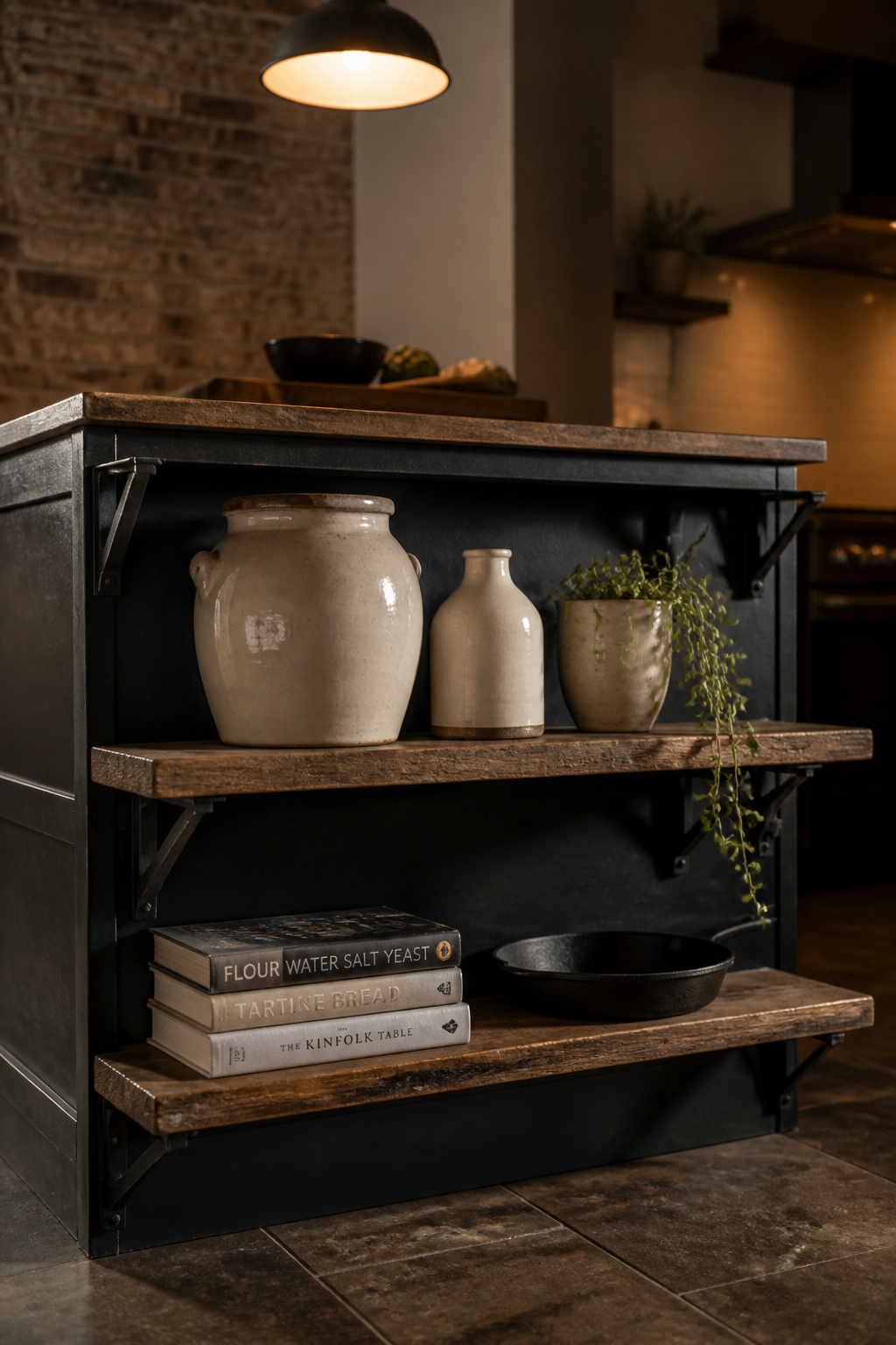
Aged oak is the most reliable species for kitchen shelving from reclaimed stock: moisture-resistant, durable enough for the weight of ceramics and cast iron, and it develops a silvery-grey surface tone over time that sits beautifully against black cabinetry. Pine with its original patina is the more rustic, knotted option — lower hardness than oak but more character; seal it with a hard-wax oil to stabilise the surface without obscuring the grain. Elm, rarer and more expensive, has an extraordinary interlocked grain that creates a river-like surface texture; look for it from specialist reclaim yards rather than standard timber merchants.
Black iron or steel bracket shelves are the mounting hardware of choice for this aesthetic: chunky L-brackets at 3/8-inch steel thickness read as industrial without sliding into pub territory. For the industrial kitchen lighting that completes this look, the same material logic applies — exposed steel, clear glass, and warm bulb tones rather than anything too polished or refined.
Keep open shelving shallower than a wall shelf — 10-12 inches on an island rather than the standard 14-16 — to reduce the temptation to pile things on. Display: earth-toned ceramics, cast iron cookware, cookbooks spine-out, a single plant. Store everything else out of sight in the closed cabinets below. The open shelf is the curated edit, not the overflow.
5. Black Kitchen Island with Integrated Wine and Bottle Storage
Dark joinery and wine storage have a long shared history — the wine cellar aesthetic, with its dark mahogany library racks and black iron floor-to-ceiling frames, sits in design memory as a specifically dramatic space. A black kitchen island with built-in wine storage draws on precisely this association. It doesn’t feel like a kitchen accessory; it feels like a considered gesture toward a way of living.
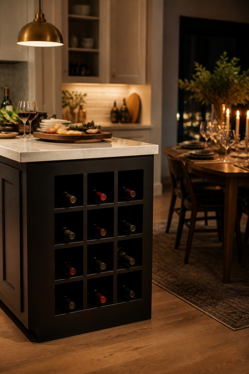
The most design-flexible option is the room-temperature wine cubby: open niches, typically 13-inch square to accommodate a standard Bordeaux bottle, built into the end panel of the island facing the dining or living space. Bottles stored horizontally in a diamond or grid arrangement are immediately visible and accessible, and the display has a genuinely decorative quality against the black ground. The alternative — a pull-out wine drawer, with bottles stored horizontally in a dedicated deep drawer with custom dividers — is the discreet option: completely hidden when closed, discovered only when you need it.
Temperature is where most kitchen wine storage falls down. Wine prefers 45-65°F (7-18°C), consistently cool without fluctuation. Kitchen ambient temperatures routinely exceed this, particularly when the oven has been running. A room-temperature rack works for bottles you’ll consume within one to three months; for anything longer, a temperature-controlled under-counter wine fridge integrated into the island with a matching front panel is the reliable solution. For the practical details on kitchen storage furniture ideas that integrate cleanly at cabinetry level, the principles are the same whether you’re storing wine or anything else.
Placement rule: wine storage should be on the cool side of the island, away from the hob wall. Direct sunlight on stored bottles is the other enemy — south-facing kitchen windows and wine racks are a poor combination.
6. Two-Tone Island: Black Lower Cabinets with a Butcher Block Counter
The painted black lower cabinet with a timber worktop is, in the history of British kitchen design, a very old combination indeed. Country house kitchens, farmhouse dressers, Victorian painted furniture — dark paint and timber have been paired on kitchen pieces for centuries, and the reason is almost tediously practical: dark paint hides wear, and timber weathers beautifully. Together, they’re the material language of a kitchen that will still look right in twenty years.
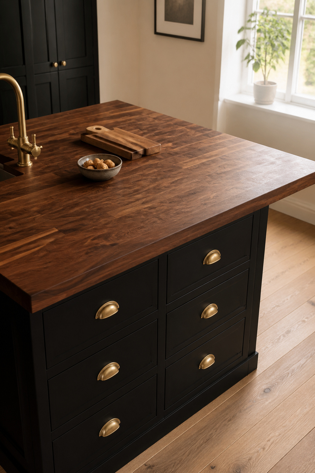
Black walnut butcher block is the premium pairing for a black island base: its warm chocolate-brown surface has sufficient depth of colour to sit alongside a dark cabinet without looking washed out, and its Janka hardness of 1010 means it handles normal kitchen use without protest. For higher-contrast drama, hard maple (Janka 1450) — light, almost blonde — creates a more graphic two-tone effect. Teak (Janka 1000-1155) has the practical advantage of high natural oil content, which makes it moisture-resistant in a way that other species are not; less conditioning required, which is a real benefit in a busy kitchen. The kitchen countertop decor ideas that work best with butcher block consistently reinforce the principle that the wood should be the feature, not the objects placed on it.
The Oiling Routine
Butcher block maintenance is not complicated but it is consistent: new countertops need daily mineral oil application for the first week (top, sides, underside), then monthly for the first year, then every few months when the surface looks dry. The recommended finish for an island you actually cook on is mineral oil followed by a beeswax topcoat — the oil saturates, the wax fills surface voids and slows moisture absorption. Do not use cooking oils (olive, coconut, walnut in its culinary form); they go rancid inside the wood within months and make the kitchen smell of a very old restaurant.
7. Fluted Cabinetry Detail on a Slim Black Kitchen Island
Fluted cabinet fronts — vertical grooves creating a repeating ridge-and-recessed-groove pattern — returned to mainstream kitchen design around 2022 and have held their ground firmly since. Their appeal is consistent across the decades they’ve appeared in (mid-century, Art Deco, now again): they add depth, shadow play, and the sense that a surface has been considered rather than simply manufactured. Against a black island base, each groove creates a deeper shadow than it would on a pale cabinet, amplifying the textural quality.
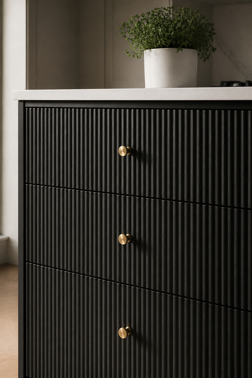
The trend evolved as it matured. Early adopters used deep vertical grooves across the full centre panel; by late 2025, the design direction shifted toward a flat centre panel framed by a beaded edge detail — the bead providing the shadow line and visual interest while the centre became simpler. Both work, though the full fluted panel has more decorative presence and is better suited to a kitchen where the island is the centrepiece.
Why Eggshell Beats Matte
Proportions matter acutely for an island rather than a full run of cabinetry. Narrow groove spacing — 20-25mm between ridges — reads as refined and jewellery-like on an island face. Wider spacing (30-40mm) can tip toward architectural and impersonal at a smaller scale, though it reads calmly in an open-plan kitchen where you’re viewing it from a distance. For horizontal fluting on the end panel of an island — an increasingly seen detail — the effect is much more furniture-like, as though the cabinetry is referencing a piece of upholstered banquette seating.
On paint finish: matte black on deeply fluted cabinetry is the technically incorrect choice, because the recessed grooves trap kitchen grease and fine debris that a matte, micro-porous surface makes genuinely difficult to clean. Eggshell — a slight sheen of around 10-20% gloss — provides just enough surface hardness and wipe-clean quality without introducing the reflectivity of satin or gloss.
8. Dark Kitchen Island with Statement Soapstone Countertop
Soapstone is the geologist’s countertop material — a metamorphic rock composed primarily of talc, which gives it its characteristic softness, heat resistance, and the faintly soapy surface quality from which it takes its name. In a kitchen, it is one of the most practically well-suited materials available: no sealing required, naturally acid-resistant, and it handles hot pans without complaint. That it also looks extraordinary against a dark island base is, happily, a bonus.
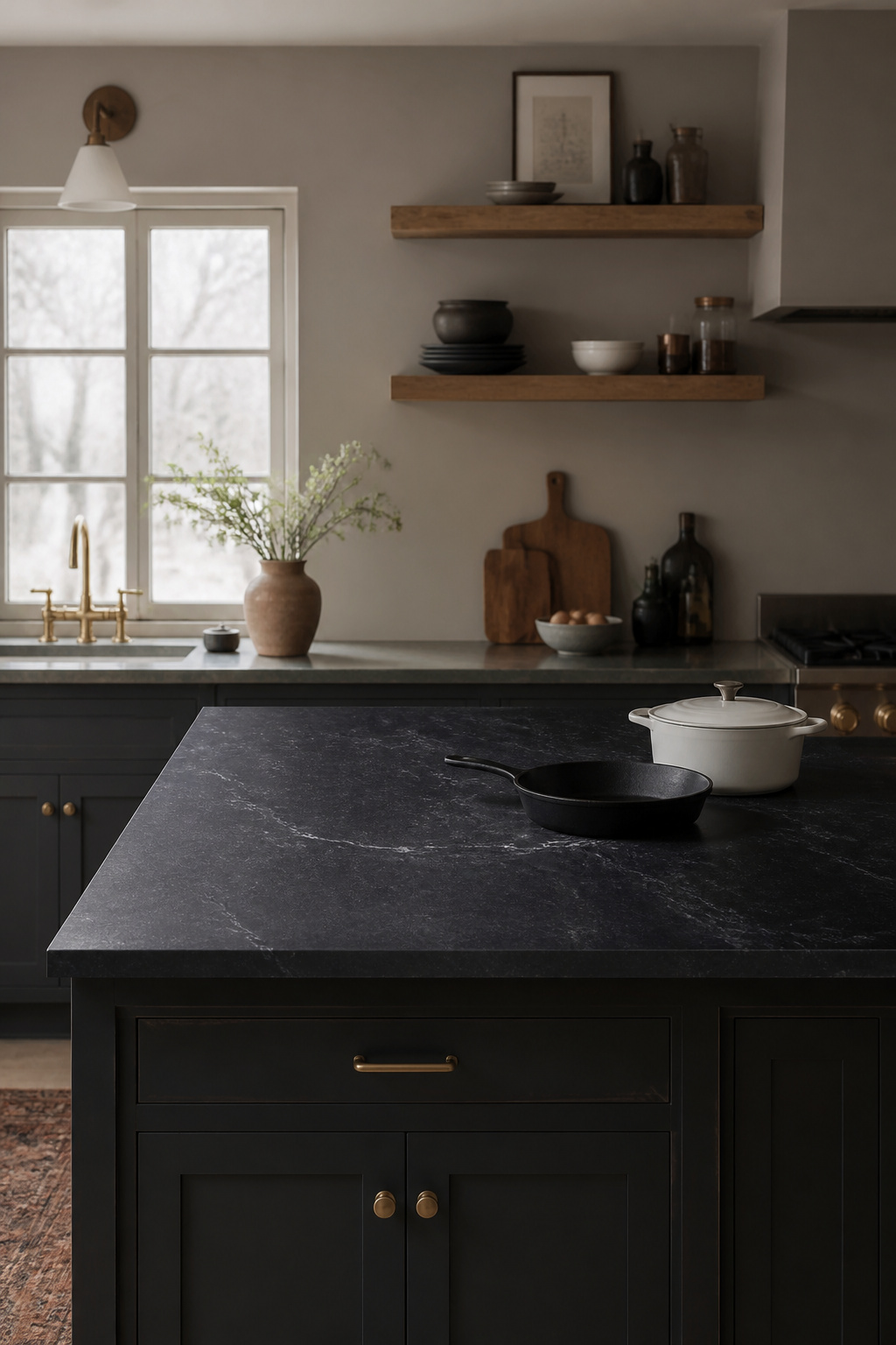
Fresh soapstone presents as a medium grey to greenish-grey with subtle white veining. Over time — and with regular mineral oil application — it darkens steadily toward deep charcoal. Applied monthly for the first year, mineral oil accelerates this darkening to create a surface that eventually reads as near-black. On a dark kitchen island base, this tone-on-tone combination is calm and geological: the countertop and the cabinetry occupy the same tonal register, differentiated only by the veining and the slight sheen difference between stone and paint.
The Practical Case
The practical comparison with alternatives is straightforward: soapstone requires no sealing (unlike granite or quartzite, which need annual sealing or more); it resists heat (unlike quartz, which can scorch); it scratches more easily than granite (Mohs hardness 1-2 vs. granite’s 6-7), but scratches are remedied with a drop of mineral oil for surface marks, or light sanding with 220-grit paper for deeper ones. This is a genuinely low-anxiety ownership experience compared to marble, where every etch is permanent. The oiling ritual — a regular deepening of colour and character — makes the countertop something you participate in rather than merely maintain.
One thing to know before ordering: soapstone lightens considerably when dry and can look underwhelming in a showroom or on a supplier’s website. The deep, dramatic colour that makes it so compelling in finished kitchens is the result of oil application, not the stone’s natural dry state.
9. Black Island Paired with Cane-Front Doors and Natural Bar Stools
Cane — the outer bark of the rattan palm, woven into an open hexagonal mesh — returned to favour in furniture and cabinetry design around 2020 and, unlike some material revivals, has proven genuinely lasting. Its appeal against black cabinetry is specific: the organic, non-uniform quality of woven plant fibre creates a true textural contrast against the precision of a painted cabinet front. The black provides the graphic rigour; the cane provides the life.
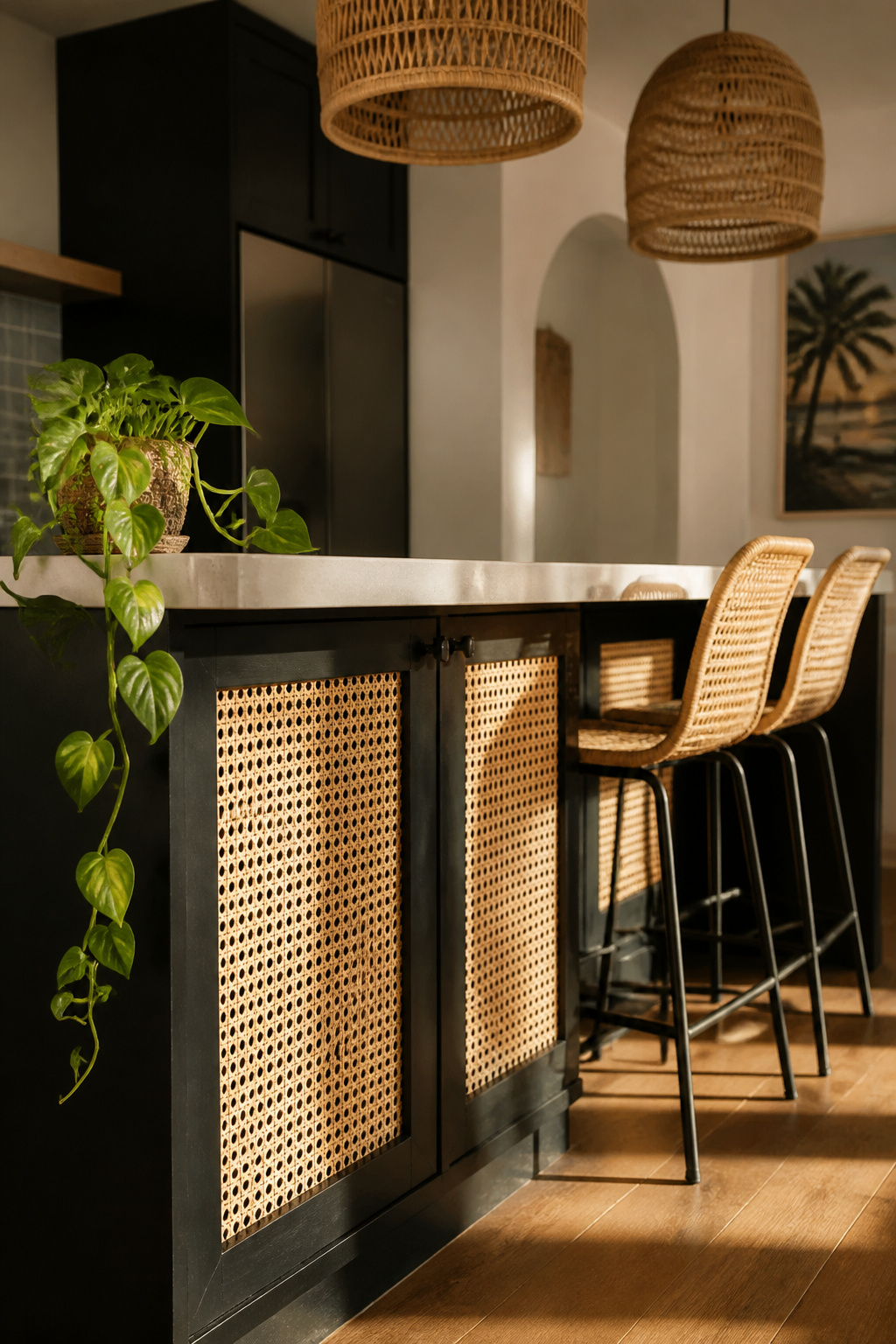
For a kitchen island, cane fronts work best on the faces that the dining or living space sees — the display side, rather than the working side adjacent to the hob. On the working side, solid cabinet fronts are more practical; cane webbing, while beautiful, is not a kitchen-splatter surface. On the dining side, a bank of lower drawers and doors with cane-insert fronts creates something that looks considerably more like a piece of furniture than standard cabinetry — which is precisely the quality that makes it interesting.
Sourcing cane inserts: the highest-quality route is bespoke joinery where cane webbing is stretched and splined into custom-routed cabinet frames. The more accessible DIY-adjacent route uses pre-woven hexagonal cane webbing (available by the roll from craft and haberdashery suppliers, typically £40-80 for enough to cover four to six doors) cut to size and fitted behind existing routed door panels. The difference in finish is visible up close; at normal viewing distance, it reads similarly.
Natural bar stools complete the material conversation: rattan counter stools at 24-27 inch seat height (for a standard 36-inch island) with solid wood or steel frames keep the combination feeling contemporary. Mid-century rattan on a steel tube frame is the specific silhouette that prevents this pairing from sliding toward purely bohemian.
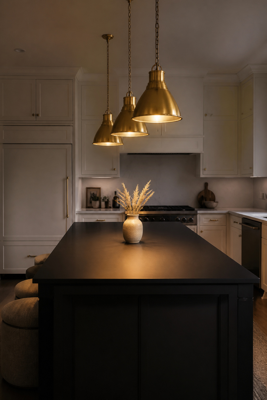
10. Black Kitchen Island Crowned with a Cluster of Pendant Lights
Pendant lighting over a kitchen island is rarely just practical — it’s decorative, directional, and one of the most visible design choices in the whole kitchen because those lights are seen from the dining space and the living area, not just from the cook’s position at the hob. Over a black island, the choice is even more charged: the fixtures are foregrounded against a dark surface and need to be genuinely considered.
The sizing rules are the ones designers use because they work. Standard hanging height: 30-36 inches above the countertop surface; for ceilings above 8 feet, add 3 inches per additional foot. Pendant-to-pendant spacing: 24-30 inches centre-to-centre, with at least 6 inches between the end of the island and the nearest pendant centre. Diameter: use the island width divided by three as a rough guide — an 18-inch island works with 6-inch pendants, a 36-inch island with 12-inch fixtures.
Finish and Cluster Configuration
For finish, the logic of the hardware pairing applies directly: unlacquered brass pendants over a matte black island are the warmest combination. Clear glass globes or caged filament pendants are the most neutral option — they recede and let the island material do the work. Matte black pendants on a matte black island is a considered all-black move that requires sufficient light output to avoid creating a genuinely dark section of kitchen; it reads as deliberate and confident when done right. The farmhouse kitchen lighting principles around warm bulb temperatures and adequate task-light lux levels apply here regardless of fixture finish.
A clustered pendant configuration — three pendants hung at the same height rather than a single statement fixture — creates more shadow play on the island surface and a more casual, residential quality than a single linear pendant. For a kitchen with a relatively standard 8-9 foot ceiling, the cluster is almost always the right move.
11. Glossy High-Sheen Black Island as a Lacquer Finish Focal Point
There is a distinct difference between a matte black kitchen island and a lacquered one, and it operates at the level of cultural reference as much as material reality. High-gloss black cabinetry references a centuries-long tradition of lacquered furniture — Japanese urushi lacquer, Chinese export lacquerware, the Georgian cabinet-makers’ japanning technique — that immediately positions it as deliberately luxurious rather than merely dark.
The reflective surface does something counterintuitive: it multiplies light rather than absorbing it. A glossy black island is a dark mirror in the kitchen, reflecting the ceiling, pendant fixtures, and movement in the room. In a kitchen with limited natural light, a high-gloss black island can actually be the brighter choice over matte, because the reflective surface bounces what light exists back into the space rather than swallowing it.
True two-pack lacquer — factory-applied in specialist spray conditions — is significantly harder and more durable than site-applied high-gloss water-based paint. The difference is visible: factory lacquer has a depth and uniformity that brush or roller application cannot replicate. The investment is more considerable, but the gap in quality is apparent. High-gloss water-based paint, while much improved in recent years, remains more vulnerable to chipping at corners and edges under hard daily use.
Fingerprints are the honest challenge of a glossy black surface: they show immediately and completely. The mitigation is practical rather than difficult — bar handles or cup pulls (reducing direct hand-contact with the cabinet face), a microfibre cloth kept in a drawer, and a daily wipe-down in one consistent direction. Never use paper towels on a gloss surface; they act as a scratch register and the fine abrasion is cumulative.
12. Shaker-Style Black Kitchen Island with Apothecary Drawer Detail
The Shaker-style black kitchen island has, in Britain, a cultural resonance that goes beyond a simple paint choice. Victorian country house kitchens were routinely painted in dark practical tones — very dark greens, near-blacks — because dark paint hides the inevitable grime of coal-range cooking and hard household work. The Shaker tradition, with its recessed-panel door and absence of applied ornament, is a natural fit: both aesthetics are rooted in honest function rather than decorative ambition.
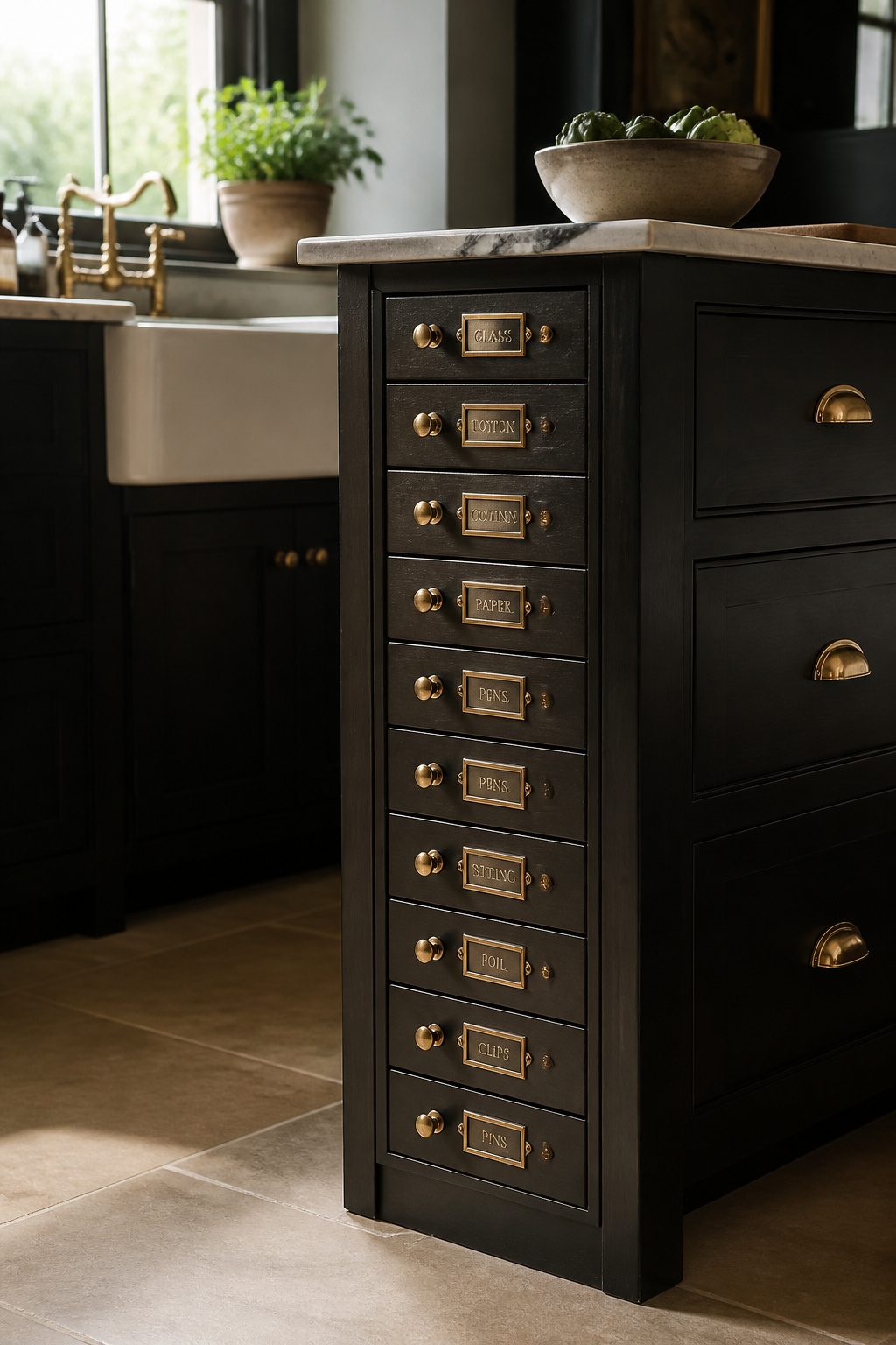
Today’s most considered versions of this configuration — the black Shaker island with apothecary-style drawer banks — draw directly on a Victorian storage tradition. Century-old European apothecaries stored hundreds of separate ingredients in small individually-labelled drawers, and the same logic applied to the Victorian kitchen, where spice drawers, tea drawers, and flour drawers were standard cabinetry vocabulary. A bank of eight to ten narrow drawers (3-4 inches high) on the end panel of an island, each fitted with a small brass pull and a label holder, creates the most practically satisfying island storage detail in any kitchen. As referenced in the history of farmhouse kitchen cabinet design, this combination of utility and heritage finish is among the most lasting in British kitchen making.
For hardware: cup pulls are historically correct for a Shaker-style black island — D-ring pulls with a cup backing plate were standard on Victorian painted furniture, and they read as entirely appropriate in this context. Bar handles (long bridge handles in unlacquered brass or polished nickel) are the modern update, suiting Shaker cabinetry while reading as slightly less period-specific. For the apothecary drawers themselves, a small round or square knob in brass or nickel is the right scale for a 3-4 inch drawer height.
Hardware for a Shaker Island
Label every apothecary drawer. This seems obvious but is almost always neglected — within a month, unlabelled narrow drawers become mystery drawers requiring opening every one to find what you need. Small engraved brass label holders or printed card inserts are the Victorian original; both are still made, and both are still correct.
13. Aged Black Island Against Exposed Brick and Stone Flooring
A flat, pristine matte black paint finish in a kitchen with exposed brick walls and flagstone or terracotta flooring creates a jarring incongruity: the paint looks installed yesterday in a room that asks for something with history. This is a mismatch not of colour but of register — the materials are speaking different temporal languages. An aged or deliberately distressed black finish corrects this entirely.
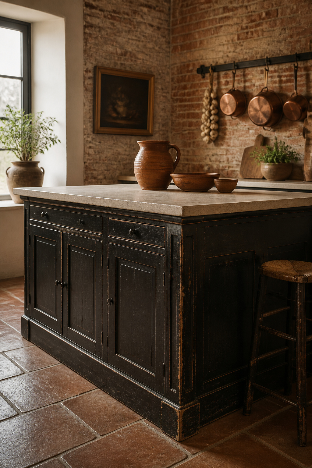
Specialist paint finishers achieve the aged look through a layered process: black basecoat, a dark glaze brushed over the top and partially wiped back, followed by careful sanding at corners and edges to reveal the colour beneath — mimicking the natural wear that accumulates on painted furniture over decades. The results, in the hands of skilled finishers, are genuinely convincing. Benjamin Moore ‘Wrought Iron’ and Farrow & Ball ‘Off-Black’ (No.57) are the paint colours most consistently named in aged-finish kitchen projects — both are soft, complex blacks with warmth rather than flat graphite.
Achieving the Aged Look
The alternative route — freestanding kitchen island units sourced already aged — is worth considering if the kitchen is genuinely period and the fitted cabinetry aesthetic is wrong for the room. Antique dealers, architectural salvage specialists, and furniture upcyclers offer pieces with honest patina that no paint technique can fully replicate. The practical challenge is finding pieces at the right height (standard kitchen island height is 36 inches; period furniture is often lower) and the right depth.
Flooring choices anchor this palette: sealed terracotta tiles introduce a warm red-orange ground that prevents the kitchen feeling cold, and the farmhouse kitchen decorations that work best in these rooms consistently reference terracotta, stone, and aged brick as the floor-to-wall material conversation. Reclaimed limestone or flagstone reads cooler and more formal; brick flooring (used in many Victorian and Edwardian kitchens originally) creates a remarkable tonal unity with brick walls when an aged black island anchors the centre.
14. Handleless Minimalist Black Island with Seamless Storage
Remove the handles from a black kitchen island and something significant happens to how it reads in a room. It stops being cabinetry and starts being an architectural object — a pure form defined by proportion, colour, and the quality of its surfaces rather than any applied detail. This is a design move that rewards a clean, thoughtful room; in a cluttered kitchen it just looks like hardware was forgotten.
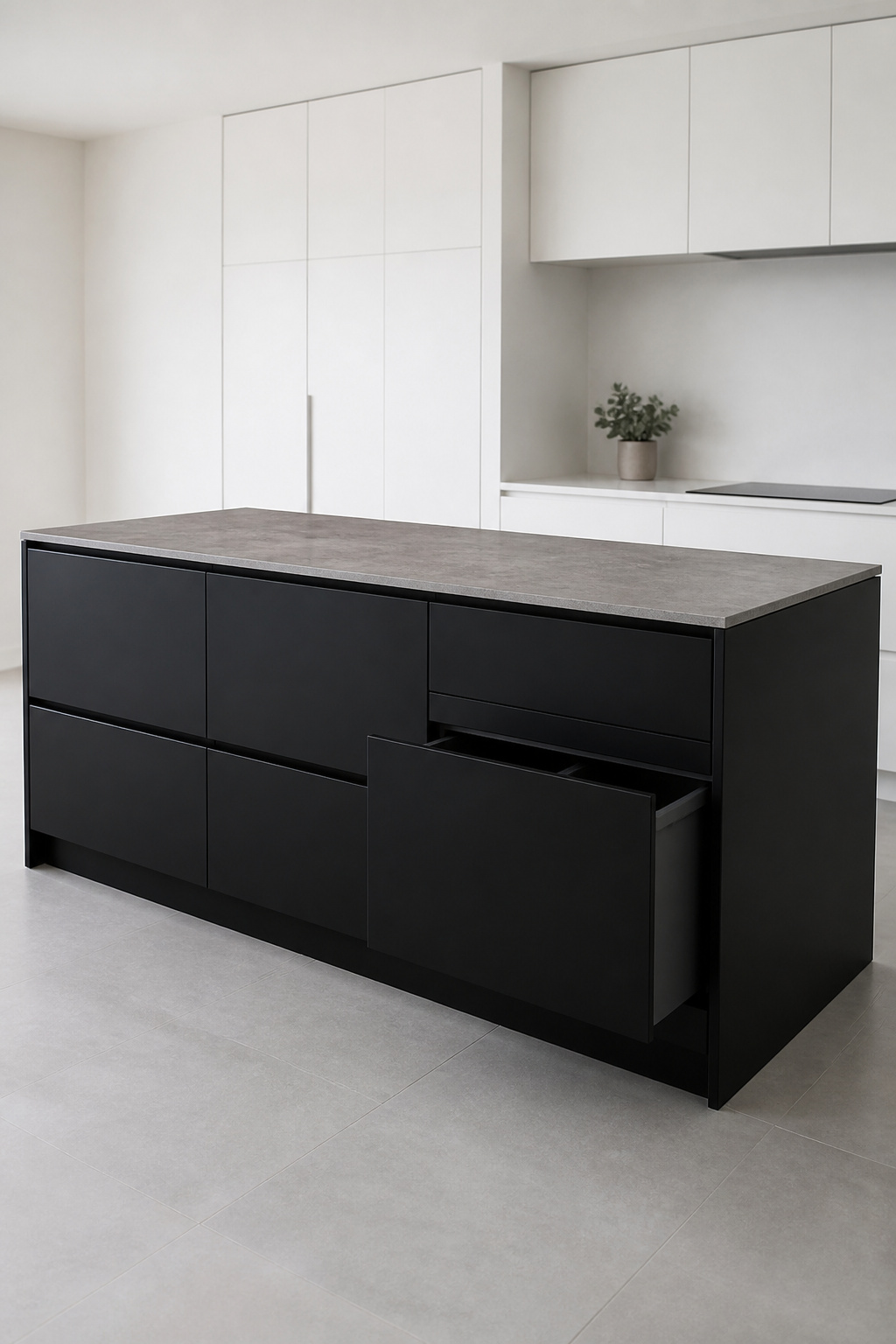
The practical mechanism is either push-to-open (spring-loaded or magnetic catches behind the door face; a gentle press releases the door, which springs open to a graspable position) or integrated channel pulls (a groove routed directly into the top or underside of the door or drawer front that creates a finger grip without any visible hardware). Push-to-open is cleaner but requires accurate cabinet alignment to function reliably; channel pulls are more forgiving mechanically and allow heavier doors. For an island with doors that open in multiple directions — toward the cook on one side, toward the seating area on the other — the placement of push-to-open catches needs careful planning per door, as the mechanism only works reliably when the user is standing in the expected position. A minimalist kitchen design approach to the whole kitchen keeps the handleless island from reading as a single precious design object in an otherwise conventional room.
Hidden Storage That Works
The hidden storage gains from a handleless black island are considerable when designed properly. A pull-out bin housing (one or two bins behind a door-front on full-extension runners) eliminates the freestanding bin entirely — the island absorbs the function cleanly. Deep pan drawers with full-extension runners (minimum 200mm interior height) make cast iron pans and large pots genuinely accessible rather than requiring kneeling and excavation. A charging drawer — standard drawer with low-voltage USB and mains socket in the base — removes the phone-charging clutter that accumulates permanently on kitchen surfaces. The island isn’t just a surface; it’s an organisation system.
15. Bespoke Black Island with Colour-Matched Display Cabinetry Above
Carrying the black from the island upward to display cabinetry above is a room-defining move — a full-height design gesture that makes the kitchen feel authored rather than assembled. It requires a particular kind of visual confidence and, more practically, a commitment to the display quality of what goes above.
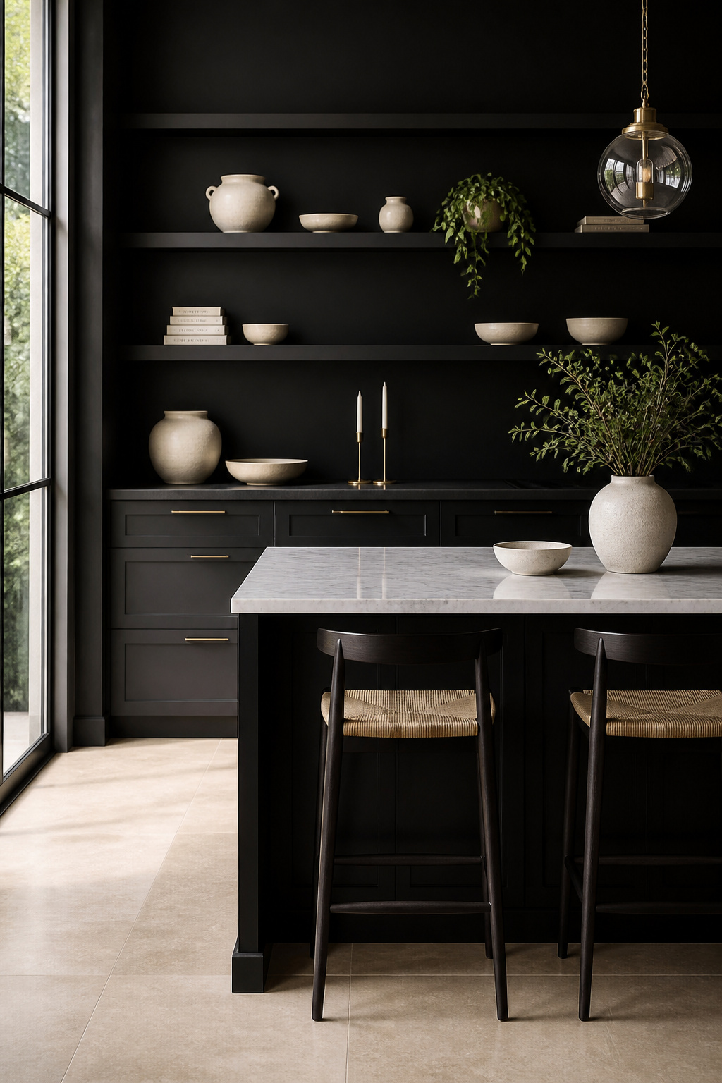
This is the critical distinction: upper display cabinets in black work when they’re open shelves or glazed fronts showing curated objects. Solid black upper cabinets — without any open element — read as walls of joinery that make a kitchen feel enclosed. The openness of the display is what saves the arrangement. An entire wall of black-framed open shelves, styled ceramics against the dark backdrop creating a gallery-like composition where every object is foregrounded — that is the idea in full form.
Styling the Display Zone
Glazed black-frame cabinets (black-painted frames with clear glass panels, reminiscent of Victorian pharmacy cabinets or a kitchen dresser glazed in the old style) are the more formal interpretation: objects are protected from kitchen steam and grease, the glass adds a layer of visual depth, and the whole reads as a considered piece of furniture rather than open shelving. The glazed cabinet suits the Shaker-style black kitchen or any room with a period sensibility; open shelving suits the more contemporary, minimal version.
Styling the display against black is genuinely easier than against white: pale objects — cream ceramics, white stoneware, natural wood boards — pop against a dark background with the clarity of museum display cases. Edit with ruthlessness. The number of objects that reads as curated above a black-background shelf is smaller than above a white one, because each object is more visible and therefore makes a greater demand on the quality of what’s been chosen. Odd numbers, varied heights, space between groups. Resist filling every inch — the negative space on a black ground reads as entirely intentional.
Choosing the Right Black Kitchen Island for Your Space
The variables that matter most are simpler than the range of options suggests. Light is the first consideration: in a south or west-facing kitchen with generous windows, virtually any black island treatment works — gloss, matte, aged, fluted, handleless. The light does the heavy lifting. In a north-facing or restricted-light kitchen, matte black absorbs what little light is available; a satin or gloss finish reflects it back and prevents the island from becoming a genuine black hole in the room.
Scale is the second: a compact kitchen benefits from a simpler black treatment — a clean Shaker door or a handleless finish, without additional texture or detail competing with the small dimensions. A large kitchen can absorb a complex island — fluted fronts, open reclaimed wood shelving, display cabinetry above — because there’s enough visual space for each element to be read individually.
Budget clarifies quickly once you know what to invest in. The countertop material deserves the best you can allocate — it’s the surface you’ll touch, work on, and see for the life of the kitchen, and a cheap countertop on an expensive island base is immediately apparent. The paint or lacquer finish is the second critical investment: factory lacquer is considerably more than site-applied paint, but the difference in durability and appearance is real and compounds over years. Compromises are most safely made on bar stools (which can be changed as taste evolves) and on internal storage accessories (which can often be retrofitted). The structure, the finish, and the countertop are not places to economise.
A black kitchen island is, done right, the piece the room builds around. It took confidence to choose it. It’s worth doing properly.