Your bedroom deserves to be more than just a place to sleep—it should be your personal sanctuary where you unwind, recharge, and dream. The colors surrounding you profoundly impact your mood and sleep quality. Ready to transform your space with a fresh coat of paint? Let’s explore 20 bedroom paint colors that will inspire your next design journey.
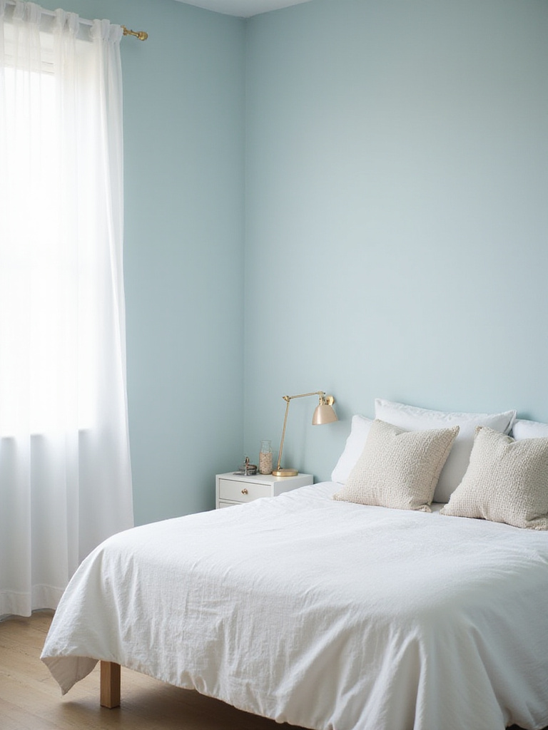
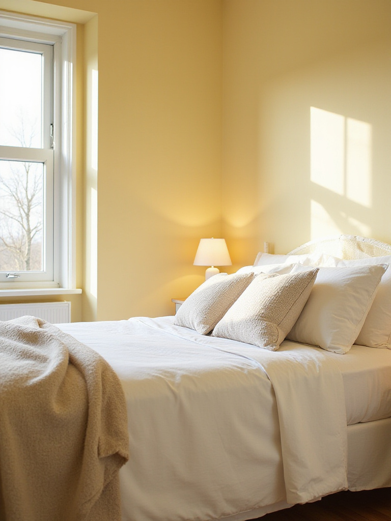
1. Timeless Warm White: Serene and Spacious
Warm white creates an instantly calming bedroom atmosphere. Unlike cooler whites that can feel clinical, warm whites have subtle yellow or beige undertones that make a room feel cozier and more inviting. They beautifully reflect light around the room, making smaller spaces feel larger and more open—a valuable benefit if you’re working with limited square footage.
Popular warm White Bedroom paint colors include Benjamin Moore’s White Dove, Sherwin-Williams’ Alabaster, Farrow & Ball’s Pointing, and Behr’s Swiss Coffee. Remember that lighting significantly influences how these colors appear, so test samples directly in your bedroom under both natural and artificial light before committing.
Here’s where it gets interesting—warm white serves as the perfect backdrop for seasonal updates through colorful bedding, artwork, and accessories, preventing your bedroom from ever feeling sterile.
2. Sophisticated Soft Gray: Effortless Elegance
Soft gray brings sophisticated elegance to a bedroom primarily through its versatility and neutrality. It serves as a refined backdrop that complements virtually any style and décor. Soft gray strikes the perfect balance—avoiding the starkness of pure white while sidestepping the intensity of bolder colors. Its subtle complexity adds depth without overwhelming your senses.
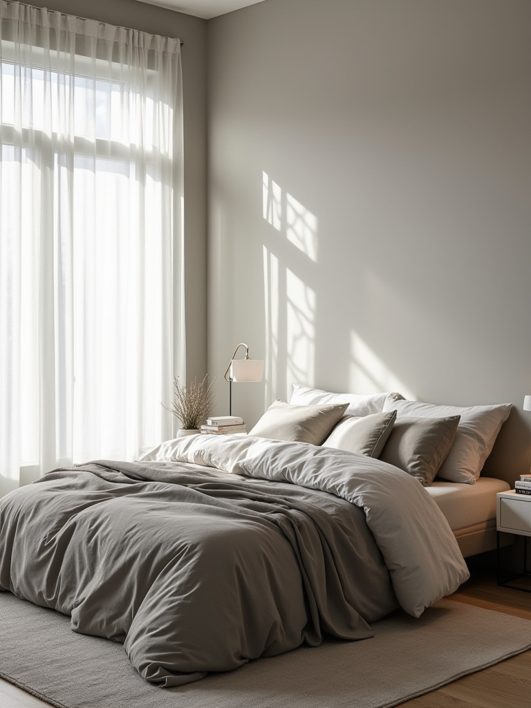
The psychological benefits of painting a bedroom soft gray are significant. Its muted tones naturally calm the mind, reducing stress and promoting relaxation—essential elements for good sleep. Unlike stimulating brighter colors, soft gray quiets the visual environment, fostering peace and stability. It also creates a feeling of spaciousness while reducing visual clutter, enhancing the overall sense of tranquility.
“Gray isn’t just a color—it’s a mood. In a bedroom, it whispers rather than shouts, allowing your mind to truly rest.” – Olivia Nguyen-Schmidt
The tricky part is choosing the right soft gray. Test several swatches under different lighting conditions throughout the day, as the color can appear dramatically different depending on natural and artificial light.
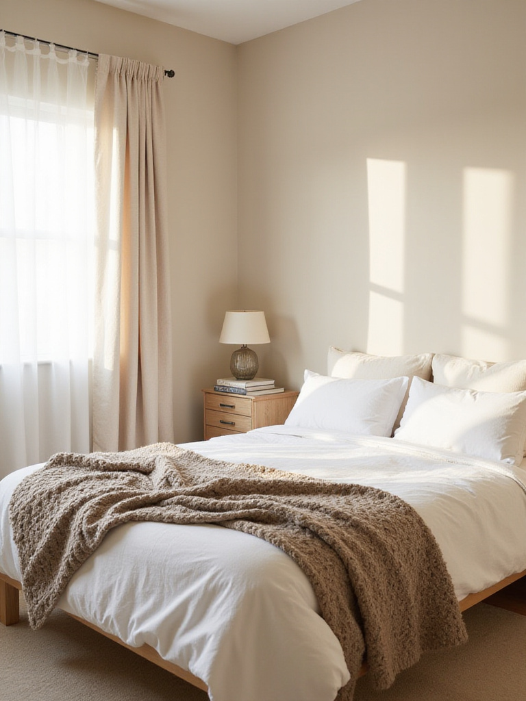
3. Cozy Beige: Warmth and Inviting Comfort
Beige earns its reputation as a ‘cozy’ bedroom paint color through its inherent ability to evoke feelings of comfort and security. Warmer beige tones offer a neutral palette that doesn’t overwhelm the senses—essential for promoting relaxation. Its remarkable versatility allows it to pair seamlessly with diverse textures and materials, further enhancing the cozy atmosphere.
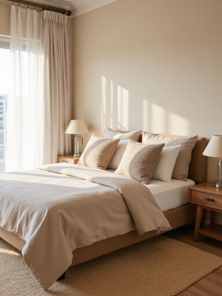
When selecting a beige paint for your bedroom, paying attention to undertones is crucial. For a truly cozy feel, prioritize beiges with warm undertones like yellow, peach, or delicate hints of brown. Generally, avoid beiges with cool undertones like gray or green, as these can sometimes feel sterile and less inviting in a sleep space.
What many people overlook is how beige can be used to create a sophisticated monochromatic bedroom by layering different shades and textures for a serene retreat that never feels boring.
4. Versatile Greige: The Modern Neutral Bridge
Greige is a fascinating bedroom paint color that skillfully blends gray and beige to create a neutral that offers the best of both worlds. Its widespread popularity stems from remarkable versatility—providing the calming effect of gray while incorporating beige’s inviting warmth. This unique balance makes greige exceptionally adaptable to various lighting conditions and décor styles, creating a comfortable atmosphere conducive to relaxation and Restful Sleep.
When selecting greige for your bedroom, pay close attention to undertones. Some greiges lean more toward gray with cooler blue or green undertones, while others tilt toward beige with warmer yellow or red undertones. Consider existing colors in your space—furniture, flooring, and textiles—to make the best choice. If your room features warm-toned woods and fabrics, a greige with warmer undertones will create a more harmonious look.
The breakthrough came when designers realized greige could serve as the perfect canvas for both bold accent colors and subtle tone-on-tone layering, making it one of the most adaptable bedroom paint colors available today.
5. Dreamy Off-White: Airy Brightness
Off-white paint colors excel in bedrooms primarily because they reflect light beautifully, creating a bright and airy atmosphere even in rooms with limited natural light. They provide a wonderfully neutral backdrop that works harmoniously with countless decorating styles, allowing your furniture and accessories to become focal points. The subtle warmth in many off-whites prevents your bedroom from feeling stark or sterile, instead cultivating an inviting and restful space.
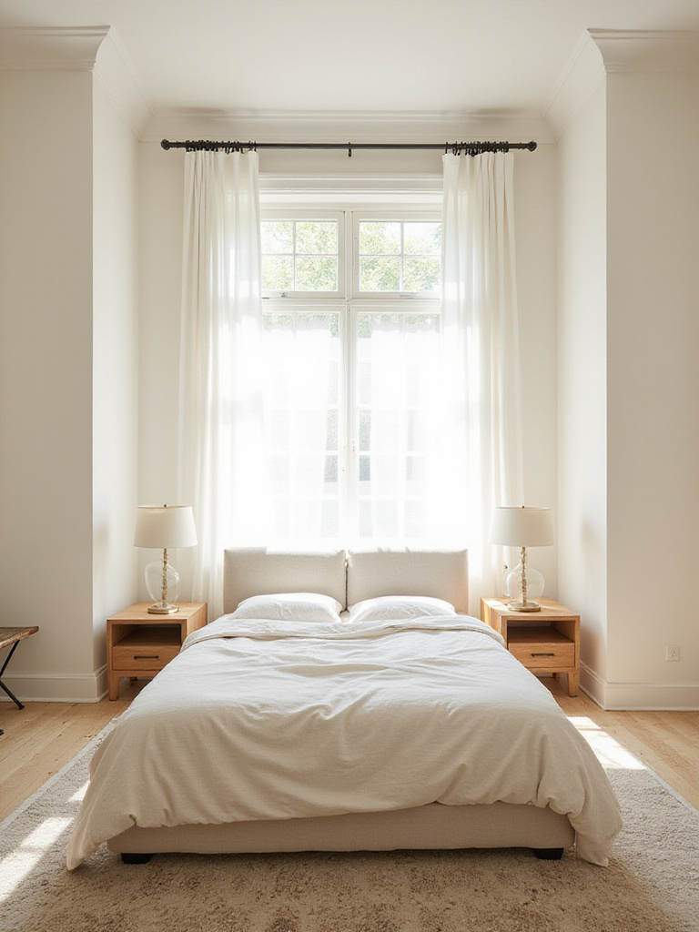
When considering off-white bedroom paint colors, you’ll discover delightful variations including warm whites with yellow or beige undertones, cool whites with hints of gray or blue, and sophisticated greiges. To make the best selection, test several samples directly in your bedroom, paying attention to how undertones shift throughout the day under different lighting conditions.
Let me paint you a picture—imagine different sheens of off-white creating subtle visual interest, with matte finish on walls and satin on trim, adding dimension without disrupting the serene atmosphere you’re cultivating.
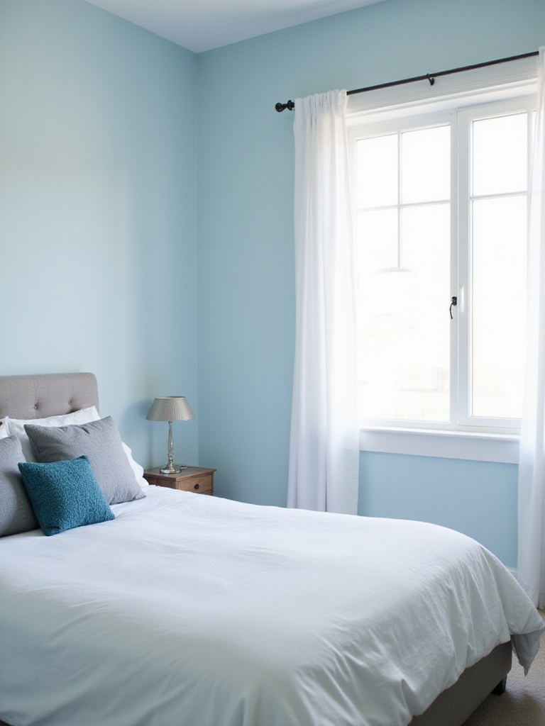
6. Tranquil Pale Blue: A Sea of Calm
Pale blue brings tranquility to bedrooms through its intrinsic association with sky and ocean—elements that universally evoke peace and openness. From a psychological perspective, blue actually lowers heart rate and blood pressure, creating a genuinely relaxing environment conducive to sleep. Its association with stability further enhances its appeal for bedrooms, promoting security and overall well-being.
When selecting pale blue bedroom paint colors, lean toward softer, more muted variations like powder blue, sky blue, or blue with subtle hints of gray or green. These shades tend to be less stimulating and more conducive to relaxation than brighter blues. Consider your room’s natural light when choosing undertones—in north-facing rooms with cool light, a pale blue with gray undertones amplifies serenity, while south-facing rooms might benefit from warmer undertones to prevent the color from feeling cold.
The heart of the matter is finding the right balance—pale blue that’s soft enough to be calming but distinct enough to create the peaceful sanctuary you’re seeking. This makes it one of the most universally appealing bedroom paint colors for promoting rest.
7. Dramatic Navy Blue: Depth and Luxury
Navy blue brings a unique atmosphere to a bedroom, creating a sense of calming luxury. It evokes feelings of tranquility, stability, and depth—all contributing to a relaxing environment. Unlike lighter blues that feel airy and expansive, navy creates an intimate, enveloping atmosphere, promoting security and coziness conducive to restful sleep. Just remember that navy, being darker, can make a room feel smaller if not strategically balanced with lighter elements.
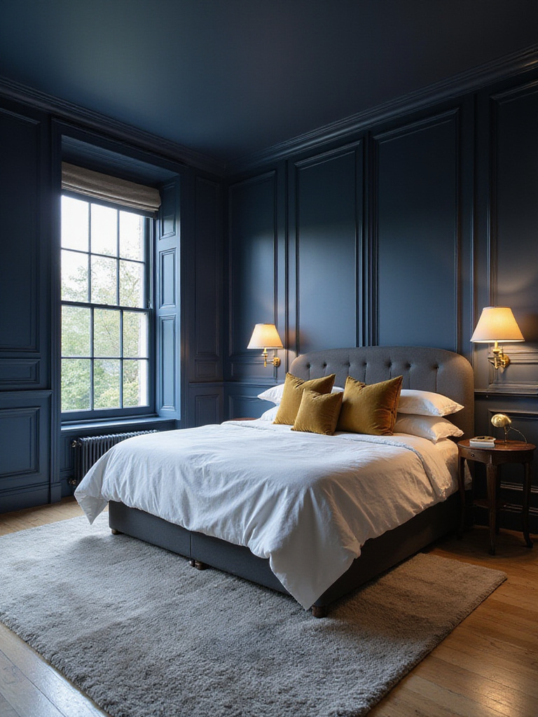
Navy blue pairs beautifully with diverse colors in bedroom settings. Crisp white provides striking contrast that brightens the space and highlights navy’s richness. For glamour and luxury, metallics like gold, brass, and silver add sophisticated shimmer. Warm neutrals such as beige, cream, and greige soften navy’s intensity, creating a cozier atmosphere. For bolder approaches, jewel tones like emerald, ruby, or amethyst add vibrant personality.
Here’s the unexpected twist—navy blue bedroom walls can actually make your ceiling appear higher when you paint the walls dark and keep the ceiling bright white, creating an illusion of expanded vertical space.
8. Refreshing Sky Blue: A Breath of Fresh Air
Sky blue can have remarkable psychological effects in a bedroom. It’s strongly associated with tranquility, peace, and openness, effectively evoking serenity and calmness—instrumental in reducing stress and promoting relaxation. This makes it excellent for unwinding and preparing for sleep. Sky blue also creates a sense of spaciousness, making smaller rooms feel larger and airier. Its connection to nature—clear skies and open horizons—promotes optimism and well-being.
When choosing sky blue bedroom paint colors, opt for lighter, softer variations that mimic a clear morning sky or gentle ocean breeze. These softer shades are less stimulating and more conducive to restful sleep than vibrant, saturated blues. Consider pastel blues, powder blues, or blues with subtle hints of gray or green to add sophistication and prevent flatness. Rooms with less natural light benefit from lighter, brighter sky blues to maximize spaciousness, while sun-drenched rooms can handle slightly deeper tones.
The ripple effects are enormous when you consider how your bedroom paint colors affect not just your space’s appearance but your actual sleep quality and morning mood—making sky blue a truly functional choice beyond its aesthetic appeal.
9. Luxurious Teal: Jewel-Toned Richness
Teal, a captivating blend of blue and green, evokes a unique combination of moods in a bedroom setting. It instills tranquility, sophistication, and intriguing depth, creating a calming atmosphere perfectly suited for restful sleep. Teal’s inherent richness adds luxury and personalized style, making your space feel more elevated and intentionally designed. Depending on the specific shade, it can also evoke invigoration and freshness, reminiscent of a gentle ocean breeze.
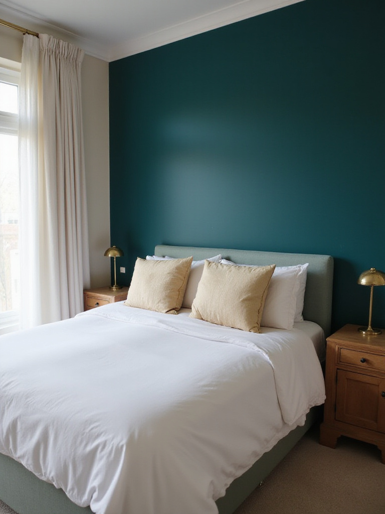
Teal is surprisingly versatile for bedroom paint colors and pairs well with numerous options. For a calming palette, combine teal with soft whites, creams, and light grays to create a tranquil, airy feel. For dramatic luxury, pair with gold accents—the contrast between deep teal and shimmering gold elevates opulence. Deep browns and charcoal gray create sophisticated, grounding effects. For warmth and femininity, coral and blush pink provide delightful counterpoints to teal’s coolness.
When we look beneath the surface, we discover that teal is actually one of the most psychologically balanced bedroom paint colors—combining blue’s calmness with green’s renewal properties to create a truly restorative environment.
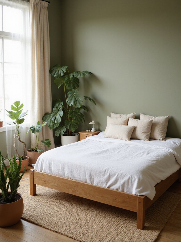
10. Earthy Sage Green: Nature-Inspired Serenity
Earthy sage green calms bedrooms because it mimics colors found abundantly in nature—foliage, herbs, and landscapes. This connection to the natural world evokes peace, tranquility, and groundedness. Its muted, desaturated tone is key to this calming effect. Unlike brighter greens, sage is less visually stimulating—ideal for promoting relaxation and reducing visual clutter in sleep environments. Its inherent softness contributes to comfort and security.
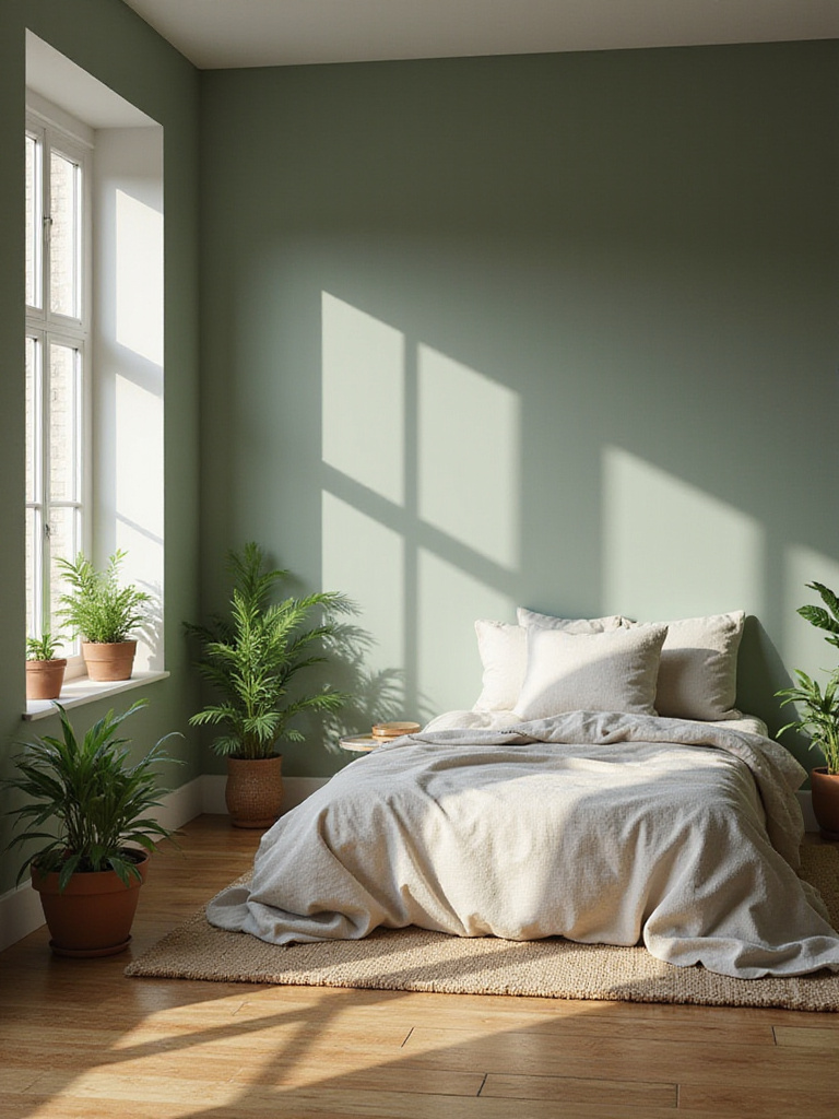
Sage green complements various bedroom styles. It works particularly well in minimalist spaces, adding organic warmth without overwhelming clean, uncluttered aesthetics. It’s a natural fit for bohemian or eclectic bedrooms, pairing beautifully with natural textures like wood, rattan, and linen to enhance the organic, relaxed vibe. Farmhouse and cottage-style bedrooms benefit from sage green’s rustic charm, reinforcing cozy, inviting atmospheres. Even modern bedrooms can incorporate sage green to add understated elegance and natural connection.
The plot thickens when you consider that sage green bedroom paint colors actually change dramatically throughout the day—appearing more gray in morning light, true green in afternoon sun, and taking on an almost silvery quality in the evening.
11. Calming Olive Green: An Organic Oasis
Olive green brings calm to bedrooms through its profound connection to nature. It mimics hues found in forests, fields, and lush foliage, evoking peace, tranquility, and groundedness. Unlike stimulating bright greens, olive green is inherently muted and earthy, reducing visual stimulation—crucial for promoting relaxation. Its inherent warmth distinguishes it from cooler colors, preventing sterility and contributing to a cozy, inviting ambiance.
Olive green harmonizes beautifully with various accent colors in bedroom settings. Warm neutrals like cream, beige, and tan create soft, grounding contrast that enhances the natural feel. Natural wood tones significantly enhance the organic aesthetic, creating a cohesive, nature-inspired look. Terracotta and rust share similar warmth with olive green, creating a harmonious palette. Mustard yellow introduces vibrant energy without disrupting calm. Soft whites provide clean contrast while maintaining serenity. Blush pink adds femininity and warmth, while deep browns establish sophistication.
Do you see how huge that is? Olive green is one of those rare bedroom paint colors that can feel simultaneously energizing in the morning light and deeply relaxing in the evening—adapting to your needs throughout the day.
12. Fresh Mint Green: Zesty and Uplifting
Mint green offers remarkable psychological benefits in a bedroom setting. It’s frequently associated with freshness, tranquility, and renewal. Its inherently calming nature effectively reduces stress and anxiety, promoting restful sleep. Unlike some very pale or muted greens, mint green possesses subtle vibrancy that uplifts mood and injects positivity, making your bedroom feel both calming and energizing.
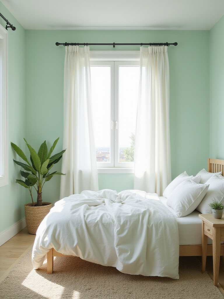
Mint green bedroom paint colors harmonize beautifully with various complementary hues. Pairing with white, cream, and light gray creates a clean, airy feel that’s classic and timeless. For sophisticated depth, combine mint green with deeper greens in a monochromatic scheme that adds visual interest without disrupting calm. Gold accents elevate mint green with glamour and warmth. Blush pink creates soft, feminine contrast, while wood tones introduce natural texture and warmth, grounding mint’s lightness.
This changes everything, doesn’t it? Unlike many bedroom paint colors that are purely restful, mint green actually helps you wake up refreshed while still promoting good sleep—giving you the best of both worlds for your sleep sanctuary.
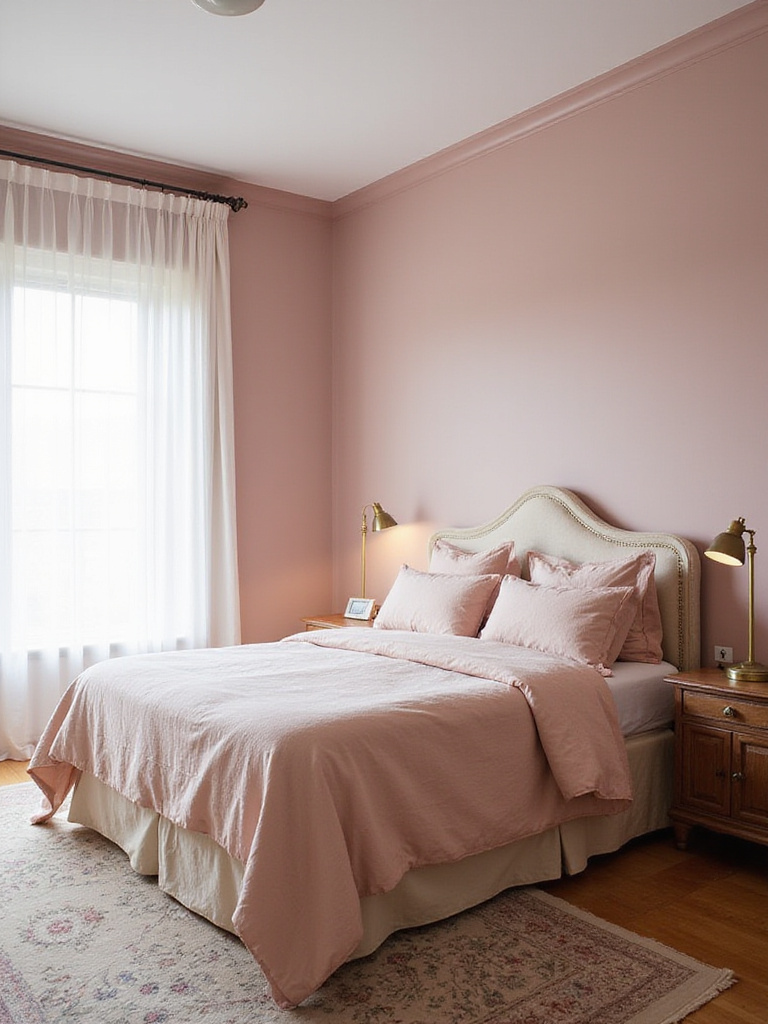
13. Romantic Blush Pink: Soft Feminine Charm
Blush pink evokes calmness, serenity, and romance in bedrooms. Its inherently soft, muted tone creates a warm, inviting atmosphere conducive to relaxation and restful sleep. Unlike bolder pinks that can be stimulating, blush pink maintains subtle sophistication without feeling overly sweet or childish. It’s surprisingly versatile as a neutral, pairing harmoniously with diverse colors and interior design styles.
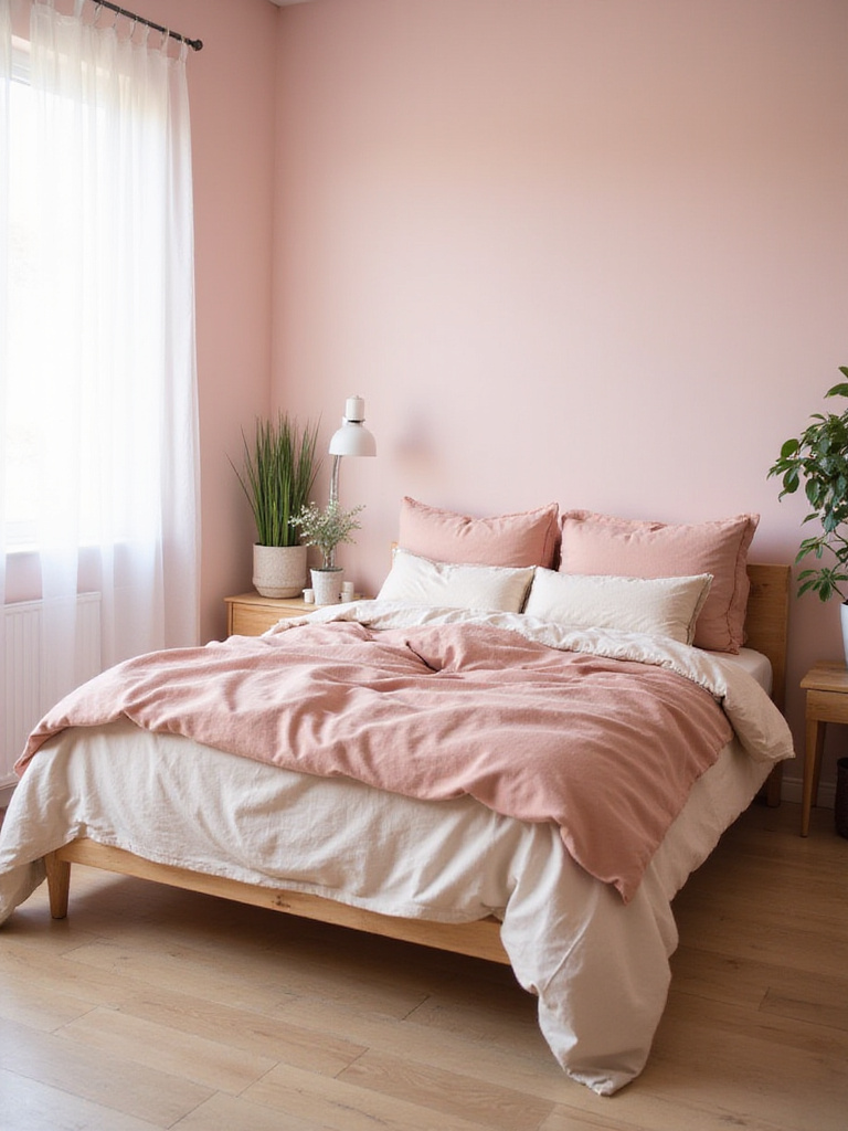
Blush pink complements various colors in bedroom settings. For classic elegance, pair with whites, creams, and soft grays. For modern sophistication, incorporate metallic accents—gold, silver, or copper elements add glamour and contemporary flair. Natural elements like warm wood tones and greenery ground pink’s softness, creating balanced, organic aesthetics. For bold contrast, introduce deeper shades like navy or emerald green, adding depth and preventing overly sweet monochromaticity.
The stumbling block is finding the perfect blush tone—too pink and it becomes childish, too beige and it loses its charm. The key to successful bedroom paint colors in this family is finding that perfect balance that feels sophisticated yet warm.
14. Soothing Lavender: Sleep Sanctuary
Lavender is deservedly considered a soothing bedroom paint color primarily through its strong association with relaxation and tranquility—a connection stemming directly from the lavender flower’s calming scent. The color itself, a gentle pale purple, is inherently less stimulating than brighter colors, evoking serenity, peace, and nostalgia. This gentle, comforting color effectively promotes calm, reducing stress and anxiety—key factors for creating a truly sleep-conducive environment.
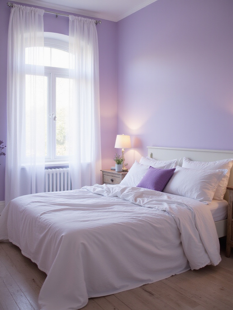
Selecting the best lavender paint shades depends largely on your desired mood and existing lighting. Lighter, pastel lavenders cultivate soft, airy, romantic atmospheres—ideal for smaller bedrooms as they make spaces feel more open. Dusty lavenders with gray undertones offer sophisticated, muted feels that work beautifully in larger bedrooms with ample natural light. For warmth, choose lavenders with pink undertones that introduce coziness. Generally avoid overly bright or saturated lavenders, as these can be too stimulating.
My breakthrough came when I realized that lavender is one of the few bedroom paint colors that actually performs equally well in both very traditional and ultra-contemporary spaces—it’s truly timeless when selected carefully.
15. Elegant Dusty Rose: Vintage Romance
Dusty rose earns its reputation as an ‘elegant’ bedroom paint color through its inherently muted and sophisticated quality, distinguishing it from brighter, more youthful pinks. The subtle gray undertones add depth and complexity, preventing it from appearing overly sweet or childish. This nuanced sophistication allows dusty rose to blend seamlessly with diverse interior design styles, consistently creating refined, timeless bedroom ambiance.
Dusty rose complements various design styles. It pairs beautifully with vintage and antique furniture, enhancing romantic, nostalgic feels and reinforcing older pieces’ charm. In modern bedrooms, it provides soft, grounding counterpoints to clean lines and minimalist décor, adding warmth without disrupting streamlined aesthetics. It harmonizes with bohemian styles—its earthy undertones align with natural textures and eclectic décor, creating cohesive, inviting atmospheres. Even Scandinavian designs can incorporate dusty rose to introduce warmth and subtle color.
What unfolded next was a fascinating trend—designers began using dusty rose as a “new neutral” among bedroom paint colors, proving that when properly balanced, this subtle hue can be as versatile as traditional neutrals while adding more character.
16. Earthy Terracotta: Grounded Natural Energy
Terracotta, with its distinctive warm, reddish-brown hue, powerfully evokes comfort, stability, and deep connection to nature. In a bedroom, it creates a grounding and inviting atmosphere that promotes relaxation and security—ideal for cultivating a restful sleep sanctuary. Think of sun-baked earth, rustic charm, and the inherent warmth of natural clay—these sensations define what terracotta brings to bedroom spaces.
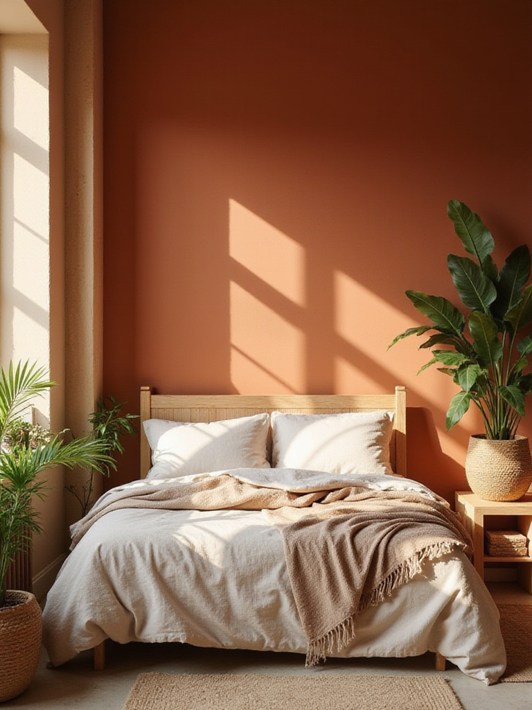
Terracotta pairs beautifully with various colors in bedroom settings. For calming, naturally-inspired palettes, combine with soft neutrals like creamy whites, warm beiges, and light grays to enhance earthy warmth while maintaining serene balance. For vibrant energy, pair with bold accents like deep greens (particularly forest or olive) or muted blues (denim or dusty blue) for harmonious contrast and sophistication. Even touches of mustard yellow can introduce cheerful color without overwhelming earthy tones.
The game-changer happened when designers started using terracotta bedroom paint colors in contemporary spaces—proving this ancient color isn’t just for Mediterranean or Southwestern styles but can bring warmth to even the most modern interiors.
17. Inviting Peach: Joyful Welcoming Atmosphere
Peach, with its inherently warm undertones, evokes a delightful range of positive emotions in bedroom settings. It’s associated with comfort, optimism, and tranquility—managing to be both uplifting and relaxing simultaneously. This unique combination creates a welcoming, joyful atmosphere, making your bedroom feel like a sanctuary of warmth and positivity. Unlike intense orange, peach maintains a gentler, more muted quality conducive to relaxation and well-being in sleep environments.
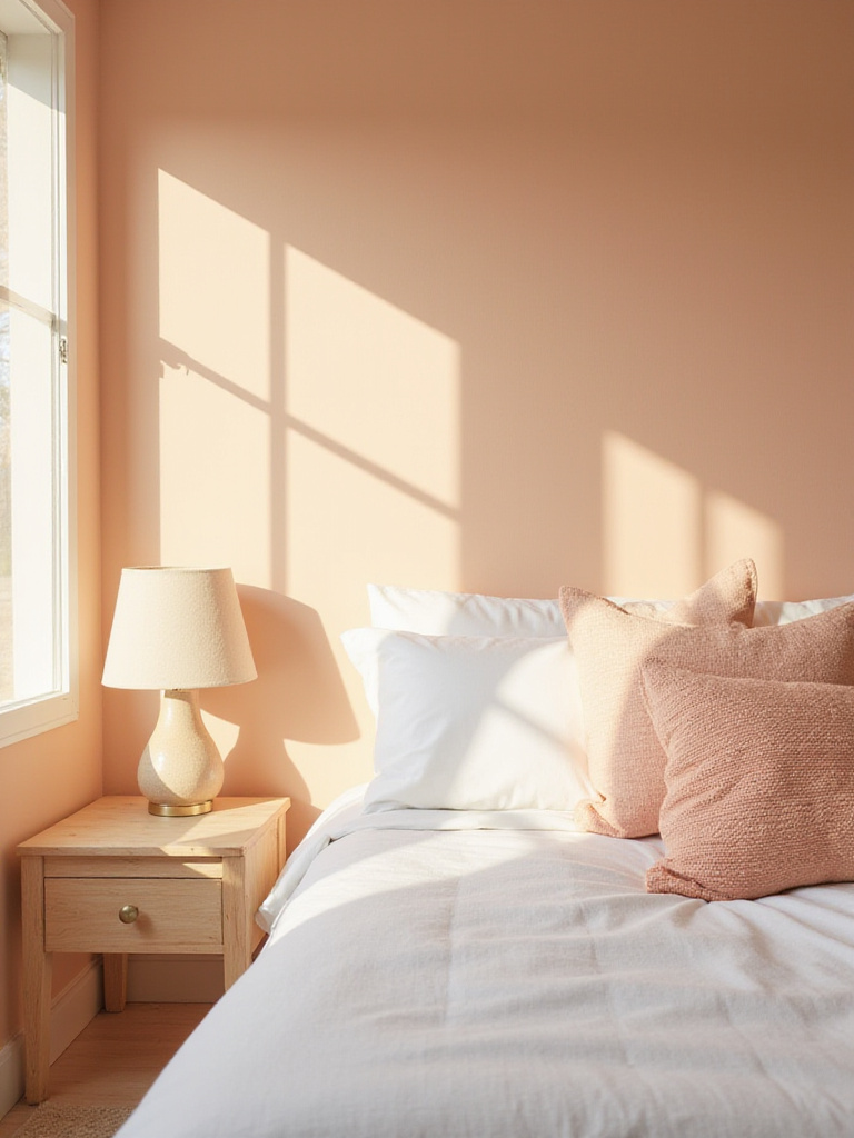
Peach pairs beautifully with diverse complementary colors in bedrooms. For calming effects, combine with soft greens, muted blues, and creamy whites to create harmonious, tranquil palettes enhancing peach’s soothing qualities. To add sophistication, incorporate charcoal gray or navy blue accents for lovely contrast. Even subtle gold touches can elevate elegance, adding luxurious hints. Light wood tones complement peach wonderfully, introducing natural, organic elements reinforcing warmth and inviting feel.
Looking at this from another angle, peach is one of the few bedroom paint colors that flatters almost every skin tone, creating a subtle glow that makes everyone look their best—a hidden benefit beyond its aesthetic appeal.
18. Sunny Light Yellow: Morning Optimism
Light yellow brings powerful psychological benefits to bedrooms, strongly associated with happiness, optimism, and invigorating energy. It creates cheerful, uplifting atmospheres from the moment you wake, brightening mornings and improving overall mood. Light yellow also enhances mental clarity and focus, potentially fostering productive, positive starts to your day. However, carefully select the right shade—overly bright or saturated yellows can sometimes induce anxiety or restlessness. For bedrooms, soft, muted yellows are generally more calming and suitable.
Light yellow complements various bedroom styles. In cottagecore/farmhouse settings, paired with natural wood, delicate florals, and soft textiles, it enhances cozy, inviting feels. In minimalist Scandinavian bedrooms, it introduces necessary warmth, adding hygge comfort while maintaining clean lines. Combined with earthy tones and eclectic elements in bohemian bedrooms, it contributes vibrant, free-spirited atmosphere. In coastal settings, it evokes sun-drenched beaches, creating fresh, airy ambiance. For transitional styles, it bridges classic and contemporary, offering traditional charm while remaining fresh and relevant.
This is exactly when most people make a mistake—they choose yellows that are too bright or saturated for bedroom paint colors. The secret is selecting buttery, muted yellows that energize without overwhelming your senses.
19. Moody Charcoal Gray: Cozy Intimacy
Charcoal gray carries unique psychological effects in bedrooms, evoking sophistication, profound calmness, and comforting security. It creates feelings of enclosure and intimacy, making bedrooms feel like true safe havens from the outside world. However, balance is crucial—incorporate lighter elements to prevent oppressiveness. Interestingly, charcoal gray can improve sleep quality by reducing light reflection, creating dimmer, more sleep-friendly environments beneficial for those sensitive to light.
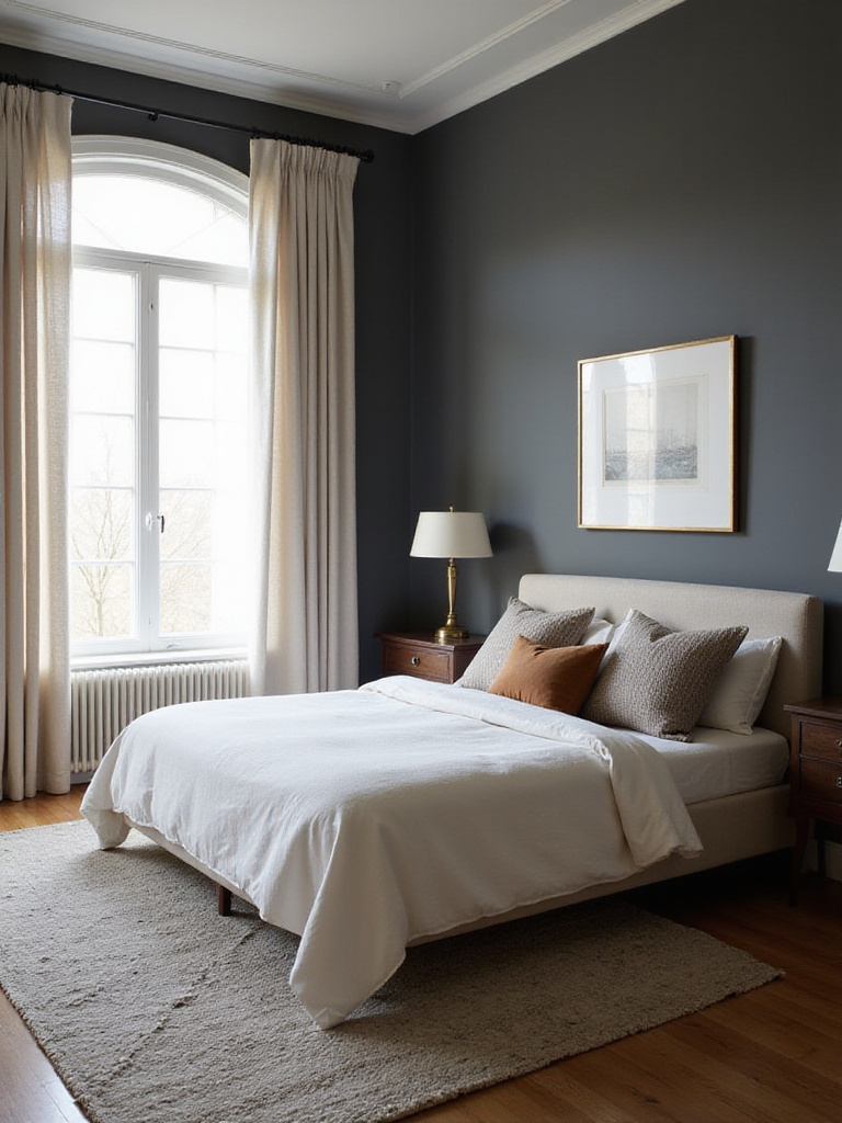
Charcoal gray bedroom paint colors complement various design styles. It shines in modern settings—its sophisticated, understated nature aligns with clean lines and minimalist aesthetics. It’s excellent for minimalist bedrooms, adding visual interest without disrupting simplicity. Industrial-chic spaces benefit from charcoal gray reinforcing raw, urban, edgy vibes. It works in Scandinavian-inspired rooms, adding depth and warmth against lighter woods and textiles. It pairs harmoniously with mid-century modern furniture, highlighting sleek lines and bold shapes. Even traditional bedrooms can incorporate charcoal gray when balanced with lighter elements.
The missing piece is understanding that charcoal gray actually makes artwork and decorative elements pop dramatically—creating a gallery-like effect that showcases your personal style against a sophisticated backdrop.
20. Enveloping Forest Green: Lush Retreat
Forest green creates an exceptional bedroom sanctuary by evoking feelings of nature, tranquility, and groundedness. As a color associated with growth, renewal, and stability, it naturally creates a calming atmosphere conducive to peaceful sleep and relaxation. Its depth and richness make rooms feel cozy and enveloping, creating security and profound peace—transforming bedrooms into true retreat-like sanctuaries.
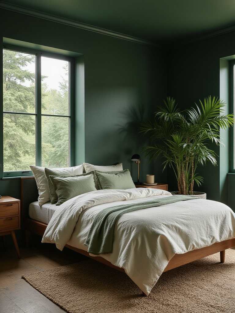
There are several effective ways to incorporate this rich hue into bedroom design. Using forest green as the primary wall color creates an immersive, enveloping experience, particularly effective in larger bedrooms. For less dominant approaches, use it as an accent on a single feature wall (especially behind the headboard) or on architectural details like trim and built-ins. Enhance the natural, retreat-like feel by pairing with natural materials—wood furniture, linen bedding, and rattan accents reinforce nature connections and create harmonious, organic aesthetics.
The implications are staggering when you consider that forest green is one of the few bedroom paint colors that can make a space feel simultaneously luxurious and deeply connected to nature—a combination that creates true sanctuary-like qualities.
Finding Your Perfect Bedroom Paint Color
Choosing the perfect bedroom paint colors is a deeply personal journey that should reflect your individual style and needs. From the serene calmness of blues and greens to the warm embrace of neutrals and the romantic whispers of pinks and lavenders, each color offers a unique transformation potential.
Remember that lighting dramatically affects how colors appear, so always test samples in your actual bedroom before committing. Consider both natural daylight and your evening lighting setup, as colors can shift dramatically between these conditions.
Most importantly, trust your instincts. The perfect bedroom paint color should evoke the feelings you want to experience in your most personal space—whether that’s tranquility, energy, romance, or comfort. With these 20 dreamy options as your guide, you’re well on your way to creating a sleep sanctuary that nurtures your well-being and invites peaceful dreams night after night.