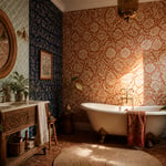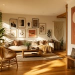
The living room is the room that lies. It presents the edited version of how you live — the considered choices, the things you’ve kept and the things you’ve quietly passed on. Good living room furniture decor doesn’t fill a room; it gives it a point of view. Britain has been doing this rather well for three centuries, which is why Georgian side tables still turn up beside contemporary sofas, and why a well-chosen Chesterfield remains one of the most loaded pieces of furniture a room can contain.
The difference between a living room that looks designed and one that merely looks furnished comes down to specifics: the height of a coffee table relative to the sofa beside it, the temperature of a light bulb, the number of cushions on a three-seater. Sweeping guidance is easy to find and rarely helpful. What actually moves the needle is knowing the exact rule and the specific exception. These eighteen living room furniture decor ideas cover the full range of decisions — from the anchor sofa to the final throw. Each one is specific enough to act on this weekend.
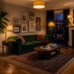
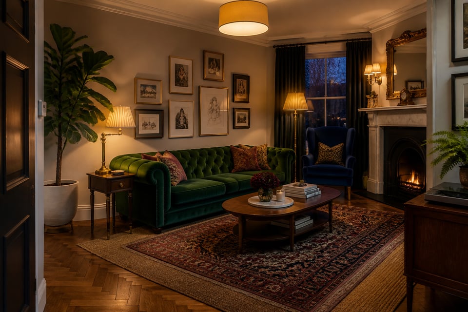
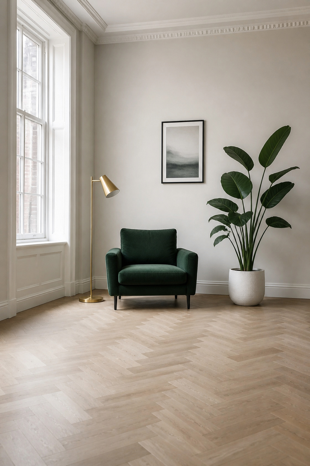
1. The Chesterfield Sofa: Britain’s Most Reliable Living Room Anchor
There is something deeply satisfying about the fact that the Chesterfield sofa was commissioned by a man primarily famous for writing letters. Lord Philip Stanhope, 4th Earl of Chesterfield, reportedly wanted a piece of furniture so properly designed that a gentleman could sit upright without creasing his suit. The rolled arms equal in height to the back, the deep button tufting, the characteristically low seat — all of it was intentional. Coiled spring suspension arrived around 1828. The silhouette has not changed meaningfully since.
What makes it so compelling is precisely its self-sufficiency. The Chesterfield does not need a matching sofa table or a particular rug to read as complete — it arrives with its own visual logic. In contemporary living room furniture decor, that historical confidence is the whole point. You are not decorating around it; it is decorating around you. There is a reason that among all the living room furniture styles that stand the test of time, the deep-buttoned silhouette keeps reappearing.
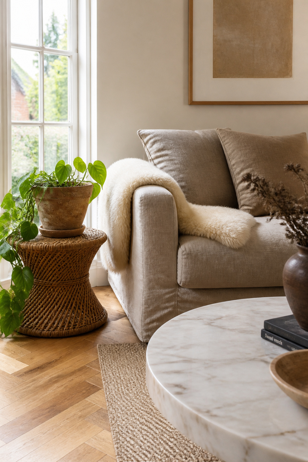
For execution, the choice between leather and velvet is really a choice between registers. Leather is clubby and traditional, improves with age, and suits rooms that skew industrial or Georgian. Velvet — particularly in jewel tones like emerald, sapphire, and deep burgundy — is more overtly decorative, highlights the tufting beautifully in lamplight, and works in contemporary rooms that need one piece to carry the room’s colour ambition. Standard depth runs to 38 or 41 inches; most living rooms need at least 18 inches of clearance alongside one long edge. The common mistake is placing it flat against a wall, where the entire back detail — the most beautiful part — becomes completely invisible.
2. Layered Rugs to Ground Your Living Room Furniture Arrangement
A rug sized to the room rather than the furniture arrangement is one of the most reliable indicators of a room that hasn’t quite been designed. The floor covering should define the seating zone, not the floor plan — and the most persuasive way to do this is with two rugs rather than one.
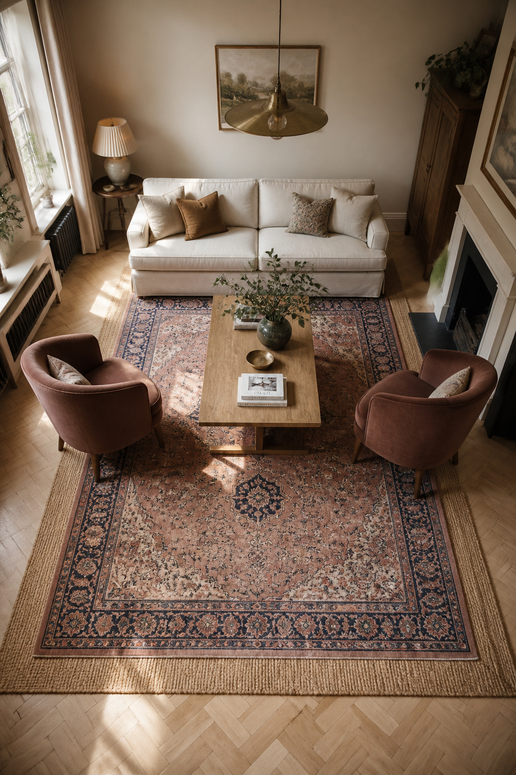
The base layer should be neutral and textural: jute, sisal, or a flatweave in a tone that complements the flooring. The top layer is where pattern, colour, or pile can appear — a vintage Persian, a bold geometric, a high-pile wool. The base goes under all the furniture; the top rug sits centred in the conversation zone, with front legs of sofas and chairs resting on it. The critical measurement is the gap between the two rugs’ edges: 12-18 inches of base rug visible around the perimeter of the top rug is what makes the layering legible rather than accidental.
Sizing: most living rooms need a base rug of at least 8×10 feet for a front-legs-on arrangement, or 10×14 if you prefer all legs on. This is where people consistently go wrong — they buy to the room’s square footage rather than to the seating group, and the result floats in the centre of the space looking unconvinced. The test: can the coffee table sit fully on the rug with six inches of breathing room on all sides? If not, go up a size. The layered version applies the same logic to both rugs — the base rug should be one standard size larger than you’d normally select for the space alone. For a jute-and-Persian combination specifically, the contrast of weave textures is the whole point; two smooth rugs layered read as redundancy, not design.
3. A Gallery Wall Scaled Correctly to the Sofa Behind It
The 2/3 rule is probably the most useful single proportion in living room design: the overall width of any art grouping hung above a sofa should be approximately two-thirds the length of the sofa. On a 90-inch sofa, you’re aiming for roughly 60 inches of horizontal art coverage. Too narrow and the grouping looks like an afterthought; wider than two-thirds and it starts to fight the furniture rather than relate to it.
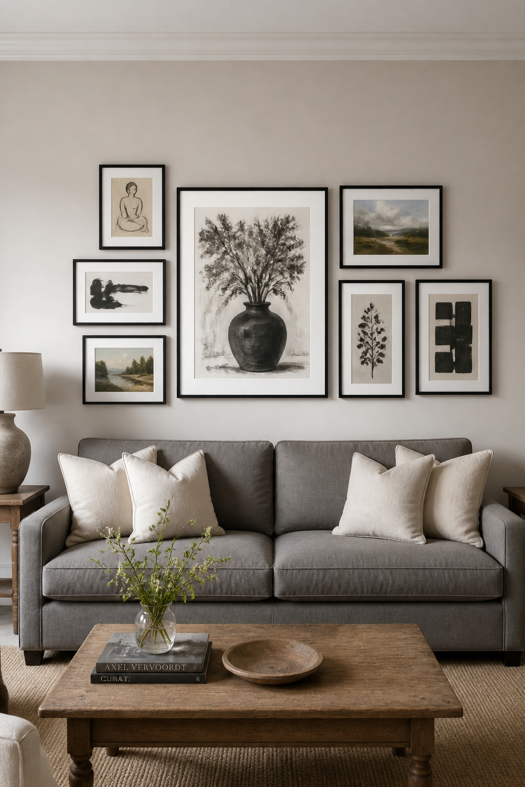
Before a single nail goes in, lay all the frames on the floor and arrange the grouping there first. This is how professional installers work, and it saves considerable patching and repainting. The centre of the entire grouping should hang 57 inches from the floor — the museum standard for eye level — and the bottom edge of the lowest frame should sit 6-8 inches above the sofa’s back. That connection between furniture and art is what makes the wall feel resolved. Frames drifting at ceiling height make a room feel taller in a bad way, as though the furniture and the wall are not on speaking terms. For comprehensive living room wall decor ideas that hold up over time, proportion is the decision that matters before any other.
Within the grouping, keep 2-3 inches between frames and treat the collection as a single object rather than a series of individuals. The most effective gallery walls have one dominant piece — the anchor — with smaller frames arranged around it. Mixing originals with prints is not a problem; a single small oil or watercolour among quality prints becomes the piece the eye keeps returning to, which is exactly what a well-designed gallery wall should do.
4. The Statement Coffee Table as the Room’s Visual Anchor
Coffee tables are the most misjudged piece of furniture in most living rooms. The instinct is to choose on aesthetics — marble looks refined, walnut looks warm, glass looks light — but the decision that actually determines whether the table works is proportion. Get that wrong and no amount of marble will save it.
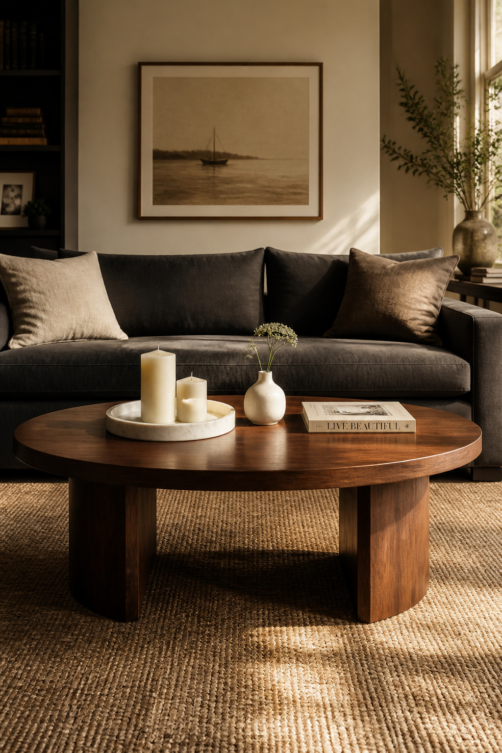
The rules are simple and mostly ignored. Height: within 1-3 inches of the sofa’s seat height, which typically means 16-18 inches. Length: approximately two-thirds the sofa’s length — a 90-inch sofa wants a table between 54 and 60 inches. Clearance: 12-17 inches between the sofa’s front edge and the table’s nearest edge. These measurements ensure that a drink can be reached, a leg can extend, and a person can pass without turning sideways. The amount of excellent coffee table styling that’s been undermined by a table that’s simply too small is considerable.
On shape: round tables solve the traffic-flow problem — no corners in walkway paths, which matters enormously in smaller rooms and family homes — while rectangular ones offer maximum surface and suit the strong horizontal of a long sofa or sectional. The often-missed option is the oval: it combines the generous surface of a rectangle with the soft edge of a circle, and at 48-54 inches reads very well in rooms where a rectangular table would feel too rigid. The table’s material should be chosen last, after proportion is confirmed. In coffee table decisions, as in most living room furniture decor decisions, the numbers matter more than the finish.
5. Living Room Furniture Placed for Conversation, Not the Screen
Rooms designed around televisions are, at their heart, cinemas — and not particularly comfortable ones. The TV-centric arrangement pushes seating to the walls, creates an empty dead zone in the room’s centre, and means that any conversation requires either shouting across the room or the particular discomfort of turning sideways and holding that position. It also makes rooms look smaller, which is the opposite of what lining walls with furniture is meant to achieve.
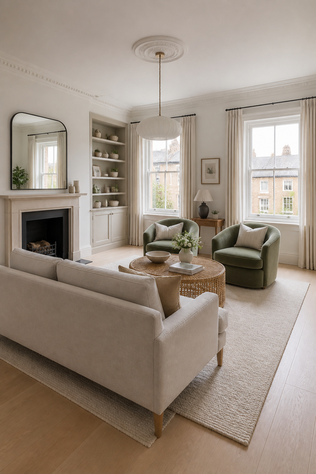
The better arrangement: float all seating 12-18 inches from the walls. Pull the sofa toward the centre of the room. Group the primary seating — sofa, two chairs, coffee table — within a conversation radius of 3-6 feet between pieces. This is the distance at which people can speak to each other without strain, and it is the dimension professional designers work to first. For practical guidance on living room interior design that improves how a room actually functions, the conversation-first arrangement is invariably the starting point.
Allow at least 30 inches clearance in major walkways around the seating group — enough for two people to pass without choreography. The screen can stay; it simply doesn’t need to be the room’s organising principle. Positioned at one end of the conversation group at a natural viewing angle, or housed in a cabinet that closes over it when not in use, a television can occupy a room without dominating it. Swivel mounts are underrated: they allow the screen to serve multiple seating positions without requiring anyone to rearrange the furniture.
6. Heritage Velvet Accent Chairs in Jewel Tones That Age Beautifully
From a living room furniture decor standpoint, the jewel-toned velvet accent chair is one of the best long-term investments a room can make. The case begins with a simple observation: neutral velvet gets tired faster. Deep dyes have more optical depth to exhaust before they start looking worn, which means an emerald or sapphire chair holds its quality longer than the same chair in pale sage or dusty rose. There is something satisfying about this — the bolder choice turns out to be the more considered one.
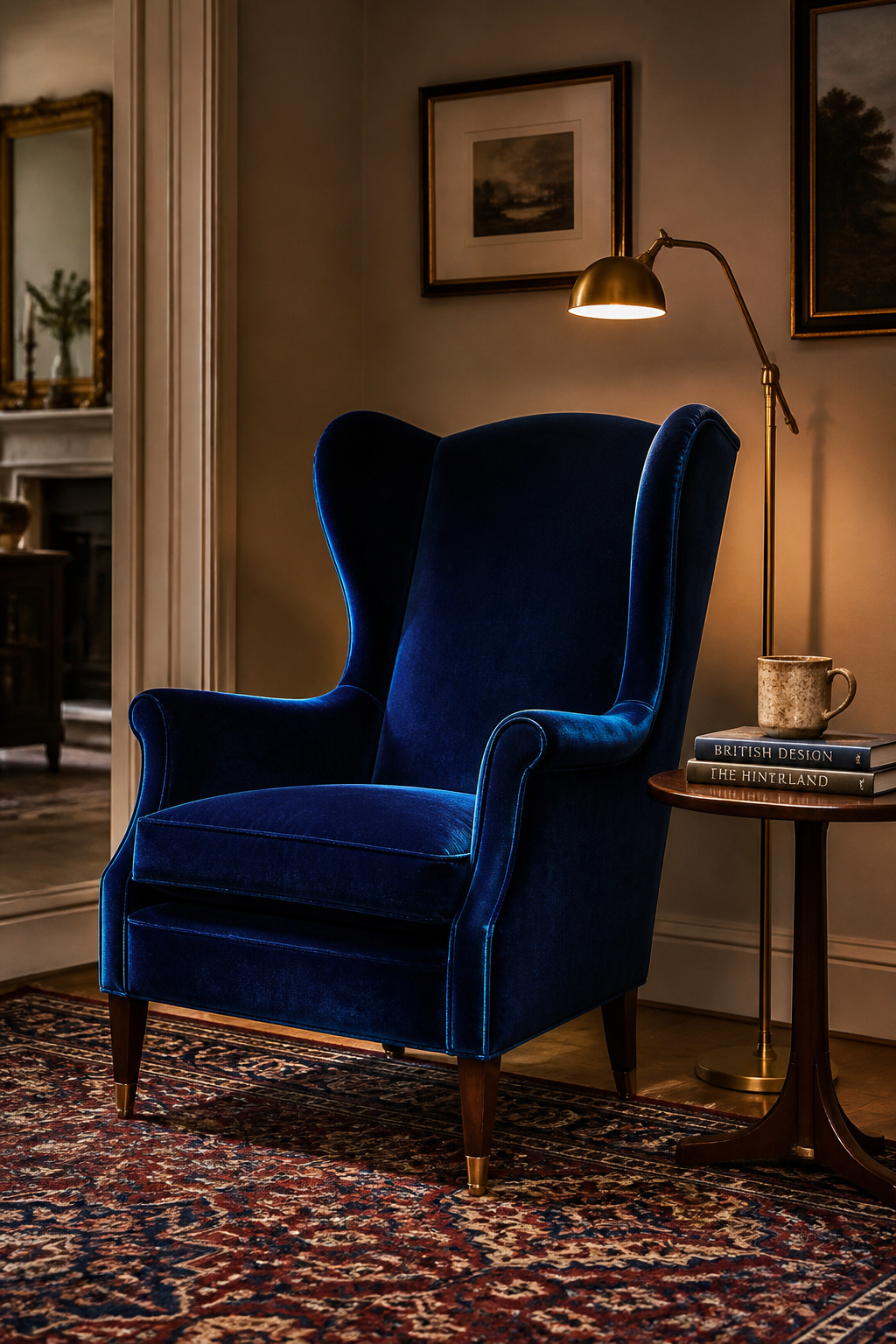
Among the many living rooms decorating ideas that rely on a strong accent piece, the heritage velvet chair is among the most versatile. A curved-back barrel chair or a wingback in deep forest green with walnut or brass-tipped legs is the classic British configuration — it provides both visual and physical enclosure, making it feel like a destination rather than overflow seating. The frame matters as much as the fabric: curved frames (barrel, slipper) read casual and feminine; straight backs (wingback, club) read formal and more heritage-aligned. Pair jewel-toned chairs with neutral primary seating so the chairs carry the room’s colour work without competing with the sofa.
Velvet maintenance is simpler than its reputation suggests. Weekly brushing with a velvet furniture brush, always in the direction of the nap, maintains the pile and prevents flattening. Spills need to be blotted immediately — never rubbed, which would crush the nap permanently. The one genuine consideration is UV exposure: jewel-toned dyes are sensitive to prolonged direct sunlight, and a chair in a sunny bay window will bronze unevenly within a season. UV-filtering window film or seasonal rotation solves this.
7. Bookshelves Styled as Living Room Decor, Not as Storage
A bookcase done well is among the most personal things a room can contain. What goes on it, what is visible, what is deliberately obscured — these are editorial choices that reveal more about an owner than any piece of furniture could. Done badly, a bookcase is expensive clutter storage with better lighting.
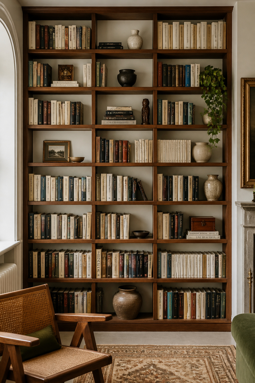
The 70/30 rule: roughly seventy percent books, thirty percent objects — plants, ceramics, framed photographs, sculptural pieces. The objects are not decoration; they are intervals in the rhythm. Each shelf reads best as a visual composition: one tall element (a vase, a candlestick), one medium (a framed photo, a small sculpture), one low (a ceramic bowl, a trailing plant). Groupings in odd numbers — three, five — resolve more naturally than even numbers, which the eye tends to split in half and then wonder about.
The counter-intuitive technique that most reliably distinguishes styled living room decor from merely stored books: turn 20-30% of the books backward so their pages face outward rather than their spines. This breaks the pattern of competing coloured spines and creates a calming cream-and-tan palette on those sections. The contrast between facing-forward sections (patterned, coloured) and facing-backward ones (uniform, textural) is what creates rhythm — all forward is busy, all backward is uniform, the mix is interesting. Leave visible wall between object clusters; breathing room is not empty space, it is part of the composition.
8. A Low Credenza That Does the Work of a Sideboard Without the Bulk
The credenza is the sideboard’s overlooked younger sibling, and it deserves considerably more recognition in living room furniture decor planning. At 24-28 inches tall versus the sideboard’s 30-36 inches, a credenza sits below most windowsills, doesn’t interrupt sightlines, and its signature sliding doors require no swing clearance — a practical benefit that compounds in rooms where a hinged door would obstruct circulation or a chair.
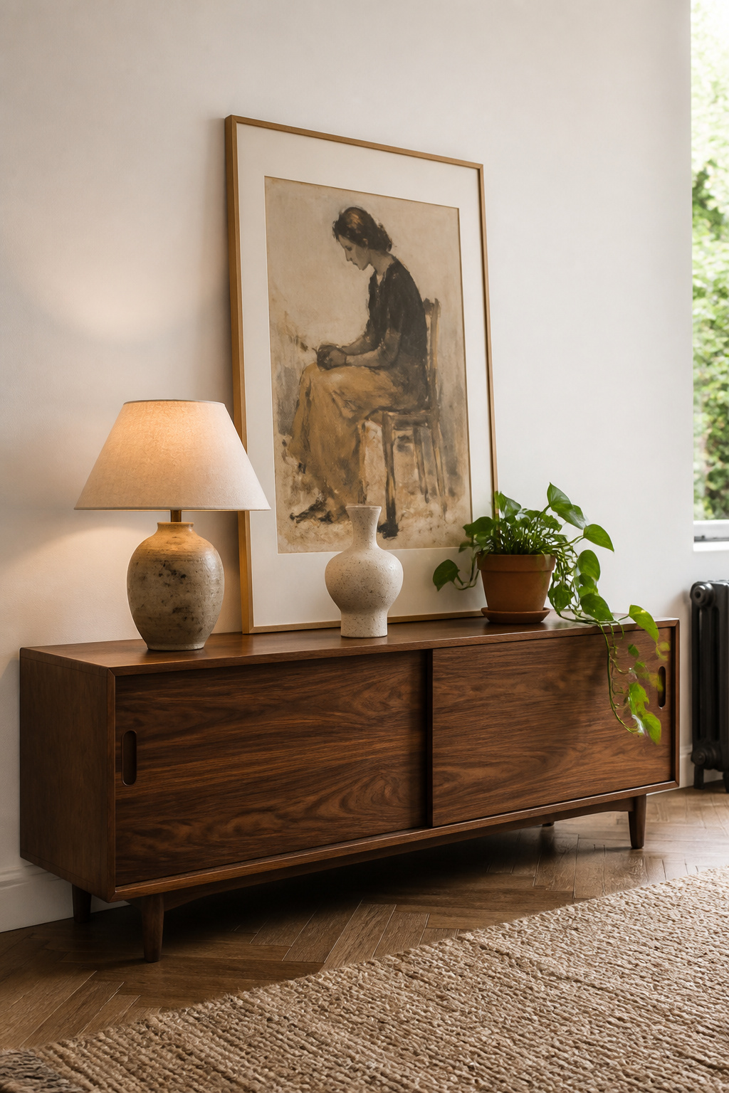
The practical distinction matters most in contemporary living rooms, where the credenza’s low profile creates a horizontal surface that works with the room’s geometry rather than competing with art or windows. For television use, this height advantage is real: it positions the centre of a 55-75 inch screen at the ideal seated eye level of 42-48 inches — a sideboard’s extra height pushes the screen too high, which causes neck strain and reads poorly from across the room.
Styling the top surface follows the same principle as every other surface: one tall element (lamp, large vase), one medium (art leaning against the wall, a stack of books), one low (ceramic bowl, candle group). The common mistake is treating the credenza top as additional storage — boxes, paperwork, and miscellaneous objects left there negate its visual contribution entirely. Rear cable management cutouts are standard on most modern designs, but not all; confirm specifications before purchase if AV use is planned.
9. A Reading Corner Built Around a Wing Chair and Floor Lamp
The reading corner is one of the clearest signals in a living room that its design considered solitary use as well as social use. A sofa and accent chairs address group situations efficiently; a single wing chair beside a floor lamp with a side table within reach says that someone thought about Tuesday evening as well as Saturday afternoon. This specificity is what good living room furniture decor achieves that purely social arrangements cannot.
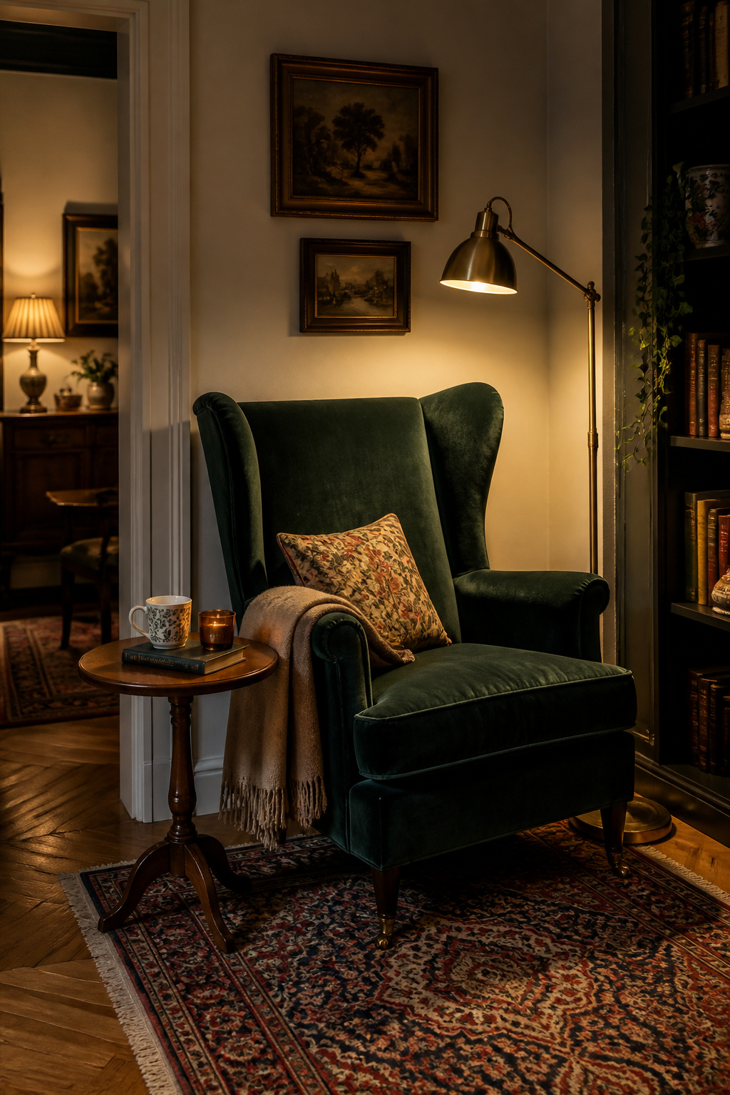
The wing chair is in genuine revival. Its curved side wings create enclosure that positions reading, curling sideways, or sitting with legs over an arm as supported positions rather than structural challenges. Pairing it with a floor lamp requires one measurement: the bottom of the shade should sit at 42-47 inches from the floor, which places it at seated eye level and directs light over the shoulder toward the page. Standard floor lamps run 58-64 inches overall; purpose-designed reading lamps position the shade slightly higher, at 48-54 inches, to bring light from above without shining directly into the reader’s eyes. Place the lamp slightly behind and to the side of the reading shoulder — a right-handed reader wants it on their right, behind and above.
The side table that makes or breaks the corner: its height should be within two inches of the chair arm height, typically 24-27 inches for a wing chair. A table between 14-24 inches wide provides the surface needed without crowding the chair’s footprint. The single transformative detail is a small tray on the surface — it corrals coasters, reading glasses, and a remote into a defined zone and converts the corner from functional to considered.
10. Living Room Furnishings in Natural and Honest Materials
Natural materials — wood, linen, stone, rattan, jute — hold up better in a room over time than their synthetic equivalents for a reason that is difficult to quantify but immediately apparent: they improve with age rather than simply wearing out. Leather develops a patina. Linen softens. Walnut deepens. Oak absorbs the light of a particular room and begins to look as though it was always there. Polyester does none of these things.
The challenge with naturals in living room furnishings is the registration problem — rooms filled entirely with warm naturals (raw wood, jute, rattan, wicker, linen) in a light-filled space tend to read as a holiday cottage rather than a home. The solution is contrast: introduce at least one cooler natural to provide visual tension. White marble, slate, pale linen, or aged zinc are the most effective choices. The pairings that work best: dark walnut with pale linen (warm/cool contrast), rattan with polished concrete (textured/smooth contrast), oak with stone (warm/cool contrast). Three warm naturals together need a cool one to prevent the room from tipping into beach house.
The one synthetic that genuinely belongs with natural materials is performance velvet — technically polyester microfibre, but with a pile that replicates the depth of natural fibre at a fraction of the maintenance. Performance velvet cushions on a natural linen sofa is a pairing where the sheen contrast makes both materials look better than they do alone. However, high-gloss synthetics, faux leather, and printed microfibre patterns do not belong in natural material schemes — they read as imitation, which is the one register you specifically do not want.
11. The Ottoman as Coffee Table: More Practical Than It Looks
The upholstered ottoman has made a quiet but decisive move into coffee table territory, and the living room furniture decor case for it is utilitarian. It serves as footrest, occasional seating, and — with a tray — a stable surface for drinks and books. A traditional coffee table only manages the last of these, and its corners are a credible hazard in any room occupied by children or late-evening navigation.
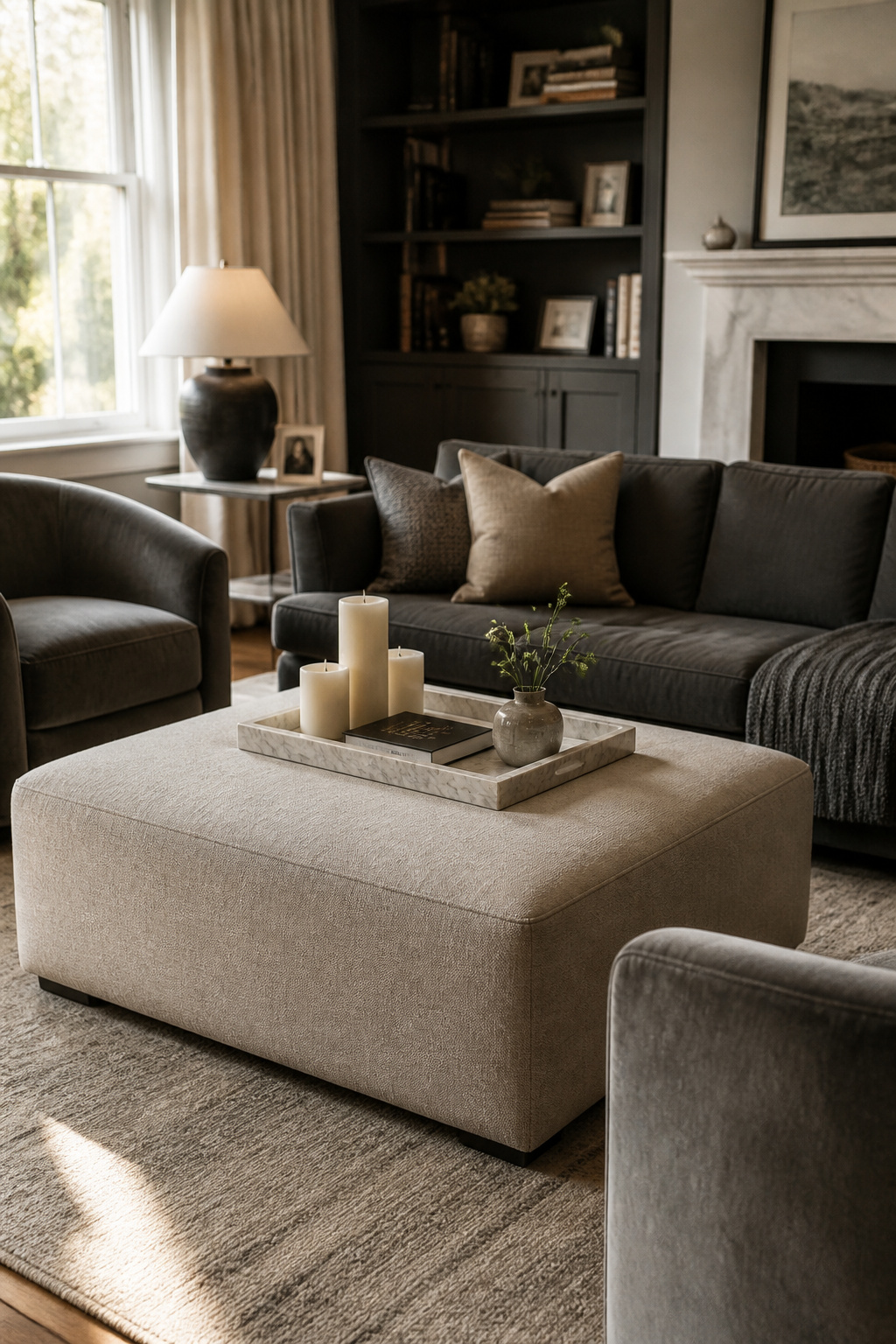
For families, performance fabrics (Crypton, Sunbrella) are the honest choice — they resist staining, survive sustained use, and clean with soap and water. For formal rooms with more controlled use, linen or velvet read beautifully. The tray is not optional when the ottoman fills the coffee table role: it defines the surface, prevents items from sliding, and creates a firm base for drinks without the soft give of upholstery beneath. Sizing follows the same 2/3 sofa length rule as a conventional coffee table; a too-small ottoman in a large conversation area looks like a footstool rather than a considered centrepiece.
Firmness is where people are most often disappointed: an ottoman that sags under a tray or under the weight of a seated adult is both functionally poor and visually deflating. High-density foam fill at 1.8 lb per cubic foot or above is the specification worth confirming before purchase. In-store test: press firmly on the display model’s surface — it should resist without meaningful depression. Soft fill works as a footrest; it does not work as a table.
12. A Console Table Behind a Floating Sofa
The moment a sofa is pulled away from the wall and floated in a room, its back becomes an exposed architectural void. Left unaddressed, this void makes the floating arrangement feel unfinished — as though the sofa has simply been pushed to the middle of the room without a plan. In living room furniture decor, the sofa without a back anchor is one of the most common and most correctable oversights.
A console table resolves this immediately. At a standard depth of 12-15 inches, it sits close to the sofa’s back without demanding floor space, and allows 12-18 inches of clearance between the sofa’s back and the console’s front edge — enough to walk through without turning. The console table’s lamp adds light from a direction the room wouldn’t otherwise have, which is particularly useful in rooms that feel dim at the back of the seating arrangement.
The objects that make a console look considered rather than assembled follow the same height-variation principle as every other surface in the room: one tall element (lamp, large vase), one medium (art leaning against the wall, a stack of books), one low (small bowl, candle grouping). Art leaning against the wall rather than hung is the most current approach — it looks deliberate without requiring holes, and can be changed seasonally without a wall repair. A mirror above the console is the right call in rooms that feel closed or dark; it reflects both light and the room from the opposite direction, adding depth that a painting cannot.
13. Lighting Layers as the Final Touch in Living Room Furniture Decor
Overhead-only lighting makes even beautiful furniture look flat. The reason is simple: shadows are what reveal texture, depth, and form, and a single ceiling source creates uniform illumination with almost no shadow. The expensive sofa looks institutional. The walnut coffee table looks like laminate. The room looks like a waiting room with nicer chairs.
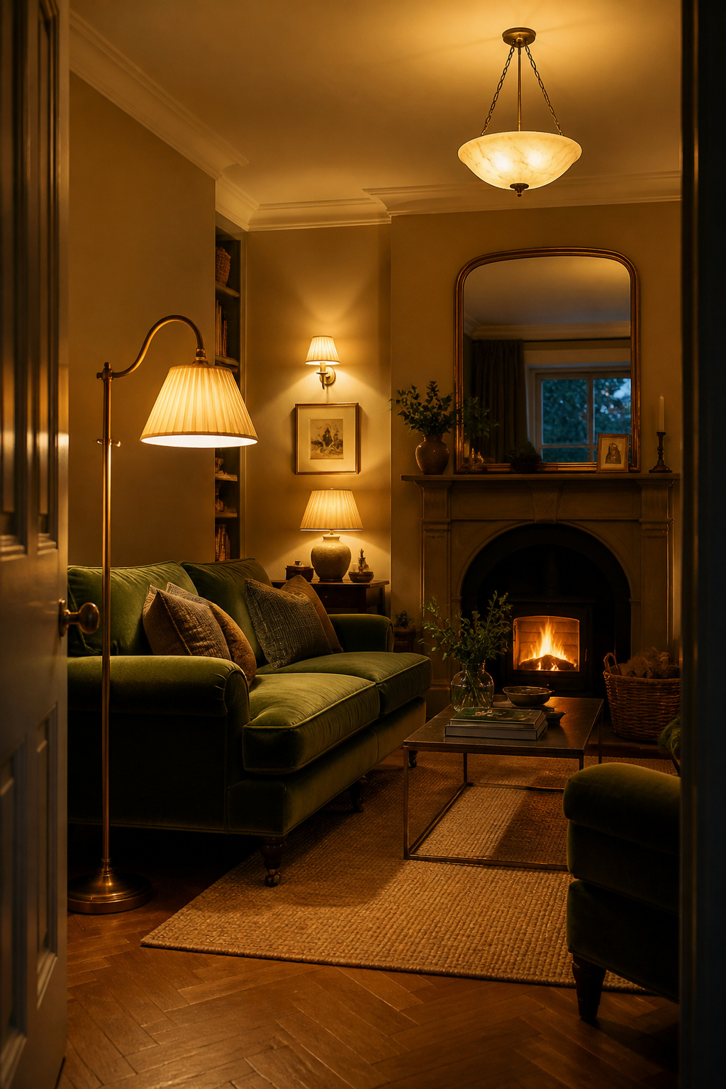
The three-layer system applied to living room furniture decor is straightforward in principle. Layer one: ambient — a ceiling fixture or recessed lights at 2700-3000K. Layer two: task — floor lamps and table lamps at sofa ends, also at 2700-3000K, positioned to serve reading and conversation. The floor lamp beside the reading chair places the shade bottom at 42-47 inches from floor. Layer three: accent — wall sconces to either side of a fireplace, picture lights over significant artworks, small LED spots inside bookshelves. This third layer is where the room’s character lives; everything else is infrastructure.
Total lumen output for a living room: 1,500-3,000 lumens from multiple sources. The single highest-impact, lowest-cost improvement most living rooms can make is a dimmer switch on the ambient circuit — it costs under £30 to install and transforms the room from lit to atmospheric. Every layer on a separate dimmer circuit, where possible, allows scenes from full morning brightness to intimate evening with no ceiling lights at all.
14. Mixing Centuries: Georgian Side Tables With Contemporary Sofas
The rooms that look most collected — assembled over decades by someone with strong opinions and decent luck — are invariably the rooms that mix furniture from different periods. A room furnished entirely in one era or from one retailer looks set-dressed rather than lived in. It says the room was completed in an afternoon, which is the thing that living room furniture decor should specifically not suggest.
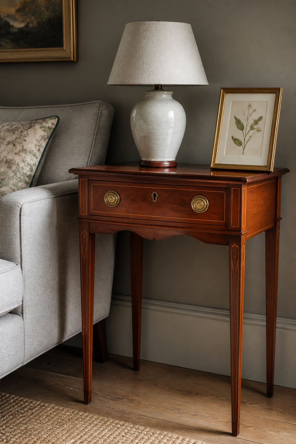
The 80/20 principle: eighty percent contemporary (for livability and clean visual field), twenty percent period pieces (for narrative, material quality, and the sense that the room has accumulated rather than been delivered). Georgian and Regency furniture is the most compatible period with contemporary sofas, for specific reasons: Hepplewhite side tables, Pembroke tables, and small Georgian cabinets were designed for domestic scale and have proportions that translate without effort into contemporary rooms. Their slim legs, restrained ornamentation, and quality hardwoods sit sympathetically beside a contemporary linen sofa in a way that heavier Victorian pieces often do not.
The connective thread — the element that makes disparate periods cohere — should be identified before mixing begins. A consistent warm wood tone across periods works well. A neutral mineral palette throughout allows widely different furniture styles to coexist. Brass hardware is perhaps the most reliable connector: both Georgian antiques and contemporary furniture frequently share it, and the contrast of patinated old brass beside new brass reads as intention rather than inconsistency.
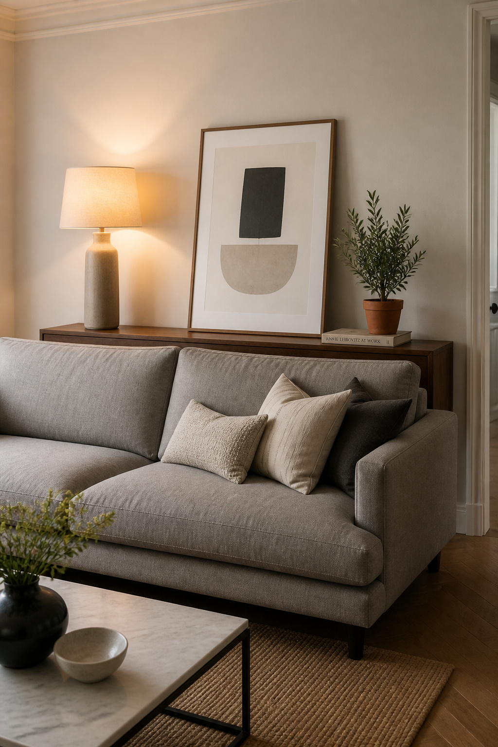
15. Throws and Cushions as the Living Room Decor Details That Actually Matter
The things guests touch first in a living room are the cushions. Before the quality of the sofa’s fabric registers, before the room’s scale is appreciated, the cushion cover has been assessed and an opinion formed. A good cover — feather-down insert, quality linen or velvet outer — communicates the same care as a well-chosen piece of furniture. A polyfill insert in a thin cover undermines an expensive sofa in the time it takes to sit down.
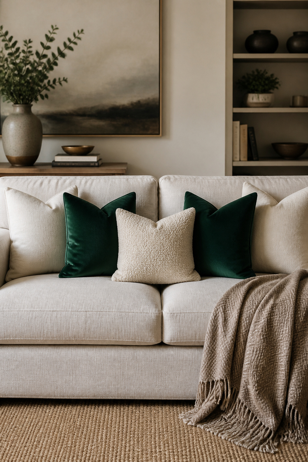
Counts by sofa size: armchair, 1-2 cushions; two-seater, 2-3; three-seater, 4-5; large sectional, 5-9. Above these counts, the showroom stack effect takes hold — it looks neither welcoming nor lived-in. The most successful combination is linen with velvet: the contrast between a woven fabric and a pile fabric makes each look better than it does alone. Boucle with linen works similarly. What doesn’t work: stacking all heavy textures together — velvet, boucle, and heavy wool in the same arrangement reads more like a fabric sample collection than seating. Odd numbers feel relaxed; even numbers feel formal. Choose based on the room’s intended register.
On throws: a throw folded in a neat rectangle over the sofa arm is staging. A throw loosely draped across the sofa’s corner, slightly gathered, as though it was recently used and not quite put away — that is the effect to aim for. One throw per sofa; a second throw at the other end tips into textile shop. The quality of that single throw should be high enough to justify its solitude.
16. A Drinks Trolley as Both Function and Character
Among the most character-revealing choices in living room furniture decor, the drinks trolley is the most honest object in the room. Everything else can be curated to project a particular identity; the trolley reveals what the room’s inhabitant actually enjoys, reaches for, and considers worth displaying. A bottle of good Scotch beside a small vase of flowers and a stack of novels tells you something specific about the person who assembled it — and specifically is what makes living rooms interesting.
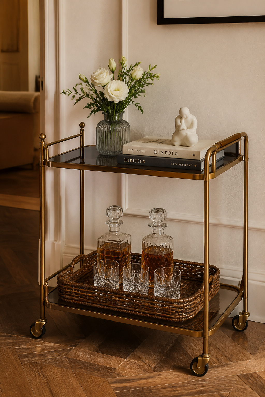
Its practical proposition is also underrated. The trolley can be moved to the dining room for a dinner party, to the garden for a summer afternoon, and returned to its habitual position without ceremony. Fixed furniture is committed; the trolley is flexible. For setup, height variation applies here as it does to every other surface: tall (spirit bottles, candlesticks), medium (glasses, decanters, small vases), low (books, coasters, a tray). Height and wheel quality matter: a trolley that wobbles or rolls unexpectedly undermines the whole proposition; lockable wheels and a minimum height of 30 inches are specifications worth holding.
For rooms where a bar function is impractical or redundant, the trolley converts readily: a coffee and tea station (French press, beans, syrups, good mugs), a book display with a small plant, or a mobile side table in a reading corner that lacks floor space for a fixed one. The requirement in any configuration is the same — maintain the decorative discipline that makes the trolley work as a design object rather than a storage unit on castors.
17. Greenery on Mantels, Shelves, and Side Tables Without It Looking Wild
Plants are the finishing touch in living room furniture decor that no catalogue image can fully replicate — they introduce organic form, movement, and a quality of aliveness that photographs, ceramics, and books cannot achieve. A large floor plant in a corner replaces a piece of furniture in terms of visual mass while adding something no furniture achieves. The discipline is scale calibration, which is where most plant-related design decisions go wrong.
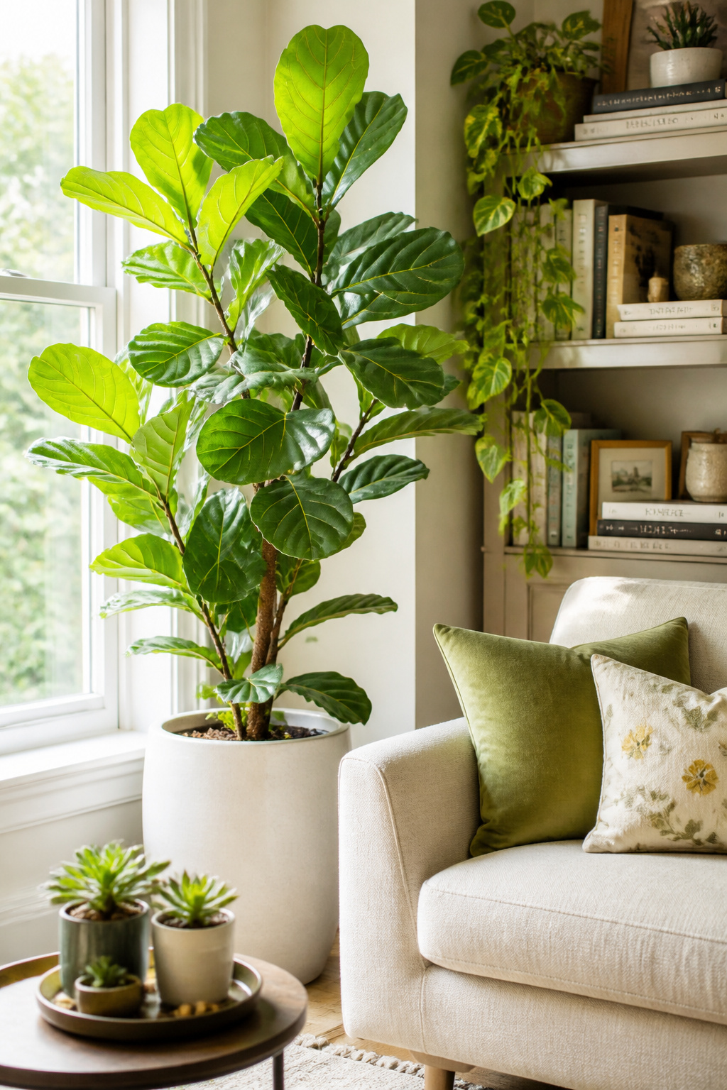
Floor plants for corners and beside sofas: aim for 4-6 feet of height. Fiddle-leaf figs, monsteras, and large-leafed philodendrons anchor dead corners and add the vertical element that rooms with all-horizontal surfaces tend to lack. Shelf and mantel plants: trailing varieties (pothos, heartleaf philodendron) work at shelf edges; compact upright plants (small ZZ, snake plant) suit mantel corners where trailing would read as overgrown. Side table plants should be 4-8 inches tall at most — at table scale, a larger plant overwhelms the surface entirely.
Two varieties that survive almost every living room: the ZZ plant (Zamioculcas zamiifolia), which stores water in its rhizomes and tolerates low light and watering every 2-3 weeks with genuine indifference, and pothos, which trails attractively from shelves, tolerates low to medium light, and grows quickly enough to make a person feel competent at plant ownership within months. Both prefer indirect light. The pot is a design object and should be chosen with the same care as a vase — a beautiful plant in a poor-quality plastic pot is a worse outcome than no plant at all.
18. The Case for Negative Space in a Furnished Living Room
Over-furnishing is the most common mistake in living room furniture decor, and the hardest to admit, because every object in a room arrived there by decision. Editing means acknowledging that some of those decisions were wrong, or at least that the room would be better without them. This is not nothing.
Why Intentional Emptiness Is a Design Decision
The Japanese concept of ma (間) — intentional negative space — provides both the framework and the permission to do this. Ma is not emptiness; it is the pause that gives surrounding objects their meaning. A room with fifteen percent fewer objects reads as more spacious, more deliberate, and more confident than the same room fully loaded. The edit is itself a design decision. For simple living room decoration that achieves this quality, the starting point is almost always subtraction rather than addition.
How to Edit What You Already Have
First edit: identify anything that duplicates a function already served by another piece. Two accent chairs where one would do. Three side tables for one sofa. Surfaces covered end to end with objects when any single one of them would read more clearly alone. Remove one — not to another room, but out of the room entirely. Then sit with what remains for a week before considering whether to add anything back.
The empty corner is often the most powerful moment in a room: a single large plant or floor lamp in a corner is a design decision; four chairs, a stack of books, a plant, and a side table make it a storage area. The British version of ma is not minimalism — a room can have a Chesterfield sofa, a full bookcase, and a gallery wall, and still have negative space, if the surfaces are disciplined and the floor plan breathes.
Editing Your Living Room Furniture Decor Down to What Actually Works
The anchor first, details last: this is the principle that prevents living room decisions from becoming expensive distractions. Before anything else, confirm the sofa and its rug — these two pieces define the room’s social zone and every subsequent decision must relate to them. The coffee table follows from the sofa’s length and seat height. The lighting follows from the arrangement. The gallery wall follows from the sofa’s width. The textiles and plants and drinks trolley arrive last — they are the room’s character layer, and they only read correctly when the foundations are in place.
For most living rooms, the single highest-impact change that costs the least is this: pull the sofa 12 inches from the wall, size the rug to the seating group rather than the room, and add one floor lamp beside the primary seating position. These three adjustments — arrangement, scale, light — account for most of what separates living room furniture decor that looks designed from living room furniture decor that looks assembled. They cost nothing if you already own the furniture, and less than most decorative objects if you need to acquire the rug or lamp.
The temptation with living room decor is to solve problems by adding: another cushion, another plant, another piece of art. Sometimes that is right. More often, the room that needs improvement needs something removed — one piece of furniture relocated, one surface cleared, one corner given back to the room. The rooms that improve most reliably do so because someone was honest about what was earning its place, and unsentimental about the rest.