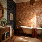
A blank wall in your living room isn’t a problem. It’s a canvas. The living room art you choose speaks before you do. It tells a guest what you value, what moves you, and how seriously you take the act of being home.
I’ve spent years helping people understand that art isn’t a finishing touch. It’s not something you add once the sofa is in place. It’s a conversation you start — with the room, with your guests, and with yourself every time you walk through the door.
Whether you’re drawn to hand-knotted textiles from the Andes, oversized abstract canvases, or a sunburst mirror that turns a corner into a moment of drama — the right living room art always comes back to two things. What genuinely moves you, and what the scale of your wall demands. Start there, and everything else follows.
In this guide, I’ve gathered 16 approaches to living room art that I return to again and again. From gallery walls built with a collector’s eye to LED neon signs that transform a room after dark. There’s something here for every aesthetic and every budget, and every idea comes with the specific, practical guidance that actually helps you execute it well.
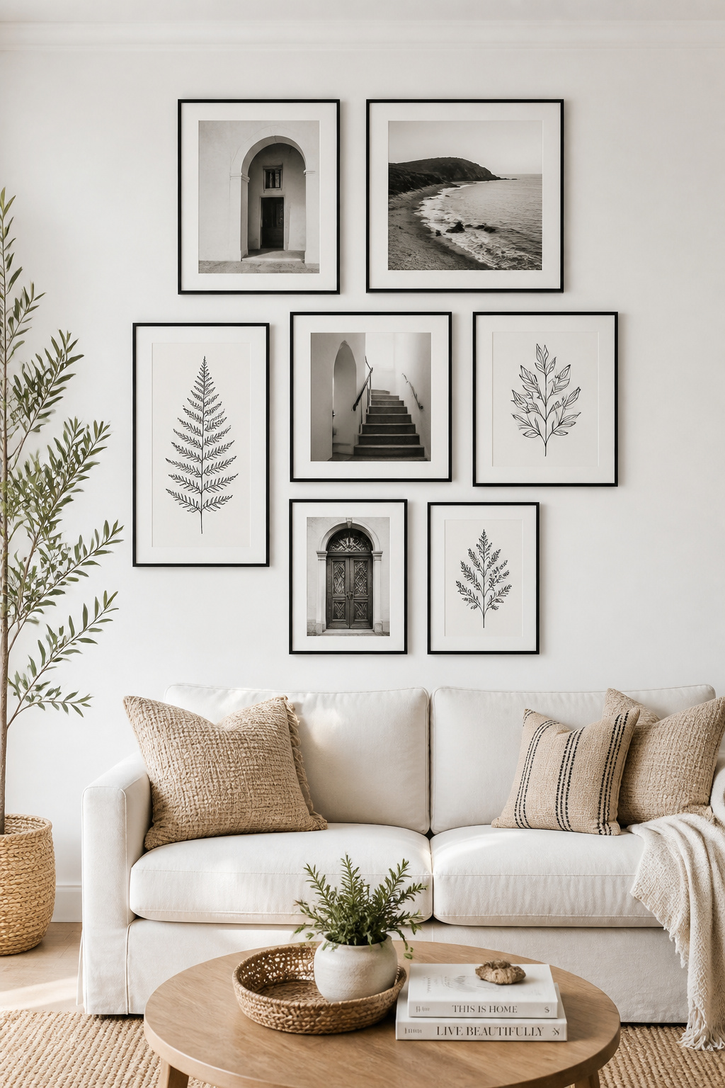
1. Gallery Wall of Framed Prints for a Living Room Art Display
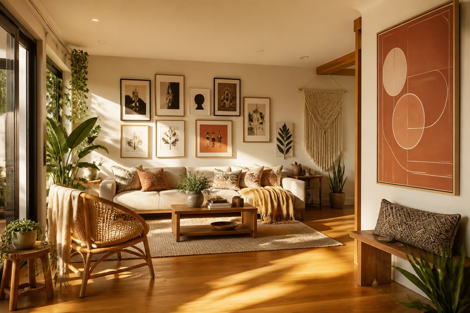
There’s a reason the gallery wall has endured. Done well, it reads as a single cohesive statement — a lived-in collection of things that matter. It’s the closest you can get, in a domestic setting, to the feeling of walking through a curated exhibition.
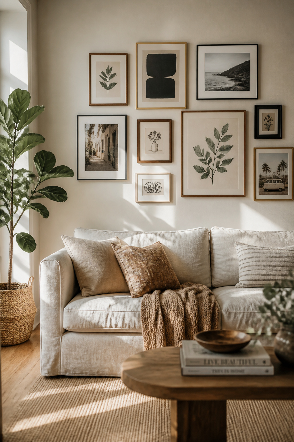
The formula is simpler than it looks. Start with your anchor piece — the largest work. Position it slightly off-centre. Everything else radiates outward from there. Keep frame spacing consistent at 2–3 inches throughout. Any wider and the arrangement starts to feel like random pictures that never quite committed to each other.
The total cluster should span roughly two-thirds the width of the sofa below it. This creates a visual connection between art and furniture. For frame finishes, the rule of three applies: one wood (walnut or light birch), one metal (brass or matte black), one neutral (white or linen). This gives enough variety to feel personal without tipping into chaos.
Before you drive a single nail, mock up your layout on the floor. Photograph it. Adjust. That five minutes saves three hours of spackle and regret.
This kind of meaningful living room wall decor takes time to build. That’s exactly what makes it feel real.
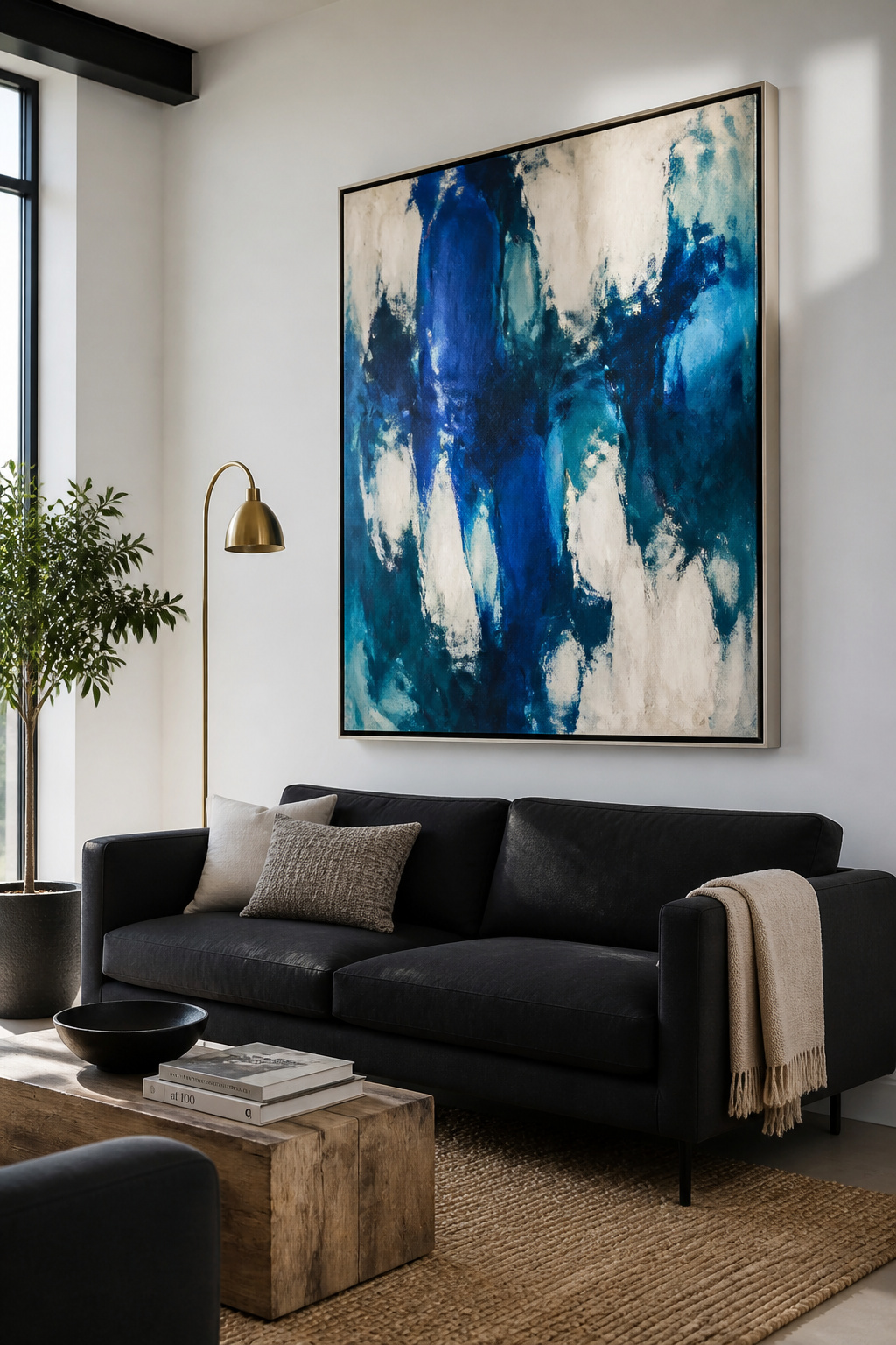
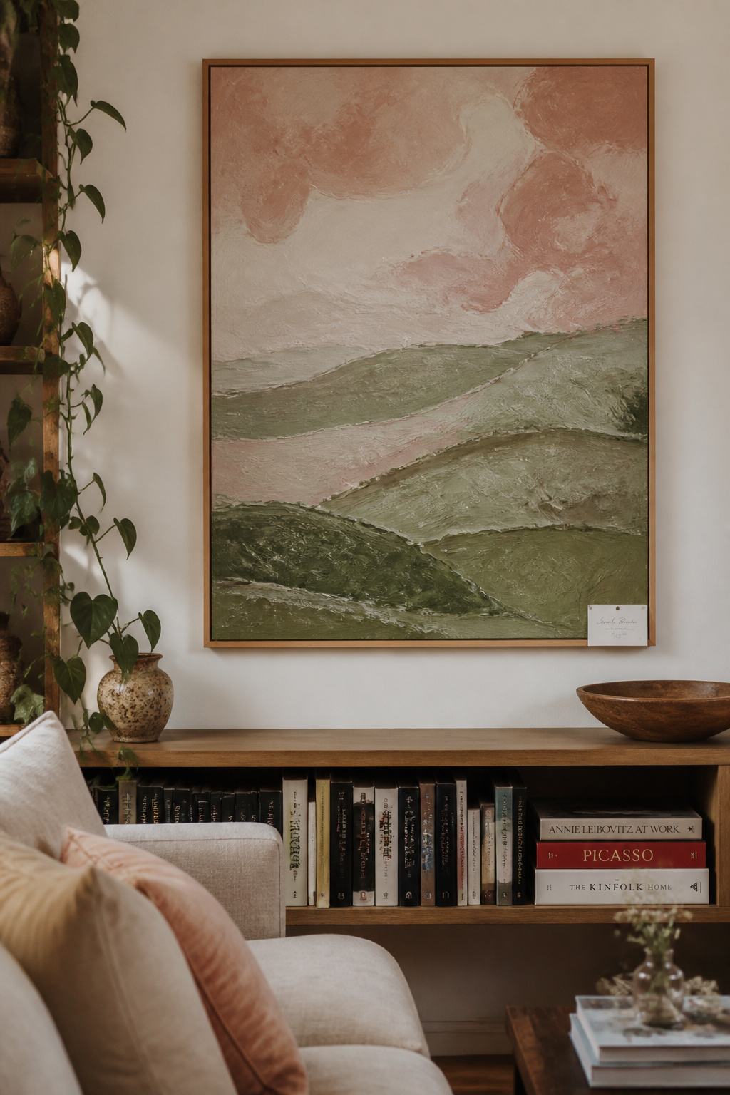
2. Oversized Canvas Painting as the Room’s Focal Anchor
Some rooms need a single authoritative voice, not a chorus. An oversized canvas is that voice. It declares a clear point of view before anyone sits down. It earns that authority through scale alone.
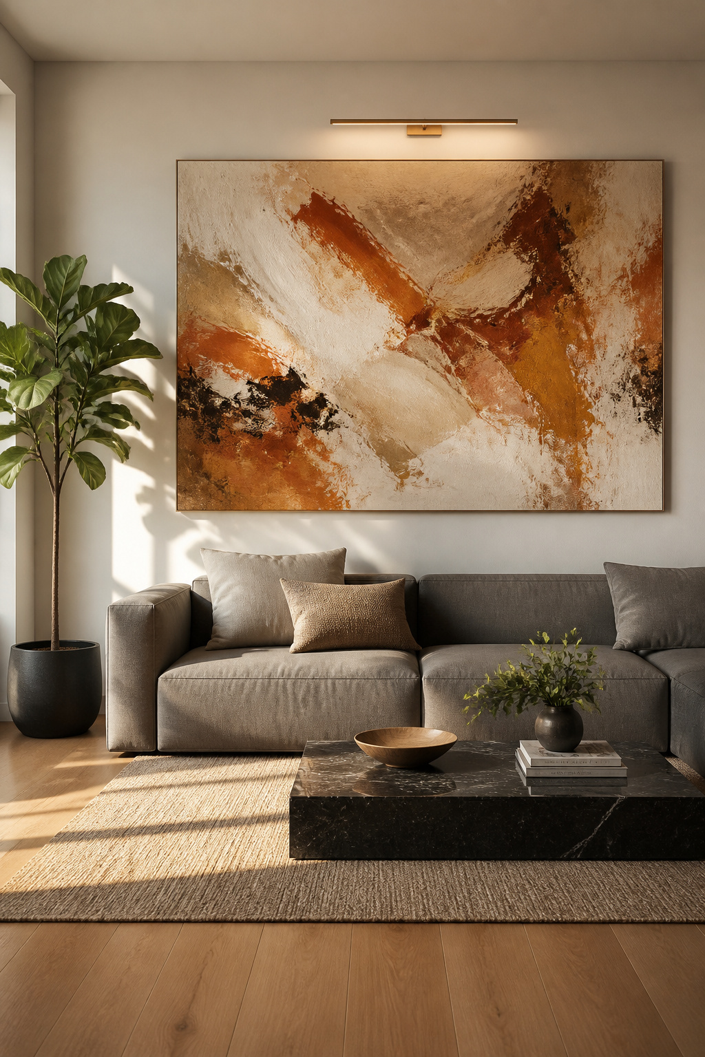
The 2/3 rule is the most reliable starting point. Your canvas should span 60–75% of the sofa’s width. For a standard 84-inch sofa, that means targeting artwork in the 50–63-inch range. A 60×40-inch canvas hits the sweet spot that interior designers reach for again and again.
Hang it so the bottom edge sits 6–8 inches above the sofa cushion top. This keeps the work visually anchored to the furniture. Hanging art too high is the most common mistake — it disconnects the artwork and makes it float up toward the ceiling like it wandered away from the conversation.
The abstract-versus-figurative decision is less about taste and more about the room’s existing content. If your sofa has strong colour or pattern, an abstract piece doesn’t compete for subject matter. North-facing rooms with cooler light benefit from warm-toned abstracts — terracotta, amber, ochre. South-facing rooms handle either direction with ease.
For original large-format work within reach, Rise Art, Artfinder, and Saatchi Art all have emerging artists producing original canvases in the $200–$600 range.
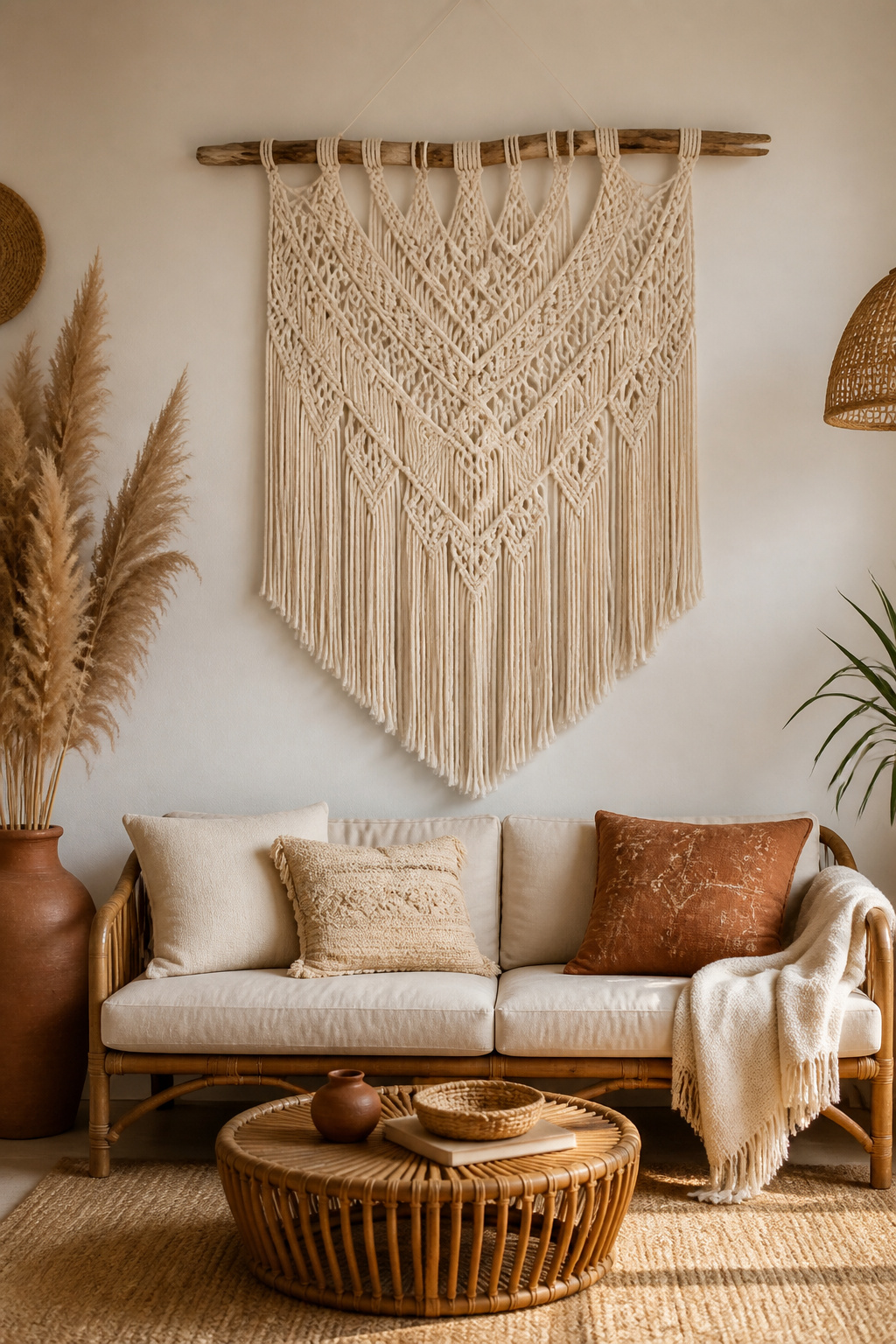
3. Handwoven Textile Wall Hangings for Bohemian Warmth
Walk into any room where a hand-woven textile hangs on the wall, and you’ll feel the warmth before you consciously notice it. This is the quality that canvas and paper art cannot replicate. Fibres absorb sound. They soften echoes. They introduce a tactile invitation to the space.
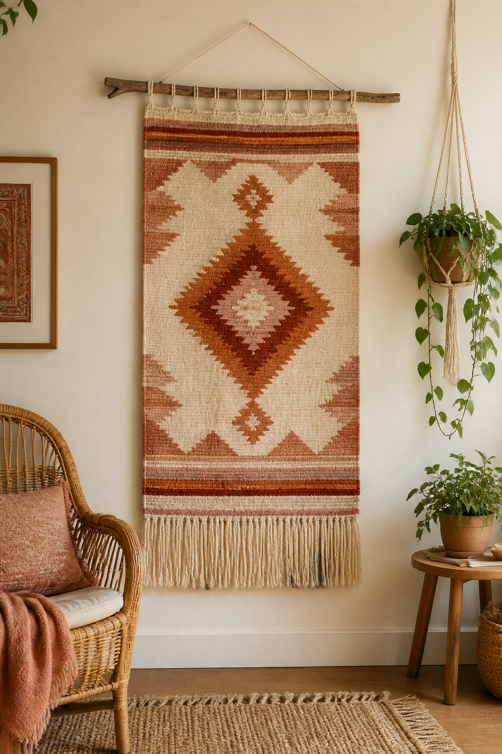
Natural fibres are the foundation of this look. Cotton and linen produce soft, flowing hangings — ideal for neutral or pale palettes. Wool holds colour more vibrantly and brings a denser, more dramatic presence. The hand-dyed Andean woven tapestries from Peru and Bolivia are extraordinary. Their geometric patterns in natural wool pigments look as striking in a contemporary room as they do in a traditional one.
Jute and sisal have a coarser, more rustic texture. They suit farmhouse, coastal, or eclectic bohemian rooms particularly well. Hang the top dowel or branch at standard art height — centre of piece at 57–60 inches from the floor. Use two hooks spaced 12–18 inches apart for anything wider than 36 inches. This prevents sag over time.
Keep loose-fibre textiles out of direct sunlight. UV bleaches natural dyes within months, dulling the very warmth you bought the piece for.
If textiles have started to feel like your design language, the wider world of boho living room wall decor goes far beyond what ends up on walls.
4. Vintage Botanical Prints for Classic Living Room Wall Art
Botanical illustration has decorated sophisticated interiors since the 18th century. It keeps coming back because it occupies a rare space: intellectually credible, visually warm, and harmonious with nearly every design style. These prints bring an organic quality without the maintenance of actual plants.
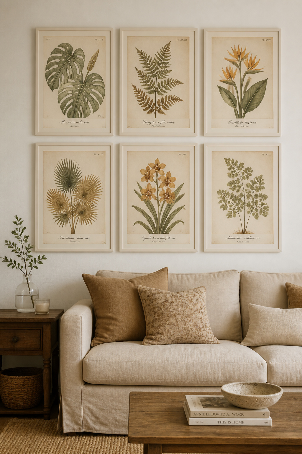
Their traditional palette — cream, sage, sepia, and faded gold — complements warm timbers, neutral linens, and earthy tiles with equal ease. As living room wall art goes, botanicals are among the most reliably successful choices for rooms that need warmth without drama.
The reproduction market has matured significantly. The British Museum Shop offers prints from the archives of Maria Sibylla Merian and Mary Delany — genuine museum-quality reproductions. The Trumpet Shop and Watercolor Botanicals produce giclée reproductions on acid-free paper with archival pigment inks. At the accessible end, Etsy printable downloads of pre-1928 public-domain botanical illustrations cost $2–$8. Frame them yourself and the entire investment is the frame.
Avoid cheap reproductions without archival inks. They yellow and fade within two to three years. That’s not economy — it’s false economy.
For placement, botanicals work brilliantly in sets. Five or six prints in matching frames, hung in a grid, create the sense of a dedicated natural history collection.
5. Abstract Expressionist Pieces for a Bold Modern Statement
The great advantage of abstract expressionist art in a living room is precisely what puts some people off. It doesn’t tell you how to feel about it. There’s no depicted subject competing with your sofa for narrative dominance. Large gestural brushwork, spontaneous marks, colour field washes — these respond to the room’s light and the viewer’s mood.
Warm-toned abstracts — terracotta, amber, burnt sienna — energise rooms with cool northern light. Cool abstracts — deep teal, sage, dusty slate — suit south-facing rooms that already have warmth. The colour field approach (broad areas of a single hue with subtle textural variation) reads as quietly sophisticated. It holds presence in a room without shouting.
For budget: under $200, Etsy has original small-format canvases from emerging artists. From $200 to $600, Rise Art, Artfinder, and Foundmyself (fully commission-free) offer original canvases from verifiable artists. Above $600, Saatchi Art and Artsy feature emerging artists whose work is tracking upward in value.
One principle I’d press on: don’t choose abstract art purely because it colour-matches your sofa. Art should introduce a note of surprise. Something slightly unexpected that keeps the eye engaged on a second and third look.
6. Folk Art and Artisanal Handcrafted Works With Cultural Roots
There’s a particular energy in a room where at least one piece was made by hand, in a tradition with roots. Not manufactured warmth — real warmth. The kind that comes from knowing that someone specific made this specific thing, for a reason. That’s what folk art brings into rooms dominated by mass production: irreplaceable human presence.
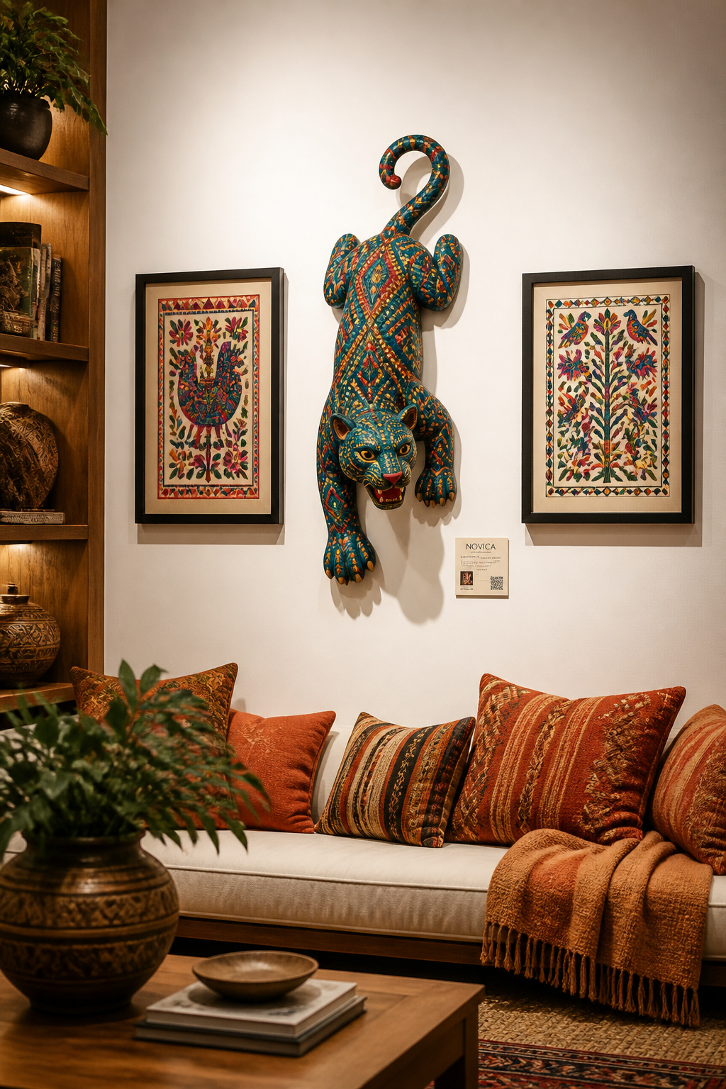
The range of folk art is wide and gloriously diverse. Oaxacan alebrijes and flat woodcarvings from Mexico are painted with bold symbolic imagery. Their colours have no equivalent in a paint chip catalogue. Andean woven tapestries from Peru and Bolivia capture village life and pastoral mythology in hand-dyed wool. West African carved wood panels bring geometric precision that holds its own against contemporary furniture.
Display these pieces with context. A small card identifying the origin, artisan, and tradition transforms the display from decoration into storytelling. When purchasing, platforms like NOVICA and Ten Thousand Villages maintain fair-trade commitments. The piece on your wall supports something beyond aesthetics.
The kind of living room that rewards years of living doesn’t come from a single shopping trip. It comes from adding pieces slowly, one story at a time.
7. Art for Your Living Room: Mixing Photography and Illustration
Photograph and illustration make one of the most dynamic pairings on a gallery wall. Photography grounds a composition in reality — a specific moment, a specific place. Illustration opens the same subject to interpretation. Together on a wall, they create a visual conversation that neither medium could hold alone.
The key is a unifying thread. Subject-based pairing is the most reliable approach. Botanical photographs alongside botanical illustrations let the viewer see the same world through two different lenses — one precise and factual, one interpretive. Black-and-white photography paired with delicate line drawings is perhaps the most elegant combination. The tonal weight of the photograph against the airy lightness of the drawing creates a rhythm the eye follows across the wall.
For a gallery wall of mixed media, repeat each style 2–3 times rather than using each once. Three photographs and two illustrations create rhythm. One of each reads as indecision. Use consistent mat widths — 2–3 inches — across all frames. This is the visual thread that ties mixed pieces into a unified whole even when the frames themselves differ slightly.
Limit frame finishes to three: a black, a white, and one accent (brass or walnut). Print both images at consistent sizes where possible — 8×10 or 11×14 — to keep the arrangement from looking accidental.
8. Sculptural Wall Art in Wood, Metal, and Ceramic
Flat art is static. A sculpted wall piece — reclaimed wood panels, hammered copper reliefs, ceramic tiles with raised surface — casts shadows that shift across the day as light moves through the room. It’s never quite the same piece twice. That’s the quality that makes three-dimensional wall art worth the extra hanging complexity.
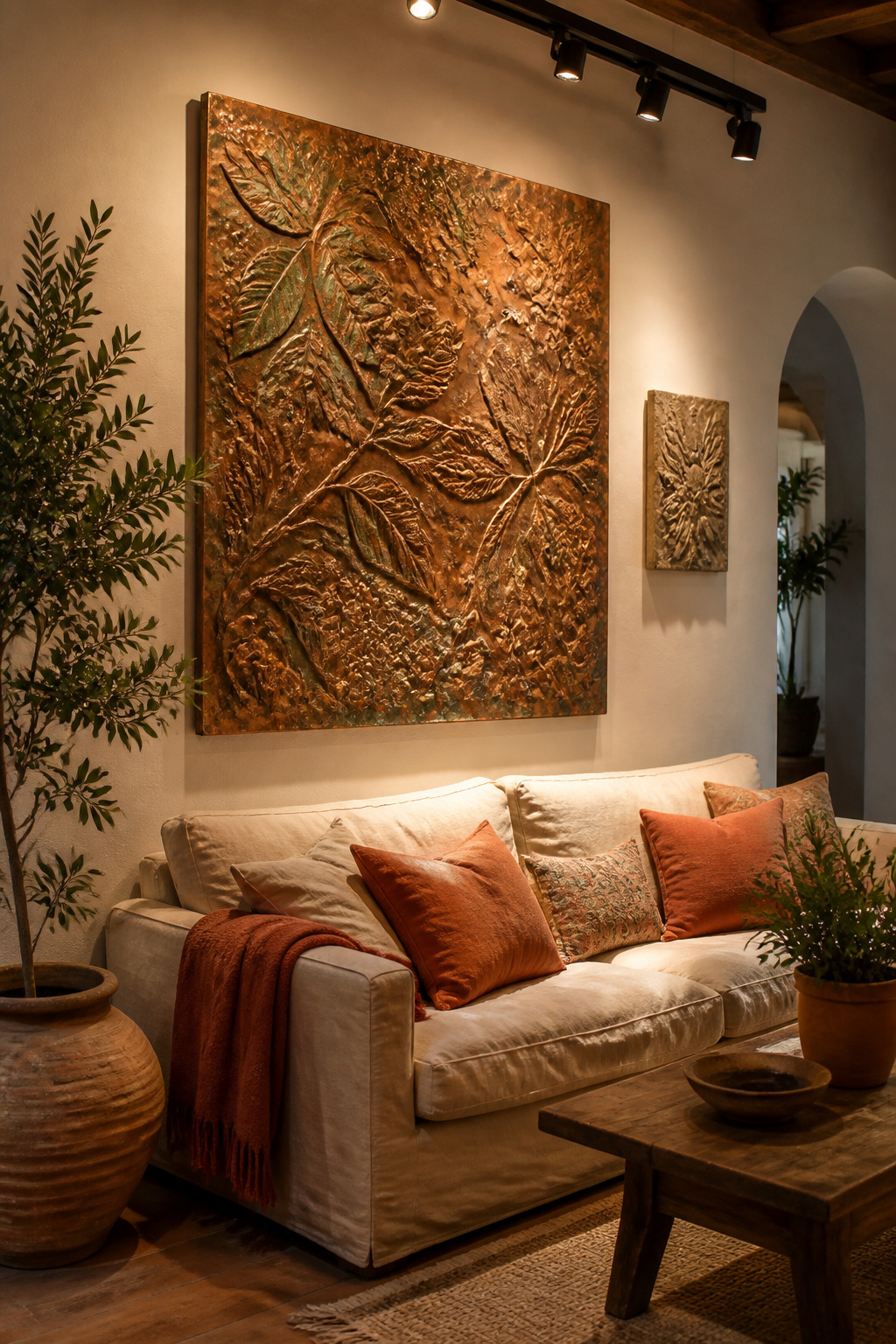
Each material brings a distinct quality. Reclaimed wood panels are lightweight, warm, and organic. Salvaged barn wood carries the history of previous use in its grain. Hammered copper panels age to a rich warm patina and sit naturally beside terracotta, leather, and linen. Artisanal handmade pieces run $150–$500. Ceramic wall tiles and relief panels are the heaviest option but the most visually complex. Metal panels in powder-coated steel or brushed aluminium work well in industrial and contemporary rooms.
For installation: pieces under 5 lb can use adhesive strips. Between 5 and 20 lb, D-rings or Z-clips with wall anchors are correct. Anything over 20 lb — and most ceramic and metal pieces qualify — requires French cleats mounted into studs. A 15 lb ceramic panel falling is not a small inconvenience. Plan the hardware before you plan the aesthetics.
Directional lighting elevates sculptural wall art enormously. A track light positioned at a 30° angle above the piece maximises shadow depth and surface texture.
9. Floating Shelves Styled With Small Framed Pieces and Objects
Shelves solve a problem that hanging art cannot: they’re refreshable. You don’t need new nail holes to change the story. You need new objects, a different vase, a print swapped for the season. This is why shelf styling has become its own serious design discipline.
The two principles that govern every good shelf vignette are the rule of three and the 25% rule. Group objects in threes — two items that share something (material, colour, height) flanked by a third that adds contrast. Leave 20–25% of the shelf surface intentionally empty. Negative space isn’t wasted — it’s the visual breath that makes each object more noticeable.
For art on shelves, lean small framed prints against the wall rather than hanging them. The casual quality reads as more collected and personal than a rigidly hung arrangement. Layer front-to-back: tallest objects at the back, medium pieces in the middle, small objects at the front. A few well-placed books — stacked horizontally as a plinth for a small sculpture — bridge art and object naturally.
For seasonal refreshing, swap the rotating elements while keeping the permanent anchors in place. A trailing plant on the shelf changes its feel through growth alone. These are the kinds of principles that resources like expert living room interior design tips articulate well — the logic that turns good taste into good rooms.
10. Macramé and Fiber Art for Tactile Wall Texture
The macramé revival that began around 2016 has, against all odds, kept going. The reason isn’t nostalgia for the 1970s. It’s that contemporary macramé bears almost no resemblance to its kitschy predecessor. Natural undyed cotton cord, oversized scale, layered knotted patterns, minimal colour — what’s emerged is a material that sits comfortably in modern, Scandinavian, and bohemian interiors.
A statement macramé piece needs to be 36+ inches wide and 48+ inches long to hold a living room wall with authority. Smaller pieces look like afterthoughts against an 8-foot wall. If budget limits you to smaller pieces, group three together with varied spacing and slight height offsets rather than hanging one alone.
Etsy searches for macramé rose over 400% in 2024. DIY craft kit sales grew 35% in the same period. A retail woven wall hanging runs $80–$400; DIY materials for the equivalent piece cost $15–$40. The four essential knots — square knot, half-hitch, lark’s head, gathering knot — can be learned in an afternoon and form the foundation of 90% of wall hangings.
For a purchase rather than a DIY project, Etsy’s most prolific artisan makers offer custom dimensions and cord colour. Wescover lists verified makers with documented provenance — useful when you want to know who made the piece as much as how it looks.
11. Living Room Artwork in Earthy Tones for a Grounded, Calm Feel
Terracotta, ochre, burnt umber, and forest green have dominated interior design conversations for two consecutive years running into 2026. The reason isn’t trend-following. It’s colour science. The human nervous system reads warm earth tones as safe, grounded, and familiar. They reduce visual stress in a way that high-contrast or cool palettes cannot.
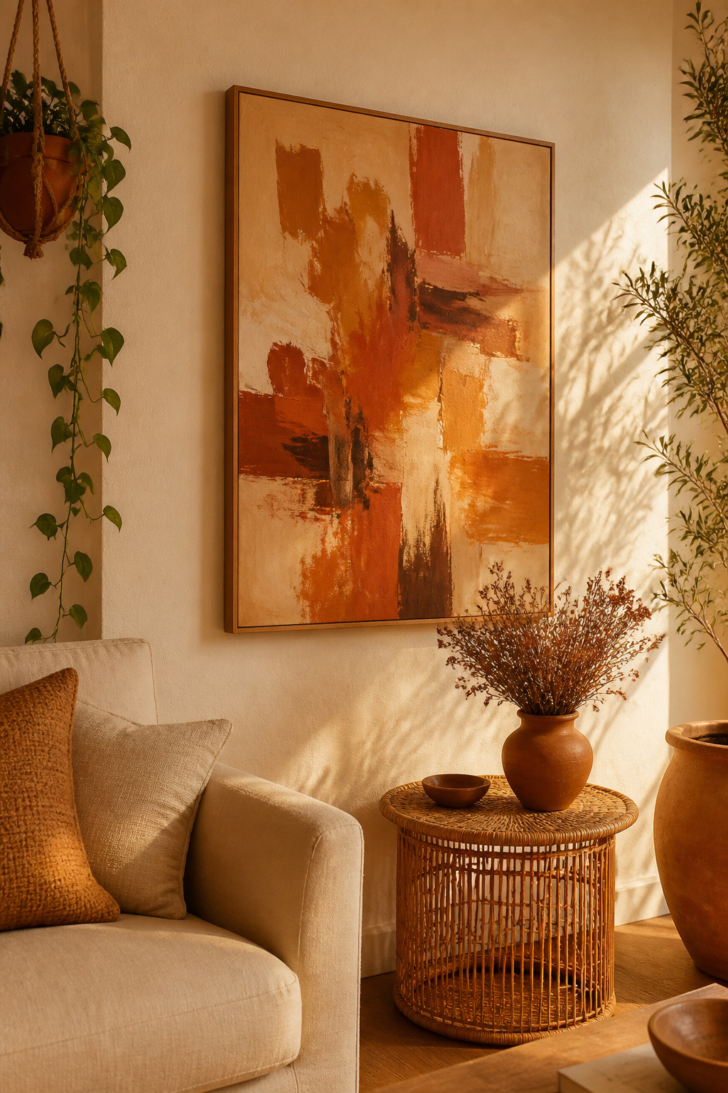
These are the colours of soil, fired clay, autumn foliage, and dried grasses. Rooms with earthy-toned living room artwork consistently read as more comfortable and restful than equivalent rooms with cool or high-contrast art. That’s not a matter of personal taste — it’s a psychological response rooted in our relationship with the natural world.
For selecting artwork, understand your room’s undertone first. Hold a white sheet of paper next to your wall paint. If the wall appears slightly yellow or pink beside the white, it carries a warm undertone. Warm undertone walls welcome terracotta and ochre art. If the wall appears slightly blue or grey by comparison, sage green, dusty olive, and muted warm brown will harmonise better.
The most available earthy art styles right now: terracotta abstracts in rust and dusty pink suit Mediterranean and bohemian rooms. Sand-tone landscape paintings carry biophilic warmth without cultural specificity. Ochre botanical prints bridge the enduring botanical tradition with the earthy palette in a way that feels both contemporary and timeless.
Exploring apartment living room ideas for urban serenity shows how earthy living room art functions within a broader design language — where it sits relative to furniture, textiles, and available light.
12. Black-and-White Photography for Timeless Elegance
Monochrome photography has one remarkable advantage over every other living room art choice: it’s colourless. It never clashes. It works against any wall — cobalt, terracotta, stark white, charcoal — and with any furniture palette. This universal compatibility makes it the most strategically flexible art choice in a living room.
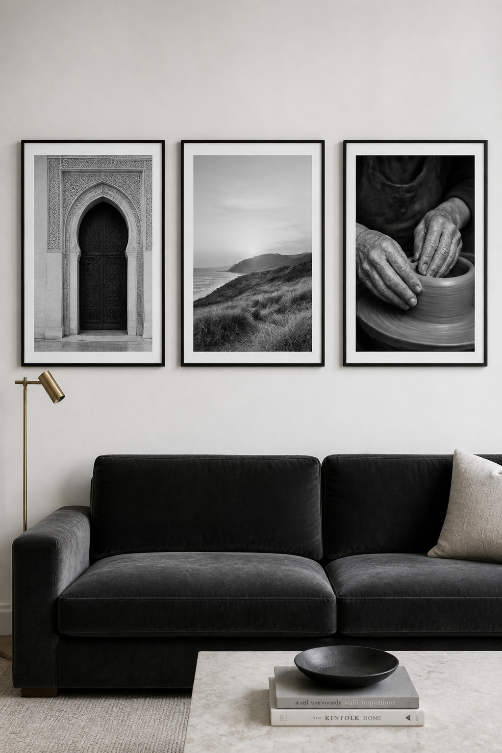
Beyond versatility, black-and-white photography creates depth through tonal contrast rather than colour. Shadow, light, and form become the subject. The viewer’s eye moves through the image differently than it would with colour work — following gradations from deep black through mid-grey to pure white.
Subject matter should match the room’s register. Architectural photography — cityscapes, structural details, geometric interiors — suits contemporary and industrial rooms. Portraiture is the most intimate wall choice. A single large-scale portrait commands presence in a way few other art forms can match. Landscape and nature photography in black and white has the most timeless quality — coastal dunes, forest light, wide-horizon vistas — neither dated nor limited by aesthetic category.
For framing: matte or satin paper finishes always over glossy. Matte eliminates glare, adds print depth, and is the professional standard for monochrome. Black frames with white matting give the classic gallery presentation. Float frames feel more contemporary. Thin brushed silver or gunmetal metal frames suit Scandi and industrial rooms. Natural walnut adds warmth to coastal and organic-modern aesthetics.
13. Statement Murals and Removable Wallpaper as Living Wall Art
Sometimes a single piece of art isn’t enough to address a wall. You need to address it as a surface. That’s where mural-scale treatment comes in. And the removable wallpaper revolution has made this accessible to renters who would have had no options a decade ago.
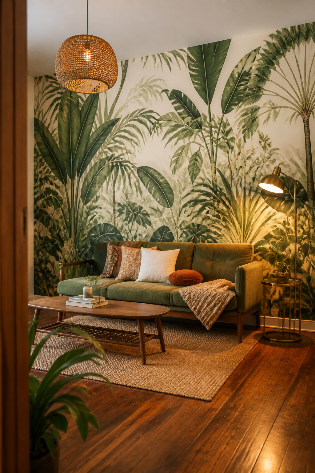
Peel-and-stick mural wallpaper applies to any smooth eggshell or satin-finish painted wall in an afternoon. It repositions during application, accommodating mistakes without drama. It removes cleanly within five years with no steamer, no scraper, no wall damage. A standard 9×8-foot accent wall costs approximately $200–$350 using brands like Wall Blush, Urbanwalls, Wallshoppe, or EazzyWalls. These brands collectively offer over 1,400 designs — botanicals, abstract brushstroke fields, geographic murals, and architectural trompe-l’oeil.
Apply to a single feature wall only. A mural on all four walls creates visual overwhelm regardless of the design. The wall behind a sofa or flanking a fireplace is typically the ideal candidate.
For a commissioned original mural, Instagram and local art school websites are the best discovery tools. Look specifically for artists whose portfolio includes residential interior work. Emerging muralists in most cities work in the $500–$1,500 range for a standard accent wall.
If the large-scale pattern approach resonates with you, exploring bold living room wallpaper ideas shows how pattern scale, repeat, and colour interact with the room’s other surfaces.
14. Mirror Art Clusters and Sunburst Mirrors as Reflective Décor
A mirror chosen as a decorative object operates by different rules than a functional one. It becomes living room art — three-dimensional, shadow-casting, light-manipulating. A sunburst mirror with radiating rays is as much sculpture as it is reflection.
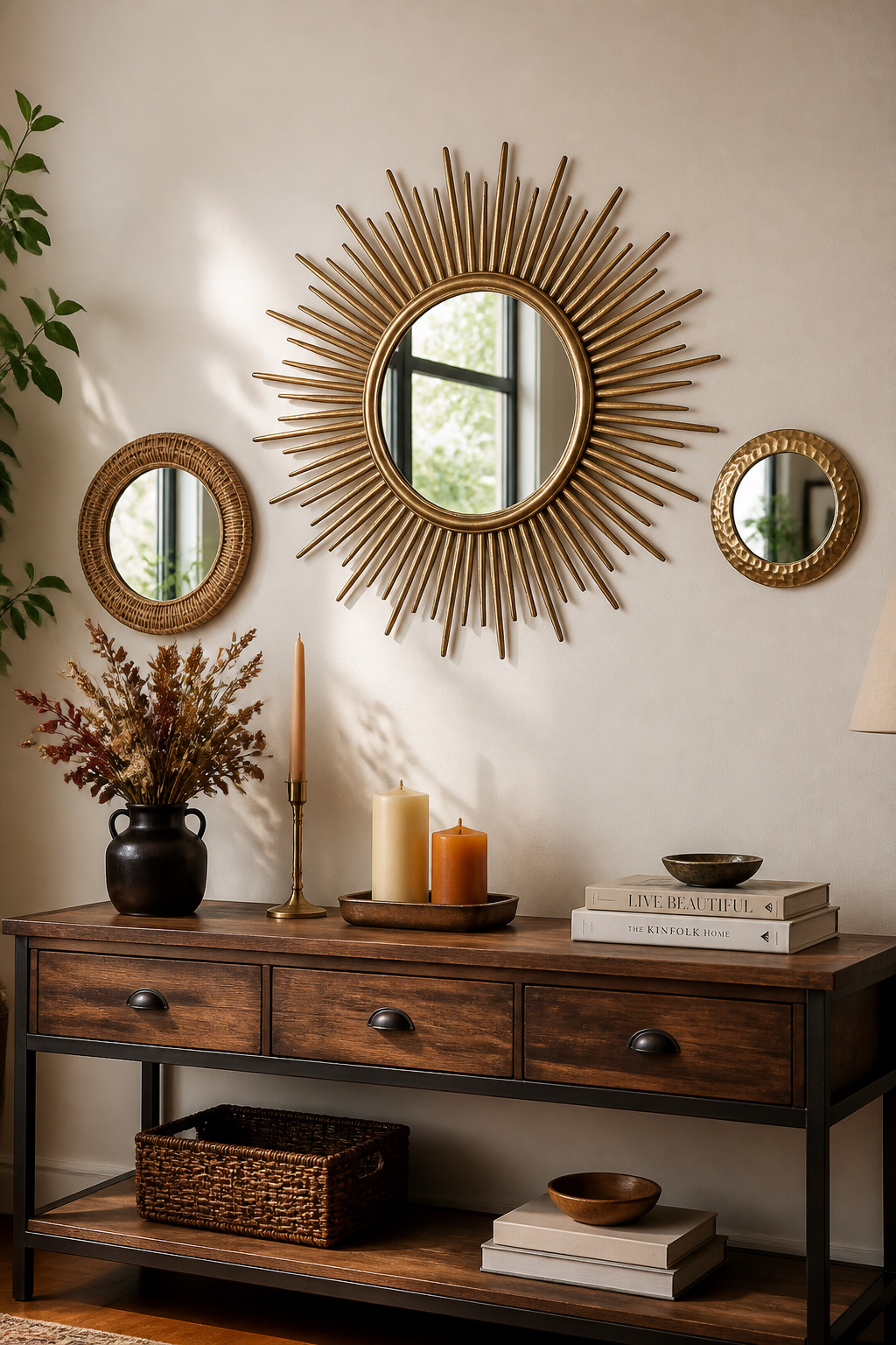
Position a statement mirror where it will catch natural light. A wall adjacent to a window doubles the room’s perceived brightness by bouncing daylight back into the space. For the mirror to read as art, it needs scale. A sunburst mirror should span at least 24–30 inches in total diameter including its rays. Anything smaller reads as a wall accessory rather than a design statement.
Grouped mirrors work by a different logic. The designer’s rule is odd numbers: 3, 5, or 7. Mix sizes with intention — one large (18–24 inches), two medium (12–16 inches), two small (8–10 inches). Arrange them so the centre of gravity sits at eye level. Arched mirrors suit traditional and transitional rooms. Irregular organic shapes suit coastal and bohemian rooms. Geometric angular forms suit contemporary and industrial aesthetics.
For safety: mirrors over 15 lb need heavy-duty toggle bolts or stud mounting. Mirrored acrylic is a practical alternative for homes with young children — same visual effect, non-breakable, significantly lighter.
15. Living Room Art From Local Artists and Original One-of-a-Kind Pieces
A reproduction — however beautifully printed and thoughtfully framed — is anonymous. An original carries something irreplaceable: the history of one person’s specific choices, on one specific day, with one set of hands. That presence is felt in a room even when the viewer can’t articulate what they’re responding to.
Why Original Living Room Art Changes a Room
Finding original work doesn’t require gallery connections or a large budget. University and art school graduate shows — typically held each spring and autumn — are the best source for emerging talent before commercial markup arrives. Work is priced by students who want it to find a good home, typically in the $50–$300 range. Local art markets work similarly. Instagram is the most powerful contemporary discovery tool. Search #[yourcity]artist or browse location-tagged posts to find local creators working right now. A direct message is all it takes to enquire about purchasing.
How to Evaluate and Build a Living Room Art Collection
For online platforms: Artfinder connects buyers with independent global artists and includes free global returns. Foundmyself operates on a fully commission-free model — 100% of every sale goes to the artist. Saatchi Art offers the widest range of original work from emerging to established.
Always document the purchase. Keep the artist’s contact information, a photo of the work in its studio context, and any exhibition history. Provenance doesn’t just add sentimental value — it adds resale value as the artist’s career develops. The best reason to buy original art, though, is simpler than all of that. It’s because you love it and you want it on your wall. Start there.
16. Living Room Wall Art Using Neon Signs and Illuminated Typography
There’s a moment in the evening, after the overhead lights go off and only the ambient sources remain, when a neon sign earns its place in a way that no framed print could. It changes the atmosphere — not decorates it, changes it. That’s the specific quality that contemporary LED neon brings to a living room.
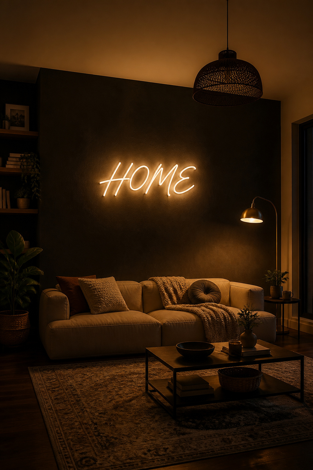
Contemporary LED neon uses flexible silicone tubing around an LED strip. It is lighter than glass neon, shatterproof, cool to the touch, silent, and energy-efficient — consuming around 80% less power than traditional neon. Custom Neon, Echo Neon, Make Neon, and NeonChamp all offer customisation in text, font, colour, and size. Prices typically run $80–$300 for standard residential pieces.
Choosing Your Phrase, Word, or Shape
Single words — ‘Home’, ‘Joy’, ‘Wild’, ‘Peace’ — are the most versatile and date the least quickly. Short personal phrases work well if the wall gives you 36+ inches of horizontal space. Abstract LED shapes (botanical forms, geometric loops, moon phases) provide the ambient light quality without typography. This is better for rooms where text feels too commercial.
Installation and Dimmer Control
Most residential signs mount via a screw kit or 3M Command strips included in the packaging. Route the power cable along the wall edge using low-profile cable channels that paint to match the wall. Cable management is the single difference between a professional installation and an afterthought.
Dimmers are standard on most contemporary LED neon. Running at 20–30% creates ambient mood lighting. That turns your living room into something that feels genuinely considered rather than illuminated. LED neon signs run on 12V transformers. They are CE and UL certified for safe indoor use and produce no heat. For the broader lighting context this sits within, types of living room light fixtures is worth reading before you plan any layered lighting scheme.
How to Choose the Right Living Room Art for Your Space and Style
The decision is simpler than the options make it seem — if you approach it in the right order.
Scale first. Measure the wall and the furniture before you look at anything. If you need a 50-inch-wide piece, that single dimension eliminates the vast majority of mismatches before you’ve spent a moment scrolling. Scale problems are the most common art mistakes. They’re also entirely preventable with a tape measure.
Style second. Does the piece’s register align with the room’s dominant aesthetic? Bold, gestural, maximalist living room art in a spare minimalist room creates productive tension — but only if it’s large enough to hold the space confidently. A small decorative piece in a visually complex room disappears entirely.
Colour last. This is the most flexible factor. Making it first leads to rooms full of technically colour-matched art that has no energy. Choose for subject, scale, and feeling first. Then verify that the colour won’t actively conflict.
If you’re new to collecting, start with one meaningful piece. One thing that genuinely moves you, at a scale the room demands. Small works on paper from local artists — watercolour, ink drawing, gouache — are the best entry point. They’re affordable, intimate, and genuinely educational about your own taste. Build over years, not all at once. The wall will tell a story worth reading.