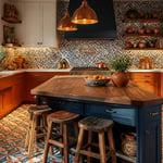
There’s a version of every kitchen that looks nice, and a version that looks designed. The difference is almost always the cabinets. Not because they shout for attention, but because the right contemporary kitchen cabinet sets the visual logic for everything else in the room. Get the profile, finish, and colour right, and the countertop, the backsplash, and the hardware all fall into place. Get it wrong, and no amount of good lighting will fix the fundamental disconnect.
Olivia Nguyen-Schmidt has spent eight years working at the intersection of European modernism and contemporary Asian design sensibilities. She’s noticed the same pattern across every well-resolved kitchen she’s encountered: restraint in the approach, precision in the execution. A contemporary kitchen cabinet isn’t about having the most features. It’s about choosing the specific detail — door profile, finish, colour undertone — that makes the space feel considered rather than assembled.
What follows is 15 contemporary kitchen cabinet ideas spanning finish, configuration, colour, and technique. Some are quiet and architectural; others are more decisive. All are worth understanding before you start ordering.
1. Flat-Panel Contemporary Kitchen Cabinets in a Matte Natural Finish
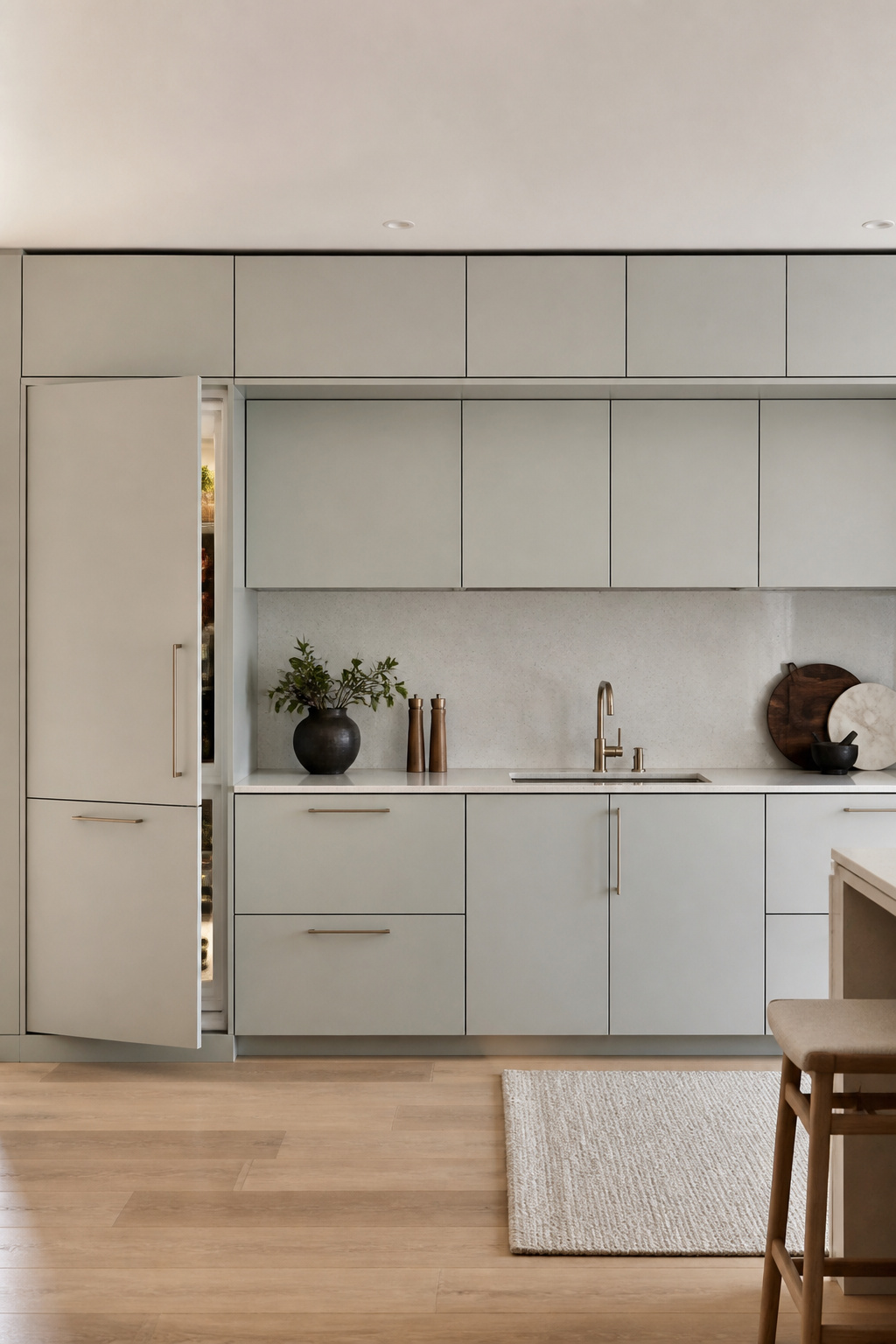
The flat-panel door — sometimes called a slab door — is the default profile of contemporary kitchen design for good reason. No raised edges, no recessed panels. Just a single flush face that lets material and finish do all the work. In a category where visual restraint is the point, it’s also the most demanding choice: there’s nowhere to hide a poor finish or a mismatched tone.
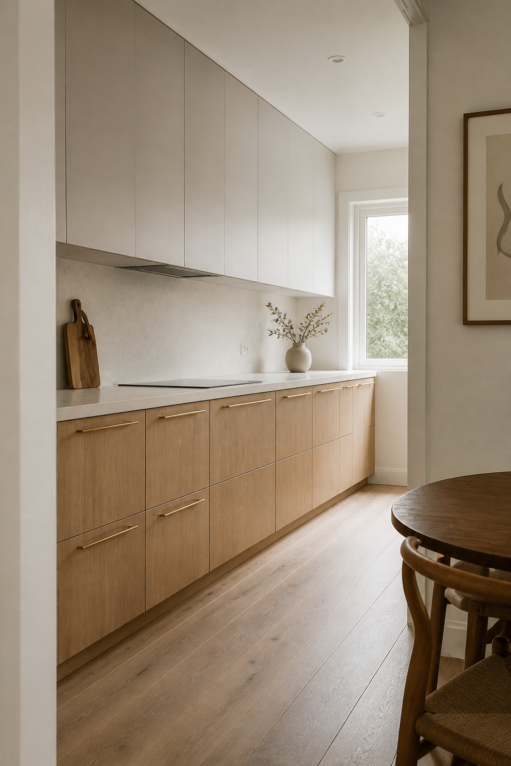
Frameless (European-style) box construction almost always accompanies flat-panel doors. The absence of a face frame creates wider drawer openings and cleaner sight lines. Surface material then determines the final register of the contemporary kitchen cabinet. Thermofoil — vinyl vacuum-pressed onto MDF — delivers uniform, uninterrupted colour. It’s best for solid shades where you don’t want grain variation. Real-wood veneer on a slab core brings genuine natural warmth. Quartersawn oak or walnut shows tighter, more linear grain than plain-sawn, which suits a contemporary scheme better. Melamine, with its improving wood-grain replications in oak, ash, and walnut, offers scratch-resistant durability for households that use the kitchen hard.
One note on thermofoil: it’s the wrong choice for cabinets directly above the hob. Heat from sustained cooking causes vinyl edges to lift within three to five years. Use lacquer or real-wood veneer near heat sources and reserve thermofoil for sections of the run that stay cool.
Hardware is the finishing decision. Bar handles in brushed brass or matte black reinforce the linear quality of a flat-panel door. Over-sized pulls — 300mm or longer — on tall pantry units make a stronger graphic statement than a row of small knobs.
2. High-Gloss White Uppers That Amplify Light in Compact Kitchens
In a kitchen under 100 square feet, high-gloss white upper cabinets function less as a style choice and more as a spatial intervention. Where matte surfaces absorb available light, gloss bounces it — back off the ceiling, across the countertop, into the corners. In a well-designed small kitchen, the effect can feel like a full extra window’s worth of brightness.
Acrylic delivers the most mirror-like result. The sheen is clear, hard, and resistant to yellowing. Factory-applied UV lacquer sits one step below in reflectivity but significantly above standard lacquer in fingerprint resistance. IKEA’s RINGHULT range uses an acrylic foil that performs consistently well for everyday family kitchens. What to avoid is site-applied white lacquer without UV inhibitors. Southern exposure will yellow it within three to five years in a way that requires a full repaint to address.
The pairing question is where most gloss white kitchens go wrong. All-white gloss from floor to ceiling tips into clinical. The fix is almost always warmth from below: oak-effect lower cabinets, a cream or greige quartz countertop, a warm-white subway tile backsplash. These additions keep the brightness of the gloss uppers while making the room feel like somewhere a person actually cooks. For more strategies built around light and limited space, small white kitchen ideas are worth exploring in their own right.
3. Open Shelving Mixed With Modern Kitchen Cabinet Banks for Balance
A kitchen where every surface is a closed cabinet door has a visual monotony problem. Acres of flat panels with no variation in depth or texture make even well-designed kitchens feel static. Open shelving solves this differently from glass-front doors: it removes the door entirely, creating a visual break and a display opportunity in one move.
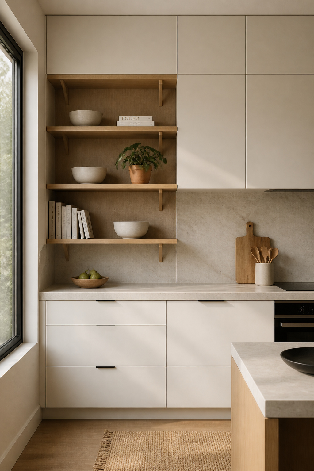
The ratio matters. Most designers land at no more than 30-40% of upper storage as open shelving. Enough to break the run and provide breathing space; not so much that everything on display becomes a permanent styling obligation. Open shelves work for daily-use ceramics in matching sets, a run of cookbooks, and a small glassware collection. They don’t work for mismatched storage containers or anything that changes shape frequently.
Depth and structure deserve attention before installation. Kitchen open shelves should be 10-12 inches deep for everyday dishes — wide enough for a dinner plate, not so wide they become a horizontal dumping surface. KCMA standards require shelves to support 15 pounds per square foot. A 30-inch wide shelf at 10 inches deep holds roughly 37 pounds comfortably. Floating shelf hardware — brackets hidden within the shelf itself — carries heavier loads and looks cleaner against the cabinet run than visible L-brackets. A well-chosen set of modern kitchen cabinet banks alongside open sections gives you the best of both approaches.
One practical warning: keep open shelves away from the hob. Steam and oil mist from active cooking coat exposed surfaces within weeks. The most considered open shelf display becomes a cleaning problem when positioned above a working cooking zone.
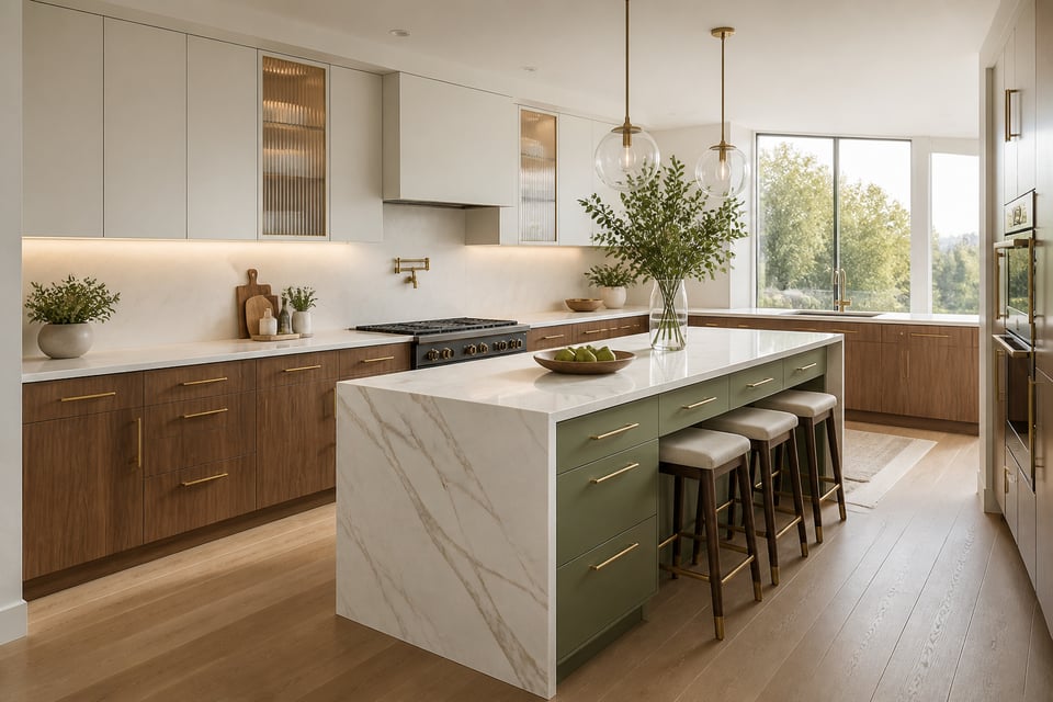
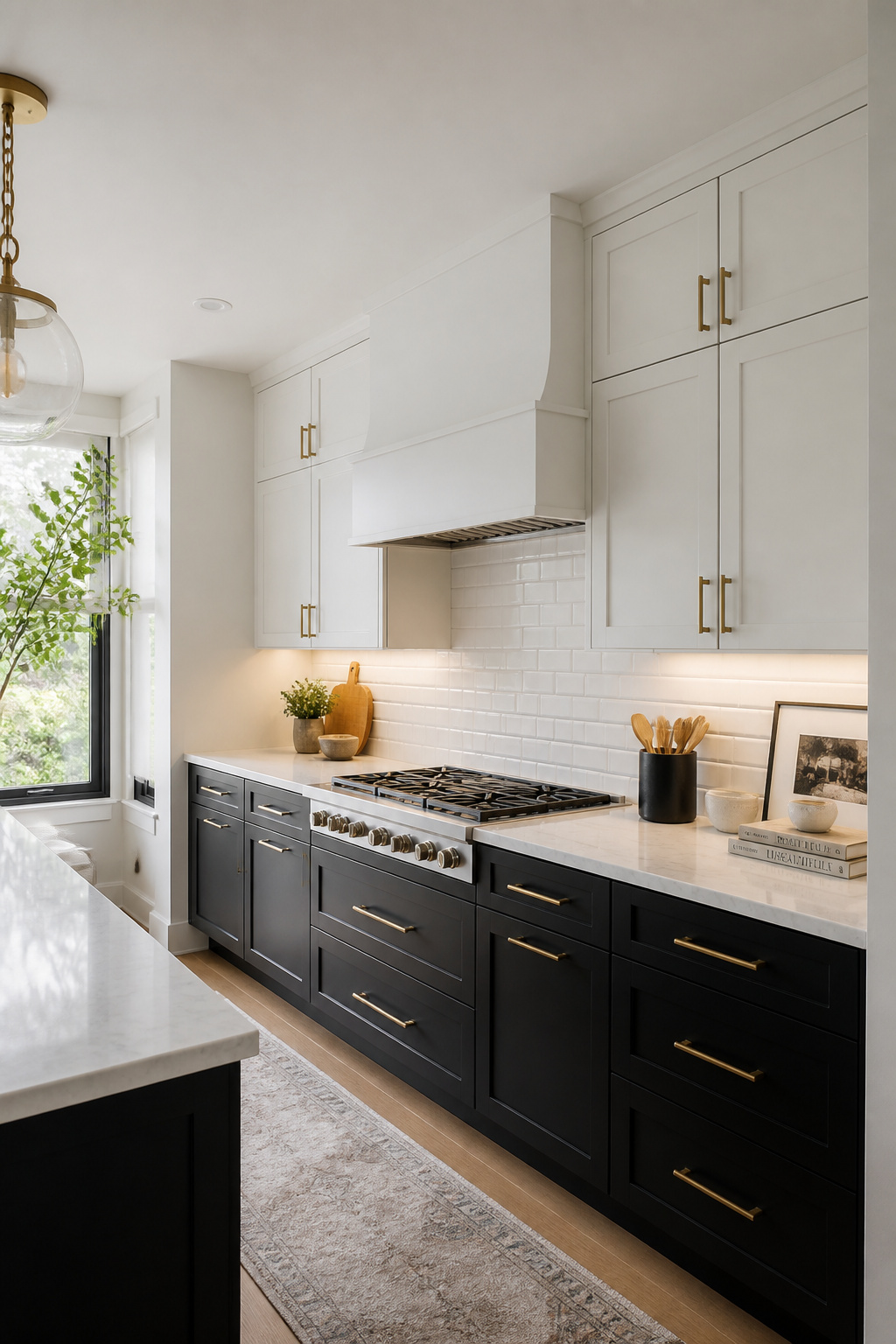
4. Two-Tone Contemporary Kitchen Cabinets in Warm Wood and Soft White
Two-tone cabinetry is a design logic, not a trend. Lighter upper cabinets keep the room open at eye level. Darker or warmer lowers ground the space and conceal the daily wear that happens at base cabinet height. The countertop acts as the visual break that makes everything read as intentional.
The rationale is also structural. Darker tones at base level feel stable. Lighter tones at ceiling height feel expansive. The configuration mirrors the way natural light falls in a room, which is why it looks instinctively right even to people who couldn’t explain exactly why.
The critical decision is what divides the tones. The countertop does this job naturally — particularly a thick stone slab with strong horizontal presence. The worst version of two-tone is where the division happens mid-cabinet-run without the countertop to create the break, which reads as indecision rather than design. Stay at the countertop line.
Three combinations that consistently work — and all three reward matched hardware. Warm oak-effect lowers with white or off-white uppers are the most versatile, reading well in both contemporary and transitional kitchens. Navy or forest green lowers with cream uppers deliver higher contrast and a more decisive statement. Sage green lowers with warm linen or greige uppers read as tonal and sophisticated, comfortable even from an adjacent living room. The right kitchen cabinet hardware choices seal the relationship between the two tones without working against either.
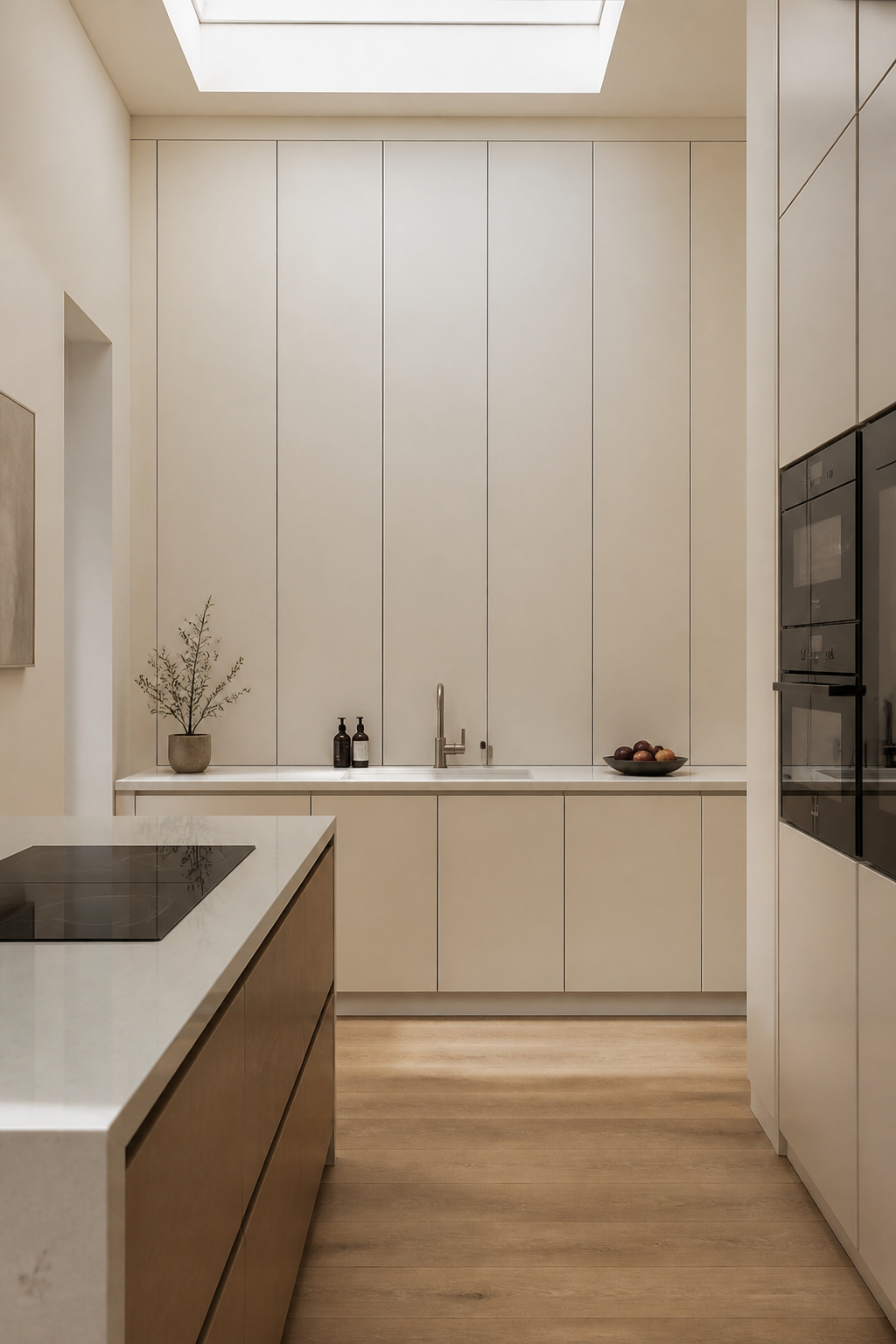
5. Handleless Push-to-Open Doors for an Uninterrupted Cabinet Face
Handleless kitchens earn their following because the effect is genuinely striking. A completely uninterrupted contemporary kitchen cabinet face, no hardware breaking the surface, creates a visual calm that few other design moves achieve at the same cost. The mechanism that makes it possible is either a mechanical spring-loaded system (Blum’s Tip-On) or an electronic one (Blum’s Servo-Drive).
Blum Tip-On uses a mechanical catch activated by a light press. A controlled spring releases the door into a smooth swing. No electricity, easy to retrofit, and rated to 80,000+ opening cycles — roughly 20 years of typical residential use. Blum Servo-Drive replaces the spring with a motor. A touch triggers an automatic open and soft-close. The electronic option adds cost but makes the gesture feel genuinely effortless on heavy larder or pantry units.
The honest consideration is where handleless struggles. A 600mm base unit loaded with cast iron pans doesn’t suit push-to-open. The weight works against the mechanism, and the opening force requires a deliberate press that feels unnatural at that scale. For heavy everyday storage, a J-pull profile — a groove routed into the door edge itself — delivers the same flush-front look with access that’s both invisible and reliable. For the broader aesthetic that handleless cabinetry contributes to, minimalistic kitchen design ideas map out the full picture.
6. Glass-Front Contemporary Kitchen Cabinet Doors That Add Visual Depth
Glass-front doors do something that neither solid doors nor open shelves quite achieve: they suggest depth without fully revealing it. The question is how much to reveal. The answer depends almost entirely on how disciplined you’re prepared to be about what sits behind the glass.
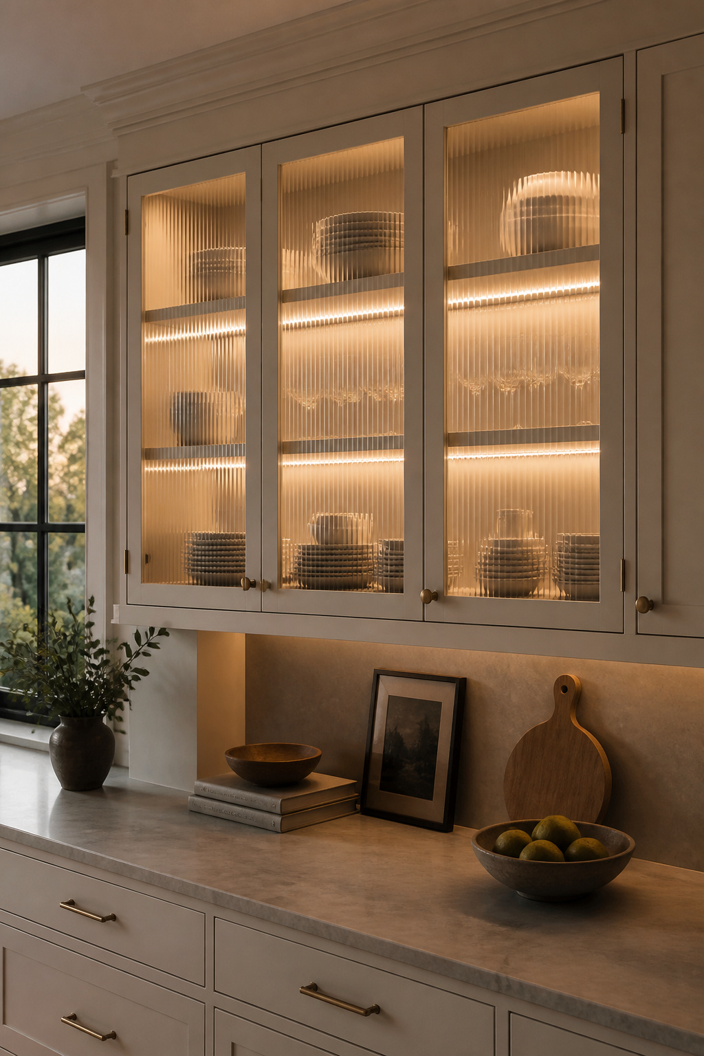
Fluted glass runs vertical channels across the pane. It diffuses contents into shapes and outlines while catching light in a way flat glass cannot. The texture is strong — a visual detail in its own right, regardless of what’s stored behind it. Reeded glass sits between fluted and clear. Shapes behind it are softer and more visible, the texture more subtle. Clear glass is the most demanding. Use it only for shelves you’d be comfortable with a dinner guest examining directly.
The addition that transforms glass-front contemporary cabinet doors from functional to atmospheric is interior LED strip lighting. Warm white strips (2700-3000K) mounted under each shelf rail wash downward light across displayed items without hotspots. On a dimmer, the same circuit that works as task lighting during cooking shifts to ambient accent lighting in the evening. Retrofit options exist — Philips Hue rechargeable puck lights work in existing cabinets without wiring — but hardwired strips produce a cleaner, more consistent result.
The planning note for clear glass: the discipline of keeping it curated must be maintained consistently, not just at installation. This is the detail that separates glass-front kitchens that stay beautiful from those that gradually fill and stop making sense.
7. Matte Black Cabinetry as a High-Contrast Anchor in a Bright Kitchen
Matte black kitchen cabinets absorb light rather than reflect it. The powder-coat surface creates visual weight at the base of the room. This makes pale stone countertops above look more luminous by contrast. In a bright kitchen with good natural light, the result is sophisticated. In a poorly lit kitchen, it tips into heaviness.
Warm Metals and Countertop Pairings
Unlacquered brass or brushed gold hardware against matte black is one of the most durable contemporary combinations. The warmth of the metal reads as intentional luxury against the dark field below. Brushed nickel offers a cooler, sharper alternative. Avoid polished chrome — its reflective surface fights the matte quality of the cabinet. For the countertop, Calacatta or white quartz with subtle grey veining is the most effective pairing. The white coordinates with the room while the veining picks up the darkness of the cabinet.
Lighting and Backsplash
Under-cabinet LED task lighting is not optional with matte black. Dark cabinetry absorbs ambient light. Target 2700-3000K warm white for the strips — cooler temperatures will make the counter feel clinical. Position strips 50-75mm back from the door face to hide the LED housing while lighting the surface below.
For the backsplash, a white or cream subway tile provides the most reliable visual relief. A slab stone backsplash continuing the countertop material up the wall reads as a single unified plane against the black cabinet faces. Avoid dark or charcoal backsplashes unless the kitchen has exceptional natural light. The combined effect can make the room feel noticeably smaller. More detail on backsplash coordination is covered in kitchen backsplash design principles.
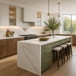
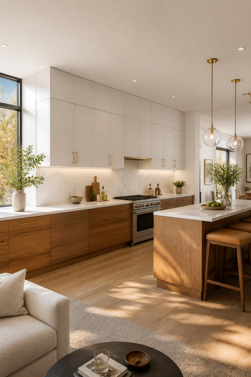
8. Warm Walnut-Veneer Lowers Paired With Pale Upper Cabinets
Walnut lower cabinets with pale upper cabinets is one of those combinations that looks instinctively right and takes a moment to understand why. The answer is that it mirrors the way natural light falls. Heavier, warmer tones at base level feel grounded. Lighter tones at ceiling height feel expansive. Walnut’s warm brown grain provides something paint cannot replicate — an organic warmth that prevents the kitchen from reading as overly processed.
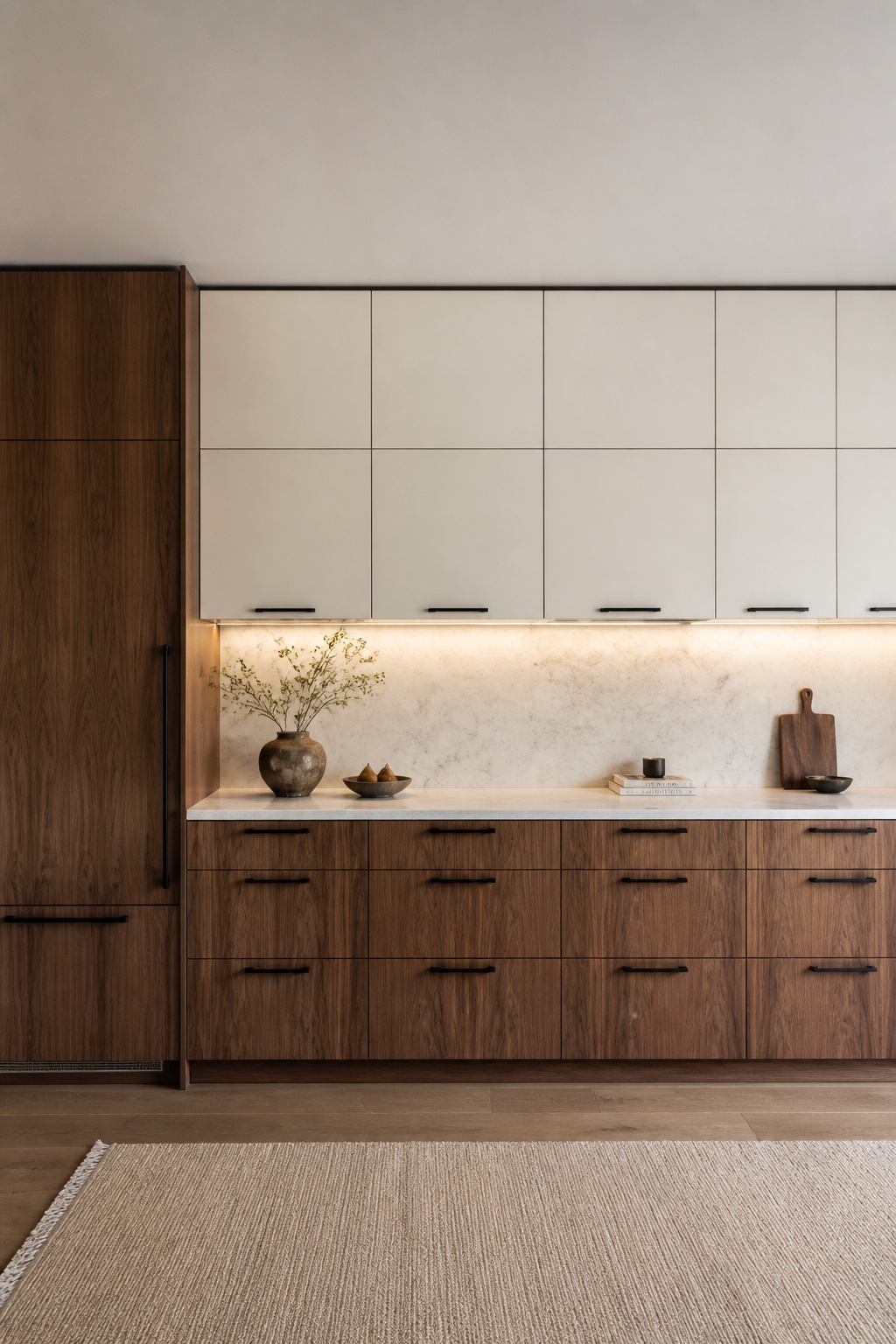
Veneer selection is a choice most people make without realising it’s a choice. American black walnut runs dark and chocolatey with distinct grain movement. European walnut is lighter, more golden-brown. Within those categories, quartersawn veneer shows tight, linear grain — cleaner for a contemporary scheme. Plain-sawn shows bolder figuring that can read as more rustic. When mixing cabinet brands across a kitchen run, get physical veneer samples in the actual kitchen’s daylight before ordering. Walnut’s tone shifts significantly between showroom lighting and natural daylight. A mismatch across a single wall reads as a mistake rather than a choice.
The countertop connects walnut lowers and pale uppers. Calacatta or Carrara quartz — white base with subtle grey veining — works well here. The white coordinates with pale uppers while the grey picks up walnut’s darker undertones. Honed limestone in cream or greige adds more warmth, which suits kitchens with particularly crisp white upper cabinets. Avoid cool grey or concrete-effect countertops. Walnut’s warmth and a cool-toned stone work against each other rather than completing the combination.
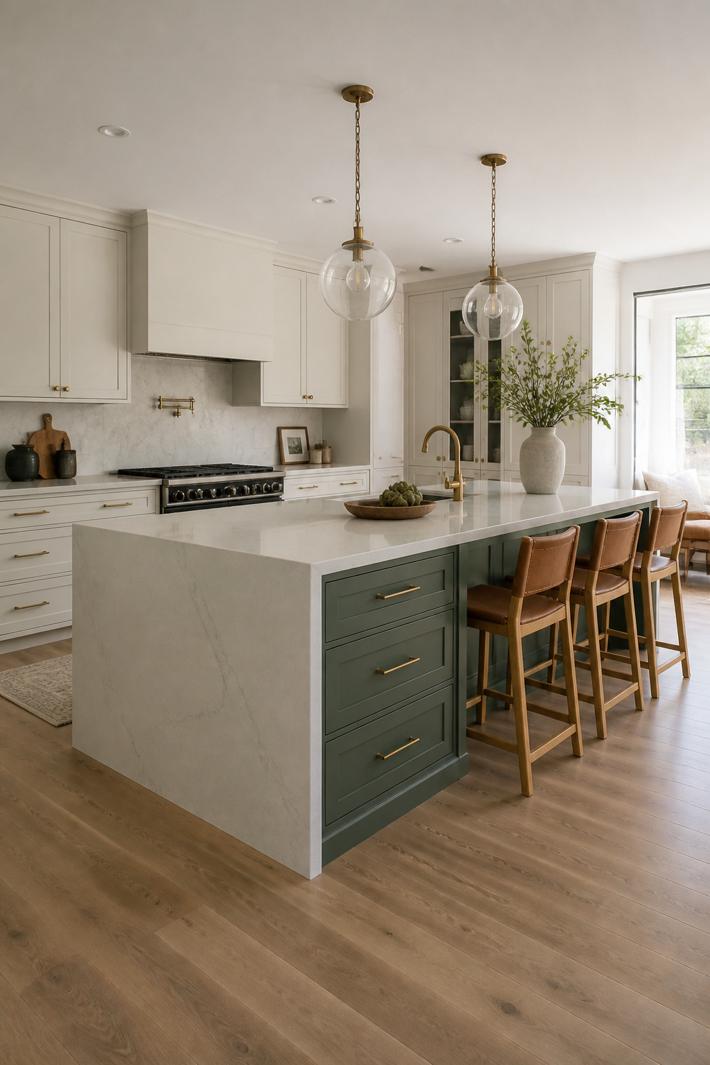
9. Sage Green Contemporary Kitchen Cabinets for Quiet, Grounded Color
Sage green has earned its position as the contemporary kitchen cabinet colour of recent years for a specific reason: it occupies a precise niche. Distinctive enough to feel designed, muted enough to feel liveable, and versatile enough to work across flat-panel contemporary kitchens and shaker-style traditional ones equally.
Cool Sage vs Warm Sage
The variable that determines whether sage works in a specific kitchen is undertone. Cool sage — with grey or blue undertones — reads as grey-green in north-facing light. Farrow & Ball Mizzle and Cromarty are the most consistently specified. They prevent the colour from feeling cold in rooms that don’t get direct sun. Warm sage — with earthy or yellow undertones — reads more herbal and organic. Benjamin Moore Saybrook Sage and Clary Sage work well alongside natural wood accents. Farrow & Ball Vert de Terre sits between both categories. It’s described as an ‘aged green’ with a slight blue-grey tilt and is one of the most responsive paint colours across different light conditions.
Hardware Selection
Brushed brass is the most consistent hardware pairing with sage green contemporary kitchen cabinets. Its warmth reads well against both cool and warm sage variants. Matte black against sage creates a sharper, more graphic contrast — well-suited to kitchens where clean lines between colour and detail are the point. Polished chrome doesn’t work. Its cool, mirror-bright finish fights sage’s muted depth rather than sitting alongside it. For a broader view of green kitchen cabinet options beyond sage, green kitchen cabinet ideas covers the full spectrum.
10. Floor-to-Ceiling Uppers That Maximize Storage Without Losing Airiness
Standard-height upper cabinets — typically 720-900mm tall — leave a gap between the cabinet top and the ceiling. That gap accumulates dust, creates an unresolved visual junction, and wastes storage simultaneously. Extending cabinets to ceiling height eliminates all three problems. The wall reads as a single designed surface, storage capacity increases, and the kitchen gains a more architectural quality.
The vertical presence of tall cabinets makes a room feel taller rather than wider. This is a useful effect in narrow galley kitchens and apartment kitchens where horizontal expansion isn’t possible. When cabinet doors run from counter height to ceiling in a single uninterrupted plane, the eye reads the entire wall as a designed element rather than a piece of furniture sitting on a bench.
Practical Use of the Top Section
The top 400-600mm is only reachable by most people with a step. Reserve this section for infrequently used items: seasonal entertaining ware, large serving platters, bulk dry goods. A pull-out step stool integrated into a base cabinet toe kick is the cleanest solution. It stores invisibly and slides out underfoot without requiring separate furniture. Some designers use the upper section as a display zone behind glass rather than everyday storage, which gets the visual benefit of height without demanding a step for daily access.
Solving the Ceiling Junction
Very few ceilings are perfectly flat across a three-metre run. Scribe moulding — a thin strip of matching material — fills the irregular gap at the top of the run. For gaps up to three or four inches, stacked crown or coved moulding provides a more architecturally finished transition. Address this in the design and fitting stage. The gap is much harder to solve neatly after installation.
11. Fluted Texture Panels as a Subtle Detail on Flat Cabinet Door Faces
The defining quality of fluted cabinetry is shadow. A series of vertical grooves across a contemporary kitchen cabinet door face creates a rhythm of light and dark that shifts as the ambient light changes. At midday the texture is subtle; in the evening it deepens. In a kitchen built around flat, uninterrupted surfaces, this shadow detail prevents the room from feeling static.
The most effective application is not across every cabinet door. It works as an accent: the island face, a single tall pantry, or one run of lower cabinets. The visual logic is contrast. The fluted section reads as a design detail because the surrounding cabinets are flat. Apply fluting to 20-25% of the total cabinet face area and the effect is sophisticated. Apply it everywhere and it becomes the new monotony.
Factory-ordered fluted MDF doors — CabinetNow and similar suppliers offer CNC-machined profiles in custom sizes — are the most precise and paint-ready option. For a DIY approach, pre-grooved MDF panels adhered and pinned to existing flat-panel doors are a realistic weekend project. Channel widths range from narrow (10-15mm, refined and contemporary) to wider profiles (25-40mm, more dramatic). The colour rule is important: fluted texture in the same colour as the rest of the cabinetry lets the shadow work on its own terms. Introducing both a new texture and a second colour simultaneously creates two competing decisions where one clear statement would land harder. For broader context on current kitchen design directions, modern kitchen design ideas covers the full range of approaches.
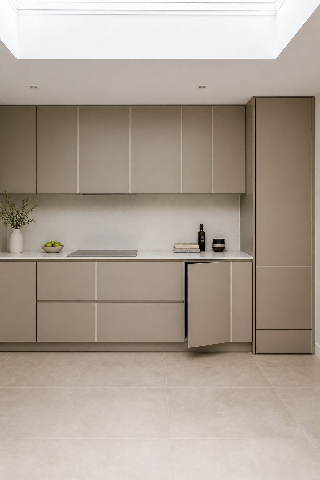
12. Integrated Appliance Panels That Hide Fridges Behind Contemporary Kitchen Cabinet Faces
Panel-ready appliances accept a custom cabinet door panel on their front face, making them indistinguishable from the surrounding contemporary kitchen cabinet run. The result — no stainless steel fronts breaking up the cabinet line — is what designers mean when they describe a kitchen as continuous. The approach extends the contemporary kitchen cabinet logic into the appliances themselves, treating the whole room as a single designed surface.
The mechanism is straightforward. Panel-ready appliances have a front face designed to accept a 3/4 inch (19mm) custom panel fabricated by the cabinetmaker to match the surrounding doors. Reveal gaps — typically 1/8 inch per side — are built into the design so the panel clears the carcass when the appliance door swings open. Counter-depth refrigerators (24 inches deep) sit flush with cabinet faces. Standard-depth models protrude 6-8 inches and disrupt the line even when panelled.
The brands worth knowing: Fisher & Paykel leads on reliability of panel integration across integrated column fridges and their DishDrawer dishwashers. Bosch’s Series 8 dishwashers accept custom panels at a mid-range price point, making integration accessible rather than exclusively high-end. Miele, Gaggenau, and Sub-Zero offer better manufacturing tolerances at significantly higher cost.
The detail most people miss until too late is handle consistency. For the integrated look to hold, the handle profile on the panelled appliance must match the surrounding cabinet handles — same style, same finish, same offset. A different handle on the fridge door breaks the logic that panel-ready integration is designed to create.
13. Linen-Effect and Stone-Look Laminates for Low-Maintenance Contemporary Cabinets
High-pressure laminate has a reputation problem that the product itself has largely outgrown. Modern HPL from Wilsonart, Formica, and Egger is harder than most lacquered or thermofoil surfaces. It handles scratches and impact better than painted cabinet finishes. And it now replicates stone and textile textures convincingly enough to be a genuine design choice rather than a budget compromise on a contemporary cabinet.
The technology difference from earlier laminate generations is in the surface texture. Egger’s Feelwood range applies a tactile wood-grain surface — running a finger across it reads as wood-like rather than plastic. Wilsonart’s stone-effect ranges deliver convincing veining at panel scale. Formica Stone Grafix brings a signature stone finish that works particularly well on island side panels, where a large-format surface can show the pattern without the repeat becoming obvious.
Scale is the critical factor with stone-effect laminate. Small cabinet doors reveal the repeating print pattern at close range. Larger surfaces — an island face, a full-height pantry door, a side panel — read more convincingly as stone. Used at the right scale, this is a legitimate alternative to real stone veneer at a fraction of the cost.
The detail that separates premium laminate work from budget laminate work is edge-banding. Matched PVC edge banding applied by a professional fabricator makes the joint between the laminate face and the door edge nearly invisible. ABS banding is an alternative with better environmental credentials. Both are available in matching references for all major brands. Hand-applied edge tape is worth avoiding — the adhesion fails at corners within a few years and immediately announces the budget origins of the cabinet.
14. Deep Navy Cabinets That Hold Their Own in an Open-Plan Kitchen
Navy earns a different read from black. Where matte black absorbs light in a way that can flatten a surface, navy reflects blue-wavelength light back into the room. In daylight, a well-lit navy cabinet has real dimensionality — it deepens, lightens, and shifts depending on the hour. Farrow & Ball Hague Blue makes this most vivid. The colour reads between deep cobalt, teal, and near-black depending on conditions and surrounding colours. Benjamin Moore Hale Navy (HC-154) is the more stable alternative. Its subtle green undertone prevents it from reading flat while keeping the overall impression clearly in the navy family.
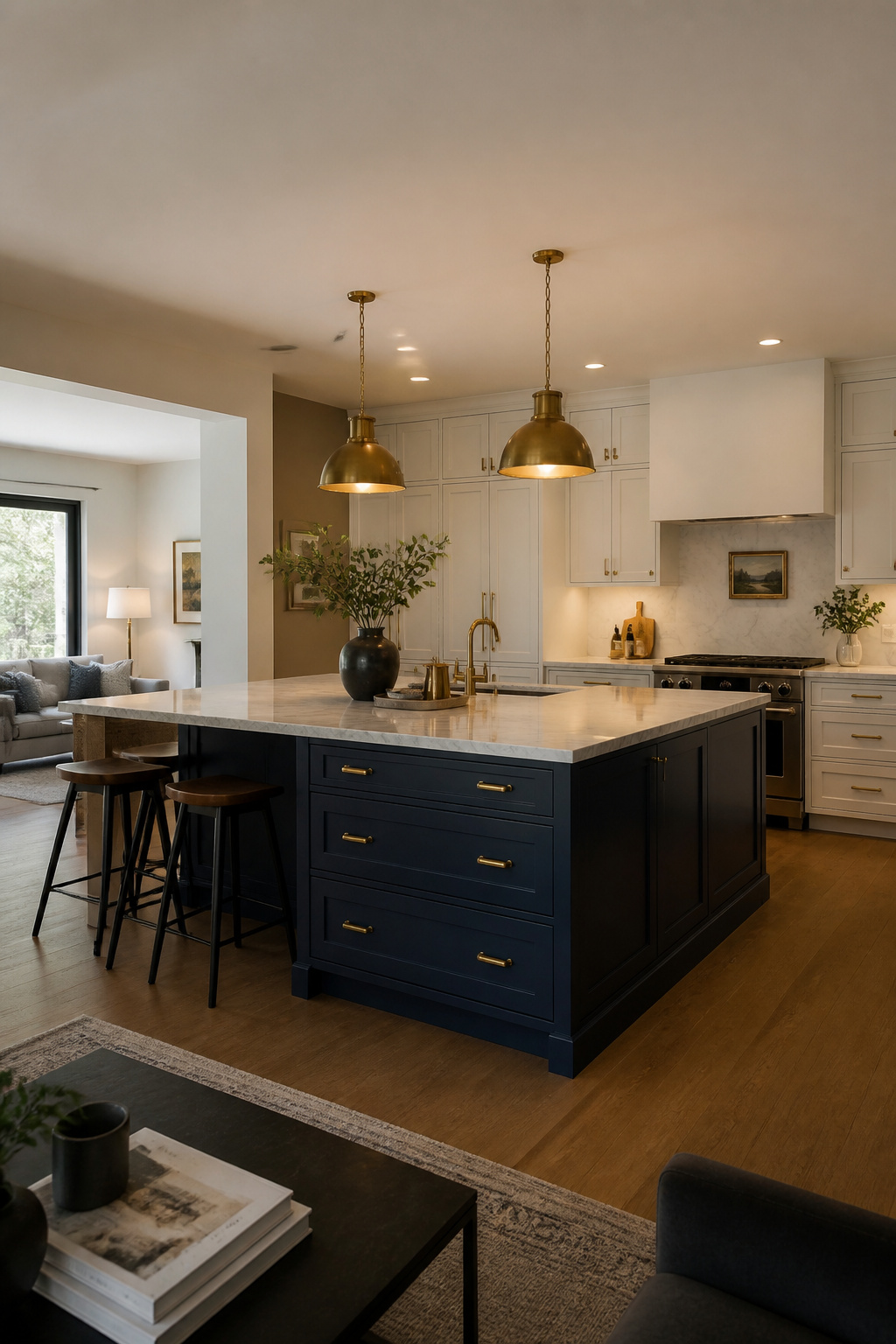
The challenge in open-plan kitchens is that navy reads from further away than most people test it. A colour that looks dramatic and intentional at arm’s length can read as gloomy from across a combined kitchen-living room. The standard mitigation is to use navy on the island only. This creates a focal point without the perimeter reading as dark from the sofa.
For countertops: Carrara or Calacatta marble is the classic pairing. The cool grey veining plays off navy’s undertones in a way that feels natural. Unlacquered or aged brass hardware bridges the cool cabinet and cool stone, adding warmth that prevents the combination from going cold. A pale grey limestone is a warmer alternative — slightly lower contrast with navy but more forgiving of daily use. Blue kitchen cabinet ideas explores the full spectrum from soft mineral tones to near-black indigo, if navy is just the starting point.
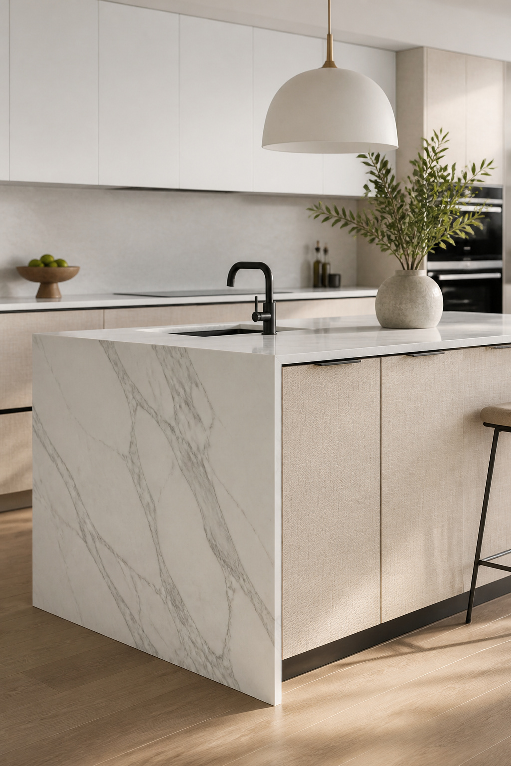
15. A Contrasting Island That Functions as the Kitchen’s Focal Point and Storage Core
A kitchen island in a different finish from the perimeter cabinets is one of the most effective contemporary kitchen cabinet moves for a straightforward reason: the contrast creates an anchor. In a large kitchen where the perimeter is a single extended cabinet run, a matching island adds mass without adding definition. The eye doesn’t know where to settle. A contrasting island gives the room a centre.
The contrast doesn’t need to be dramatic. A shade darker or lighter than the perimeter cabinets is often enough, particularly when there’s also a material change — painted perimeters with a walnut-veneer island, or white perimeters with a deep green island. The logic is differentiation: the island is furniture-adjacent, a distinct object within the room, and treating it as one reads more resolved than trying to make everything match.
Sizing and Seating
Standard island height is 36 inches (91cm) — the same as a kitchen counter. A raised 42-inch bar-height section is increasingly replaced by a uniform 36-inch surface with a generous overhang. Allow 15 inches minimum at counter height for comfortable knee clearance, and 18 inches for a full dining posture. Allow 42-48 inches of clear passage between the island and any opposing cabinet run. Less than 42 inches creates a navigation problem that reveals itself the first time two people cook simultaneously.
Storage Configuration
Deep drawers — 400-600mm depth — on the non-seating side handle pots, pans, and large serving pieces better than hinged doors at this cabinet depth. A built-in pull-out bin cabinet within the island keeps waste management off the floor and out of sight. The one detail worth planning at the design stage rather than adding later: the countertop overhang on the seating side. Retrofit overhangs lack the structural integrity of a designed seating overhang — and the kitchen island countertop ideas that elevate the island from a surface to a statement depend on getting this detail right from the outset.
How to Choose Your Contemporary Kitchen Cabinet Style: Making It Work for Your Space
The 15 ideas above span a wide range. From a flat-panel matte veneer that barely announces itself to a glass-front LED-lit display cabinet to a contrasting navy island. The question isn’t which is best. It’s which serves the specific conditions of your kitchen.
Light is the first filter. North-facing kitchens need finishes that work with limited natural light. Gloss or semi-gloss surfaces amplify what’s available, lighter colours avoid absorbing what little the room gets, and careful artificial lighting fills the gaps. South-facing kitchens can carry darker tones — navy, matte black, forest green — which need good natural light to show their quality and avoid reading as heavy.
Architecture is the second filter. Contemporary flat-panel cabinetry looks precisely right in a modern extension or open-plan space without historical reference. In a kitchen within an older house — original coving, sash windows, wide floorboards — cabinetry with some texture or detail reads as more sympathetic to the existing character. A completely smooth, handleless cabinet run can fight the architecture rather than working with it.
Budget is the practical filter. The 80/20 principle holds in contemporary kitchen cabinet selection: 80% of visual impact comes from the door fronts, the countertop, and the hardware. These are the elements where investment returns the most visible result. The carcass interior looks identical in melamine or solid wood once items are stored inside. Spend on the door profile and finish, the countertop material, and the hardware quality. Save on what nobody sees once the drawers are full.