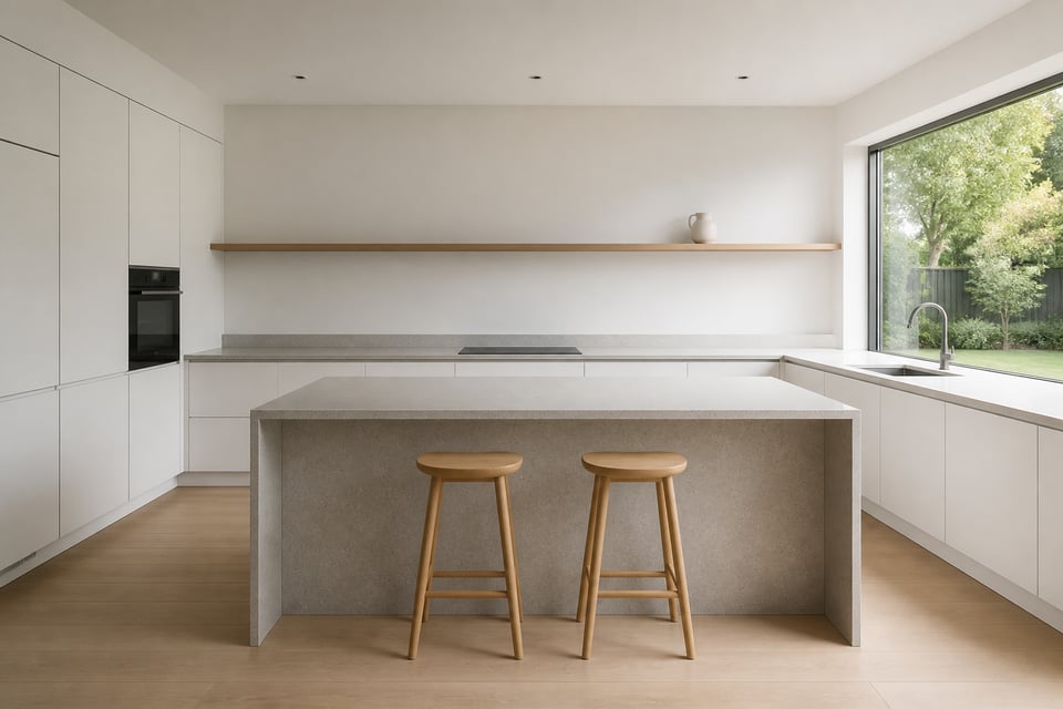
Walk into a genuinely minimal kitchen and your shoulders drop before your mind registers why. There is nothing asking for your attention — no pattern to decode, no object competing with the next, no surface pressing you to tidy it. Just clean planes, honest materials, and a quality of stillness the rest of the house rarely manages.
This is what minimalistic kitchen design actually means. Not a kitchen stripped of personality, but one so thoughtfully edited that everything remaining has earned its place. The Japanese concept of ma — the principle that meaningful emptiness is itself a design element — sits at the heart of every idea here. Each choice is a choice to remove something that doesn’t belong rather than add something that might work.
The fifteen ideas below range from structural decisions made during a full renovation to changes achievable over a weekend. Some concern hardware and surfaces; others concern philosophy and restraint. All of them point the same direction: a kitchen that works quietly, looks composed, and asks nothing of you except that you cook in it.
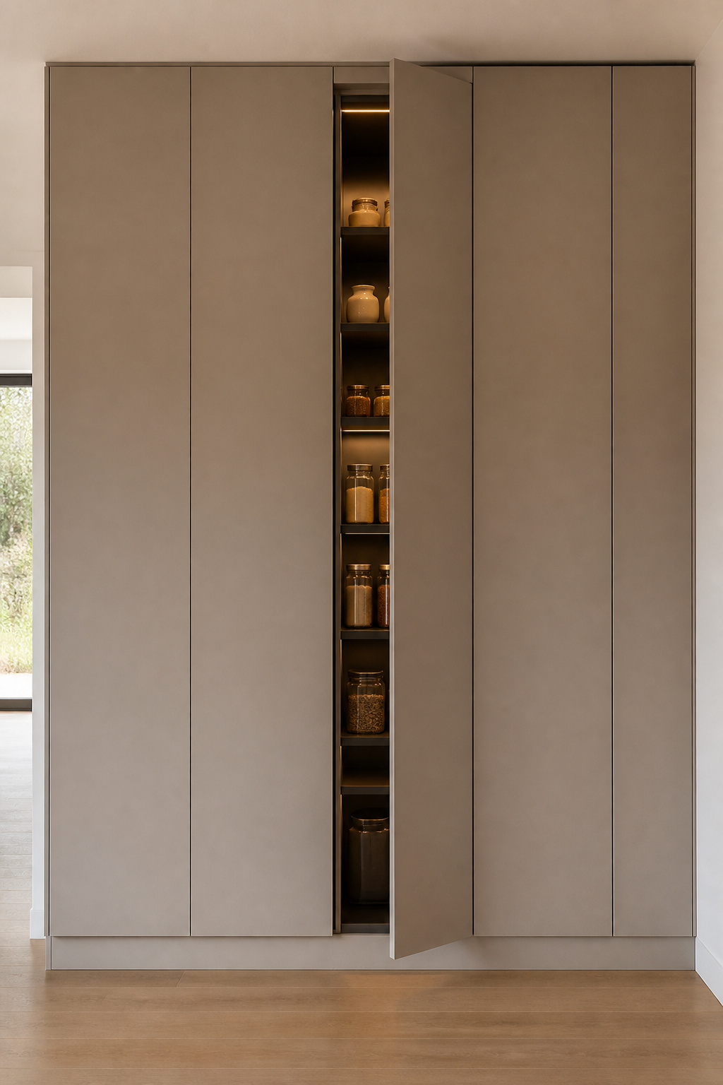
1. Handleless Cabinets for an Uninterrupted Kitchen Surface
Hardware is not neutral. Even the smallest, most discreet handle punctuates the surface it’s mounted on. When a kitchen has thirty or forty cabinets and drawers, those punctuations accumulate into visual noise the eye cannot stop processing. Remove them entirely and something significant happens: the room becomes legible in one reading rather than dozens.
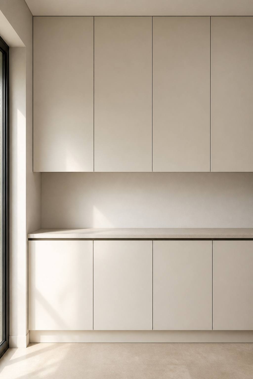
Three systems achieve this. Blum’s TIP-ON push-to-open is the industry standard: a spring-loaded magnetic catch releases with gentle pressure, no electricity required, and it won KBIS 2024’s ‘Most Functional Find’. The J-pull profile — a groove routed into the cabinet edge — costs less but collects crumbs and suits veneer fronts better than lacquer. The gola rail — a recessed aluminium channel running the full width above or below the doors — is the most architectural solution. It integrates LED strip lighting inside the channel and disappears into the line between cabinetry and ceiling.
Choosing the Right Mechanism
Matte lacquer cabinet fronts in off-white or warm grey pair best with gola rail — the flat surface reads as a single unbroken plane. Veneer fronts in white oak or ash suit the J-pull profile, where the grain and the routed groove feel coherent together. For households with young children, push-to-open is the safer choice; J-pull grooves at lower heights can trap small fingers. In family kitchens, the Blum mechanism is also more durable over years of daily use.
This is a minimalistic kitchen design principle that starts with subtraction: the simplest version of a cabinet front is no front at all — just surface.
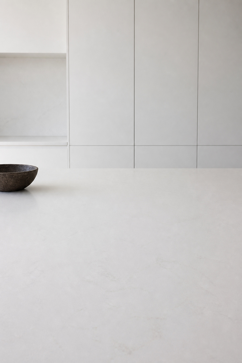
2. A Monochrome Palette That Defines Minimalistic Kitchen Design
The instinct in most kitchen design is to use colour as punctuation — a coloured island, different shades on the lower units, a contrasting tile. Each addition feels like a small personality. The cumulative effect is a kitchen that reads as a collection of decisions rather than a single resolved thought.
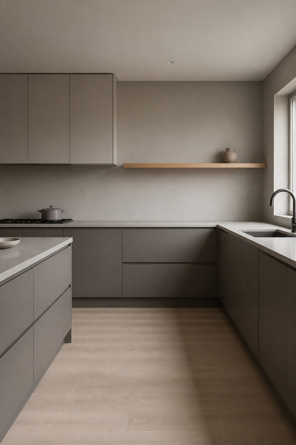
A monochromatic palette resolves this. When cabinetry, walls, and worktops share the same colour family — different shades and finishes, but the same hue — the kitchen stops being a room full of things. It becomes a space with a mood. The eye registers colour contrast as something requiring attention. Remove the contrast and the room becomes genuinely easy to inhabit. For context on how modern kitchen design principles have shifted toward tonal restraint, the direction in 2026 is consistently away from contrast-led colour.
Working Within One Hue
Depth comes from varying the finish rather than the colour. A matte cabinet front, a satin worktop, a gloss tile — all in the same warm grey. Each surface reflects light differently, creating movement without introducing a second colour. The most common mistake is choosing pure brilliant white throughout. Under artificial lighting, it reads as blue-grey and the effect is clinical. A warm white with LRV 85-88 stays neutral across the full day’s light range. North-facing kitchens particularly need this warmth. A cool grey that reads well in a south-facing showroom can feel genuinely bleak in a kitchen that never sees direct sun.
Test any monoscheme on a large swatch taped to the wall for a full day. The kitchen at seven in the morning is not the same kitchen at seven in the evening.
3. Integrated Appliances That Disappear Into the Cabinetry
A stainless steel appliance face has its own language — industrial, functional, unapologetic. In a kitchen built around restraint, it speaks at a volume the surrounding surfaces cannot match. The fridge becomes the loudest thing in the room. The dishwasher introduces a different material system at floor level. Together they prevent the kitchen from ever reading as one coherent thing.
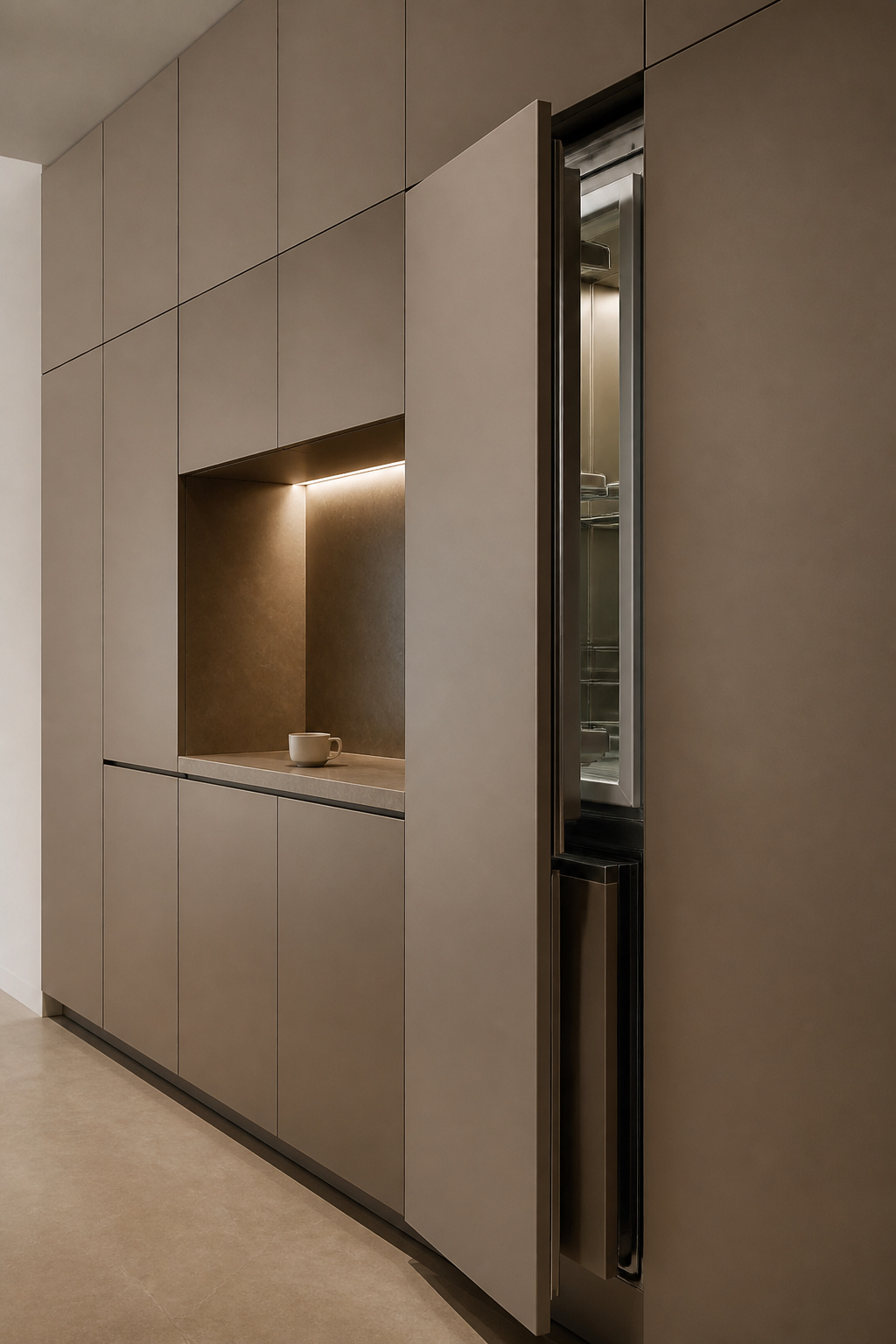
Panel-ready appliances solve this. Miele, Bosch, Fisher & Paykel, and Beko all build shallower tubs and tighter tolerances specifically so the panel sits flush rather than proud of surrounding cabinets. Bosch panel-ready dishwashers run $1,299–$1,499. Fisher & Paykel’s integrated French door fridge at 32 inches wide accepts a full-height panel and is one of the cleaner solutions at the higher end.
What Integration Actually Costs
The trade-offs are real. Integrated fridges lose roughly 10–15% of internal volume due to the double-wall construction needed for panel fitting. Installation costs 30–50% more than standard appliances. Integrated appliances must also be sourced from the same cabinetmaker as the kitchen. Two millimetres of proud panel is the difference between a resolved minimalistic kitchen design and an almost-resolved one. In a minimal kitchen, almost-resolved is visible every time you look.
4. Open Shelving With Disciplined, Curated Displays
Open shelving is high-risk and high-reward. The reward is obvious — a few carefully chosen objects add warmth and humanity to a space that might otherwise feel sealed. The risk is equally obvious: shelves fill up, and what started as three intentional objects becomes twenty.
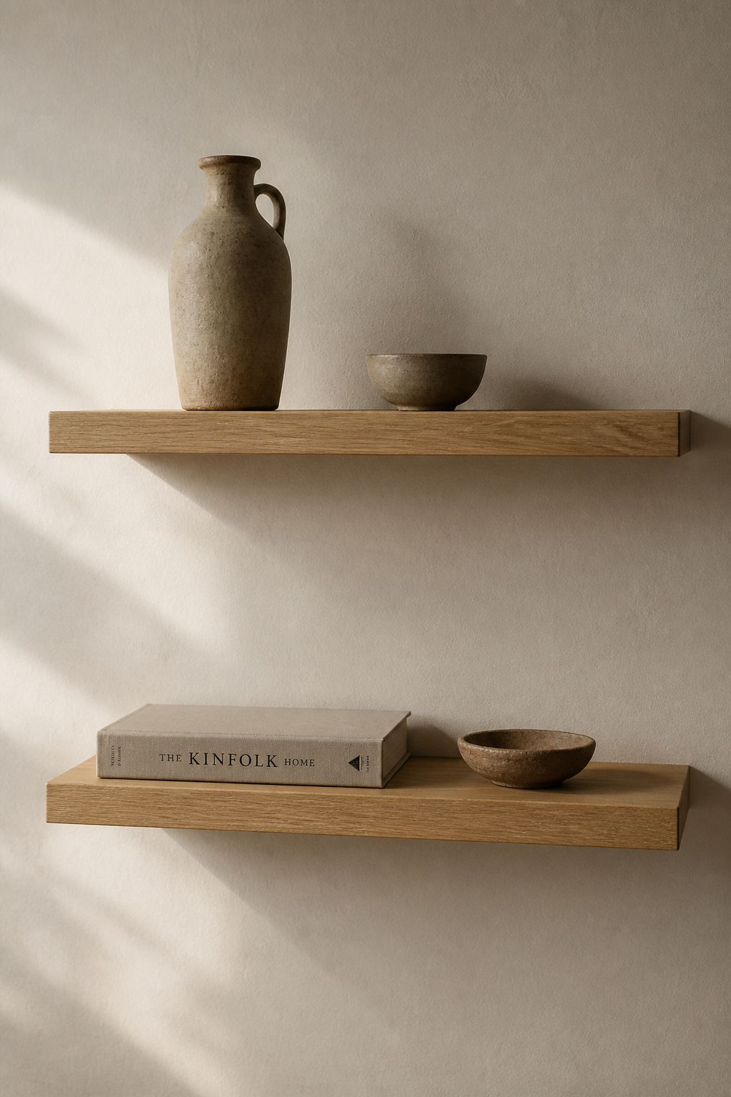
The wabi-sabi approach applies directly here. Display only what you would miss if it were gone. Applied to kitchen shelving: if removing the object makes the shelf look better, remove it. The empty space that remains is not a gap to fill — it is the correct proportion.
In practice: no more than three objects per shelf, with deliberate negative space between them. Height variation creates rhythm — a tall ceramic jug beside a small bowl beside a single book. White oak floating shelves at 25–30mm thickness with concealed brackets suit this perfectly; the wood provides warmth without introducing anything that competes. Shelf depth of 250–300mm is right for display; deeper than 350mm reads as storage and changes the room’s proportions.
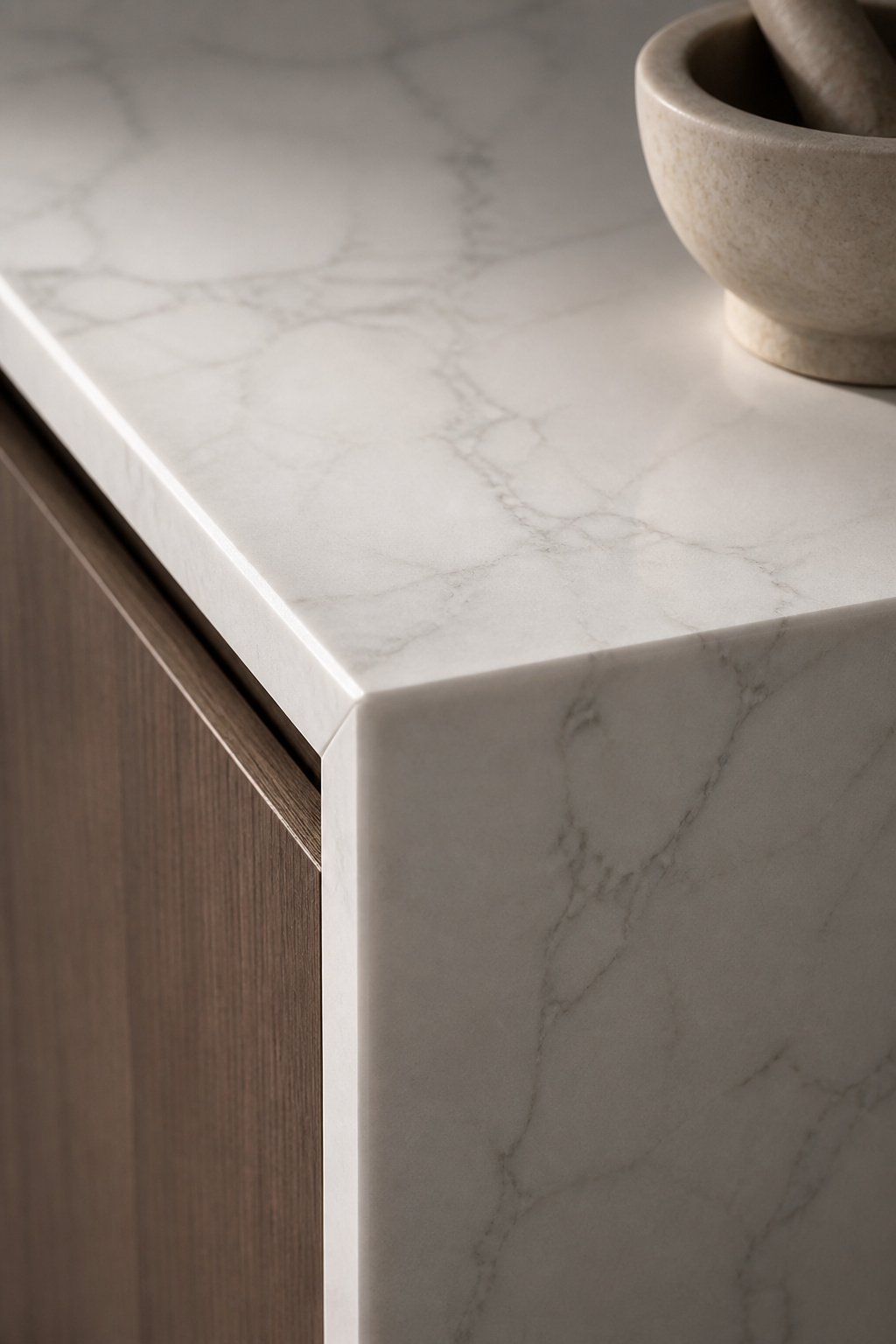
5. Quartz and Concrete: Minimalist Kitchen Countertops That Last
In a handleless, monochromatic kitchen with integrated appliances, the worktop surface carries more visual weight than in almost any other kitchen context. It is often the only material making a statement — the place where texture, light, and colour converge without competition. Surface choice is the most important single decision in a minimalistic kitchen.
How that surface choice ripples through the room depends on thinking about kitchen countertop decor that works as a system rather than a single specification.
The Three Main Options
Quartz (Silestone, Caesarstone, Dekton) is the most practical choice: non-porous, non-requiring of sealing, and available in uniform colours and subtle movement finishes. The uniformity some find limiting is exactly what a minimal kitchen needs. A surface that stays consistent rather than mapping every kitchen incident into its patina.
Poured concrete offers a connection to material that engineered stone cannot replicate: no two surfaces alike, genuine craft quality, honest impermanence. It needs sealing on installation and every year or two thereafter, and can develop hairline cracks. In the wabi-sabi tradition, this is not a flaw — it is a material being honest about existing in time.
Honed marble reads as luxury minimal. It needs sealing every three months and etches from acidic liquids permanently. Whether this patina is beautiful or distressing depends on your tolerance for imperfection. For edge profiles: always eased or pencil-round. On an island, the waterfall edge — worktop continuing to the floor — is the most architecturally resolved detail available.
6. Under-Cabinet Lighting That Erases Visual Clutter
A run of wall cabinets presses down on the worktop below it. Under-cabinet lighting changes this. Light from below visually lifts the cabinet mass, creating a luminous band between cabinet base and counter surface that makes the unit appear to float. In Japanese interior lighting philosophy, this is indirect light — light that illuminates an adjacent surface rather than the room directly. The effect is warmer and more considered than downlighting.
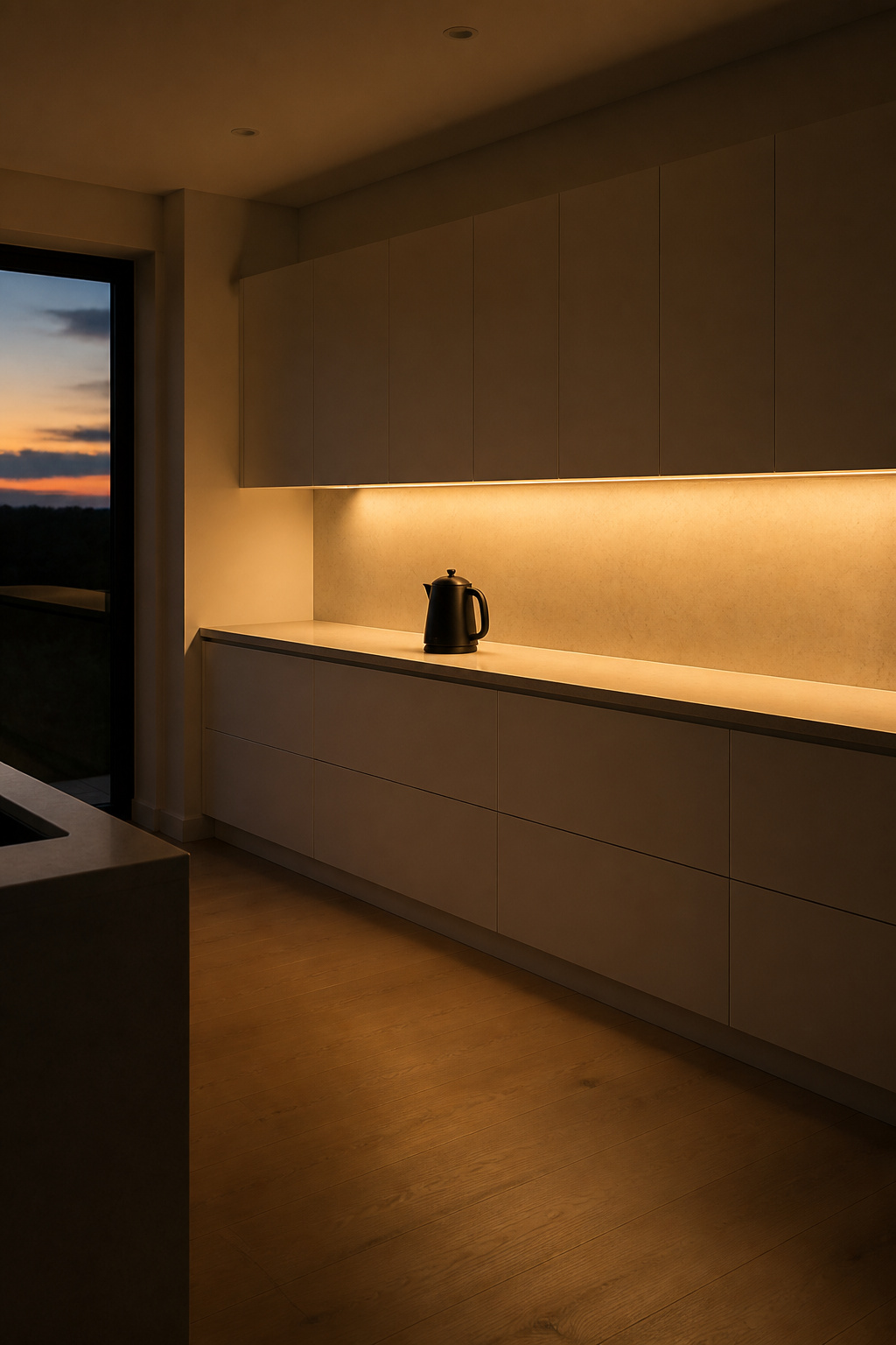
Colour Temperature and Concealment
2700K warm white is the correct temperature for a minimal residential kitchen. Anything cooler introduces a daylight quality that reads as clinical and conflicts with the settled feeling the room is working to create. The strips should run in recessed aluminium channels (Häfele, Sensio, Illuma) that conceal the tape entirely and diffuse light evenly. Exposed LED strip without a channel creates hot spots on the worktop that look unfinished. Aim for 1500–2000 lumens per linear metre.
A separate dimmable driver for the under-cabinet circuit is the element that makes this minimalistic kitchen design choice truly functional. Evening mode at 20% output transforms the room. The worktop glows softly, the cabinet mass above it disappears, and the kitchen becomes somewhere to linger rather than just to work in.
7. A Single Statement Material as the Room’s Focal Point
Japanese design has a specific concept for this: the tokonoma. It is a recessed alcove in a traditional Japanese room containing, at most, a single hanging scroll, a single ceramic vessel, and nothing else. The walls around it are bare. Everything in the room exists in service of the one thing in the alcove. Encountered in all that emptiness, it becomes powerful beyond its individual quality.
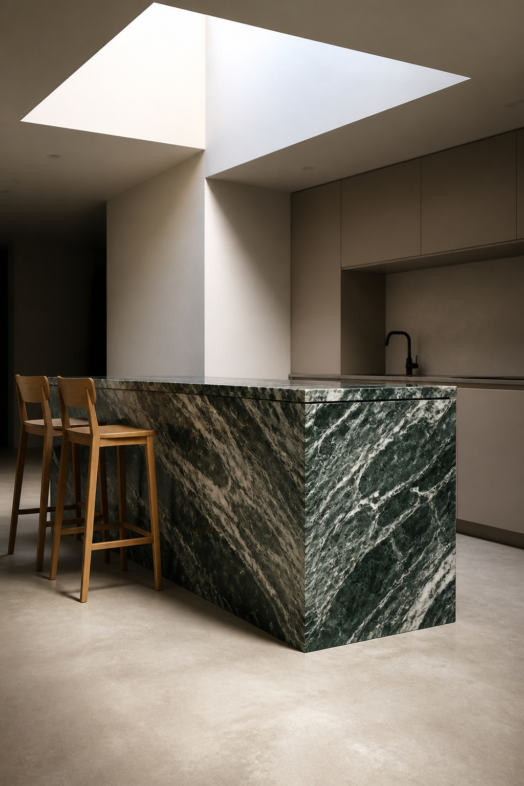
Apply this to a kitchen: choose one material to be expressive and let everything else fall quiet around it. The material can be a book-matched stone island face — two slabs opened to reveal mirror-image veining in Calacatta, Pietra Grey, or Verde Alpi. It can be a reclaimed oak beam across the kitchen ceiling. It can be a single run of terracotta tile behind the range cooker, aged and uneven, against handleless lacquer cabinets that are otherwise immaculate.
For how modern kitchen interiors that elevate a space handle this principle across different aesthetic contexts, the through-line is consistent: one material speaks, everything else listens.
The rule that follows is equally important: once you have your statement material, stop. A feature stone island and a feature timber wall simultaneously produce a kitchen where nothing is at peace. Both elements fight for the attention only one was meant to hold. Restraint is a minimalistic kitchen design virtue that applies most critically here, at the moment when the temptation to add is strongest.
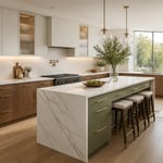
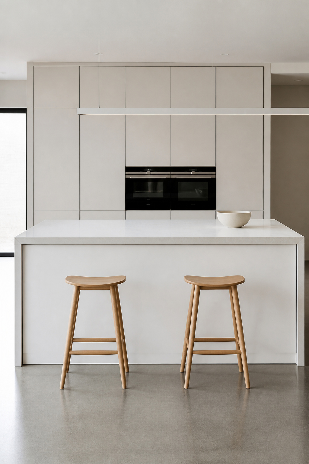
8. Streamlined Kitchen Islands Built for Function, Not Show
The island is where minimal kitchen design most reliably loses its way. Every decorative instinct correctly suppressed elsewhere tends to congregate here — contrasting colours, open shelving, decorative legs, ornamental corbels. The logic is that the island is a piece of furniture deserving personality. The result is a kitchen whose island reads as a different design register from everything around it.
For decisions that directly affect this — particularly the worktop and its integration with the island structure — kitchen island countertop decisions are worth working through methodically before specification.
Proportions and Storage
Standard working depth is 90cm (36 inches US). This is sufficient for a full-extension drawer system on the work side and a 15-inch seating overhang on the opposite face. Allow 24 inches of width per seated person; a four-person island needs at least 2.4 metres of seating-side length. Counter height at 36 inches is standard; 42 inches for bar stool seating.
The island face should be completely flat. Full-height handleless cabinet doors with deep Blum Tandembox or Hettich ArciTech internal drawers hide pots and pans behind a panel that reads as solid from outside. Power sockets, if required, should be pop-up units flush-mounted into the worktop — not sockets on the island face, which immediately break the perimeter line. The waterfall edge detail adds approximately £300–600 per end and is almost always worth it in a streamlined kitchen environment.
9. Natural Wood Accents Against Matte Neutral Planes
There is a version of minimalistic kitchen design that is technically correct and still feels inhospitable — all stone and lacquer and precision, no warmth anywhere. One element prevents this: wood.
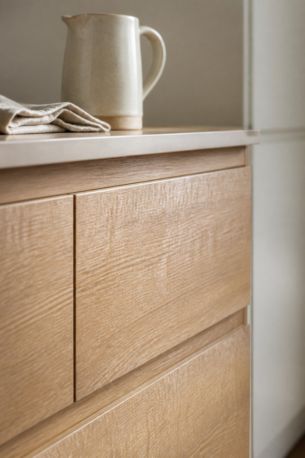
Wood is the most humanising material available to a kitchen designer. Its grain provides visual complexity at a scale too small to register as pattern. It changes over time — it patinas, responds to the environment, records its history. In the wabi-sabi tradition, this is not a flaw but the definition of authenticity: a material that’s honest about existing in time.
Choosing a Species
White oak leads for kitchen applications. It scores Janka 1,360, has a closed grain structure that resists moisture, and a neutral warm tone that works against both cool greys and warm off-whites. Quarter-sawn white oak shows tight medullary rays that further limit seasonal movement. Ash is lighter and more golden — better for Scandinavian-influenced kitchens than Japanese-influenced ones. Walnut brings the most character at Janka 1,010 — the softest of the three, meaning it shows use over time. Its rich chocolate tones pair best with cool grey or white minimalistic kitchen design schemes where warmth is the deliberate counterpoint.
Oil finish (Rubio Monocoat, Osmo Hard Wax Oil) preserves the natural feel of the wood and develops patina; lacquered wood feels sealed-off. Use wood in one zone only. More than one application reads as an absence of decision rather than an abundance of warmth.
10. Matte Hardware as a Minimalistic Kitchen Design Detail
Not every kitchen can be fully handleless — the mechanism is sometimes impractical, sometimes expensive, sometimes simply not right for how the household operates. When hardware is present, it becomes one of the few remaining decision points in a minimalistic kitchen design. It repeats across every cabinet and drawer dozens of times. The finish choice amplifies accordingly.
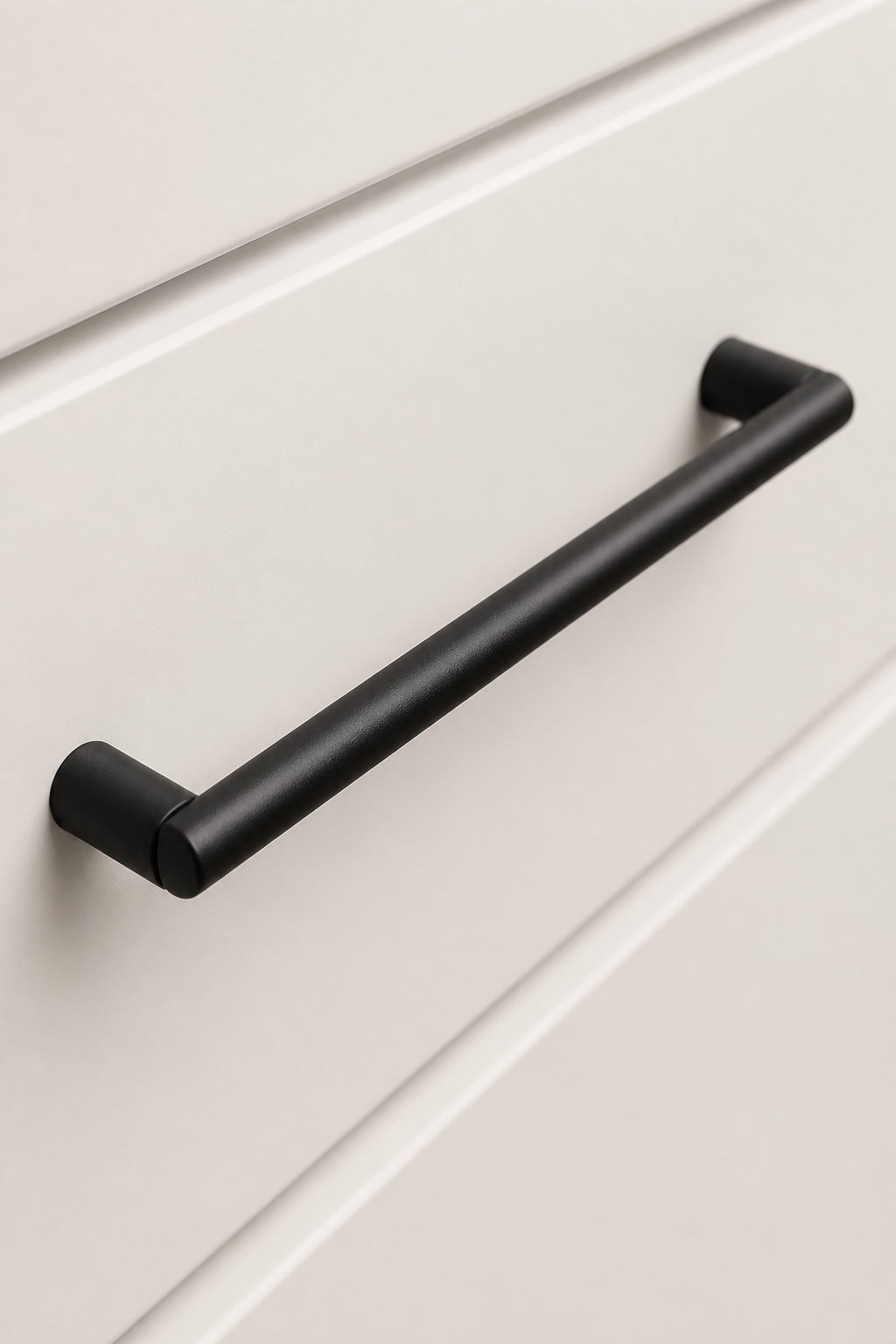
Polished chrome and polished brass both reflect light strongly. In a minimal kitchen, a highly reflective finish introduces sparkle points that draw the eye unpredictably. Matte finishes absorb rather than scatter light. For readers working through the specific decisions around kitchen cabinet hardware that makes a difference, the direction in 2026 is consistently toward less reflective, more tactile finishes.
The Three Matte Options
Matte black: the sharpest contrast option, pairs powerfully with white and light grey cabinetry, hides fingerprints well, and has remained consistently strong since 2019. Brushed nickel is the timeless neutral. Its soft metallic tone bridges warm and cool palettes, hides water spots better than any polished metal, and has transitioned from trend to reliable classic. Satin brass: the warmth choice. It pairs with warm grey or greige cabinetry, and in 2026 means burnished or antique brass rather than high-polish — a more lived-in quality. Whatever finish: use only one throughout. Mixing finishes across different cabinet types introduces exactly the inconsistency that a minimalistic kitchen design is engineered to avoid.
11. Concealed Storage That Keeps Every Surface Bare
The minimal kitchen does not begin with aesthetic decisions. It begins with a question: where does everything live? Before a single cabinet front is chosen, every item in the kitchen needs a specific, concealed home. This is storage-first design, and it is the discipline that separates kitchens that look minimal in photographs from kitchens that remain minimal to live in.
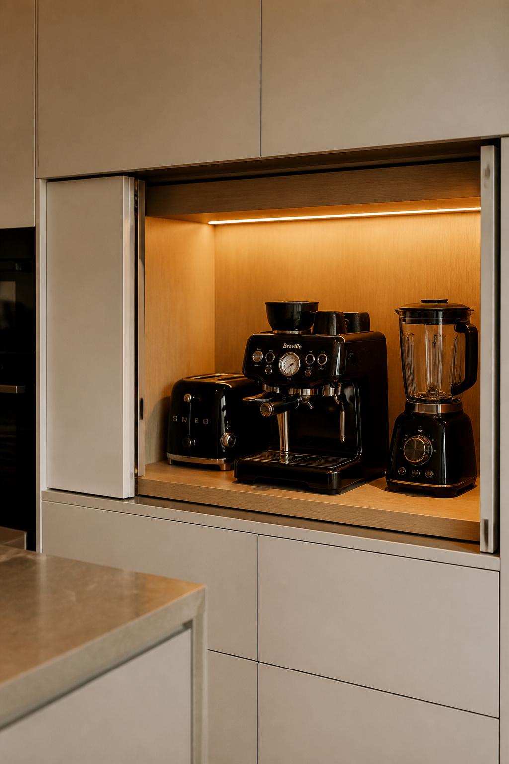
For the specific furniture and hardware that makes this work, kitchen storage furniture that works harder covers the category in practical detail.
The Key Solutions
Blum’s REVEGO pocket door appliance garage slides doors into recessed wall pockets with a touch of TIP-ON technology. The full garage width opens with no obstruction — unlike a tambour roll-up door, which narrows access as it rises. When closed, it reads as a section of base cabinet. Tall pull-out pantry towers (Blum Tandembox, Hettich AvanTech YOU) eliminate the dead zone at the back of standard pantry cabinets. The full-extension pullout reveals every item on both sides from a single handle movement. Hidden bin drawers are a pull-out unit within a base cabinet. They house 2–3 waste compartments within a 450–600mm width without a visible bin carrier on the floor.
The Japanese discipline of danshari — releasing attachment to possessions — suggests one-in-one-out. Each new appliance that enters the kitchen needs an existing one to leave. A minimalistic kitchen design lives or dies by this discipline long after the renovation is complete.
12. Minimal Window Treatments for Maximum Natural Light
The window in a minimal kitchen has two jobs: to admit light and, where required, to provide privacy. Linen drapes and layered blinds are decorative softening devices. They are work this kitchen does not need its windows to do.
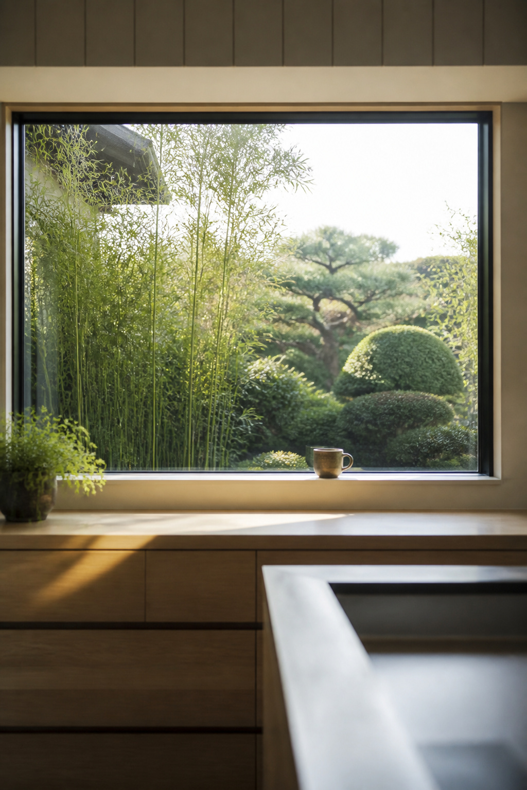
The Japanese domestic default is to leave windows bare where the situation permits. The garden beyond, the changing sky, the quality of morning light on a clear day — these are dynamic design elements. They are not things the interior needs to screen. In a kitchen facing an appealing view, no treatment at all is often the most powerful choice. This approach is integral to minimalistic kitchen design thinking: the view costs nothing and changes daily.
Where privacy or glare is a genuine concern, a solar roller blind recessed into the ceiling or reveal is the minimal solution. It is invisible when raised and light-filtering rather than light-blocking when lowered. Off-white and warm linen fabrics are correct; avoid blackout, which converts the window into a visual void. Frosted film on the lower portion provides ground-floor privacy without compromising overhead light. It reads as part of the glazing rather than an addition to it — a contemporary equivalent of the Japanese shoji screen. Roman blinds, layered curtains, and café rods all introduce horizontal or vertical elements that contradict the clean perimeter lines of a minimal kitchen.
13. Integrated Pantry Doors That Blend Into the Wall
A standard door introduces a frame, visible hinges, and a thickness proud of its surroundings. Even one painted to match the surrounding cabinets will do this. In a kitchen calibrated to read as a single continuous plane, the disruption is immediately visible. The pantry becomes a separate event in the room rather than a resolved part of it.
The solution is a door that matches the surrounding cabinet run so precisely that its location is ambiguous until opened. This requires three things. First, the exact same surface material as the surrounding cabinets — not a close match, but the identical batch. Second, concealed hinges with no visible face plate. Third, a flush fit that sits in the same plane as the doors on either side. This is the test of minimalistic kitchen design resolve: whether the construction discipline matches the visual aspiration.
A push-to-open panel door — the same Blum TIP-ON mechanism used in the handleless cabinet run — is the cleanest solution for a pantry entry. For larger openings (900mm or wider), a pocket door system (Häfele Slido, Eclisse) is more practical. It slides into a wall cavity and disappears entirely when open. The detail that most often fails: the finish. Kitchen cabinets from a specialist manufacturer are typically sprayed in a controlled factory environment. A pantry door painted on-site by a joiner will not match, regardless of how precisely the colour is specified. Source the pantry door panel from the same manufacturer as the kitchen cabinetry.
14. Negative Space as a Core Minimalistic Kitchen Design Principle
Everything in this list is, ultimately, a specific application of a single principle: that emptiness is not the absence of design but its fullest expression.
The Japanese concept of ma (間) is not simply ‘negative space.’ Ma is not the emptiness between objects — it is the emptiness that gives objects their meaning. A ceramic bowl on a bare worktop is encountered fully, appreciated for its weight and colour and proportion. The same bowl surrounded by a coffee machine, a fruit bowl, and yesterday’s mail is invisible. The worktop did not become more generous by adding things to it. It became smaller.
For a different application of these Japanese aesthetics to kitchen organisation, Japanese kitchen sink organisation for serene flow extends this minimalistic kitchen design philosophy to the room’s most-used work zone.
In practical terms: keep 70% of worktop surface clear at all times. Leave the void above cabinetry — the space between cabinet tops and ceiling — completely empty, painted the same colour as the ceiling. Leave the wall between cabinets and rangehood without tile, artwork, or anything. These decisions feel, to most people, like leaving things unfinished. The discomfort is worth sitting with. The question that guides minimalistic kitchen design in the Japanese tradition is not ‘What can I add here?’ It is ‘What can I remove so that this feels calm, useful, and honest?’
15. A Restrained Backsplash for a Clean Kitchen Design
The backsplash is frequently where discipline breaks down. It is a relatively small surface, easy to treat as an exception — a place where a bit of personality is allowed without compromising the whole. A patterned tile, a contrasting grout, a handmade ceramic with appealing irregularity. Each of these is a reasonable choice in a different kitchen. In this one, each becomes the loudest thing in the room.
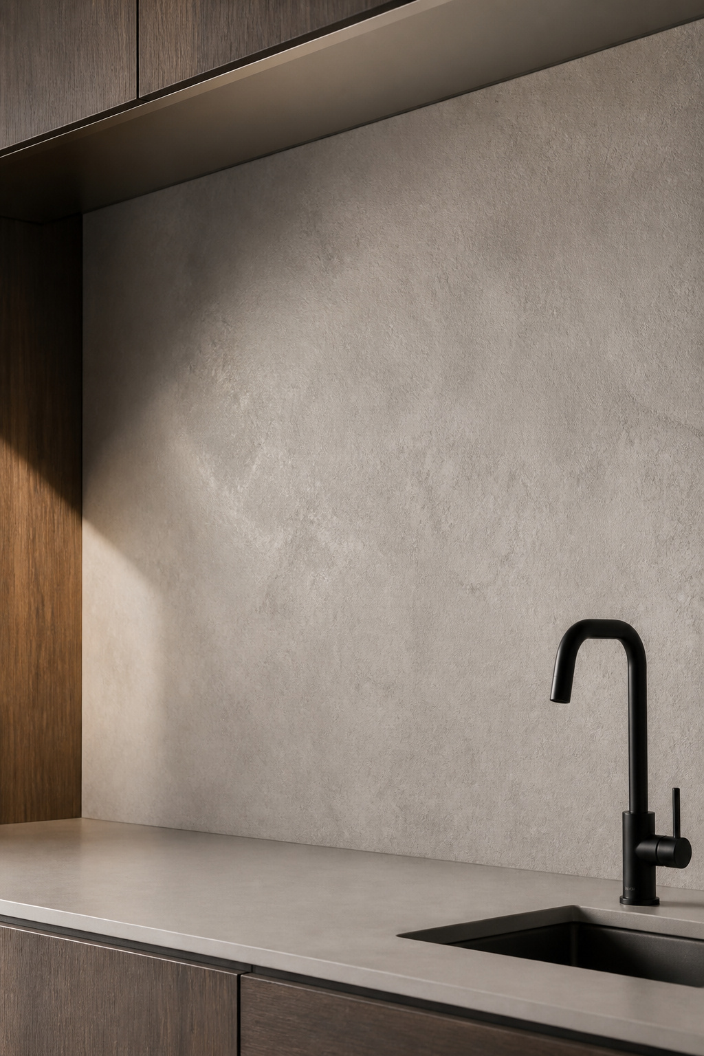
In a handleless, monochromatic kitchen, the backsplash introduces pattern or colour contrast at the one location where the eye has nowhere else to go. It becomes the punctuation at the end of a sentence that was working perfectly without it.
The most resolved approach is to extend the countertop material as a full-height backsplash. The same Dekton, quartz, or stone — from worktop to underside of wall cabinets — creates an uninterrupted vertical plane. Dekton is the most practical material here: heat-resistant enough for installation directly behind a cooktop, and available in large-format slabs with practically invisible joins. Its 8mm slim profile is designed specifically for backsplash applications. For a comprehensive guide to kitchen backsplash design that lasts, the full-height slab approach consistently produces the most durable and visually resolved clean kitchen design result.
Where a slab is outside budget, plain rectified ceramic or porcelain in a colour closely matching the cabinetry is the correct alternative. Rectified tiles have machine-precise edges that allow 1–2mm micro-joints — essentially no visible grout line. Grout colour should match the tile exactly. The surface reads more like a panel than a tiled wall. That is the point.
Designing Your Minimalistic Kitchen From the Ground Up
The most useful way to approach this list is as a priority order rather than a checklist. In a full renovation with unconstrained budget, all fifteen ideas belong together. Each reinforces the others, and the cumulative effect is a kitchen that functions as a genuine whole. For most kitchens, choices have to be made.
The highest-impact changes are consistent: handleless hardware (or retrofitting push-to-open catches to existing cabinets), a monochromatic palette across all painted surfaces, and clearing the countertops to near-bare. These three can be made without replacing a single cabinet. The first two cost money; the third costs nothing and arguably delivers the highest return of anything in this list.
For those working with an existing kitchen rather than building from scratch: start with what is visible from the main entry point. The eye reads that view first and calibrates its expectations from it. Apply a monochromatic palette to the visible surfaces, clear the countertops, and house appliances out of sight. The kitchen then reads as resolved — even when the inside of every drawer is still a negotiation.
For a new kitchen or full renovation: plan storage first. Decide where every item will live before choosing a cabinet profile or colour palette. Minimalistic kitchen design is not a style applied to an existing layout. It is a planning discipline that determines what the space must contain, then designs the kitchen around those requirements. Everything concealed. Nothing residual.
The kitchen that results is not a kitchen with less in it. It is a kitchen where everything that remains has been chosen.