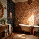
There’s a moment in every kitchen renovation when the room is technically finished — but something’s missing. Often, that something is the wall. A bare kitchen wall is a missed opportunity of the most colourful kind. Wallpaper changes that. It brings personality, depth, and the kind of storytelling that no hardware or tile can replicate. I’ve spent years helping people move past their fear of pattern. Kitchens are where I always make the boldest case. The room where you cook every day deserves more than a coat of magnolia.
Kitchen wallpaper in 2026 is better than ever. Options range from vinyl-coated botanicals that take steam cleaning in stride to artisan block-prints with variation no machine could reproduce. Whether you’re drawn to dark geometric patterns or a soft sage watercolour wash, this list covers sixteen kitchen wallpaper inspiration ideas across every style and budget. These aren’t just pretty pictures — each one comes with the practical guidance you need to actually make it work.
1. Bold Botanical Prints for Kitchen Wallpaper Inspiration
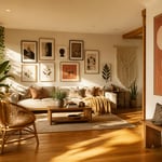
A kitchen with oversized botanical wallpaper doesn’t look decorated — it looks designed. There’s a critical difference. The right large-scale leaf or floral print does all the styling work. Your cabinetry, countertops, and accessories can then stay simple and still feel considered.
The 2026 trend has shifted toward painterly, moody botanicals. Think hand-drawn, country-casual patterns rather than the bright graphic tropical prints of a few years ago. Consider oversized fern fronds in olive and cream, or Arts and Crafts vines in muted blue and tan. Brands like Sandberg and Rebel Walls lead this shift with large-scale non-woven wallpapers in semi-gloss finishes. That finish handles the humidity and occasional steam of a working kitchen.
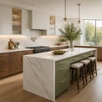
White or cream Shaker doors suit almost any botanical print. The plain cabinetry lets the pattern breathe. Coloured cabinets need more care. Match wallpaper background to cabinet colour — no more than one shade lighter — or the scheme will look uncoordinated. An olive-green botanical on a sage ground behind sage cabinets creates tonal richness rather than a clash.
Keep countertops in plain quartz, honed stone, or concrete. Choose hardware in brushed brass or gold. Both decisions let the botanical wallpaper lead without competition. For shelving accessories, plain white ceramics or terracotta pots are the right choice. The wallpaper is already doing the storytelling; there’s nothing left for the accessories to prove. For further ideas on decorating around bold pattern, kitchen wall decor ideas that complement bold print are worth exploring.
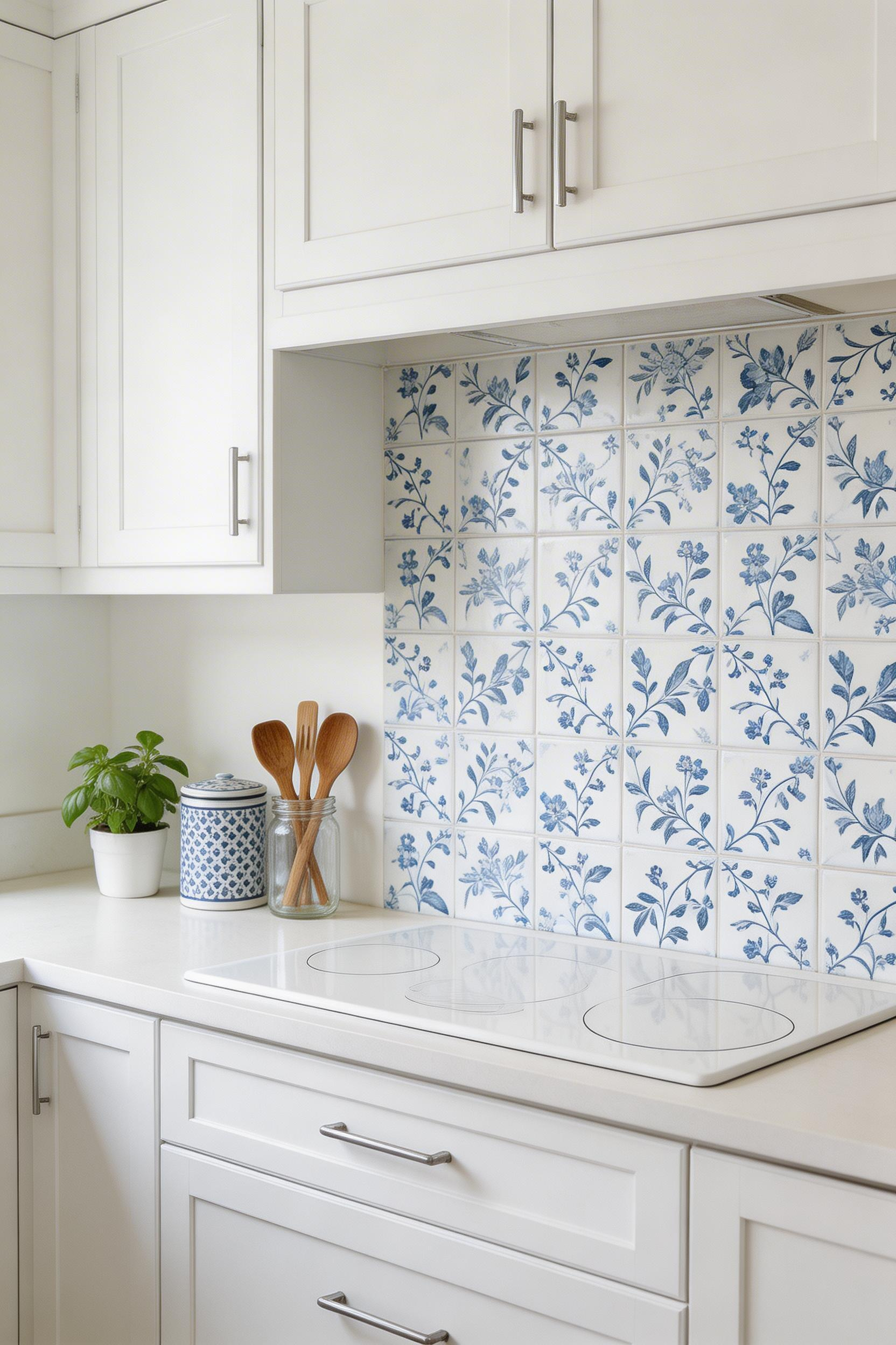
2. Geometric Tile-Effect Patterns That Double as a Backsplash
The fantasy of hand-painted encaustic tiles at a fraction of the cost is no longer a fantasy. Vinyl tile-effect wallpapers have reached the point where, from a metre away, the eye can’t reliably tell the difference. In a kitchen, a metre away is roughly where you spend most of your time.
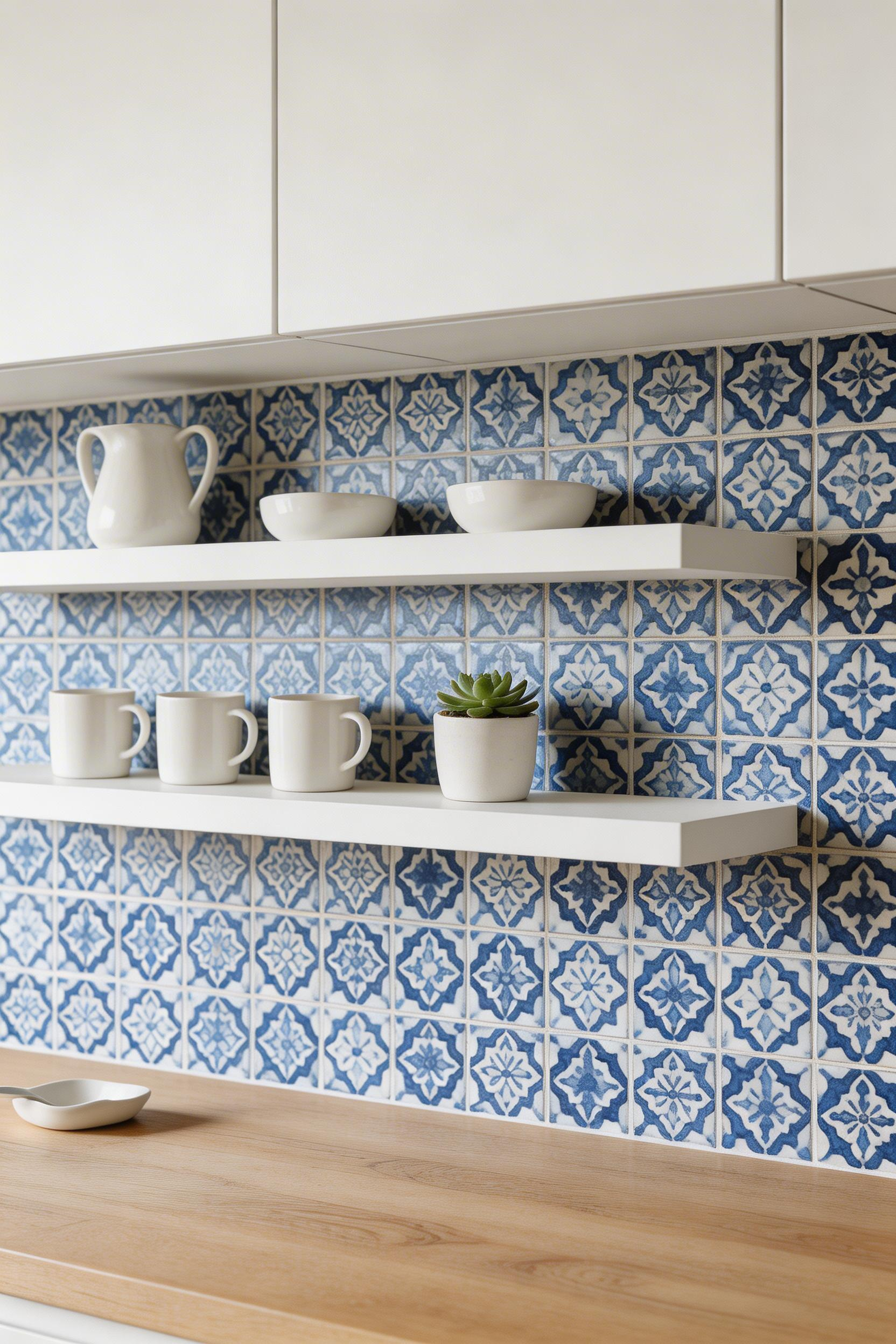
Tile-effect wallpaper combines an embossed surface with careful multicolour printing. The best versions — from Tempaper’s tile collection and AllModern’s kitchen backsplash range — use 4-5 shades per tile shape. That range replicates the colour variation found in real ceramic. The result is a Moroccan zellige-style hexagonal pattern or a classic geometric grid. It reads as authentic without the grouting, weight, or installation cost of real tiles.
Material Matters
For kitchen backsplash use, vinyl is the correct material. Its plastic coating repels grease and water. You can clean it with mild soap and a damp cloth. Non-woven wallpaper is a close second. The synthetic-natural fibre blend breathes and resists mould. That makes it actually better than vinyl in very steamy kitchens. Plain paper wallpaper belongs nowhere near a kitchen; it warps, peels, and grows mould.
The practical placement rule: keep wallpaper at least six to eight inches from the hob. A short glass or stainless panel behind the burners, with tile-effect wallpaper on either side, gives you the look without the failure point.
3. Warm Terracotta and Earthy Tones for a Grounded Kitchen
2025 has been declared the year of brown, terracotta, and olive by nearly every major design forecaster. In kitchens, this trend makes the most sense. After years of cool grey worktops and white cabinets, the warm earth tone revival feels like a long-overdue correction.
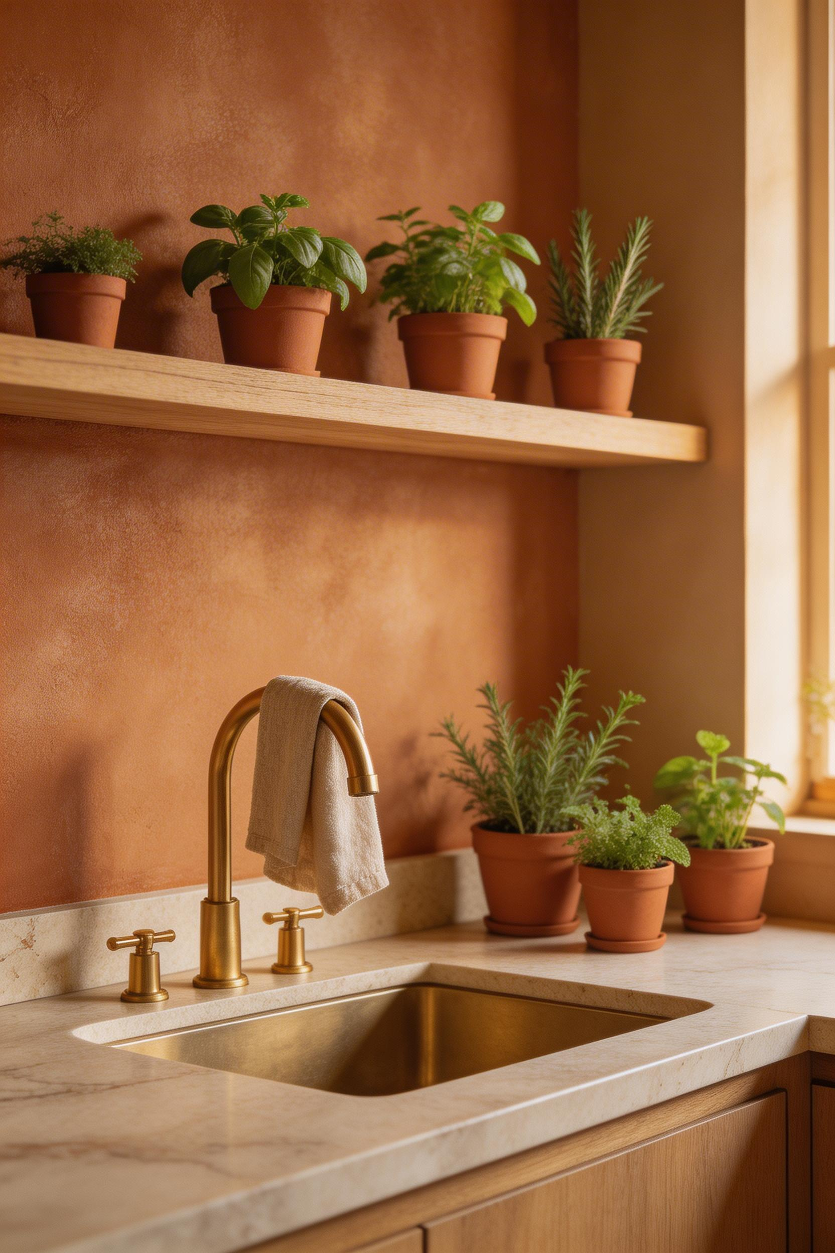
Terracotta kitchen wallpaper comes in several forms. The most convincing versions mimic limewash walls with a plaster texture. They add depth without pattern and warmth without drama. Then there are geometric prints with a mid-century edge. Terracotta-ground wallpapers with small ochre or cream diamond repeats bridge the earth-tone palette with visual rhythm. Both read as sophisticated rather than seasonal.
The material pairing logic is straightforward. Light-toned oak or birch wood elements amplify terracotta’s warmth without overwhelming it. Stone countertops in honed travertine, cream limestone, or sandy quartzite continue the natural palette into the horizontal plane. Brushed brass or unlacquered brass fixtures complete the material story — chrome reads too industrial against warm earthy tones.
One warning about light: deep terracotta tones can darken considerably under artificial light. In a north-facing kitchen, stick to lighter terracotta and rust-orange shades rather than deep burnt sienna. South-facing kitchens can carry richer, deeper tones. Test a sample under your actual kitchen lighting for two to three days before ordering. This applies to any wallpaper, but it’s particularly critical with warm, saturated tones. With deep terracotta, the difference between beautiful and oppressive often comes down to light.
4. Classic Gingham and Ticking Stripe Kitchen Wallpaper Ideas
Gingham is back, and the 2026 version isn’t the kitchen-tablecloth nostalgia trip it once was. The pattern has found a more considered footing. Paired with plain ceramics, aged wood, and simple linen accessories, it reads as quietly confident.
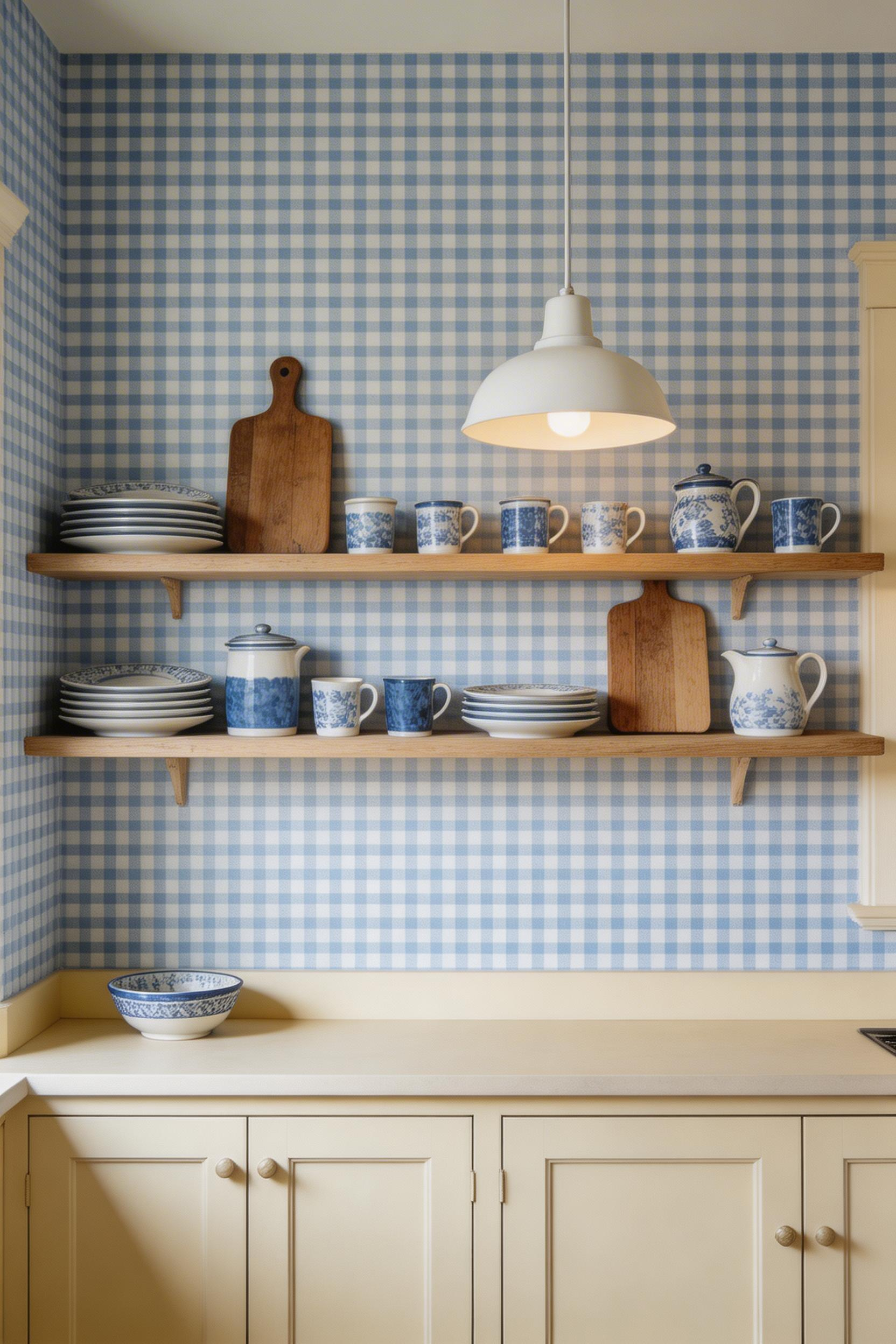
Ticking stripe has never really left. Its origins are in mattress fabric and utility linen. That gives it a durability and honesty that more decorative patterns often lack. In a kitchen context, that heritage feels exactly right. Milton & King’s ticking stripe — tight 3-4mm stripes in navy, sage, or charcoal on cream — convinced me the pattern had been miscategorised as farmhouse-only for too long. The farmhouse kitchen tradition finds a natural home for both gingham and ticking stripe.
Scale matters more with gingham than almost any other pattern. Micro checks (under 5mm squares) read as near-solid from a distance. They add texture without visible pattern — useful in small kitchens where a bolder check would feel busy. Medium checks (10-20mm) are the classic kitchen scale — visible but not overwhelming. They work on all four walls or as a single accent. Large checks (30mm or more) need confident architecture and a commitment to a single statement wall.
Colour: blue-and-white is more versatile than red-and-white in contemporary kitchens, but black-and-white gingham suits urban, loft-adjacent spaces. Green-and-white gingham, particularly in a soft sage shade, is the 2026 update that feels fresh without abandoning the pattern’s charm.
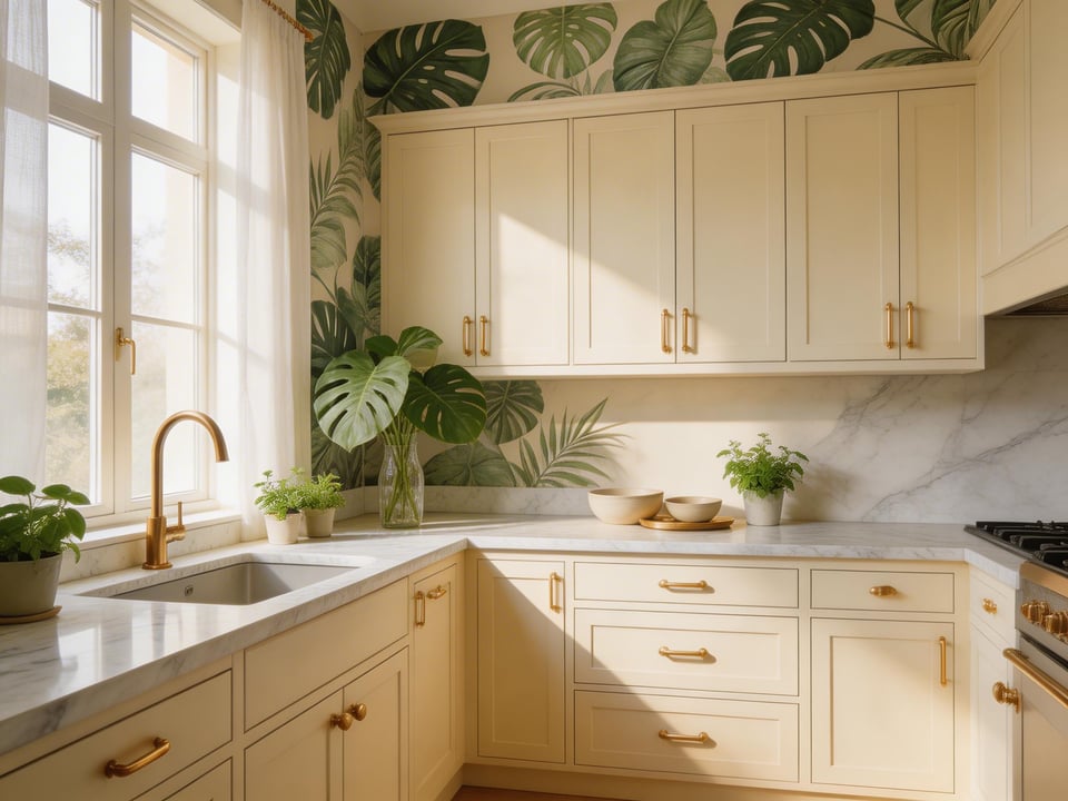
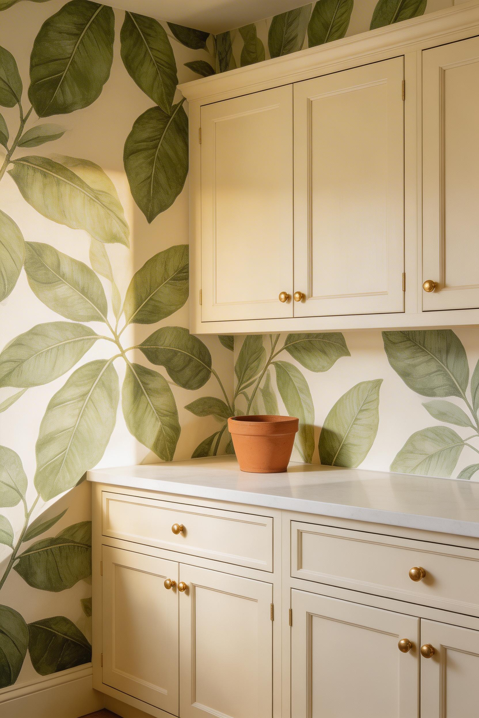
5. Maximalist Tropical Leaf Prints for the Adventurous Cook
Not every kitchen needs to be restrained. Some rooms benefit from an invitation to be loud. Kitchens, where things boil and sizzle and steam, are honest about their energy in a way most living rooms are not. Kitchen wallpaper with maximalist tropical prints matches that energy rather than fighting it.
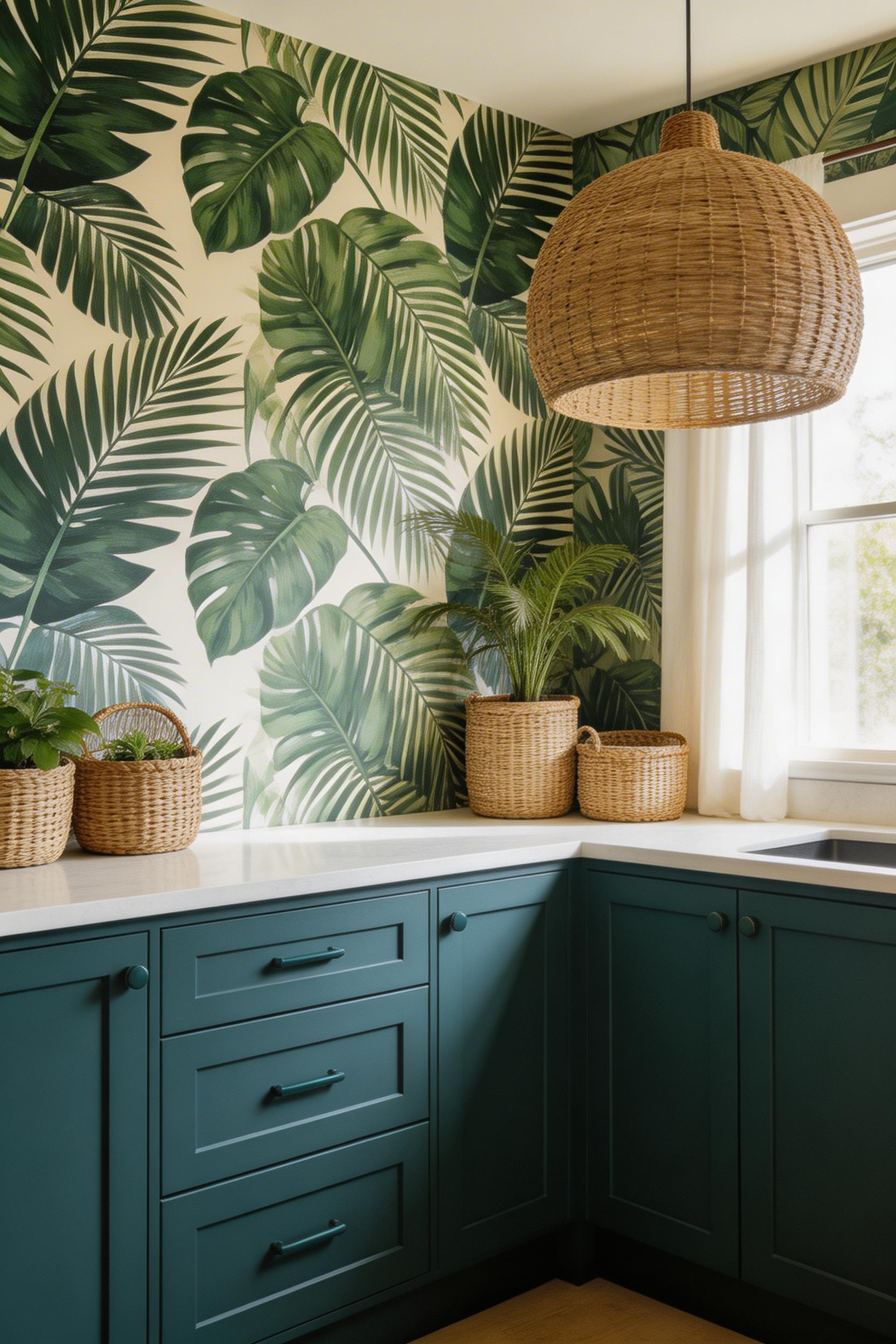
The trick with tropical wallpaper in kitchens is managing what surrounds it. The pattern is already doing a significant amount of work. Give it solid countertops — plain quartz, honed stone, or poured concrete. Nothing with its own pattern. Choose cabinets in a single deep colour from the wallpaper’s palette. Forest green against jungle wallpaper feels anchored and intentional; pale grey looks indecisive. Large-format plain floor tiles in stone or light wood flooring complete the triangle without adding another competing surface.
For accessories, natural materials are the only answer: terracotta plant pots, wooden cutting boards, woven rattan baskets, handmade ceramic vessels. These materials reinforce the tropical palette’s connection to the natural world. High-gloss cabinet doors, polished chrome fittings, and mirrored splashbacks read as a cocktail bar when paired with bold tropical prints. Wicker pendant lights, in particular, make tropical wallpaper feel like a deliberate design decision rather than an inherited feature.
Pick your tropical print carefully. Painterly, oversized leaf designs in darker, moodier palettes — forest, navy, deep teal as backgrounds — hold better over time. Bright, graphic tropical patterns on stark white grounds can feel like a holiday rental within a few years.
6. Subtle Linen-Texture Wallpaper for a Soft Minimal Kitchen
Not all kitchen wallpaper needs to be a bold statement. For kitchens where the ambition is warmth without drama, linen-texture wallpaper is one of the best decisions you can make.
Plain painted walls look flat. Linen-texture kitchen wallpaper looks alive. The difference lies in the way a woven surface creates light-catching variation that changes through the day. It reads cooler in morning light and warmer under evening downlighters. In a minimal kitchen, this quality provides interest without complexity. It’s the interior equivalent of a textured linen suit: sophistication comes from the material, not the pattern. For kitchens where restraint matters more than drama, linen-texture wallpaper is one of the most underrated tools available.
Non-woven linen-texture wallpaper is the correct material choice for kitchens — the synthetic-natural fiber blend breathes, resisting the mould that can develop under solid vinyl. Available in undyed naturals (off-white, warm greige, sand) and in softer dyed versions in sage, dusty blue, or blush, there’s significant range within the quiet palette.
The practical limit: matte-finish textured wallpaper is less cleanable than semi-gloss vinyl. Keep it away from the hob and sink splash zones. Use it on perimeter walls, above a tiled splashback, or on a single accent wall. In a kitchen with a good extractor hood and reasonable ventilation, non-woven textured wallpaper performs very well. In a steamy kitchen with no extractor, it will absorb cooking residue over time.
Paired with matte-finish cabinetry in putty, warm white, or pale greige, and with integrated push-to-open or J-pull doors, linen-texture wallpaper creates an all-matte kitchen that’s warm, quiet, and confident.
7. Dark and Moody Deep-Toned Kitchen Wallpaper Inspiration
Dark kitchen wallpaper is no longer a fringe choice. Navy, forest green, and deep charcoal have moved from design-magazine aspirational to mainstream achievable. A kitchen with dark wallpaper stops feeling like a utility room. It becomes a room with genuine atmosphere.
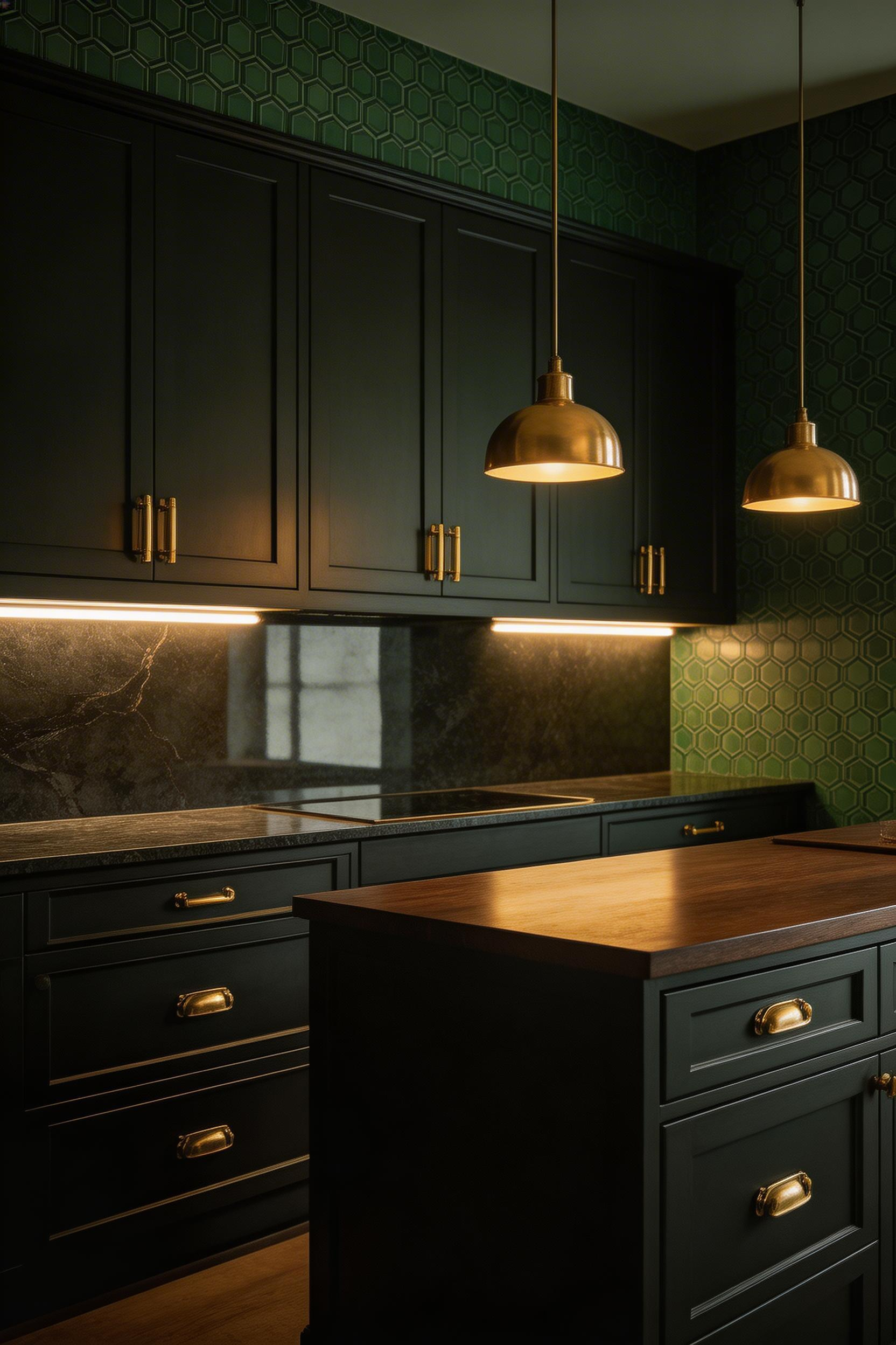
Forest green is the easiest entry point: it reads as warm rather than cold (unlike charcoal), pairs naturally with brass and wood, and doesn’t show cooking residue the way navy can. Homezyllo’s 2025-2026 report names it the most versatile of the dark kitchen colours. Deep navy comes second — more dramatic, more formal, and striking when paired with white marble and polished chrome for a cooler, more architectural look. Charcoal works best as a wallpaper supporting a full dark-kitchen aesthetic where cabinets, floor, and surfaces are all reading in the same tonal register.
Lighting Is Non-Negotiable
A dark-wallpapered kitchen needs 40-60% more artificial light than a pale one to function comfortably during the day. Under-cabinet LED strips are not optional — they illuminate the worktops without requiring the ceiling to work harder. Pendant lights over islands or dining areas should use warm-spectrum bulbs (2,700-3,000K maximum); cooler bulbs make dark walls feel clinical rather than intimate. Dimmer switches are the feature that makes people fall in love with dark kitchens: bright for food prep, dramatically low for a dinner party — the same room, two completely different readings.
Reflective surfaces prevent cave-like darkness. Unlacquered brass hardware, a polished stone splashback, and glass pendant shades all bounce light effectively. These details matter. For the full playbook on balancing dark surfaces with light, modern kitchen interiors that use depth and drama well covers this in depth.
A single dark-wallpapered accent wall behind the range is the lower-commitment version: bold and dramatic without requiring a complete kitchen rethink.
8. Vintage French Toile for a Kitchen with Storytelling Charm
Toile de Jouy was first produced in Jouy-en-Josas, France, in the 1760s. The scenes depicted pastoral life, chinoiserie, and hunting imagery in a two-toned line illustration on plain cotton — and the kitchen has remained its most natural domestic home ever since. In wallpaper format, toile brings something no geometric or abstract pattern can: a narrative. You can look closely at a toile wall and find something new. A ship, a shepherd, a classical figure. The kitchen wall as a story.
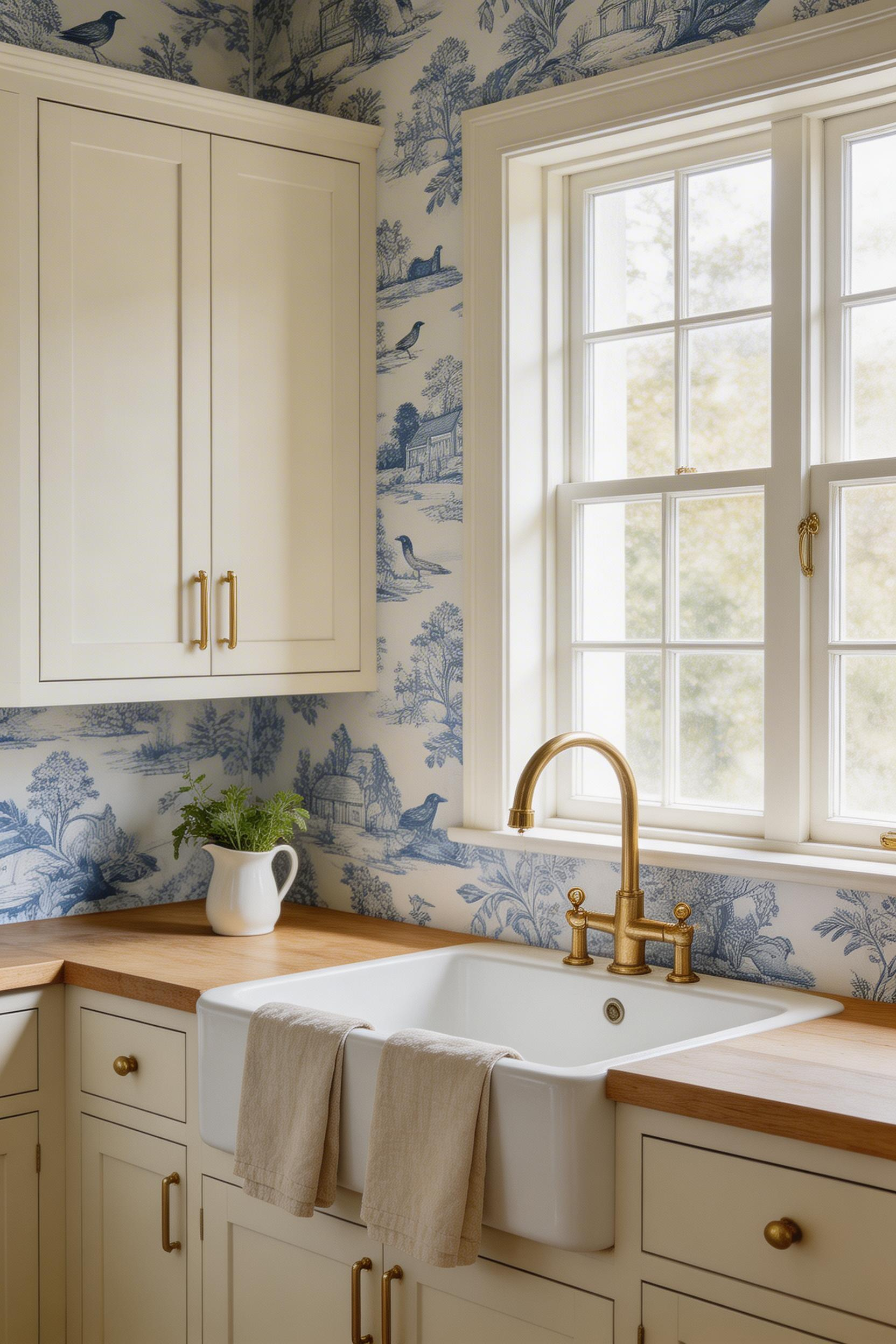
The key to toile in a contemporary kitchen is colour. Classic blue-and-white toile pairs with crisp white or linen cream cabinetry and brass accents — it’s the most forgiving version, flexible enough to sit alongside both Shaker and more traditional kitchen styles. Red-and-white toile channels French bistro energy and works confidently with dark grey or charcoal cabinet doors. Green-and-cream toile (currently having a distinct 2026 moment in sage and olive versions) reads as more naturalistic, particularly with wood worktops and stone flooring. Black-and-white toile on a cream ground is the most graphic interpretation — suited to kitchens with clean-lined cabinetry where the pattern provides the period warmth.
Cabinetry choice matters more with toile than with almost any other wallpaper style. Matte cream or soft white painted Shaker doors are the most sympathetic — the simple frame-and-panel profile echoes the structure of the toile print without competing. Unlacquered brass handles and taps age alongside toile beautifully; both develop character over time. High-gloss or very contemporary flat-front cabinets fight the heritage character of the pattern — the pairing feels unresolved rather than interestingly contrasted.
9. Scandi Minimalist Prints for a Nordic-Inspired Kitchen
Scandinavian wallpaper occupies a specific emotional register that few other styles match: it’s warm but not cluttered, characterful but not demanding, traditional but never stiff. The folk-inspired patterns — stylised flowers, geometric shapes, forest motifs — are rooted in Swedish and Finnish craft traditions. Those traditions treat everyday objects as worth decorating. A kitchen, as the most everyday room in the house, is exactly where this sensibility belongs.
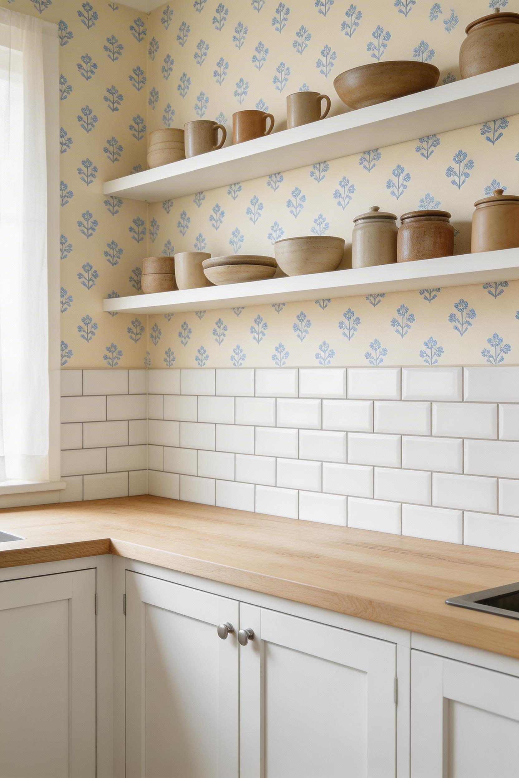
The 2026 update from Nordiska Kök shows Scandi kitchens incorporating slightly warmer, more colourful folk motifs compared to the pure-white minimalism of previous years. Brands like Boråstapeter and Wallpaper from the 70s lead with Swedish Country House patterns — small-scale stylised florals and geometric folk shapes in muted blues, greens, and soft warm pinks on cream or white grounds. The prints feel hand-drawn. That quality adds warmth that purely digital patterns cannot replicate.
White or grey Shaker doors suit Scandi wallpaper well. Their simple profile echoes the pattern’s structural clarity without competing. Oak, ash, or birch worktops complete the Nordic material palette; lighter tones keep the room airy where darker walnut would drag it down. For the backsplash area near the hob, plain white or pale grey metro tiles hold the aesthetic cleanly. For those working with less space, small kitchen decor ideas with a Scandinavian sensibility translate these principles into tighter footprints.
Keep the kitchen deliberately spare. No patterned tiles competing with the wallpaper, no ornate light fixtures. Load open shelving with simple hand-thrown stoneware and blue-and-white ceramics, and let that be the decoration. The Scandi kitchen asks you to choose less and choose well — the wallpaper is doing enough.
10. Blue and White Delftware Kitchen Wallpaper Ideas Done Right
Delftware originated in 17th-century Holland as a domestic interpretation of imported Chinese porcelain — the distinctive cobalt-on-white imagery of windmills, tulips, and sailing ships became a defining pattern of Northern European home design, and it has never stopped being convincing. In kitchen wallpaper format, Delftware-style patterns translate the ceramic tile tradition into a wall covering that reads as culturally rich without feeling like a museum installation.
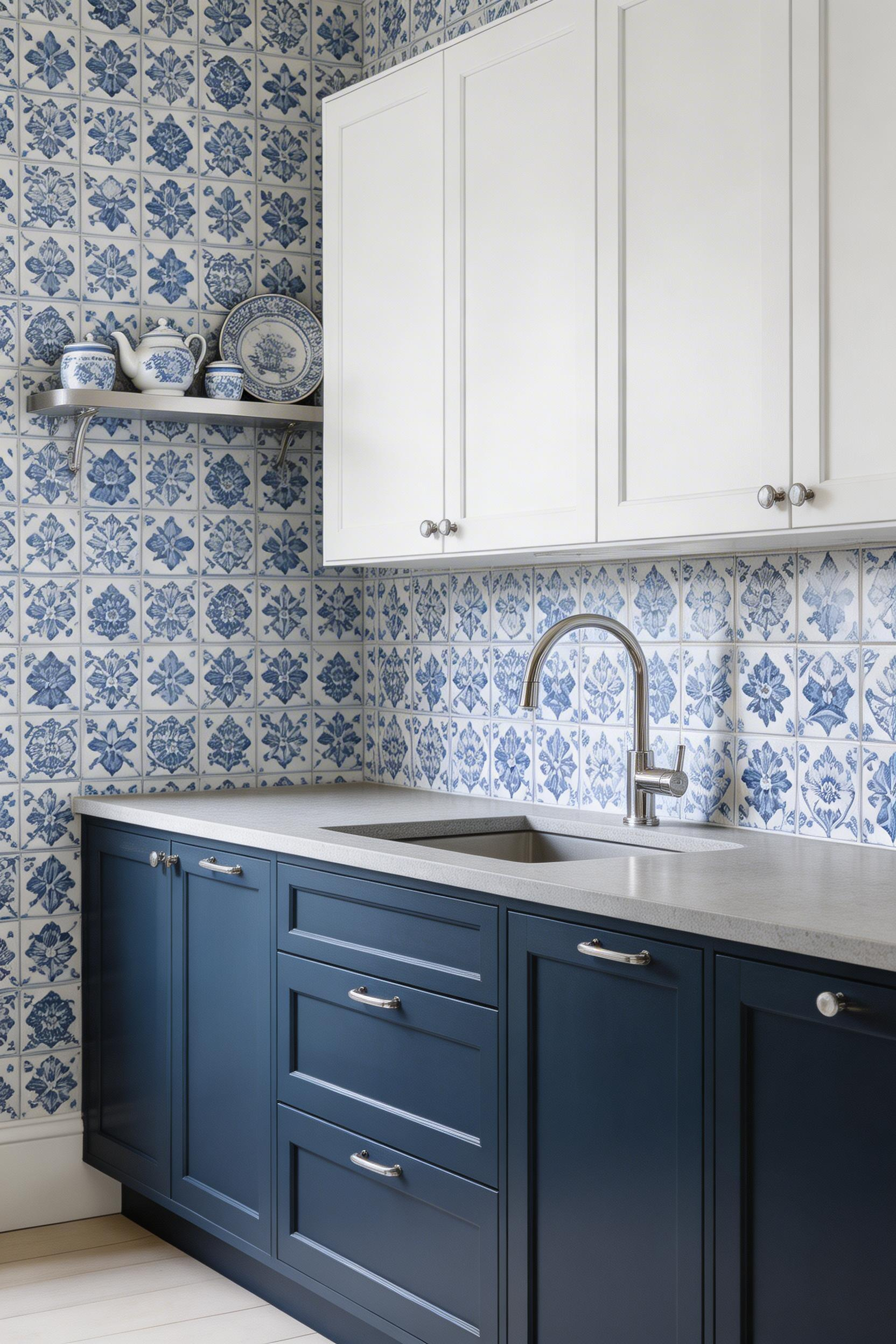
The two-tone palette is one of its greatest virtues. Unlike patterns requiring complex coordination, blue-and-white Delftware works with almost any neutral kitchen scheme. White cabinetry lets the wallpaper carry the colour story; navy or cobalt cabinet doors create a tonal richness where the wallpaper provides the detail and the doors provide the depth. Polished chrome fixtures read well with Delftware’s cool cobalt palette; unlacquered brass is also effective but gives the whole scheme a warmer, more traditional reading.
Stone countertops in white Carrara marble or pale grey quartz provide the correct neutral surface — anything with its own pattern or strong colour will interrupt the blue-and-white story the wallpaper is telling.
The pitfall to avoid: over-coordination. Delftware wallpaper surrounded by Delft tiles on the floor, blue-and-white ceramics on every shelf, and cobalt glassware reads as a themed room rather than a designed one. Let the wallpaper be the primary blue-and-white element. Add one deliberate accessory — a collection of blue-and-white ceramics on a single shelf — and keep everything else in white, natural wood, or plain stone. In a contemporary kitchen, a single Delftware panel behind open shelving (rather than all four walls) makes a focused, sophisticated statement while keeping the room legible.
11. Statement Mural-Style Wallpaper as a Kitchen Focal Wall
Mural wallpaper treats the kitchen wall as a canvas — a single wall becomes a botanical illustration, a Moroccan souk scene, a Japanese cherry blossom study, or a hand-drawn map of an imaginary place. It is, without question, the most committed choice on this list. It is also frequently the most rewarding.
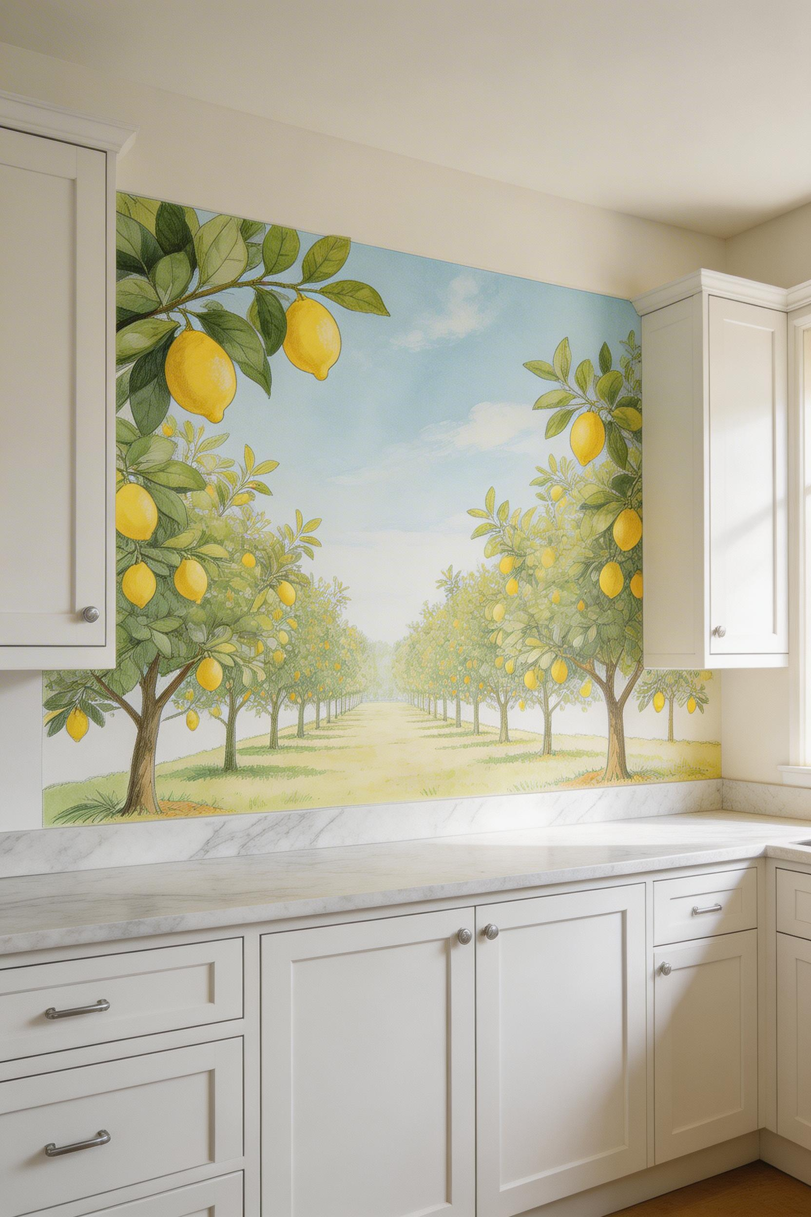
The most popular kitchen mural subjects for 2026 are illustrated food-and-nature scenes: citrus orchards, herb gardens with dense botanical labelling, open-air markets with crates of produce, and detailed scientific botanical studies. These subjects connect the mural to the kitchen’s purpose — cooking, eating, gathering — in a way pure landscape murals don’t. They make the kitchen feel as if someone very curious and very specific lived there.
Brands like Anewall and Rebel Walls print bespoke mural panels to exact wall dimensions. No repeating pattern, no complicated cutting, no awkward joins. The panel arrives sized to your wall. This is worth the premium price over standard roll murals, which require careful planning and precise installation. As for wall selection: the wall opposite your main window receives the most natural light and the best viewing angle — this is the ideal mural wall. The splashback wall behind the range works too, protected by a glass panel mounted in front of the wallpaper for the splash zone. You can find additional kitchen wall decor that uses statement art effectively to complement the mural approach.
Always order a mural panel sized to full ceiling height, not to cabinet top — a panel that stops mid-wall looks incomplete. Add five to ten centimetres on all sides for trimming allowance, and measure twice before ordering.
12. Hand-Blocked and Artisan-Print Kitchen Wallpaper Inspiration
There’s something a machine-printed wallpaper cannot do, no matter how sophisticated its printing technology becomes: it cannot replicate the slight variation that happens when a human hand presses an inked wooden block onto paper. The minute imperfections in alignment, the tiny differences in ink distribution from one block impression to the next — these are the qualities that make hand-blocked wallpaper alive in a way that its factory counterparts are not.
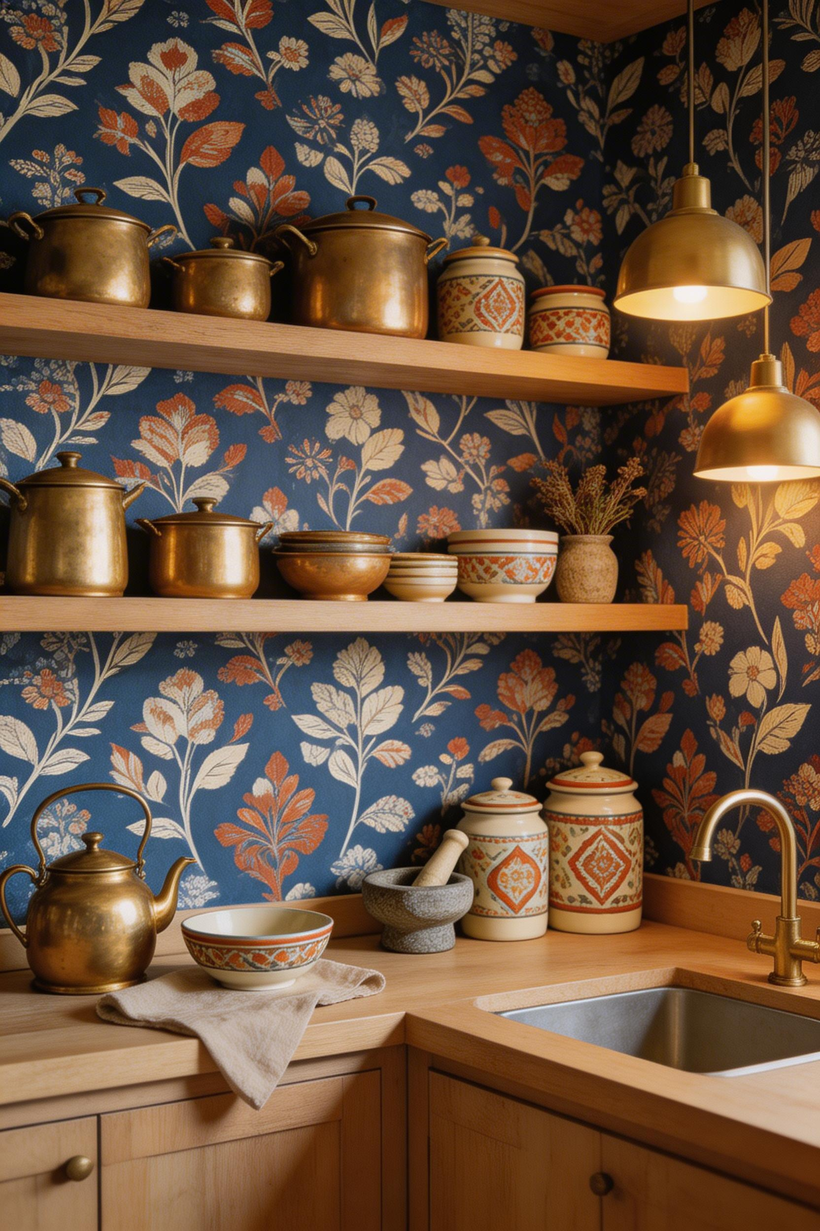
Fabdivine and Marble Lotus produce authentic block-print wallpapers using artisan co-op teams in Jaipur, India. The city has been the centre of block-printing craft for centuries. Indian block-print traditions include geometric florals, paisley, lotus-and-vine motifs, and mandala-influenced geometric repeats. The colour palettes — indigo, rust, saffron, sage — are drawn from natural dye traditions. They hold a richness that synthetic colour reproduction rarely matches.
Moroccan-inspired zellige and arabesque patterns bring a different kind of precision: geometric exactness with colour variation from piece to piece, producing a tiled visual effect that is both structured and organic. Japanese katazome wallpaper — adapted from a stencil-dyeing tradition — offers clean-lined botanical and wave patterns that suit kitchens where East Asian aesthetic and minimal form intersect.
Sourcing Authentically
The important distinction is between ‘artisan-look’ machine-printed wallpaper and genuinely hand-produced work. Look for products listing specific workshop locations (Jaipur, Udaipur, Fez) and described as ‘hand-printed by artisan co-op’. Generic ‘artisan-inspired’ language usually indicates machine printing that mimics the aesthetic. 1stDibs lists verified hand-blocked wallpaper from independent makers at $80-$200 per roll — the price reflects actual human production. When ordering for kitchen use, always request a physical sample and confirm the substrate is non-woven or cotton-fiber backed; pure paper base performs poorly in humid environments.
13. Art Deco Gold Geometric Kitchen Wallpaper for a Glamorous Touch
The 1920s are back in kitchens, and they’ve brought gold. Art Deco design — crisp angular lines, metallic accents, fan motifs, bold symmetry — is appearing across kitchen interiors in 2026 with a confidence that suggests this revival has more than a season left to run. The geometric precision of Art Deco patterns pairs particularly well with the straight lines of contemporary cabinetry; the pattern adds jazz-age personality without requiring any architectural changes.
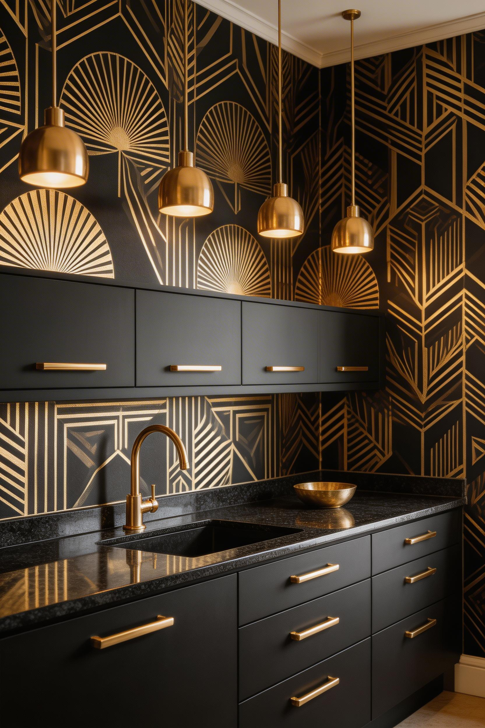
Graham & Brown’s Art Deco collection and Rebel Walls’ 180+ Art Deco designs for 2026 confirm the depth of interest in this direction. The most kitchen-functional versions are printed on vinyl or semi-gloss substrate — gold geometric patterns that can be wiped clean, which makes practical sense in a room where cooking happens. The geometric precision of Art Deco sits well alongside contemporary cabinet profiles — the pattern provides the period warmth that otherwise-minimal kitchens often lack.
Cabinet and Hardware Pairings
The three cabinet colours that work best with gold Art Deco wallpaper are black (the most dramatic — pure 1920s glamour), deep navy (more restrained, the gold cools into sophistication), and forest green (the most 2026-feeling combination — nature meets glamour, and the warmth of gold reads as organic against green rather than purely decorative). Matte black pendant lights and brushed brass handles are the hardware combination that closes the Art Deco kitchen look.
The critical restraint note: Art Deco wallpaper carries enough visual weight on its own. Resist adding period-appropriate accessories — angular vases, gold lamp bases, starburst clocks — that turn the kitchen into a themed installation. One or two deliberate accessories in the same palette (a matte black ceramic bowl, a single brass pendant over the island) are enough. The wallpaper establishes the character; the room doesn’t need to prove it.
14. Farmhouse-Friendly Brick and Shiplap-Effect Vinyl Wallpaper
Modern faux-finish vinyl wallpaper has come a long way from the unconvincing beige squares of its early incarnations. The best current versions use embossed surfaces with three to five colour tones per ‘brick’ or ‘board’, creating depth and variation that flat printing cannot. In a farmhouse kitchen where the aesthetic is being established by cabinetry, stone, and honest materials anyway, faux-finish vinyl adds texture and character at a fraction of the cost and weight of real reclaimed brick or tongue-and-groove boarding.
Brick-effect wallpaper performs best in warm, earthy tones — aged red brick, off-white whitewash, sandy stone texture. These suit the terracotta floors, stone worktops, and brass fixtures that define most farmhouse kitchens. Shiplap-effect wallpaper serves a lighter purpose. White or pale grey ‘boards’ lift the space and suit kitchens where the farmhouse look needs to feel coastal rather than fully rustic.
Scale matters for shiplap: boards at 10-12cm width look more convincing than wider versions, which can read as theatrical. Texture always works better as part of a considered material palette. Farmhouse kitchen decorations that balance rustic and refined covers the wider approach.
The finishes that make faux-finish wallpaper convincing: matte or low-sheen surfaces (never glossy), multi-tone printing that replicates natural material variation, and an embossed surface with real physical depth. The best test is to stand back three metres and squint — if it still reads as genuine, you’ve found the right product.
15. Peel-and-Stick Kitchen Wallpaper Inspiration for Renters
Peel-and-stick wallpaper is not the compromise it used to be. Brands like Tempaper, Rifle Paper Co., and NextWall now offer genuine design quality. Critically, their adhesive technology bonds well to smooth surfaces and removes without tearing plaster. For renters staring at landlord-beige walls, this is a significant development.
Tempaper — selected by Bob Vila as the top peel-and-stick brand — partners with designers and offers metallic and textured versions from $25-$50 per roll. Rifle Paper Co.’s hand-painted botanical designs run $65-$70 per roll and scan as premium traditional wallpaper at conversation distance. NuWallpaper ($20-$40 per roll) covers the affordable end with the widest range of patterns. For kitchen-specific applications, Rocky Mountain Decals offers splash-proof designs in woven-texture wall fabric — genuinely kitchen-appropriate material rather than regular adhesive vinyl.
Before You Apply
Smooth, cured painted walls are the only correct surface. Freshly painted walls (under four weeks) can reject adhesion; textured walls (orange peel, heavy knockdown) won’t bond at the raised points and will lift at the edges. In kitchens specifically, clean every wall with rubbing alcohol before application. Cooking grease is invisible on painted walls but makes peel-and-stick adhesive fail within weeks. Apply in sections rather than full floor-to-ceiling lengths for easier removal and future repositioning.
For the most convincing kitchen look, Tempaper’s tile collection replicates ceramic tile designs with moisture-tolerant adhesive. Livette’s Wallpaper — tested by The Spruce, New York Times, and Southern Living — is the most consistently recommended brand for kitchen longevity.
16. Watercolour Nature Prints That Soften Hard Kitchen Lines
The beauty of watercolour wallpaper is that it asks nothing of you. No coordination challenges, no dramatic lighting requirements, no risk of the room feeling themed. The soft, brushstroke-edged prints — in sage, dusty rose, sky blue, pale ochre — bring organic warmth to kitchens where personal matters more than polished.
Brands like Ondecor and Walls Republic have both built serious watercolour collections. Their pastel palettes hold well in kitchens that receive strong natural light. The visible brushstroke quality means each wall section looks slightly different. It reads more like original art than a repeating manufactured pattern. That quality makes watercolour wallpaper particularly effective in open-plan kitchen-diners. It reads as intentional whether seen from the kitchen or the dining space. For broader kitchen inspiration design ideas for bright, personal spaces, watercolour wallpaper is consistently one of the most versatile starting points.
Colour Families That Work in Watercolour Kitchens
The colour logic is straightforward. Sage green watercolour pairs naturally with white, cream, and warm wood — the most versatile choice across kitchens of every type. Dusty rose watercolour against cream or off-white cabinetry is warm, soft, and timeless without sweetness. Sky blue and pale cerulean give kitchens a coastal or Nordic quality, best with white cabinets and natural linen accessories. Pale ochre and warm sand extend the earth-tone trend into a softer, less saturated register.
For painted glass cabinet fronts — increasingly popular in contemporary kitchens — choose a glass colour that echoes rather than exactly matches the wallpaper: sage glass behind sage watercolour is tonal and cohesive; dusty pink glass behind sage watercolour creates a gentle complementary relationship. Brushed gold hardware ties both elements together with warmth. One lighting note: watercolour wallpaper needs warm-spectrum bulbs (2700-3000K). Cool artificial light drains the palette and turns sage and blush to grey.
Choosing Your Kitchen Wallpaper: Pattern, Scale, and Practicality
Sixteen options is either inspiring or overwhelming, depending on where you are in your decision process. So here’s a practical way to narrow it down.
Start with your cabinetry. Shaker and painted cabinets are the most forgiving. They work with almost every pattern on this list. Flat-panel contemporary cabinets work best with graphic geometric, Scandi folk, or Art Deco patterns. The clean lines suit structured prints. Rustic or distressed wood cabinets call for organic choices: botanicals, terracotta textures, hand-blocked prints. The period-matching principle almost always holds. Choose a wallpaper from the same design era as your cabinet style and coordination becomes instinctive.
Then consider your kitchen’s relationship with steam and humidity. Vinyl and non-woven are the only correct materials — not plain paper, which will warp and mould. Look for ‘washable’, ‘scrubbable’, or ‘moisture-resistant’ on the product spec — especially near the hob or sink. If your kitchen lacks a strong extractor hood, vinyl is the safer choice. In a well-ventilated kitchen, non-woven’s breathability is a genuine advantage.
Measure carefully: wall width and height, plus 10cm allowance in both directions. Calculate roll quantities using the supplier’s pattern-repeat guidance. Underordering means mismatched dye lots. Overordering is never a mistake.
Finally, order a sample and live with it on the wall for two or three days under different lighting conditions. Morning light, evening downlighters, cloudy days — all of these change how wallpaper reads. The sample is the only honest test — buy it before you commit to twelve rolls.