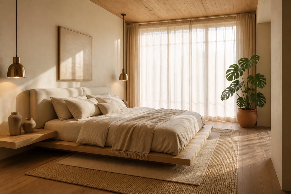
Beige is not a surrender. It is a decision — perhaps the most demanding one a bedroom can ask of you. In Japanese design philosophy, the concept of *ma* describes the meaningful pause between things: negative space that is not empty but charged with intention. The beige bedroom aesthetic operates on a similar principle. By removing colour as the primary design tool, every other element — texture, material, light, proportion — is asked to do more.
For those who see their home as a place for contemplation rather than display, this aesthetic represents a genuine philosophy. It draws from wabi-sabi’s acceptance of imperfection, from Japandi’s respect for natural materials, and from the universal instinct that a sleeping space should shelter rather than stimulate. These 16 ideas explore the full range of that beige bedroom aesthetic — from the material logic of layered linen to the philosophical act of editing a room down to its essential quiet.
1. Linen-Draped Layers for a Soft Beige Bedroom Aesthetic
There is a moment, usually on the third or fourth wash, when linen stops being fabric and becomes something else — softer, more alive, more itself. This is the quality that makes linen the foundational material of the beige bedroom aesthetic. Not the newness of it, but the promise it holds.

Belgian linen is the benchmark. It is made from long-fibre flax grown in EU mills and woven in Belgium. The hand is firm and fine — smooth without being slippery, crisp without stiffness. French linen from Normandy tends toward a lighter weight and a more relaxed drape. For the beige bedroom, the ideal is to work with both: an unwashed Belgian linen duvet cover over a stonewashed fitted sheet. The textural difference between them is perceptible to the eye and to the hand.
The layering itself is the art. A flat sheet folded back over the duvet. A merino wool throw draped asymmetrically across one corner. Two sleeping pillows in linen cases and one accent cushion in oatmeal cotton. Each element contributes without competing. If creating a cozy relaxing bedroom that supports deeper sleep is the goal, linen’s natural temperature regulation adds a practical reason to what is already an aesthetic one.
The common mistake is buying all-matching linen sets. The uniformity reads as sterile rather than layered. Choose cream for the duvet cover, natural for the flat sheet, oatmeal for the pillowcases. Within the same colour family, three tones give the bed the kind of complexity that takes years in a hotel room to achieve.
2. Warm Ivory Walls With Natural Wood Accents
Cool white is a trap. It looks serene in paint chips. On a bedroom wall under natural light, however, it reads as clinical. Worse, it makes warm-toned furniture and cream linen appear slightly yellow by comparison. The difference between cool white and warm ivory is undertones. In the beige bedroom aesthetic, undertones are everything.

Farrow & Ball’s Pointing is perhaps the most forgiving option. It is a chalky off-white with a gentle cream undertone. It reflects light in a flattering, shifting way — differently in morning sunlight than under evening lamplight at 2700K. Benjamin Moore’s Sail Cloth achieves something similar: a soft off-white with delicate beige undertones. For more warmth, Putnam Ivory’s peach and orange undertones tip the walls toward gold.
Against these walls, natural wood accents provide the grounding that pure ivory alone cannot. White oak — warm in honey-to-grey tonal range, open-grained — sits naturally against cream walls. It does not introduce colour. Walnut’s deeper chocolate tones anchor the room without heaviness. The key is undertone: avoid woods with strong red or orange casts next to warm ivory walls. The two warm undertones compete rather than harmonise.
Before committing, test paint in a sample of at least 30cm x 30cm on the actual wall. Check it at morning, afternoon, and evening lamp temperature. For a complete guide, exploring bedroom paint colors for your sleep sanctuary gives a broader sense of how neutral tones behave in bedroom conditions.
3. Cream Linen Bedding and Textural Throws for Sensory Depth
The all-cream bedding scheme is often misunderstood as monotonous. In practice it is the opposite. By eliminating colour as a tool, it makes texture the only available language. And texture, in a room lit by warm light and filtered through natural materials, turns out to be endlessly articulate.

Percale weave at 180–220 thread count is matte and crisp. It folds with clean edges and holds its shape. Sateen has a slight sheen — enough surface reflectivity to catch light differently than percale. Linen is visibly irregular, with slubs and colour variations within a single sheet. Layer these three weave types in the same cream colourway. The bed becomes a surface worth looking at — a study in how light behaves differently across different planes.
The throw is where the scheme gains warmth. A merino wool throw at 400–600g/m² drapes and pools naturally at the foot of the bed. It has the quality of something draped rather than arranged. Waffle cotton is lighter and cooler. Its grid-relief texture casts miniature shadows in morning light. One throw is usually enough; two competing textures at the bed’s foot tips the arrangement from layered to cluttered.
For arrangement: the asymmetric fold is more truthful to the aesthetic than hospital corners. Fold the duvet top back by one-third, at a slight angle rather than perfectly straight. The bed should look as though someone just got out of it thoughtfully — not as though it has been staged for a catalogue.
4. Wabi-Sabi Neutral Bedroom Aesthetic: Embracing the Imperfect
The term comes from two Japanese words held in productive tension. *Wabi* refers to sobriety, humility, and the beauty of simple living. *Sabi* speaks to the passage of time and the patina it leaves on materials. Together they describe something that most design philosophy actively resists: the idea that wear, irregularity, and imperfection are not problems to be solved but qualities to be sought.

In the bedroom, wabi-sabi translates practically. A limewash wall develops uneven tonal depth as it ages. No two limewash walls are identical — the material reacts with the substrate and the humidity of the room over years. This variation cannot be manufactured. A worn wooden stool beside the bed carries more presence than a new one. Raw linen softens unevenly with use. The areas of most contact soften first, creating a gradual record of the body’s presence in the room.
Axel Vervoordt, who brought wabi-sabi to international interior design attention, speaks of the ‘patina of time’ — the traces left by years and the authenticity of raw materials. What things are made of matters in a way that what they look like does not. This is the wabi-sabi bedroom’s essential philosophy. It connects directly to the Japanese design sensibilities applied across different room contexts: the material is always the message.
So resist the urge to replace a slightly worn piece with a new one. Resist matched furniture sets. Let one bedside table be higher than the other. Allow the linen to crease. The room’s quality comes not from its perfection but from its willingness to record the life lived in it.
5. Rattan Furniture and Woven Accents for Organic Warmth
Rattan’s honey tone is, in the strictest colour sense, a warm neutral. It is a deeper expression of the beige palette rather than a departure from it. This is what allows it to work in the beige bedroom without introducing contrast. It deepens the warmth of the room rather than competing with lighter linen and ivory wall tones.

The distinction from bamboo and cane matters. Bamboo has a slightly greenish cast and a more regular, jointed surface. Cane is processed to uniformity. Natural rattan retains visible tonal variation across its surface — lighter where the stem tapers, darker at the nodes. That variation is precisely what gives it warmth. In the beige bedroom, it reads as a richer, more sculptural version of the cream and oatmeal palette.
A rattan headboard is the strongest single statement. An arched frame, approximately 130cm high above a queen mattress, introduces material and form without colour. Keep rattan to one primary piece — headboard or bedside table, not both. Pair it with a linen-upholstered element nearby to pull it into a more restrained context. A rattan pendant shade achieves the same warmth without the visual mass. The key is not to overdose: one piece reads as a material note, a full matched set reads as a theme.
6. Japandi Style in Beige: Minimalist Forms in Warm Neutral Tones
Japandi is not a merger of two aesthetics — it is a resolution of their apparent tension. Japanese design brings the philosophy: negative space, impermanent materials, the idea that a room should shelter the mind as much as the body. Scandinavian design brings the warmth: natural materials, tactile softness, the acceptance that a room must also be comfortable, not only beautiful to look at. Together they produce something calm without coldness, minimal without austerity.

In the beige bedroom, Japandi translates most clearly through furniture proportion. The low platform bed — at 25 to 35 centimetres from floor to frame — is the defining piece. It lowers the visual centre of gravity. It makes the ceiling appear proportionally higher. It brings the room’s horizontal line down toward the floor in a way that reads as intentional repose. This connects to the Japanese floor-level living tradition. It also connects to the bedroom design aesthetic where Eastern and Western design influences converge toward the same essential warmth.
For material selection, solid hardwood is non-negotiable. The bed frame should be white oak, walnut, or ash — with a finish that shows the grain rather than concealing it. Heavy varnishes and painted finishes mask the wood’s character. A natural oil finish or light matte lacquer preserves the grain while protecting the surface. Bedside furniture at 45–50cm height keeps the horizontal proportion intact. Above all, resist the impulse to add: Japandi is edited by definition.
7. Aged Ceramics and Stone as Quiet Bedside Companions
The bedside surface is the room’s most intimate zone. It is the last thing seen before sleep and the first encountered on waking. In the beige bedroom aesthetic, this surface works best when it carries objects of material quality rather than visual novelty. Ceramics and stone have a density that lighter materials lack. They settle into a room rather than floating above it.

For the beige bedroom palette, three ceramic families work well. Korean celadon has a distinctive jade-green glaze over grey stoneware. In a cream and oatmeal room, this quiet green reads as an extremely subtle accent — close to the note a living plant would make, without the maintenance. Japanese stoneware, fired at 1200–1300°C, often features deliberately irregular glazing. Uneven colour, small runs, asymmetric form. These are intentional marks of craft quality rather than defects. Sand-coloured and unglazed terracotta pieces are the safest entry point: their warm earthy tone extends the palette without adding to it.
Group ceramics in threes: one anchor piece (tallest, most visually complex) with two supporting objects of different heights. Vary the surface quality — one unglazed, one with a matte glaze, one with a slight sheen. Each surface reflects light differently. The group holds interest across different times of day. Avoid matching pairs: two identical ceramic vessels read as product placement. And product placement is the opposite of collection.
8. Terracotta Tones That Deepen a Beige Bedroom Aesthetic Palette
There is a particular quality that terracotta brings to a beige room: it warms the whole palette by association. The surrounding beige reads differently — fuller, earthier, more settled — when a clay-toned object or textile is nearby. This is not colour contrast. It is colour deepening. Terracotta and beige belong to the same earthy family. Placing them together makes each more fully itself.

The ratio matters precisely here. The 60-30-10 colour rule in standard form suggests 30% for a secondary colour. In a beige bedroom aesthetic, however, terracotta at 30% tips the room into terracotta territory. Keep terracotta to 10–15% of the palette’s visible surface. One terracotta cushion among cream cushions. One ceramic vessel on the bedside. One small framed print in rust and raw umber. That is approximately the right weight for a queen or king bedroom.
The choice of neutral base matters, too. Warm neutrals — beige, cream, taupe — allow terracotta’s natural clay quality to come through cleanly. Cool greys and stark whites make terracotta appear muddy. The clay pigment is dulled rather than deepened. When terracotta is sitting well in a room, it looks like the earth version of everything else. When it’s sitting wrong, it looks like a mistake. The difference is almost always the undertone of the surrounding neutral.
9. Sheer Linen Curtains That Let Morning Light Define the Room
In the beige bedroom aesthetic, the quality of morning light is a design material as real as the linen on the bed or the wood in the furniture. Blackout curtains eliminate it. The room becomes a neutral box. The warm qualities of its palette are invisible until artificial light is switched on. Sheer linen curtains do something more interesting. They translate harsh direct sun into diffused warmth. They cast the room in soft, shifting light that makes ivory walls glow and cream textiles deepen toward gold.

Sheer linen at 100–150g/m² is heavier than cotton voile but lighter than standard furnishing linen. It drapes and has body enough to hang cleanly. Also, it is not opaque. The natural colour of undyed or very lightly bleached linen reads as cream or warm white when backlit. This warm glow is not incidental — it is the primary quality you are choosing. Pure white sheers, by contrast, can read as cool against warm ivory walls.
Hanging technique is the detail most often overlooked. The curtain rail should sit within 5–10cm of the ceiling, not at the window frame. Extended 20–30cm beyond the glass on each side, the panels stack completely clear of the window when pulled back. At this height and width, a standard window becomes a floor-to-ceiling feature. The room’s apparent ceiling height increases without any structural change.
10. A Linen Upholstered Headboard as the Room’s Quiet Anchor
The headboard’s job in the beige bedroom is different from its job in a more colourful scheme. It does not provide contrast or introduce pattern. Instead, it provides definition. A linen-upholstered panel gives the bed visual framing without the visual weight of solid wood. Its matte, textured surface absorbs rather than reflects light. It sits quietly against the wall while still registering as a distinct element.

Flat panels are the most architecturally honest option. No tufting, no quilting — simply the linen surface at scale. A flat panel in natural or oatmeal linen reads as almost part of the wall: present, grounding, but not decorative. Channel quilting (vertical or horizontal seamed channels, usually 8–10cm apart) adds subtle structure without visual complexity. It is the midpoint between architectural restraint and tactile warmth. Button tufting, though classic, creates a more traditional read that can work against the contemplative quality of the beige aesthetic.
Proportion matters more than most designers admit. A headboard should extend slightly beyond the bed frame — not the mattress, which varies, but the frame itself. For a queen frame at approximately 160cm wide, a headboard of 170–180cm allows the frame to read as contained and grounded. For height: 100–120cm above the mattress registers the headboard as architectural in a standard 240cm ceiling. For a curated bedroom art aesthetic that considers how every surface contributes to the room’s overall quality, the headboard is the starting point.
11. Cream Bedroom Aesthetic: Art and Objects With Sepia Depth
The challenge of art in a cream bedroom is selecting pieces that contribute to the room’s settled quality rather than interrupting it. Saturated colour prints draw the eye continuously. Even a small frame, even a beautiful image, will pull attention toward it in a room that is otherwise asking the eye to rest. The solution is not to avoid art. It is to choose it within a restricted register: sepia, ecru, sand, soft grey, and the warm browns of antique paper.

Antique botanical illustrations work particularly well. Their warm ink on aged paper sits within the beige family naturally. Moreover, their subject matter — plants, seeds, root systems — introduces a quiet reference to the natural world without bringing actual colour into the room. Sepia-toned photography of landscapes or architecture achieves the same palette without botanical specificity. Abstract line art in single ink on cream stock reads almost as part of the wall surface at a distance — the image resolves only on close approach.
Gallery wall arrangements in the beige bedroom aesthetic should be restrained. Three to five frames, aligned by a single horizontal axis (tops or centres), with generous space between them. A single frame finish — thin natural wood, or fine aged brass — unifies a varied print selection. Warm-toned frames prevent black-and-white photography from reading as cool in a warm room. The most common mistake is too many frames and too little wall visible between them. In this aesthetic, the wall is part of the composition.
12. Trailing Plants as Gentle Contrast in Neutral Bedrooms
A single plant in a beige bedroom is an event. It introduces the only true green in a palette that has otherwise excluded colour. Placed well — in a corner that was purposefully empty, or on a high shelf where it can trail — it reads as a considered punctuation mark. The Japanese principle of *ma* applies here as directly as anywhere else in the room. The empty corner that contained nothing becomes more expressive once a single plant occupies it. The surrounding emptiness now has something to define itself against.

The monstera deliciosa is the natural choice for this role. Its split leaves are architecturally specific — the fenestrations that develop on mature specimens are unlike any other houseplant. At floor level in a corner, a monstera operates at the scale of furniture. It prefers indirect light and tolerates lower light conditions. A golden pothos, in a room with limited natural light, trails beautifully from a high bracket or shelf. It cascades downward unhurried and directional.
In both cases, the planter is the material decision. Terracotta is the correct choice. Its porous clay regulates soil moisture. Its warm earthy tone sits within the beige palette without adding new colour. Handmade terracotta with visible throwing marks carries the wabi-sabi quality the rest of the room is working toward. A glossy white ceramic planter, by contrast, introduces coolness and clinical precision — both qualities the beige bedroom aesthetic actively avoids. One plant. Not five. The difference is between a considered note and a collection.
13. Muted Gold and Aged Brass Lighting as Warm Focal Points
Of all the decisions in the beige bedroom, lighting is the one most often approached as a practical consideration rather than an aesthetic one. This is an error. The warmth of every surface in the room — the honey of rattan, the cream of linen, the ivory of the walls — is dramatically altered by colour temperature. At 2700K, those surfaces glow. At 4000K, which some manufacturers label ‘warm white’ without the Kelvin figure, the same surfaces turn grey.

Aged brass belongs to the warm neutral family as naturally as beige itself. Its patinated finish — yellowish-gold with brown tones — reads as a warm neutral rather than a shiny metal. Polished brass is different. Its high reflectivity and orange-intensity makes it assertive in a room asking all elements to be quiet. Aged, unlacquered, or matte brass is the version that sits within the beige aesthetic without competing.
Pendant lights above the bedside replace table lamps entirely. They free the surface below — a significant aesthetic benefit as much as a practical one. The shade diameter should be approximately one-third the width of the bedside table: a 40cm shade above a 50cm table. The bottom of the shade should hang at approximately 140–150cm from the floor — eye level when sitting up in bed, where reading light needs to land. Also, avoid exposed filament bulbs. Their moment has passed. More importantly, they draw the eye to the light source itself rather than allowing light to distribute into the room.
14. Layered Rugs That Build a Beige Bedroom Aesthetic From the Floor Up
The floor layer is where most beige bedrooms fail before they have begun. A hard floor without a rug — regardless of how considered the walls, bedding, and furniture are — creates acoustic harshness and visual coldness. The rest of the room cannot compensate for it. Equally, one thin rug placed as an afterthought under the bed fails the same test. The floor layer demands as much consideration as any other surface.

Jute is the correct base. It is softer than sisal — critical for bare feet at the bedside. Its slightly irregular surface texture reads as organic rather than manufactured. Its warm honey tone deepens slightly in evening lamplight. The base rug should be substantially larger than instinct suggests. A queen bed at 153cm wide needs a base rug of at least 270cm width. That extension of 60cm on each side is the minimum for the rug to be felt underfoot when getting out of bed.
For the layering itself — which shares its logic with the textile layering principles used in other bedroom styles — the top rug should be approximately two-thirds the size of the base. A 160x230cm wool topper over a 240x330cm jute base creates a clearly layered zone. The topper’s softness provides the comfort that jute alone cannot. Use a non-slip pad between the layers to prevent shifting. Size is the most common mistake. A 160x230cm rug in a room with a queen bed ends at the bed edge. It leaves bare floor where feet actually land.
15. Driftwood, Jute, and Raw Linen: The Natural Material Triad
The triad is the smallest unit of material diversity that creates genuine depth. One natural material in a room reads as a material choice. Two reads as a pairing. Three reads as a considered material philosophy. The particular combination of driftwood, jute, and raw linen works because each contributes a different quality — roughness, woven warmth, soft drape — while all three share the same bleached-and-earthy colour family.

Driftwood enters the room as sculptural object: a photo frame, a lamp base, a small wall panel. Its bleached, weathered surface records time and weather. It has the wabi-sabi quality of being irrecoverably itself — impossible to fake with manufactured distressing. Jute appears in the floor (as the base rug layer), in storage baskets beside the bed, and as the lining of a lamp shade. Its warm honey weave is functional and beautiful simultaneously. Raw linen is the draped layer: the lampshade, the Roman blind, the throw, the pillowcase in natural undyed linen that shows the fibre’s irregularity most clearly.
All three materials pair well with aged brass. That adds a warm metallic note without introducing colour. Together — driftwood, jute, raw linen, and aged brass — they create a material vocabulary self-consistent and deep enough to carry a room from floor to ceiling. No synthetic material belongs in this grouping. The visual coherence breaks the moment a glossy lacquer or plastic element enters the material conversation.
16. The Warm Neutral Bedroom Aesthetic: Editing for Lasting Calm
Research in environmental psychology is unambiguous: physical clutter raises cortisol levels. The brain reads an unorganised environment as unfinished business. It cannot properly rest in the presence of unfinished business. The beige bedroom aesthetic is, among other things, a response to this reality. Its calm is not purely visual — it is physiological.
The Fragility of Neutral Calm
The calm of a warm neutral bedroom is fragile. A charging cable draped across the bedside. A second water glass left from last night. A skincare collection arranged by size on the dresser. A stack of books that has grown horizontally across a surface. Any one of these is a small thing. Together, they constitute visual noise that the warm ivory walls and cream linen cannot absorb. The eye finds the chaos. The room’s quality is gone.
The one-in-one-out rule is the maintenance system for this aesthetic. When a new object enters the room — a new cushion, a new candle, a new book on the bedside — one existing object leaves. Not necessarily to storage. Out of the room. Applied consistently over months, this rule ensures every object is present because it earned its place by replacing something less loved.

The Photography Test
The practical tool is photography. Stand at the bedroom door. Photograph the room at eye level — this is the view the room gives, and the view the eye registers first each morning. The camera flattens the space. It reveals clutter that the adapted eye has learned to ignore. If the photograph reveals objects that do not belong to the beige bedroom aesthetic — even just two or three — remove them before adding anything new.
The Japanese principle of ma (negative space) is most visible in the editing. An empty stretch of wall. A clear bedside surface except for one lamp and one object. A floor with nothing on it. This is, ultimately, the same lesson that wabi-sabi has been teaching for centuries: a room is most eloquent when it contains only what is necessary.
Choosing Your Beige Bedroom Aesthetic: Where to Begin
The instinct when confronted with sixteen ideas is to want all of them immediately. Resist it. The beige bedroom aesthetic is built incrementally — layer by layer, decision by decision — and rooms assembled in a single shopping session rarely achieve the quality that rooms assembled over seasons do.
Start with bedding. A new set of linen bedding in cream or oatmeal has a higher immediate visual impact than any single furniture purchase. It costs less than a new headboard and requires no installation. For a week, live with the new bedding before adding anything else. Notice what the room still needs.
In month one, add one natural material accent. A jute rug, a rattan pendant shade, or a set of beige stoneware vessels — chosen based on what the observation period revealed, not what seemed most appealing in isolation. Then stop again. Let the room show its next gap.
The one-in-one-out rule is not just a maintenance strategy for an established beige bedroom aesthetic. It is also the building strategy. Add one, assess, decide. The rooms that most closely express this aesthetic are built by this slow, deliberate process. They contain less than you would expect. And they hold more than you would think possible.