Blue has been working hard in kitchens for decades. It is one of the few colours that sits comfortably across every design register — from powder-pale farmhouse to near-black contemporary. Whether you are adding a single accent or committing to full cabinetry, blue kitchen ideas cover more ground than any other colour category. The question is no longer whether blue works. It is which blue, applied how, and alongside what.
These fifteen blue kitchen ideas span the full spectrum of commitment. Some you can test for under £100. Others will define the room for a decade. But before anything else: please test paint samples in your actual kitchen before ordering. Natural light reveals colours that showroom lighting conceals. I have watched too many homeowners fall in love with a navy chip under fluorescent bulbs, only to find something distinctly bruised on their actual wall by Tuesday afternoon. Test first. Everything follows from that.
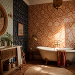
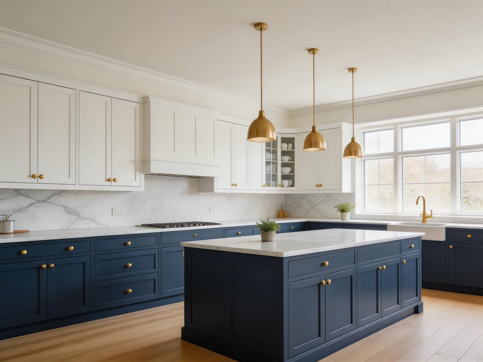
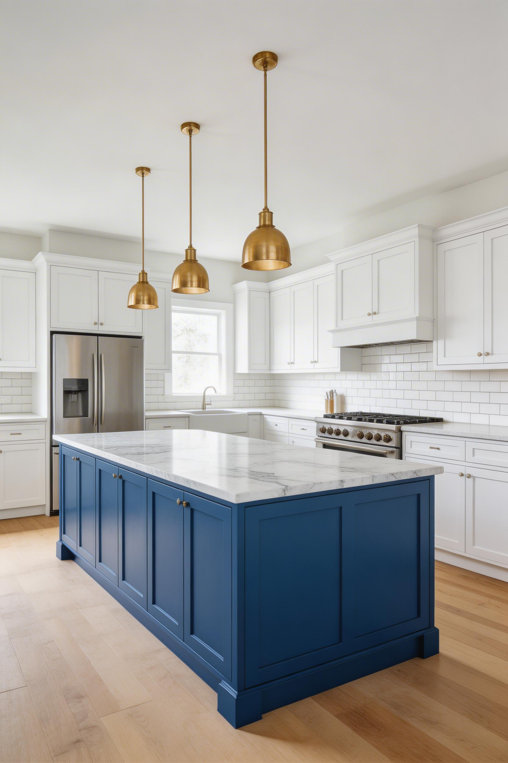
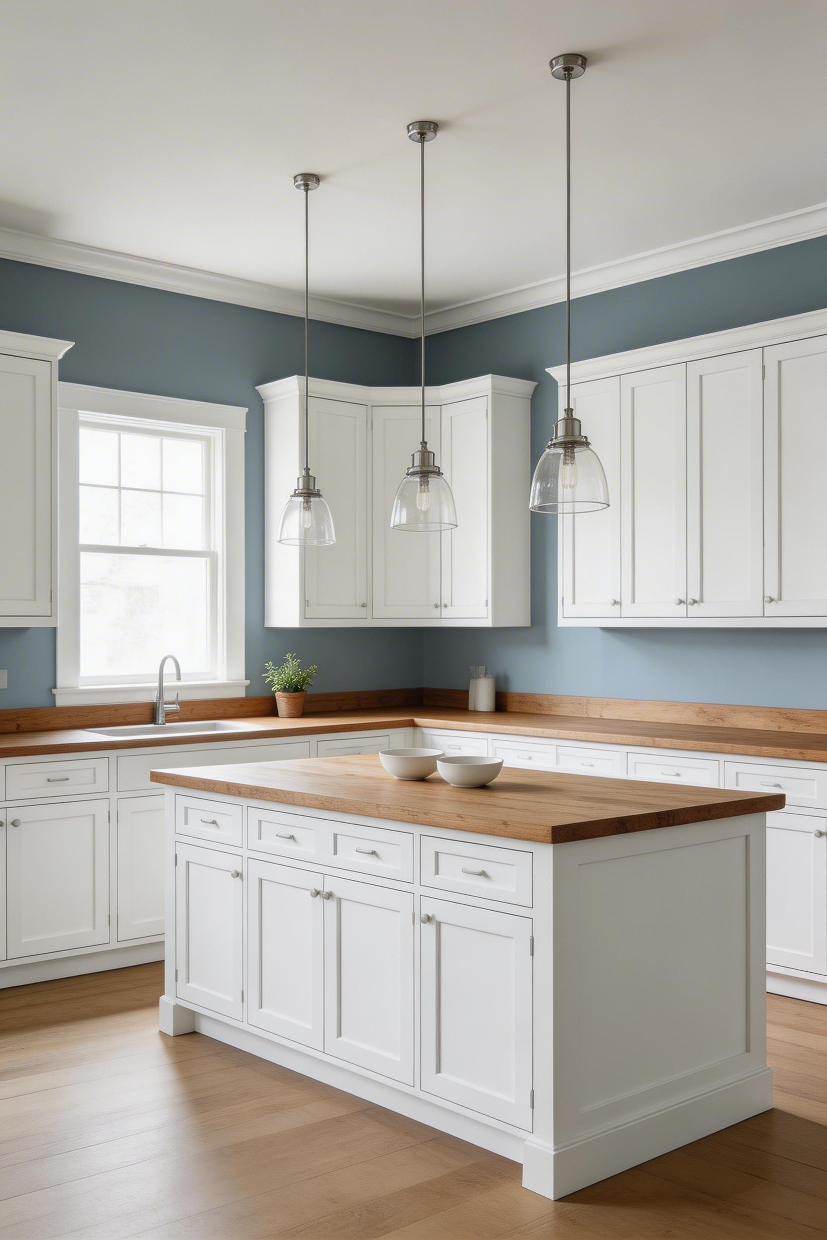
1. Navy Blue Lower Cabinets Paired with White Uppers
Navy has earned its place as the default ‘serious blue’ for kitchens. It works like a neutral — low-saturation enough to recede from the main conversation, yet deep enough to deliver real colour presence. That is exactly what the lower half of a kitchen needs.
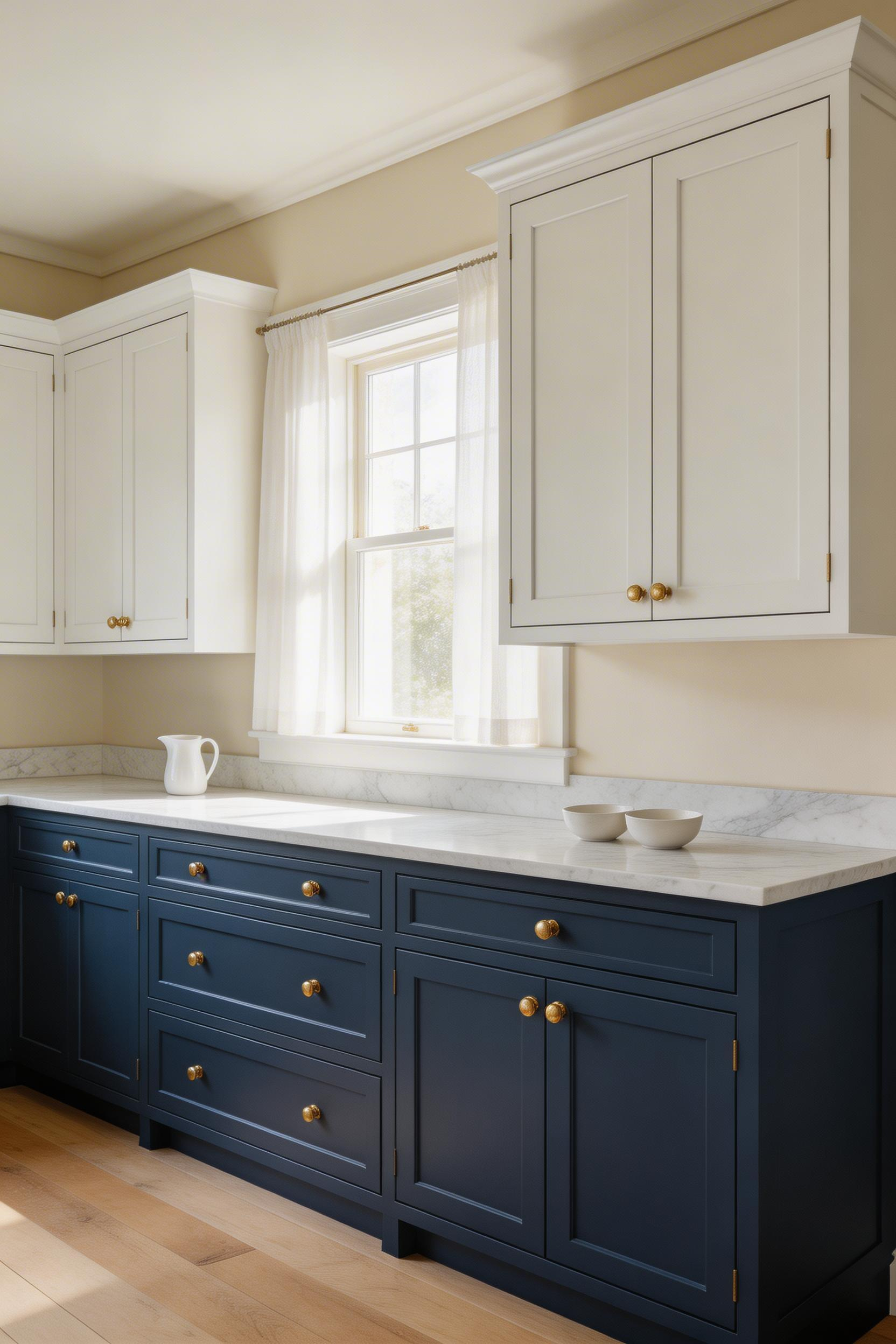
The two-tone approach has practical logic behind it. Lower cabinets take more abuse than uppers — cooking splashes, shoe scuffs, and daily contact all land at base-cabinet level. Darker paint hides marks better. It extends the time between repaints by several years, which for kitchen cabinetry can cost £200–£600 in paint and labour. So the navy-lower/white-upper combination is both aesthetically considered and sensible maintenance planning.
Why This Specific Combination Works
The visual principle is Gestalt design logic. Darker tones at floor level and lighter tones near the ceiling create a grounded, stable composition. Heavier visual weight sits low; lighter weight sits high. The room reads as proportionally correct rather than top-heavy. Also, keeping the upper cabinets white means the ceiling appears higher than it is. There is no visual break between cabinet and ceiling, so the eye reads the upper half as open space.
For paint, Farrow & Ball Hague Blue (No. 30) is the most referenced navy for UK kitchen cabinets. It has a green undertone that prevents it veering violet in changing light, and it reads as near-charcoal in dim conditions. In the US, Sherwin-Williams Naval (SW 6244) is the practical equivalent — truer navy without the green undertone. A 2023 Houzz Kitchen Trends Study found that 28% of remodelled kitchens used a two-tone colour scheme, up from 18% in 2019. Blue was the most common choice for the darker half. That is not a fading trend. It is a design approach that has moved into the permanent mainstream.
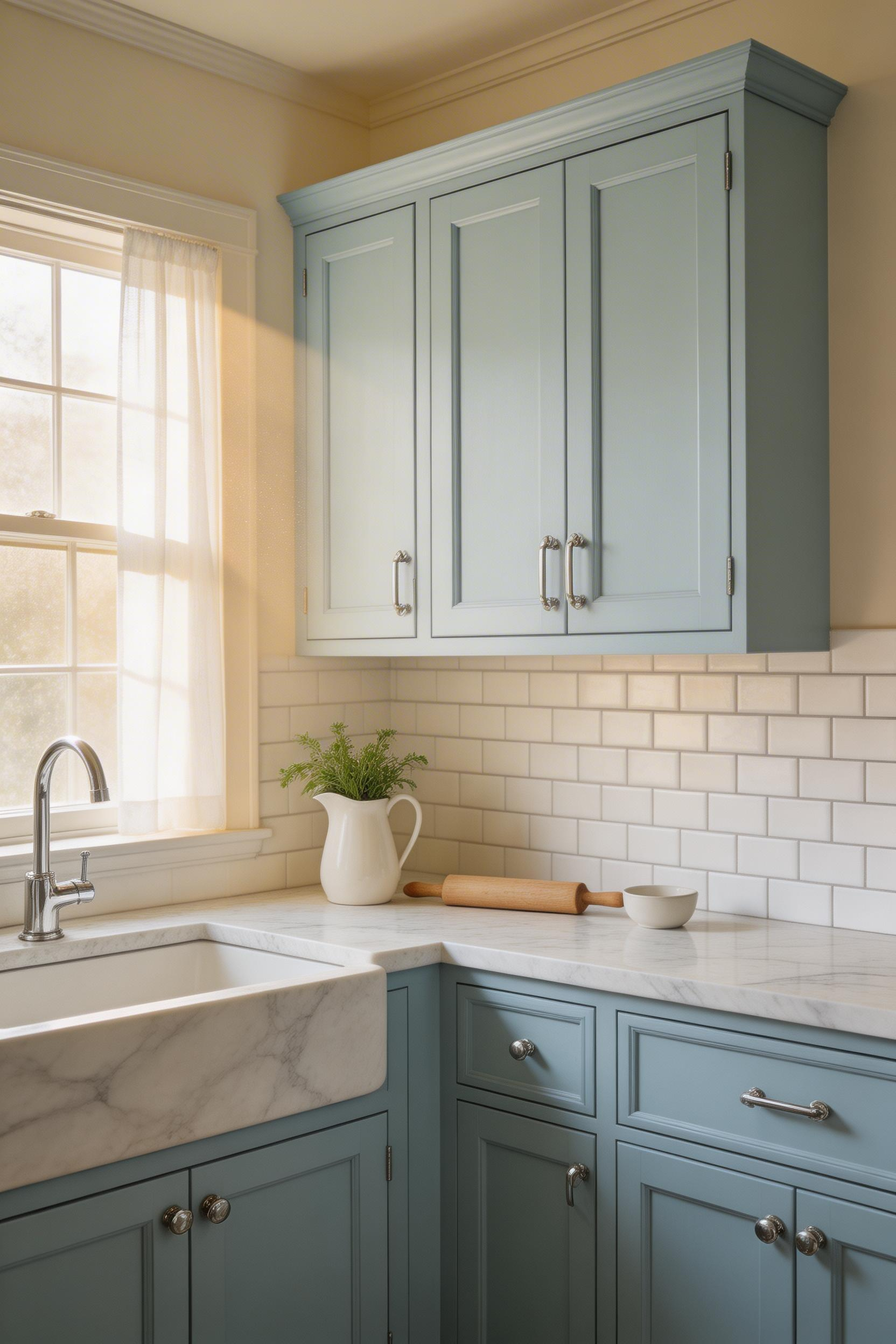
2. Powder Blue Shaker Cabinets for a Soft, Approachable Feel
Powder blue is what happens when navy is placed in a very good mood. It carries the credibility of blue kitchen design without the weight. That makes it especially useful in kitchens that do not receive a full day of direct sunlight. In a north-facing room, powder blue reads as calm and airy. Navy in the same conditions can feel oppressive.
The Light-Dependent Nature of Powder Blue
Here is what showrooms will not tell you: powder blue looks significantly different under fluorescent retail lighting than under a grey British sky. The desaturated quality that reads airy in a well-lit room can shift mauve or slate-grey when the weather closes in. Farrow & Ball Lulworth Blue (No. 89) is the classic reference. It is beautiful in south-facing rooms with warm afternoon light. In north-facing kitchens, try Little Greene’s Sky Blue Light or Benjamin Moore’s Air Blue (2060-60) instead. Both read more steadily blue across different light conditions.
The Shaker door profile pairs especially well with powder blue. The flat centre panel and framed surround give the colour shadow variation across the door face — creating depth that a flat slab door cannot achieve. With pale colours, that shadow detail matters. With navy or dark teal, the shadow is absorbed into the depth of the colour and becomes invisible.
The Paint and Decorating Retailers Association (PDRA) reported that ‘soft blue’ was the second most-requested kitchen colour after white in 2023, at approximately 14% of kitchen paint purchases. Executing it well means choosing the right shade for your specific light conditions — not simply picking the most popular option in the brochure.
3. Cobalt Blue Kitchen Island as a Single Statement Piece
Cobalt is the blue that wants to be noticed. It sits in the saturated middle of the blue spectrum — more vivid than navy, less gentle than powder blue. It announces itself immediately in a room. But that announcement works best when it is the only loud voice speaking.
The Case for Putting All Your Colour in One Place
The statement island approach emerged around 2016–2018 and has stayed relevant because it solves a real problem: how to introduce bold colour without overwhelming a room. By restricting cobalt to one piece, the colour reads as furniture rather than architecture. You are placing a vivid object in a neutral room — not painting the walls of a vivid room. The psychological difference is significant. Bold colour on a cabinet or wall reads as a decision about the room. Bold colour on a piece of furniture reads as a decision about a single object.
This also means the stakes are lower. A freestanding island can be repainted. Even built-in islands are far more easily recoloured than a full cabinet run. Among blue kitchen ideas, this is high-impact at medium commitment.
Cobalt needs careful pairing: white or cream perimeter cabinets, natural stone or marble on the island surface, and either brass or matte black hardware. Annie Sloan Chalk Paint in Napoleonic Blue is the standard DIY approach for painting an existing unit. A 2024 Rightmove survey found that contrasting island colours added an average 2–4% to perceived UK property value versus all-one-colour kitchens. The cobalt island is not just aesthetically considered. It may also be financially sensible.
4. Duck Egg Blue Cabinets with Unlacquered Brass Hardware
Duck egg is not quite blue and not quite green. That is exactly why it works so well. The yellow-green undertone brings warmth that pure blues lack. It also creates a natural alignment with unlacquered brass — hardware that develops a living patina over years of regular handling.
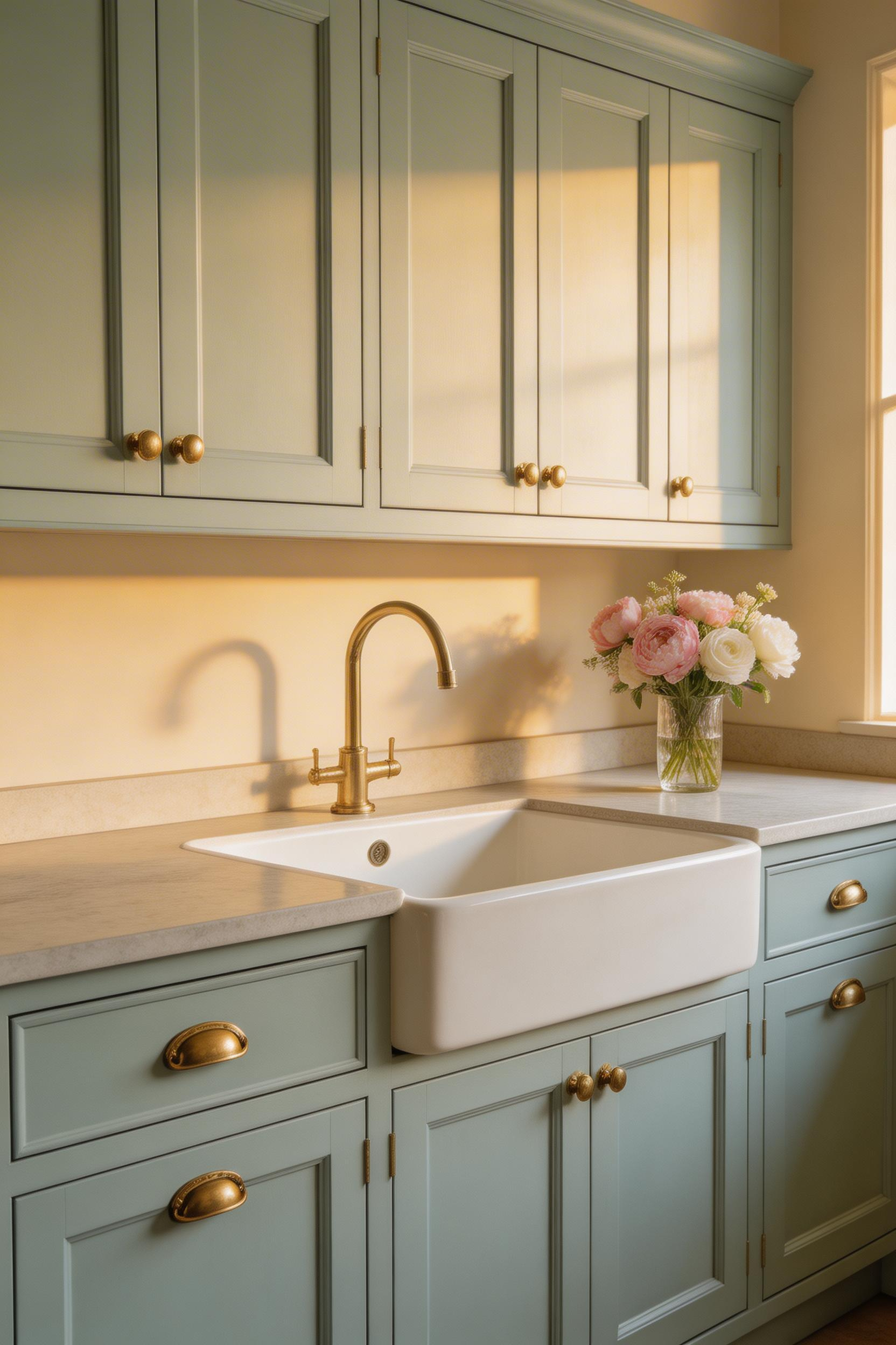
The combination works because of colour chemistry. Duck egg contains yellow-green in its base, and brass is a yellow-gold alloy. Both sit in the warmer half of the colour spectrum. When paired, the undertones reinforce rather than compete — creating harmony that feels considered but not calculated. This is the combination that the traditional British country kitchen has been built around since the 1980s. It has stayed current because it is rooted in actual colour theory rather than fashion.
Choosing Between Patinating and Polished Brass
Unlacquered brass is the better choice here. It develops a patina over 1–3 years of handling — shifting from bright gold to a deeper, more complex amber. Lacquered brass remains bright and new-looking indefinitely. That is fine in a contemporary context. But it reads stiff in a kitchen designed around organic, heritage materials. Armac Martin’s Burlington range (£18–£35 per handle) is the standard UK recommendation. For a more contemporary profile, Buster + Punch’s brass cup pulls maintain the unlacquered finish with a less traditional silhouette.
Farrow & Ball Dix Blue (No. 82) was in their top 10 most-purchased kitchen colours every year from 2016 to 2023. However, it is a light-dependent colour. Duck egg reads warm and coastal against a south-facing window. In a dim basement flat, the same paint reads dingy and greenish. If your kitchen receives fewer than four hours of natural light daily, powder blue is the safer choice.
5. Deep Teal Blue-Green Cabinets for Dramatic Depth
Teal is where blue kitchen ideas stop being polite. It sits on the boundary between blue and green — approximately 170–185° on the colour wheel. That position gives it a character that pure blues do not have: a complexity that shifts with the hour and the intensity of the light.
Teal and the Case for Natural Materials
Deep teal is demanding when it comes to the materials alongside it. It needs the contrast of warmth to work well. Natural oak, walnut, stone, or linen provide the grounding it needs. Pair deep teal with stark white and chrome and it reads cold, even clinical. Pair it with brushed brass and a walnut countertop and it reads expensive and considered. The countertop does as much work as the paint colour itself with this particular shade.
Farrow & Ball Inchyra Blue (No. 289) is the most referenced deep teal for kitchens. It sits right on the blue-green boundary and reads blue in cool light, then perceptibly green in warm afternoon light. That shifting quality is also its design risk. In a kitchen with inconsistent or harsh artificial lighting, the colour can appear to change dramatically from morning to evening.
Also, deep teal requires more coats than lighter blues. Expect three coats minimum over primed surfaces, sometimes four. The high pigment load extends drying time significantly. Pinterest Predicts 2023 recorded a 67% increase in saves for ‘teal kitchen’ compared to 2021. That is strong sustained interest — not a trend already on its way out.
6. Blue Subway Tile Backsplash to Add Colour Without Commitment
The backsplash is the most forgiving surface for colour experimentation. It covers a fraction of the cabinet area, it is not structural, and it can be retiled in a day. Among blue kitchen ideas, this is the deliberately accessible entry point.
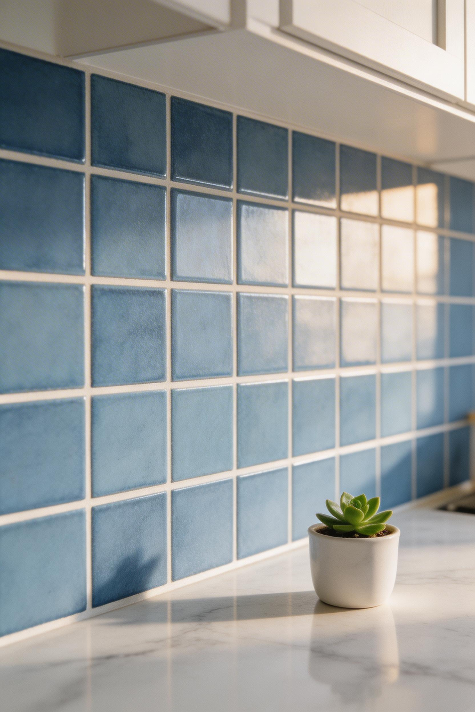
Subway tile has been a kitchen standard since the early 20th century. The format originated in the New York City subway stations designed by Heins & LaFarge in 1904. The 3×6 inch brick format became domestic standard in the 1930s and has never left. Blue glazed subway tile saw a significant resurgence from approximately 2015 onwards. Handmade and reactive-glaze versions now represent the premium end of the category.
The Handmade Versus Factory Tile Question
The key decision is handmade versus factory-produced. Handmade subway tile — like Bert & May’s Brick tile in Ink (from £95/m²) — has slight variations in size, glaze depth, and surface texture. These variations catch light differently across the surface. The result is a depth that flat-glazed factory tile cannot replicate. Factory tile is consistent, predictable, and significantly cheaper at £22–£40/m² from mainstream retailers. Both are genuinely good options for different purposes. If you are tiling a backsplash you plan to keep for fifteen years, handmade tile is worth the premium. If you are making a practical, affordable choice in a rental, factory tile is the obvious answer.
Blue glazed subway tile searches increased 43% from 2020 to 2023 according to Google Trends. For kitchen backsplash design that stays relevant for a decade, blue tile has both the design history and the current momentum.
7. Slate Blue Painted Walls in a White-Cabinet Kitchen
Sometimes the best blue kitchen idea is not applied to the cabinets at all. Painting the walls rather than the joinery keeps all options open. Walls repaint in a weekend. Cabinets require preparation, primer, finish coats, and several days of cure time. Slate blue on the walls is also a fundamentally different design statement than slate blue on cabinets.
Slate blue sits in the desaturated, grey-leaning part of the blue spectrum. Because of that low saturation, it behaves as a sophisticated neutral rather than as a colour statement. It recedes behind white cabinetry, making the joinery appear crisper and pop forward. The overall effect is ‘framed’: the room looks as though it has been art directed without a single cabinet being painted.
When Walls Do the Work
The key technical point for wall paint in a kitchen is the finish. Eggshell is the right choice near cooking areas for wipe-clean practicality. However, it reads slightly shiny on large wall surfaces. A scrubbable matt finish — the type sold specifically as ‘kitchen and bathroom paint’ — balances durability with a less reflective surface. Farrow & Ball Parma Gray (No. 27) is the definitive pale slate blue for walls. It reads as almost white with a blue warmth at a distance. In the US, Benjamin Moore’s Quiet Moments (861) is the direct equivalent. A 2023 Dulux survey found that ‘blue-grey’ was the fastest-growing kitchen wall colour, growing 31% year on year in UK paint sales. The appeal is clear: colour personality without the cost of cabinet repainting.
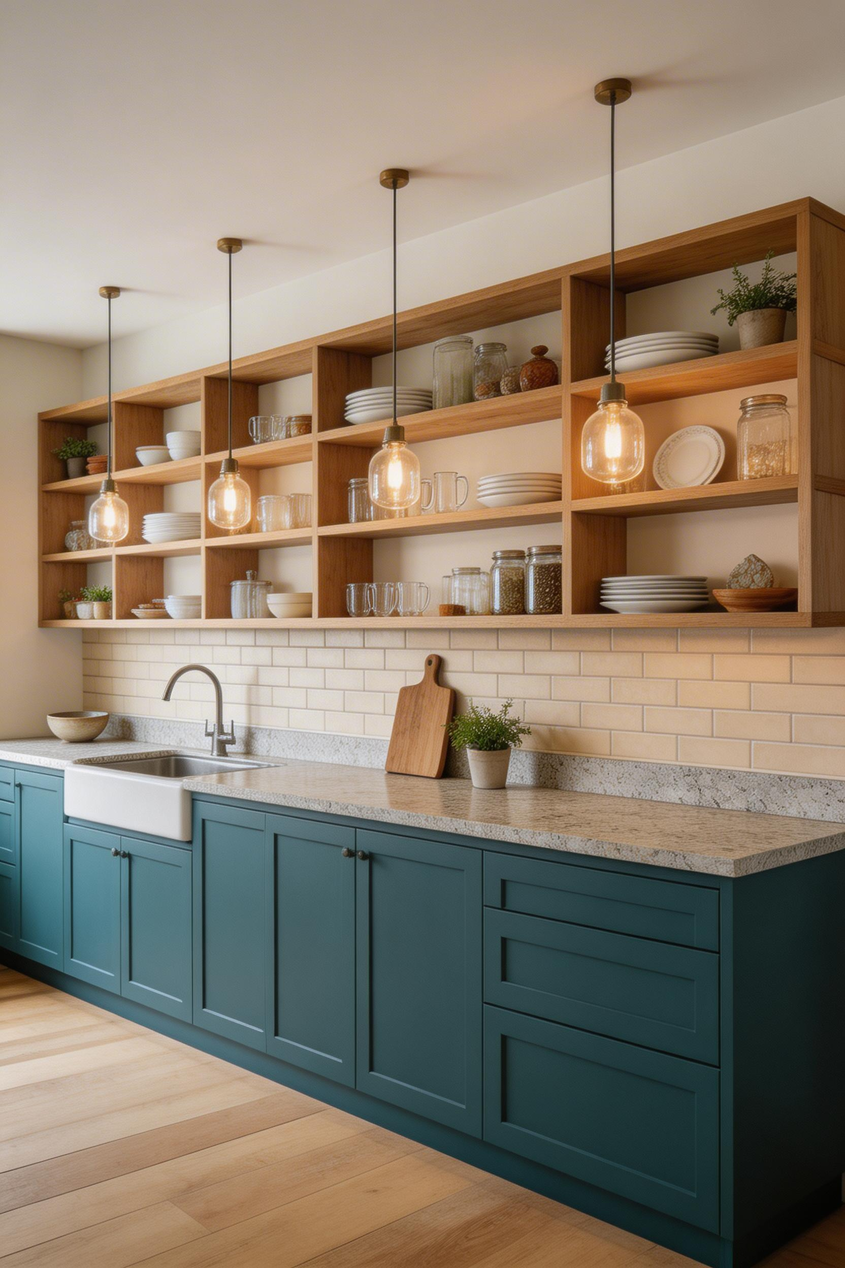
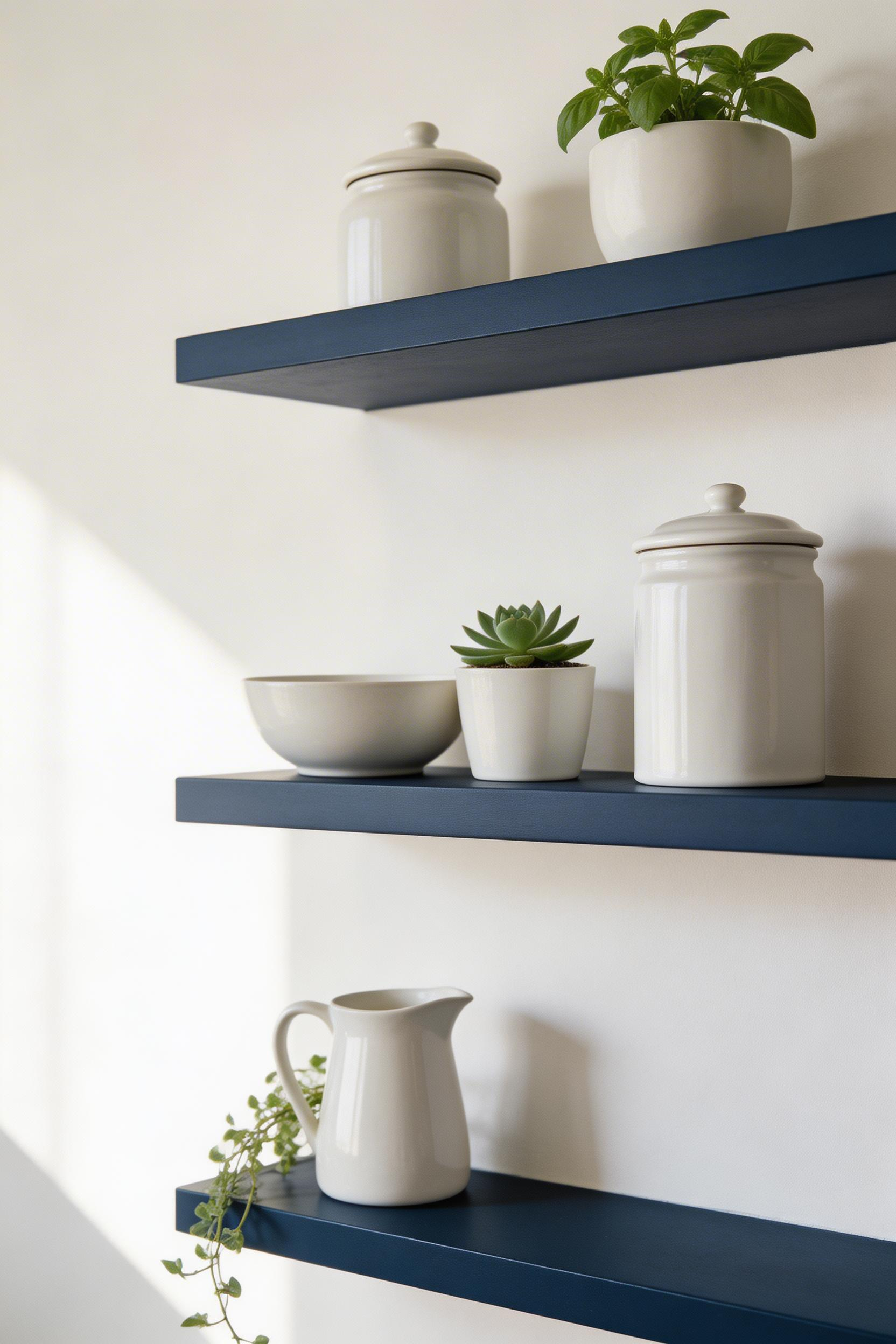
8. Indigo Open Shelving for Bold but Removable Colour
Indigo sits darker and more violet-leaning than navy. It lands at approximately 240–270° on the colour wheel — the most dramatic of the kitchen blues without reaching midnight territory. On floating shelves, it works as punctuation: a series of deep-coloured planes marking a neutral wall.
Open shelving appeared in approximately 35% of new kitchen designs in 2022, according to NKBA data. The appeal is both visual and practical. However, the most underrated advantage of open shelving is its value as a colour vehicle. A floating shelf costs £30–£80. The paint costs £5–£15. That makes indigo shelving one of the lowest-stakes bold blue kitchen ideas available.
Styling Indigo Shelves Successfully
The visual load of dark indigo shelves is shaped entirely by what sits on them. Light-coloured objects — white ceramics, glass bottles, light wood boards — create a gallery quality against deep blue. The objects are clearly legible and the shelves recede as a dark backdrop. Crowd the same shelves with a mix of dark objects and kitchen clutter, and the effect becomes merely moody.
Also, it is worth being honest about open-shelving in real life. The curated kitchen shelf exists in photographs because someone has arranged three objects and then left the room. Real kitchens introduce clutter within weeks. If you want indigo shelves to keep looking intentional, either edit the display objects ruthlessly or add closed storage elsewhere for functional items. Little Greene’s Indigo (No. 188) is the cleanest reference for a true indigo — deeper and more violet than navy, so it reads as distinct rather than simply duplicating the cabinet colour if the base units are also blue.
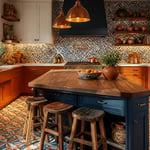
9. Blue and White Farmhouse Kitchen: The Enduring Cottage Classic
The blue and white kitchen has survived every design decade since the 1950s. That is a longer run than almost any other colour combination in domestic interiors. Its persistence is not accidental. The pairing has deep roots: blue cobalt on white tin-glazed pottery originated in Delftware traditions from 17th-century Netherlands. It became embedded in British country kitchen culture through the 1970s and has never entirely left.
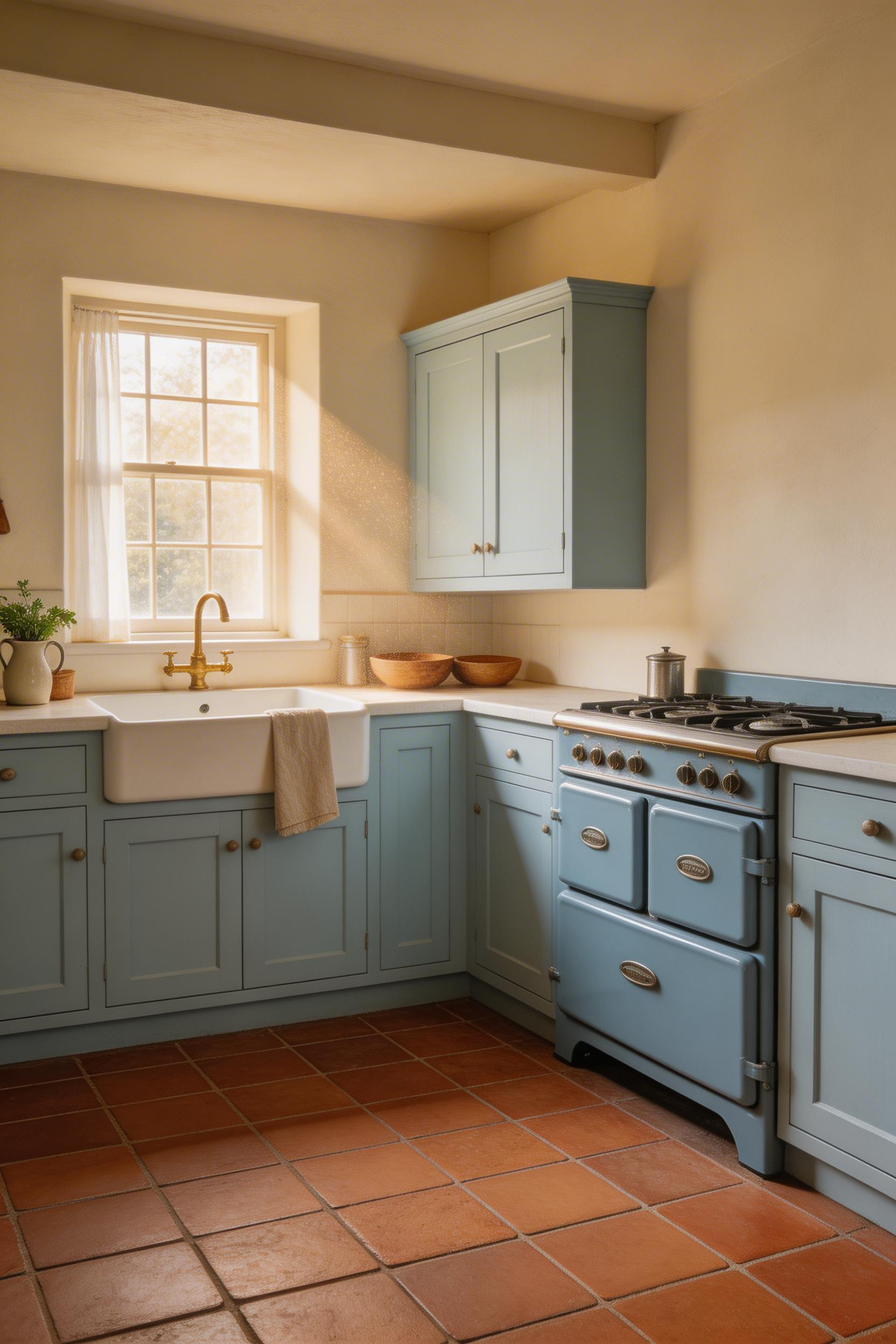
The specific combinations that still feel current in 2025 include powder blue cabinets with white marble, navy lower cabinets with white linen walls, and duck egg upper cabinets paired with a white Belfast sink. Each uses the blue-white contrast in a considered way. Each references the farmhouse tradition without reproducing it as a period costume. The combinations that feel dated: matching blue-and-white gingham check with blue painted everything. Or blue ceramic handles on blue cabinets. The total effect tips from curated to themed in a way that is genuinely hard to walk back from.
Updating the Farmhouse Approach for Contemporary Living
For small kitchen decor contexts, the farmhouse blue-white combination is particularly useful. Both colours work well at small scale and maintain legibility in compact rooms. Three updates prevent the look from reading as a 1994 country kitchen. First, use brushed stainless or matte-black hardware rather than chrome. Second, install a single large pendant or two rather than a grid of recessed spotlights. Third, choose stone, concrete, or real wood for the countertop rather than laminate. Those three decisions redirect the historical reference toward contemporary design rather than nostalgia.
The AGA in Wedgwood Blue (from £8,900) remains the farmhouse kitchen centrepiece for those who can accommodate it. Searches for ‘farmhouse kitchen ideas’ consistently generate 12–18 million results on Google and have stayed in the top five kitchen design search terms since 2017. That is sustained cultural interest, not a trend that has already peaked.
10. Midnight Blue Cabinets with Marble Countertops
Midnight blue is where blue kitchen ideas move into genuinely luxurious territory. At its darkest, it appears nearly black in dim light. It reveals its full blue depth only in natural or well-directed artificial light. The combination with white marble is formal and confident in a way that most colour combinations simply aren’t.

The design logic mirrors a classic suit and white shirt: the contrast is formal, high-legibility, and genuinely elegant rather than merely fashionable. Calacatta marble — white with gold veining — is the most commonly paired stone. The warm yellow veining bridges the cool blue of the cabinetry naturally. Arabescato (bolder dark veining) creates a more dramatic effect. Carrara (grey veining on white) is more affordable and produces a softer, less formal pairing.
The Lighting Imperative with Dark Cabinetry
There is one non-negotiable practical requirement for midnight blue kitchens: under-cabinet LED strip lighting. Without it, the work surface sits in shadow below the dark cabinet fronts. The kitchen becomes genuinely impractical by mid-afternoon in winter. The specification matters: 2700–3000K colour temperature, CRI 90+ for accurate colour rendering, installed in an aluminium diffuser channel. Budget £200–£600 for a standard kitchen installation. DeVOL’s Inky Blue is the most referenced dark blue finish from a UK kitchen manufacturer — a handmade-quality deep navy that sits between midnight blue and standard navy. A 2024 Fixr survey reported kitchen cabinet painting averages $1,200–$7,000 in the US, with dark blue consistently among the most requested colours for a luxury finish.
I’d caution against midnight blue in any kitchen under 12 square metres without significant natural light. A beautiful midnight blue kitchen in a poorly lit ground-floor flat requires artificial lighting by 2pm in November. The cabinets can be extraordinary. But the daily kitchen experience suffers. Square footage and light levels matter as much as the colour choice itself.
11. Sky Blue Kitchen Ceiling for an Unexpected Colour Placement
The ceiling is the most underused surface in the kitchen. Most homeowners default to white without considering alternatives. That default is also what makes a sky blue kitchen ceiling so effective when executed well. The surprise of colour overhead is different in quality from colour on a wall or cabinet. It is ambient, atmospheric, and genuinely unexpected.
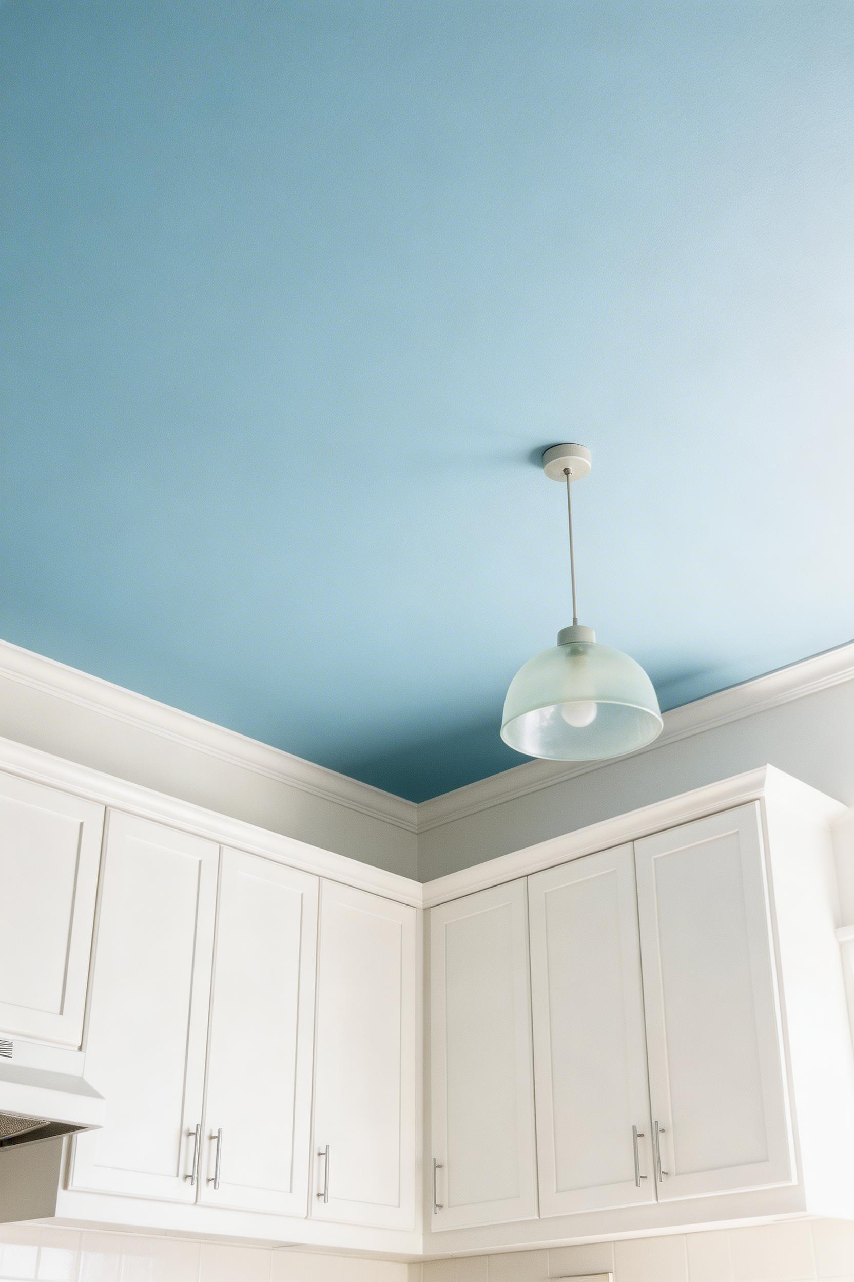
Pale blue painted ceilings have a history in British and American domestic architecture that predates the current trend. Victorian porches and Southern US kitchen ceilings were painted pale blue from the 1800s onwards. Whether or not it deterred insects, the visual effect is real. Looking up at a pale blue ceiling creates a quality of expansiveness similar to looking at an open sky. The room feels lifted rather than pressed.
The sky blue ceiling only works convincingly in rooms with standard or high ceilings (2.4m+). In very low-ceilinged kitchens, the colour draws attention to the ceiling height and can make the space feel compressed. Farrow & Ball’s Borrowed Light (No. 235) is the most commonly cited pale blue ceiling colour. It reads as almost white with a blue warmth rather than as an obvious colour. Benjamin Moore’s Blue Sky (2065-70) is the US equivalent.
The Practical Case for a Blue Ceiling
A 2023 Dulux consumer survey found that 22% of UK homeowners had painted a ceiling a colour other than white in the previous 12 months, up from 11% in 2019. This is one of the genuinely low-stakes blue kitchen ideas. If you dislike the result, repainting a ceiling costs under £100 in materials and takes an afternoon. For modern kitchen design exploration, the ceiling is a logical first step. The only technical note: ceiling paint should be flat or matt finish. Sheen amplifies every imperfection on a ceiling surface. Also use a ceiling-specific formulation — it has a thicker consistency that minimises dripping on an overhead surface.
12. Blue Retro Appliances as Colour Accents
Not every blue kitchen idea requires touching the walls, floor, or cabinets. Coloured appliances deliver blue at countertop and appliance scale without any permanent commitment. Smeg, Big Chill, and KitchenAid are the main players in this category. Each offers blue kitchen ideas that come with the product and leave when it does.
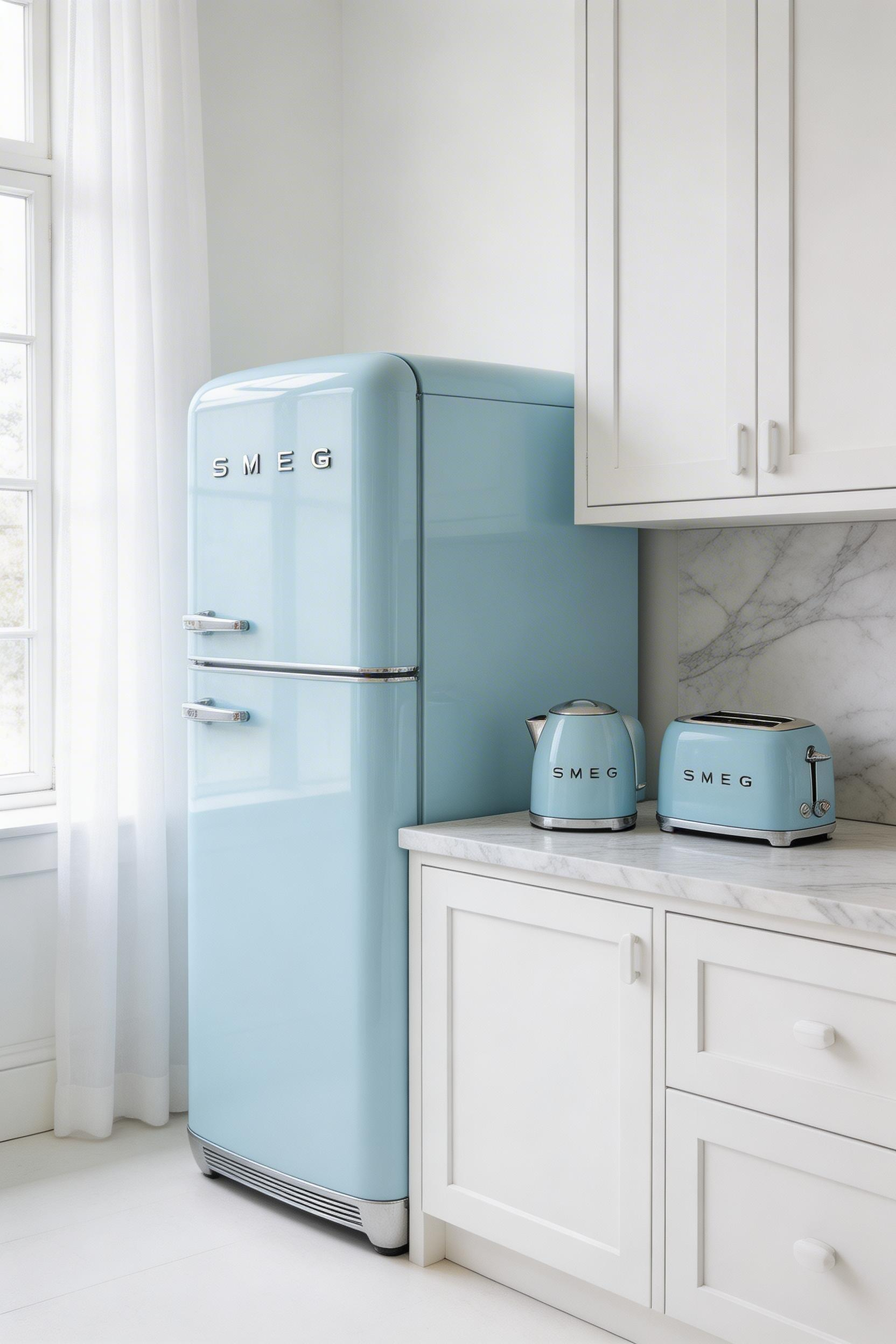
Smeg’s FAB28 refrigerator is one of the most photographed domestic appliances in the world. It comes in over 40 colours including Pastel Blue, Azure Blue, Blue Matte, and Turquoise. It has become the single-object argument for introducing colour into a kitchen without any other intervention. A blue Smeg fridge in a white or neutral kitchen delivers the visual effect of a considered blue kitchen without any structural commitment. Also, the fridge can move with you if you rent. It can be sold if you change direction. That portability has real value.
Appliances Versus Permanent Colour
However, it is worth being honest about the Smeg’s limitations. The FAB28 has less efficient interior organisation than a modern standard-form fridge of the same capacity (269L). It is designed as a beautiful object that also functions as a fridge. The Big Chill range (US market) has better storage organisation and a wider colour range. It lacks the cultural shorthand the FAB28 has accumulated from approximately 2.5 million Instagram posts tagged #smeg. But it is the more practical kitchen appliance. KitchenAid’s Artisan Stand Mixer in Blue Velvet ($499–$549 UK / $499–$599 US) is the countertop companion that completes a blue appliance scheme. The coordinated set — fridge, kettle, toaster, stand mixer in matching blue — creates a vignette effect that reads as a colour scheme even in a fully white kitchen.
13. Blue Kitchen Floor Tiles for Unexpected Drama Underfoot
Of all the kitchen surfaces, the floor is the most consequential. It covers the largest area. It takes the heaviest physical use. And changing it is the most disruptive renovation intervention. So blue kitchen floor tiles represent the highest-commitment of the blue kitchen ideas — and also, potentially, the most dramatic transformation per pound spent.
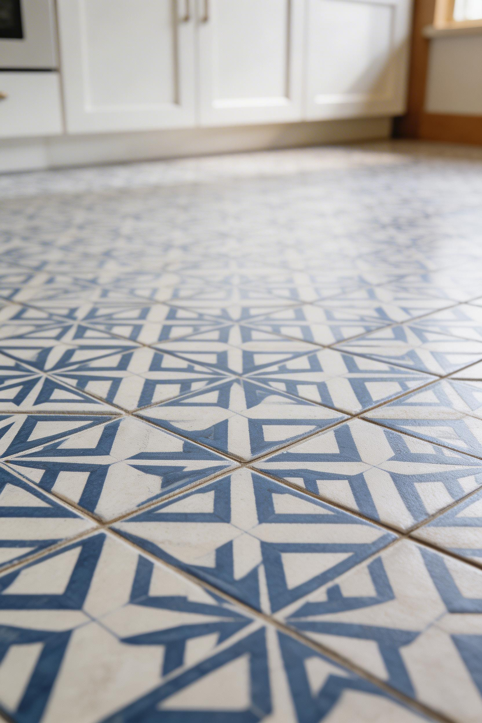
Blue floor tiles are particularly effective when all other elements are white or neutral. The floor becomes the sole colour decision. The entire design is built around it. This is a genuinely confident approach. Most kitchen floor decisions are made in neutral tones precisely because the floor is so consequential. Choosing blue tile is committing to colour at the most structural level.
When choosing what to do with the backsplash alongside blue floor tiles, the standard approach is to keep it simple. Either a plain white subway tile or a plain white painted surface works best. Allowing both the floor and backsplash to carry pattern or strong colour creates visual overload in a typical kitchen size.
The Maintenance Reality of Blue Floor Tiles
Here is the honest part: cement encaustic tiles in a busy family kitchen are high-maintenance. They require sealing before installation (2–3 coats of penetrating sealer) and after. They need resealing every 2–5 years depending on foot traffic. They cannot be used with underfloor heating on a concrete screed slab due to thermal expansion differences that cause cracking. And blue tiles — particularly pale or mid-tone blue — show grime in grout lines more readily than grey alternatives. If the kitchen floor gets significant daily abuse, porcelain versions of similar geometric patterns are a better choice. The aesthetics are comparable. The durability difference is significant. The Tile Association UK reported patterned tiles grew 24% between 2020 and 2023, with blue and white patterns as the leading subcategory.
14. Layering Multiple Blue Tones Throughout the Kitchen
The tonal blue kitchen — using multiple values and saturations within the blue family across different surfaces — is the most sophisticated of the blue kitchen ideas. It is also the most technically demanding to execute correctly.
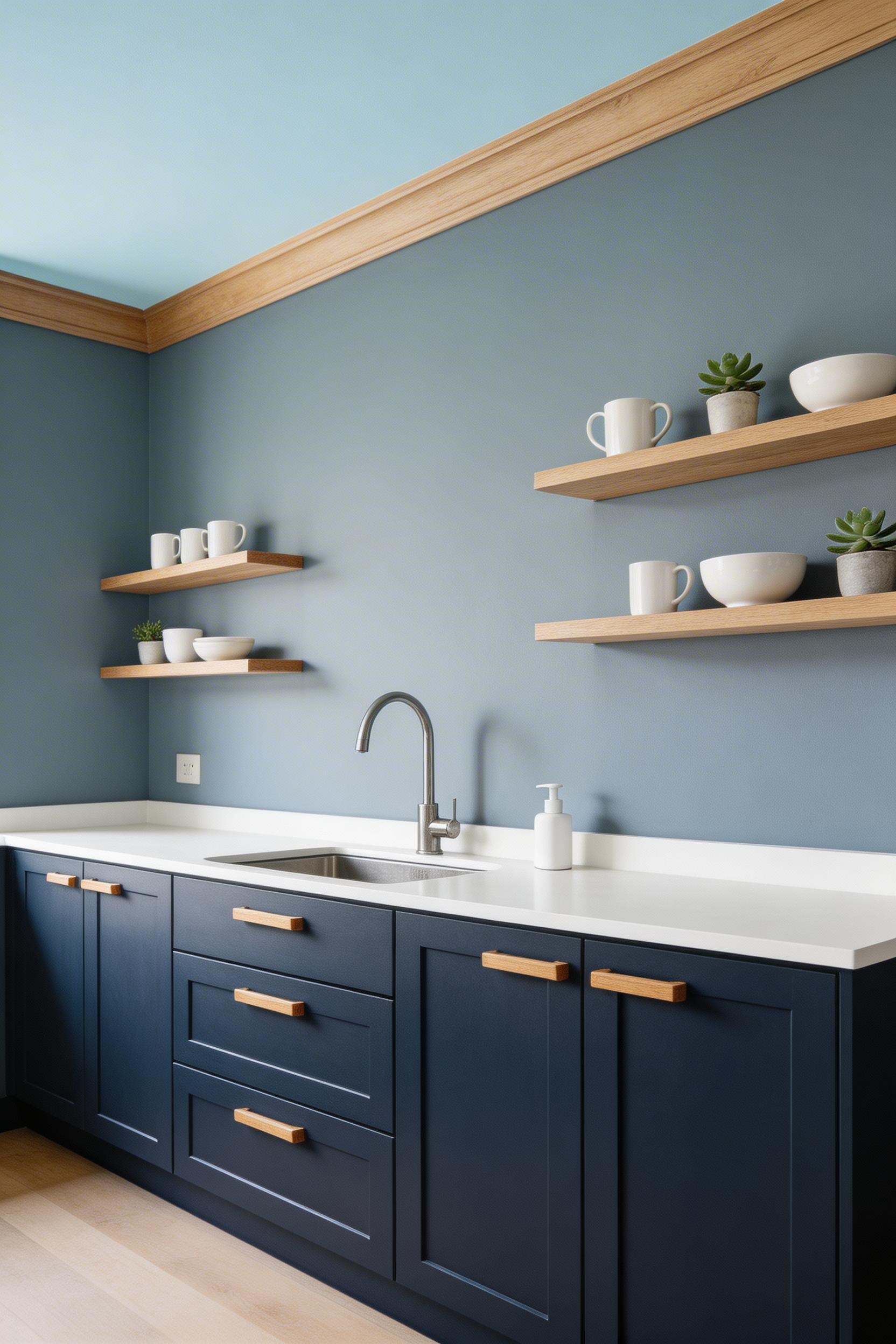
The design principle is tonal dressing applied to architecture. Combine a deep navy base (lower cabinets or island) with a mid-tone slate blue (walls or upper shelving) and a pale blue (ceiling or backsplash tile). The three registers of the same colour family create coherence without monotony — provided the undertones align. This is the critical point. All blues in the scheme must sit within a 30° arc on the colour wheel. Either all cool-leaning (blue with violet undertones) or all warm-leaning (blue with green undertones). Mixing a cool navy with a warm duck egg reads as a mistake rather than as intentional layering.
The Brand Consistency Rule
For a tonal scheme, I strongly recommend sticking to a single paint brand for all colour elements. Different manufacturers formulate their bases differently. Two blues of nominally the same hue from different brands can have subtly different undertones — one slightly cooler, one slightly warmer. In a tonal scheme without contrast-interruption, those small differences become visible. For blue kitchen cabinets and wall colour in the same room, staying within the Farrow & Ball range ensures consistent undertones. Hague Blue (No. 30) on lower cabinets, Parma Gray (No. 27) on walls, and Borrowed Light (No. 235) on the ceiling create a tonal graduation that reads as intentional. Coloro’s 2024 annual trends report identified ‘monochromatic tonal schemes’ as the fastest-growing colour approach in residential interiors, with blue as the most requested colour family within that trend.
The LRV (Light Reflectance Value) is a useful calibration tool here. Aim for at least 20 LRV points difference between the darkest and lightest blues in the scheme. That ensures the graduation is visible and reads as a deliberate choice rather than an accident.
15. Blue Velvet Bar Stools at a Kitchen Island
The most accessible of the blue kitchen ideas: no paint, no tile, no planning, no commitment to a fixed surface. Blue velvet bar stools introduce colour through soft furnishings — the most portable and reversible form that colour can take in a kitchen.
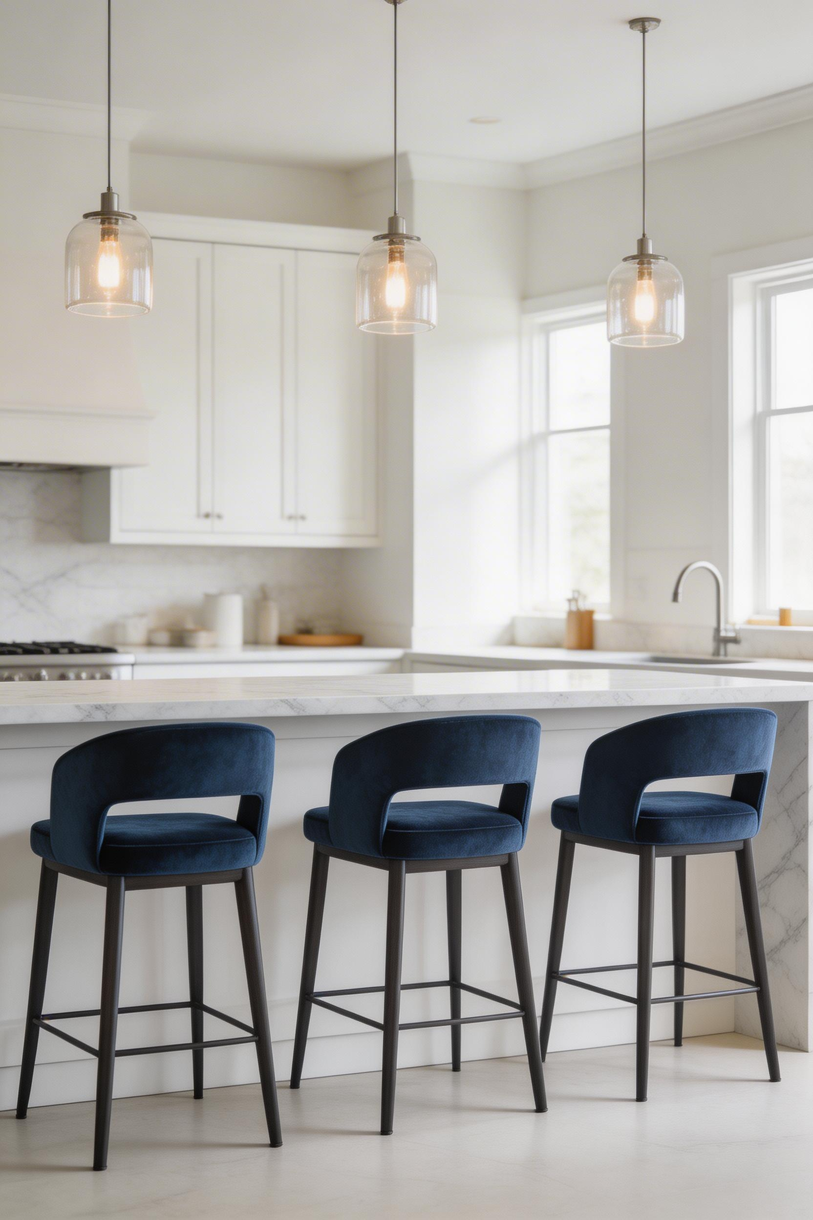
Velvet returned to domestic interiors in earnest around 2016–2018, after decades of association with Victorian drawing rooms. Kitchen stools and dining chairs drove much of the revival. Velvet has a quality that flat-woven fabrics cannot replicate: as the nap catches light from different directions, the colour appears deeper or lighter. A navy velvet stool appears more complex and richer than a navy painted cabinet, simply because the textile surface is doing more optical work.
The Financial Case for Starting Here
For kitchen countertop choices and colour decisions more broadly, starting with the soft furnishings is genuinely good practice before committing to any fixed surface. Three navy velvet stools at a kitchen island can be sourced from HAY (£275–£325 each) or the more accessible IKEA HENRIKSDAL with a velvet cover replacement (approximately £130 per stool all-in). Total cost: £400–£1,000. That is a fraction of what cabinet painting, backsplash tiling, or flooring would cost. And if you decide blue is not the direction after all, the stools move to another room or sell on.
The global bar stool market was valued at $1.2 billion in 2022. Velvet upholstery represents approximately 18% of the upholstered bar stool segment, up from 9% in 2018. That growth reflects genuine consumer demand for tactile, colour-forward seating — not a brief fashion moment.
Which Blue Kitchen Idea Is Right for You?
Fifteen blue kitchen ideas, and the honest answer is: the best one is whichever your kitchen can actually support. Start with light levels. If your kitchen is north-facing or receives fewer than four hours of direct sunlight, stay with powder blue, slate blue, or pale options that read correctly without strong light. Dark blues — navy, midnight, deep teal — need either generous natural light or excellent artificial lighting to avoid making the room feel oppressive.
Then consider your commitment level. If you are testing the concept, blue velvet stools or a blue subway tile backsplash give you the colour effect at low cost and near-zero structural commitment. If you are renovating with a ten-year horizon, the two-tone navy lower cabinet approach is the most durable and most consistently well-regarded option across changing design periods. For something more personal, the duck egg and brass combination or the tonal blue layering approach reward attention to undertone and material choice in ways the simpler options don’t.
The blue kitchen idea I would recommend as a universal starting point: the velvet bar stools. Buy three, live with them for six months, and see how the colour makes you feel in the kitchen every day. If you love it, you will have your answer about whether to go further. If not, you have spent a weekend’s budget rather than a kitchen renovation budget to find that out. That is a reasonable price for the information.