There’s a point in every living room’s life when the space stops feeling like yours and starts feeling like furniture that happens to coexist. The cushions have lost their shape, the lighting has never really worked, and you can’t quite remember why you arranged things the way you did. These living room decorating ideas aren’t a full renovation — they’re the specific adjustments that create the shift from a room you tolerate to a room you return to.
After working across interiors that blend Asian discipline with European character, I’ve noticed that the rooms that feel most considered share one quality: each element earns its place. Not through expense, but through intention. The 18 living room decorating ideas here span structural layout changes, lighting upgrades, material choices, and seasonal swaps — because transformation rarely requires starting from scratch. Whether your space is compact or open-plan, these approaches work at any budget level and in any architectural context.
1. Build on a Neutral Foundation — The First Rule of Living Room Decorating Ideas
In wabi-sabi philosophy, the neutral ground isn’t a compromise — it’s the breath between objects. Choosing the right neutral base for your living room is arguably the most consequential single decision in the room, because everything that comes after layers on top of it. Get this wrong and every accent fights the backdrop; get it right and even a single ceramic vase reads with quiet authority.
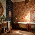
Warm neutrals — sand, greige, warm taupe, soft clay — sit on the red and yellow side of the colour wheel, and they respond generously to morning light and evening lamplight alike. Cool neutrals — stone grey, pale ash, linen white — suit south-facing rooms already flooded with warm light, preventing the space from reading orange as the day progresses. Crisp Scandinavian whites read colder and harder than the earthy wabi-sabi palette. That distinction matters when you’re spending most of your waking hours in the space.
The practical test: paint a large A4-sized swatch on your actual wall and observe it at 7am, noon, and 9pm with your evening lighting on. The undertone reveals itself only in your room’s specific light conditions — not in the paint shop. If you’re drawn to layering boho living room wall decor with wabi-sabi touches over a neutral ground, the earthy palette makes that transition seamless.
The reward for choosing well: every accent you introduce — a brass lamp, a terracotta vessel, a block-print cushion — reads with far more clarity against a calm backdrop than it ever could against a competing colour.
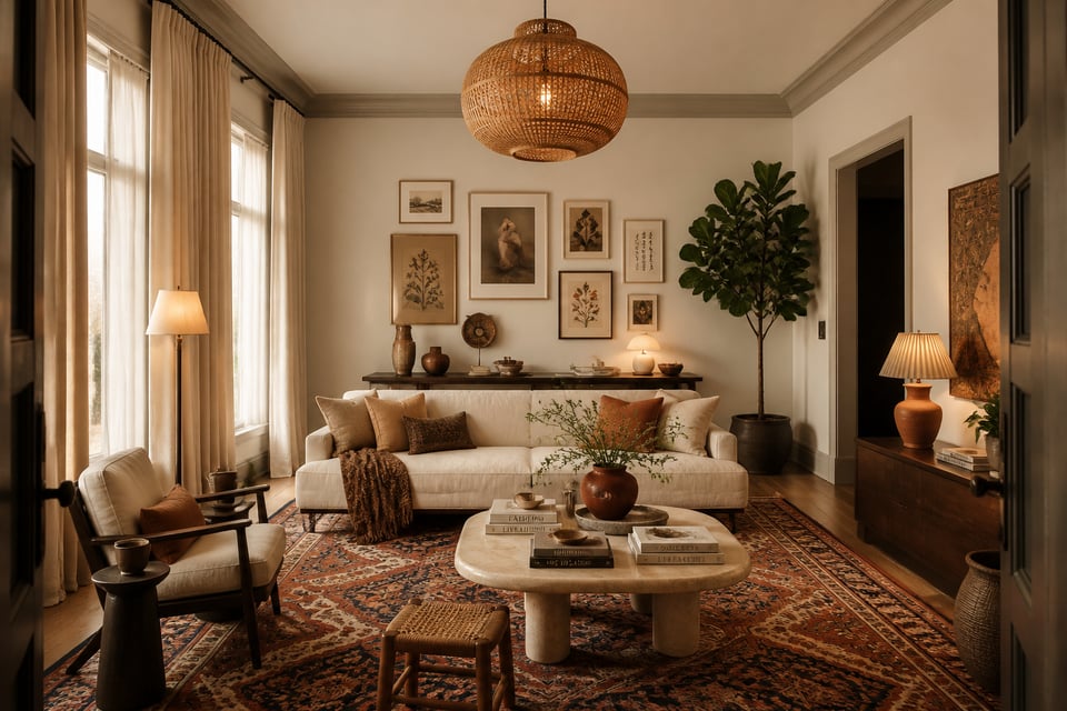
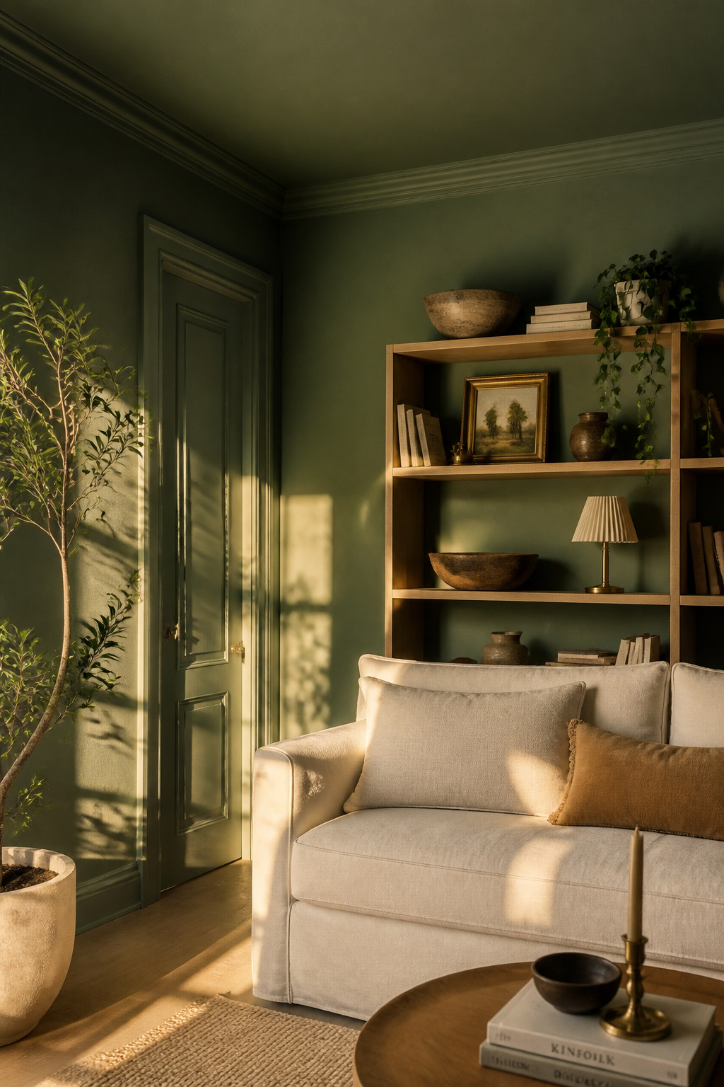
2. Layer Contrasting Textures: Linen, Rattan, Stone, and Silk
Texture is the element that photographs least accurately and reads most powerfully in person. A room built on a single texture — all linen, all cotton, all smooth — registers as flat even to untrained eyes. The solution is contrast, not accumulation. And as living room decorating ideas go, this one costs almost nothing to test with throws and cushion covers before committing to furniture.
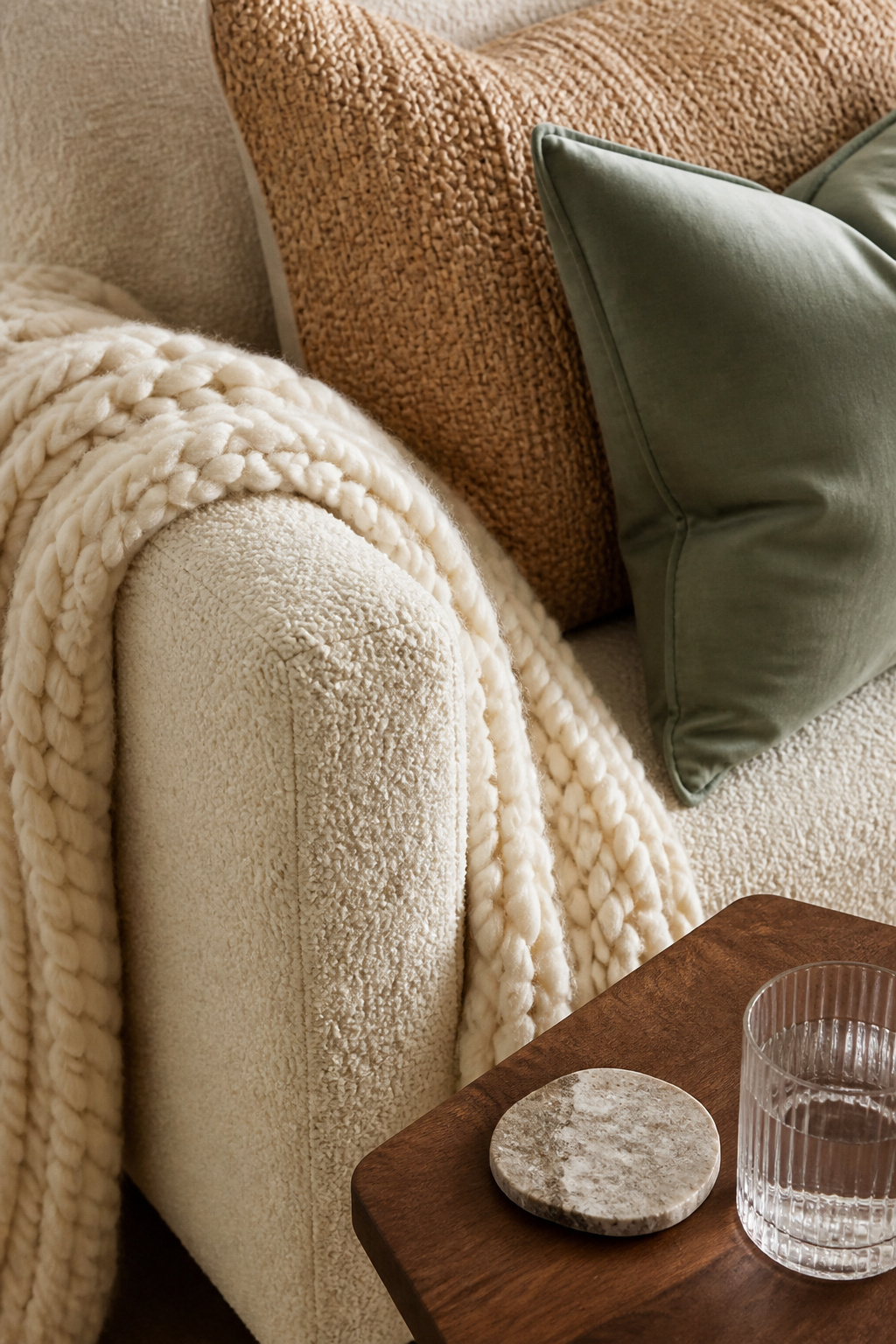
The pairing of rough with refined is a fundamental tension in both Japanese craft philosophy and European interior tradition. Woven rattan with plush leather, raw wood with polished stone, a bouclé sofa with a silk cushion — the visual energy between unlike surfaces is the point. It creates a room that rewards close attention and feels richer the longer you spend in it.
The three-texture rule provides a reliable framework: choose one dominant texture (the linen sofa or the natural wood floor), one contrasting texture (the rattan side table or the stone-topped console), and one refined accent (silk or velvet cushions, a lacquered tray). Beyond three distinct textures in a single seating zone, the room can tip toward restlessness.
Vary the textures across heights, too. At floor level: a jute or flatweave rug. Mid-level: the sofa and cushions. Eye level: curtain fabric and lampshade material. Higher: artwork frame texture and ceiling finish. A room that layers thoughtfully at every height feels designed rather than assembled.
3. Anchor the Space With a Statement Area Rug
The most common decorating mistake in a living room isn’t a colour choice or a furniture selection — it’s a rug that’s too small. A rug that floats in the centre of the seating zone, disconnected from every piece of furniture, makes the room feel fragmented regardless of what else you’ve done right. Among all the living room decorating ideas here, this one is the easiest to get wrong and the most immediately obvious when you fix it.
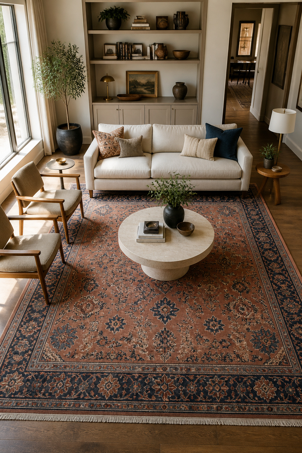
For most living rooms, an 8×10 or 9×12 rug is the starting point — not a large size, but a functional minimum. The front-legs-on approach is the most practical standard: the front legs of the sofa and accent chairs rest on the rug, the rear legs on the bare floor. This grounds the conversation zone while leaving enough of the floor exposed to keep the room feeling open. In more formal spaces, the all-legs-on method — requiring a 10×14 rug or larger — creates a fully defined territory that reads as luxurious rather than accidental.
Material matters for living rooms that see daily use. Low-pile options — flatweave, wool loop, kilim — handle foot traffic more gracefully than high-pile shag. Natural fibres like wool and jute age well and earn their patina with time. For pattern: a rug with design hides the evidence of daily life far more forgivingly than an all-ivory option, which is a maintenance commitment disguised as a design choice.
Before buying, tape out the rug’s dimensions on your floor using masking tape. This exercise resolves sizing debates immediately and costs nothing. For more on how furniture choices interact with rug placement, rustic living room furniture ideas offer practical grounding in how scale works across a seating zone.
4. Create a Gallery Wall That Reflects Your Personal Story
The salon-style gallery wall — varied frames, varied scales, loose arrangement — has remained one of the most lasting living room features because it solves a problem no other design element can: how to make a room feel specific to the people who live in it. A gallery wall done well doesn’t look like Instagram; it looks like a life. This living room decorating idea works in any aesthetic, from raw industrial to refined French country.
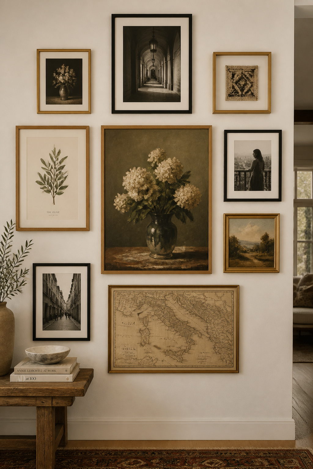
The secret is the anchor. Choose the largest or most visually weighted piece first — a framed print, a textile, a mirror — and position it as the compositional centre of the arrangement. Everything else orbits around that decision. Lay the full arrangement on the floor within a taped outline matching your wall zone, photograph it from above as your reference, then transfer it to the wall. Hanging piece by piece without a plan is how gallery walls become gallery arguments.
For framing consistency without uniformity: limit yourself to two or three frame finishes — black, natural oak, and antique gold, for instance. This creates cohesion across varied content (photography, prints, small textile pieces, mirrors) without making the wall feel like a matching set. Maintain consistent two-inch gaps between frames for the professional finish that separates a curated display from a cluttered one.
The Japanese tokonoma tradition — a recessed alcove where one primary object of significance is displayed with complementary supporting pieces — offers useful discipline: every element earns its place or it doesn’t go up.
5. Mix Metals Thoughtfully for a Sophisticated Living Room Decor Update
The old rule about matching all metals in a room has been quietly retired by every designer working today. Mixed metals — deliberately, not accidentally — create the patina of a space that’s been collected over time rather than purchased in a single afternoon. Of all the living room decorating ideas in this list, this update produces the most visible before-and-after for the least cost.
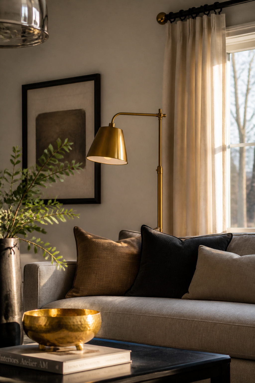
The modern approach comes down to three disciplines. First, limit yourself to two or three finishes; a fourth metal, even in a small detail, fractures the palette. Second, repeat each finish at least twice — a single appearance reads as an accident, but a pair reads as a decision. Third, stay broadly within warm tones (brass, gold, bronze, copper) or cool tones (nickel, chrome, gunmetal) for the combination to remain cohesive. Crossing temperature families works, but it requires a dominant finish to anchor the mix.
The most current pairings for 2025–26: champagne bronze with matte black (soft warmth against graphic contrast), aged brass with polished nickel (patina against brightness), or brushed gold with satin nickel (close in tone, sophisticated in their near-match). Texture variation within a metal family — matte brass lamp next to hammered brass bowl next to polished brass candleholder — adds depth without adding a new finish.
Ceiling light fixtures, table lamps, curtain rods, picture frame edges, and door handles are the places where a room’s metal story is told. For the full picture of how fixtures contribute to the scheme, living room lighting ideas cover the metal-and-light relationship in practical detail.
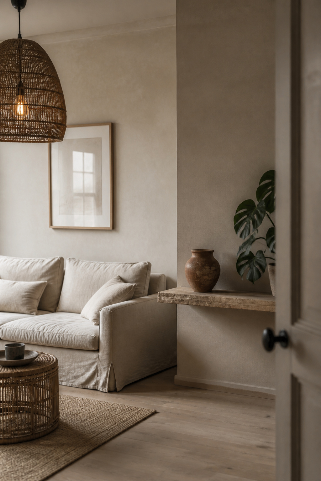
6. Bring Indoor Plants and Natural Elements Into the Composition
In every tradition of thoughtful interior design — Japanese, Scandinavian, Vietnamese, Southern European — the living room connects to the natural world through organic materials and living elements. Plants are the most immediate way to make that connection. Research consistently shows they do more than look beautiful: biophilic design reduces cortisol levels, improves focus, and filters airborne chemicals that synthetic interiors generate. As a living room decorating idea, plants also have the lowest barrier to entry of anything on this list.
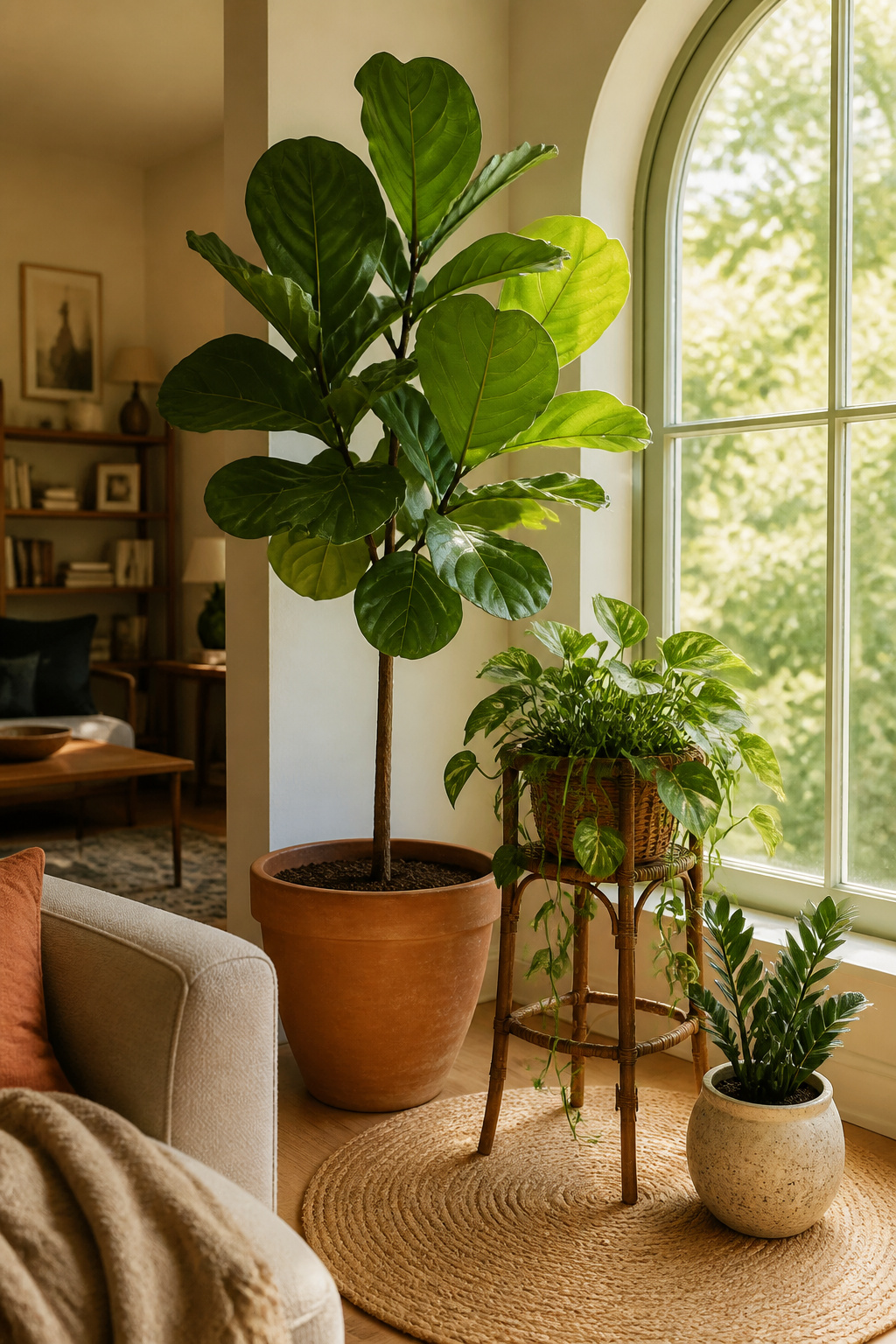
The ikebana approach is worth understanding even if you’re not arranging flowers in its tradition. It treats the plant, the vessel, and the space around both as equal compositional elements. The container is not merely a holder — a rough wabi-sabi ceramic, a terracotta pot, a smooth white vessel each changes the emotional register of the same plant.
For light-challenged spaces, ZZ plants and pothos are virtually indestructible and quietly effective air purifiers. For rooms with generous natural light, a fiddle-leaf fig or monstera deliciosa provides the architectural scale that justifies a corner placement. Group in odd numbers — three plants at varying heights rather than three identical specimens — and vary the vessel materials within the group. A mirror placed behind or beside a plant cluster doubles the perceived greenery and amplifies light simultaneously, a useful trick in smaller rooms.
Stands and pedestals that bring trailing plants to eye level turn them from floor clutter into genuine architectural accents.
7. Master Layered Lighting to Set the Room’s Mood
The most common lighting mistake in a living room is relying on a single overhead source. One central ceiling fixture creates flat, even illumination that removes atmosphere from the room at the flick of a switch — everything becomes equally visible and nothing becomes beautiful. This living room decorating idea is the one most people put off, yet it transforms the space more completely than almost any other single change.
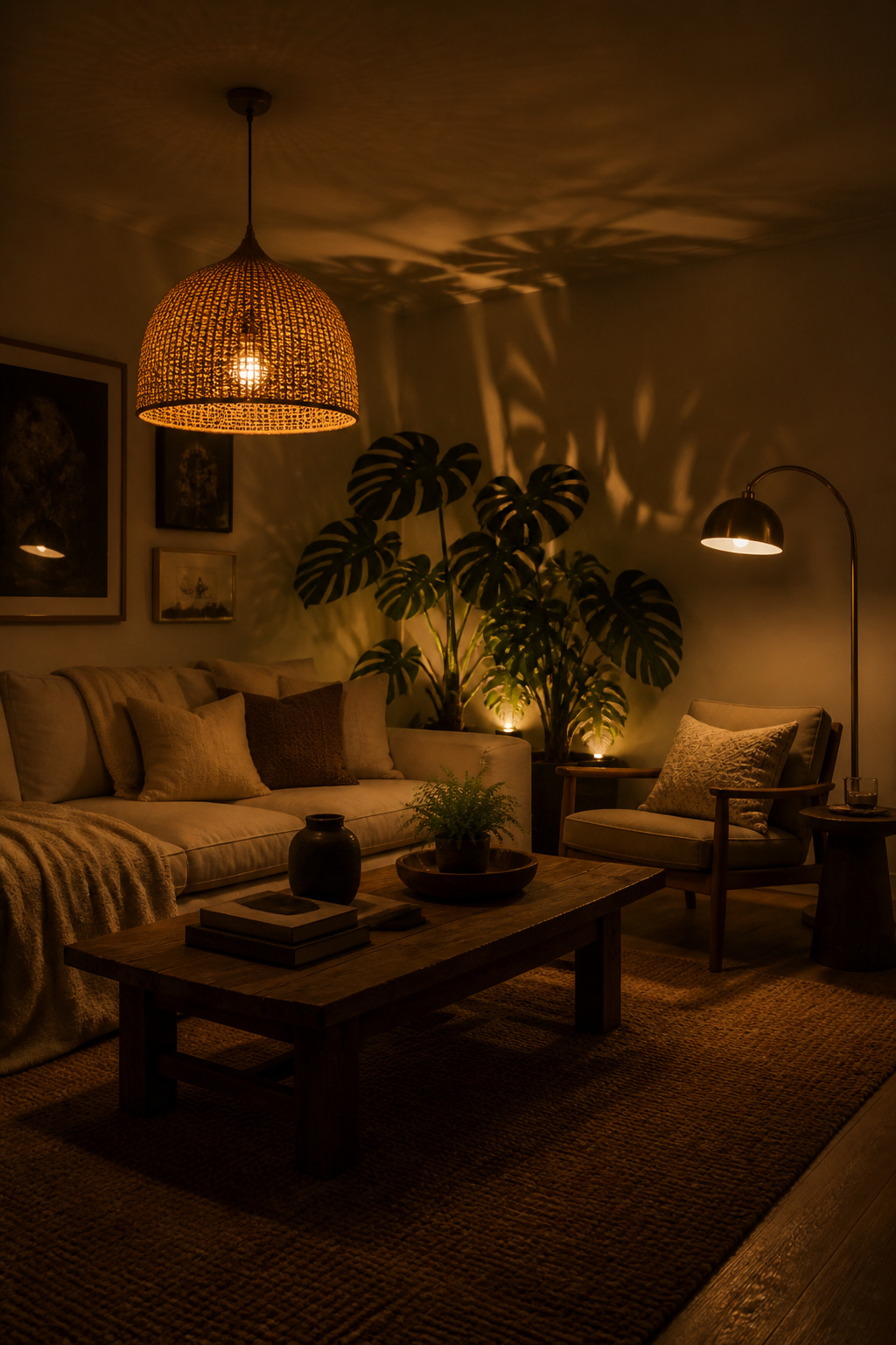
The fix is three distinct layers: ambient, task, and accent. Ambient is the base layer — the pendant, chandelier, or recessed light that allows comfortable movement through the room. Task is focused and functional — a floor lamp beside a reading chair, a table lamp on a side table. Accent is purely atmospheric — an up-light behind a plant, a picture light over a significant piece of art, candles on the console. Each layer operates independently, and ideally each is on a separate dimmer.
Warm Bulbs and the Right Lumen Range
Warm white bulbs (2700K–3000K) are the correct temperature choice for living rooms. That range mimics the quality of traditional incandescent light — golden, relaxed, and flattering to both skin tones and wooden finishes. Living rooms typically feel right at 1,500–3,000 total lumens from a mix of sources; the variety of sources matters as much as the total output.
The statement fixture deserves particular consideration. A pendant or chandelier at the right scale functions as the room’s ceiling sculpture — not just a light source, but a design object viewed from below. Scale it at roughly one-third the width of the sofa beneath it. Rattan pendants, sculptural plaster shades, hand-blown glass — each adds texture at the vertical level that most other furnishings never reach.
8. Choose One Strong Focal Point and Build Around It
Every room with a clear visual hierarchy feels intentional. Every room without one feels unresolved — the eye wanders, nothing settles, and however well-chosen the individual pieces are, the room fails to add up. Choosing a focal point is one of the oldest living room decorating ideas in the designer’s toolkit, and it remains relevant because the problem it solves — rooms that feel anxious rather than restful — never goes away.
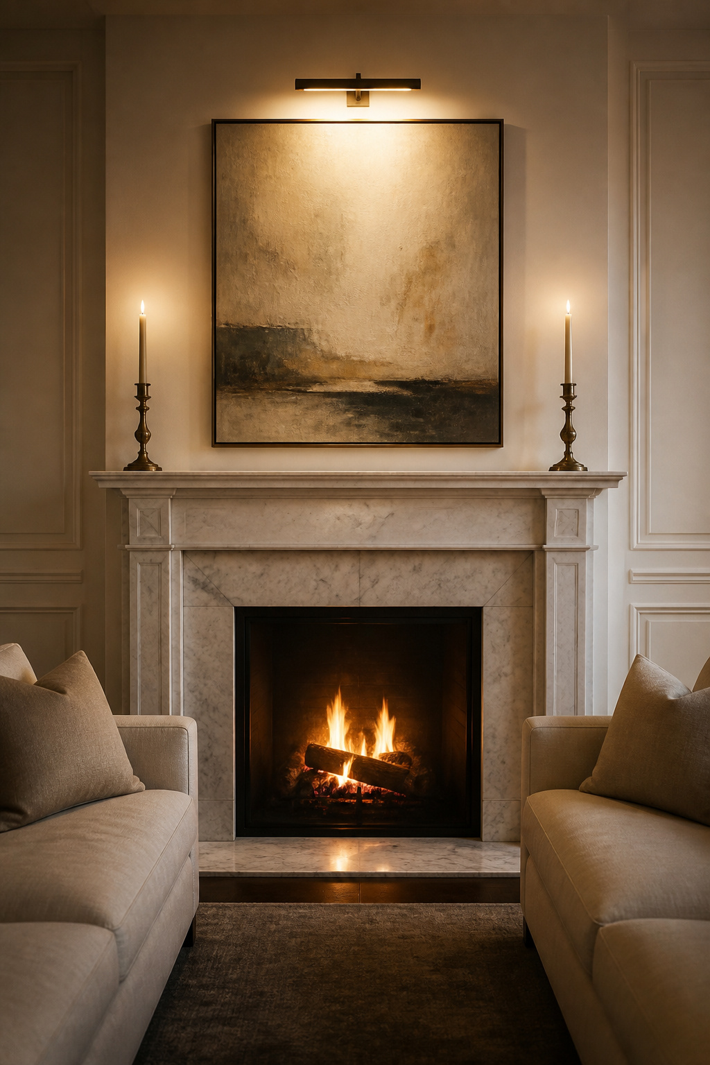
A fireplace with a mantel is the most compelling architectural focal point because it has physical mass and cultural memory; it draws the eye even when cold. Large windows with a genuine view function similarly — furniture should face them rather than turn away from the room’s best natural asset. When neither exists, a large piece of art — minimum 36 inches wide for a standard living room wall — creates an instant visual anchor.
The more important skill is knowing what not to do: too many competing focal elements is one of the most common reasons rooms feel anxious rather than restful. A fireplace AND an oversized gallery wall AND a large TV on the same wall asks the eye to do work it shouldn’t have to. Also avoid mounting the television above a fireplace — neither focal element reads clearly, and you’re creating neck strain for good measure.
In feng shui practice, the principal seating should command the room’s focal point while maintaining a solid wall at its back. This isn’t mysticism — it’s basic spatial psychology. The person sitting with their back protected and the focal point ahead feels settled in a way that the reverse never achieves.
9. Apply the 60-30-10 Rule for Confident Living Room Decoration
The 60-30-10 rule has survived decades of design trend cycles because it mirrors how the eye naturally processes a room: one dominant impression, one supporting contrast, one sharp accent. The proportions aren’t arbitrary; they reflect the visual hierarchy that creates balance without monotony. As living room decorating ideas go, this is the framework that makes every other idea easier to execute.
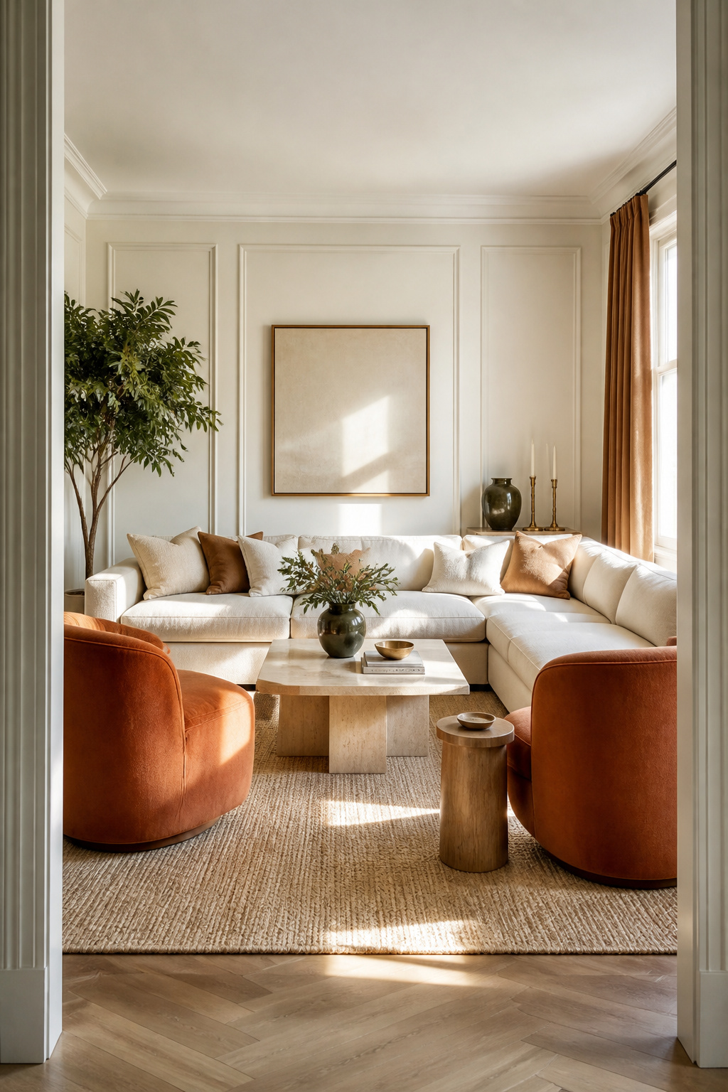
Sixty percent is the dominant colour — the walls, large upholstery, and the rug. Thirty percent is the secondary — curtains, accent chairs, smaller furniture pieces, and key textiles. Ten percent is the accent — cushions, vases, art, and any object that draws the eye as a punctuation point rather than a sustained statement.
In practice: warm off-white walls (60%) pair with caramel or dusty terracotta upholstery (30%) and brass or deep olive accents (10%). The secondary and accent tones are most effective when they introduce temperature contrast — a warm dominant ground and a cool accent creates the same tension that warm-cool jewellery pairings do in fashion.
The rule applies to the whole room, not just the walls. Many well-intentioned applications collapse because the ratio is considered only for paint colours, while the rug, sofa, and curtains — the heaviest colour contributors in a living room — are treated separately. The walls are sometimes the smallest colour surface in a furnished room.
10. Display Books, Ceramics, and Objects as Living Room Decor
The surfaces in a living room — shelves, consoles, coffee tables, window sills — are where a room’s personality shows in closest detail. How you arrange objects on these surfaces is the difference between a room that feels like a photo shoot and one that feels like a home. This is one of the living room decorating ideas that costs nothing to revise; the investment is attention, not money.
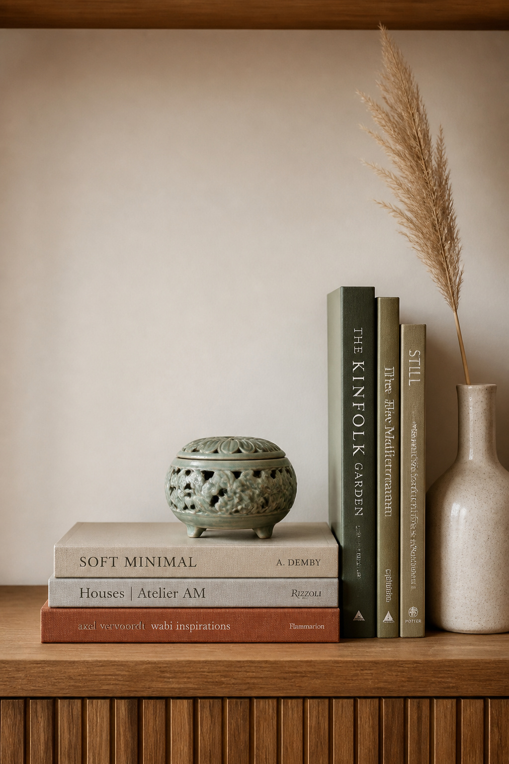
The fundamental principle is the vignette: a composed grouping of 3-5 objects at varying heights, arranged in a triangular composition so the eye travels upward and returns. Odd numbers create visual movement that even numbers cannot — three objects feel dynamic, four feel symmetrical and static. The Japanese concept of ma applies directly: 70% objects and 30% negative space on a shelf reads as intentional, while a packed surface reads as storage.
Books earn their place as structural elements in these compositions. A horizontal stack of 2-3 art or design books provides an elevated platform for a smaller sculptural object; colour-coded bookshelves — spines grouped by colour family — create a visual sweep readable from across the room.
Treat the editing process as part of the design work. If an object requires explanation to earn its visual weight, it belongs in a drawer. Limit active display zones to three surfaces per room; beyond that, individual vignettes begin competing with each other for attention.
11. Use Paint as the Most Transformative of Living Room Decorating Ideas
Of every living room decorating idea available, paint delivers the highest return on investment and the most dramatic visible transformation. Not just on the walls — but applied with the colour-drenching technique that designers have been recommending since 2024, where walls, trim, door frames, and ceiling are all wrapped in the same tone. I’d prioritise this above any furniture purchase at a comparable budget.
Colour drenching works because it eliminates the visual interruptions created by contrasting trim. A room where wall colour meets white trim meets a different ceiling colour is a room cut into horizontal and vertical zones. Remove those interruptions and the space feels taller, calmer, and more architectural. The technique’s recent evolution — material drenching — extends the same tone into coloured woods, tiles, and textiles for total immersion.
The most successful drench colours are deep greens, muted blues, warm taupes, and soft clay tones. Use different finishes in the same colour to add depth without breaking the scheme: limewash on the walls, matte on the ceiling, and a slight sheen on the trim reads as layered and intentional rather than flat.
If full drenching feels like too large a commitment, consider starting with an accent wall behind the sofa using wallpaper or a deeper tone — wallpaper accent wall ideas for living rooms offer a graduated entry to the technique. Whatever approach you choose, always test with a large swatch on the actual wall and observe it at multiple times of day.
12. Layer Window Treatments for Light, Privacy, and Visual Depth
Single curtains — one panel per window in one fabric, hung at frame height — signal that a room hasn’t been fully considered. Double-layered window treatments, by contrast, add the visual weight and architectural softness that separate designed rooms from decorated ones. As a living room decorating idea, it’s also one of the most correctable: the hardware is inexpensive and the impact of raising the rod height is immediate.
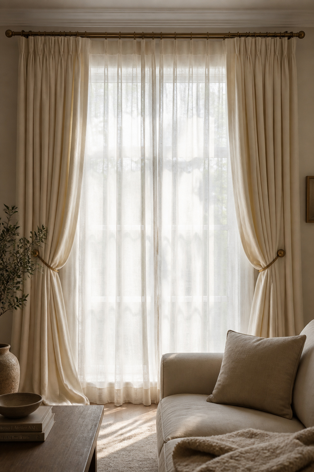
The combination of sheers beneath heavier drapes gives you genuine control: sheers drawn for diffused morning light and visual privacy, heavier drapes pulled back to frame the window during the day, or closed at night for warmth and complete privacy. Each layer has a function, and the visual result is a window that reads with the same complexity as a well-dressed figure.
Hang the rod 2-3 inches below crown moulding or ceiling — not at window-frame height. This single adjustment makes windows appear taller and ceilings higher, and it costs nothing to change on an existing setup. Extend the rod 3-6 inches beyond the window frame on each side; when drapes are open they frame the glass without blocking any of it. Curtain panels should combine to 2-2.5 times the window width for adequate fullness — skimping on fabric width creates flat, lifeless drapery regardless of how expensive the fabric.
For material: linen is the designer default. It filters light beautifully, hangs with natural weight, and improves with age. Velvet adds luxurious acoustic mass for winter, particularly effective in colour-drenched rooms where it carries the wall tone into the soft furnishing layer.
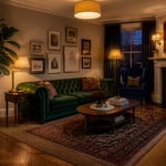
13. Ground the Room With Strategic Furniture Arrangement
Most living rooms fail at layout before a single piece of furniture is chosen. The instinct to push sofas against the walls — a habit formed in smaller spaces where floor area matters — creates exactly the problem it’s trying to solve: a room that feels larger at the edges and emptier at the centre. This is a living room decorating idea you can try this weekend without spending a penny.
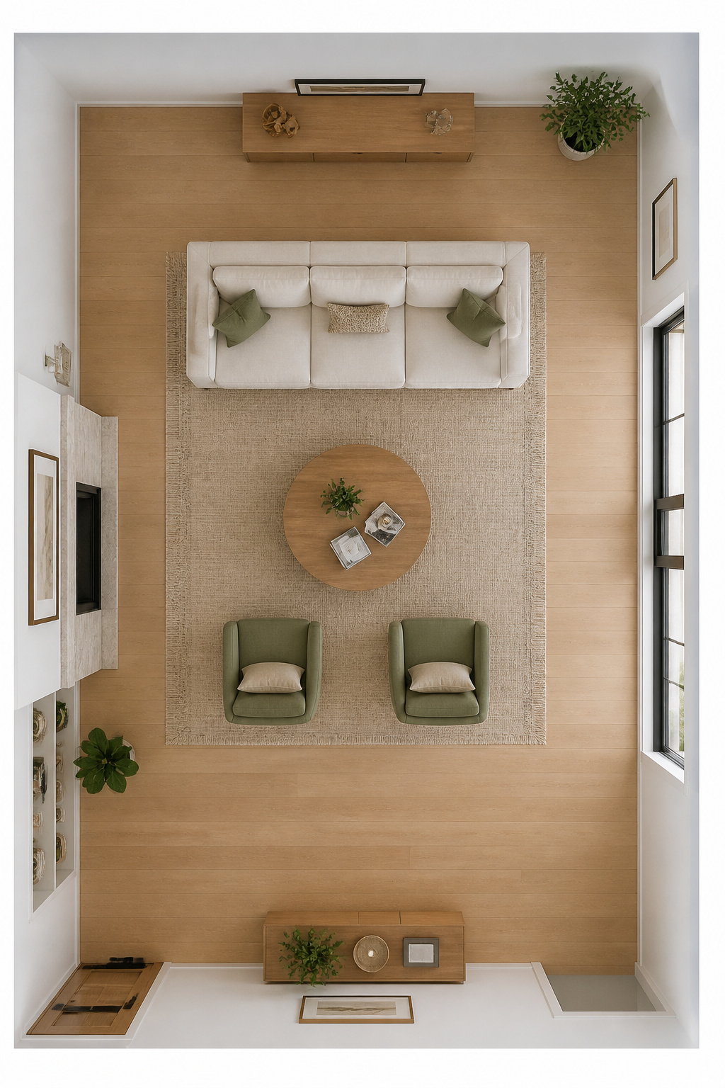
Float the sofa 12-24 inches from the wall. This counterintuitive move creates depth, improves traffic flow behind the seating, and pulls conversation into a more intimate formation. In feng shui, the ideal arrangement has the sofa facing the room’s focal point with a solid wall visible — even at distance — at its back.
Plan conversation zones before placing anything. Seats should face each other within 4-8 feet for comfortable interaction — beyond 8 feet, conversation requires effort and loses its naturalness. The coffee table to sofa clearance is 14-18 inches: close enough to reach without leaning, far enough to pass without turning sideways. Main walkways need 30-36 inches minimum.
Map all traffic routes before moving any furniture: from entrance to kitchen, entrance to hallway, sofa to balcony door. A perfectly arranged conversation zone that blocks the primary daily path will be rearranged within weeks. For guidance on the furniture pieces that work best within floating arrangements, modern living room furniture essentials cover scale and proportion in practical terms.
14. Use Mirrors to Open, Brighten, and Reflect the Space
A mirror placed with intention is the closest thing to free square footage in interior design. It amplifies natural light, adds compositional mass, and makes a room feel larger without changing a single dimension. The placement decision matters more than the mirror’s size or style — and this living room decorating idea is reversible if you get it wrong.
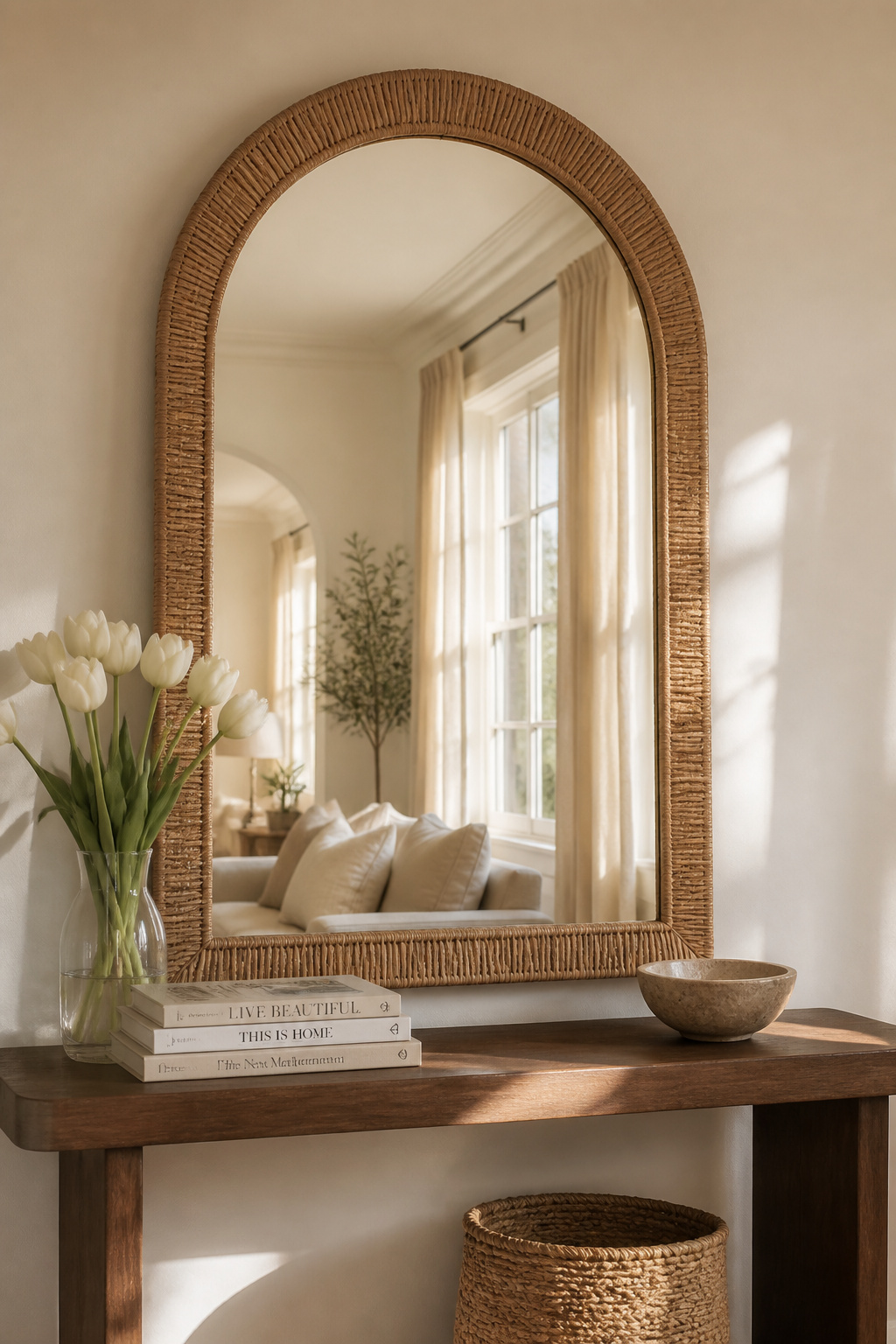
The single most effective placement: opposite a window. A mirror facing a window doubles the perceived light in the room and creates the illusion of an additional window — particularly useful in north-facing rooms that receive limited direct sun. In feng shui, mirrors amplify whatever they reflect, making position as meaningful as the mirror itself. Face a beautiful view, a plant cluster, or a composed console arrangement. Never face a cluttered corner, a plain door, or another mirror.
Frame style is a compositional choice in its own right. Arched frames — one of the most requested shapes since 2022 — add organic softness that counterbalances sharp architectural lines. Wood frames (bleached oak, dark walnut, raw natural) add warmth and textural grounding to a reflective surface. An ornate gilt frame works effectively as the single decorative statement in a minimalist room — the contrast is intentional and confident.
Grouping three to five smaller mirrors with complementary frames creates the visual mass of one large mirror with more placement flexibility. Round or oval mirrors together promote a sense of harmonic energy; a vertical rectangular mirror on a narrow wall opens the space and keeps movement fluid.
15. Add Pattern Through Wallpaper, Upholstery, or Printed Textiles
Pattern is the decorating element most frequently avoided for fear of getting it wrong — and most frequently responsible for the difference between a room that reads as sophisticated and one that reads as flat. The rule of three scales makes it reliably navigable. This living room decorating idea rewards the brave and punishes only the careless.
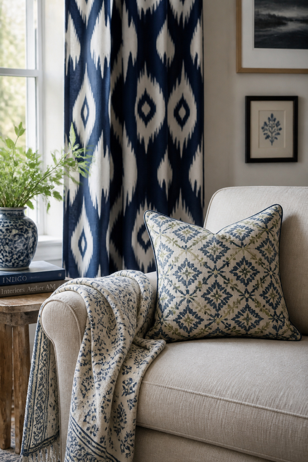
Large-scale pattern anchors the scheme: oversized florals or bold geometrics on the primary curtains or feature wall provide the room’s dominant visual rhythm. Medium-scale pattern bridges: an ikat or stripe on an accent chair, a block-print cushion on the sofa. Small-scale pattern adds depth as texture: a small geometric lampshade, a delicate printed throw. Two patterns at the same scale create visual vibration that’s immediately uncomfortable; these three scales together create a pattern story the eye can follow.
The colour rule is the override: patterns in the same colour family mix easily regardless of scale variation. A sage geometric + sage floral + sage stripe reads as cohesive even with three different pattern types. This is why working within your 60-30-10 colour scheme before selecting patterns makes the process significantly more intuitive.
Globally sourced textiles offer pattern with cultural depth. Ikat — the resist-dyeing technique from Indonesia, Central Asia, and South America — has blurred, handmade edges that read as artisanal rather than printed. Block-printed Indian textiles carry enormous visual weight from a single cushion cover. Batik’s flowing organic patterns introduce narrative and warmth that geometric or floral Western prints rarely achieve alone.
16. Style the Coffee Table as a Miniature Curated Vignette
The coffee table sits at the visual centre of the living room conversation zone and is the surface most frequently in close range of the people using the room. It deserves the same compositional attention as any other display surface — and it’s the easiest surface to refresh without touching anything else. This living room decorating idea can transform the room’s feel on a Sunday afternoon.
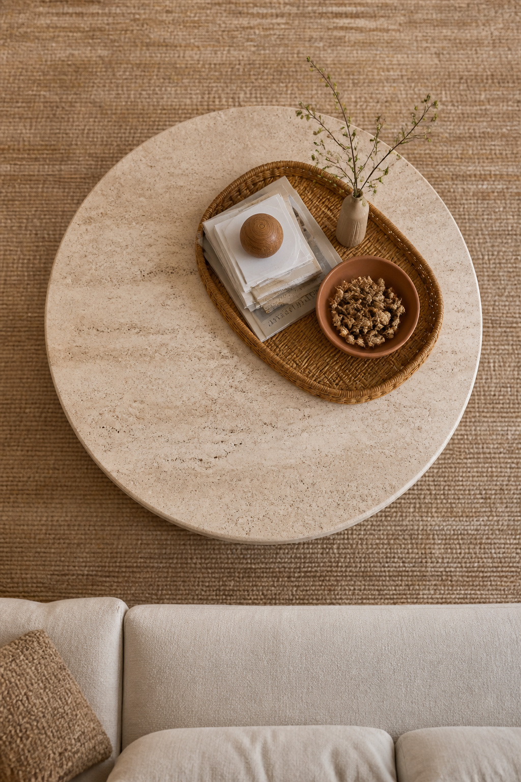
The four-element framework is the reliable starting point: a height element (a tall vase or sculptural piece), a platform element (a stack of 2-3 books with a smaller object resting on top), a living element (a small potted plant or a low vase of garden cuttings), and a personal element (a meaningful small object, a stone, a bowl of things from a trip). Within those four categories, the variety is entirely yours.
A tray organises the composition without making it look controlled. Choose a material that contrasts with the coffee table surface — woven rattan on a marble table, dark lacquer on a wooden table. Size the tray generously (18 inches or larger) to allow the objects within it space to breathe. Placed slightly off-centre, the tray vignette reads as naturally styled rather than staged.
For the full depth of coffee table styling approaches across different aesthetics, coffee table styling secrets offers 24 considered ideas that expand on every element of this framework. The underlying principle across all of them is the same: intentional restraint creates more impact than generous accumulation.
17. Refresh Your Living Room Decorating Ideas With Seasonal Updates
The Japanese concept of mono no aware — finding beauty in the transience of things, in the changing of seasons — offers a philosophical case for seasonal living room decorating that goes beyond novelty. A room that never changes develops a kind of deadness; the same arrangement, the same objects, the same throw through every season, flattens the atmosphere and gradually disappears from conscious attention.

The practical framework: keep the structural elements season-neutral and swap the accents. The sofa, the rug, the curtains, the lighting — these should be chosen in tones that hold across twelve months. The cushion covers, throws, flowers, coffee table objects, and candles are where seasonal narrative enters. Swapping cushion covers (not whole cushions) is the most cost-effective route: the same insert, four different seasonal cover sets, stored flat in a box under a bed.
The four-season palette approach makes the process feel systematic rather than effortful. Spring: lighter linen covers, fresh tulips or blossom branches, pale green accents. Summer: citrus tones, glass vessels, tropical greenery. Autumn: warm wool and velvet in rust, amber, and deep green; dried seed heads and ceramic vessels; dark woody candles. Winter: metallic accents, deep jewel tones, sculptural bare branches, cashmere or faux-fur throws.
Budget for seasonal refreshes: a set of seasonal cushion covers from artisan sellers costs £30-60 and lasts several years. Fresh market flowers (£10-15) serve as seasonal punctuation for one to two weeks. Scented candles — spring floral, summer citrus, autumn smoky, winter spiced — cost under £20 each and change the room’s atmosphere through a sense that paint colour never reaches.
18. Add Personal Meaning Through Heirlooms, Travel Finds, and Art
The rooms that stay in the memory — that feel genuinely compelling rather than merely attractive — are the ones that couldn’t belong to anyone else. No amount of correctly sized rugs or perfectly layered lighting creates that quality. Only personal objects can. And yet this is the living room decorating idea most people treat as an afterthought, stacking meaningful objects on a dedicated shelf that announces itself as separate from the design.
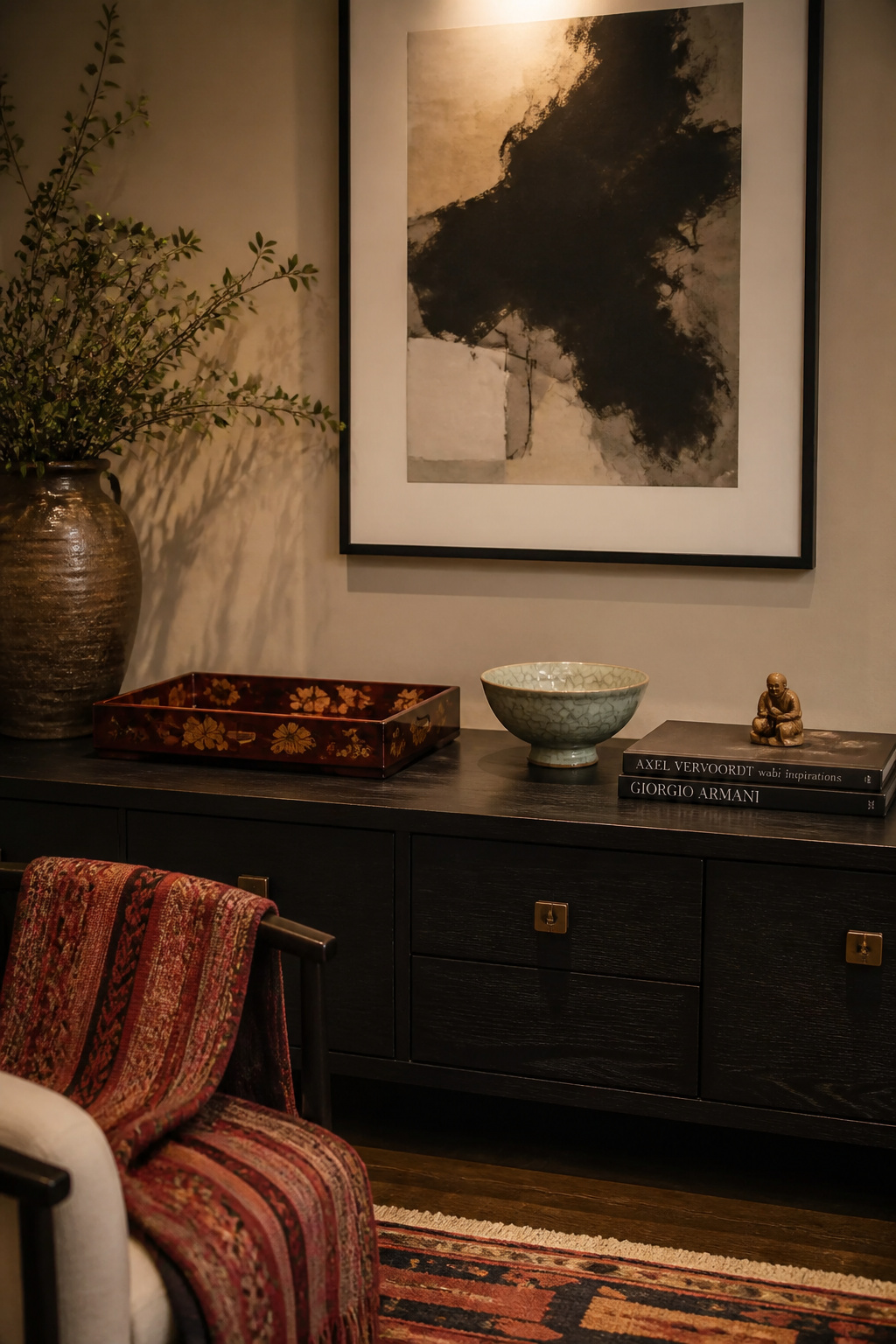
The principle is simple and difficult in equal measure: a travel find elevated from souvenir to design statement, a family heirloom repositioned in contemporary context, a piece of art chosen because it meant something — these objects carry a weight that purchased décor can never replicate. A Vietnamese lacquer box becomes a coffee table tray. A handmade Moroccan plate becomes wall art. A grandmother’s side table receives contemporary upholstery in a bold geometric and bridges fifty years without erasing either end.
The challenge is integration, not preservation. Personal objects belong among the room’s other elements as equals — not exiled to a special ‘memories shelf’ that announces itself as separate from the design. A Korean celadon bowl on a Scandinavian shelf, a Japanese netsuke beside a contemporary art print, a hand-woven textile from a market in Oaxaca draped over a modernist chair — these combinations create cultural conversation that nothing from a design website can reproduce.
Display Strategies for Meaningful Objects
Display strategies for odd-shaped or fragile pieces: a shadow box turns a collection of small finds into cohesive wall art. A glass-fronted cabinet protects without hiding. A dedicated console zone — grouped intentionally rather than distributed randomly — gives personal objects collective weight that scattered individual placements cannot. The room should tell a story. These objects are the chapters only you can write.
Bringing Your Living Room Decorating Ideas Together: Where to Start
The honest difficulty of decorating a living room is that everything connects to everything else, and it’s easy to become paralysed by the scope of what needs attention. The order of operations matters more than people expect.
Start with structure: furniture arrangement and rug placement. Get the bones right before adding anything else. A correctly floated sofa on a properly sized rug resolves the spatial foundation that every subsequent living room decorating decision builds on. This step costs nothing if you’re rearranging existing pieces, and it creates the biggest immediate shift in how a room feels.
Add lighting next. One additional floor lamp and a dimmer switch on the overhead transforms the evening atmosphere of a room more dramatically than any amount of decorative accessories. The mood of a room is established before the first cushion is placed.
Then paint — if the walls are fighting everything you’re trying to do, colour drenching one room costs the price of paint and a weekend of labour. The ROI on this single investment outpaces almost any furniture purchase at a comparable budget.
Accents — art, plants, objects, seasonal elements — come last. When applied to a room that hasn’t yet resolved its foundations, they’re decoration. When applied to a room that has, they become the room’s personality.
Choose two or three of these living room decorating ideas and begin. The room you want isn’t a complete renovation away — it’s usually a series of deliberate, sequenced decisions that compound into something that finally feels like yours.